


常用的css样式集锦
在前端开发过程中,css层叠样式表的规范特别重要,有经验的前端开发人员会自己记录一些常用的css代码,比如通用的css reset代码,常见的布局,表单,搜索框,按钮等css代码。
当然现在这些我们都有现成的ui框架,比如bootstrap,sui,mui等ui框架,但是假如现在然你自己开发呢,你会怎么办呢?
下面是一些常见的css样式大全,初学者可以学习下,老手略过。
一、css reset代码
*{word-wrap:break-word}
html,body,h1,h2,h3,h4,h5,h6,hr,p,iframe,dl,dt,dd,ul,ol,li,pre,form,button,input,textarea,th,td,fieldset{margin:0;padding:0}
ul,ol,dl{list-style-type:none}
html,body{*position:static}
html{font-family: sans-serif;-webkit-text-size-adjust:100%;-ms-text-size-adjust:100%}
address,caption,cite,code,dfn,em,th,var{font-style:normal;font-weight:400}
input,button,textarea,select,optgroup,option{font-family:inherit;font-size:inherit;font-style:inherit;font-weight:inherit}
input,button{overflow: visible;vertical-align:middle;outline:none}
body,th,td,button,input,select,textarea{font-family:“Microsoft Yahei”,“Hiragino Sans GB”,“Helvetica Neue”,Helvetica,tahoma,arial,Verdana,sans-serif,“WenQuanYi Micro Hei”,"\5B8B\4F53";font-size:12px;color: #333;-webkit-font-smoothing: antialiased;-moz-osx-font-smoothing:grayscale}
body{line-height:1.6}
h1,h2,h3,h4,h5,h6{font-size:100%}
a,area{outline:none;blr:expression(this.onFocus=this.blur())}
a{text-decoration:none;cursor: pointer}
a:hover{text-decoration:underline;outline:none}
a.ie6:hover{zoom:1}
a:focus{outline:none}
a:hover,a:active{outline:none}:focus{outline:none}
sub,sup{vertical-align:baseline}
button,input[type=“button”], input[type=“submit”] {line-height:normal !important}
/img/
img{border:0;vertical-align:middle}
a img,img{-ms-interpolation-mode:bicubic}
.img-responsive{max-width: 100%;height: auto}
/*IE下a:hover 背景闪烁*/
*html{overflow:-moz-scrollbars-vertical;zoom:expression(function(ele){ele.style.zoom = "1";document.execCommand("BackgroundImageCache",false,true)}(this))}

/*HTML5 reset*/
header,footer,section,aside,details,menu,article,section,nav,address,hgroup,figure,figcaption,legend{display:block;margin:0;padding:0}time{display:inline}
audio,canvas,video{display:inline-block;*display:inline;*zoom:1}
audio:not([controls]){display:none}
legend{width:100%;margin-bottom:20px;font-size:21px;line-height:40px;border:0;border-bottom:1px solid #e5e5e5}
legend small{font-size:15px;color:#999}
svg:not(:root) {overflow: hidden}
fieldset {border-width:0;padding: 0.35em 0.625em 0.75em;margin: 0 2px;border: 1px solid #c0c0c0}
input[type="number"]::-webkit-inner-spin-button,input[type="number"]::-webkit-outer-spin-button {height: auto}
input[type="search"] {-webkit-appearance: textfield; /* 1 */-moz-box-sizing: content-box;-webkit-box-sizing: content-box; /* 2 */box-sizing: content-box}
input[type="search"]::-webkit-search-cancel-button,input[type="search"]::-webkit-search-decoration {-webkit-appearance: none}
/*
Name:			style_clearfix
Example:		class="clearfix|cl"
Explain:		Clearfix(简写cl)避免因子元素浮动而导致的父元素高度缺失能问题
*/
.cl:after,.clearfix:after{content:".";display:block;height:0;clear:both;visibility:hidden}.cl,.clearfix{zoom:1}
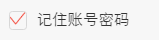
二、美化复选框
.hidden {
display: none;
}
.checkbox:checked ~.icon-checkbox {
background: url(…/images/yes_15.png) no-repeat;
background-size: 0.3rem 0.25rem;
}
.icon-checkbox {
width: 0.3rem;
height: 0.3rem;
margin-right: 0.1rem;
border: 0.02rem solid #d7d7d7;
border-radius: 0.06rem;
}
.icon {
display: inline-block;
vertical-align: middle;
}
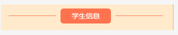
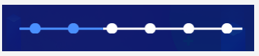
三、中间文字,两边横线居中
效果
四、怎么实现图标水平垂直居中(rem单位)
利用background-size来设置背景图的本身大小尺寸,然后利用background-position:center center;来设置背景图相对元素的水平垂直居中,其中元素的宽是背景图的宽,高就是原来的高
五、常用表单布局
- 收货地址:
六、答题进度条
就是用来展示答题进度的进度条,效果如下
其中img是形状底色(小圆圈是透明的)。而recommend-jd-bg是进度条背景色,recommend-jd-ks是控制进度的颜色!!,其中img的z-index>recommend-jd-bg>recommend-jd-ks


七、修改input的placeholder样式
.detail-page input::-webkit-input-placeholder { /* WebKit, Blink, Edge /
font-size: .26rem;
color:#b2b2b2;
opacity: 1;
}
.detail-page input:-moz-placeholder { / Mozilla Firefox 4 to 18 /
font-size: .26rem;
color:#b2b2b2;
opacity: 1;
}
.detail-page input::-moz-placeholder { / Mozilla Firefox 19+ /
font-size: .26rem;
color:#b2b2b2;
opacity: 1;
}
.detail-page input:-ms-input-placeholder { / Internet Explorer 10-11 */
font-size: .26rem;
color:#b2b2b2;
opacity: 1;
}
八、input中增加disabled会自带灰色,修改颜色如下
input:disabled{
border:1px solid #DDD;
background-color:#F5F5F5;
color:#ACA899;
}
九、多行文字左右对齐:
p {
text-align: justify;
text-justify: inter-ideograph;
}
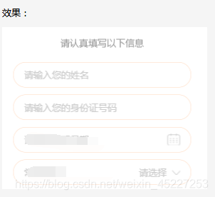
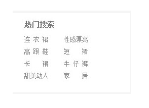
十、实现单行文字两端对齐,例如要实现下列单行文字对齐
方法一,使用伪类:
.hotsearch dd{
float: left;
line-height: 24px;
margin-right: 30px;
overflow: hidden;
text-align: center;
width: 4em; /这个值是看最长能显示几个文字,如x,则为x em/
}
.hotsearch dd a{
display:block;
}
.w2{
letter-spacing:2em; /*如果需要y个字两端对齐,则为(x-y)/(y-1),这里是(4-2)/(2-1)=2em */
margin-right:-2em; /同上/
}
.w3{
letter-spacing:0.5em; /*如果需要y个字两端对齐,则为(x-y)/(y-1),这里是(4-3)/(3-1)=0.5em */
margin-right:-0.5em; /同上/
}
效果:
十一、实现图片加载过程高度自适应
应用情景:在页面布局过程中,遇到轮播图或者大张图片,当图片下面还有其它块内容,在图片加载过程中,由于高度是0,下面的元素会往上跑,图片加载完。元素会往下跑,给用户感觉抖动。
解决方法:在图片最外层设置一个div,给这个div设置如下样式
.img-box {
overflow: hidden;
width: 100%;
height: 0;
padding-bottom: 52%;
/方法二/
width:100%;
/高度相对父级宽度比例/
height: 52%vw;
background:#eee;
}
十二、实现文字超出省略…
(需要设置宽度,当父级元素使用flex布局时,需要在display:flex;这边设置min-width:0;不然ellipsis会失效!!)
.ellipsis {
overflow: hidden;
text-overflow: ellipsis;
white-space: nowrap;
}
.ellipsis-2l {
display: -webkit-box;
overflow: hidden;
text-overflow: ellipsis;
-webkit-box-orient: vertical;
-webkit-line-clamp: 2; //第几行
}
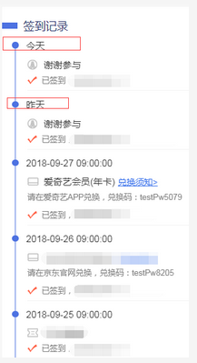
十三、竖向时间轴
效果,每次点都要与时间对齐,可以把小圆点放在跟日期同一个div上,然后横线做成整个记录的背景图
html:
.list {
padding-top: .1rem;
padding-bottom: .1rem;
font-size: .3rem;
color: #333;
background-color: #fff;
}
.list-item {
width: 100%;
margin-left: .32rem;
margin-top: -.15rem;
padding-bottom: .4rem;
background: url("…/images/border.png") no-repeat .1rem .21rem;
background-size: 1px 100%;
}
.progres2-item {
display: inline-block;
margin-right: .25rem;
width: .21rem;
height: .21rem;
background-color: #4d72e2;
border-radius: 50%;
}
/最后一个没有直线也就是没有背景,只有一个的时候也没有/
.list-item:last-of-type{
background:transparent;
}
.list-item-award,.list-item-text {
margin-left: .5rem;
}
.list-item-award{
padding-left: .53rem;
margin-bottom: .12rem;
margin-top: .22rem;
}
.list-item-text {
width: 100%;
padding-left: .46rem;
padding-bottom: .16rem;
background: url("…/images/sign-icon.png") no-repeat left .05rem;
background-size: .32rem .25rem;
font-size: .26rem;
color: #808080;
box-sizing: border-box;
border-bottom: 1px solid #f4f4f4;
}
.list-item:last-of-type .list-item-text {
border-bottom: 0 none;
}
.list-item .list-btn {
padding-left: .1rem;
text-decoration: underline;
font-size: .28rem;
color: #316cec;
}
十四、文字底部横线背景
另外我们常用的css属性有下面这些
一 CSS文字属性:
color : #999999; /文字颜色/
font-family : 宋体,sans-serif; /文字字体/
font-size : 9pt; /文字大小/
font-style:itelic; /文字斜体/
font-variant:small-caps; /小字体/
letter-spacing : 1pt; /字间距离/
line-height : 200%; /设置行高/
font-weight:bold; /文字粗体/
vertical-align:sub; /下标字/
vertical-align:super; /上标字/
text-decoration:line-through; /加删除线/
text-decoration: overline; /加顶线/
text-decoration:underline; /加下划线/
text-decoration:none; /删除链接下划线/
text-transform : capitalize; /首字大写/
text-transform : uppercase; /英文大写/
text-transform : lowercase; /英文小写/
text-align:right; /文字右对齐/
text-align:left; /文字左对齐/
text-align:center; /文字居中对齐/
text-align:justify; /文字分散对齐/
vertical-align属性
vertical-align:top; /垂直向上对齐/
vertical-align:bottom; /垂直向下对齐/
vertical-align:middle; /垂直居中对齐/
vertical-align:text-top; /文字垂直向上对齐/
vertical-align:text-bottom; /文字垂直向下对齐/
二、CSS边框空白
padding-top:10px; /上边框留空白/
padding-right:10px; /右边框留空白/
padding-bottom:10px; /下边框留空白/
padding-left:10px; /*左边框留空白
三、CSS符号属性
list-style-type:none; /不编号/
list-style-type:decimal; /阿拉伯数字/
list-style-type:lower-roman; /小写罗马数字/
list-style-type:upper-roman; /大写罗马数字/
list-style-type:lower-alpha; /小写英文字母/
list-style-type:upper-alpha; /大写英文字母/
list-style-type:disc; /实心圆形符号/
list-style-type:circle; /空心圆形符号/
list-style-type:square; /实心方形符号/
list-style-image:url(/dot.gif); /图片式符号/
list-style-position: outside; /凸排/
list-style-position:inside; /缩进/
四、CSS背景样式
background-color:#F5E2EC; /背景颜色/
background:transparent; /透视背景/
background-image : url(/image/bg.gif); /背景图片/
background-attachment : fixed; /浮水印固定背景/
background-repeat : repeat; /重复排列-网页默认/
background-repeat : no-repeat; /不重复排列/
background-repeat : repeat-x; /在x轴重复排列/
background-repeat : repeat-y; /在y轴重复排列/
指定背景位置
background-position : 90% 90%; /背景图片x与y轴的位置/
background-position : top; /向上对齐/
background-position : buttom; /向下对齐/
background-position : left; /向左对齐/
background-position : right; /向右对齐/
background-position : center; /居中对齐/
五、CSS连接属性
a /所有超链接/
a:link /超链接文字格式/
a:visited /浏览过的链接文字格式/
a:active /按下链接的格式/
a:hover /鼠标转到链接/
鼠标光标样式:
链接手指 CURSOR: hand
十字体 cursor:crosshair
箭头朝下 cursor:s-resize
十字箭头 cursor:move
箭头朝右 cursor:move
加一问号 cursor:help
箭头朝左 cursor:w-resize
箭头朝上 cursor:n-resize
箭头朝右上 cursor:ne-resize
箭头朝左上 cursor:nw-resize
文字I型 cursor:text
箭头斜右下 cursor:se-resize
箭头斜左下 cursor:sw-resize
漏斗 cursor:wait
光标图案(IE6) p {cursor:url(“光标文件名.cur”),text;}
六、CSS框线一览表
border-top : 1px solid #6699cc; /上框线/
border-bottom : 1px solid #6699cc; /下框线/
border-left : 1px solid #6699cc; /左框线/
border-right : 1px solid #6699cc; /右框线/
以上是建议书写方式,但也可以使用常规的方式 如下:
border-top-color : #369 /设置上框线top颜色/
border-top-width :1px /设置上框线top宽度/
border-top-style : solid/设置上框线top样式/
其他框线样式
solid /实线框/
dotted /虚线框/
double /双线框/
groove /立体内凸框/
ridge /立体浮雕框/
inset /凹框/
outset /凸框/
七、CSS表单运用
文字方块
按钮
复选框
选择钮
多行文字方块
下拉式菜单 选项1选项2
八、CSS边界样式
margin-top:10px; /上边界/
margin-right:10px; /右边界值/
margin-bottom:10px; /下边界值/
margin-left:10px; /左边界值/
九、CSS滤镜属性
Filter:在样式中加上滤镜特效。由于此属性内容比较多,我们将到下一章单独对滤镜介绍。
1.Alpha:设置透明度
Alpha(Opacity=?, FinishOpacity=?, Style=?, StartX=?, StartY=?, FinishX=?, FinishY=?)
Opacity:透明度级别,范围是0-100,0代表完全透明,100代表完全不透明。FinishOpacity:设置渐变的透明效果时,用来指定结束时的透明度,范围也是0 到 100。Style:设置渐变透明的样式,值为0代表统一形状、1代表线形、2代表放射状、3代表长方形。StartX和StartY:代表渐变透明效果的开始X和Y坐标。 FinishX和FinishY:代表渐变透明效果结束X和Y 的坐标。
2.BlendTrans:图像之间的淡入和淡出的效果
BlendTrans(Duration=?) Duration:淡入或淡出的时间。注意:这个滤镜必须配合JS建立图片序列,才能做出图片间效果。
3.Blru:建立模糊效果
Blur(Add=?, Direction=?, Strength=?) Add:是否单方向模糊,此参数是一个布尔值,true(非0)或false(0)。 Direction:设置模糊的方向,其中0度代表垂直向上,然后每45度为一个单位。 Strength:代表模糊的象素值。
4.Chroma:把指定的颜色设置为透明
Chroma(Color=?) Color:是指要设置为透明的颜色。
5.DropShadow:建立阴影效果
DropShadow(Color=?, OffX=?, OffY=?, Positive=?) Color:指定阴影的颜色。OffX:指定阴影相对于元素在水平方向偏移量,整数。 OffY:指定阴影相对于元素在垂直方向偏移量,整数。 Positive:是一个布尔值,值为true(非0)时,表示为建立外阴影;为false(0),表示为建立内阴影。
6.FlipH:将元素水平反转
7.FlipV:将元素垂直反转
8.Glow:建立外发光效效果
Glow(Color=?, Strength=?)
Color:是指定发光的颜色。
Strength:光的强度,可以是1到255之间的任何整数,数字越大,发光的范围就越大。
9.Gray:去掉图像的色彩,显示为黑白图象
10. Invert:反转图象的颜色,产生类似底片的效果
11. Light:放置光源的效果,可以用来模拟光源在物体上的投影效果 注意:此效果需要用JS设置光的位置和强度。
12. Mask:建立透明遮罩
Mask(Color=?) Color:设置底色,让对象遮住底色的部分透明。
13. RevealTrans:建立切换效果
RevealTrans(Duration=?, Transition=?)
Duration:是切换时间,以秒为单位。
Transtition:是切换方式,可设置为从0到23。
注意:如果做页面间的切换效果,可以在区加上一行代码:<Meta http-equiv=Page-enter content=revealTrans(Transition=?,Duration=?) >。如果用在页面里的元素必须配合JS使用。
14. Shadow:建立另一种阴影效果 Shadow(Color=?, Direction=?) Color:是指阴影的颜色。
Direction:是设置投影的方向,0度代表垂直向上,然后每45度为一个单位。
15. Wave:波纹效果
Wave(Add=?, Freq=?, LightStrength=?, Phase=?, Strength=?) Add:表示是否显示原对象,0表示不显示,非0表示要显示原对象。 Freq:设置波动的个数。LightStrength:设置波浪效果的光照强度,从0到100。0表示最弱,100表示最强。 Phase:波浪的起始相角。从0到100的百分数值。(例如:25相当于90度,而50相当于180度。) Strength:设置波浪摇摆的幅度。
16. Xray:显现图片的轮廓,X光片效果
注意:在使用CSS滤镜时,必须使用在有区域的元素,比如表格,图片等。而文本,段落这样没有区域的元素不能使用CSS滤镜,对这样的元素我们可以设置元素的Height和Width样式或坐标来实现。"


 1169
1169


 被折叠的 条评论
为什么被折叠?
被折叠的 条评论
为什么被折叠?
 到【灌水乐园】发言


