


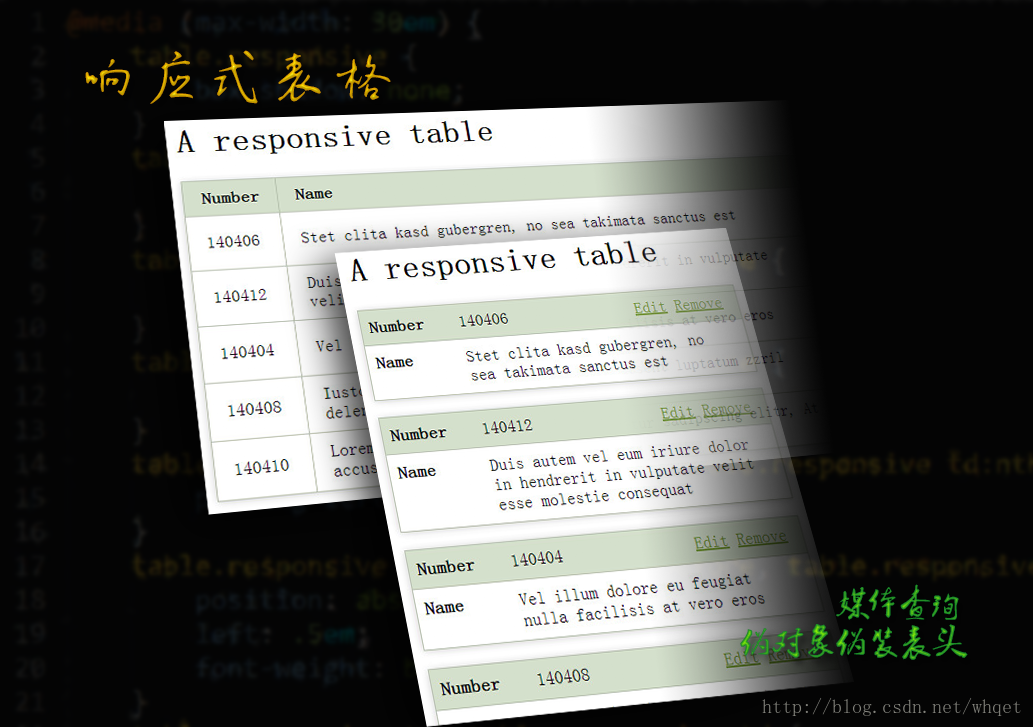
来继续看一个响应式表格,重点学习媒体查询,智能手机中将表头隐藏,利用:before伪对象伪造表头,效果见如下图所示。
在线研究点这里,下载收藏点这里,千万别忘了改变下屏幕宽度试试响应式哟。
ok, let's go.
html文件里面,我们得有table
<h1>A responsive table</h1>

<table class="responsive">
    <thead>
        <tr>
            <th>Number</th>
            <th>Name</th>
            <th>Action</th>
        </tr>
    </thead>
    <tbody>
        <tr>
            <td class="organisationnumber">140406</td>
            <td class="organisationname">Stet clita kasd gubergren, no sea takimata sanctus est</td>
            <td class="actions"> <a href="?" class="edit-item" title="Edit">Edit</a>
 <a href="?" class="remove-item" title="Remove">Remove</a>

            </td>
        </tr>
        <tr>
            <td class="organisationnumber">140412</td>
            <td class="organisationname">Duis autem vel eum iriure dolor in hendrerit in vulputate velit esse molestie consequat</td>
            <td class="actions"> <a href="?" class="edit-item" title="Edit">Edit</a>
 <a href="?" class="remove-item" title="Remove">Remove</a>

            </td>
        </tr>
        <tr>
            <td class="organisationnumber">140404</td>
            <td class="organisationname">Vel illum dolore eu feugiat nulla facilisis at vero eros</td>
            <td class="actions"> <a href="?" class="edit-item" title="Edit">Edit</a>
 <a href="?" class="remove-item" title="Remove">Remove</a>

            </td>
        </tr>
        <tr>
            <td class="organisationnumber">140408</td>
            <td class="organisationname">Iusto odio dignissim qui blandit praesent luptatum zzril delenit</td>
            <td class="actions"> <a href="?" class="edit-item" title="Edit">Edit</a>
 <a href="?" class="remove-item" title="Remove">Remove</a>

            </td>
        </tr>
        <tr>
            <td class="organisationnumber">140410</td>
            <td class="organisationname">Lorem ipsum dolor sit amet, consetetur sadipscing elitr, At accusam aliquyam diam</td>
            <td class="actions"> <a href="?" class="edit-item" title="Edit">Edit</a>
 <a href="?" class="remove-item" title="Remove">Remove</a>

            </td>
        </tr>
    </tbody>
</table>body {
padding: 1em;
}
a {
color: #739931;
}
.page {
max-width: 60em;
margin: 0 auto;
}
table th {
text-align: left;
}
table.responsive {
width: 100%;
border-collapse: collapse;
margin: 1em 0;
}
table.responsive th, table.responsive td {
border: 1px solid #B3BFAA;
padding: .5em 1em;
}
table.responsive th {
background: #D5E0CC;
}
table.responsive td {
background: #fff;
}
table.responsive {
box-shadow: 0 1px 10px rgba(0, 0, 0, 0.2);
}@media (max-width: 30em) {
table.responsive {
box-shadow: none;
}
table.responsive thead {
display: none;
}
table.responsive td:nth-child(1):before {
content:'Number';
}
table.responsive td:nth-child(2):before {
content:'Name';
}
table.responsive td:nth-child(1), table.responsive td:nth-child(2) {
padding-left: 25%;
min-height:1.5em; /*纠正空数据位置问题,当然空数据问题最好在服务器端进行处理。*/
}
table.responsive td:nth-child(1):before, table.responsive td:nth-child(2):before {
position: absolute;
left: .5em;
font-weight: bold;
}
table.responsive tr, table.responsive td {
display: block;
}
table.responsive tr {
position: relative;
margin-bottom: 1em;
box-shadow: 0 1px 10px rgba(0, 0, 0, 0.2);
}
table.responsive td {
border-top: none;
}
table.responsive td.organisationnumber {
background: #D5E0CC;
border-top: 1px solid #B3BFAA;
}
table.responsive td.actions {
position: absolute;
top: 0;
right: 0;
border: none;
background: none;
}
}在线研究点这里,下载收藏点这里,千万别忘了改变下屏幕宽度试试响应式哟。
---------------------------------------------------------------
前端开发whqet,关注web前端开发技术,分享网页相关资源。
---------------------------------------------------------------


 扫一扫
扫一扫
 557
557

 被折叠的 条评论
为什么被折叠?
被折叠的 条评论
为什么被折叠?
 到【灌水乐园】发言


