


无意间看到《css揭秘》这本书,感觉书挺好的,想看的可以看一下。里面有很多有意思的动画,平常是我们很难想到的,如果能用到其中的,必然是不错的。我截取了部分好玩又实用的代码,作为记录。
1.多个边框
示意图: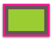
代码:
.Multiple_borders{
	width:  100px;
        height:  60px;
        margin:  25px;
       background: yellowgreen;
       box-shadow:  0  0  0  10px  #655,0  0  0  15px deeppink,
       0  2px  5px  15px  rgba(0,0,0,.6);
}
2.图片背景位置
示意图:
代码:
.background-position{
    background:  url(http://csssecrets.io/images/code-pirate.svg)
    no-repeat  bottom  right  #58a;
    background-position:  right  20px  bottom  10px;
    /* Styling */
    width:  10em;
    min-height:  5em;
    padding:  10px;
    color:  white;
    font:  100%/1  sans-serif;
}
3.内圆角
示意图:
代码:
.Inner_rounding{
    outline:  .6em  solid  #655;
    box-shadow:  0  0  0  .4em  #655; /* todo calculate max of this */
    max-width:  10em;
    border-radius:  .8em;
    padding:  1em;
    margin:  1em;
    background: tan;
    font:  100%/1.5  sans-serif;
}
4.圆锥曲线梯度
示意图:
代码:
.Conic_gradients{
	background:  red;
	background:  conic-gradient(limegreen,  green, limegreen);
	min-height:  100%;
	width:  10em;
	height:  7em;
}
5.边框图像
示意图:
代码:
.border-image{
border:  40px  solid  transparent;
    border-image:  33.334%  url('data:image/svg+xml,<svg xmlns="http:%2F%2Fwww.w3.org%2F2000%2Fsvg" width="30" height="30"> \
<circle cx="5" cy="5" r="5" fill="%23ab4"%2F><circle cx="15" cy="5" r="5" fill=" %23655"%2F> \
<circle cx="25" cy="5" r="5" fill="%23e07"%2F><circle cx="5" cy="15" r="5" fill=" %23655"%2F> \
<circle cx="15" cy="15" r="5" fill="hsl(15, 25%, 75%)"%2F> \
<circle cx="25" cy="15" r="5" fill=" %23655"%2F><circle cx="5" cy="25" r="5" fill="%23fb3"%2F> \
     <circle cx="15" cy="25" r="5" fill=" %23655"%2F><circle cx="25" cy="25" r="5" fill="%2358a"%2F><%2Fsvg>');
    padding:  1em;
    max-width:  10em;
    font:  130%/1.6 Baskerville, Palatino,  serif;
}
示意图:
代码:
.border-image2 {
border:  40px  solid  transparent;
    border-image:  33.334%  url('data:image/svg+xml,<svg xmlns="http:%2F%2Fwww.w3.org%2F2000%2Fsvg" width="30" height="30"> \
<circle cx="5" cy="5" r="5" fill="%23ab4"%2F><circle cx="15" cy="5" r="5" fill=" %23655"%2F> \
<circle cx="25" cy="5" r="5" fill="%23e07"%2F><circle cx="5" cy="15" r="5" fill=" %23655"%2F> \
<circle cx="15" cy="15" r="5" fill="hsl(15, 25%, 75%)"%2F> \
<circle cx="25" cy="15" r="5" fill=" %23655"%2F><circle cx="5" cy="25" r="5" fill="%23fb3"%2F> \
     <circle cx="15" cy="25" r="5" fill=" %23655"%2F><circle cx="25" cy="25" r="5" fill="%2358a"%2F><%2Fsvg>');
    padding:  1em;
    max-width:  10em;
    font:  130%/1.6 Baskerville, Palatino,  serif;
    margin-top:  1em;
    border-image-repeat:  round;
}
6.复古信封主题边框
示意图:
代码:
.Vintage_envelope_themed_border{
    padding:  1em;
    border:  1em  solid  transparent;
    background:  linear-gradient(white,  white) padding-box,
    repeating-linear-gradient(-45deg,  red  0,  red  12.5%,  transparent  0,
    transparent  25%,
    #58a  0,  #58a  37.5%,  transparent  0,  transparent  50%) 0 / 6em  6em;
    max-width:  20em;
    font:  100%/1.6 Baskerville, Palatino,  serif;
}
7.折角
示意图:
代码:
.Folded_corner{
width:  12em;
    background:  #58a; /* Fallback */
    background:
        linear-gradient(to  left  bottom,  transparent  50%,  rgba(0,0,0,.4) 0) 100%  0  no-repeat,
        linear-gradient(-135deg,  transparent  1.5em,  #58a  0);
    background-size:  2em  2em,  auto;
    padding:  2em;
    color:  white;
    font:  100%/1.6 Baskerville, Palatino,  serif;
}
8.蚂蚁行军边界
示意图:
代码:
.Marching_ants_border{
    padding:  1em;
    border:  1px  solid  transparent;
    background:  linear-gradient(white,  white) padding-box,
    repeating-linear-gradient(-45deg,  black  0,  black  25%,  transparent  0,
    transparent  50%) 0 / .6em  .6em;
    animation: ants 12s  linear  infinite;
    max-width:  20em;
    font:  100%/1.6 Baskerville, Palatino,  serif;
}
@keyframes  ants { to { background-position:  100%  100% } }
9.菱形图像
示意图:
代码:
.Diamond_images{
	width:  100px;
	height:  100px;
	transform:  rotate(45deg);
	overflow:  hidden;
	margin:  20px;
}
.Diamond_images  img {
  	  max-width:  100%;
	  transform:  rotate(-45deg) scale(1);
	  z-index:  -1;
	  position:  relative;
	  transition:  1s;
}
.Diamond_images  img:hover {
         transform:  rotate(0deg) scale(1.42);
}
10.剪辑路径
示意图:
代码:
.clip-path  img{
    max-width:  100px;
    margin:  20px;
    -webkit-clip-path:  polygon(50%  0,  100%  50%,  50%  100%,  0  50%);
    clip-path:  polygon(50%  0,  100%  50%,  50%  100%,  0  50%);
    transition:  1s;
}
.clip-path  img:hover {
    -webkit-clip-path:  polygon(0  0,  100%  0,  100%  100%,  0  100%);
    clip-path:  polygon(0  0,  100%  0,  100%  100%,  0  100%);
}
11.饼图
示意图:
代码:
.pie {
    width:  100px; height:  100px;
    border-radius:  50%;
    background: yellowgreen;
    background-image:  linear-gradient(to  right,  transparent  50%, currentColor 0);
    color:  #655;
}
.pie::before {
    content:  '';
    display:  block;
    margin-left:  50%;
    height:  100%;
    border-radius:  0  100%  100%  0 / 50%;
    background-color:  inherit;
    transform-origin:  left;
    animation: spin 3s  linear  infinite, bg 6s  step-end  infinite;
}
12.全景的图片预览
示意图:
代码:
.panoramic {
    width:  150px; height:  150px;
    background:  url('http://c3.staticflickr.com/3/2671/3904743709_74bc76d5ac_b.jpg');
    background-size:  auto  100%;
    animation: panoramic 10s  linear  infinite  alternate;
    animation-play-state:  paused;
}
.panoramic:hover,  .panoramic:focus {
    animation-play-state:  running;
}


 508
508


 被折叠的 条评论
为什么被折叠?
被折叠的 条评论
为什么被折叠?
 到【灌水乐园】发言


