


📚往期推文全新看点(文中附带全新鸿蒙5.0全栈学习笔录)
🎯 鸿蒙(HarmonyOS)北向开发知识点记录~
🎯 鸿蒙(OpenHarmony)南向开发保姆级知识点汇总~
🎯 鸿蒙应用开发与鸿蒙系统开发哪个更有前景?
🎯 嵌入式开发适不适合做鸿蒙南向开发?看完这篇你就了解了~
🎯 对于大前端开发来说,转鸿蒙开发究竟是福还是祸?
🎯 鸿蒙岗位需求突增!移动端、PC端、IoT到底该怎么选?
🎯 记录一场鸿蒙开发岗位面试经历~
🎯 持续更新中……
概述
针对应用,构建ArkUI应用级和页面级主题设置能力,并提供局部深浅色模式设置、动态换肤等功能。
本文提供如下场景:
- 自定义品牌色
- 应用级自定义品牌色
- 局部页面自定义主题风格
- 局部深浅色
自定义品牌色
CustomTheme 用于自定义主题,属性可选,只需要复写修改的部分,未修改内容继承于系统,参考 系统缺省token色值 。请参考:
  import { CustomColors, CustomTheme } from '@kit.ArkUI'

  export class AppColors implements CustomColors {
    //自定义品牌色
    brand: ResourceColor = '#FF75D9';
  }

  export class AppTheme implements CustomTheme {
    public colors: AppColors = new AppColors()
  }

  export let gAppTheme: CustomTheme = new AppTheme()
设置应用级自定义品牌色
- 可在页面入口处统一设置,需要在页面build前执行 ThemeControl 。
其中, onWillApplyTheme 回调函数用于自定义组件获取当前生效的Theme对象。
  import { Theme, ThemeControl } from '@kit.ArkUI'
  import { gAppTheme } from './AppTheme'

  //在页面build前执行ThemeControl
  ThemeControl.setDefaultTheme(gAppTheme)

  @Entry
  @Component
  struct DisplayPage {
    @State menuItemColor: ResourceColor = $r('sys.color.background_primary')

    onWillApplyTheme(theme: Theme) {
      this.menuItemColor = theme.colors.backgroundPrimary;
    }

    build() {
      Column() {
        List({ space: 10 }) {
          ListItem() {
            Column({ space: '5vp' }) {
              Text('Color mode')
                .margin({ top: '5vp', left: '14fp' })
                .width('100%')
              Row() {
                Column() {
                  Text('Light')
                    .fontSize('16fp')
                    .textAlign(TextAlign.Start)
                    .alignSelf(ItemAlign.Center)
                  Radio({ group: 'light or dark', value: 'light' })
                    .checked(true)
                }
                .width('50%')

                Column() {
                  Text('Dark')
                    .fontSize('16fp')
                    .textAlign(TextAlign.Start)
                    .alignSelf(ItemAlign.Center)
                  Radio({ group: 'light or dark', value: 'dark' })
                }
                .width('50%')
              }
            }
            .width('100%')
            .height('90vp')
            .borderRadius('10vp')
            .backgroundColor(this.menuItemColor)
          }

          ListItem() {
            Column() {
              Text('Brightness')
                .width('100%')
                .margin({ top: '5vp', left: '14fp' })
              Slider({ value: 40, max: 100 })
            }
            .width('100%')
            .height('70vp')
            .borderRadius('10vp')
            .backgroundColor(this.menuItemColor)
          }

          ListItem() {
            Column() {
              Row() {
                Column({ space: '5vp' }) {
                  Text('Touch sensitivity')
                    .fontSize('16fp')
                    .textAlign(TextAlign.Start)
                    .width('100%')
                  Text('Increase the touch sensitivity of your screen' +
                    ' for use with screen protectors')
                    .fontSize('12fp')
                    .fontColor(Color.Blue)
                    .textAlign(TextAlign.Start)
                    .width('100%')
                }
                .alignSelf(ItemAlign.Center)
                .margin({ left: '14fp' })
                .width('75%')

                Toggle({ type: ToggleType.Switch, isOn: true })
                  .margin({ right: '14fp' })
                  .alignSelf(ItemAlign.Center)
                  .width('25%')
              }
              .width('100%')
              .height('80vp')
            }
            .width('100%')
            .borderRadius('10vp')
            .backgroundColor(this.menuItemColor)
          }
        }
      }
      .padding('10vp')
      .backgroundColor('#dcdcdc')
      .width('100%')
      .height('100%')
    }
  }
- 在Ability中设置 ThemeControl ,需要在onWindowStageCreate()方法中 setDefaultTheme 。
  import AbilityConstant from '@ohos.app.ability.AbilityConstant';
  import hilog from '@ohos.hilog';
  import UIAbility from '@ohos.app.ability.UIAbility';
  import Want from '@ohos.app.ability.Want';
  import window from '@ohos.window';
  import { CustomColors, ThemeControl } from '@kit.ArkUI';

  class AppColors implements CustomColors {
    fontPrimary = 0xFFD53032
    iconOnPrimary = 0xFFD53032
    iconFourth = 0xFFD53032
  }

  const abilityThemeColors = new AppColors();

  export default class EntryAbility extends UIAbility {
    onCreate(want: Want, launchParam: AbilityConstant.LaunchParam) {
      hilog.info(0x0000, 'testTag', '%{public}s', 'Ability onCreate');
    }

    onDestroy() {
      hilog.info(0x0000, 'testTag', '%{public}s', 'Ability onDestroy');
    }

    onWindowStageCreate(windowStage: window.WindowStage) {
      // Main window is created, set main page for this ability
      hilog.info(0x0000, 'testTag', '%{public}s', 'Ability onWindowStageCreate');

      windowStage.loadContent('pages/Index', (err, data) => {
        if (err.code) {
          hilog.error(0x0000, 'testTag', 'Failed to load the content. Cause: %{public}s', JSON.stringify(err) ?? '');
          return;
        }
        hilog.info(0x0000, 'testTag', 'Succeeded in loading the content. Data: %{public}s', JSON.stringify(data) ?? '');
        // 在onWindowStageCreate()方法中setDefaultTheme
        ThemeControl.setDefaultTheme({ colors: abilityThemeColors })
        hilog.info(0x0000, 'testTag', '%{public}s', 'ThemeControl.setDefaultTheme done');
      });
    }

  }

注:如果setDefaultTheme的参数为undefined时,默认token值对应的色值参考 系统缺省token色值 。
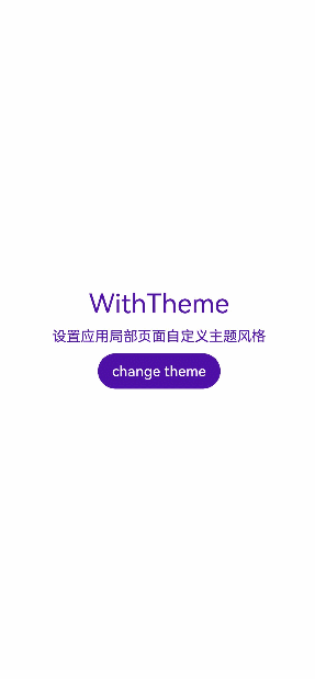
设置应用局部页面自定义主题风格
将自定义Theme的配色通过设置 WithTheme 作用于内组件缺省样式,WithTheme作用域内组件配色跟随Theme的配色生效。
在下面示例中,通过WithTheme({ theme: this.myTheme })将作用域内的组件配色设置为自定义主题风格。后续可通过更改this.myTheme更换主题风格。
onWillApplyTheme 回调函数用于自定义组件获取当前生效的Theme对象。
  import { CustomColors, CustomTheme, Theme } from '@kit.ArkUI'

  class AppColors implements CustomColors {
    fontPrimary: ResourceColor = $r('app.color.brand_purple')
    backgroundEmphasize: ResourceColor = $r('app.color.brand_purple')
  }

  class AppColorsSec implements CustomColors {
    fontPrimary: ResourceColor = $r('app.color.brand')
    backgroundEmphasize: ResourceColor = $r('app.color.brand')
  }

  class AppTheme implements CustomTheme {
    public colors: AppColors = new AppColors()
  }

  class AppThemeSec implements CustomTheme {
    public colors: AppColors = new AppColorsSec()
  }

  @Entry
  @Component
  struct DisplayPage {
    @State customTheme: CustomTheme = new AppTheme()
    @State message: string = '设置应用局部页面自定义主题风格'
    count = 0;

    build() {
      WithTheme({ theme: this.customTheme }) {
        Row(){
          Column() {
            Text('WithTheme')
              .fontSize(30)
              .margin({bottom: 10})
            Text(this.message)
              .margin({bottom: 10})
            Button('change theme').onClick(() => {
              this.count++;
              if (this.count > 1) {
                this.count = 0;
              }
              switch (this.count) {
                case 0:
                  this.customTheme = new AppTheme();
                  break;
                case 1:
                  this.customTheme = new AppThemeSec();
                  break;
              }
            })
          }
          .width('100%')
        }
        .height('100%')
        .width('100%')
      }
    }
  }
设置应用页面局部深浅色
通过 WithTheme 可以设置深浅色模式, ThemeColorMode 有三种模式,ThemeColorMode.SYSTEM模式表示跟随系统模式,ThemeColorMode.LIGHT模式表示浅色模式,ThemeColorMode.DARK模式表示深色模式。
在WithTheme作用域内,组件的样式资源取值跟随指定的模式读取对应的深浅色模式系统和应用资源值,WithTheme作用域内的组件配色跟随指定的深浅模式生效。
在下面的示例中,通过WithTheme({ colorMode: ThemeColorMode.DARK })将作用域内的组件设置为深色模式。
设置局部深浅色时,需要在resources文件夹下添加dark目录,dark目录添加dark.json资源文件,深浅色模式才会生效。
  @Entry
  @Component
  struct DisplayPage {
    @State message: string = 'Hello World';
    @State colorMode: ThemeColorMode = ThemeColorMode.DARK;

    build() {
      WithTheme({ colorMode: this.colorMode }) {
        Row() {
          Column() {
            Text(this.message)
              .fontSize(50)
              .fontWeight(FontWeight.Bold)
            Button('Switch ColorMode').onClick(() => {
              if (this.colorMode === ThemeColorMode.LIGHT) {
                this.colorMode = ThemeColorMode.DARK;
              } else if (this.colorMode === ThemeColorMode.DARK) {
                this.colorMode = ThemeColorMode.LIGHT;
              }
            })
          }
          .width('100%')
        }
        .backgroundColor($r('sys.color.background_primary'))
        .height('100%')
        .expandSafeArea([SafeAreaType.SYSTEM], [SafeAreaEdge.TOP, SafeAreaEdge.END, SafeAreaEdge.BOTTOM, SafeAreaEdge.START])
      }
    }
  }

系统缺省token色值


 扫一扫
扫一扫


 被折叠的 条评论
为什么被折叠?
被折叠的 条评论
为什么被折叠?
 到【灌水乐园】发言


