


包含块:是视觉格式化模型的一个重要概念,它与盒模型类似,也可以理解为一个矩形,而这个矩形的作用是为它里面包含的元素提供一个参考,元素的尺寸和位置的计算往往是由该元素所在的包含块决定的。
可以把包含块理解成一个参考系。
那么怎么确定包含块的所属关系了,简单的说谁是谁的包含块,谁是谁的参照系。
1:根元素所在的包含块被成为初始包含块,在xhtml中根元素是html,对于连续媒体设备,初始包含块的大小等于视口的大小(这个与后面的display:fixed有关系)。对于分页媒体,初始包含块是页面区域。初始包含块的direction属性与根元素相同,direction属性决定了块的书写方法,布局方向还有水平溢出方法。
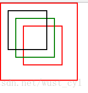
2:对于设置有position属性的元素,若position:fixed那么包含块由视口建立。
<body>
  <div class='head'>
   <div class='test1'></div>
   <div class='test2'></div>
   <div class='test3'></div>
  </div>
</body>
html body{
padding:0px;
margin:0px;
}
.head{
border:1px solid red;
width:100px;
height:100px;
/*没有开启 position*/
/*加上这句话 对下面三个div没有影响 position: relative;*/
top :100px;
left:100px;
}
.test1{
border:1px solid red;
position :fixed;
top:30px;
left:30px;
width:50px;
height:50px;
}
.test2{
border:1px solid green;
position :fixed;
top:20px;
left:20px;
width:50px;
height:50px;
}
.test3{
border:1px solid black;
position :fixed;
top:10px;
left:10px;
width:50px;
height:50px;
}
3:对于设置有position属性的元素,若position:relative或者static那么包含块为最近的块级祖先元素的内容区域(这里需要特别注意咯)
<body>
  <div class='head'>
   <div class='test1'></div>
  </div>
</body>
html body{
padding:0px;
margin:0px;
}
.head{
border:1px solid red;
width:100px;
height:100px;
/*注意加上这句话的区别 padding-top:10px;*/
}
.test1{
border:1px solid red;
position :relative;
top:0px;
left:30px;
width:50px;
height:50px;
} 仅仅加上padding-top:10px;
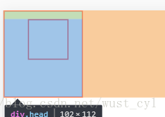 应该很明显了,是内容区域咯。(颜色是谷歌浏览器查看元素带的)
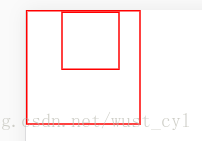
3:对于设置有position属性的元素,若position:absolute那么包含块由离此元素最近的设置有position属性(但非static)的祖先元素
如果祖先元素是块级元素,那么包含块是padding的ege围成的区域,和上面的有所不同。
<body>
  <div class='head'>
   <div class='test1'></div>
  </div>
</body>
html body{
padding:0px;
margin:0px;
}
.head{
border:1px solid red;
width:100px;
height:100px;
position:relative;
top:0px;
left:0px;
/*注意加上这句话的区别 padding-top:10px;*/
}
.test1{
border:1px solid red;
position :absolute;
top:0px;
left:30px;
width:50px;
height:50px;
}
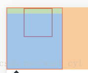
如果祖先元素是内联元素,那么情况变得复杂一下,这个取决与它的direction属性
如果 direction 是 ltr,祖先产生的第一个盒子的上、左内容边界是 包含块 的上方和左方,祖先的最后一个盒子的下、右内容边界是 包含块 的下方和右方
看一下如下代码:
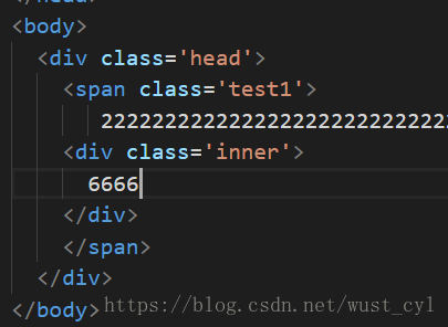
html body{
    padding:0px;
    margin:0px;
}
.head{
    margin: 0px;
    line-height: 1.5em;
    height: 3em;
    word-break:break-all;
    background:green;
}
.test1{
    position :relative;
}
.inner{
    position:absolute;
    bottom:0px;
    right:0px;
    color:red;
}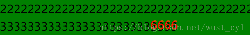
如果把bottom:0px;改成top:0px;
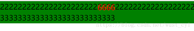
体会一下就可以了,包含块就是左上角到下面的3333右下角。
如果 direction 是从右到左,祖先产生的第一个盒子的上、右内容边界是 containing block 的上方和右方,祖先的最后一个盒子的下、左内容边界是 containing block 的下方和左方。
html body{
    padding:0px;
    margin:0px;
}
.head{
    margin: 0px;
    line-height: 1.5em;
    height: 3em;
    direction:rtl;
    word-break:break-all;
    background:green;
}
.test1{
    position :relative;
}
.inner{
    position:absolute;
   bottom:0px;
    left:0px;
    color:red;
}
如果不存在这样的祖先元素,那么就以根元素的内容边界为包含块


 1625
1625


 被折叠的 条评论
为什么被折叠?
被折叠的 条评论
为什么被折叠?
 到【灌水乐园】发言


