


工作中经常用到ProgressBar ,但是android自带的ProgressBar style基本上都不符合我们的需求。这就需要我们自定义ProgressBar 的样式了。下面介绍下progressbar的基础知识。
ProgressBar简介
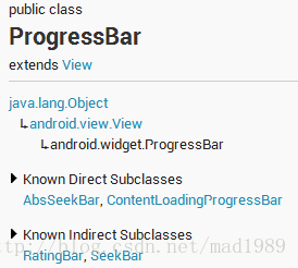
继承于View类,直接子类有AbsSeekBar和ContentLoadingProgressBar,其中AbsSeekBar的子类有SeekBar和RatingBar,可见这二者也是基于ProgressBar实现的。
1、ProgressBar有两个进度,一个是android:progress,另一个是android:secondaryProgress。后者主要是为缓存需要所涉及的,比如在看网络视频时候都会有一个缓存的进度条以及还要一个播放的进度,在这里缓存的进度就可以是android:secondaryProgress,而播放进度就是android:progress,有了secondProgress,可以很方便定制ProgressBar。
2、ProgressBar分为确定的和不确定的,确定的是我们能明确看到进度,相反不确定的就是不清楚、不确定一个操作需要多长时间来完成,这个时候就需要用的不确定的ProgressBar了。属性android:indeterminate如果设置为true的话,那么ProgressBar就可能是圆形的滚动条或者水平的滚动条(由样式决定),但是我们一般时候,是直接使用Style类型来区分圆形还是水平ProgressBar的。
3、ProgressBar的样式设定其实有两种方式,在API文档中说明的方式如下:
- Widget.ProgressBar.Horizontal
- Widget.ProgressBar.Small
- Widget.ProgressBar.Large
- Widget.ProgressBar.Inverse
- Widget.ProgressBar.Small.Inverse
- Widget.ProgressBar.Large.Inverse
- style="?android:attr/progressBarStyle"
- style="?android:attr/progressBarStyleHorizontal"
- style="?android:attr/progressBarStyleInverse"
- style="?android:attr/progressBarStyleLarge"
- style="?android:attr/progressBarStyleLargeInverse"
- style="?android:attr/progressBarStyleSmall"
- style="?android:attr/progressBarStyleSmallInverse"
- style="?android:attr/progressBarStyleSmallTitle"
<ProgressBar
        android:id="@+id/progressBar1"
        style="?android:attr/progressBarStyleHorizontal"
        style="@android:style/Widget.ProgressBar.Horizontal"(等同于@android:attr)
        android:layout_width="match_parent"
android:layout_height="wrap_content" />一、水平ProgressBar系统样式
我们去看一下 style="@android:style/Widget.ProgressBar.Horizontal"的源码,如下:
  <span style="font-size:14px;"> <style name="Widget.ProgressBar.Horizontal">
        <item name="android:indeterminateOnly">false</item>
        <item name="android:progressDrawable">@android:drawable/progress_horizontal</item>
        <item name="android:indeterminateDrawable">@android:drawable/progress_indeterminate_horizontal</item>
        <item name="android:minHeight">20dip</item>
        <item name="android:maxHeight">20dip</item>
        <item name="android:mirrorForRtl">true</item>
    </style></span>
<layer-list xmlns:android="http://schemas.android.com/apk/res/android">

    <item android:id="@android:id/background">
        <shape>
            <corners android:radius="5dip" />
            <gradient
                    android:startColor="#ff9d9e9d"
                    android:centerColor="#ff5a5d5a"
                    android:centerY="0.75"
                    android:endColor="#ff747674"
                    android:angle="270"
            />
        </shape>
    </item>

    <item android:id="@android:id/secondaryProgress">
        <clip>
            <shape>
                <corners android:radius="5dip" />
                <gradient
                        android:startColor="#80ffd300"
                        android:centerColor="#80ffb600"
                        android:centerY="0.75"
                        android:endColor="#a0ffcb00"
                        android:angle="270"
                />
            </shape>
        </clip>
    </item>

    <item android:id="@android:id/progress">
        <clip>
            <shape>
                <corners android:radius="5dip" />
                <gradient
                        android:startColor="#ffffd300"
                        android:centerColor="#ffffb600"
                        android:centerY="0.75"
                        android:endColor="#ffffcb00"
                        android:angle="270"
                />
            </shape>
        </clip>
    </item>

</layer-list>
这里面有3个item,分别为:background、secondProgress、progress,看名字就能知道其大概作用,我们比较关心的应该是后两个,其实把这个文件copy一份到自己的项目下,就可以随心所欲的修改shape属性:圆角、渐变等等。
二、圆形ProgressBar系统样式
我以style="@android:style/Widget.ProgressBar.Inverse"为例子查看源码:
 <style name="Widget.ProgressBar.Inverse">
        <item name="android:indeterminateDrawable">@android:drawable/progress_medium</item>
    </style>
<animated-rotate xmlns:android="http://schemas.android.com/apk/res/android"
    android:drawable="@drawable/spinner_black_48"
    android:pivotX="50%"
    android:pivotY="50%"
    android:framesCount="12"
    android:frameDuration="100" />
看到这里就透彻了,就是在这里spinner_white_48进行不停的旋转的,我们copy一下这个文件,就可以直接自定义了。
这里有一个疑惑,别人发的博客里圆形progressbar的动画是:
<rotate xmlns:android="http://schemas.android.com/apk/res/android"
    android:drawable="@drawable/spinner_white_76"
    android:pivotX="50%"
    android:pivotY="50%"
    android:fromDegrees="0"
    android:toDegrees="360" />
不知道是怎么回事???我用的and roid-18的style。
三、自定义圆形ProgressBar
自定义圆形progressbar也有两种方法:1.用几张图片堆砌2.自己用shape画图
1)用设计的图片
 <ProgressBar
        android:layout_width="40dp"
        android:layout_height="40dp"
        android:indeterminate="true"
        android:indeterminateDuration="1000"
      <span style="color:#FF0000;">  android:indeterminateDrawable="@drawable/progrress_circle_pic" </span>
       />
progrress_circle_pic的内容如下
<rotate xmlns:android="http://schemas.android.com/apk/res/android"
    android:fromDegrees="0"
    android:toDegrees="360"
    android:pivotX="50%"
    android:pivotY="50%"
   <span style="color:#FF0000;"> android:drawable="@drawable/progress_animation_list"</span>>

</rotate>
<animation-list xmlns:android="http://schemas.android.com/apk/res/android" >

    <item
        android:drawable="@drawable/loading_0"
        android:duration="100"/>
    <item
        android:drawable="@drawable/loading_1"
        android:duration="100"/>
    <item
        android:drawable="@drawable/loading_2"
        android:duration="100"/>
    <item
        android:drawable="@drawable/loading_3"
        android:duration="100"/>
    <item
        android:drawable="@drawable/loading_4"
        android:duration="100"/>
    <item
        android:drawable="@drawable/loading_5"
        android:duration="100"/>
    <item
        android:drawable="@drawable/loading_6"
        android:duration="100"/>
    <item
        android:drawable="@drawable/loading_7"
        android:duration="100"/>

</animation-list>
效果如下:

2)自己画图片
<rotate xmlns:android="http://schemas.android.com/apk/res/android"
    android:fromDegrees="0"
    android:pivotX="50%"
    android:pivotY="50%"
    android:toDegrees="360" >

    <shape
        android:innerRadius="35dp"
        android:shape="ring"
        android:thickness="5dp"
        android:useLevel="false" >
        <gradient
            android:centerColor="#f00"
            android:endColor="#ff0"
            android:startColor="#000" />
    </shape>

</rotate>
效果如下:

四、自定义水平ProgressBar系统样式
    <ProgressBar
        android:indeterminate="false"
        android:indeterminateOnly="false"
        android:layout_width="match_parent"
        android:layout_height="wrap_content"
        android:background="@android:color/background_light"
        android:padding="5dp"
        android:max="100"
        android:progress="60"
        android:maxHeight="20dp"
        android:minHeight="20dp"
        android:progressDrawable="@drawable/progressbar_horizontal"
        android:secondaryProgress="20"
        />
progressbar_horizontal.xml内容如下:
<layer-list xmlns:android="http://schemas.android.com/apk/res/android" >

    <item
        android:id="@android:id/background"
        android:drawable="@color/yellow">
    </item>
    <item android:id="@android:id/progress">
        <clip>
            <nine-patch android:src="@drawable/red_bg" />
        </clip>
    </item>
    <item android:id="@android:id/secondaryProgress">
        <clip>
            <nine-patch android:src="@drawable/blue" />
        </clip>
    </item>

</layer-list>


 扫一扫
扫一扫
 1327
1327

 被折叠的 条评论
为什么被折叠?
被折叠的 条评论
为什么被折叠?
 到【灌水乐园】发言


