


1. CSS
1.1 什么是CSS
CSS的英文名为 Cascading Style Sheet,中文为层叠样式表
CSS 能够对网页中元素位置的排版进行像素级精确控制, 实现美化页面的效果. 能够做到页面的样式和结构分离.
1.2 CSS 的基本语法
选择器+{
	属性: 属性值;
}
例如:
<style>
	p {
	font-size : 10px;
	color : red;
	}
</style>

<p>你好</p>
1.3 CSS的使用方式
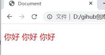
① 直接定义标记的 style 属性
<p style="color:red; font-size: 20px;">你好 你好 你好</p>
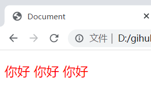
② 定义内部样式表
    <style>
        p{
            color:red;
            font-size: 20px;
        }
    </style>
    <p>你好 你好 你好</p>
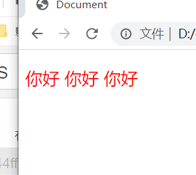
③ 嵌入外部样式表
    <style>
        @import url(1.css);
    </style>
    <p>你好 你好 你好</p>
1.css
p {
    color: red;
    font-size: 20px;
}
④ 链接外部样式表
    <link rel="stylesheet" href="1.css">
    <p>你好 你好 你好</p>
1.css
p {
    color: red;
    font-size: 20px;
}

2. 选择器的种类
2.1 基础选择器
由单个选择器构成的
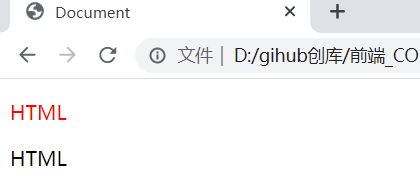
① 标签选择器
    <style>
        p {
            color: red;
        }
        div {
            color: pink;
        }
    </style>
    <p>HTML</p>
    <p>HTML</p>
    <div>CSS</div>
    <div>CSS</div>

② 类选择器
    <style>
        .red {
            color: red;
        }
    </style>
    <p class="red">HTML</p>
    <p>HTML</p>
    <div>CSS</div>
    <div>CSS</div>

③ id 选择器
    <style>
        #red {
            color: red;
        }
    </style>
    <p id="red">HTML</p>
    <p>HTML</p>
④ 通配符选择器
使用 * 的定义, 选取所有的标签
    <style>
        * {
            color: red;
        }
    </style>
    <p>HTML</p>
    <p>HTML</p>
    <div>CSS</div>
    <div>CSS</div>

2.2 复合选择器
① 后代选择器
又叫包含选择器. 选择某个父元素中的某个子元素.
元素1 元素2 {样式声明}
- 元素 1 和 元素 2 要使用空格分割
- 元素 1 是父级, 元素 2 是子级, 只选元素 2 , 不影响元素 1
代码示例1
    <style>
        ul li {
            color: pink;
        }
    </style>
    <ul>
        <li>你好!</li>
        <li>你好!</li>
        <li>你好!</li>
    </ul>

代码示例2
    <style>
        ul a {
            color: pink;
        }
    </style>
    <ul>
        <li><a href="http://www.baidu.com">你好!</a></li>
        <li>你好!</li>
        <li>你好!</li>
    </ul>

代码示例3
    <style>
        .one a {
            color: pink;
        }
    </style>
    <ul class="one">
        <li><a href="http://www.baidu.com">你好!</a></li>
        <li>你好!</li>
        <li>你好!</li>
    </ul>

② 子选择器
和后代选择器类似, 但是只能选择子标签.
元素1>元素2 { 样式声明 }
- 使用大于号分割
- 只选亲儿子, 不选孙子元素
代码示例1
    <style>
        .cat>ul>li>a {
            color: red;
        }
    </style>
    <div class="cat">
        <a href="#">不好</a>
        <ul>
            <li><a href="#">你好</a></li>
            <li><a href="#">你好</a></li>
        </ul>
    </div>

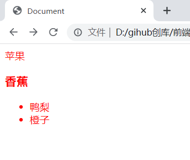
③ 并集选择器
用于选择多组标签.
元素1, 元素2 { 样式声明 }
- 通过 逗号 分割等多个元素.
- 表示同时选中元素 1 和 元素 2
- 任何基础选择器都可以使用并集选择器.
- 并集选择器建议竖着写. 每个选择器占一行.
代码示例1
    <style>
        div,h3 {
            color: red;
        }
    </style>
    <div>苹果</div>
    <h3>香蕉</h3>
    <ul>
        <li>鸭梨</li>
        <li>橙子</li>
    </ul>

代码示例2
    <style>
        div,h3,ul>li {
            color: red;
        }
    </style>
    <div>苹果</div>
    <h3>香蕉</h3>
    <ul>
        <li>鸭梨</li>
        <li>橙子</li>
    </ul>
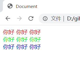
④ 伪类选择器
1) 链接伪类选择器
| 标记 | 描述 |
|---|---|
| a:link | 选择未被访问过的链接 |
| a:visited | 选择已经被访问过的链接 |
| a:hover | 选择鼠标指针悬停上的链接 |
| a:active | 选择活动链接(鼠标按下了但是未弹起) |
    <style>
        /* 未被访问过的链接是黑色 */
        a:link {
            color: black;
            /* 去掉下划线 */
            text-decoration: none;
        }
        /* 被访问过之后是红色 */
        a:visited {
            color: red;
        }
        /* 鼠标悬停的时候是蓝色 */
        a:hover {
            color: blue;
        }
        /* 鼠标按下但没松的时候是绿色 */
        a:active {
            color: green;
        }
    </style>
    <a href="http://www.sougou.com">你好</a>

2) :focus 伪类选择器
选取获取焦点的 input 表单元素.
    <style>
        div>input:focus {
            color: red;
        }
    </style>
    <div>
        <input type="text">
    </div>
这里此时被选中的表单的字体就会变成红色

3. 常用元素属性
3.1 字体属性
① 字体设置 font-family
注: 字体的名称可以用中文,但是不建议.
    <style>
        body {
            font-family:'黑体';
        }
    </style>
    <p>你好 你好 你好</p>

② 字体大小 font-size
    <style>
        .p1 {
            font-size: large;
        }
        .p2 {
            font-size: 20px;
        }
    </style>
    <p class="p1">你好 你好 你好</p>
    <p class="p2">不好 不好 不好</p>

③ 字体粗细 font-weight
| 值 | 描述 |
|---|---|
| normal | 默认值。定义标准的字符。 |
| bold | 定义粗体字符。 |
| bolder | 定义更粗的字符。 |
| lighter | 定义更细的字符。 |
| 100,200,300,400,500, 600,700,800,900 | 定义由粗到细的字符。400 等同于 normal,而 700 等同于 bold。 |
    <style>
        .p1 {
            font-weight: bold;
        }
        .p2 {
            font-weight: 100;
        }
    </style>
    <p class="p1">你好 你好 你好</p>
    <p class="p2">不好 不好 不好</p>

④ 字体样式 font-style
| 值 | 描述 |
|---|---|
| normal | 默认值。浏览器显示一个标准的字体样式。 |
| italic | 浏览器会显示一个斜体的字体样式。 |
| oblique | 浏览器会显示一个倾斜的字体样式。 |
    <style>
        .p1 {
            font-style: italic;
        }
        .p2 {
            font-style: oblique;
        }
    </style>
    <p class="p1">你好 你好 你好</p>
    <p class="p2">不好 不好 不好</p>

3.2 文本属性
① 文本颜色 color
color 属性值的写法:
- 颜色的单词
#+ 8位16进制的形式- RGB方式
    <style>
        .one {
            color: red;
        }
        .two {
            color: #00ff00;
        }
        .three {
            color: rgb(0,0,255);
        }
    </style>
    <div class="one">你好 你好 你好</div>
    <div class="two">你好 你好 你好</div>
    <div class="three">你好 你好 你好</div>
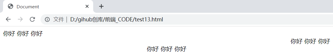
② 文本对齐 test-align
| 值 | 描述 |
|---|---|
| left | 把文本排列到左边。默认值:由浏览器决定。 |
| right | 把文本排列到右边。 |
| center | 把文本排列到中间。 |
| justify | 实现两端对齐文本效果。 |
    <style>
        .one {
            text-align: left;
        }
        .two {
            text-align: right;
        }
        .three {
            text-align: center;
        }
    </style>
    <div class="one">你好 你好 你好</div>
    <div class="two">你好 你好 你好</div>
    <div class="three">你好 你好 你好</div>
③ 文本装饰 text-decoration
| 值 | 描述 |
|---|---|
| none | 默认。定义标准的文本。 |
| underline | 定义文本下的一条线。 |
| overline | 定义文本上的一条线。 |
| line-through | 定义穿过文本下的一条线。 |
    <style>
        .one {
            text-decoration: underline;
        }
        .two {
            text-decoration: line-through;
        }
        .three {
            text-decoration: overline;
        }
        .five {
            text-decoration: none;
        }
    </style>
    <div class="one">你好 你好 你好</div><br/>
    <div class="two">你好 你好 你好</div><br/>
    <div class="three">你好 你好 你好</div><br/>
    <a href="http://www.baidu.com" class="five">你你你你你好好好好好</a>

④ 文本缩进 text-indent
输入的属性值可以是长度单位,可以是百分比单位
注: 要是想要首行缩进2格,可以为2em
    <style>
        .one {
            text-indent: 50%;
        }
        .two {
            text-indent: 3em;
        }
    </style>
    <div class="one">你好 你好 你好</div><br/>
    <div class="two">你好 你好 你好</div><br/>

⑤ 行距 line-height
| 值 | 描述 |
|---|---|
| normal | 默认。设置合理的行间距。 |
| number | 设置数字,此数字会与当前的字体尺寸相乘来设置行间距。 |
| length | 设置固定的行间距。 |
| % | 基于当前字体尺寸的百分比行间距。 |
    <style>
        .one {
            line-height: 30px;
        }
        .two {
            line-height: 20%;
        }
    </style>
    <div class="one">你好<br/>你好<br/>你好</div><br/>
    <div class="two">你好<br/>你好<br/>你好</div>

3.3 背景属性
① 背景颜色 background-color
    <style>
        .one {
            background-color: red;
        }
        .two {
            background-color: #00ff00;
        }
        .three {
            background-color: transparent;
        }
    </style>
    <div class="one">你好</div>
    <div class="two">你好</div>
    <div class="three">你好</div>

② 背景图片 background-image:url()
    <style>
        body {
            background-image: url(1.jpg);
            height: 200px;
        }
    </style>

③ 背景平铺 background-repeat
| 值 | 描述 |
|---|---|
| repeat | 默认。背景图像将在垂直方向和水平方向重复。 |
| repeat-x | 背景图像将在水平方向重复。 |
| repeat-y | 背景图像将在垂直方向重复。 |
| no-repeat | 背景图像将仅显示一次。 |
    <style>
        .one {
            background-image: url(male.png);
            height: 300px;
            background-repeat: repeat;
        }
        .two{
            background-image: url(male.png);
            height: 300px;
            background-repeat: no-repeat;
        }
        .three{
            background-image: url(male.png);
            height: 300px;
            background-repeat: repeat-x;
        }
        .four{
            background-image: url(male.png);
            height: 300px;
            background-repeat: repeat-y;
        }
    </style>
    <div class="one">你好</div>
    <div class="two">你好</div>
    <div class="three">你好</div>
    <div class="four">你好</div>

④ 背景位置 background-position: x y
| 值 | 描述 |
|---|---|
| top left top center top right center left center center center right bottom left bottom center bottom right | 如果您仅规定了一个关键词,那么第二个值将是"center"。默认值:0% 0%。 |
| x% y% | 第一个值是水平位置,第二个值是垂直位置。左上角是 0% 0%。右下角是 100% 100%。如果您仅规定了一个值,另一个值将是 50%。 |
| xpos ypos | 第一个值是水平位置,第二个值是垂直位置。左上角是 0 0。单位是像素 (0px 0px) 或任何其他的 CSS 单位。如果您仅规定了一个值,另一个值将是50%。您可以混合使用 % 和 position 值。 |
    <style>
        .one {
            background-image: url(male.png);
            height: 300px;
            background-position: top right;
        }
        .two{
            background-image: url(male.png);
            height: 300px;
            background-position: center right;
        }
        .three{
            background-image: url(male.png);
            height: 300px;
            background-position: 20px 80px;
        }
        .four{
            background-image: url(male.png);
            height: 300px;
            background-position: 20% 80%;
        }
    </style>
    <div class="one">你好</div>
    <div class="two">你好</div>
    <div class="three">你好</div>
    <div class="four">你好</div>

⑤ 背景尺寸 background-size
属性值:length|percentage|cover|contain
    <style>
        .one {
            background-image: url(male.png);
            height: 300px;
            background-size: 50px;
        }
        .two{
            background-image: url(male.png);
            height: 300px;
            background-size: 50%;
        }
        .three{
            background-image: url(male.png);
            height: 300px;
            background-size:cover
        }
        .four{
            background-image: url(male.png);
            height: 300px;
            background-size: contain;
        }
    </style>
    <div class="one">你好</div>
    <div class="two">你好</div>
    <div class="three">你好</div>
    <div class="four">你好</div>

3.4 圆角矩形
基本用法
border-radius: length;
length表示内切圆的半径,length越大,弧度越大
示例1
    <style>
        div {
            font-size: 50px;
            width: 200px;
            height: 300px;
            border: 2px solid green;
            border-radius: 20px;
        }
    </style>
    <div>哈喽</div>

生成圆形
让 border-radius 的值为正方形宽度的一半即可
    <style>
        div {
            font-size: 50px;
            width: 300px;
            height: 300px;
            border: 2px solid green;
            border-radius: 50%;
        }
    </style>
    <div>哈喽</div>

生成圆角矩形
让 border-radius 的值为矩形高度的一半即可
    <style>
        div {
            font-size: 50px;
            width: 200px;
            height: 300px;
            border: 2px solid green;
            border-radius: 150px;
        }
    </style>
    <div>哈喽</div>

展开写法
border-radius 是一个复合写法. 实际上可以针对四个角分别设置.
border-radius:2em;
等价于
border-top-left-radius:2em;
border-top-right-radius:2em;
border-bottom-right-radius:2em;
border-bottom-left-radius:2em;
border-radius: 10px 20px 30px 40px;
等价于
border-top-left-radius:10px;
border-top-right-radius:20px;
border-bottom-right-radius:30px;
border-bottom-left-radius:40px;
注: CSS 中顺序一般都是按照顺时间顺序的.
4. 元素的显示模式
4.1 块级元素
常见的元素: h1~h6 p div ul ol li …
特点
- 独占一行
- 高度, 宽度, 内外边距, 行高都可以控制.
- 宽度默认是父级元素宽度的 100% (和父元素一样宽)
- 是一个容器(盒子), 里面可以放行内和块级元素.
代码示例
    <style>
        .one .parent{
            width: 500px;
            height: 300px;
            background-color: red;
        }
        .one .child{
            /* 这里width没设置,默认是父级的 */
            height: 200px;
            background-color: blue;
        }
    </style>
    <div class="one">
        <div class="parent">
            <div class="child">
                child1
            </div>
        </div>
    </div>

注意事项
- 文字类的元素内不能使用块级元素
- p 标签主要用于存放文字, 内部不能放块级元素, 尤其是 div
4.2 行内元素/内联元素
常见的元素:a strong b em i del u span …
特点
- 不独占一行, 一行可以显示多个
- 设置高度, 宽度, 行高无效
- 左右外边距有效(上下无效). 内边距有效.
- 默认宽度就是本身的内容
- 行内元素只能容纳文本和其他行内元素, 不能放块级元素
代码示例:
    <style>
        span{
            width: 300px;
            height: 500px;
            background-color: red;
        }
    </style>
    <span>你好~</span>

注意事项
- a 标签中不能再放 a 标签 (虽然 chrome 不报错, 但是最好不要这么做).
- a 标签里可以放块级元素, 但是更建议先把 a 转换成块级元素
4.3 行内元素和块级元素的区别
- 块级元素独占一行, 行内元素不独占一行
- 块级元素可以设置宽高, 行内元素不能设置宽高.
- 块级元素四个方向都能设置内外边距, 行内元素垂直方向不能设置.
4.4 改变显示模式
display: block改成块级元素 [常用]display: inline改成行内元素 [很少用]display: inline-block改成行内块元素
5. 盒模型
每一个 HTML 元素就相当于是一个矩形的 “盒子”
这个盒子由这几个部分构成:
- 边框
border- 内容
content- 内边距
padding- 外边距
margin

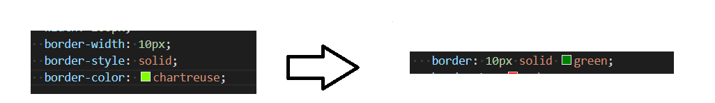
5.1 边框
基础属性
| 描述 | 标记 |
|---|---|
| 粗细 | border-width |
| 样式 | border-style, 默认没边框. solid 实线边框 dashed 虚线边框 dotted 点线边框 |
| 颜色 | border-color |
代码示例1
    <style>
        div {
            height: 200px;
            width: 200px;
            border-width: 10px;
            border-style: solid;
            border-color: chartreuse;
        }
    </style>
    <div>你好</div>

以上代码中可以简写.没有顺序要求
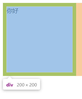
边框会撑大盒子

设置200 * 200 变成了220 * 220
因为算上了边框的距离
解决办法:
<style>
        /* 这里用通配符解决了问题 */
        * {
            box-sizing: border-box;
        }
        div {
            height: 200px;
            width: 200px;
            border: 10px solid green;
        }
    </style>
    <div>你好</div>
5.2 内边距
padding设置内容和边框之间的距离
基础属性
| 标记 | 描述 |
|---|---|
| padding-top | 上 |
| padding-bottom | 下 |
| padding-left | 左 |
| padding-right | 右 |
代码示例
    <style>
        div {
            width: 200px;
            height: 200px;
            border: 2px solid green;
            padding-top: 20px;
            padding-left: 10px;
        }
    </style>
    <div>你好</div>

复合写法
| 写法 | 描述 |
|---|---|
| padding: 5px; | 表示四个方向都是 5px |
| padding: 5px 10px; | 表示上下内边距 5px, 左右内边距为 10px |
| padding: 5px 10px 20px; | 表示上边距 5px, 左右内边距为 10px, 下内边距为 20px |
| padding: 5px 10px 20px 30px; | 表示 上5px, 右10px, 下20px, 左30px (顺时针) |
5.3 外边距
基础属性
| 标记 | 描述 |
|---|---|
| margin-top | 上 |
| margin-bottom | 下 |
| margin-left | 左 |
| margin-right | 右 |
代码示例
    <style>
        div {
            background-color: green;
            width: 200px;
            height: 200px;
            margin-bottom: 20px;
        }
    </style>
    <div>你好</div>

复合写法
| 写法 | 描述 |
|---|---|
| margin: 10px; | // 四个方向都设置 |
| margin: 10px 20px; | // 上下为 10, 左右 20 |
| margin: 10px 20px 30px; | // 上 10, 左右 20, 下 30 |
| margin: 10px 20px 30px 40px; | // 上 10, 右 20, 下 30, 左 40 |
块级元素水平居中
三种写法
	margin-left: auto; margin-right: auto;
	margin: auto;
	margin: 0 auto;
代码示例:
    <style>
        div {
            background-color: green;
            width: 200px;
            height: 200px;
            margin: 0 auto;
        }
    </style>
    <div>你好</div>

注意事项:
- 这个水平居中的方式和 text-align 不一样.
margin: auto是给块级元素用得到.
text-align: center是让行内元素或者行内块元素居中的. - 对于垂直居中, 不能使用 "上下 margin 为 auto " 的方式
去除浏览器默认样式
浏览器会给元素加上一些默认的样式, 尤其是内外边距. 不同浏览器的默认样式存在差别.
为了保证代码在不同的浏览器上都能按照统一的样式显示, 往往我们会去除浏览器默认样式
* {
	margin: 0;
	padding: 0;
}

6. 弹性布局
6.1 flex 布局基本概念
flex是 flexible box 的缩写. 意思为 “弹性盒子”.
任何一个 html 元素, 都可以指定为 display:flex 完成弹性布局.
flex 布局的本质是给父盒子添加 display:flex 属性, 来控制子盒子的位置和排列方式.
基础概念:
- 被设置为
display:flex属性的元素, 称为flex container - 它的所有子元素立刻称为了该容器的成员, 称为
flex item flex item可以纵向排列, 也可以横向排列, 称为flex direction(主轴)

注:当父元素设置为display: flex之后, 子元素的float, clear, vertical-align都会失效.
6.2 常用属性
① justify-content
设置主轴上的子元素排列方式.
| 值 | 描述 |
|---|---|
| flex-start | 默认值。项目位于容器的开头。 |
| flex-end | 项目位于容器的结尾。 |
| center | 项目位于容器中央。 |
| space-between | 项目在行与行之间留有间隔。 |
| space-around | 项目在行之前、行之间和行之后留有空间。 |
代码示例: space-around
    <style>
        .one {
            width:100%;
            height: 300px;
            background-color:hotpink;
            display: flex;
            justify-content: space-around;
        }
        .two,.three,.four {
            width: 40px;
            height: 100px;
            background-color:lawngreen;
        }
    </style>
    <div class="one">
        <div class="two">你好</div>
        <div class="three">你好</div>
        <div class="four">你好</div>
    </div>

代码示例: space-between
    <style>
        .one {
            width:100%;
            height: 300px;
            background-color:hotpink;
            display: flex;
            justify-content: space-between;
        }
        .two,.three,.four {
            width: 40px;
            height: 100px;
            background-color:lawngreen;
        }
    </style>
    <div class="one">
        <div class="two">你好</div>
        <div class="three">你好</div>
        <div class="four">你好</div>
    </div>

② align-items
| 值 | 描述 |
|---|---|
| stretch | 默认。项目被拉伸以适合容器。 |
| center | 项目位于容器的中央。 |
| flex-start | 项目位于容器的开头。 |
| flex-end | 项目位于容器的末端。 |
| space-between | 行均匀分布在弹性容器中 |
| space-around | 行均匀分布在弹性容器中,两端各占一半 |
代码示例:
    <style>
        .one {
            width:100%;
            height: 300px;
            background-color:hotpink;
            display: flex;
            justify-content: space-around;
            align-items: center;
        }
        .two,.three,.four {
            width: 40px;
            height: 100px;
            background-color:lawngreen;
        }
    </style>
    <div class="one">
        <div class="two">你好</div>
        <div class="three">你好</div>
        <div class="four">你好</div>
    </div>

代码示例:
    <style>
        .one {
            width:100%;
            height: 300px;
            background-color:hotpink;
            display: flex;
            justify-content: space-around;
            align-items: flex-end;
        }
        .two,.three,.four {
            width: 40px;
            height: 100px;
            background-color:lawngreen;
        }
    </style>
    <div class="one">
        <div class="two">你好</div>
        <div class="three">你好</div>
        <div class="four">你好</div>
    </div>

注: align-items只能针对单行元素来实现. 如果有多行元素, 就需要使用 item-contents


 228
228


 被折叠的 条评论
为什么被折叠?
被折叠的 条评论
为什么被折叠?
 到【灌水乐园】发言


