


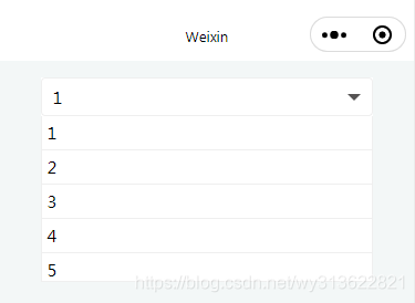
1、下拉弹窗选择列表
一、封装一个下拉弹窗选择列表组件
效果图:
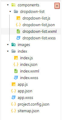
首先新建一个component文件–dropdown-list:
dropdown-list.js代码:
// 下拉弹窗选择列表
Component({
  options: {
    multipleSlots: true // 在组件定义时的选项中启用多slot支持
  },
  /**
   * 组件的属性列表
   */
  properties: {
    selectData: {
      type: Array,
      value: [],
    }
  },

  /**
   * 组件的初始数据
   */
  data: {
    show: false,
    index: 0 //选择的下拉列表下标
  },

  /**
   * 组件的方法列表
   */
  methods: {

    //展示或隐藏弹框
    selectTap: function () {
      console.log("显示==》")
      this.setData({
        show: !this.data.show
      })
    },

    /*
     * 内部私有方法建议以下划线开头
     * triggerEvent 用于触发事件
     */
    _optionTap(e) {
      //触发取消回调
      // console.log("回调optionTap==》", e.currentTarget.dataset.index)
      this.setData({
        index: e.currentTarget.dataset.index
      })
      this.selectTap() //展示或隐藏弹框
      // 为了能在indes里面拿到选择了哪个项而加入  selectId
      this.triggerEvent("optionTap",{'selectId':e.currentTarget.dataset.index})
    },

  }
})
dropdown-list.json代码:
{
  "component": true,
  "usingComponents": {}
}
dropdown-list.wxml代码:
<!--下拉选择框 dropdownlist-->
<view class='select_box'>
  <view class='select' catchtap='selectTap'>
    <text class='select_text'>{{selectData[index]}}</text>
    <!-- 画的三角形 -->
    <view class='view-triangle {{show&&"select_img_rotate"}}'></view>
  </view>

  <view class='option_box' style='height:{{show?(selectData.length>5?300:selectData.length*60):0}}rpx;'>
    <text class='option' style='{{index==selectData.length-1&&"border:0;"}}' wx:for='{{selectData}}' wx:key='this'
      data-index='{{index}}' catchtap='_optionTap'>{{item}}</text>
  </view>
</view>
<!--下拉选择框-->
dropdown-list.wxss代码:
/* 弹层下拉选择框 begin */
.select_box {
  background: #fff;
  width: 80%;
  margin: 30rpx auto;
  position: relative;
}

.select {
  box-sizing: border-box;
  width: 100%;
  height: 70rpx;
  border: 1px solid #efefef;
  border-radius: 8rpx;
  display: flex;
  align-items: center;
  padding: 0 20rpx;
}

.select_text {
  font-size: 30rpx;
  flex: 1;
}

.select_img {
  width: 30rpx;
  height: 30rpx;
  display: block;
  transition: transform 0.3s;
}

.select_img_rotate {
  transform: rotate(180deg);
}

.option_box {
  position: absolute;
  top: 70rpx;
  width: 100%;
  border: 1px solid #efefef;
  box-sizing: border-box;
  height: 0;
  overflow-y: auto;
  border-top: 0;
  background: #fff;
  transition: height 0.3s;
}

.option {
  display: block;
  line-height: 40rpx;
  font-size: 30rpx;
  border-bottom: 1px solid #efefef;
  padding: 10rpx;
}
/* css画的三角形 */
.view-triangle{
  display: block;
  transition: transform 0.3s;
  width: 0;
  height: 0;
  border-left: 6px solid transparent;
  border-right: 6px solid transparent;
  border-bottom: 6px solid rgb(85, 83, 83);
}
二、使用封装好的弹窗下拉组件
index.json代码:
{
  "usingComponents": {
    "dropdown-list": "../components/dropdown-list/dropdown-list"
  }
}
index.wxml代码:
<dropdown-list selectData='{{selectData}}' bind:optionTap="_optionTap"></dropdown-list>
index.js代码:
const app = getApp()

Page({
  data: {
    selectData: ['1', '2', '3', '4', '5', '6'], //下拉列表的数据
  },

  onLoad: function (options) {

  },

  _optionTap(e) {
    console.log("选择了:", e.detail.selectId)
  }

})
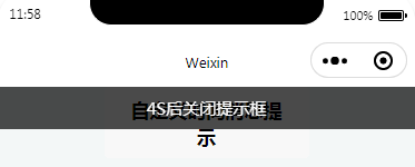
2、顶部消息提示
效果图:
代码结构为:
js
const app = getApp()

Page({
  data: {
    index: 0,
    tipShow: true
  },

  onLoad: function (options) {

  },

  showTips: function (e) {
    let options = {
      msg: "4S后关闭提示框",
      duration: 4000,
      type: "translucent"
    };
    this.toast(options)
  },


  toast: function (options) {
    const component = this.getComponent('#tui-tips-ctx');
    if (component) {
      component.showTips(options);
    }
  },

  getComponent: function (selector) {
    const pages = getCurrentPages();
    const current = pages[pages.length - 1];
    const component = current.selectComponent(selector);
    if (!component) {
      return null;
    }
    return component;
  },

})
json
{
  "usingComponents": {
    "tui-tips": "../components/tips/tips"
  }
}
wxml
<tui-tips id="tui-tips-ctx" wx:if="{{index==0}}"></tui-tips>
<button class="btn-primary btn-gray" hover-class="btn-gray-hover" data-index="6" bindtap="showTips">自定义时间消息提示</button>
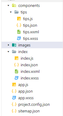
tips里面的代码为:
js
let timer;
Component({
  externalClasses: ['tui-tips-class'],
  properties: {
    //top bottom center
    position: {
      type: String,
      value: "top"
    }
  },
  data: {
    show: false,
    msg: "无法连接到服务器~",
    //translucent,primary,green,warning,danger
    type: "translucent"
  },
  lifetimes: {
    detached: function() {
      clearTimeout(timer);
      timer = null;
    }
  },
  methods: {
    showTips: function(options) {
      const {type = 'translucent', duration = 2000} = options;
      clearTimeout(timer);
      this.setData({
        show: true,
        type: type,
        msg: options.msg
      }, () => {
        timer = setTimeout(() => {
          this.setData({
            show: false
          }, () => {
            timer = null;
          })
        }, duration)
      })
    }
  }
})
json
{
  "component": true,
  "usingComponents": {}
}
wxml
<block wx:if="{{position=='top'}}">
  <view class='tui-tips-class tui-toptips {{"tui-"+type}} {{show?"tui-top-show":""}}'>{{msg}}</view>
</block>
<block wx:else>
  <view class='tui-tips-class tui-toast {{position=="center"?"tui-centertips":"tui-bottomtips"}}  {{show?"tui-toast-show":""}}'>
    <view class="tui-tips-content {{'tui-'+type}}">
      {{msg}}
    </view>
  </view>
</block>
wxss
/*顶部消息提醒 start*/
.tui-toptips {
  width: 100%;
  padding: 18rpx 30rpx;
  box-sizing: border-box;
  position: fixed;
  z-index: 9999;
  color: #fff;
  font-size: 30rpx;
  left: 0;
  top: 0;
  display: flex;
  align-items: center;
  justify-content: center;
  word-break: break-all;
  opacity: 0;
  transform: translateZ(0) translateY(-100%);
  transition: all 0.3s ease-in-out;
}

.tui-top-show {
  transform: translateZ(0) translateY(0);
  opacity: 1;
}

/*顶部消息提醒 end*/

/*toast消息提醒 start*/

/*注意问题:
 1、fixed 元素宽度无法自适应,所以增加了子元素
 2、fixed 和 display冲突导致动画效果消失,暂时使用visibility替代
*/
.tui-toast{
  width: 80%;
  box-sizing: border-box;
  color: #fff;
  font-size: 28rpx;
  position: fixed;
  visibility: hidden;
  opacity: 0;
  left: 50%;
  transition: all 0.3s ease-in-out;
  z-index: 9999;
  display: flex;
  align-items: center;
  justify-content: center;
}
.tui-toast-show {
  visibility: visible;
  opacity: 1;
}
.tui-tips-content{
   word-wrap: break-word;
   word-break: break-all;
   border-radius: 8rpx;
   padding: 18rpx 30rpx;
}
/*底部消息提醒 start*/
.tui-bottomtips {
  bottom: 120rpx;
  -webkit-transform: translateX(-50%);
  transform: translateX(-50%);
}
/*底部消息提醒 end*/

/*居中消息提醒 start*/
.tui-centertips{
  top: 50%;
  -webkit-transform: translate(-50%,-50%);
  transform: translate(-50%,-50%);
}
/*居中消息提醒 end*/

/*toast消息提醒 end*/

/*背景颜色 start*/

.tui-primary {
  background: #5677fc;
}

.tui-green {
  background: #19be6b;
}

.tui-warning {
  background: #ff7900;
}

.tui-danger {
  background: #ed3f14;
}

.tui-translucent {
  background: rgba(0, 0, 0, 0.7);
}

/*背景颜色 end*/

/*消息提醒 end*/
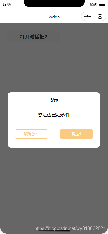
3、倒计时的modal
效果图:
下载地址为:https://download.csdn.net/download/wy313622821/16758710


 787
787


 被折叠的 条评论
为什么被折叠?
被折叠的 条评论
为什么被折叠?
 到【灌水乐园】发言


