


1、CSS 布局 - display 属性
1.1 display 属性
-
display属性是用于控制布局的最重要的CSS属性。 -
display属性规定是否/如何显示元素。 -
每个
HTML元素都有一个默认的display值,具体取决于它的元素类型。大多数元素的默认display值为block或inline。
1.2 块级元素(block element)
- 块级元素总是从新行开始,并占据可用的全部宽度(尽可能向左和向右伸展)。
- 会占领页面的一行,其后多个
block元素自动换行、 可以设置width,height,设置了width后同样也占领一行、同样也可以设置margin与padding属性。
块级元素的一些例子:
<div><h1> - <h6><p><form><header><footer><section>
1.3 行内元素(inline element)
- 内联元素不从新行开始,仅占用所需的宽度。
- 与其他元素在同一行上,高度,行高以及底边距不可改变,高度就是内容文字或者图片的宽度,不可以改变。
行内元素的一些例子:
<span><a><img>
1.4 Display: none
-
display: none;通常与JavaScript一起使用,以隐藏和显示元素,而无需删除和重新创建它们。如果您想知道如何实现此目标,请查看本页面上的最后一个实例。 -
默认情况下,
<script>元素使用display: none;。
1.5 覆盖默认的 Display 值
display: inline; 将内容设置为行内元素
将元素显示为块级元素,从而可以更好地操控元素的宽高,以及内外边距,每一个块级元素都是从新的一行开始。display: block;将内容设置为块元素
将元素显示为行内元素,高度,行高以及底边距不可改变,高度就是内容文字或者图片的宽度,不可以改变。多个相邻的行内元素排在同一行里,知道页面一行排列不下,才会换新的一行。
li {
  display: inline;
}
a {
  display: block;
}
1.6 隐藏元素
- display:none 隐藏元素,不占位
- visibility:hidden 隐藏元素,占位
(1)display:none
<!DOCTYPE html>
<html lang="en">
<head>
<meta charset="UTF-8">
<meta http-equiv="X-UA-Compatible" content="IE=edge">
<meta name="viewport" content="width=device-width, initial-scale=1.0">
<title>Document</title>
</head>
<style>
h1.hidden{
display: none;
}
</style>
<body>
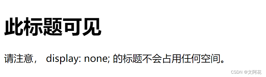
<h1>此标题可见</h1>
<h1 class="hidden">此标题不可见</h1>
<p>请注意, display: none; 的标题不会占用任何空间。</p>
</body>
</html>
运行效果:
(2)visibility:hidden
<!DOCTYPE html>
<html lang="en">
<head>
<meta charset="UTF-8">
<meta http-equiv="X-UA-Compatible" content="IE=edge">
<meta name="viewport" content="width=device-width, initial-scale=1.0">
<title>Document</title>
</head>
<style>
h1.hidden{
display: none;
}
h1.hiddenvisibility{
visibility: hidden;
}
</style>
<body>
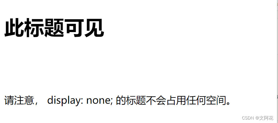
<h1>此标题可见</h1>
<!-- <h1 class="hidden">此标题不可见</h1> -->
<h1 class="hiddenvisibility">此标题不可见,占空间</h1>
<p>请注意, display: none; 的标题不会占用任何空间。</p>
</body>
</html>
运行效果:
2、CSS 布局 - width 和 max-width
- 外边距设置为
auto(margin: auto),以将元素在其容器中水平居中
<!DOCTYPE html>
<html lang="en">
<head>
<meta charset="UTF-8">
<meta http-equiv="X-UA-Compatible" content="IE=edge">
<meta name="viewport" content="width=device-width, initial-scale=1.0">
<title>Document</title>
</head>
<style>
div.width{
width: 500px;
border: 3px solid #73AD21;
margin: auto;
}
div.maxwidth{
max-width: 500px;
margin: auto;
border:3px solid #73AD21;
}
</style>
<body>
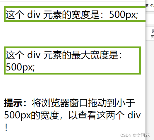
<div class="width">这个 div 元素的宽度是:500px;</div>
<br>
<div class="maxwidth">这个 div 元素的最大宽度是:500px;</div>
<p><b>提示:</b>将浏览器窗口拖动到小于500px的宽度,以查看这两个 div !</p>
</body>
</html>
运行效果:
3、CSS 布局 - position 属性
position属性规定应用于元素的定位方法的类型。
有五个不同的位置值:
staticrelativefixedabsolutesticky
3.1 默认属性: position: static
-
HTML元素默认情况下的定位方式为static(静态)。 -
静态定位的元素不受
top、bottom、left和right属性的影响。 -
position: static; 的元素不会以任何特殊方式定位;它始终根据页面的正常流进行定位 -
默认情况下,块级元素占据其父容器的整个宽度,并垂直堆叠。
-
内联元素则不会创建换行符,并与其他元素在同一行内显示。
-
具有
position: static;的元素不受z-index属性影响。它们的堆叠顺序由它们在文档树中的位置决定,并且无法改变。
<!DOCTYPE html>
<html lang="en">
<head>
<meta charset="UTF-8">
<meta http-equiv="X-UA-Compatible" content="IE=edge">
<meta name="viewport" content="width=device-width, initial-scale=1.0">
<title>Document</title>
</head>
<style>
div.static {
border: 3px solid #73AD21;
position: static;
}
</style>
<body>
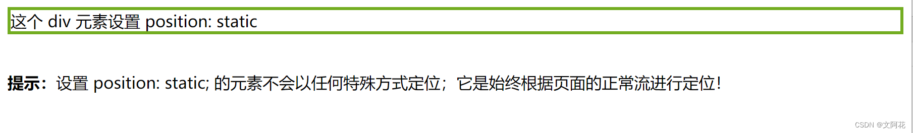
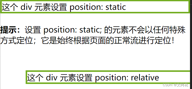
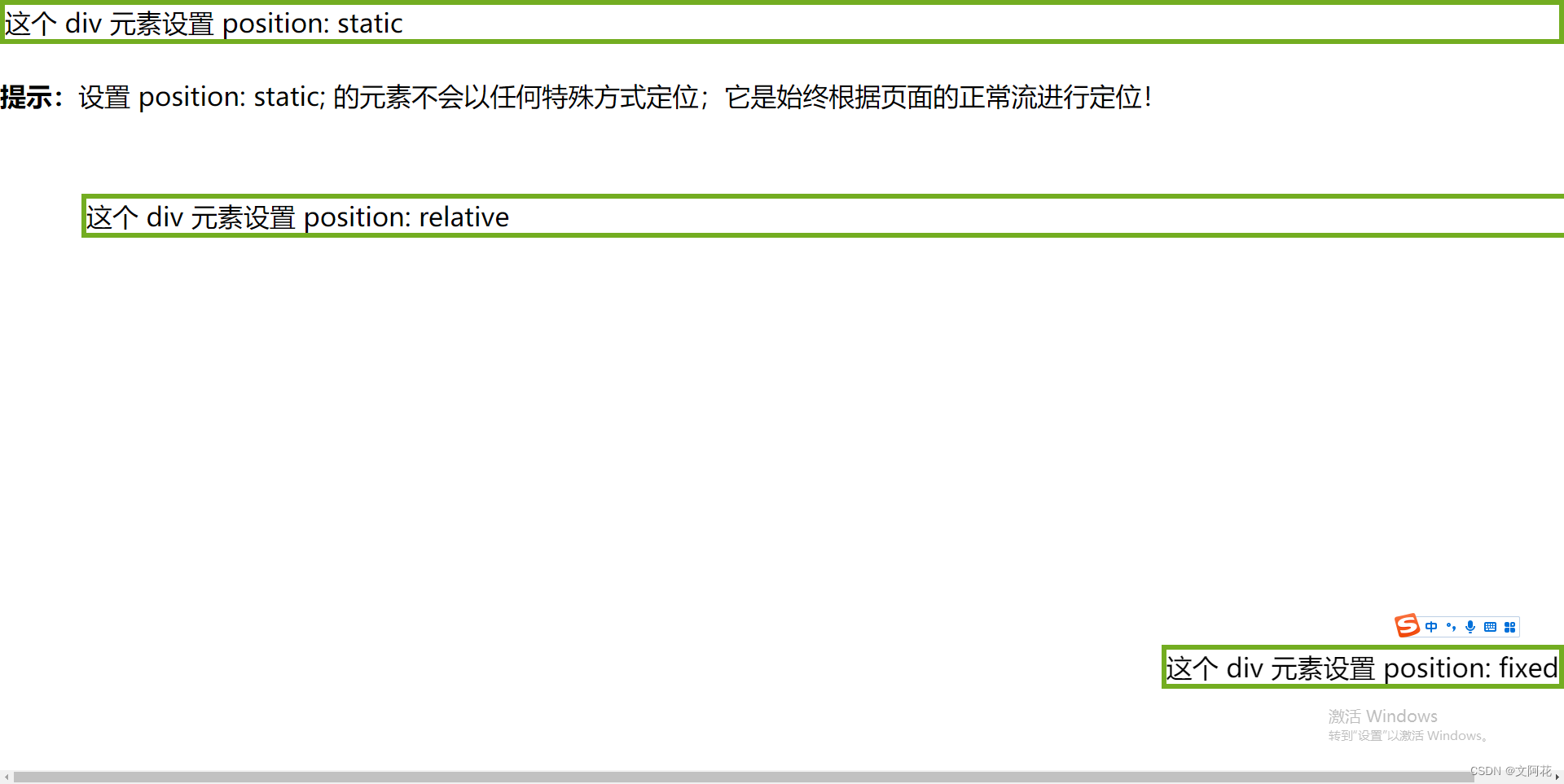
<div class="static">这个 div 元素设置 position: static</div>
<p><b>提示:</b>设置 position: static; 的元素不会以任何特殊方式定位;它是始终根据页面的正常流进行定位!</p>
</body>
</html>
运行效果:
3.2 相对定位:position: relative;
- 具有
position: relative;的元素仍然遵循文档流,并且不会脱离文档流。相对定位的元素仍然占据其原始位置,其他元素的布局不会受到影响。 - 可以使用
top、right、bottom和left属性来定义相对于元素原始位置的偏移量。这些偏移量是相对于元素自身进行计算的。 - 当使用相对定位时,元素不会对其他相对定位或绝对定位的元素产生影响。其他元素的定位不会受到影响,它们仍会按照正常流程进行显示。
<!DOCTYPE html>
<html lang="en">
<head>
<meta charset="UTF-8">
<meta http-equiv="X-UA-Compatible" content="IE=edge">
<meta name="viewport" content="width=device-width, initial-scale=1.0">
<title>Document</title>
</head>
<style>
*{
margin: 0px;
padding: 0px;
}
/* 默认属性 */
div.static {
border: 3px solid #73AD21;
position: static;
}
div.relative{
position: relative;
left: 50px;
top: 50px;
border: 3px solid #73AD21;
}
</style>
<body>
<div class="static">这个 div 元素设置 position: static</div>
<p><b>提示:</b>设置 position: static; 的元素不会以任何特殊方式定位;它是始终根据页面的正常流进行定位!</p>
<div class="relative">这个 div 元素设置 position: relative</div>
</body>
</html>
运行效果:
3.3 固定定位:position: fixed;
- 固定定位,元素的位置相对于浏览器窗口进行定位,不会随页面滚动而改变。可以使用
top、bottom、left、right属性来指定定位的偏移量。
<!DOCTYPE html>
<html lang="en">
<head>
<meta charset="UTF-8">
<meta http-equiv="X-UA-Compatible" content="IE=edge">
<meta name="viewport" content="width=device-width, initial-scale=1.0">
<title>Document</title>
</head>
<style>
*{
margin: 0px;
padding: 0px;
}
/* 默认属性 */
div.static {
border: 3px solid #73AD21;
position: static;
}
div.relative{
position: relative;
left: 50px;
top: 50px;
border: 3px solid #73AD21;
}
div.fixed{
position: fixed;
right: 0px;
bottom: 50px;
border: 3px solid #73AD21;
}
</style>
<body>
<div class="static">这个 div 元素设置 position: static</div>
<p><b>提示:</b>设置 position: static; 的元素不会以任何特殊方式定位;它是始终根据页面的正常流进行定位!</p>
<div class="relative">这个 div 元素设置 position: relative</div>
<div class="fixed">这个 div 元素设置 position: fixed</div>
</body>
</html>
运行效果:
3.4 绝对定位:position: absolute;
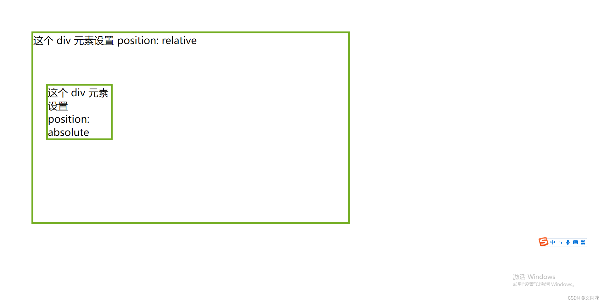
-
position: absolute; 的元素相对于最近的定位祖先元素进行定位(而不是相对于视口定位,如fixed)。 -
然而,如果绝对定位的元素没有祖先,它将使用文档主体(
body),并随页面滚动一起移动。
<!DOCTYPE html>
<html lang="en">

<head>
  <meta charset="UTF-8">
  <meta http-equiv="X-UA-Compatible" content="IE=edge">
  <meta name="viewport" content="width=device-width, initial-scale=1.0">
  <title>Document</title>
</head>
<style>
  * {
    margin: 0px;
    padding: 0px;
  }

  div.relative {
    position: relative;
    left: 50px;
    top: 50px;
    width: 500px;
    height: 300px;
    border: 3px solid #73AD21;
  }

  div.absolute {
    position: absolute;
    border: 3px solid #73AD21;
    width: 100px;
    left: 20px;
    top: 80px;
  }
</style>

<body>

  <div class="relative">
    <p> 这个 div 元素设置 position: relative</p>

    <div class="absolute">这个 div 元素设置 position: absolute</div>

  </div>

</body>

</html>
运行效果:
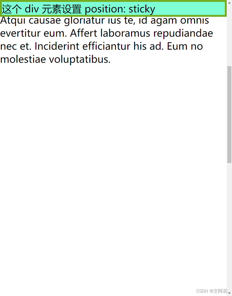
3.5 粘性定位:position: sticky;
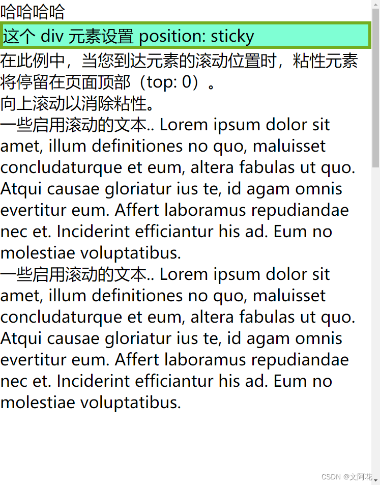
-
position: sticky; 的元素根据用户的滚动位置进行定位。 -
粘性元素根据滚动位置在相对(
relative)和固定(fixed)之间切换。起先它会被相对定位,直到在视口中遇到给定的偏移位置为止 - 然后将其“粘贴”在适当的位置(比如position:fixed)。
<!DOCTYPE html>
<html lang="en">

<head>
  <meta charset="UTF-8">
  <meta http-equiv="X-UA-Compatible" content="IE=edge">
  <meta name="viewport" content="width=device-width, initial-scale=1.0">
  <title>Document</title>
</head>
<style>
  * {
    margin: 0px;
    padding: 0px;
  }

  div.sticky{
    position: -webkit-sticky;
    position: sticky;
    top: 0px;
    background-color:aquamarine;
    border: 3px solid #73AD21;
  }
</style>

<body>

  <p>哈哈哈哈</p>

  <div class="sticky">这个 div 元素设置 position: sticky</div>
  <div style="padding-bottom: 1000px">
    <p>在此例中,当您到达元素的滚动位置时,粘性元素将停留在页面顶部(top: 0)。</p>
  <p>向上滚动以消除粘性。</p>
  <p>一些启用滚动的文本.. Lorem ipsum dolor sit amet, illum definitiones no quo, maluisset concludaturque et eum, altera fabulas ut quo. Atqui causae gloriatur ius te, id agam omnis evertitur eum. Affert laboramus repudiandae nec et. Inciderint efficiantur his ad. Eum no molestiae voluptatibus.</p>
  <p>一些启用滚动的文本.. Lorem ipsum dolor sit amet, illum definitiones no quo, maluisset concludaturque et eum, altera fabulas ut quo. Atqui causae gloriatur ius te, id agam omnis evertitur eum. Affert laboramus repudiandae nec et. Inciderint efficiantur his ad. Eum no molestiae voluptatibus.</p>

  </div>
</body>

</html>
运行效果:
滚动后效果:
3.6 重叠元素:z-index
-
在对元素进行定位时,它们可以与其他元素重叠。
-
z-index属性指定元素的堆栈顺序(哪个元素应放置在其他元素的前面或后面)。 -
元素可以设置正或负的堆叠顺序
-
具有较高堆叠顺序的元素始终位于具有较低堆叠顺序的元素之前。
-
如果两个定位的元素重叠而未指定
z-index,则位于HTML代码中最后的元素将显示在顶部。
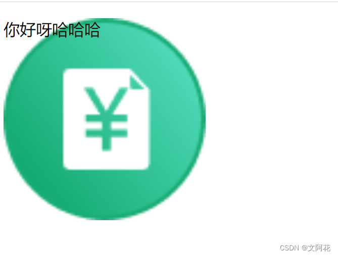
(1) z-index: -1;
<!DOCTYPE html>
<html lang="en">
<head>
  <meta charset="UTF-8">
  <meta http-equiv="X-UA-Compatible" content="IE=edge">
  <meta name="viewport" content="width=device-width, initial-scale=1.0">
  <title>Document</title>
</head>
<style>
img{
  position: absolute;
  z-index: -1;
  width: 200px;
  height: 200px;
}

</style>
<body>
  <div>
<img src="imgs/icon_mess_sellorder.png">
<p>你好呀哈哈哈</p>
  </div>

</body>
</html>
运行效果:
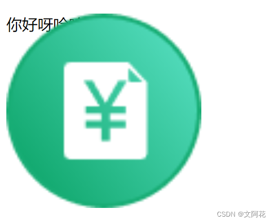
(2) z-index: 1;
<!DOCTYPE html>
<html lang="en">
<head>
  <meta charset="UTF-8">
  <meta http-equiv="X-UA-Compatible" content="IE=edge">
  <meta name="viewport" content="width=device-width, initial-scale=1.0">
  <title>Document</title>
</head>
<style>
img{
  position: absolute;
  z-index: 1;
  width: 200px;
  height: 200px;
}

</style>
<body>
  <div>
<img src="imgs/icon_mess_sellorder.png">
<p>你好呀哈哈哈</p>
  </div>

</body>
</html>
运行效果:
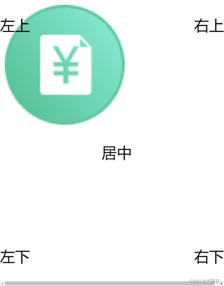
3.7 定位图像中的文本
Top + LeftTop +RightBottom +LeftBottom +RightCentered
<!DOCTYPE html>
<html lang="en">

<head>
  <meta charset="UTF-8">
  <meta http-equiv="X-UA-Compatible" content="IE=edge">
  <meta name="viewport" content="width=device-width, initial-scale=1.0">
  <title>Document</title>
</head>
<style>
  div.relative {
    position: relative;
  }

  img {
    width: 200px;
    height: 200px;
    opacity: 0.7;
    z-index: -1;
  }

  p.topleft {
    position: absolute;
    top: 0px;
    left: 0px;
    font-size: 25px;
  }

  p.topright {
    position: absolute;
    top: 0px;
    right: 0px;
    font-size: 25px;
  }

  p.bottomleft {
    position: absolute;
    bottom: 0px;
    left: 0px;
    font-size: 25px;
  }

  p.bottomright {
    position: absolute;
    bottom: 0px;
    right: 0px;
    font-size: 25px;
  }

  p.centered {
    position: absolute;
    text-align: center;
    font-size: 25px;
    width: 100%;
  }
</style>

<body>
  <div>
    <img src="imgs/icon_mess_sellorder.png">
    <p class="topleft">左上</p>
    <p class="topright">右上</p>
    <p class="bottomleft">左下</p>
    <p class="bottomright">右下</p>
    <p class="centered">居中</p>
  </div>

</body>

</html>
运行效果:
4、CSS 布局 - 溢出:overflow
overflow属性指定在元素的内容太大而无法放入指定区域时是剪裁内容还是添加滚动条。overflow属性仅适用于具有指定高度的块元素。
overflow 属性可设置以下值:
visible- 默认。溢出没有被剪裁。内容在元素框外渲染hidden- 溢出被剪裁,其余内容将不可见scroll- 溢出被剪裁,同时添加滚动条以查看其余内容auto- 与 scroll 类似,但仅在必要时添加滚动条
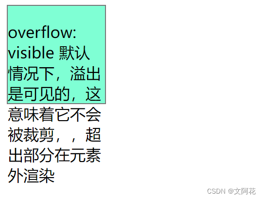
4.1 overflow: visible
- 默认。溢出没有被剪裁。内容在元素框外渲染
<!DOCTYPE html>
<html lang="en">
<head>
  <meta charset="UTF-8">
  <meta http-equiv="X-UA-Compatible" content="IE=edge">
  <meta name="viewport" content="width=device-width, initial-scale=1.0">
  <title>Document</title>
</head>
<style>
div.visible{
  width: 100px;
  height: 100px;
  overflow: visible;
  border:  1px solid #777;
  background-color: aquamarine;
}

</style>
<body>
  <div class="visible" >
    <p>overflow: visible 默认情况下,溢出是可见的,这意味着它不会被裁剪,,超出部分在元素外渲染</p>
  </div>

</body>
</html>
运行效果:
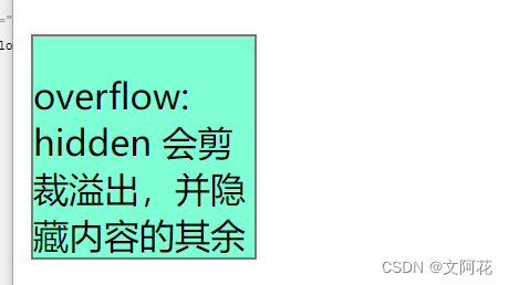
4.2 overflow: hidden;
- 使用
hidden值,溢出会被裁剪,其余内容被隐藏
<!DOCTYPE html>
<html lang="en">
<head>
  <meta charset="UTF-8">
  <meta http-equiv="X-UA-Compatible" content="IE=edge">
  <meta name="viewport" content="width=device-width, initial-scale=1.0">
  <title>Document</title>
</head>
<style>

div.hidden{
  margin-top: 100px;
  width: 100px;
  height: 100px;
  overflow: hidden;
  border:  1px solid #777;
  background-color: aquamarine;
}

</style>
<body>

  <div class="hidden" >
    <p>overflow: hidden  会剪裁溢出,并隐藏内容的其余部分</p>
  </div>

</body>
</html>
运行效果:
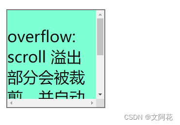
4.3 overflow: scroll;
scroll,溢出将被裁剪,并添加滚动条以便在框内滚动。请注意,这将在水平和垂直方向上添加一个滚动条(即使您不需要它)
<!DOCTYPE html>
<html lang="en">
<head>
  <meta charset="UTF-8">
  <meta http-equiv="X-UA-Compatible" content="IE=edge">
  <meta name="viewport" content="width=device-width, initial-scale=1.0">
  <title>Document</title>
</head>
<style>

div.scroll{
  margin-top: 20px;
  width: 100px;
  height: 100px;
  overflow: scroll;
  border:  1px solid #777;
  background-color: aquamarine;
}

</style>
<body>

  <div class="scroll" >
    <p>overflow: scroll 溢出部分会被裁剪,并自动添加滚动条,滚动可见其余部分</p>
  </div>

</body>
</html>
运行效果:
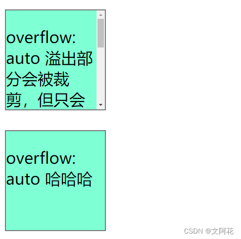
4.4 overflow: auto;
auto值类似于scroll,但是它仅在必要时添加滚动条
<!DOCTYPE html>
<html lang="en">
<head>
  <meta charset="UTF-8">
  <meta http-equiv="X-UA-Compatible" content="IE=edge">
  <meta name="viewport" content="width=device-width, initial-scale=1.0">
  <title>Document</title>
</head>
<style>
div.auto{
  margin-top: 20px;
  width: 100px;
  height: 100px;
  overflow: auto;
  border:  1px solid #777;
  background-color: aquamarine;
}

</style>
<body>
  <div class="auto" >
    <p>overflow: auto 溢出部分会被裁剪,但只会在必要时候增加滚动条(内容超出元素高度时候自动增加滚动条),滚动可见其余部分</p>
  </div>
  <div class="auto" >
    <p>overflow: auto 哈哈哈</p>
  </div>
</body>
</html>
运行效果:
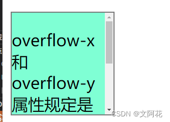
4.5 overflow-x 和 overflow-y
overflow-x 和 overflow-y 属性规定是仅水平还是垂直地(或同时)更改内容的溢出:
overflow-x指定如何处理内容的左/右边缘。overflow-y指定如何处理内容的上/下边缘。
<!DOCTYPE html>
<html lang="en">
<head>
  <meta charset="UTF-8">
  <meta http-equiv="X-UA-Compatible" content="IE=edge">
  <meta name="viewport" content="width=device-width, initial-scale=1.0">
  <title>Document</title>
</head>
<style>

div.overflow-xy{
    margin-top: 20px;
  width: 100px;
  height: 100px;
  overflow-x: hidden;
  overflow-y: scroll;
  border:  1px solid #777;
  background-color: aquamarine;
}

</style>
<body>

  <div class="overflow-xy" >
    <p>overflow-x 和 overflow-y 属性规定是仅水平还是垂直地(或同时)更改内容的溢出</p>
  </div>
</body>
</html>
运行效果:
5、CSS 布局 - 浮动和清除:float、clear
-
CSS float属性规定元素如何浮动。 -
CSS clear属性规定哪些元素可以在清除的元素旁边以及在哪一侧浮动。
5.1 浮动:float 属性
float属性用于定位和格式化内容,例如让图像向左浮动到容器中的文本那里。
float 属性可以设置以下值之一:
left- 元素浮动到其容器的左侧right- 元素浮动在其容器的右侧none- 元素不会浮动(将显示在文本中刚出现的位置)。默认值。inherit- 元素继承其父级的 float 值
5.1.1 float: right;
<!DOCTYPE html>
<html lang="en">
<head>
<meta charset="UTF-8">
<meta http-equiv="X-UA-Compatible" content="IE=edge">
<meta name="viewport" content="width=device-width, initial-scale=1.0">
<title>Document</title>
</head>
<style>
* {
margin: 0px;
padding: 0px;
}
div.block{
display: block;
}
img.right {
width: 100px;
height: 100px;
float: right;
margin-left: 20px;
}
img.left {
width: 100px;
height: 100px;
float: left;
margin-right: 20px;
}
</style>
<body>
<div class="block">
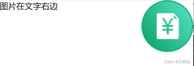
<p><img class="right" alt="pic" src="imgs/icon_mess_sellorder.png">图片在文字右边</p>
</div>
</body>
</html>
运行效果:
5.1.2 float: left;
<!DOCTYPE html>
<html lang="en">
<head>
<meta charset="UTF-8">
<meta http-equiv="X-UA-Compatible" content="IE=edge">
<meta name="viewport" content="width=device-width, initial-scale=1.0">
<title>Document</title>
</head>
<style>
* {
margin: 0px;
padding: 0px;
}
div.block{
display: block;
}
img.right {
width: 50px;
height: 50px;
float: right;
margin-left: 20px;
}
img.left {
width: 50px;
height: 50px;
float: left;
margin-right: 20px;
}
</style>
<body>
<!-- <div class="block">
<p><img class="right" alt="pic" src="imgs/icon_mess_sellorder.png">图片在文字右边</p>
</div> -->
<div class="block">
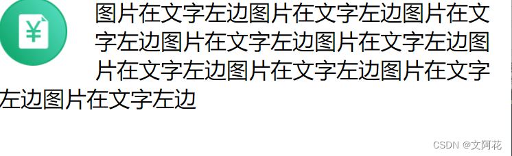
<p><img class="left" alt="pic" src="imgs/icon_mess_sellorder.png">图片在文字左边图片在文字左边图片在文字左边图片在文字左边图片在文字左边图片在文字左边图片在文字左边图片在文字左边图片在文字左边</p>
</div>
</body>
</html>
运行效果:
5.1.3 float: none;
<!DOCTYPE html>
<html lang="en">
<head>
<meta charset="UTF-8">
<meta http-equiv="X-UA-Compatible" content="IE=edge">
<meta name="viewport" content="width=device-width, initial-scale=1.0">
<title>Document</title>
</head>
<style>
* {
margin: 0px;
padding: 0px;
}
div.block{
display: block;
}
img.none{
width: 50px;
height: 50px;
float: none;
}
</style>
<body>
<div class="block">
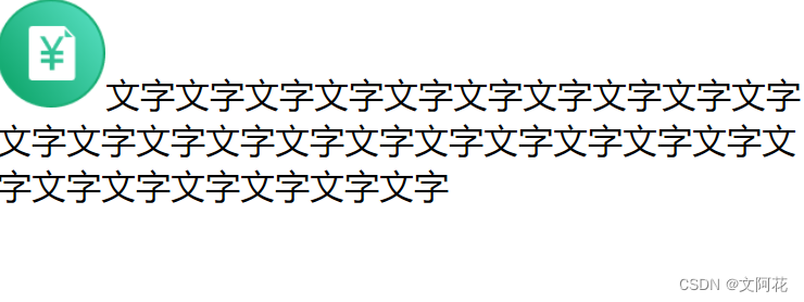
<p><img class="none" alt="pic" src="imgs/icon_mess_sellorder.png">文字文字文字文字文字文字文字文字文字文字文字文字文字文字文字文字文字文字文字文字文字文字文字文字文字文字文字文字</p>
</div>
</body>
</html>
运行效果:在这里插入代码片
5.2 清除: clear 和 clearfix
5.2.1 clear
clear属性指定哪些元素可以浮动于被清除元素的旁边以及哪一侧。- 使用
clear属性的最常见用法是在元素上使用了float属性之后。
clear 属性可设置以下值之一:
none- 允许两侧都有浮动元素。默认值left- 左侧不允许浮动元素right- 右侧不允许浮动元素both- 左侧或右侧均不允许浮动元素inherit- 元素继承其父级的 clear 值
<!DOCTYPE html>
<html lang="en">
<head>
<meta charset="UTF-8">
<meta http-equiv="X-UA-Compatible" content="IE=edge">
<meta name="viewport" content="width=device-width, initial-scale=1.0">
<title>Document</title>
<!-- 外部引入css -->
<link rel="stylesheet" type="text/css" href="css/baseStyle.css">
</head>
<style>
div.ex1 {
float: left;
border: 1px solid #777;
}
div.ex2{
clear: left;
}
img.left {
width: 50px;
height: 50px;
float: left;
}
</style>
<body>
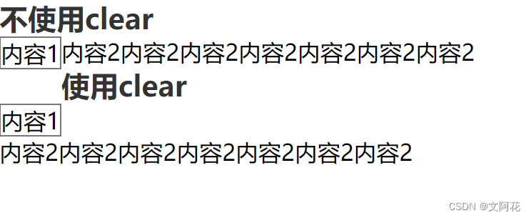
<h1>不使用clear</h1>
<div class="ex1">
内容1
</div>
<div >
内容2内容2内容2内容2内容2内容2内容2
</div>
<h1>使用clear</h1>
<div class="ex1">
内容1
</div>
<div class="ex2">
内容2内容2内容2内容2内容2内容2内容2
</div>
</body>
</html>
运行效果:
5.2.2 clearfix
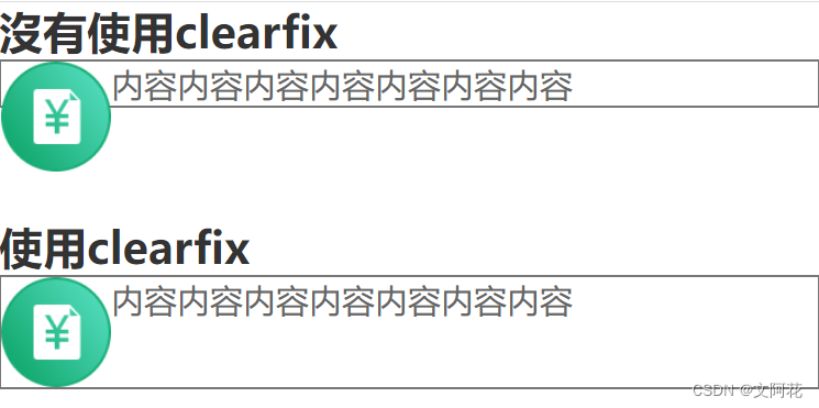
- 如果一个元素比包含它的元素高,并且它是浮动的,它将“溢出”到其容器之外,然后我们可以向包含元素添加
overflow: auto;,来解决此问题
<!DOCTYPE html>
<html lang="en">

<head>
  <meta charset="UTF-8">
  <meta http-equiv="X-UA-Compatible" content="IE=edge">
  <meta name="viewport" content="width=device-width, initial-scale=1.0">
  <title>Document</title>
  <!-- 外部引入css -->
  <link rel="stylesheet" type="text/css" href="css/baseStyle.css">
</head>
<style>
  div.ex1 {
    clear: both;
    border: 1px solid #777;
  }

  div.clearfix{
    clear: both;
    overflow: auto;
    border: 1px solid #777;
  }

  img.float {
    width: 50px;
    height: 50px;
    float: left;
  }
</style>

<body>
  <h1>沒有使用clearfix </h1>
  <div class="ex1">
    <img class="float" src="imgs/icon_mess_sellorder.png">
    <p>内容内容内容内容内容内容内容</p>
  </div>
  <h1 style="padding-top: 50px">使用clearfix </h1>
  <div class="clearfix">
    <img class="float" src="imgs/icon_mess_sellorder.png">
    <p>内容内容内容内容内容内容内容</p>
  </div>

</body>

</html>
运行效果:
5.3 补充
5.3.1 box-sizing: border-box;(添加边距后会破坏排版的解决方法)
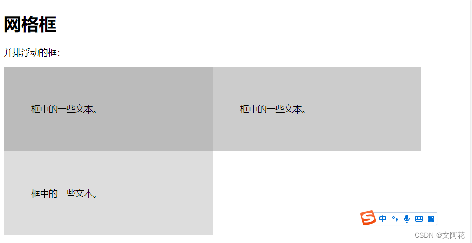
- 您可以轻松地并排创建三个浮动框。但是,当您添加一些内容来扩大每个框的宽度(例如,内边距或边框)时,这个框会损坏。
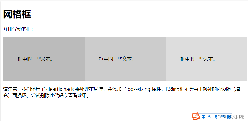
box-sizing属性允许我们在框的总宽度(和高度)中包括内边距和边框,确保内边距留在框内而不会破裂。
(1)未使用
<!DOCTYPE html>
<html>
<head>
<style>


.box {
  float: left;
  width: 33.33%;
  padding: 50px;
}

.clearfix::after {
  content: "";
  clear: both;
  display: table;
}
</style>
</head>
<body>

<h1>网格框</h1>

<p>并排浮动的框:</p>

<div class="clearfix">
  <div class="box" style="background-color:#bbb">
  <p>框中的一些文本。</p>
  </div>
  <div class="box" style="background-color:#ccc">
  <p>框中的一些文本。</p>
  </div>
  <div class="box" style="background-color:#ddd">
  <p>框中的一些文本。</p>
  </div>
</div>

</body>
</html>
运行效果:
(2)使用后:
<!DOCTYPE html>
<html>
<head>
<style>
* {
  box-sizing: border-box;
}

.box {
  float: left;
  width: 33.33%;
  padding: 50px;
}

.clearfix::after {
  content: "";
  clear: both;
  display: table;
}
</style>
</head>
<body>

<h1>网格框</h1>

<p>并排浮动的框:</p>

<div class="clearfix">
  <div class="box" style="background-color:#bbb">
  <p>框中的一些文本。</p>
  </div>
  <div class="box" style="background-color:#ccc">
  <p>框中的一些文本。</p>
  </div>
  <div class="box" style="background-color:#ddd">
  <p>框中的一些文本。</p>
  </div>
</div>

<p>请注意,我们还用了 clearfix hack 来处理布局流,并添加了 box-sizing 属性,以确保框不会由于额外的内边距(填充)而损坏。尝试删除此代码以查看效果。</p>

</body>
</html>
运行效果:
5.3.2 水平多个框的时候,保证高度一致(高度为最高的那个框)
display: flex;将对象作为弹性伸缩盒显示
(1)未使用:
<!DOCTYPE html>
<html lang="en">
<head>
<meta charset="UTF-8">
<meta http-equiv="X-UA-Compatible" content="IE=edge">
<meta name="viewport" content="width=device-width, initial-scale=1.0">
<title>Document</title>
<link rel="stylesheet" type="text/css" href="css/baseStyle.css">
</head>
<style>
* {
/* padding和border的值就不会在影响元素的宽高,相当于把padding和border的值都算在content里 */
box-sizing: border-box;
}
.clearfix::after{
content: '';
clear: both;
display: table;
}
/* div.flex {
display: flex;
} */
div.ex1 {
float: left;
width: 33%;
background-color: aquamarine;
padding: 50px;
}
div.ex2 {
float: left;
width: 33%;
background-color: bisque;
padding: 50px;
}
div.ex3 {
float: left;
width: 33%;
background-color: cadetblue;
padding: 50px;
}
/* p{
text-align: center;
} */
</style>
<body>
<!-- <div class="flex"> -->
<div class="ex1">
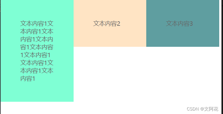
<p>文本内容1文本内容1文本内容1文本内容1文本内容1文本内容1文本内容1文本内容1文本内容1</p>
</div>
<div class="ex2">
<p>文本内容2</p>
</div>
<div class="ex3">
<p>文本内容3</p>
</div>
<!-- </div> -->
</body>
</html>
运行效果:
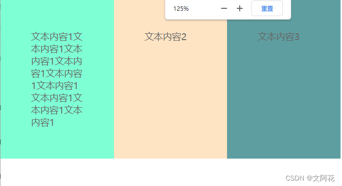
(2)使用后:
<!DOCTYPE html>
<html lang="en">

<head>
  <meta charset="UTF-8">
  <meta http-equiv="X-UA-Compatible" content="IE=edge">
  <meta name="viewport" content="width=device-width, initial-scale=1.0">
  <title>Document</title>
  <link rel="stylesheet" type="text/css" href="css/baseStyle.css">
</head>
<style>
  * {
    /* padding和border的值就不会在影响元素的宽高,相当于把padding和border的值都算在content里 */
    box-sizing: border-box;
  }

  .clearfix::after{
    content: '';
    clear: both;
    display: table;
  }

  div.flex {
    display: flex;
  }

  div.ex1 {
    float: left;
    width: 33%;
    background-color: aquamarine;
    padding: 50px;
  }

  div.ex2 {
    float: left;
    width: 33%;
    background-color: bisque;
    padding: 50px;
  }

  div.ex3 {
    float: left;
    width: 33%;
    background-color: cadetblue;
    padding: 50px;
  }

  /* p{
    text-align: center;
  } */
</style>

<body>
  <div class="flex">
    <div class="ex1">
      <p>文本内容1文本内容1文本内容1文本内容1文本内容1文本内容1文本内容1文本内容1文本内容1</p>
    </div>
    <div class="ex2">
      <p>文本内容2</p>
    </div>
    <div class="ex3">
      <p>文本内容3</p>
    </div>
  </div>
</body>

</html>
运行效果:
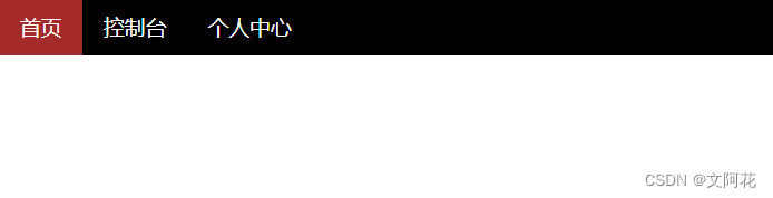
5.3.3 导航栏 练习
<!DOCTYPE html>
<html lang="en">

<head>
  <meta charset="UTF-8">
  <meta http-equiv="X-UA-Compatible" content="IE=edge">
  <meta name="viewport" content="width=device-width, initial-scale=1.0">
  <title>Document</title>
  <link rel="stylesheet" href="css/baseStyle.css">

  <style>
    ul {
      width: 100%;
      background-color: black;
      margin: 0;
      padding: 0;
      overflow: hidden;
    }

    li  a{
      float: left;
      padding: 10px 15px;
      font-size: 15px;
      color: white;
      display: inline-block;
    }

    a.choose {
      background-color: brown;
    }


    a {
      color: white;
      /* 取消下划线 */
      text-decoration: none;
      /* 文字居中 */
      text-align: center;
    }

    /* 鼠标放置效果 */
    a:hover {
      background-color: aquamarine;
    }
  </style>
</head>

<body>


  <ul>
    <li ><a  class="choose" href="html_jump_page.html">首页</a></li>
    <li ><a class="unchoose" href="html_jump_page.html">控制台</a></li>
    <li ><a class="unchoose" href="html_jump_page.html">个人中心</a></li>
  </ul>
</body>

</html>
运行效果:
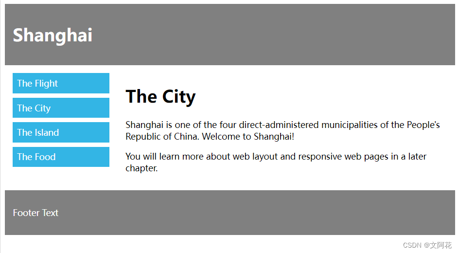
5.3.4 简单布局练习
<!DOCTYPE html>
<html lang="en">

<head>
  <meta charset="UTF-8">
  <meta http-equiv="X-UA-Compatible" content="IE=edge">
  <meta name="viewport" content="width=device-width, initial-scale=1.0">
  <title>简单布局</title>
  <!-- 引用外部css样式 -->
  <!-- <link rel="stylesheet" href="css/baseStyle.css"> -->

  <style>
    /* padding和border的值就不会在影响元素的宽高,相当于把padding和border的值都算在content里 */
    * {
      box-sizing: border-box;
    }

    /* 防止溢出 */
    .clearfix::after {
      content: "";
      clear: both;
      display: table;
    }

    div.header {
      background-color: grey;
      padding: 20px 10px;
      margin: 10px;
    }


    h1.header {
      color: white;
      font-size: 20px;
    }

    div.footer {
      background-color: grey;
      padding: 20px 10px;
    }

    ul {
      list-style-type: none;
      padding: 0;
      margin: 0;
    }

    li {
      background-color: #33b5e5;
      color: white;
      padding: 10px 20px;
      margin-bottom: 10px;
    }

    .column {
      float: left;
      padding: 15px;
    }

    .menu {
      width: 25%;
    }

    .content {
      width: 75%;
    }
  </style>
</head>

<body>

  <!-- 顶部标题 -->
  <div class="header">
    <h1 class="header">Shang Hai</h1>
  </div>
  <!-- 中间 -->
  <div class="clearfix">

    <div class="column menu">
      <!-- 左侧导航栏 -->
      <ul>
        <li>The Fight</li>
        <li>The City</li>
        <li>The IsIand</li>
        <li>The Food</li>
      </ul>
    </div>
    <!-- 右侧内容 -->
    <div class="column content">
      <h1>The City</h1>
      <p>Shanghai is one of the four direct-administered municipalities of the People's Republic of China. Welcome to
        Shanghai!</p>
      <p>You will learn more about web layout and responsive web pages in a later chapter.</p>
    </div>

  </div>
   <!-- Footer -->
   <div class="header">
    <h1 class="header">Footer Text</h1>
  </div>

</body>

</html>


 351
351


 被折叠的 条评论
为什么被折叠?
被折叠的 条评论
为什么被折叠?
 到【灌水乐园】发言


