


 可视化大屏
可视化大屏
一、Matplotlib绘图
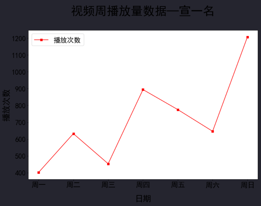
折线图
import matplotlib.pyplot as plt # 调用画图库
plt.rcParams['font.sans-serif'] = ['SimHei'] # 设置成可以显示中文,字体为黑体
plt.figure(figsize=(12,8)) # 调整图片尺寸
x = ['周一','周二','周三','周四','周五','周六','周日'] # 设置x轴数据
y = [401,632,453,894,775,646,1207] # 设置对应的y轴数据
plt.tick_params(labelsize=21) # 设置坐标轴刻度的字体大小
plt.xlabel('日期', fontsize=24, labelpad=20) # 设置x轴标签
plt.ylabel('播放次数', fontsize=24) # 设置y轴标签
plt.title('视频周播放量数据—宣一名', fontsize=35, pad=45) # 设置标题
plt.plot(x,y, label = "播放次数",color='r',marker='s' ) # 绘制图形
plt.legend(fontsize=20)
plt.show() # 展示图形,在Jupyter中,可省略本行
柱状图
import matplotlib.pyplot as plt # 调用画图库
plt.rcParams['font.sans-serif'] = ['SimHei'] # 设置成可以显示中文,字体为黑体
plt.figure(figsize=(12,8)) # 调整图片尺寸
x = ['周一','周二','周三','周四','周五','周六','周日'] # 设置x轴数据
y = [401,632,453,894,775,646,1207] # 设置对应的y轴数据
plt.tick_params(labelsize=21) # 设置坐标轴刻度的字体大小
plt.xlabel('日期', fontsize=24, labelpad=20) # 设置x轴标签
plt.ylabel('播放次数', fontsize=24) # 设置y轴标签
plt.title('视频周播放量数据—宣一名', fontsize=35, pad=45) # 设置标题
plt.plot(x,y, label = "播放次数",color='r',marker='s' ) # 绘制图形
plt.legend(fontsize=20)
plt.show() # 展示图形,在Jupyter中,可省略本行c
环形图
import matplotlib.pyplot as plt # 调用画图库
plt.rcParams['font.sans-serif'] = ['SimHei'] # 设置成可以显示中文,字体为黑体
plt.figure(figsize=(12,8)) # 调整图片尺寸
x = ['周一','周二','周三','周四','周五','周六','周日'] # 设置x轴数据
y = [401,632,453,894,775,646,1207] # 设置对应的y轴数据
plt.tick_params(labelsize=21) # 设置坐标轴刻度的字体大小
plt.xlabel('日期', fontsize=24, labelpad=20) # 设置x轴标签
plt.ylabel('播放次数', fontsize=24) # 设置y轴标签
plt.title('视频周播放量数据—宣一名', fontsize=35, pad=45) # 设置标题
plt.plot(x,y, label = "播放次数",color='r',marker='s' ) # 绘制图形
plt.legend(fontsize=20)
plt.show() # 展示图形,在Jupyter中,可省略本行c
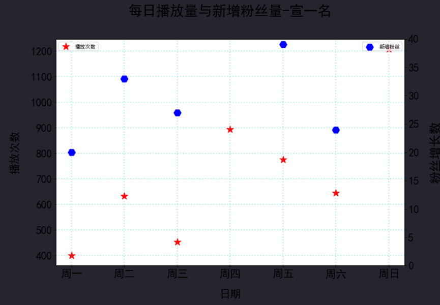
散点图
import matplotlib.pyplot as plt # 调用画图库
plt.rcParams['font.sans-serif'] = ['SimHei'] # 设置成可以显示中文,字体为黑体
plt.figure(figsize=(12, 8)) # 调整图片尺寸
x = ["周一", "周二", "周三", "周四", "周五", "周六", "周日"]
y = [401,632,453,894,775,646,1207]
y1 = [20,33,27,45,39,24,64]
plt.tick_params(labelsize=21) # 设置坐标轴刻度的字体大小为 21
plt.xlabel('日期', fontsize=21, labelpad=20) # 设置 x 轴名称
plt.ylabel('播放次数', fontsize=21,labelpad=20) # 设置 y 轴名称
plt.title('每日播放量与新增粉丝量-宣一名', fontsize=27, pad=45) # 设置标题
plt.grid( color = 'c', linewidth = 2, linestyle = ':', alpha = 0.3) # 设置网格,颜色、线宽、样式、透明度
plt.scatter(x,y, marker = '*', c = 'r', s = 200,label="播放次数") # 绘制散点图, 设置散点样式
plt.legend()
plt.twinx() #添加右侧 y 轴,实际上是又画了一个折线图,和柱状图共享 x 轴
plt.tick_params(labelsize=21) # 设置坐标轴刻度的字体大小
plt.ylim(0,40)
plt.ylabel('粉丝增长数', fontsize=24,labelpad=20) # 设置 y 轴标签
plt.scatter(x,y1, marker = 'H', c = 'b', s = 200,label="新增粉丝")
plt.legend()
plt.show()
二、Pyecharts绘图
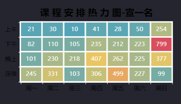
热力图
from pyecharts import options as opts # 调用图表配置选项库
from pyecharts.charts import HeatMap # 调用画图库
课程安排数据 =[[0, 3, 21], [1, 3, 30], [2, 3,10], [3, 3, 41], [4, 3, 28], [5, 3, 50], [6, 3, 254],
[0, 2, 82], [1, 2, 110], [2, 2, 105], [3, 2,235], [4, 2, 212], [5, 2, 223], [6, 2, 799],
[0, 1, 101], [1, 1, 230], [2, 1, 218 ], [3, 1, 407], [4, 1, 262], [5, 1, 225], [6, 1, 377],
[0, 0, 245], [1, 0, 331], [2, 0, 103], [3, 0, 306], [4, 0, 499], [5, 0, 227], [6, 0, 99] ]# 设置数据
热力图横坐标 = ['周一', '周二', '周三', '周四', '周五', '周六', '周日'] # x轴坐标数据
热力图纵坐标 = ['深夜','晚上','下午','上午'] # y轴坐标数据
宽3='410px' # 设置图片宽度高度变量
高3='250px'
热力图 = (
HeatMap(init_opts=opts.InitOpts(width=宽3, height=高3, chart_id=3)) # 绘图,设置图片大小、图表id
.add_xaxis(热力图横坐标) # 设置x轴坐标名
.add_yaxis("", 热力图纵坐标, 课程安排数据, # 设置y轴坐标名,添加数据
label_opts=opts.LabelOpts(color="white", # 标签字体颜色
font_size=13, # 字体大小
position="inside"), # 位置
itemstyle_opts=opts.ItemStyleOpts(border_color='white', # 边界线颜色
border_width=3)) # 边界线宽度
.set_global_opts(
visualmap_opts=opts.VisualMapOpts(max_=799,is_show=False), # 设置视觉映射配置项,最大值为600
xaxis_opts = opts.AxisOpts(
axislabel_opts = opts.LabelOpts(font_size = 13, # 坐标轴字体大小
color='black'), # 坐标轴字体颜色
axisline_opts = opts.AxisLineOpts(
linestyle_opts=opts.LineStyleOpts(
color='white', # 坐标轴线颜色
width=3))), # 坐标轴线宽度
yaxis_opts = opts.AxisOpts(
axislabel_opts = opts.LabelOpts(font_size = 13, # 坐标轴字体大小
color='black'), # 坐标轴字体颜色
axisline_opts = opts.AxisLineOpts(
linestyle_opts=opts.LineStyleOpts(
color='white', # 坐标轴线颜色
width=3))), # 坐标轴线宽度 width=3))), # 坐标轴线宽度
title_opts = opts.TitleOpts(
title='课 程 安 排 热 力 图-宣一名', # 设置标题
title_textstyle_opts=opts.TextStyleOpts(font_size = 20, # 标题字体大小
color="black"), # 标题颜色
pos_left = 'center',pos_top='10%'))) # 设置居中
# 将图表作为函数返回值
热力图.render_notebook()
散点图
from pyecharts.charts import Scatter # 调用画图库
import pyecharts.options as opts # 调用图表配置选项库
x = ["周一", "周二", "周三", "周四", "周五", "周六", "周日"]
y = [401,632,453,894,775,646,1207]
y1 = [20,33,27,45,39,24,64]
散点图 =(
Scatter(init_opts=opts.InitOpts(width="800px", height="600px")) # 定义散点图,设置图片大小
.add_xaxis(x) # 添加x轴数据
.add_yaxis('每日播放量', y, # 添加y轴数据
symbol_size = 20, # 设置散点大小
symbol = 'triangle', # 设置散点为三角形
color = 'blue', # 设置绿色
) # 取消自动注释
.add_yaxis("粉丝数",y1)
.set_global_opts(
title_opts = opts.TitleOpts(title='播放量与粉丝增长情况-宣一名', # 设置标题
title_textstyle_opts=opts.TextStyleOpts(font_size = 15,color="black"), # 设置字体大小
pos_left = 'center'), # 设置居中
legend_opts=(opts.LegendOpts(pos_left="75%")),
yaxis_opts=opts.AxisOpts(name="播放量",splitline_opts = opts.SplitLineOpts(is_show=True, # 显示y轴网格线
linestyle_opts= opts.LineStyleOpts(
width= 3, # 网格宽度为3
opacity=0.9, # 透明度90%
type_='dotted')),
name_textstyle_opts=opts.TextStyleOpts(color="black")),
xaxis_opts=opts.AxisO
 最低0.47元/天 解锁文章


 4615
4615

 被折叠的 条评论
为什么被折叠?
被折叠的 条评论
为什么被折叠?
 到【灌水乐园】发言


