


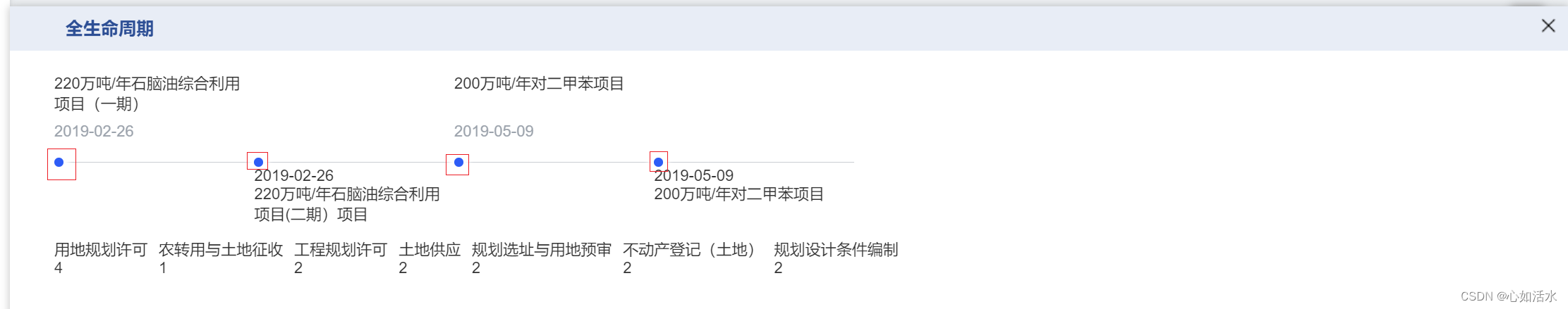
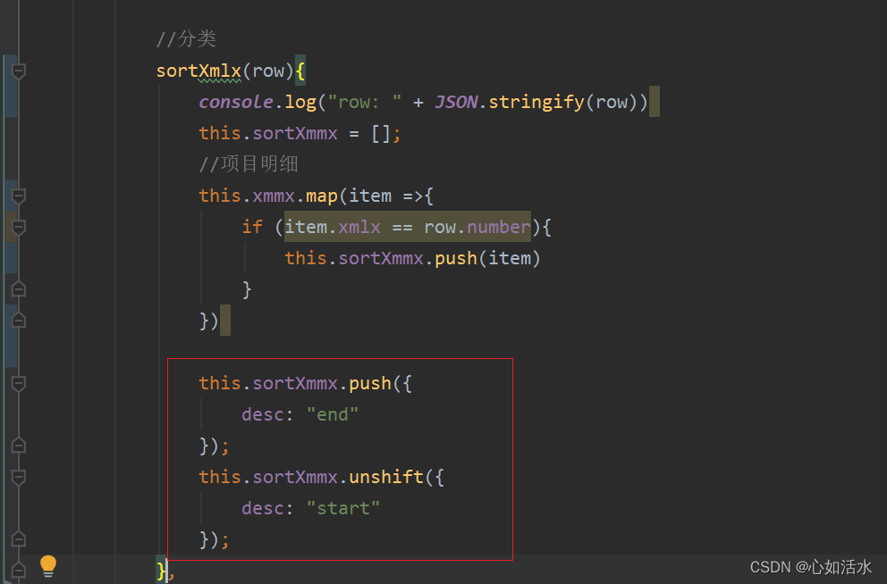
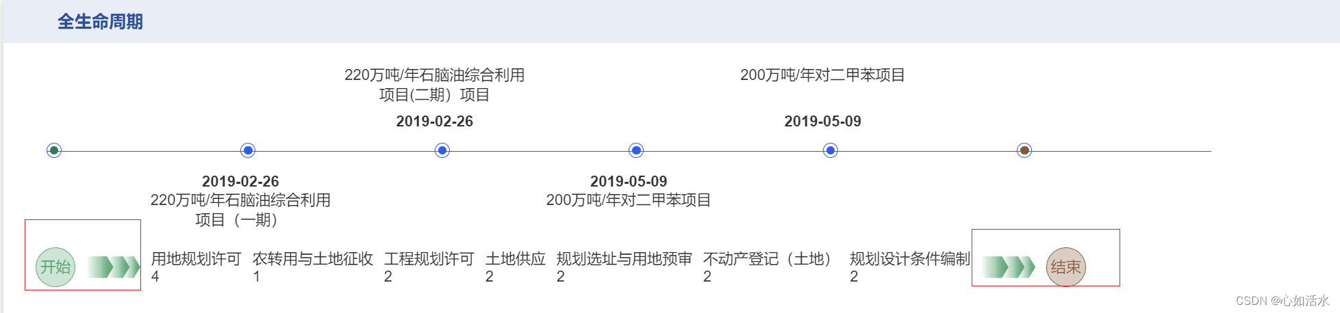
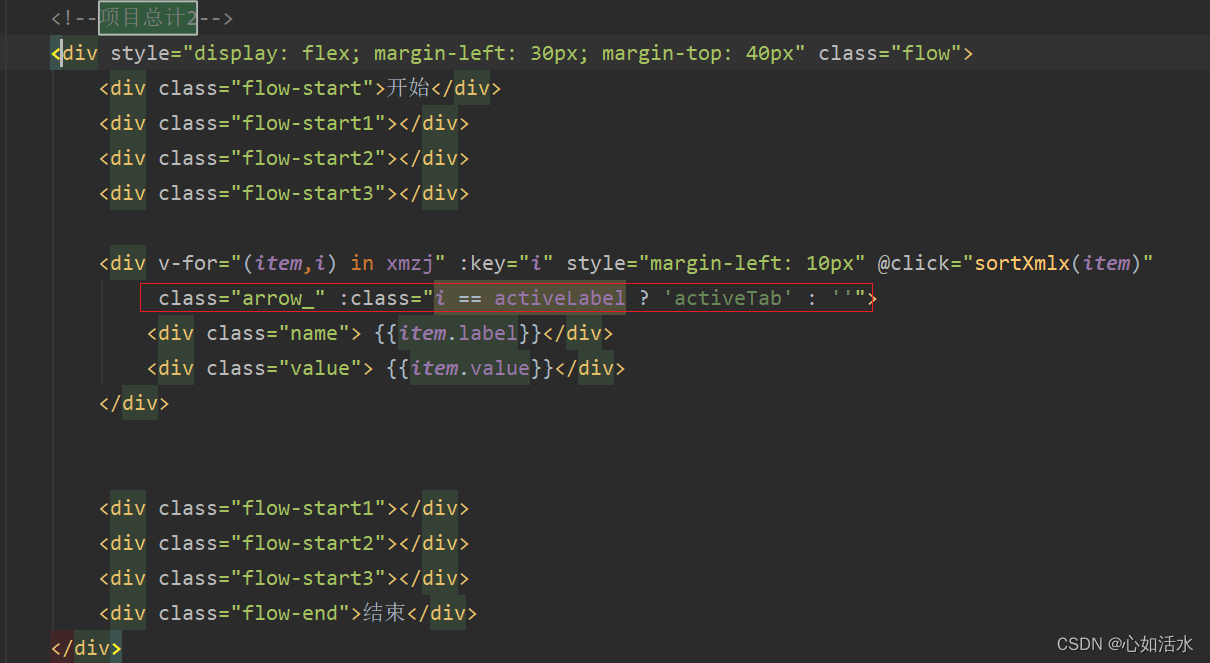
一、生命周期
div内容:
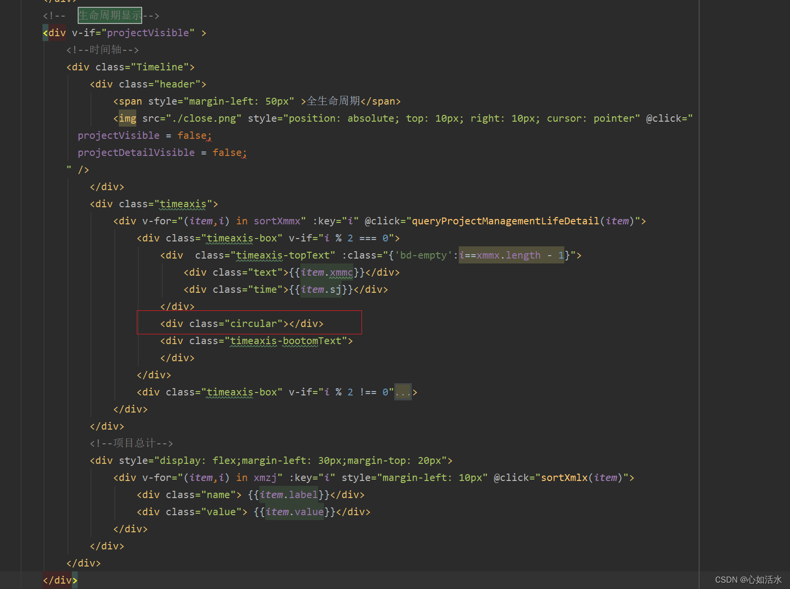
<div v-if="projectVisible" >
<!--时间轴-->
<div class="Timeline">
<div class="header">
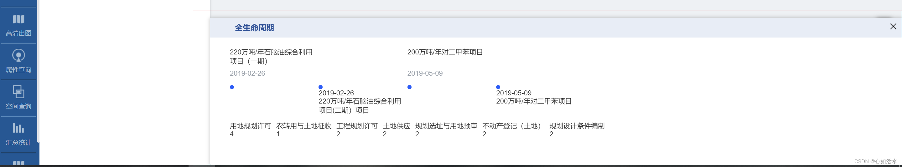
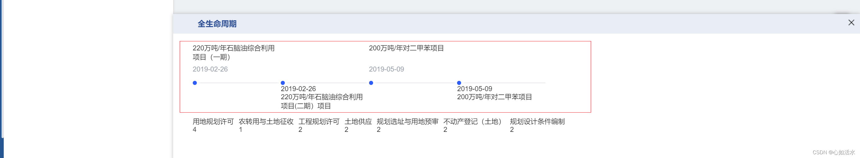
<span style="margin-left: 50px" >全生命周期</span>
<img src="./close.png" style="position: absolute; top: 10px; right: 10px; cursor: pointer" @click="
projectVisible = false;
projectDetailVisible = false;
" />
</div>
<div class="timeaxis">
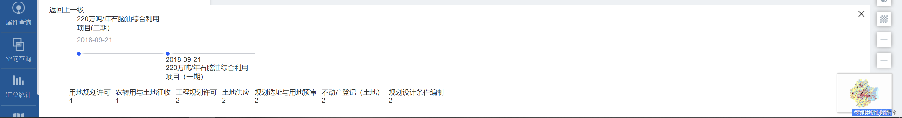
<div v-for="(item,i) in sortXmmx" :key="i" @click="queryProjectManagementLifeDetail(item)">
<div class="timeaxis-box" v-if="i % 2 === 0">
<div class="timeaxis-topText" :class="{'bd-empty':i==xmmx.length - 1}">
<div class="text">{{item.xmmc}}</div>
<div class="time">{{item.sj}}</div>
</div>
<div class="circular"></div>
<div class="timeaxis-bootomText">
</div>
</div>
<div class="timeaxis-box" v-if="i % 2 !== 0">
<div class="timeaxis-topText" :class="{'bd-empty':i==xmmx.length - 1}">
</div>
<div class="circular"></div>
<div class="timeaxis-bootomText">
<div class="time" >{{item.sj}}</div>
<div class="text">{{item.xmmc}}</div>
</div>
</div>
</div>
</div>
<!--项目总计-->
<div style="display: flex;margin-left: 30px;margin-top: 20px">
<div v-for="(item,i) in xmzj" :key="i" style="margin-left: 10px" @click="sortXmlx(item)">
<div class="name"> {{item.label}}</div>
<div class="value"> {{item.value}}</div>
</div>
</div>
</div>
</div>效果:
2.1 div整体样式(Timeline)
.Timeline {
		position: fixed; //生成绝对定位的元素, 相对于浏览器窗口进行定位。可以通过设置 "left", "top", "right" 以及 "bottom" 属性给目标元素定位
		left: 426px;
		right: 0;
		border-radius: 4px; //为元素添加圆角边框
		-webkit-transition: all 0.2s linear;
		transition: all 0.2s linear;
		// margin-left: 22%;
		// width: 78%;
		height: 300px;
		background: #ffffff;
		-webkit-box-shadow: 0px 0px 7px 1px #00000030;
		box-shadow: 0px 0px 7px 1px #00000030;
		// left: 0;
		bottom: 0; //底部
		z-index: 4;

		.header {
			height: 40px;
			background-color: #e7edf7;
			color: #20509a;
			line-height: 40px;
			font-size: 16px;
			// padding: 0 10px;
			font-weight: 600;
			width: 100%;
		}

		.timeaxis {
			height: 50px;
			margin-top: 100px;
			margin-left: 40px;
			width: calc(100% -40px);
			display: flex;
			box-sizing: border-box;
			padding: 0 40px 0 0; //线加长
			.timeaxis-box {
				width: 180px;
				.circular {
					width: 8px;
					height: 8px;
					border-radius: 4px;
					background: #165dff;
					margin-bottom: -4px;
					position: relative;
					top: -4px;
					box-shadow: 0px 0px 5px 5px #fff;
				}
				.timeaxis-topText {
					border-bottom: 1px solid #c9cdd4;
					position: relative;
					.text {
						position: absolute;
						top: -80px;
					}
					.time {
						position: absolute;
						top: -35px;
						font-size: 14px;
						color: #9ba3ad;
					}
				}
				.bd-empty {
					border: 0;
				}
				.timeaxis-bootomText {
					position: relative;
					.text {
						position: absolute;
						top: 15px;
						font-size: 14px;
					}
				}
			}
		}
	}
具体拆分
2.2生命周期的div中加头部,统一展示头部
效果: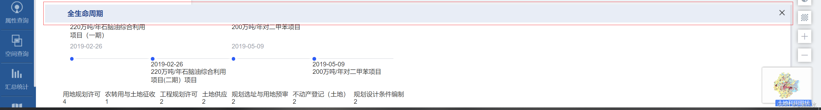
代码:
.header {
		height: 40px;
		background-color: #e7edf7;
		color: #20509a;
		line-height: 40px;
		font-size: 16px;
		// padding: 0 10px;
		font-weight: 600;
		width: 100%;
	}
2.2 div整体移动展示
效果
代码:
.Timeline {
		position: fixed; //生成绝对定位的元素, 相对于浏览器窗口进行定位。可以通过设置 "left", "top", "right" 以及 "bottom" 属性给目标元素定位
		left: 426px;
		right: 0;
		border-radius: 4px; //为元素添加圆角边框
		-webkit-transition: all 0.2s linear;
		transition: all 0.2s linear;
		// margin-left: 22%;
		// width: 78%;
		height: 300px;
		background: #ffffff;
		-webkit-box-shadow: 0px 0px 7px 1px #00000030;
		box-shadow: 0px 0px 7px 1px #00000030;
		// left: 0;
		bottom: 0; //底部
		z-index: 4;
}
2.3 时间线 (.timeaxis)
效果:
整体效果:
.timeaxis {
			height: 50px;
			margin-top: 100px;
			margin-left: 40px;
			width: calc(100% -40px);
			display: flex;
			box-sizing: border-box;
			padding: 0 40px 0 0; //线加长
			.timeaxis-box {
				width: 180px;
				.circular {
					width: 8px;
					height: 8px;
					border-radius: 4px;
					background: #165dff;
					margin-bottom: -4px;
					position: relative;
					top: -4px;
					box-shadow: 0px 0px 5px 5px #fff;
				}
				.timeaxis-topText {
					border-bottom: 1px solid #c9cdd4;
					position: relative;
					.text {
						position: absolute;
						top: -80px;
					}
					.time {
						position: absolute;
						top: -35px;
						font-size: 14px;
						color: #9ba3ad;
					}
				}
				.bd-empty {
					border: 0;
				}
				.timeaxis-bootomText {
					position: relative;
					.text {
						position: absolute;
						top: 15px;
						font-size: 14px;
					}
				}
			}
		}
2.4 时间轴上的圆圈、日期时间(.timeaxis-box)
效果:

代码:
.timeaxis-box {
width: 180px;
.circular { //圆形圈
width: 8px;
height: 8px;
border-radius: 4px;
background: #165dff;
margin-bottom: -4px;
position: relative;
top: -4px;
box-shadow: 0px 0px 5px 5px #fff;
}
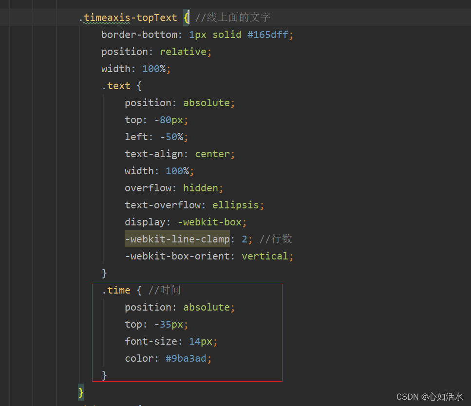
.timeaxis-topText { //线上面的文字
border-bottom: 1px solid #c9cdd4;
position: relative;
.text {
position: absolute;
top: -80px;
}
.time { //时间
position: absolute;
top: -35px;
font-size: 14px;
color: #9ba3ad;
}
}
.bd-empty {
border: 0;
}
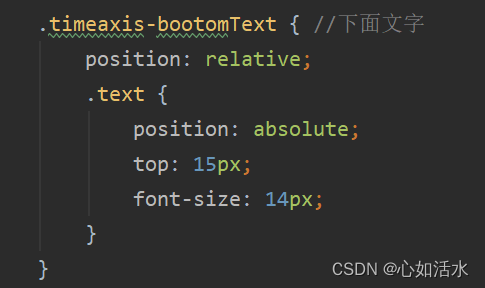
.timeaxis-bootomText { //下面文字
position: relative;
.text {
position: absolute;
top: 15px;
font-size: 14px;
}
}
}2.5 圆圈
2.5.1改造前
效果:
代码:
div代码:
css代码:
.circular { //圆形圈
					width: 8px;
					height: 8px;
					border-radius: 4px;
					background: #165dff;
					margin-bottom: -4px;
					position: relative;
					top: -4px;
					box-shadow: 0px 0px 5px 5px #fff;
				}
2.5.2 改造后
效果:

div代码:
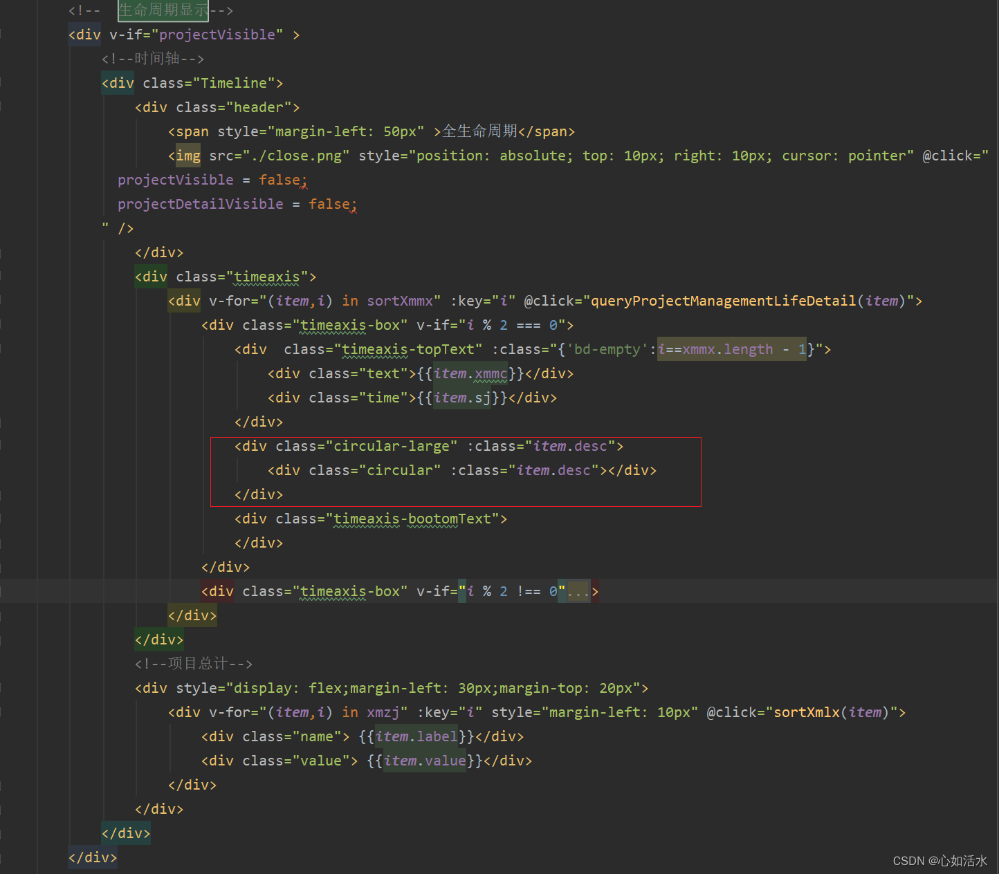
css代码:
.circular-large {
					width: 12px;
					height: 12px;
					border-radius: 50%;
					border: 1px solid #165dff;
					margin-bottom: -4px;
					position: relative;
					top: -8px;

					cursor: pointer;

					.circular {
						width: 8px;
						height: 8px;
						border-radius: 4px;
						background: #165dff;

						position: absolute;
						left: 0;
						top: 0;
						bottom: 0;
						right: 0;
						margin: auto;
					}
				}
2.6 时间轴前后添加圆圈
效果:
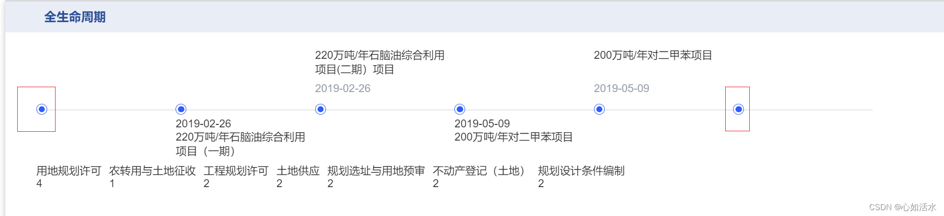
代码:在列表前后添加一个标识
css样式:
.circular-large.start {

					// border: 1px solid green;
					.circular {
						background: #227853;
					}
				}

				.circular-large.end {

					// border: 1px solid red;
					.circular {
						background: #895631;
					}
				}
2.7 文字
改造前:文字不居中显示
效果:
css代码:

改造后:文字居中显示
效果:
css代码:
.text {
						position: absolute;
						top: -80px;
						left: -50%;
						text-align: center;
						width: 100%;
						overflow: hidden;
						text-overflow: ellipsis;
						display: -webkit-box;
						-webkit-line-clamp: 2; //行数
						-webkit-box-orient: vertical;
					}
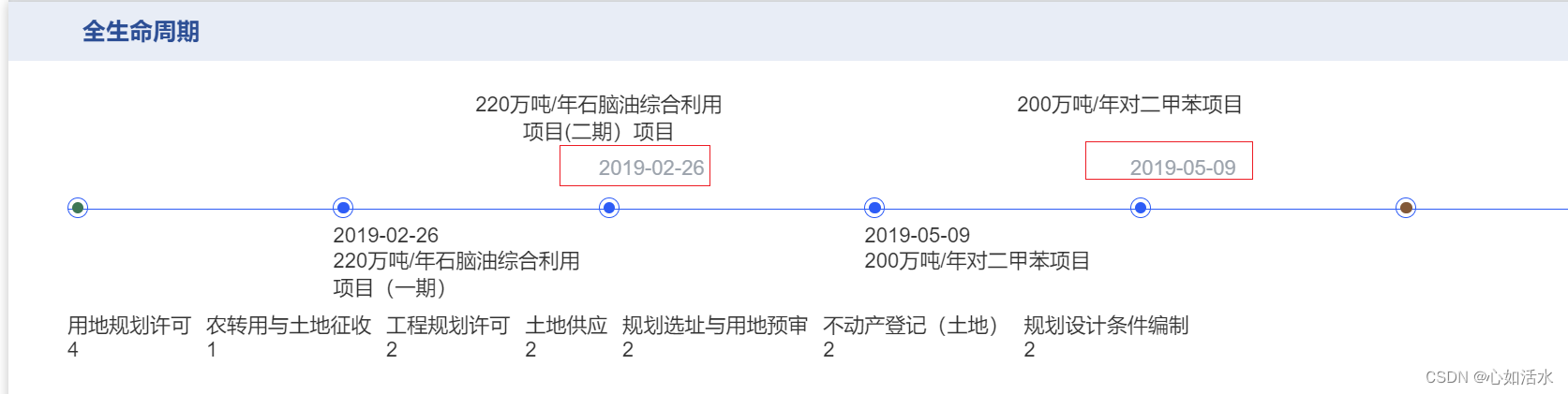
2.8 文字日期时间
改造前:文字不居中显示,颜色灰色
css代码:
改造后:居中、高亮显示
效果:

css代码:
.time { //时间
						position: absolute;
						width: 100%;
						top: -35px;
						font-size: 14px;
						//   color: #9ba3ad;
						font-weight: 600;
						left: -50%;
						text-align: center;
					}
2.9 下面文字日期显示
改造前:文字不居中,文字紧凑
效果:
css代码:
改造后:文字不紧凑、文字居中显示
效果:

css代码:
.timeaxis-bootomText {
					position: relative;
					width: 100%;
					// left: -34px;
					.time {
						position: absolute;

						font-size: 14px;
						//   color: #9ba3ad;
						font-weight: 600;
						// left: -80px;
						// left: -116px;
						left: -50%;
						text-align: center;
						width: 100%;
						margin: 10px 0;
					}

					.text {
						width: 100%;
						position: absolute;
						top: 15px;
						margin: 10px 0;
						font-size: 14px;
						// left: -80px;
						// left: -116px;
						left: -50%;
						text-align: center;
						overflow: hidden;
						text-overflow: ellipsis;
						display: -webkit-box;
						-webkit-line-clamp: 2; //行数
						-webkit-box-orient: vertical;
					}
				}
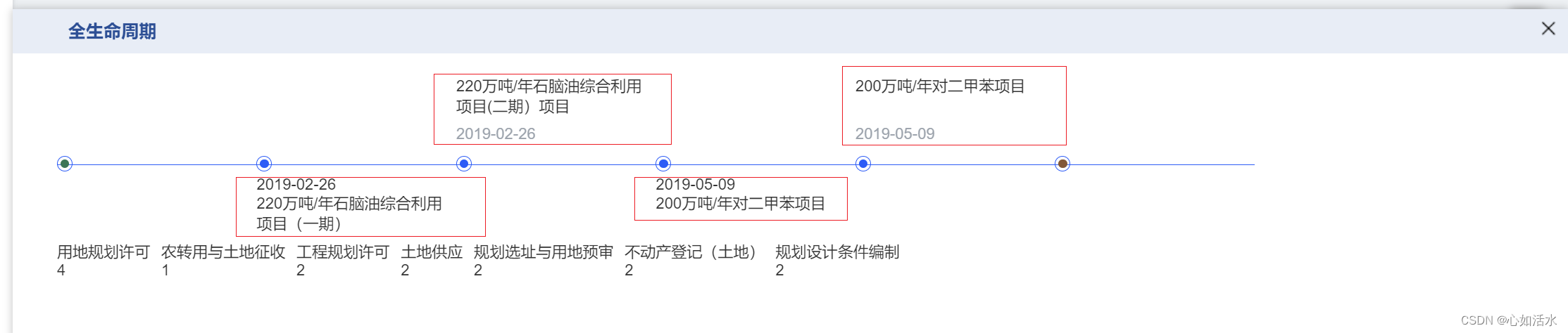
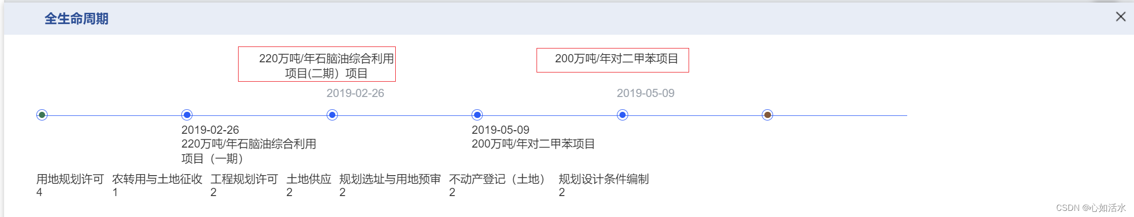
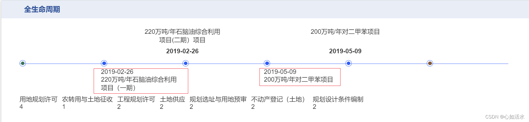
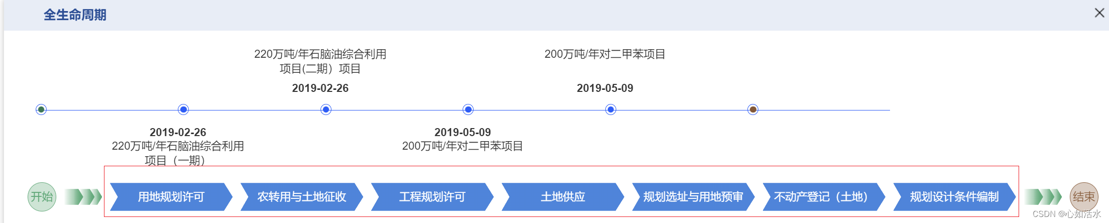
3.项目类型
效果:

最终实现效果:
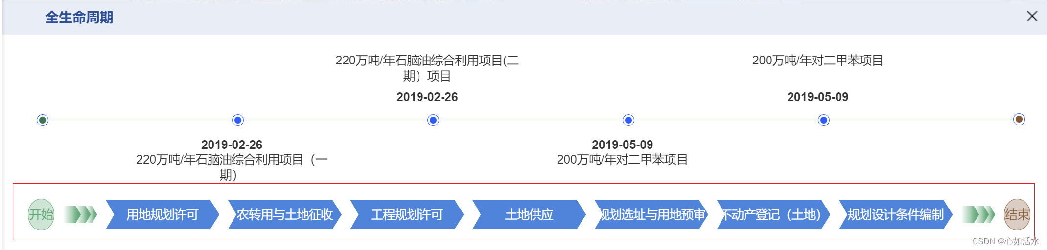
3.1 开始+渐变,渐变+结束
效果:
代码:
.flow {
		display: flex;
		align-items: center;
		padding-right: 20px;

		.flow-start {
			height: 35px;
			width: 35px;
			line-height: 35px;
			border: 1px solid #46aa75;
			background: #46aa7550;
			text-align: center;
			border-radius: 50%;
			color: #46aa75;
		}

		.flow-start1 {
			margin-left: 10px;
			height: 20px;
			width: 25px;

			clip-path: polygon(0 0,
			0px 50%,
			0 100%,
			calc(100% - 6px) 100%,
			100% 50%,
			calc(100% - 6px) 0);
			background: linear-gradient(to right,
			#46aa7500 0px,
			#46aa7550 50%,
			#46aa75 100%),
			linear-gradient(to right, #46aa7500 0px, #46aa7550 50%, #46aa75 100%);

			background-repeat: no-repeat;
		}

		.flow-start2 {
			height: 20px;
			width: 20px;
			margin-left: -5px;

			clip-path: polygon(0 0,
			0px 50%,
			0 100%,
			calc(100% - 6px) 100%,
			100% 50%,
			calc(100% - 6px) 0);
			background: linear-gradient(to right,
			#46aa7500 0px,
			#46aa7550 50%,
			#46aa75 100%),
			linear-gradient(to right, #46aa7500 0px, #46aa7550 50%, #46aa75 100%);

			background-repeat: no-repeat;
		}

		.flow-start3 {
			height: 20px;
			width: 15px;
			margin-left: -5px;

			clip-path: polygon(0 0,
			0px 50%,
			0 100%,
			calc(100% - 6px) 100%,
			100% 50%,
			calc(100% - 6px) 0);
			background: linear-gradient(to right,
			#46aa7500 0px,
			#46aa7550 50%,
			#46aa75 100%),
			linear-gradient(to right, #46aa7500 0px, #46aa7550 50%, #46aa75 100%);

			background-repeat: no-repeat;
		}

		.flow-end {
			height: 35px;
			width: 35px;
			line-height: 35px;
			border: 1px solid #905d39;
			background: #905d3950;
			text-align: center;
			border-radius: 50%;
			color: #905d39;
			margin-left: 10px;
		}

		.flow-end1 {
			margin-left: 10px;
			height: 20px;
			width: 25px;

			clip-path: polygon(0 0,
			0px 50%,
			0 100%,
			calc(100% - 6px) 100%,
			100% 50%,
			calc(100% - 6px) 0);
			background: linear-gradient(to right,
			#46aa7500 0px,
			#46aa7550 50%,
			#46aa75 100%),
			linear-gradient(to right, #46aa7500 0px, #46aa7550 50%, #46aa75 100%);

			background-repeat: no-repeat;
		}

		.flow-end2 {
			height: 20px;
			width: 20px;
			margin-left: -5px;

			clip-path: polygon(0 0,
			0px 50%,
			0 100%,
			calc(100% - 6px) 100%,
			100% 50%,
			calc(100% - 6px) 0);
			background: linear-gradient(to right,
			#46aa7500 0px,
			#46aa7550 50%,
			#46aa75 100%),
			linear-gradient(to right, #46aa7500 0px, #46aa7550 50%, #46aa75 100%);

			background-repeat: no-repeat;
		}

		.flow-end3 {
			height: 20px;
			width: 15px;
			margin-left: -5px;

			clip-path: polygon(0 0,
			0px 50%,
			0 100%,
			calc(100% - 6px) 100%,
			100% 50%,
			calc(100% - 6px) 0);
			background: linear-gradient(to right,
			#46aa7500 0px,
			#46aa7550 50%,
			#46aa75 100%),
			linear-gradient(to right, #46aa7500 0px, #46aa7550 50%, #46aa75 100%);

			background-repeat: no-repeat;
		}

		.arrow_ {
			width: 160px;
			height: 35px;
			line-height: 35px;
			float: left;
			margin: 3px 0;
			color: #c0c4cc;
			text-align: center;
			cursor: pointer;
			// border: 1px solid #165dff;
			clip-path: polygon(0 0,
			10px 50%,
			0 100%,
			calc(100% - 11px) 100%,
			100% 50%,
			calc(100% - 11px) 0);
			background: linear-gradient(-135deg,
			transparent 0px,
			#3b86e0 0px,
			#3b86e0 100%) top right,
			linear-gradient(-45deg, transparent 0px, #3b86e0 0px, #3b86e0 100%) bottom right;

			background-repeat: no-repeat;
			color: #fff;
			// background: linear-gradient(-135deg, transparent 0px, #eee 0px, #eee 100%)
			//     top right,
			//   linear-gradient(-45deg, transparent 0px, #eee 0px, #eee 100%) bottom right;
			// background-size: 100% 50%;
			// background-repeat: no-repeat;
		}

		.on {
			cursor: pointer;
			// clip-path: polygon(
			//   0 0,
			//   10px 50%,
			//   0 100%,
			//   calc(100% - 11px) 100%,
			//   100% 50%,
			//   calc(100% - 11px) 0
			// );
			// background: linear-gradient(
			//       -135deg,
			//       transparent 0px,
			//       #3b86e0 0px,
			//       #3b86e0 100%
			//     )
			//     top right,
			//   linear-gradient(-45deg, transparent 0px, #3b86e0 0px, #3b86e0 100%)
			//     bottom right;

			// background-repeat: no-repeat;
			color: #000;
		}

		.activeTab {
			clip-path: polygon(0 0,
			10px 50%,
			0 100%,
			calc(100% - 11px) 100%,
			100% 50%,
			calc(100% - 11px) 0);
			background: linear-gradient(-135deg,
			transparent 0px,
			#3b86e0 0px,
			#3b86e0 100%) top right,
			linear-gradient(-45deg, transparent 0px, #3b86e0 0px, #3b86e0 100%) bottom right;

			background-repeat: no-repeat;
			color: #fff;
		}
	}
3.2 文字添加底图
效果:
div代码:
 css样式:
.arrow_ {
			width: 160px;
			height: 35px;
			line-height: 35px;
			float: left;
			margin: 3px 0;
			color: #c0c4cc;
			text-align: center;
			cursor: pointer;
			// border: 1px solid #165dff;
			clip-path: polygon(0 0,
			10px 50%,
			0 100%,
			calc(100% - 11px) 100%,
			100% 50%,
			calc(100% - 11px) 0);
			background: linear-gradient(-135deg,
			transparent 0px,
			#3b86e0 0px,
			#3b86e0 100%) top right,
			linear-gradient(-45deg, transparent 0px, #3b86e0 0px, #3b86e0 100%) bottom right;

			background-repeat: no-repeat;
			color: #fff;
			// background: linear-gradient(-135deg, transparent 0px, #eee 0px, #eee 100%)
			//     top right,
			//   linear-gradient(-45deg, transparent 0px, #eee 0px, #eee 100%) bottom right;
			// background-size: 100% 50%;
			// background-repeat: no-repeat;
		}
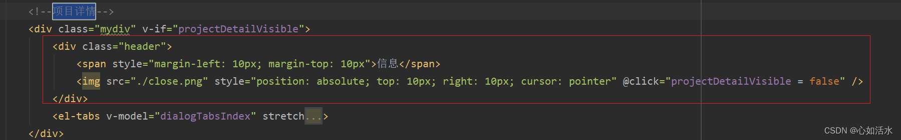
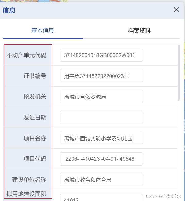
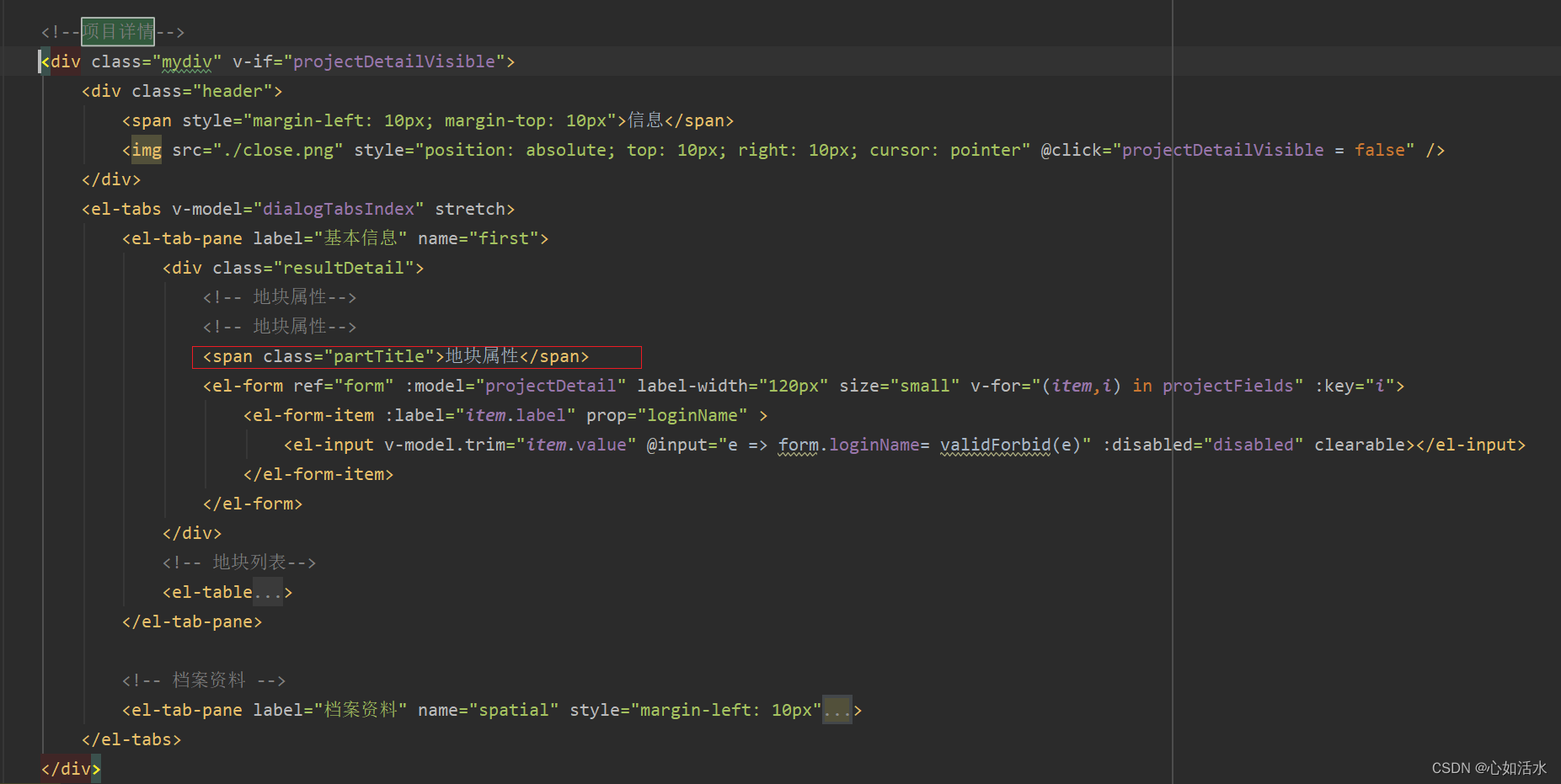
二、详情信息
div总体:
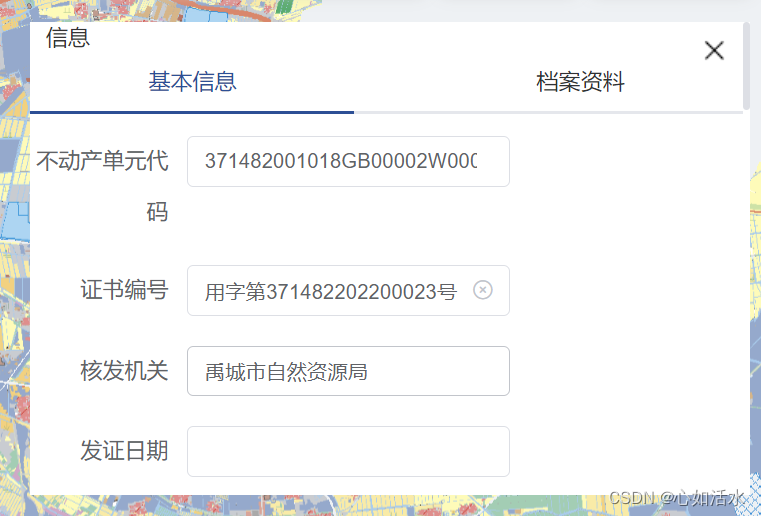
2.1 边框修剪
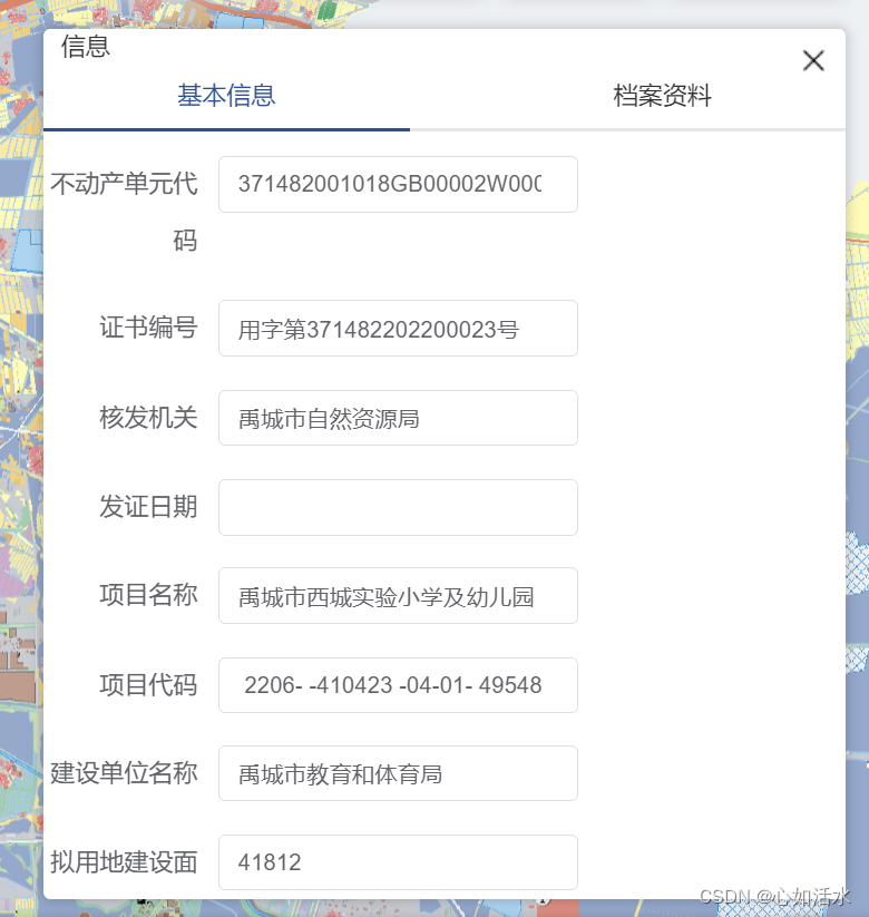
改造前:角度太尖锐、文字大小不统一、上面“信息”、“X”会随着滑轮滚动,不固定
效果:如上:
代码:
div代码:

css代码:
.mydiv{
width: 25%;
height: 300px;
background: #ffffff;
overflow-y:scroll;
position: fixed;
right: 1%;
top: 18%;
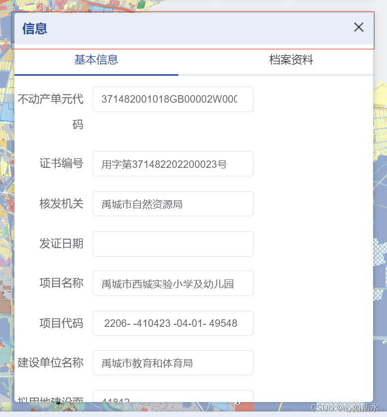
}改造后:
效果:
css代码:
.mydiv{
width: 25%;
// height: 440px;
// height: 580px;
background: #ffffff;
// overflow-y: scroll;
overflow: hidden;
position: fixed;
right: 1%;
top: 18%;
bottom: 312px;
border-radius: 4px;
box-shadow: 0px 0px 7px 1px #00000030;
// padding: 10px;
box-sizing: border-box;
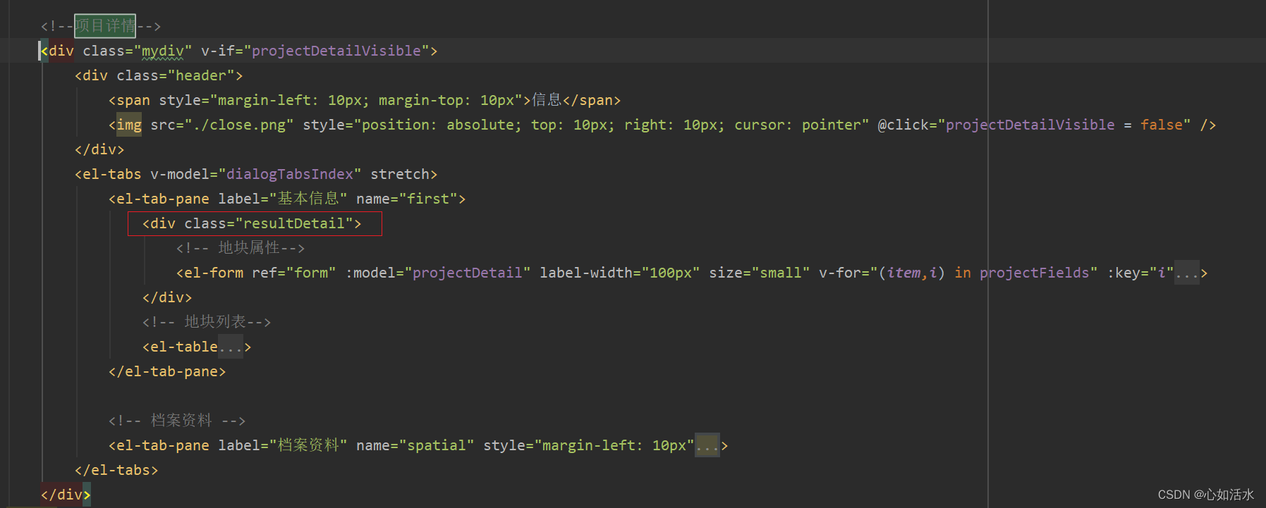
}2.2 div添加头部处理
效果:
div代码:
css代码:
.header {
			height: 40px;
			background-color: #e7edf7;
			color: #20509a;
			line-height: 40px;
			font-size: 16px;
			// padding: 0 10px;
			font-weight: 600;
			width: 100%;
		}
2.3 div添加滚轮滑动

html代码:
css代码:

2.4 form加背景
效果:
css代码:
.mydiv{
		width: 25%;
		// height: 440px;
		// height: 580px;
		background: #ffffff;
		//   overflow-y: scroll;
		overflow: hidden;
		position: fixed;
		right: 1%;
		top: 18%;
		bottom: 312px;
		border-radius: 4px;
		box-shadow: 0px 0px 7px 1px #00000030;
		//   padding: 10px;
		box-sizing: border-box;

		/deep/.el-tabs {
			padding: 10px;
			height: calc(100% - 60px);
			.el-tabs__content{
				width: 100%;
				height: calc(100% - 40px);
				.el-tab-pane{
					width: 100%;
					height: 100%;
					.resultDetail{
						max-height: calc(100% - 10px);
						overflow-y: auto;
					}
				}
			}
		}

		.table-box {
			height: 320px;
			overflow: auto;
			width: 100%;

			box-sizing: border-box;
		}

		.header {
			height: 40px;
			background-color: #e7edf7;
			color: #20509a;
			line-height: 40px;
			font-size: 16px;
			// padding: 0 10px;
			font-weight: 600;
			width: 100%;
		}


		/deep/.el-form-item {
			/* margin-bottom: 18px; */
			height: 50px;
			display: flex;
			align-items: center;
			justify-content: flex-start;
			margin-bottom: 0;
			// border-bottom: 1px solid #e4e7ed;
			// border-right: 1px solid #e4e7ed;
		}

		/deep/.el-form {
			border: 1px solid #e4e7ed;
			border-bottom: none;
		}
		/deep/.el-form-item__content {
			margin-left: 0 !important;
			height: 100%;
			display: flex;
			align-items: center;
			justify-content: flex-start;
			padding-left: 20px;
		}
		/deep/.el-form-item__label {
			height: 100%;
			display: flex;
			align-items: center;
			justify-content: flex-end;
			background: #e7edf7;
			// border-left: 1px solid #e4e7ed;
			border-right: 1px solid #e4e7ed;
		}

	}
2.5 表头添加描述
效果:

html代码:
css代码:
.partTitle{
        display: inline-block;
        font-weight: bold;
        border-left: 5px solid #0C5898;
        box-sizing: border-box;
        padding-left: 6px;
        margin: 10px 0;
    }


 被折叠的 条评论
为什么被折叠?
被折叠的 条评论
为什么被折叠?
 到【灌水乐园】发言


