


一、盒子模型
一个标签的大小,到底是由哪些部分组成的
- content 内容
- padding 内边距
- margin 外边距
- border 边框
一个元素的大小 = content + padding + border
一个元素在网页中占据位置的大小 = content + padding + border + margin
               .a{
                    border:10px solid;
                    background-color: blueviolet;
               }
               .box div{
                    width: 300px;
                    text-align: center;
                    line-height: 200px;
                    color:chocolate;
               }
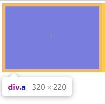
大小=(height+broder x 2)+(width + broder x 2)=(300+10 x 2)(200+10 x 2)
.box{
                    background-color:yellow;
                    width: 200px;
                    height: 200px;
                    border: 10px solid chocolate;
                    padding: 40px;
                    text-align: justify;
               }
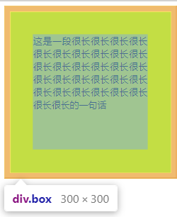
大小=(height + padding x 2 + border x 2) + (width + padding x 2 + border x 2)=
(200+40 x 2 +10 x 2)+(200+40 x 2 +10 x 2)
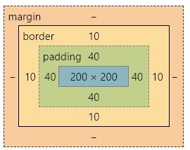
width,height属性规定了内容区的大小,标签元素大小会随着padding , border的大小而变化
html很多标签都自带padding 和 margin
  h1{
                    border: 1px solid green;
               }
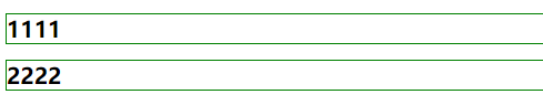
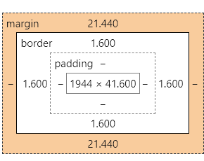
h1标签自带上下21400的外边距
 ul{
                    border: 1px solid yellow;
               }
               li{
                    border: solid red;
               }
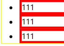

ul标签左边有40px的padding内边距,以及16px的外边距
因此在编写时,可以在最开始使用通配选择器将padding,margin 设置为0,又因为通配选择器的权重为0,所以最后面如果有需要边距,可以再添加覆盖
margin padding
在上述发现,margin、padding不只是有四个边,还可以单独定义一个边或者两个边。
所以讨论一下margin、padding的取值
margin : 值; 四个边
值1,值2;上下、左右
值1,值2,值3:上,左右,下
值1,值2,值3,值4:上、右、下、左
值1,auto: 上下边距,水平居中
二、怪异盒子模型
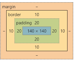
在上述问题中,盒子的大小是=内容+边框+边距,有没有一种盒子就是给定了高度和宽度(内容大小)就是整个盒子的大小呢?
<style>
              .box{
                    width: 200px;
                    height: 200px;
                    background-color: red;
                    padding:20px;
                    border: 10px solid orange;
              }
          </style>

大小是加上了内容和边框和边距
加上box-sizing:border-box时
不仅有边框,边距,大小就是一开始给定的200 x 200
其实就是压缩了内容大小
三、定位
固定定位 position: fixed
  body{
                  height: 3000px;
             }
 .box{
                    width: 200px;
                    height: 200px;
                    background-color: red;
                    position: fixed;
               }

可以发现,再拖动滚动条的时候,box的内容并没有跟着进行移动。
当网页中拥有两个position: fixed的元素时,会出现重叠现象,如何让两个重叠的元素,拥有图层顺序
      .box{
                    width: 200px;
                    height: 200px;
                    background-color: red;
                    position: fixed;
               }
       .box2{
                    width: 200px;
                    height: 200px;
                    background-color:blue;
                    position: fixed;
                    left: 70px;
                    top: 70px;
               }

使用z-index
			  .box{
                    width: 200px;
                    height: 200px;
                    background-color: red;
                    position: fixed;
                    z-index: 1;
               }
               .box2{
                    width: 200px;
                    height: 200px;
                    background-color:blue;
                    position: fixed;
                    left: 70px;
                    top: 70px;
                    z-index: 0;
               }

相对定位: position:relative
  .box{
                    width: 200px;
                    height: 200px;
                    background-color: red;
                    position:relative;

               }
 h3{
                    border: 1px solid blue;
               }

当把box的值进行修改
    .box{
                    width: 200px;
                    height: 200px;
                    background-color: red;
                    position:relative;
                    left: 50px;
                    top: 70px;

               }

box是在原来的位置上进行修改,修改之后,原先的位置还保留着
绝对定位:position:absolute
          <style>
             body{
                  height: 3000px;
             }
              *{
                   padding: 0;
                   margin: 0;
              }

              .b{
                    width: 50px;
                    height: 50px;
                    background-color: yellow;

               }
               .a{
                    width: 200px;
                    height: 200px;
                    background-color:blue;

               }
               .box{
                    width: 350px;
                    height: 350px;
                    background-color: red;

               }
          </style>
     </head>
     <body>
          <div class="box">
               <div class="a">
                    <div class="b"></div>
               </div>
          </div>
     </body>

当b设置为绝对定位,请问它的定位是依据谁的位置?
          <style>
             body{
                  height: 3000px;
             }
              *{
                   padding: 0;
                   margin: 0;
              }

              .b{
                    width: 50px;
                    height: 50px;
                    background-color: yellow;
                    margin: 0 auto;
                    position: absolute;
                    top: 20px;
                    right: 50px;
               }
               .a{
                    width: 200px;
                    height: 200px;
                    margin: 0 auto;
                    background-color:blue;
                    position: relative;
               }
               .box{
                    width: 350px;
                    height: 350px;
                    margin: 0 auto;
                    background-color: red;

               }

          </style>
     </head>
     <body>
          <div class="box">
               <div class="a">
                    <div class="b"></div>
               </div>
          </div>

     </body>
</html>
是根据父级中(由内向外)第一个定位 为position.
四、浏览器兼容问题
浏览器兼容问题,通常是因为不同的浏览器对同一段代码有不同的解析,造成页面显示不统一的情况
这里谈到的浏览器,主要是指 IE6 / IE7 /IE… FireFox / Chrome / Opera Safari等等,但更多的兼容还是考虑IE6 /IE7/FF之间的斗争
CSS Hack
为了让页面形成统一的效果,要针对不同的浏览器或者不同版本写出对应解析的CSS样式,所以将针对不同浏览器 / 版本而写出CSS的过程叫做CSS Hack
1、IE条件注释法
在正常代码之外添加判别IE浏览器或对应版本的条件注释,符合条件的浏览器或者版本号才会执行里面的代码
<!-- lt是小于 gt是大于 lte是小于等于 gte是不小于 !是不等于-->
<!-- [if IE]>
      想要执行的代码
<![endif]-->
   <!--[if lte IE 8]>
                    <link rel="stylesheet" href="style.css">
               <![endif]-->
Edge:

IE11:
IE8:

2、CSS属性前缀法
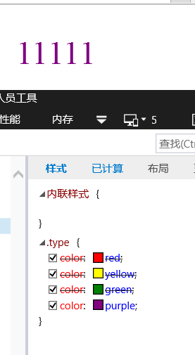
CSS属性前缀法,即给css的属性添加前缀,比如 * 可以被IE6 / IE7 识别,但 _ 只能被 IE6识别,IE6——IE10 都可以识别 \9 。IE6不能识别important , FF不能识别 _ \9
        .type{
                    color:red; /*all*/
                    color:yellow \9; /*IE*/
                    *color: green; /*IE6 / IE7 */
                    _color: purple;
               }
可以先使用 \9 ,将IE分离出来,再用 * 分离出 IE6 / IE7 ,最后可以使用 _ 分离出 IE6
Edge:

IE7:

IE5:
3、选择器前缀法
IE6 可识别*div
IE7 可识别 * +div
   *h2{
                    color: red;
               }
浏览器私有属性
-moz 代表FF浏览器私有属性
-ms 代表IE浏览器私有属性
-webkit 代表chrome、safari 私有属性
-o 代表 opera私有属性
对于私有属性的顺序要注意,把标准写法放到最后,兼容性写法放到前面
    .box{
                 width: 300px;
                 height: 300px;
                  background-color: red;
                 border-radius: 100px;/*边框圆角*/
                 -webkit-border-radius: 100px;
                 -moz-border-radius: 100px;
                 -ms-border-radius: 100px;
                 -o-border-radius: 100px;
            }
Edge:

CSS样式初始化
在css文件下,对一些CSS样式进行初始化,在html文件进行link


 206
206


 被折叠的 条评论
为什么被折叠?
被折叠的 条评论
为什么被折叠?
 到【灌水乐园】发言


