


2-7 CoordinatorLayout控件
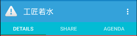
手势,及滚动布局,MD的手势有很多组成部分,包括touch ripples和meaningful transitions。Design library引入了CoordinatorLayout,一个从另一层面去控制子view之间触摸事件的布局,Design library中的很多控件都利用了它。一个很好的例子就是当你将FloatingActionButton作为一个子View添加进 CoordinatorLayout并且将CoordinatorLayout传递给 Snackbar.make(),在3.0及其以上的设备上,Snackbar不会显示在悬浮按钮的上面,而是FloatingActionButton 利用CoordinatorLayout提供的回调方法,在Snackbar以动画效果进入的时候自动向上移动让出位置,并且在Snackbar动画地消失的时候回到原来的位置,不需要额外的代码。
CoordinatorLayout的另一个用例是ActionBar与滚动技巧。你可能已经在自己的布局中使用了Toolbar ,它允许你更加自由的自定义其外观与布局的其余部分融为一体。Design library把这种设计带到了更高的水平,使用AppBarLayout可以让你的Toolbar与其他View(比如TabLayout的选项卡)能响应被标记了ScrollingViewBehavior的View的滚动事件。
注意项:
当用户滚动RecyclerView,AppBarLayout可以这样响应滚动事件:
根据子view的滚动标志(scroll flag)来控制它们如何进入(滚入屏幕)与退出(滚出屏幕)。
Flag包括:
- scroll:所有想滚动出屏幕的View都需要设置这个flag,没有设置这个flag的View将被固定在屏幕顶部。
- enterAlways:这个flag让任意向下的滚动都会导致该View变为可见,启用快速“返回模式”。
- enterAlwaysCollapsed:当你的视图已经设置minHeight属性又使用此标志时,你的视图只能已最小高度进入,只有当滚动视图到达顶部时才扩大到完整高度。
- exitUntilCollapsed:this flag causes the view to scroll off until it is ‘collapsed’ (its minHeight) before exiting。
特别注意:所有使用scroll flag的View都必须定义在没有使用scroll flag的View前面,这样才能确保所有的View从顶部退出,留下固定的元素。
PS一句:CoordinatorLayout还提供了layout_anchor和layout_anchorGravity属性一起配合使用,可以用于放置floating view,比如FloatingActionButton与其他View的相对位置。相见Demo中演示。
2-8 AppBarLayout控件
这个没啥解释的,就是一个ViewGroup,配合ToolBar与CollapsingToolbarLayout等使用。就是一个纯容器类。
无特殊注意项。
实例代码:
页面:
<?xml version="1.0" encoding="utf-8"?>
<android.support.design.widget.CoordinatorLayout xmlns:android="http://schemas.android.com/apk/res/android"
    xmlns:app="http://schemas.android.com/apk/res-auto"
    xmlns:tools="http://schemas.android.com/tools"
    android:layout_width="match_parent"
    android:layout_height="match_parent"
    tools:context="bw.com.bw_day13.demo07.AppBarNestedActivity">
    <android.support.design.widget.AppBarLayout
        android:layout_width="match_parent"
        android:layout_height="100dp">
        <!-- app:layout_scrollFlags="scroll"  根据子view的滚动标志(scroll flag)来控制它们如何进入(滚入屏幕)与退出(滚出屏幕)。

            scroll : 所有想滚动出屏幕的View都需要设置这个flag,没有设置这个flag的View将被固定在屏幕顶部
            enterAlways:这个flag让任意向下的滚动都会导致该View变为可见,启用快速“返回模式”。
         -->
        <android.support.v7.widget.Toolbar
            android:layout_width="match_parent"
            android:layout_height="match_parent"
            android:id="@+id/tool_bar_id"
            app:title="北方那个吹,雪花还没下。。。。"
            app:layout_scrollFlags="scroll|enterAlways"
            />
    </android.support.design.widget.AppBarLayout>
    <android.support.v4.widget.NestedScrollView
        android:layout_width="match_parent"
        android:layout_height="match_parent">
        <LinearLayout
            android:layout_width="match_parent"
            android:layout_height="match_parent"
            android:orientation="vertical">
            <ImageView
                android:layout_width="match_parent"
                android:layout_height="wrap_content"
                android:src="@mipmap/img01"/>
            <ImageView
                android:layout_width="match_parent"
                android:layout_height="wrap_content"
                android:src="@mipmap/img01"/>
            <ImageView
                android:layout_width="match_parent"
                android:layout_height="wrap_content"
                android:src="@mipmap/img01"/>
            <ImageView
                android:layout_width="match_parent"
                android:layout_height="wrap_content"
                android:src="@mipmap/img01"/>
            <ImageView
                android:layout_width="match_parent"
                android:layout_height="wrap_content"
                android:src="@mipmap/img01"/>
            <ImageView
                android:layout_width="match_parent"
                android:layout_height="wrap_content"
                android:src="@mipmap/img01"/>

            <ImageView
                android:layout_width="match_parent"
                android:layout_height="wrap_content"
                android:src="@mipmap/img01"/>
            <ImageView
                android:layout_width="match_parent"
                android:layout_height="wrap_content"
                android:src="@mipmap/img01"/>
        </LinearLayout>
    </android.support.v4.widget.NestedScrollView>
</android.support.design.widget.CoordinatorLayout>
代码:
public class AppBarNestedActivity extends AppCompatActivity {
    @Override
    protected void onCreate(Bundle savedInstanceState) {
        super.onCreate(savedInstanceState);
        supportRequestWindowFeature(Window.FEATURE_NO_TITLE);//取消ActionBar
        setContentView(R.layout.activity_app_bar_nested);
    }
}
2-9 CollapsingToolbarLayout控件

可伸缩折叠的Toolbar (Collapsing Toolbar),直接添加Toolbar到AppBarLayout可以让你使用enterAlwaysCollapsed和 exitUntilCollapsedscroll标志,但是无法控制不同元素如何响应collapsing的细节。这里使用了 CollapsingToolbarLayout的app:layout_collapseMode=”pin”来确保Toolbar在view折叠的时候仍然被固定在屏幕的顶部。还可以做到更好的效果,当你让CollapsingToolbarLayout和Toolbar在一起使用的时候,title 会在展开的时候自动变得大些,而在折叠的时候让字体过渡到默认值。必须注意,在这种情况下你必须在CollapsingToolbarLayout上调用 setTitle(),而不是在Toolbar上。除了固定住View,你还可以使用 app:layout_collapseMode=”parallax”(以及使用 app:layout_collapseParallaxMultiplier=”0.7”来设置视差因子)来实现视差滚动效果(比如 CollapsingToolbarLayout里面的一个ImageView),这中情况和CollapsingToolbarLayout的 app:contentScrim=”?attr/colorPrimary”属性一起配合更完美。
有一件事情必须注意,那就是CoordinatorLayout并不知道FloatingActionButton或者AppBarLayout的内部工作原理,它只是以Coordinator.Behavior的形式提供了额外的API,该API可以使子View更好的控制触摸事件与手势以及声明它们之间的依赖,并通过onDependentViewChanged()接收回调。
可以使用CoordinatorLayout.DefaultBehavior(你的View.Behavior.class)注解或者在布局中使用app:layout_behavior=”com.example.app.你的View$Behavior”属性来定义view的默认行为。 framework让任意View和CoordinatorLayout结合在一起成为了可能。
注意项:
注意项上面描述部分已经声明,不需要额外说明。
实例代码页面:
<?xml version="1.0" encoding="utf-8"?>
<android.support.design.widget.CoordinatorLayout
    xmlns:android="http://schemas.android.com/apk/res/android"
    xmlns:app="http://schemas.android.com/apk/res-auto"
    android:layout_width="match_parent"
    android:layout_height="match_parent">
    <android.support.design.widget.AppBarLayout
        android:layout_width="match_parent"
        android:layout_height="300dp">
        <!--app:layout_scrollFlags="scroll|enterAlwaysCollapsed"  滚动的模式
        app:expandedTitleGravity=""  展开时,文字显示的位置
         app:expandedTitleMarginBottom="@dimen/activity_vertical_margin"    距离底部的尺寸
           app:expandedTitleMarginEnd="@dimen/activity_vertical_margin"    距离右侧的尺寸
           app:contentScrim="#00ff00"   折叠起来的颜色, 回到固定大小时, 显示的颜色
        -->
        <android.support.design.widget.CollapsingToolbarLayout
            android:layout_width="match_parent"
            android:layout_height="match_parent"
            android:id="@+id/ct_id"
            app:layout_scrollFlags="scroll|exitUntilCollapsed"
            app:expandedTitleGravity="right|bottom"
            app:expandedTitleMarginBottom="20dp"
            app:expandedTitleMarginEnd="20dp"
            app:contentScrim="#00ff00"
            >
            <!--app:layout_collapseMode=”parallax”  来实现视差滚动效果-->
            <ImageView
                android:layout_width="match_parent"
                android:layout_height="200dp"
                app:layout_collapseMode="parallax"
                android:src="@mipmap/img4"
                />
            <!-- app:layout_collapseMode="pin"  确保了toolBar在在view折叠的时候, 依然固定在屏幕的顶部-->
            <android.support.v7.widget.Toolbar
                app:layout_collapseMode="pin"
                app:title="可以折叠的layout"
                android:id="@+id/tool_bar_id"
                android:layout_width="match_parent"
                android:layout_height="40dp"/>
        </android.support.design.widget.CollapsingToolbarLayout>
    </android.support.design.widget.AppBarLayout>
    <android.support.v4.widget.NestedScrollView
        android:layout_width="match_parent"
        android:layout_height="wrap_content"
        app:layout_behavior="@string/appbar_scrolling_view_behavior">
        <LinearLayout
            android:layout_width="match_parent"
            android:layout_height="wrap_content"
            android:orientation="vertical">
            <ImageView
                android:layout_width="match_parent"
                android:layout_height="300dp"
                android:scaleType="centerCrop"
                android:src="@mipmap/img01"/>
            <ImageView
                android:layout_width="match_parent"
                android:layout_height="300dp"
                android:scaleType="centerCrop"
                android:src="@mipmap/img01"/>
            <ImageView
                android:layout_width="match_parent"
                android:layout_height="300dp"
                android:scaleType="centerCrop"
                android:src="@mipmap/img01"/>
            <ImageView
                android:layout_width="match_parent"
                android:layout_height="300dp"
                android:src="@mipmap/img01"/>
            <ImageView
                android:layout_width="match_parent"
                android:layout_height="300dp"
                android:scaleType="centerCrop"
                android:src="@mipmap/img01"/>
            <ImageView
                android:layout_width="match_parent"
                android:layout_height="300dp"
                android:scaleType="centerCrop"
                android:src="@mipmap/img01"/>
        </LinearLayout>
    </android.support.v4.widget.NestedScrollView>
</android.support.design.widget.CoordinatorLayout>
代码:
public class CollapsingToolbarLayoutActivity extends AppCompatActivity {
    @Override
    protected void onCreate(Bundle savedInstanceState) {
        super.onCreate(savedInstanceState);
        setContentView(R.layout.activity_collapsing_toolbar_layout);
    }
}


 587
587

 被折叠的 条评论
为什么被折叠?
被折叠的 条评论
为什么被折叠?
 到【灌水乐园】发言


