


这是一个轮播图案例,本案例使用了三张图片,实现效果如下:
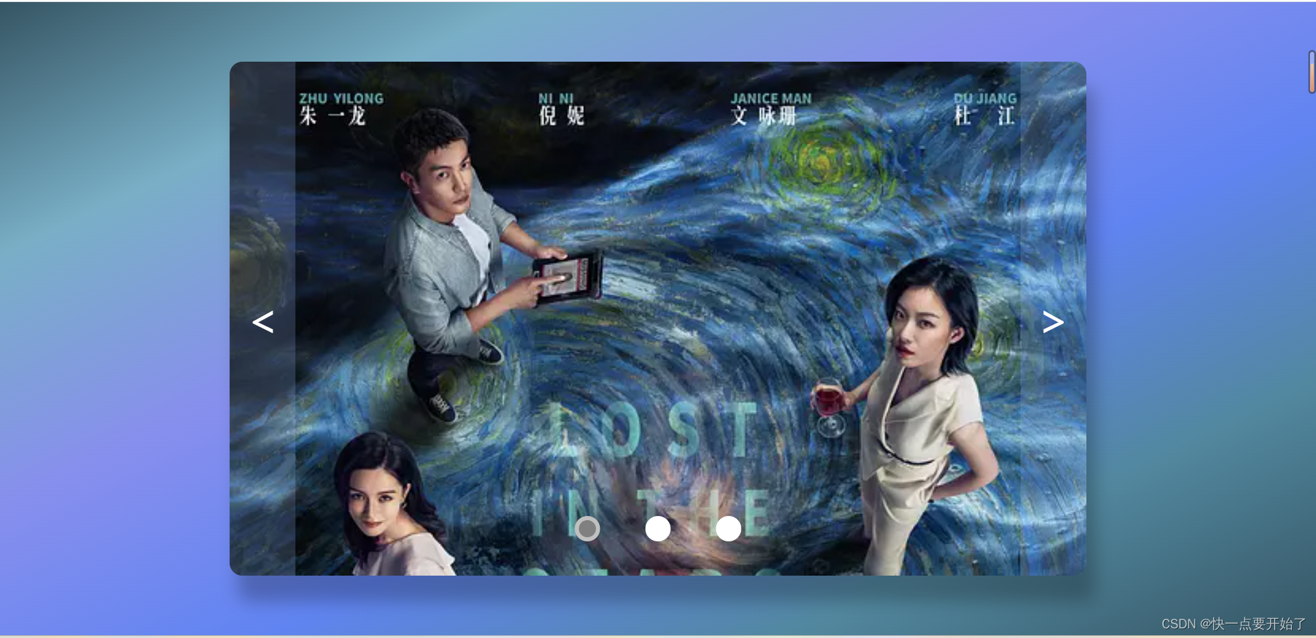
点击下边的小圆点,会自动跳到对应的图片上;点击左右两边的箭头,分别会往后或往前跳一张图片。无任何点击时,会每隔3秒自动换到下一张图片。
<!DOCTYPE html>
<html lang="en">
<head>
<meta charset="UTF-8">
<meta name="viewport" content="width=device-width, initial-scale=1.0">
<title>轮播图</title>
<style>
* {
margin: 0;
padding: 0;
list-style: none;
bottom: 0;
text-decoration: none;
}
body {
display: flex;
justify-content: center;
align-items: center;
height: 100vh;
background-image: linear-gradient(to bottom right,
#355563,
#79afc6,
#878fed,
#6084f1,
#52889f,
#355563);
}
.shell {
width: 1000px;
height: 600px;
position: relative;
overflow: hidden;
border-radius: 15px;
box-shadow: 10px 30px 20px rgba(0, 0, 0, 0.25);
/* border: 1px solid black; */
}
.images {
width: 300%;
height: 100%;
display: flex;
position: absolute;
left: 0%;
transition: .2s;
}
.img {
width: 1000px;
background-size: cover;
}
.img:nth-child(1) {
background-image: url(./image/01.webp);
}
.img:nth-child(2) {
background-image: url(./image/02.webp);
}
.img:nth-child(3) {
background-image: url(./image/03.webp);
}
.min {
display: flex;
justify-content: space-evenly;
position: absolute;
bottom: 40px;
width: 30%;
z-index: 999;
left: 50%;
transform: translateX(-50%);
}
.m {
width: 20px;
height: 20px;
cursor: pointer;
border-radius: 50%;
border: 5px solid rgba(255, 255, 255, 0.5);
background-color: #fff;
}
.button {
width: 100%;
height: 100%;
position: absolute;
display: flex;
justify-content: space-between;
user-select: none;
}
.button_left,
.button_right {
font-size: 50px;
background-color: rgba(160, 193, 255, 0.2);
padding: 0 20px;
cursor: pointer;
line-height: 600px;
color: #fff;
}
</style>
</head>
<body>
<div class="shell">
<ul class="images">
<li class="img"></li>
<li class="img"></li>
<li class="img"></li>
</ul>
<ul class="min">
<li class="m"></li>
<li class="m"></li>
<li class="m"></li>
</ul>
<div class="button">
<div class="button_left"><</div>
<div class="button_right">></div>
</div>
</div>
</body>
<script>
let left = document.querySelector('.button_left');
let right = document.querySelector('.button_right');
let m = document.querySelectorAll('.m');
let images = document.querySelector('.images');
let index = 0;
let time;
function position() {
images.style.left = (index * (-100)) + '%';
}
function add() {
if (index >= m.length - 1) {
index = 0;
} else {
index++;
}
}
function desc() {
if (index < 1) {
index = m.length - 1;
} else {
index--;
}
}
function timer() {
time = setInterval(() => {
index++;
desc();
add();
position();
m_color(index);
}, 3000)
}
function m_color(index) {
m[index].style.backgroundColor = 'gray';
for (let j = 0; j < m.length; j++) {
if (j != index) m[j].style.backgroundColor = 'white';
}
}
left.addEventListener('click', () => {
desc();
position();
m_color(index);
clearInterval(time);
timer();
})
right.addEventListener('click', () => {
console.log('add', index);
add();
position();
m_color(index);
clearInterval(time);
timer();
})
for (let i = 0; i < m.length; i++) {
m[i].addEventListener('click', () => {
m_color(i);
index = i;
position();
clearInterval(time);
timer();
})
}
timer();
</script>
</html>


 834
834


 被折叠的 条评论
为什么被折叠?
被折叠的 条评论
为什么被折叠?
 到【灌水乐园】发言


