


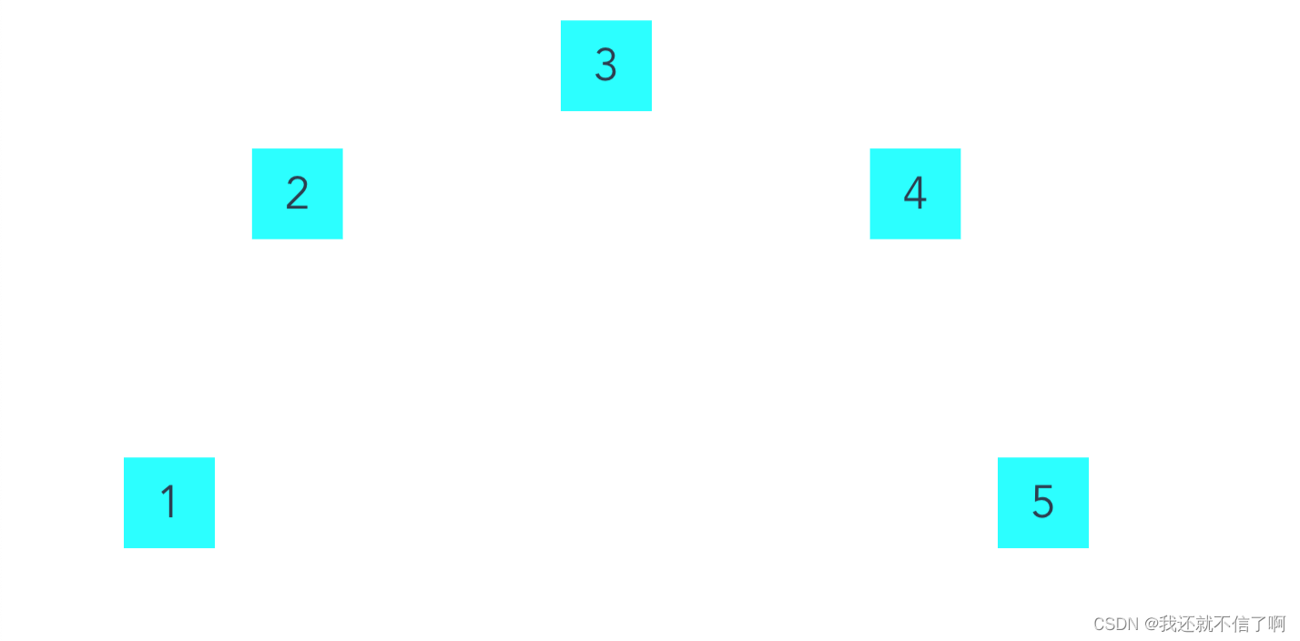
如何实现如下图的元素半圆形排列:
实现一个半圆形元素排列如图
<template>
  <div class="demo">
    <ul class="ul">
      <li
        v-for="(item, index) in transform"
        :key="item"
        :style="{ transform: item }"
      >
        <div class="li">
          <p>
            {{ index + 1 }}
          </p>
        </div>
      </li>
    </ul>
  </div>
</template>
  <script>
export default {
  data() {
    return {};
  },
  computed: {
    transform() {
      // let num = 5;
      // let angle = 180 / num;
      let arr = [270, 315, 0, 45, 90];
      // for (let index = 0; index < num; index++) {
      //   arr.push(index * angle);
      // }
      arr = arr.map((d) => this.getAxis(d));
      return arr;
    },
  },
  methods: {
    getAxis(angle) {
      // 公式,r-半径,angle-角度
      // x: r+r*Math.sin(angle*Math.PI/180)
      // y: r-r*Math.cos(angle*Math.PI/180)
      return `translate(${240 * Math.sin((angle * Math.PI) / 180) + 240}px, ${
        240 - 240 * Math.cos((angle * Math.PI) / 180)
      }px)`;
    },
  },
};
</script>
<style lang="less" scoped>
.demo {
  padding: 100px;
  box-sizing: border-box;
}
ul,
li {
  margin: 0;
  list-style-type: none;
  padding: 0;
}
ul {
  width: 480px;
  height: 480px;
  background-color: #fff;
  border-radius: 50%;
  position: relative;
  // transform: rotateZ(-70deg);
}
li {
  width: 80px;
  height: 80px;
  position: absolute;
  // background-color: rgb(97, 153, 74);
  // color: white;
  font-size: 25px;
  // border-radius: 50%;
  line-height: 80px;
  text-align: center;
  margin-left: -40px;
  margin-top: -40px;
  transform-origin: 0px 0px;
  .li {
    animation-name: shake;
    animation-duration: 5s;
    animation-timing-function: ease-in-out;
    animation-iteration-count: infinite;
  }
  p {
    display: block;
    width: 50px;
    height: 50px;
    background-color: aqua;
    line-height: 50px;
  }
}
@keyframes shake {
  /* 抖动动画 */
  0% {
    transform: translateY(0);
  }
  10%,
  30%,
  50%,
  70%,
  90% {
    transform: translateY(10px);
  }
  20%,
  40%,
  60%,
  80% {
    transform: translateY(-10px);
  }
  100% {
    transform: translateY(0);
  }
}
</style>


 1299
1299


 被折叠的 条评论
为什么被折叠?
被折叠的 条评论
为什么被折叠?
 到【灌水乐园】发言


