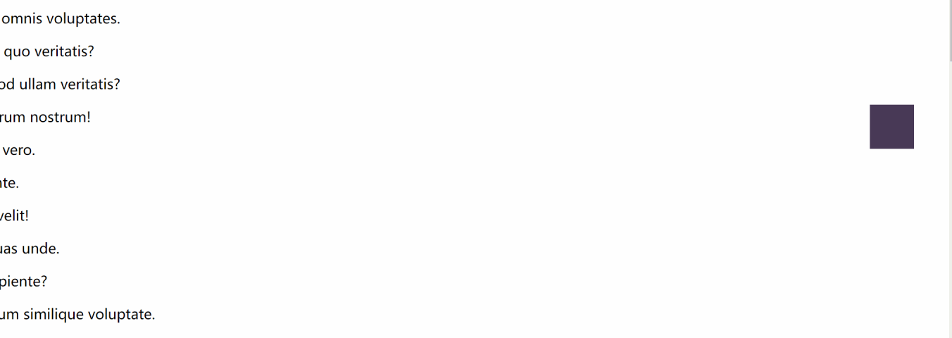
html中关于侧边导航栏和导航栏的编写

侧边导航栏

<style>
		.box{
     
			width: 50px;
			height: 50px;
			background-color: #483957;
			transition: width .5s,background-color .2s;
		}
		.box:hover{
     
			background-color: #004FCB;
			width: 200px;
			cursor: pointer;
		}
		.a1{
     
			position: fixed;
			right: 40px;
			top: 200px;
			float: right;
		}
	</style>

其中box属性中transition: width .5s,background-color .2s;表示动画效果。.box:hover鼠标移入事件改变背景颜色,宽度,鼠标变成小手。.a1中对其进行绝对定位,使其固定在屏幕的某个地方。

<div class="box a1"></div>

最后只需在在body中使用div即可完成一个简单的侧边导航栏。
请添加图片描述

下拉导航栏的编写

<!DOCTYPE html>
<html lang="zh-CN">
<head>
	<meta charset="UTF-8">
	<title>css侧边菜单</title>
	<style>
		/* css reset */
		* {
     
			margin: 0;
			padding: 0;
		}
		
		.box1 {
     
			/*设置了第一个div的宽度高度和背景色*/
			align-content: center;
			width: 100%;
			height: 50px;
			background-color: rgb(90, 149, 222);
		}
		
		
		.box2 {
     
			/*设置定位为相对定位宽度可以根据内容进行调整,注意在这不要使用百分比,
			最后水平居中*/
			position: relative;
			width: 1200px;
			margin: auto;
		}
		
		.menu ul {
     
			/*nav的属性,在这取消无序列表的标*/
			list-style-type: none;
		}
		
		.menu ul > li {
     
			/*设置li为左浮动,使列表项在一行*/
			float: left;
		}
		
		.menu a {
     
			/*对a标签进行主要的效果设置 display: inline-block取消下划线*/
			text-decoration: none;
			color: #fff;
			background-color: rgb(90, 149, 222);
			width: 160px;
			height: 50px;
			display: inline-block;
			text-align: center;
			line-height: 50px;
		}
		
		.menu a:hover {
     
			/*鼠标移入事件,1s改变背景色*/
			background-color: rgb(26, 102, 196);
			transition: background-color 1s;
		}
		
		.submenu {
     
			/*设置二级菜单隐藏效果*/
			width
  • 26
    点赞
  • 112
    收藏
    觉得还不错? 一键收藏
  • 0
    评论
Bootstrap侧边导航栏可以使用Bootstrap提供的`nav`和`nav-pills`组件来实现。下面是一个简单的例子: ```html <div class="container-fluid"> <div class="row"> <nav class="col-md-2 d-none d-md-block bg-light sidebar"> <div class="sidebar-sticky"> <ul class="nav flex-column nav-pills"> <li class="nav-item"> <a class="nav-link active" href="#">菜单1</a> </li> <li class="nav-item"> <a class="nav-link" href="#">菜单2</a> </li> <li class="nav-item"> <a class="nav-link" href="#">菜单3</a> </li> </ul> </div> </nav> <main role="main" class="col-md-9 ml-sm-auto col-lg-10 pt-3 px-4"> <div class="d-flex justify-content-between flex-wrap flex-md-nowrap align-items-center"> <h1 class="h2">标题</h1> </div> <div class="table-responsive"> <table class="table table-striped table-sm"> <thead> <tr> <th>表头1</th> <th>表头2</th> <th>表头3</th> <th>表头4</th> <th>表头5</th> </tr> </thead> <tbody> <tr> <td>内容1</td> <td>内容2</td> <td>内容3</td> <td>内容4</td> <td>内容5</td> </tr> </tbody> </table> </div> </main> </div> </div> ``` 这里使用了Bootstrap提供的`nav-pills`组件,添加了三个导航菜单项,并设置了第一个菜单项为激活状态。在`nav`标签,`flex-column`类将菜单项垂直排列,`nav-link`类设置了导航链接的样式。在`col-md-2`类,`d-none d-md-block`类将侧边栏在小屏幕上隐藏,只在等屏幕以上显示。 在`main`标签,`col-md-9`类设置了主内容区域的宽度,`ml-sm-auto`类将内容区域左对齐,`pt-3 px-4`类添加了一些顶部和左右的内边距,`table-responsive`类使表格具有响应式布局。 你可以根据自己的需求进行调整和定制。

“相关推荐”对你有帮助么?

  • 非常没帮助
  • 没帮助
  • 一般
  • 有帮助
  • 非常有帮助
提交
评论
添加红包

请填写红包祝福语或标题

红包个数最小为10个

红包金额最低5元

当前余额3.43前往充值 >
需支付:10.00
成就一亿技术人!
领取后你会自动成为博主和红包主的粉丝 规则
hope_wisdom
发出的红包
实付
使用余额支付
点击重新获取
扫码支付
钱包余额 0

抵扣说明:

1.余额是钱包充值的虚拟货币,按照1:1的比例进行支付金额的抵扣。
2.余额无法直接购买下载,可以购买VIP、付费专栏及课程。

余额充值