


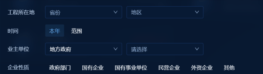
1、效果
是你要的效果,咱们继续往下看,搜索面板实现省市区下拉,原本有antd的Cascader组件,但是级联组件必须选到子节点,不能只选省,满足不了页面的需求
2、环境准备
1、react18
2、antd 4+
3、功能实现
原理:封装一个受控组件,该组件就是两select基本组件
1、首先,导入需要的组件:
import { Select, Space, Tag } from 'antd';2、定义2个状态变量来存储选中省和市的下拉枚举
  const [firstOptions, setFirstOptions] = useState<any>([]);
  const [secondOptions, setSecondOptions] = useState<any>([]);
3、组件可接收的props子属性 如下:
- options: 省市级联数据
- value: 已选中的值
- width:slect框的宽度
- firstPlaceholder 第一个select框的placeholder
- secondPlaceholder第二个select框的placeholder
- onChange: 选中的值发生变化时回调
4、创建handleFirstChange函数来处理第一个select框的change事件,更新第二个select框的下拉项和值
  // 第一个select生变化
  const handleFirstChange = (data: any) => {
    if (!isEmpty(data) && data.value) {
      let insertIndex = (options || []).findIndex((item: any) => {
        return item?.value === data?.value;
      });
      setSecondOptions(options?.[insertIndex]?.children || []);
      onChange({ first: [data] });
    } else {
      setSecondOptions([]);
      onChange(null);
    }
  };
5、创建onSecondChange 函数来处理第二个select框的change事件,将选中的值回传给父组件
  // 第二个select发生变化
  const onSecondChange = (data: any) => {
    if (!isEmpty(value) && value.first) {
      if (!isEmpty(data)) {
        onChange({
          ...value,
          second: mode === 'multiple' ? (data || []).filter((item: any) => !isNil(item?.label)) : [data],
        });
      } else {
        onChange({ first: value.first, second: null });
      }
    } else {
      onChange(null);
    }
}; 6、最后,使用2个select组件渲染,并将选中状态和change事件绑定到对应的属性上:
return (
    <>
      <Space wrap={false} direction="horizontal" size={12}>
        <Select
          defaultValue={firstOptions[0]}
          style={{ width: width }}
          onChange={handleFirstChange}
          placeholder={firstPlaceholder || '请选择'}
          value={value?.first}
          options={firstOptions}
          labelInValue
          allowClear
        />
        <Select
          style={{ width: width }}
          value={value?.second || []}
          onChange={onSecondChange}
          placeholder={secondPlaceholder || '请选择'}
          options={secondOptions}
          {...mode === "multiple" ? { mode: "multiple", maxTagCount: 'responsive', tagRender: tagRender } : {}}
          labelInValue
          allowClear
        />
      </Space>
    </>
)
7、完整代码如下:
import { Select, Space, Tag } from 'antd';
import clsx from 'clsx';
import { isEmpty, isNil } from 'lodash';
import { useEffect, useState } from 'react';
import './index.less';

const MultipleCascaderSelect = (props: any) => {
  const {
    options,
    value,
    onChange,
    width = 160,
    firstPlaceholder,
    secondPlaceholder,
    mode = 'multiple'
  } = props;

  const [firstOptions, setFirstOptions] = useState<any>([]);
  const [secondOptions, setSecondOptions] = useState<any>();

  useEffect(() => {
    setFirstOptions(options || []);
    if (Array.isArray(value?.first) && value.first.length) {
      let findIndex = (options || []).findIndex((item: any) => {
        return item.value === value.first?.[0].value;
      });
      setSecondOptions(options[findIndex]?.children || []);
    } else {
      setSecondOptions([]);
    }
  }, [options, value]);

  // 第一个select生变化
  const handleFirstChange = (data: any) => {
    if (!isEmpty(data) && data.value) {
      let insertIndex = (options || []).findIndex((item: any) => {
        return item?.value === data?.value;
      });
      setSecondOptions(options?.[insertIndex]?.children || []);
      onChange({ first: [data] });
    } else {
      setSecondOptions([]);
      onChange(null);
    }
  };

  // 第二个select发生变化
  const onSecondChange = (data: any) => {
    if (!isEmpty(value) && value.first) {
      if (!isEmpty(data)) {
        onChange({
          ...value,
          second: mode === 'multiple' ? (data || []).filter((item: any) => !isNil(item?.label)) : [data],
        });
      } else {
        onChange({ first: value.first, second: null });
      }
    } else {
      onChange(null);
    }
  };
  const tagRender = ({ label, closable, onClose }: any) => {
    const isLongTag = `${label}`.length > 4;
    return (
      <Tag
        color={label.props?.color}
        closable={closable}
        onClose={onClose}
        className={clsx([
          'text-sky-400 bg-sky-400/10 text-sm font-normal leading-5',
          // 'border border-solid border-sky-400/50',
          'max-w-[110px] border-none',
          // 'whitespace-nowrap text-ellipsis overflow-hidden'
        ])}
      >
        <span>{isLongTag ? `${label.slice(0, 4)}...` : label}</span>
        {/* {isLongTag ? (
          <Tooltip
            title={label}
            key={label}
            rootClassName={clsx('toolTipCard')}
            placement="top"
          >
            <span>{label.slice(0, 4)}...</span>
          </Tooltip>
        ) : (
          <span>{label}</span>
        )} */}
      </Tag>
    );
  };
  return (
    <>
      <Space wrap={false} direction="horizontal" size={12}>
        <Select
          defaultValue={firstOptions[0]}
          style={{ width: width }}
          onChange={handleFirstChange}
          placeholder={firstPlaceholder || '请选择'}
          value={value?.first}
          options={firstOptions}
          labelInValue
          allowClear
        />
        <Select
          style={{ width: width }}
          value={value?.second || []}
          onChange={onSecondChange}
          placeholder={secondPlaceholder || '请选择'}
          options={secondOptions}
          {...mode === "multiple" ? { mode: "multiple", maxTagCount: 'responsive', tagRender: tagRender } : {}}
          labelInValue
          allowClear
        />
      </Space>
    </>
  );
};

export default MultipleCascaderSelect;
组件调用
 <MultipleCascaderSelect
     width={162}
     options={enumData|| []}
     firstPlaceholder="请选择"
     secondPlaceholder="请选择"
 />


 1737
1737


 被折叠的 条评论
为什么被折叠?
被折叠的 条评论
为什么被折叠?
 到【灌水乐园】发言


