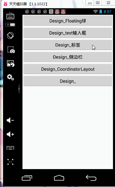
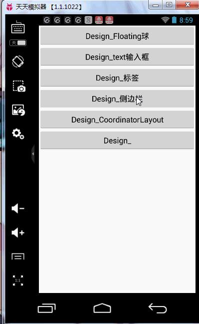
概述:
这是google今年推出的兼容库。
步骤:
、环境
studio:
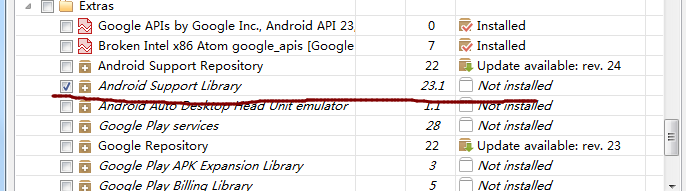
1.安装studio,并更新到最新版本的库(22.2版本以上)
2.在gradle中,添加库
compile 'com.android.support:design:22.2.0'
或者在depence中直接添加support库
eclipse:
1.import库
位置:sdk>extras>android>support>design
记得copy 到工程的选项打钩。
clean,打钩design
2.如果报错,将此项目的sdk版本修改到5.1
将其作为library使用。只要在新建的项目中使用这个库即可。
布局中设置
1.添加<android.support.design.widget.FloatingActionButton/>
,注:可以像图片那样设置src,放一张图片在表面
2.需要在布局中添加app的声明:
最外层布局中:
xmlns:app="http://schemas.android.com/apk/res-auto"
这样之后就可以直接用app来设置基本属性。
2.Floating Action Button的基本属性:
- app:backgroundTint=”” //设置背景色
- app:fabSize=”“值有normal【包裹与内部图片还有一段距离】和mini【包裹直接紧贴裹在图片】
- app:elevation=”5dp”//周围的阴影
- app:rippleColor=”“//设置点击时的颜色
也可以在代码中来设置上面的属性。不再详细介绍
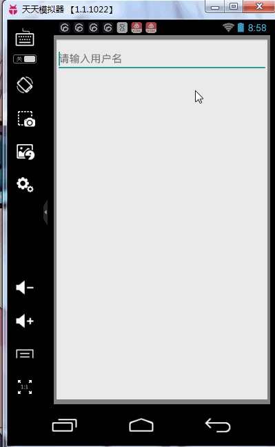
控件二:TextInputLayout-让edittext提示更加人性化
1.布局:
<android.support.design.widget.TextInputLayout>
2.TextInputLayout中必须要放个EditText
3.代码中可以设置hint
setHint();
4.可以获得其中的edittext【getEditText()】,并可以对它添加事件editText.addTextChangedListener()
范例:
package com.example.mydesigntest;
import android.support.design.widget.TextInputLayout;
import android.support.v7.app.AppCompatActivity;
import android.os.Bundle;
import android.text.Editable;
import android.text.TextWatcher;
import android.view.Menu;
import android.view.MenuItem;
import android.widget.EditText;
public class TextInputLayoutTest extends AppCompatActivity {
private TextInputLayout textInputLayout;
@Override
protected void onCreate(Bundle savedInstanceState) {
super.onCreate(savedInstanceState);
setContentView(R.layout.activity_text_input_layout_test);
textInputLayout = (TextInputLayout) findViewById(R.id.textInput);
textInputLayout.setHint("请输入用户名");
EditText editText = textInputLayout.getEditText();
editText.addTextChangedListener(new TextWatcher() {
@Override
public void beforeTextChanged(CharSequence charSequence, int i, int i1, int i2) {
}
@Override
public void onTextChanged(CharSequence charSequence, int i, int i1, int i2) {
if(charSequence.length()>10){
textInputLayout.setError("用户名超过了10个字符");
textInputLayout.setErrorEnabled(true);
}else {
textInputLayout.setErrorEnabled(false);
}
}
@Override
public void afterTextChanged(Editable editable) {
}
});
}
}
- 1
- 2
- 3
- 4
- 5
- 6
- 7
- 8
- 9
- 10
- 11
- 12
- 13
- 14
- 15
- 16
- 17
- 18
- 19
- 20
- 21
- 22
- 23
- 24
- 25
- 26
- 27
- 28
- 29
- 30
- 31
- 32
- 33
- 34
- 35
- 36
- 37
- 38
- 39
- 40
- 41
- 42
- 43
- 44
- 45
- 46
- 47
- 48
- 49
布局:
<LinearLayout xmlns:android="http://schemas.android.com/apk/res/android"
    xmlns:tools="http://schemas.android.com/tools"
    android:layout_width="match_parent"
    android:layout_height="match_parent"
    tools:context="com.example.mydesigntest.TextInputLayoutTest">

    <android.support.design.widget.TextInputLayout
        android:id="@+id/textInput"
        android:layout_width="match_parent"
        android:layout_height="wrap_content">
        <EditText
            android:layout_width="match_parent"
            android:layout_height="wrap_content" />
    </android.support.design.widget.TextInputLayout>

</LinearLayout>
效果演示:
控件三:Snackbar-可交互的提示框
功能:点击某按钮,使其出现snackbar,一段时间会自动消失,或者添加action,点击后使其消失。
范例:这里使用上面的floatingactionbar点击,使其出现snackbar
public class FloatingAction extends AppCompatActivity {
private FloatingActionButton floatingActionButton;
@Override
protected void onCreate(Bundle savedInstanceState) {
super.onCreate(savedInstanceState);
setContentView(R.layout.activity_floating_action);
floatingActionButton = (FloatingActionButton) findViewById(R.id.floating_button);
floatingActionButton.setOnClickListener(new View.OnClickListener() {
@Override
public void onClick(View view) {
final Snackbar snackbar = Snackbar.make(floatingActionButton,"你点击了按钮",Snackbar.LENGTH_LONG);
snackbar.show();
snackbar.setAction("知道了", new View.OnClickListener() {
@Override
public void onClick(View view) {
snackbar.dismiss();
}
});
}
});
}
}
- 1
- 2
- 3
- 4
- 5
- 6
- 7
- 8
- 9
- 10
- 11
- 12
- 13
- 14
- 15
- 16
- 17
- 18
- 19
- 20
- 21
- 22
- 23
- 24
- 25
控件四:TabLayout-便捷实现标签
1.布局中
<android.support.design.widget.TabLayout>
2.布局中可以设置个属性
仍需要
xmlns:app="http://schemas.android.com/apk/res-auto"
设置:
app:tabTextColor = “”//未选中的字体颜色
app:tabSelectedTextColor = “”//选中时的字体颜色
app:tabIndicatorColor = “”//滑块颜色
app:tabIndicatorHeight=”“//高度
background=”“//背景色
tabMode=”scrollable” //可以滑动
范例:需要fragment,adapter,tab共同实现
布局:
 <android.support.design.widget.TabLayout
        android:id="@+id/tablayout"
        android:layout_width="match_parent"
        android:layout_height="wrap_content"
        app:tabTextColor="@android:color/black"
                app:tabMode="scrollable"

        app:tabSelectedTextColor="@android:color/holo_red_light"
        app:tabIndicatorColor="@android:color/holo_orange_light"
        app:tabIndicatorHeight="5dp"
        android:background="@android:color/holo_green_light"

        >
         <android.support.v4.view.ViewPager
        android:id="@+id/viewPager"
        android:layout_width="match_parent"
        android:layout_height="match_parent"></android.support.v4.view.ViewPager>
- 1
- 2
- 3
- 4
- 5
- 6
- 7
- 8
- 9
- 10
- 11
- 12
- 13
- 14
- 15
- 16
- 17
- 18
代码:
主活动:
package com.example.mydesigntest;
import android.support.design.widget.TabLayout;
import android.support.v4.app.Fragment;
import android.support.v4.view.ViewPager;
import android.support.v7.app.AppCompatActivity;
import android.os.Bundle;
import android.view.Menu;
import android.view.MenuItem;
import java.util.ArrayList;
import java.util.List;
public class TabLayoutTest extends AppCompatActivity {
private TabLayout tabLayout;
private ViewPager viewPager;
@Override
protected void onCreate(Bundle savedInstanceState) {
super.onCreate(savedInstanceState);
setContentView(R.layout.activity_tab_layout_test);
tabLayout = (TabLayout) findViewById(R.id.tablayout);
viewPager = (ViewPager) findViewById(R.id.viewPager);
List<String> titles = new ArrayList<>();
List<Fragment> fragments = new ArrayList<>();
for(int i = 0;i<4;i++){
String title = "Tab"+(i+1);
tabLayout.addTab(tabLayout.newTab().setText(title));
titles.add(title);
Fragment fragment = new TabFragment(title);
fragments.add(fragment);
}
TabAdapter adapter = new TabAdapter(getSupportFragmentManager(),titles,fragments);
viewPager.setAdapter(adapter);
tabLayout.setupWithViewPager(viewPager);
tabLayout.setTabsFromPagerAdapter(adapter);
}
}
- 1
- 2
- 3
- 4
- 5
- 6
- 7
- 8
- 9
- 10
- 11
- 12
- 13
- 14
- 15
- 16
- 17
- 18
- 19
- 20
- 21
- 22
- 23
- 24
- 25
- 26
- 27
- 28
- 29
- 30
- 31
- 32
- 33
- 34
- 35
- 36
- 37
- 38
- 39
- 40
- 41
- 42
- 43
- 44
- 45
- 46
- 47
- 48
- 49
fragment:
package com.example.mydesigntest;
import android.os.Bundle;
import android.support.annotation.Nullable;
import android.support.v4.app.Fragment;
import android.view.LayoutInflater;
import android.view.View;
import android.view.ViewGroup;
import android.widget.TextView;
/**
* Created by 董梦娇 on 2015/11/8.
*/
public class TabFragment extends Fragment {
String title;
public TabFragment(String title){
this.title = title;
}
public TabFragment(){
}
@Nullable
@Override
public View onCreateView(LayoutInflater inflater, ViewGroup container, Bundle savedInstanceState) {
View view = inflater.inflate(R.layout.layout_tab_fragment,null);
TextView textView = (TextView) view.findViewById(R.id.text_title);
textView.setText(title);
return view;
}
}
- 1
- 2
- 3
- 4
- 5
- 6
- 7
- 8
- 9
- 10
- 11
- 12
- 13
- 14
- 15
- 16
- 17
- 18
- 19
- 20
- 21
- 22
- 23
- 24
- 25
- 26
- 27
- 28
- 29
- 30
- 31
- 32
- 33
adapter:
public class TabAdapter extends FragmentStatePagerAdapter {
List<String> titles;
List<Fragment> fragments;
public TabAdapter(FragmentManager fm,List<String> titles,List<Fragment> fragments) {
super(fm);
this.titles = titles;
this.fragments=fragments;
}
@Override
public Fragment getItem(int position) {
return fragments.get(position);
}
@Override
public int getCount() {
return fragments.size();
}
@Override
public CharSequence getPageTitle(int position) {
return titles.get(position);
}
}
- 1
- 2
- 3
- 4
- 5
- 6
- 7
- 8
- 9
- 10
- 11
- 12
- 13
- 14
- 15
- 16
- 17
- 18
- 19
- 20
- 21
- 22
- 23
- 24
- 25
fragment布局:
<LinearLayout xmlns:android="http://schemas.android.com/apk/res/android"
    android:layout_width="match_parent" android:layout_height="match_parent">
<TextView
    android:id="@+id/text_title"
    android:layout_width="match_parent"
    android:layout_height="wrap_content"
    android:gravity="center"/>
</LinearLayout>
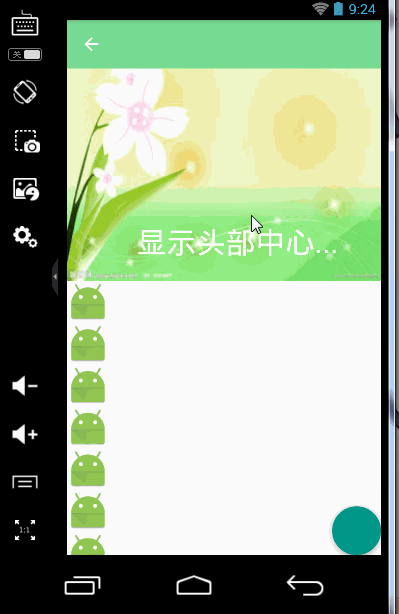
控件五:Navigation View - 美观的侧滑视图
1.可以设置侧滑栏的头部。
app:headerLayout=”@layout/head_view”
2.代码中可以设置侧边栏的显示与隐藏
drawlayout.openDrawer();
drawlayout.closeDrawer();
3.范例:
布局
<android.support.v4.widget.DrawerLayout xmlns:android="http://schemas.android.com/apk/res/android"
    xmlns:tools="http://schemas.android.com/tools"
    xmlns:app="http://schemas.android.com/apk/res-auto"
    android:layout_width="match_parent"
    android:layout_height="match_parent"
    tools:context="com.example.mydesigntest.NavigationTest">
<include layout="@layout/activity_main"/>
    <android.support.design.widget.NavigationView
        android:id="@+id/navigationview"
        android:layout_width="match_parent"
        android:layout_height="match_parent"
        android:layout_gravity="left"
        android:fitsSystemWindows="true"
        app:headerLayout="@layout/head_view"
        app:menu="@menu/menu_main"
        ></android.support.design.widget.NavigationView>
</android.support.v4.widget.DrawerLayout>
- 1
- 2
- 3
- 4
- 5
- 6
- 7
- 8
- 9
- 10
- 11
- 12
- 13
- 14
- 15
- 16
- 17
- 18
头部布局:
<?xml version="1.0" encoding="utf-8"?>
<LinearLayout xmlns:android="http://schemas.android.com/apk/res/android"
    android:orientation="vertical" android:layout_width="match_parent"
    android:layout_height="match_parent">
    <ImageView
        android:layout_width="match_parent"
        android:layout_height="wrap_content"
        android:layout_gravity="center"
        android:src="@mipmap/ic_launcher"/>

</LinearLayout>
控件六:具有过渡动画效果的布局Layout
CoordinatorLayout - 完美协调子View工作的核心部件
AppBarLayout
范例中:
弹出snakbar时,flotingactionbar也向上了,不被挡住.
延伸:toolbar使用v7包中的。
使用:
setSupportActionBar(toolbar);//设置上toolbar
toolbar布局
<android.support.v7.widget.Toolbar
        android:layout_width="match_parent"
        android:layout_height="?attr/actionBarSize"
        android:background="#77db93"
        app:popupTheme="@style/Theme.AppCompat.Light"
        app:theme="@style/ThemeOverlay.AppCompat.Dark.ActionBar"
        ></android.support.v7.widget.Toolbar>
style中:
<style name="AppTheme" parent="Theme.AppCompat.Light.DarkActionBar">
<!
<item name="android:windowActionBar">false</item>
<item name="android:windowNoTitle">true</item>
<item name="windowActionBar">false</item>
<item name="windowNoTitle">true</item>
</style>
问题及解决:
CoordinatorLayout中需要使用一个scrollview进行滑动,而由于CoordinatorLayout对scrollview的支持并不好,这里采用v4包下的NestedScrollView。
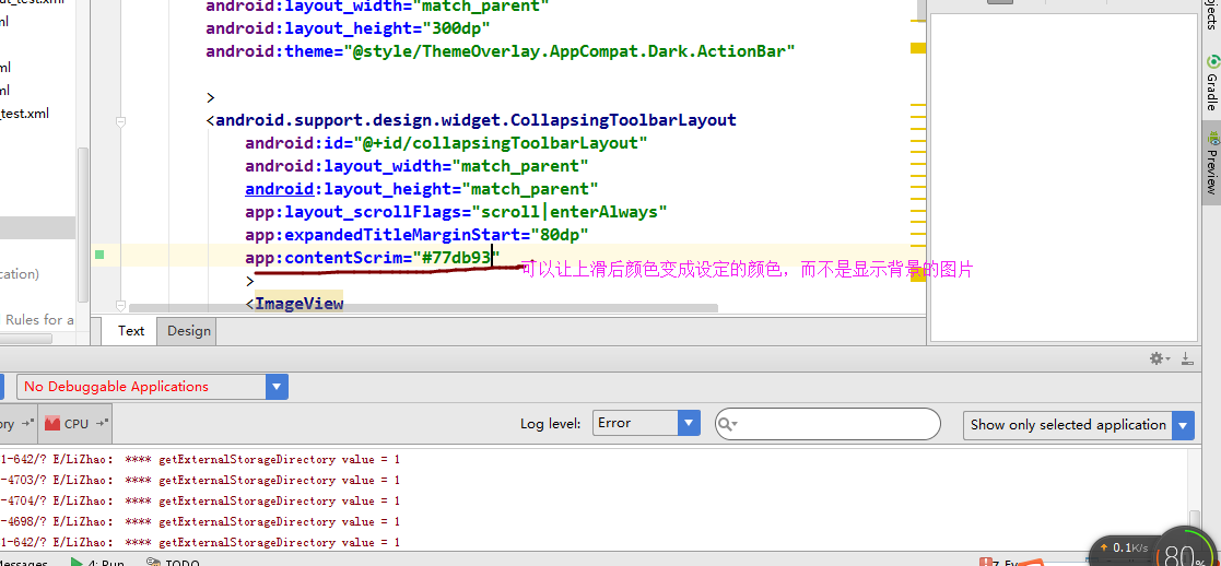
1.添加app:layout_behavior=”@string/appbar_scrolling_view_behavior”
2.在toolbar外层再裹上design中的AppBarLayout布局。
经过上面两个步骤后,toolbar就可以在最上层,且里面可以进行滑动。
这是可以给toolbar添加其他的属性了,例如:
app:layout_scrollFlags="scroll|enterAlways"
当向上推到一定程度,toolbar隐藏,上拉到一定程度,toolbar出现。
对ayout_scrollFlags中几个值的介绍:
scroll:一般都带上,表示可以跟随NestedScrollView的滑动一块滑动。
enterAlways:表示只要一上拉,就出现。
enterAlwaysCollapsed:只有上拉到第一个,toolbar才又出现。
exitUntilCollapsed:需要与android:minHeight属性一起出现,会跟随滑动,而toolbar到最小高度时就不再滑动。
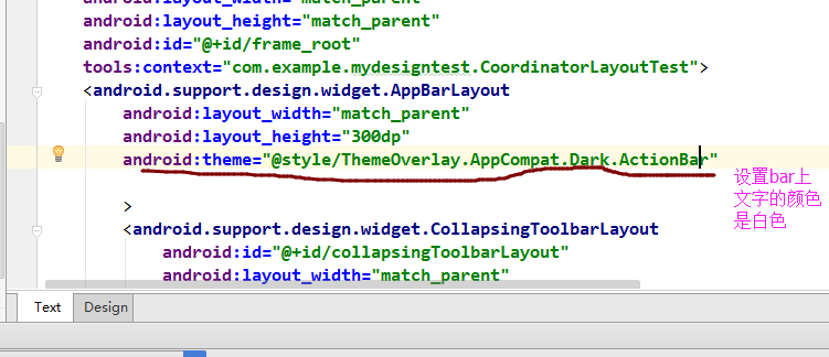
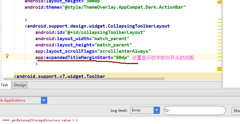
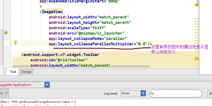
再延伸:使用CollapsingToolbarLayout
总体效果演示:
所有示例源代码:
原文http://blog.csdn.net/womengmengyan/article/details/49717963


 扫一扫
扫一扫
 3599
3599

 被折叠的 条评论
为什么被折叠?
被折叠的 条评论
为什么被折叠?
 到【灌水乐园】发言


