


本博文专门讲解和CoordinatorLayout相关的知识点,这也是Design Support Library中最重要与最难的部分。
概览
CoordinatorLayout实现了多种Material Design中提到的滚动效果。目前这个框架提供了几种不用写动画代码就能工作的方法,这些效果包括:
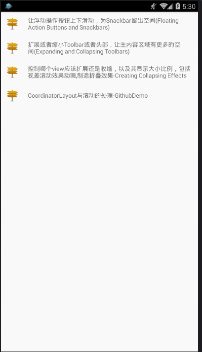
让浮动操作按钮上下滑动,为Snackbar留出空间

扩展或者缩小Toolbar或者头部,让主内容区域有更多的空间。
控制哪个view应该扩展还是收缩,以及其显示大小比例,包括视差滚动效果parallax scrolling effects 动画。

Code Samples
官方为我们提供了一个漂亮的demo ,使用了 CoordinatorLayout 和其他的 design support library特性.
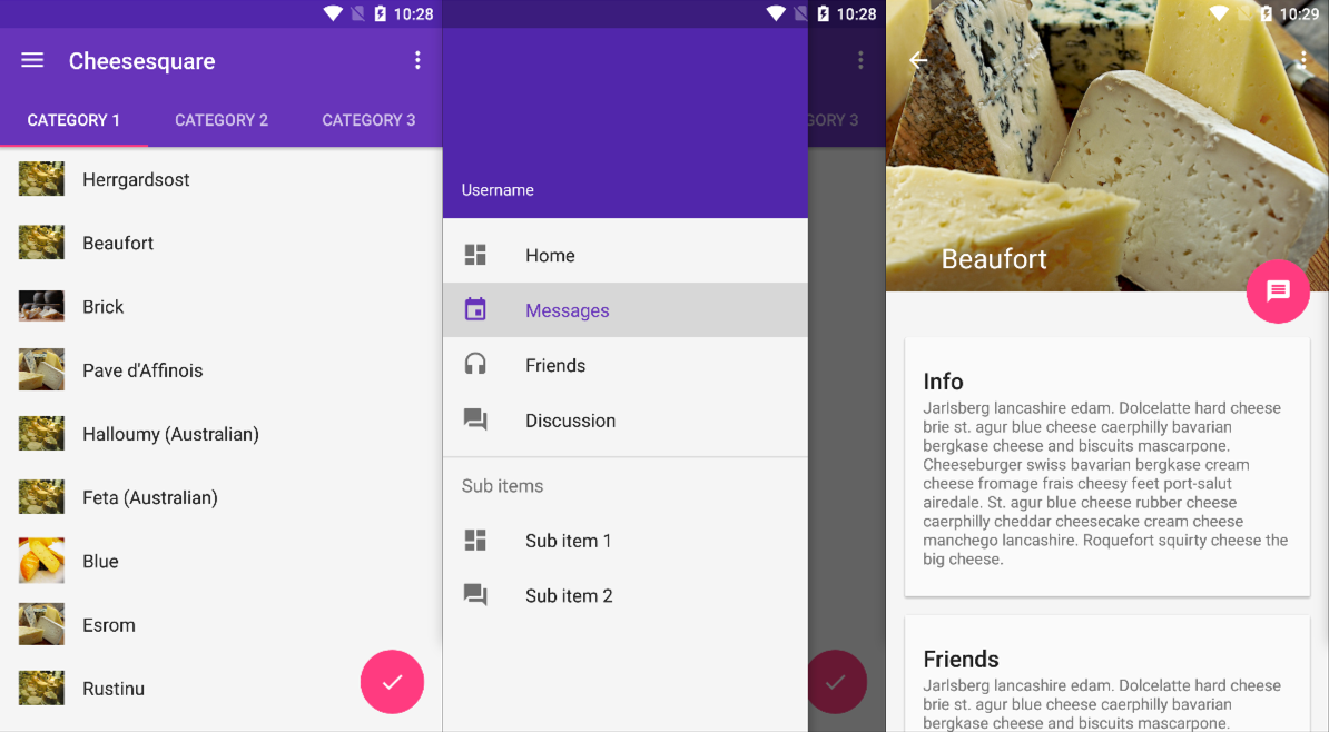
详情请查看github
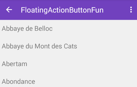
效果图
Setup
Make sure to follow the Design Support Library instructions first.
Floating Action Buttons and Snackbars
The CoordinatorLayout can be used to create floating effects using the layout_anchor and layout_gravity attributes. See the Floating Action Buttons guide for more information.
When a Snackbar is rendered, it normally appears at the bottom of the visible screen. To make room, the floating action button must be moved up to provide space.
So long as the CoordinatorLayout is used as the primary layout, this animation effect will occur for you automatically. The floating action button has a default behavior that detects Snackbar views being added and animates the button above the height of the Snackbar.
Code
activity_fab__snackar.xml
<?xml version="1.0" encoding="utf-8"?>
<android.support.design.widget.CoordinatorLayout
    xmlns:android="http://schemas.android.com/apk/res/android"
    xmlns:app="http://schemas.android.com/apk/res-auto"
    android:id="@+id/main_content"
    android:layout_width="match_parent"
    android:layout_height="match_parent">

    <android.support.v7.widget.RecyclerView
        android:id="@+id/rvToDoList"
        android:layout_width="match_parent"
        android:layout_height="wrap_content"/>


    <android.support.design.widget.FloatingActionButton
        android:id="@+id/floatingActionButton"
        android:layout_width="wrap_content"
        android:layout_height="wrap_content"
        android:layout_gravity="bottom|right"
        android:layout_margin="16dp"
        android:src="@drawable/gur_project_10"
        app:layout_anchor="@id/rvToDoList"
        app:layout_anchorGravity="bottom|right|end"
        app:layout_behavior="demo.turing.com.materialdesignwidget.floatingActionButton.ScrollAwareFABBehavior"/>

</android.support.design.widget.CoordinatorLayout>
Fab_SnackarAct.java
public class Fab_SnackarAct extends AppCompatActivity {

    private RecyclerView recyclerView;
    private FloatingActionButton floatingActionButton;
    private CoordinatorLayout coordinatorLayout ;

    @Override
    protected void onCreate(Bundle savedInstanceState) {
        super.onCreate(savedInstanceState);
        setContentView(R.layout.activity_fab__snackar);

        coordinatorLayout = (CoordinatorLayout) findViewById(R.id.main_content);

        floatingActionButton = (FloatingActionButton) findViewById(R.id.floatingActionButton);

        recyclerView = (RecyclerView) findViewById(R.id.rvToDoList);

        // 线性布局
        recyclerView.setLayoutManager(new LinearLayoutManager(this));
        // 设置适配器,填充数据
        recyclerView.setAdapter(new NormalRecyclerViewAdapter(this));


        floatingActionButton.setOnClickListener(new View.OnClickListener() {
            @Override
            public void onClick(View view) {
                Snackbar.make(view,"HELLO",Snackbar.LENGTH_SHORT).show();
            }
        });
    }
}
关键点
- 根布局必须为CoordinatorLayout
- FloatingActionButton设置 app:layout_anchor和app:layout_anchorGravity属性
- app:layout_behavior这个属性也可以不加也能实现点击floatingActionButton弹出Snackbar,fab自动上移的效果,app:layout_behavior的为自定义的效果,当下滑时,fab消失,上滑时fab显示,详情请查看本人博客 Floating Action Button-Android M新控件
运行图
Expanding and Collapsing Toolbars(Toolbar的扩展与收缩)

- The first step is to make sure you are not using the deprecated ActionBar. Make sure to follow the Using the ToolBar as ActionBar guide.
- Also make sure that the CoordinatorLayout is the main layout container.
<android.support.design.widget.CoordinatorLayout xmlns:android="http://schemas.android.com/apk/res/android"
 xmlns:app="http://schemas.android.com/apk/res-auto"
    android:id="@+id/main_content"
    android:layout_width="match_parent"
    android:layout_height="match_parent"
    android:fitsSystemWindows="true">

      <android.support.v7.widget.Toolbar
                android:id="@+id/toolbar"
                android:layout_width="match_parent"
                android:layout_height="?attr/actionBarSize"
                app:popupTheme="@style/ThemeOverlay.AppCompat.Light" />

</android.support.design.widget.CoordinatorLayout>
Responding to Scroll Events
Next, we must make the Toolbar responsive to scroll events using a container layout called AppBarLayout:
接下来,我们必须使用一个容器布局:AppBarLayout来让Toolbar响应滚动事件。
<android.support.design.widget.AppBarLayout
        android:id="@+id/appbar"
        android:layout_width="match_parent"
        android:layout_height="@dimen/detail_backdrop_height"
        android:theme="@style/ThemeOverlay.AppCompat.Dark.ActionBar"
        android:fitsSystemWindows="true">

  <android.support.v7.widget.Toolbar
                android:id="@+id/toolbar"
                android:layout_width="match_parent"
                android:layout_height="?attr/actionBarSize"
                app:popupTheme="@style/ThemeOverlay.AppCompat.Light" />

</android.support.design.widget.AppBarLayout>Note: AppBarLayout currently expects to be the first child nested within a CoordinatorLayout according to the official Google docs.
注意:根据官方的谷歌文档,AppBarLayout目前必须是第一个嵌套在CoordinatorLayout里面的子view。
Next, we need to define an association between the AppBarLayout and the View that will be scrolled. Add an app:layout_behavior to a RecyclerView or any other View capable of nested scrolling such as NestedScrollView 。
The support library contains a special string resource @string/appbar_scrolling_view_behavior that maps to AppBarLayout.ScrollingViewBehavior, which is used to notify the AppBarLayout when scroll events occur on this particular view. The behavior must be established on the view that triggers the event.
然后,我们需要定义AppBarLayout与滚动视图之间的联系。在RecyclerView或者任意支持嵌套滚动的view比如NestedScrollView上添加app:layout_behavior。support library包含了一个特殊的字符串资源@string/appbar_scrolling_view_behavior,它和AppBarLayout.ScrollingViewBehavior相匹配,用来通知AppBarLayout 这个特殊的view何时发生了滚动事件,这个behavior需要设置在触发事件(滚动)的view之上。
<android.support.v7.widget.RecyclerView
        android:id="@+id/rvToDoList"
        android:layout_width="match_parent"
        android:layout_height="match_parent"
        app:layout_behavior="@string/appbar_scrolling_view_behavior">
当CoordinatorLayout发现RecyclerView中定义了这个属性,它会搜索自己所包含的其他view,看看是否有view与这个behavior相关联。AppBarLayout.ScrollingViewBehavior描述了RecyclerView与AppBarLayout之间的依赖关系。RecyclerView的任意滚动事件都将触发AppBarLayout或者AppBarLayout里面view的改变。
AppBarLayout里面定义的view只要设置了app:layout_scrollFlags属性,就可以在RecyclerView滚动事件发生的时候被触发:
 <android.support.design.widget.AppBarLayout
        android:layout_width="match_parent"
        android:layout_height="wrap_content"
        android:fitsSystemWindows="true"
        android:theme="@style/ThemeOverlay.AppCompat.Dark.ActionBar">

            <android.support.v7.widget.Toolbar
                android:id="@+id/toolbar"
                android:layout_width="match_parent"
                android:layout_height="?attr/actionBarSize"
                app:layout_scrollFlags="scroll|enterAlways"/>

 </android.support.design.widget.AppBarLayout>
app:layout_scrollFlags属性里面必须至少启用scroll这个flag,这样这个view才会滚动出屏幕,否则它将一直固定在顶部。可以使用的其他flag有:
- enterAlways: 一旦向上滚动这个view就可见。
Normally, the Toolbar only appears when the list is scrolled to the top as shown below:
- enterAlwaysCollapsed: 顾名思义,这个flag定义的是何时进入(已经消失之后何时再次显示)。假设你定义了一个最小高度(minHeight)同时enterAlways也定义了,那么view将在到达这个最小高度的时候开始显示,并且从这个时候开始慢慢展开,当滚动到顶部的时候展开完。
exitUntilCollapsed: 同样顾名思义,这个flag时定义何时退出,当你定义了一个minHeight,这个view将在滚动到达这个最小高度的时候消失。
snap:Using this option will determine what to do when a view only has been partially reduced. If scrolling ends and the view size has been reduced to less than 50% of its original, then this view to return to its original size. If the size is greater than 50% of its sized, it will disappear completely.
记住,要把带有scroll flag的view放在前面,这样收回的view才能让正常退出,而固定的view继续留在顶部。
此时,你应该注意到我们的Toolbar能够响应滚动事件了。
Creating Collapsing Effects(制造折叠效果)
如果想制造toolbar的折叠效果,我们必须把Toolbar放在CollapsingToolbarLayout中:
<android.support.design.widget.CollapsingToolbarLayout
            android:id="@+id/collapsing_toolbar"
            android:layout_width="match_parent"
            android:layout_height="match_parent"
            android:fitsSystemWindows="true"
            app:contentScrim="?attr/colorPrimary"
            app:expandedTitleMarginEnd="64dp"
            app:expandedTitleMarginStart="48dp"
            app:layout_scrollFlags="scroll|exitUntilCollapsed">

            <android.support.v7.widget.Toolbar
                android:id="@+id/toolbar"
                android:layout_width="match_parent"
                android:layout_height="?attr/actionBarSize"
                app:layout_scrollFlags="scroll|enterAlways"></android.support.v7.widget.Toolbar>

</android.support.design.widget.CollapsingToolbarLayout>
现在效果就成了:

通常,我们我们都是设置Toolbar的title,而现在,我们需要把title设置在CollapsingToolBarLayout上,而不是Toolbar。
CollapsingToolbarLayout collapsingToolbar =
              (CollapsingToolbarLayout) findViewById(R.id.collapsing_toolbar);
      collapsingToolbar.setTitle("Title");
Note that when using CollapsingToolbarLayout, the status bar should be made translucent (API 19) or transparent (API 21) as shown in this file. In particular, the following styles should be set in res/values-xx/styles.xml as illustrated:
<!-- res/values-v19/styles.xml -->
<style name="AppTheme" parent="Base.AppTheme">
    <item name="android:windowTranslucentStatus">true</item>
</style>

<!-- res/values-v21/styles.xml -->
<style name="AppTheme" parent="Base.AppTheme">
    <item name="android:windowDrawsSystemBarBackgrounds">true</item>
    <item name="android:statusBarColor">@android:color/transparent</item>
</style>
Creating Parallax Animations(制造视差效果)
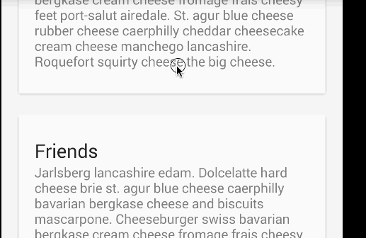
CollapsingToolbarLayout还能让我们做出更高级的动画,比如在里面放一个ImageView,然后在它折叠的时候渐渐淡出。同时在用户滚动的时候title的高度也会随着改变。

为了制造出这种效果,我们添加一个定义了app:layout_collapseMode=”parallax” 属性的ImageView。
 <android.support.design.widget.CollapsingToolbarLayout
          android:id="@+id/collapsing_toolbar"
          android:layout_width="match_parent"
          android:layout_height="match_parent"
          android:fitsSystemWindows="true"
          app:contentScrim="?attr/colorPrimary"
          app:expandedTitleMarginEnd="64dp"
          app:expandedTitleMarginStart="48dp"
          app:layout_scrollFlags="scroll|exitUntilCollapsed">

          <android.support.v7.widget.Toolbar
              android:id="@+id/toolbar"
              android:layout_width="match_parent"
              android:layout_height="?attr/actionBarSize"
              app:layout_scrollFlags="scroll|enterAlways"></android.support.v7.widget.Toolbar>
          <ImageView
              android:src="@drawable/cheese_1"
              app:layout_scrollFlags="scroll|enterAlways|enterAlwaysCollapsed"
              android:layout_width="wrap_content"
              android:layout_height="wrap_content"
              android:scaleType="centerCrop"
              app:layout_collapseMode="parallax"
              android:minHeight="100dp"/>

      </android.support.design.widget.CollapsingToolbarLayout>
Custom Behaviors (自定义Behavior)
在CoordinatorLayout 与浮动操作按钮中我们讨论了一个自定义behavior的例子。
译文http://www.jcodecraeer.com/a/anzhuokaifa/androidkaifa/2015/0718/3197.html 。
CoordinatorLayout的工作原理是搜索定义了CoordinatorLayout Behavior 的子view,不管是通过在xml中使用app:layout_behavior标签还是通过在代码中对view类使用@DefaultBehavior修饰符来添加注解。当滚动发生的时候,CoordinatorLayout会尝试触发那些声明了依赖的子view。
要自己定义CoordinatorLayout Behavior,你需要实现layoutDependsOn() 和onDependentViewChanged()两个方法。比如AppBarLayout.Behavior 就定义了这两个关键方法。这个behavior用于当滚动发生的时候让AppBarLayout发生改变。
public boolean layoutDependsOn(CoordinatorLayout parent, View child, View dependency) {
          return dependency instanceof AppBarLayout;
      }

 public boolean onDependentViewChanged(CoordinatorLayout parent, View child, View dependency) {
          // check the behavior triggered
          android.support.design.widget.CoordinatorLayout.Behavior behavior = ((android.support.design.widget.CoordinatorLayout.LayoutParams)dependency.getLayoutParams()).getBehavior();
          if(behavior instanceof AppBarLayout.Behavior) {
          // do stuff here
          }
 }
英文原文:
https://guides.codepath.com/android/Handling-Scrolls-with-CoordinatorLayout


 扫一扫
扫一扫
 1406
1406

 被折叠的 条评论
为什么被折叠?
被折叠的 条评论
为什么被折叠?
 到【灌水乐园】发言


