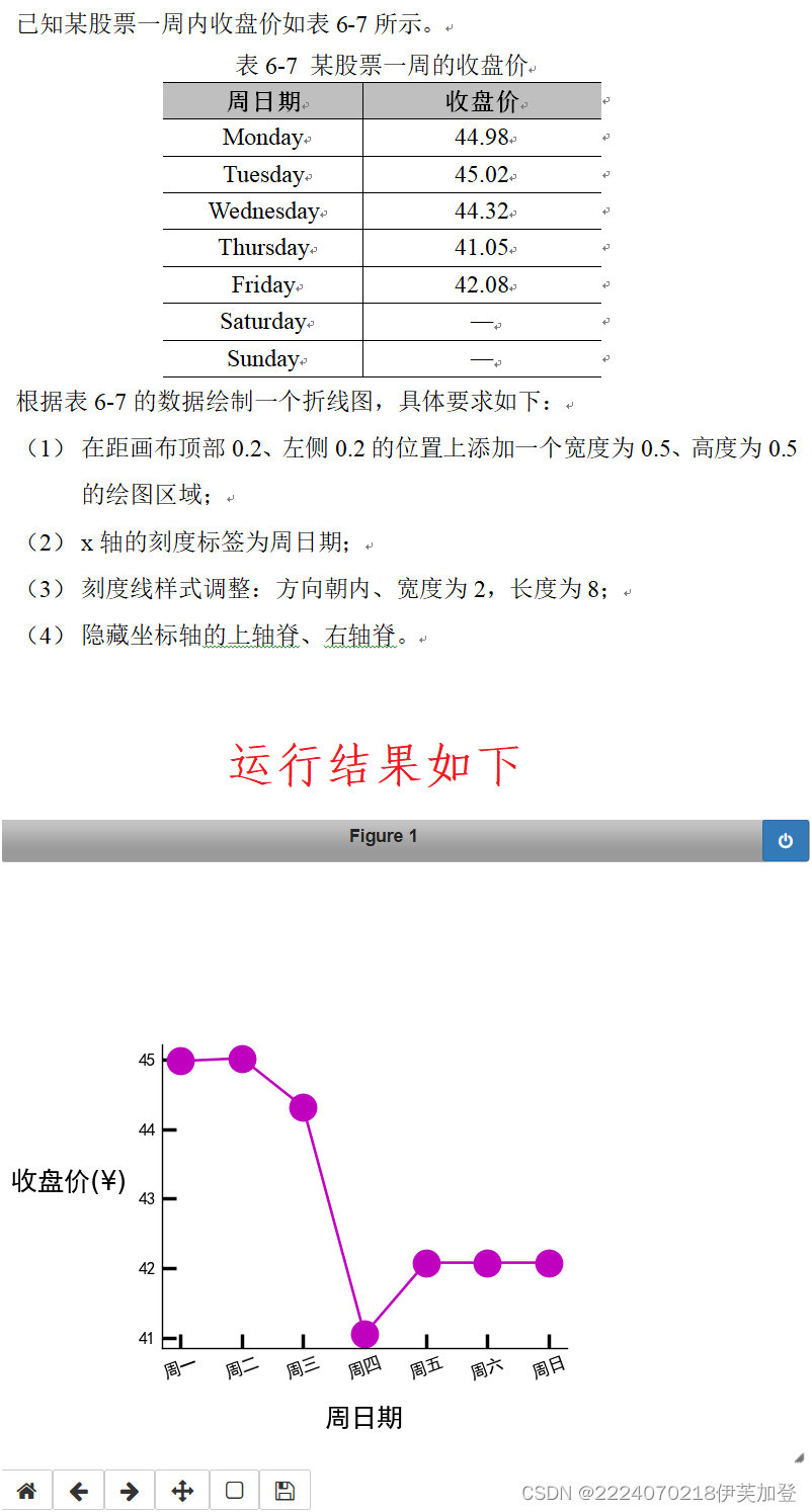
代码:
#导入模块
%matplotlib notebook
import numpy as np
import matplotlib.pyplot as plt

# 0.设置中文黑体
plt.rcParams["font.sans-serif"] = ["SimHei"]
plt.rcParams["axes.unicode_minus"] = False

# 1.准备数据
x_data = np.arange(1,8,1)
y_data = [44.98, 45.02, 44.32, 41.05, 42.08, 42.08, 42.08] # 周末休市

labels  = ['周一','周二','周三','周四','周五','周六','周日']
x_data = np.array(labels)
# 2.创建画布和坐标系
fig = plt.figure()
ax = fig.add_axes((0.2,0.2,0.5,0.5))#设置距画布顶部 0.2、左侧 0.2 的位置上添加一个宽度为 0.5、高度为 0.5的绘图区域


# 3.绘图

ax.plot(x_data,y_data,'mo-')#设置折线图数据标记样式

# 4.定制刻度
ax.xaxis.set_tick_params(direction = 'in',width = 2,length = 8,labelrotation = 35)# 设置x轴刻度线样式朝内,刻度线长度为8、宽为2,字体倾斜35°
ax.yaxis.set_tick_params(direction = 'in',width = 2,length = 8)# 设置y轴刻度线样式朝内,刻度线长度为8、宽为2


# 5.设置轴标签
ax.set_xlabel('周日期')#  添加x轴标签
ax.set_ylabel('收盘价(¥)')#  添加y轴标签

# 6.隐藏上轴脊和右轴脊
ax.spines['top'].set_color('none')
ax.spines['right'].set_color('none')

# 7.展示图表
plt.show()
效果图:
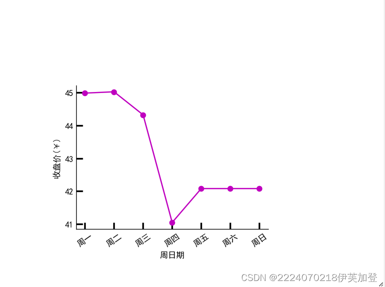


 647
647


 被折叠的 条评论
为什么被折叠?
被折叠的 条评论
为什么被折叠?
 到【灌水乐园】发言


