


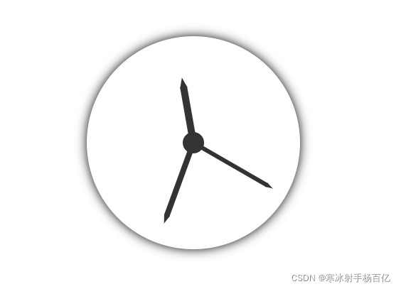
效果
html
<body>
    <div id="clock">
        <div class="hms">
            <!-- 时针 -->
            <div class="hour"></div>
            <!-- 分针 -->
            <div class="min"></div>
            <!-- 秒针 -->
            <div class="sec"></div>
        </div>
    </div>
</body>
css
    html,
    body {
        width: 100%;
        height: 100%;
    }

    body,
    ul {
        margin: 0;
    }

    ul {
        padding: 0;
        list-style: none;
    }

    /* clock */
    #clock {
        display: flex;
        -webkit-justify-content: center;
        -moz-justify-content: center;
        -ms-justify-content: center;
        justify-content: center;
        -webkit-align-items: center;
        -ms-align-items: center;
        -moz-align-items: center;
        align-items: center;
        width: 300px;
        height: 300px;
        margin: 60px auto;
        border-radius: 50%;
        box-shadow: 0 0 15px;
    }

    .hms {
        position: relative;
        display: inline-block;
        width: 30px;
        height: 30px;
        background-color: #333;
        border-radius: 50%;
    }

    .hms div {
        position: absolute;
        bottom: 50%;
        background-color: #333;
        transform-origin: center bottom;
    }

    .hms .hour {
        left: calc(50% - 10px/ 2);
        width: 10px;
        height: 80px;
    }

    .hms .hour::after {
        content: "";
        position: absolute;
        left: 0;
        bottom: 79px;
        border-width: 14px 5px;
        border-style: solid;
        border-color: transparent transparent #333 transparent;
    }

    .hms .min {
        left: calc(50% - 8px/ 2);
        width: 8px;
        height: 110px;
        /* transform: rotate(15deg); */
    }

    .hms .min::after {
        content: "";
        position: absolute;
        left: 0;
        bottom: 109px;
        border-width: 12px 4px;
        border-style: solid;
        border-color: transparent transparent #333 transparent;
    }

    .hms .sec {
        left: calc(50% - 6px/ 2);
        width: 6px;
        height: 120px;
        /* transform: rotate(30deg); */
    }

    .hms .sec::after {
        content: "";
        position: absolute;
        left: 0;
        bottom: 119px;
        border-width: 10px 3px;
        border-style: solid;
        border-color: transparent transparent #333 transparent;
    }
</style>
js
    var doc = document;
    var ele = {
        eleHour: doc.getElementsByClassName("hour")[0],
        eleMin: doc.getElementsByClassName("min")[0],
        eleSec: doc.getElementsByClassName("sec")[0],
    };

    // 控制指针随便转
    function rotating(val1,val2,val3) {
        ele.eleSec.style.transform = "rotate(" + val1 + "deg)";
        ele.eleMin.style.transform = "rotate(" + val2 + "deg)";
        ele.eleHour.style.transform = "rotate(" + val3 + "deg)";
    }
    rotating(120,200,350)


 2420
2420


 被折叠的 条评论
为什么被折叠?
被折叠的 条评论
为什么被折叠?
 到【灌水乐园】发言


