


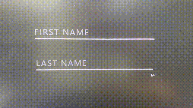
其实我觉得,想实现这种效果,代码量其实都不大,最重要的东西就是思路,首先,展示一下,这个东西的效果,下面在给大家讲讲我的思路吧!
代码展示!!! (直接化身 C V 工程师!!!) 下面也有大致的讲解
<!DOCTYPE html>
<html lang="en">

<head>
	<meta charset="UTF-8">
	<title></title>
	<style>
		* {
			margin: 0;
			padding: 0;
			box-sizing: border-box;
		}

		body {
			display: flex;
			justify-content: center;
			align-items: center;
			min-height: 100vh;
			flex-direction: column;
			gap: 30px;
			background: #222;
		}

		.inputBox {
			position: relative;
			width: 250px;
		}

		.inputBox input {
			width: 100%;
			padding: 10px 0 5px;
			background: transparent;
			outline: none;
			box-shadow: none;
			border: none;
			color: #fff;
			font-size: 1em;
			letter-spacing: 0.1em;
			transition: 0.5s;
		}

		.inputBox span {
			position: absolute;
			left: 0;
			padding: 10px 0 5px;
			pointer-events: none;
			font-size: 1em;
			color: rgba(255, 255, 255, 0.5);
			text-transform: uppercase;
			/* 定义无小写字母,仅有大写字母 */
			letter-spacing: 0.1em;
			/* 是增加(值为正)或减少(值为负)字符间距 */
			transition: 0.5s;
		}

		.inputBox input:valid~span,
		/* 表单元素的值需要根据指定条件验证时设置指定样式 */

		.inputBox input:focus~span

		/* 选择具有焦点的时候 */
			{
			color: #b0a4e3;
			transform: translateY(-16px);
			/* 将文字向Y轴(向上)平移16px */
			font-size: 0.65em;
		}

		.inputBox i

		/* 可见的一个线 */
			{
			position: absolute;
			left: 0;
			bottom: 0;
			width: 100%;
			height: 2px;
			background: #fff;
			overflow: hidden;
		}

		.inputBox i::before

		/* 在i标签的左边创建(伪元素)一个跟i等大的一条线,加上炫彩颜色 */
			{
			content: '';
			position: absolute;
			left: -100%;
			width: 100%;
			height: 100%;
			background: linear-gradient(90deg, #EEBD89, #D13ABD, #C973FF, #6CC6CB, #9FA5D5, #EAD6EE);
			animation: runing 1s linear infinite;
			transition: 0.5s;
		}

		.inputBox input:valid~i::before,
		.inputBox input:focus~i::before {
			left: 0;
		}

		/* 创建动画 */
		@keyframes runing {
			0% {
				background-position-x: 0;
			}

			100% {
				background-position-x: 250px;
			}
		}
	</style>
</head>

<body>
	<div class="inputBox">
		<input type="text" required="required">
		<span>First Name</span>
		<i></i>
	</div>
	<div class="inputBox">
		<input type="text" required="required">
		<span>Last Name</span>
		<i></i>
	</div>
</body>

</html>
首先,我们看到这种效果就应该想到C3的动画效果,然后心里应该有一个大概的框架,就是这样
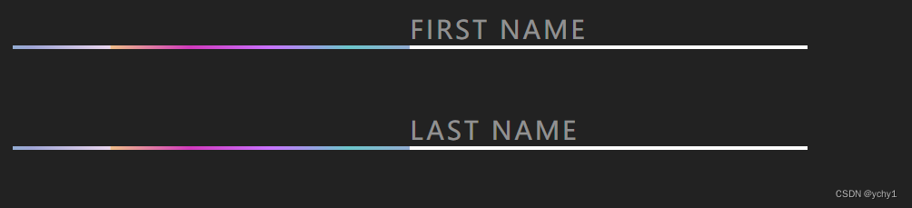
左边是一条渐变的线,当input框有焦点的时候,跑到白色线那里,中间使用一个动画效果。
那么废话不多说了,上HTML代码!
	<div class="inputBox">
		<input type="text" required="required">
		<span>First Name</span>
		<i></i>
	</div>
	<div class="inputBox">
		<input type="text" required="required">
		<span>Last Name</span>
		<i></i>
	</div>
下面给body,input框和里面的文字加上样式
body
{
	display: flex;
	justify-content: center;
	align-items: center;
	min-height: 100vh;
	flex-direction: column;
	gap: 30px;
	background: #222;
}
.inputBox
{
	position: relative;
	width: 250px;
}
.inputBox input
{
	width: 100%;
	padding: 10px 0 5px;
	background: transparent;
	outline: none;
	box-shadow: none;
	border: none;
	color: #fff;
	font-size: 1em;
	letter-spacing: 0.1em;
	transition: 0.5s;
}
.inputBox span
{
	position: absolute;
	left: 0;
	padding: 10px 0 5px;
	pointer-events: none;
	font-size: 1em;
	color: rgba(255,255,255,0.5);
	text-transform: uppercase;  /* 定义无小写字母,仅有大写字母 */
	letter-spacing: 0.1em;  /* 是增加(值为正)或减少(值为负)字符间距 */
	transition: 0.5s;
}
实现文字向上方移动的效果,思想:向上移动然后文字变小
.inputBox input:valid ~ span,  /* 表单元素的值需要根据指定条件验证时设置指定样式 */

.inputBox input:focus ~ span /* 选择具有焦点的时候 */
{
	color: #b0a4e3;
	transform: translateY(-16px);  /* 将文字向Y轴(向上)平移16px */
	font-size: 0.65em;
}
给i标签加上样式,然后给i标签里面加一个伪元素并加上样式,再加上动画,实现丝滑的效果
.inputBox i  /* 可见的一个线 */
{
	position: absolute;
	left: 0;
	bottom: 0;
	width: 100%;
	height: 2px;
	background: #fff;
	overflow: hidden;
}

.inputBox i::before   /* 在i标签的左边创建(伪元素)一个跟i等大的一条线,加上炫彩颜色 */
{
	content: '';
	position: absolute;
	left: -100%;
	width: 100%;
	height: 100%;
	background: linear-gradient(90deg,#EEBD89,#D13ABD,#C973FF,#6CC6CB,#9FA5D5,#EAD6EE);
	animation: runing 1s linear infinite;
	transition: 0.5s;
}
.inputBox input:valid ~ i::before,
.inputBox input:focus ~ i::before
{
	left: 0;
}
/* 创建动画 */
@keyframes runing
{
	0%
	{
		background-position-x: 0;
	}
	100%
	{
		background-position-x: 250px;
	}
}


 1455
1455

 被折叠的 条评论
为什么被折叠?
被折叠的 条评论
为什么被折叠?
 到【灌水乐园】发言


