


背景
实习过程中,发现滴滴H5页面中,多处用到了进度条,部分是渐变色,部分是纯色
我觉得每次都去单独写一遍组件很麻烦,虽然可以copy上一份代码,但是还是需要微调
不如直接封装一个通用组件,使用上会方便很多
参数介绍
| 参数 | 说明 | 类型 | 可选值 | 默认值 |
| progress | 百分比(必填) | number | 0-1 | 0 |
| progressOption | 进度条配置选项 | object | -- | {} |
接下来是progressOption的可选属性
| 参数 | 说明 | 类型 | 可选值 | 默认值 |
| strokeWidth | 进度条的宽度,单位 px | number | -- | 10 |
| radius | 圆环的半径,单位是px | number | -- | 50 |
| backColor | 进度条的背景颜色 | string | -- | white |
| startColor | 进度条渐变色的开始 | array | -- | [160,209,236] |
| endColor | 进度条渐变色的结束 | array | -- | [179,160,236] |
| progressTextColor | 进度条中文字的颜色 | string | -- | black |
| progressTextSize | 进度条中文字的大小 | number | -- | 20 |
| progressTextWeight | 进度条中文字的粗细 | string | -- | normal |
| progressTextFamily | 进度条中文字的字体 | string | -- | -- |
| showProgressText | 是否展示进度百分比 | boolean | -- | true |
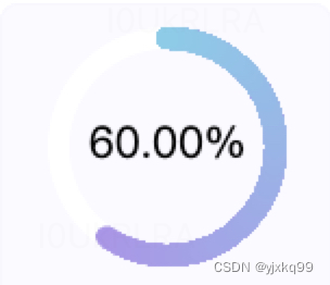
默认效果
在手机上没有这么粗糙,图片的问题
使用方法
使用很简单,只用给一个参数就够了(进度百分比)
// progressOption可不带,只需要携带一个参数progress,0.6含义为:60%
<circular-progress-bar :progress="0.6" :progressOption="progressOption"></circular-progress-bar>
代码
用一个props配置项来修改,这个配置项可以接收所有的配置,例如样式修改,然后通过Object.assign去覆盖默认的样式对象
原理就是使用circle标签的边框来充当进度条
circle内部不填充,只渲染边框
用了1 + 100 个circle标签
第一个底部circle标签来充当背景色
然后用一个循环,生成100个circle标签,每一个circle标签的颜色与长度各不相同,通过覆盖,做成渐变的效果
通过给定的rgb颜色,然后通过步数为100,生成一个颜色数组,
(就相当于总共一百步,然后计算每一步的颜色,通过rgb的增量来算)
得到每一步的颜色后,计算每一步的长度,通过总长度/100步 * index。
最后一定要反转数组,因为数组里面是从起始到结束,起始的步数很短,全部都会被最后一步覆盖,所以应该是从结束到起始开始渲染
还有就是一定要记得逆时针旋转90度:
transform: rotate(-90deg)
因为circle标签边框默认是从水平方向顺时钟开始渲染,也就是圆环的右侧水平位置,所以需要我们逆时针旋转90度
<template>
  <svg
  :height="option.size"
  :width="option.size"
  x-mlns="http://www.w3.org/200/svg"
  class="progress"
  >
    <circle
      :r="option.radius"
      :cx="option.cx"
      :cy="option.cy"
      :stroke="option.backColor"
      :stroke-width="option.strokeWidth"
      fill="none"
    />
    <circle
      v-for="(item, index) in arcArr"
      :key="index"
      :r="option.radius"
      :cx="option.cx"
      :cy="option.cy"
      :stroke="item.color"
      :stroke-dasharray="item.arcLength"
      :stroke-width="option.strokeWidth"
      fill="none"
      stroke-linecap="round"
    />
    <text
      v-if="option.showProgressText"
      :x="option.cx"
      :y="option.cy"
      text-anchor="middle"
      dominant-baseline="middle"
      :font-size="option.progressTextSize"
      :fill="option.progressTextColor"
      :font-weight="option.progressTextWeight"
      :font-family="option.progressTextFamily"
      class="progress-text"
    >
      {{ progressPercentage }}
    </text>
  </svg>
</template>
<script>
/* eslint-disable */
export default {
  name: 'circular-progress-bar',
  props: {
    progress: {
      type: Number,
      required: true,
      default: 0,
      validator (value) {
        return value >= 0 && value <= 1
      }
    },
    progressOption: {
      type: Object,
      default: () => { }
    }
  },
  computed: {
    // 进度百分比文字
    progressPercentage () {
      return parseFloat((this.progress * 100).toFixed(2)).toFixed(2) + '%'
    },
    arcArr () {
      if (this.progress === 0) return []
      const circleLength = Math.floor(2 * Math.PI * this.option.radius)
      const progressLength = this.progress * circleLength
      const step = 100 // 设置到100则已经比较难看出来颜色断层
      const gradientColor = (startRGB, endRGB, step) => {
        // 定义一个渐变颜色函数,根据给定的起始颜色、结束颜色和步数生成一个颜色数组
        // 返回一个由起始颜色到结束颜色之间渐变的颜色数组
        const startR = startRGB[0]
        const startG = startRGB[1]
        const startB = startRGB[2]
        const endR = endRGB[0]
        const endG = endRGB[1]
        const endB = endRGB[2]
        const sR = (endR - startR) / step
        const sG = (endG - startG) / step
        const sB = (endB - startB) / step
        const colorArr = []
        for (let i = 0; i < step; i++) {
          const color = `rgb(${Math.floor(sR * i + startR)},${Math.floor(sG * i + startG)},${Math.floor(sB * i + startB)})`
          colorArr.push(color)
        }
        return colorArr
      }
      const colorArr = gradientColor(this.option.startColor, this.option.endColor, step)
      // 计算每个步进中的弧长
      const arcLengthArr = colorArr.map((color, index) => ({
        arcLength: `${index * (progressLength / 100)},100000000`,
        color: color
      }))
      arcLengthArr.reverse()
      return arcLengthArr
    },
    option () {
      // 进度条的可配置项
      const baseOption = {
        radius: 50, // 半径,作用是控制圆的大小,单位是px
        strokeWidth: 10, // 圆环的宽度,即进度条的宽度,单位是px
        backColor: 'white', // 圆环的背景颜色,即进度条的背景颜色
        startColor: [160, 209, 236], // 用于渐变色的开始
        endColor: [179, 160, 236], // 用于渐变色的结束
        progressTextColor: 'black', // 进度条中文字的颜色
        progressTextSize: 20, // 进度条中文字的大小
        progressTextWeight: 'normal', // 进度条中文字的粗细
        progressTextFamily: '', // 进度条中文字的字体
        showProgressText: true // 是否显示进度条中的文字
      }
      Object.assign(baseOption, this.progressOption)
      baseOption.cy = baseOption.cx = baseOption.radius + baseOption.strokeWidth
      baseOption.size = (baseOption.radius + baseOption.strokeWidth) * 2
      return baseOption
    }
  }
}
</script>
<style scoped lang="stylus">
.progress
  transform: rotate(-90deg)
.progress-text
  transform: rotate(90deg)
  transform-origin: 50% 50%
</style>


 4460
4460


 被折叠的 条评论
为什么被折叠?
被折叠的 条评论
为什么被折叠?
 到【灌水乐园】发言


