


1 左边固定,右边自适应
           css:
            * {
				padding: 0;
				margin: 0;
				list-style: none;
			}
			html, body {
				height: 100%;
			}
			.container {
				padding-left: 200px;
				position: relative;
				height: 100%;
			}
			.left {
				position: absolute;
				width: 200px;
				height: 100%;
				top: 0;
				left: 0;
				background: red;
			}

        html:
        <div class="container">
			<div class="left">这边是导航</div>
			<div class="con">
				这里是内容盒子
			</div>
		</div>
效果图:

2 右边固定
            * {
				padding: 0;
				margin: 0;
				list-style: none;
			}
			html, body {
				height: 100%;
			}
			.container {
				padding-right: 200px;
				position: relative;
				height: 100%;
			}
			.left {
				position: absolute;
				width: 200px;
				height: 100%;
				top: 0;
				right: 0;
				background: red;
			}
<div class="container">
<div class="left">这边是导航</div>
<div class="con">
这里是内容盒子这里是内容盒子这里是内容盒子这里是内容盒子这里是内容盒子这里是内容盒子这里是内容盒子
这里是内容盒子这里是内容盒子这里是内容盒子这里是内容盒子这里是内容盒子这里是内容盒子
</div>
</div>效果图

3 两边固定,中间自适应
            * {
				padding: 0;
				margin: 0;
				list-style: none;
			}
			html, body {
				height: 100%;
			}
			.container {
				padding-left: 200px;
				padding-right: 200px;
				position: relative;
				height: 100%;
			}
			.left {
				position: absolute;
				width: 200px;
				height: 100%;
				top: 0;
				left: 0;
				background: red;
			}
			.right {
				position: absolute;
				width: 200px;
				height: 100%;
				top: 0;
				right: 0;
				background: red;
			}
<div class="container">
<div class="left">这边是导航</div>
<div class="right">这边是导航</div>
<div class="con">
这里是内容盒子这里是内容盒子这里是内容盒子这里是内容盒子这里是内容盒子这里是内容盒子这里是内容盒子
这里是内容盒子这里是内容盒子这里是内容盒子这里是内容盒子这里是内容盒子这里是内容盒子
</div>
</div>效果图:

4 四周固定,中间自适应
            * {
				padding: 0;
				margin: 0;
				list-style: none;
			}
			html, body {
				height: 100%;
			}
			.container {
				position: relative;
				height: 100%;
			}
			/* 写法一  */
			/*.con {
				padding: 100px;
			}*/
			/*  写法二  */
			.con {
				position: absolute;
				top: 100px;
				left: 100px;
				bottom: 100px;
				right: 100px;
			}
			.left {
				position: absolute;
				width: 100px;
				top: 100px;
				bottom: 0;
				background: red;
				left: 0;
			}
			.right {
				position: absolute;
				width: 100px;
				top: 0;
				right: 0;
				bottom: 100px;
				background: yellow;
			}
			.top {
				position: absolute;
				height: 100px;
				background: deepskyblue;
				top: 0;
				left: 0;
				right: 100px;
			}
			.bottom {
				position: absolute;
				height: 100px;
				background: grey;
				bottom: 0;
				right: 0;
				left: 100px;
			}
<div class="container">
<div class="top">这边是头部这边是头部这边是头部这边是头部这边是头部这边是头部------------------------------这边是头部这边是头部这边是头部这边是头部这边是头部这边是头部</div>
<div class="left">这边是导航</div>
<div class="bottom">这边是导航</div>
<div class="right">这边是导航</div>
<div class="con">
这里是内容盒子这里是内容盒子这里是内容盒子这里是内容盒子这里是内容盒子这里是内容盒子这里是内容盒子
这里是内容盒子这里是内容盒子这里是内容盒子这里是内容盒子这里是内容盒子这里是内容盒子
</div>
</div>效果图:

绝对居中问题:
1 固定宽高
        css:
          * {
				padding: 0;
				margin: 0;
				list-style: none;
			}
			/*已知宽高,绝对居中*/
		    div {
		    	width: 200px;
		    	height: 200px;
		    	background: red;
		    	position: absolute;
		    	top: 50%;
		    	left: 50%;
		    	/*写法一:IE9+*/
		    	/*transform: translate(-50%, -50%);*/
		    	/*写法二:兼容性高*/
		    	margin-top: -100px;
		    	margin-left: -100px;
		    }
        html:
            <div></div>
2 固定宽度,高度不定
css:
* {
padding: 0;
margin: 0;
list-style: none;
}
/*已知宽高,绝对居中*/
div {
width: 100px;
background: red;
position: absolute;
top: 50%;
left: 50%;
/*写法一:IE9+*/
transform: translate(-50%, -50%);
}
html:
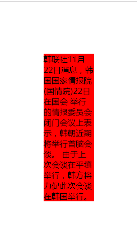
<div>韩联社11月22日消息,韩国国家情报院(国情院)22日在国会
举行的情报委员会闭门会议上表示,韩朝近期将举行首脑会谈。
由于上次会谈在平壤举行,韩方将力促此次会谈在韩国举行。</div>
效果:
3 宽高均不固定
css:
            * {
				padding: 0;
				margin: 0;
				list-style: none;
			}
			html, body {
				height: 100%;
			}
			.container {
				height: 100%;
				width: 100%;
				text-align: center;
				display: table;
				overflow:hidden;
			}
			.con {
				display:table-cell;
				vertical-align: middle;
			}
			span {
				display:inline-block;
				width: 15px;
				height: 8px;
				background: url(img/slide.PNG) no-repeat;
				background-size: contain;
				margin-left: 4px;
			}
html:
        <div class="container">
			<div class="con">
				点击加载更多<span></span>
			</div>
		</div>
效果图:


 862
862


 被折叠的 条评论
为什么被折叠?
被折叠的 条评论
为什么被折叠?
 到【灌水乐园】发言


