


声明:此文为狂神说css课程的学习记录,不喜勿喷
1.入门
<!DOCTYPE html>
<html lang="en">
<head>
    <meta charset="UTF-8">
    <title>index</title>

<!--规范<style>可以编写CSS代码
语法:
    选择器{
        声明1;
        声明2;
        ......
    }

-->
    <style>
        h1{
            color: blue;
        }
    </style>

</head>
<body>
<h1>一级标题level1</h1>
</body>
</html>
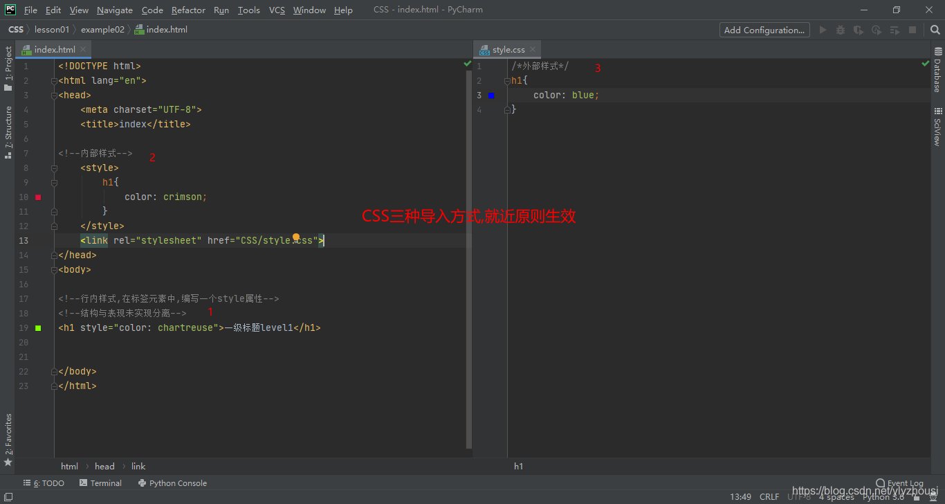
2.css与html分离
建议使用这种规范
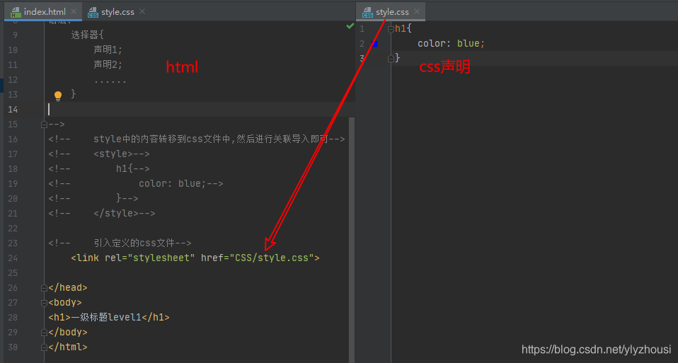
css导入方式优先级
就近原则,离元素近的生效
3.选择器
作用:选择页面中某一个或一类元素
3.1.基本选择器
优先级 id选择器>class选择器>标签选择器
标签选择器
<!DOCTYPE html>
<html lang="en">
<head>
    <meta charset="UTF-8">
    <title>标签选择器</title>

    <style>
        /*标签选择器可以选择页面上的一类标签*/
        h1{
            color: #ff0000;
            background: wheat;
            border-radius: 3px;
        }
        p{
            font-size: 50px;
        }
    </style>
</head>
<body>

<h1>一级标题level1</h1>
<h1>一级标题level1</h1>
<h1>一级标题level1</h1>
<p>段落</p>


</body>
</html>
类选择器 class
<!DOCTYPE html>
<html lang="en">
<head>
    <meta charset="UTF-8">
    <title>Title</title>

    <style>
        /*类选择器对一类标签进行不同的设置*/
        /*
        类选择器的格式, 以.class名称{}
        可以通过class将多个标签归类,可以复用, 可以跨标签使用
        */
        .yu{
            color: red;
        }
        .gan{
            color: blue;
        }
    </style>
</head>
<body>

<h1 class="yu">一级标题level1</h1>
<h1 class="gan">一级标题level1</h1>
<h1>一级标题level1</h1>
<h3 class="gan">三级标题level3</h3>

<p class="gan">段落</p>

</body>
</html>
id选择器
<!DOCTYPE html>
<html lang="en">
<head>
    <meta charset="UTF-8">
    <title>Title</title>

    <style>

        /*
        id选择器,#id名称{}
        id必须全局唯一
        不遵循就近原则 优先级 id选择器>class选择器>标签选择器
        */
        #gan{
            color: red;
        }
        #yu{
            color: #f50f72;
        }
        .gan{
            color: blue;
        }
    </style>
</head>
<body>

<h1 id="yu">一级标题level1</h1>
<h1 id="gan">一级标题level1</h1>
<h1 class="gan">一级标题level1</h1>
<h3>三级标题level3</h3>

<p>段落</p>


</body>
</html>
3.2.层次选择器
<!DOCTYPE html>
<html lang="en">
<head>
    <meta charset="UTF-8">
    <title>Title</title>
    <style>
        /*p{*/
        /*    color: green;*/
        /*}*/
    /*后代选择器*/
    /*    body p{*/
    /*        color: red;*/
    /*    }*/
    /*子选择器*/
    /*    body>p{*/
    /*        color: blue;*/
    /*    }*/
    /*同辈选择器*/
    /*    .active + p{*/
    /*        color: yellow;*/
    /*    }*/

    /*通用选择器*/
        .active~p{
            color: #0ca2e8;
        }

    </style>
</head>
<body>
<p>p0</p>
<p class="active">p1</p>
<p>p2</p>
<p>p3</p>

<ul>
    <li>
        <p>p4</p>
    </li>
    <li>
        <p>p5</p>
    </li>
    <li>
        <p>p6</p>
    </li>

</ul>

<p>p7</p>
<p>p8</p>


</body>
</html>
后代选择器:在某个元素的后面
body p{
    color: red;
}
子选择器: 一代
body>p{
    color: blue;
}
相邻兄弟选择器(向下一个邻居生效)
.active + p{
    color: yellow;
}
通用选择器(向下的所有兄弟标签)
.active~p{
    color: #0ca2e8;
}
3.3.结构伪类选择器
<!DOCTYPE html>
<html lang="en">
<head>
    <meta charset="UTF-8">
    <title>Title</title>
<!--避免使用class和id选择器-->
    <style>
        /*ul的第一个元素*/
        ul li:first-child{
            color: red;
        }
        /*ul的最后个元素*/
        ul li:last-child{
            color: green;
                 }
        /*选中p1
        选中当前p元素的父级元素的第n个子元素,并且是当前同类元素才生效
        */
        p:nth-child(2){
            color: blue;
        }
        /*选中p1
        选中当前p元素的父级元素的p元素第n个子元素,类型
        */
        p:nth-of-type(1){
            color: yellow;
        }
        /*链接变颜色,特效*/
        a:hover{
            color: yellow;
        }

    </style>
</head>
<body>
<h1>h1</h1>
<p>p1</p>
<p>p2</p>
<p>p3</p>
<a href="">链接</a>
<ul>
    <li>li1</li>
    <li>li2</li>
    <li>li3</li>

</ul>

<p>p7</p>
<p>p8</p>


</body>
</html>
ul的第一个元素
/*ul的第一个元素*/
ul li:first-child{
    color: red;
}
ul的最后个元素
/*ul的最后个元素*/
ul li:last-child{
    color: green;
}
选中当前p元素的父级元素的第n个子元素
/*选中p1
选中当前p元素的父级元素的第n个子元素
*/
p:nth-child(1){
    color: blue;
}
选中当前p元素的父级元素的p元素第n个子元素,类型
/*选中p1
选中当前p元素的父级元素的p元素第n个子元素,类型
*/
p:nth-of-type(1){
    color: yellow;
}
3.4.属性选择器
可以使用正则表达式进行匹配
<!DOCTYPE html>
<html lang="en">
<head>
    <meta charset="UTF-8">
    <title>Title</title>
    <style>
        .demo a{
            float: left;
            display: block;
            height: 50px;
            width: 50px;
            border-radius: 3px;
            background: wheat;
            text-align: center;
            color: #0ca2e8;
            text-decoration: none;
            margin-right: 5px;
            font: bold 20px/50px "Times New Roman";
        }

    /* 存在id属性的元素*/
    /*    a[id]{*/
    /*        background: yellow;*/
    /*    }*/
    /* 存在id=first属性的元素*/
    /*    a[id=first]{*/
    /*        background: yellow;*/
    /*    }*/
       /* class 中有links的元素
       = 绝对等于 *= 包含即可 ^=表示开头  $表示结尾
       */
       /*a[class*="links"]{*/
       /*     background: yellow;*/
       /* }*/

    /*  选中herf中以http开头的元素  */
    /*    a[href^=tttp]{*/
    /*        background: yellow;*/
    /*    }*/

        /*  选中herf中以image结尾的元素  */
        a[href$=image]{
            background: yellow;
        }


    </style>

</head>
<body>

<p class="demo">

    <a href="https://i.csdn.net/#/msg/notice" class="links item test" id="first">1</a>
    <a href="https://www.runoob.com/css3/css3-borders.html" class="links item test" target="_blank" title="test">2</a>
    <a href="https://www.runoob.com/try/try.php?filename=trycss3_border-image">3</a>
    <a href="https://blog.csdn.net/ylyzhousi/article/details/107155534">4</a>
    <a href="tttp://www.csdn.net/" class="links item">5</a>
    <a href="https://blog.csdn.net/" target="_blank" id="hello">6</a>
    <a href="https://download.csdn.net/" class="green">7</a>
    <a href="https://www.baidu.com/" title="333">8</a>
    <a href="https://xueshu.baidu.com/" id="footer">9</a>
    <a href="https://tieba.baidu.com/index.html" target="_parent" id="ppp">10</a>


</p>

</body>
</html>
4.美化网页元素
span 标签: 重点突出的字,使用span
<!DOCTYPE html>
<html lang="en">
<head>
    <meta charset="UTF-8">
    <title>Title</title>

    <style>
        #NEU{
            color: red;
            font-size: 20px;
        }

    </style>
</head>
<body>

欢迎报考 <span id="NEU">东北大学</span>

</body>
</html>
4.1.字体样式
<!DOCTYPE html>
<html lang="en">
<head>
    <meta charset="UTF-8">
    <title>Title</title>
    <style>
        p{
            font: oblique bolder 20px "宋体";
        }

    </style>
</head>
<body>

<p class="p1">
棋圣们一面绞尽脑汁,一面审度形势。范西屏丢了羽扇,先失飘然神韵;刘仲甫扯去纶巾,不见大家风采。瘸子先生挨不到桌边,急得鼠窜,却被诸多大腿一绊一跌,显出饿死鬼的猴急。
</p>

</body>
</html>
4.2.文本样式
<!DOCTYPE html>
<html lang="en">
<head>
    <meta charset="UTF-8">
    <title>字体样式</title>
<!--
font-family 字体
font-size 字体大小
font-weight 字体的粗细
color 字体颜色
-->
    <style>
        body{
            font-family: "Times New Roman", 宋体;
        }

        h1{
            font-size: 40px;
            font-family: 楷体;
            color: brown;
            text-align: center;
        }
        .p1{
            font-weight: bolder;
            text-decoration: underline;
        }
        /*行高和块的高度一致的话,可以实现上下居中*/
        p{
            text-indent: 2em;
            line-height: 35px;
        }

    </style>
</head>
<body>
<h1>胜天半子</h1>

<p class="p1">
棋圣们一面绞尽脑汁,一面审度形势。范西屏丢了羽扇,先失飘然神韵;刘仲甫扯去纶巾,不见大家风采。瘸子先生挨不到桌边,急得鼠窜,却被诸多大腿一绊一跌,显出饿死鬼的猴急。
</p>
<p>
骊山老母最擅计算,已知结局,扁着没牙嘴巴喃喃道:“胜负半子,全在右下角那一劫上……”心里急,手上一运仙力,竟把龙头拐杖折断。   果然,官子收尽,开始了右下角的劫争。围棋创造者立下打劫规则,真正奇特之极:出现双方互相提子的局面,被提一方必须先在别处走一手棋,逼对方应了,方可提还一子。如此循环,就叫打劫。打劫胜负,全在双方掌握的劫材上。浑沌的大龙死而不僵,此时成了好劫材,逼得蚊帐中人一手接一手应,直到提尽为止。黑阵内的白棋残子也大肆骚乱,扰得浑沌终不得粘劫。两个人你提过去,我提回来,为此一直争得头破血流。
</p>

<p>
Nothing succeeds lacks confidence. When you are truly and justifiably confident, it radiates from you like sunlight, and attracts success to you like a magnet. It's important to believe in yourself. Believe that you can do it under any circumstances, because if you believe you can, then you really will.The belief keeps you searching for answers, which means that pretty soon you will get them. Confidence is more than an attitude. It comes from knowing exactly where you are going and exactly how you are going to get there. It comes from acting with integrity and confidence. It comes from a strong sense of purpose. It comes from a strong commitment to take responsibility, rather than just letting life happen. One way to develop self-confidence is to do the thing you fear and to get a record of successful experiences behind you. Confidence is compassionate and understanding. It is not arrogant. Arrogance is born out of fear and insecurity, while confidence comes from strength and integrity.
</p>

</body>
</html>
4.3.超链接伪类
<!DOCTYPE html>
<html lang="en">
<head>
    <meta charset="UTF-8">
    <title>Title</title>
    <style>
        /*默认颜色*/
        a{
            text-decoration: none;
            color: blue;
        }
        /*悬浮颜色*/
        a:hover{
            color: #f3710e;
        }
        /*鼠标按住未释放时颜色*/
        a:active{
            color: green;
        }
    </style>
</head>
<body>

<a href="#">
    <img src="images/qq.jpg" alt="">
</a>

<p>
    <a href="#">一张精美的图片</a>
</p>

<p>
    <a href="#">作者:gou</a>
</p>
<p>
    <a href="#">价格:100$</a>
</p>


</body>
</html>
4.4.列表
4.5.背景
颜色
图片平铺
<style>
        div{
            width: 500px;
            height: 400px;
            border: 1px solid red ;
            /*默认时全部平铺的 repeat*/
            background-image: url("images/qq.jpg");
        }
        .div1{
            /*水平平铺*/
            background-repeat: repeat-x;
        }
        .div2{
            /*垂直平剖面*/
            background-repeat: repeat-y;
        }
        .div3{
            /*不平铺*/
            background-repeat: no-repeat;
        }
    </style>
background: rgba(232, 232, 200, 0.83) url("../images/down.jpg") 250px 15px  no-repeat;
或
background-image: url("../images/right.jpg");
background-repeat: no-repeat;
background-position: 215px 5px;
4.6.渐变
网站 https://www.grabient.com/
background-color: #FFFFFF;
background-image: linear-gradient(180deg, #FFFFFF 0%, #6284FF 50%, #FF0000 100%);
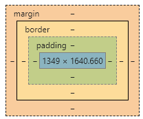
5.盒子模型
5.1.什么是盒子
margin: 外边距
padding : 内边距
border : 边框
5.2.边框
边框的颜色
边框的样式
边框的粗细
5.3.内外边距
margin: 10px 5px; 上下左右
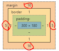
padding: 2px 4px; 同样上下左右
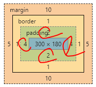
盒子的计算方式: margin + border + padding + 内容宽度
5.4.圆角边框
/*左上 右上 右下 左下    顺时针*/
/*画圆

*/
div{
    width: 100px;
    height: 100px;
    border: 10px solid red;
    /*border-radius: 50px 20px;*/
    border-radius: 60px;
}
圆角图片
<!DOCTYPE html>
<html lang="en">
<head>
    <meta charset="UTF-8">
    <title>Title</title>

    <style>
        img{
            border-radius: 25px;
        }
    </style>
</head>
<body>
<img src="images/qq.jpg" alt="">
</body>
</html>
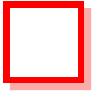
5.5.盒子阴影
width: 100px;
height: 100px;
border: 10px solid red;
box-shadow: #FAACA8 10px 10px 1px;
几个资源网站
飞冰 https://ice.work/
模板之家 http://www.cssmoban.com/
源码之家 https://www.mycodes.net/
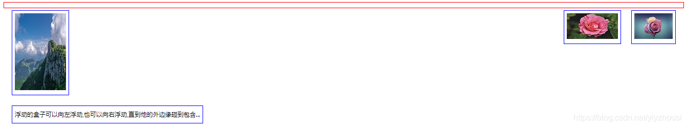
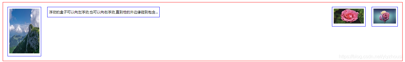
6.浮动
6.1.标准文档流
块级元素: 独占一行
h1~h6 p div 列表…
行内元素: 不独占一行
span a img strong em…
行内元素可以包含在块级元素之中
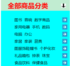
qq会员导航栏
6.2.display
div{
            width: 100px;
            height: 100px;
            border: 1px solid red;
            display: inline-block;
        }
        span{
            width: 100px;
            height: 100px;
            border: 1px solid red;
            display: inline-block;
        }
6.3.float
1.标准文档流

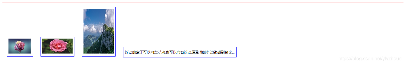
2.左右浮动
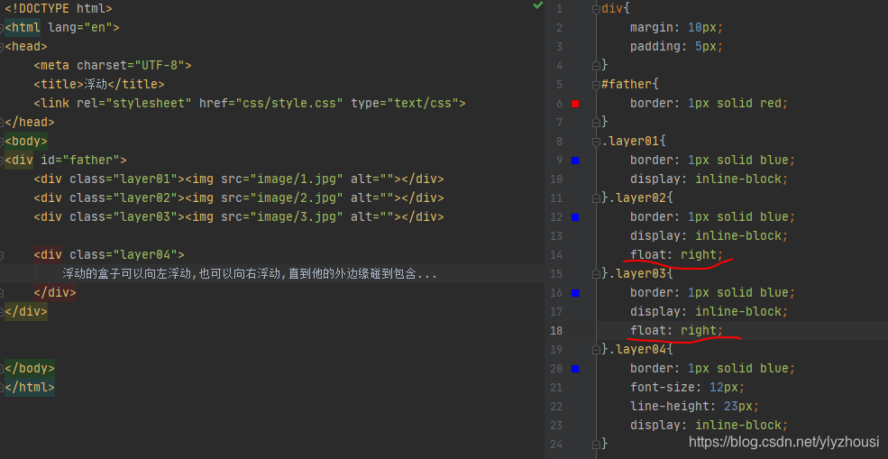
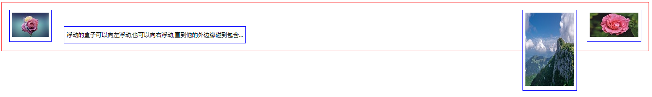
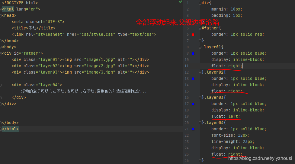
6.4.父级边框沦陷问题
clear: left		左侧不允许有浮动
clear: right	右侧不允许有浮动
clear: both     两侧不允许有浮动元素
clera: none     允许
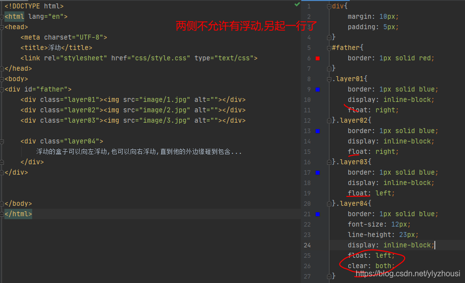
解决方案
1.增加父级元素的高度
#father{
    border: 1px solid red;
    height: 500px;
}
2.增加一个空的div,然后清除浮动
<div class="clear"></div>
 .clear{
     clear: both;
     margin: 0;
     padding: 0;
 }
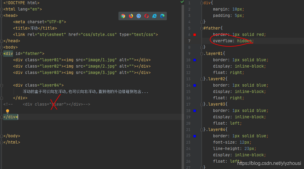
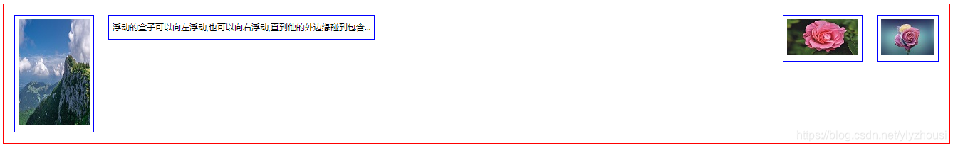
3.overflow
在父级元素中增加一个overflow
overflow: hidden 隐藏
overflow:auto 自动
overflow:scroll 滚动条
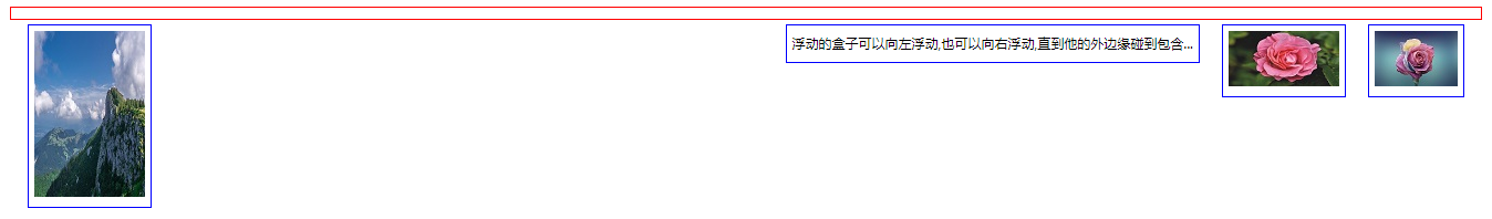
<div id="content">
    <img src="image/1.jpg" alt="">
    <p>
        layui 是一款采用自身模块规范编写的前端 UI 框架,遵循原生 HTML/CSS/JS 的书写与组织形式,门槛极低,拿来即用。其外在极简,却又不失饱满的内在,体积轻盈,组件
    </p>
</div>
#content{
    width: 200px;
    height: 150px;
    overflow: scroll;
}
4.父类添加一个伪类:after
#father:after{
    content: '';
    display: block;
    clear: both;
}
小结:
1.浮动元素后面增加空的div
简单,但是代码中尽量避免空的div
2.设置父级元素的高度
简单, 元素假设有了固定的高度就会 被限制
3.overflow
简单,下拉的一些场景避免使用
4.父类添加一个伪类:after(推荐)
6.5.对比
display 方向不可控制
float 需要解决父级元素塌陷的问题
7.定位
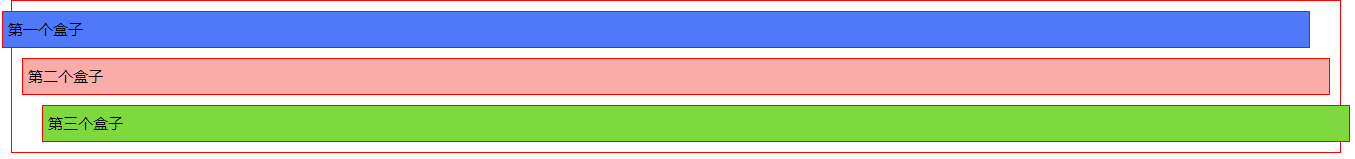
7.1.相对定位
position: relative; 相对定位并没有浮动,仍然在标准文档流中,原来的位置仍被保留
top:20px
right:20px
left:20px
bottom:20px
<!DOCTYPE html>
<html lang="en">
<head>
    <meta charset="UTF-8">
    <title>Title</title>
<!--
相对定位
相对于自己原来的位置进行偏移
-->
    <style>
        /*body{*/
        /*    padding: 20px;*/
        /*}*/
        div{
            margin: 10px;
            padding: 5px;
            font-size: 15px;
            line-height: 25px;
        }
        #father{
            border: 1px solid red;
            padding: 0;

        }
        #first{
            border: 1px solid red;
            background-color: #4e7afa;
            position: relative;
            /*top: 20px;*/
            left: -20px;
        }
        #second{
            border: 1px solid red;
            background-color: #FAACA8;
        }
        #third{
            border: 1px solid red;
            background-color: #7dd93d;
            position: relative;
            left: 20px;
        }

    </style>
</head>
<body>

<div id="father">
    <div id="first">第一个盒子</div>
    <div id="second">第二个盒子</div>
    <div id="third">第三个盒子</div>
</div>
</body>
</html>
7.2.绝对定位
1.没有父级元素定位的前提下,相对于浏览器定位
#father{
    border: 1px solid red;
    padding: 0;
}
#first{
    border: 1px solid red;
    background-color: #4e7afa;
    position: absolute;
    top: 15px;
}
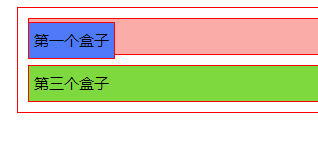
2.假设父级元素存在定位,则相当于父级元素进行偏移
#father{
    border: 1px solid red;
    padding: 0;
    position: relative;

}
#first{
    border: 1px solid red;
    background-color: #4e7afa;
    position: absolute;
    top: 15px;
}
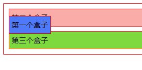
3.在父级元素范围内移动过
原来的位置仍被保留
7.3. 固定定位
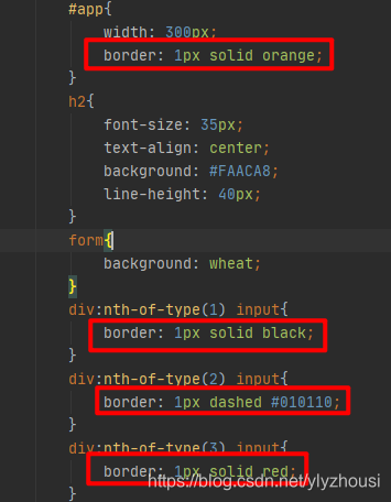
 <style>
        body{
            height: 1500px;
        }
        /*绝对定位*/
        div:nth-of-type(1){
            width: 100px;
            height: 100px;
            background-color: #FAACA8;
            position: absolute;
            right: 0;
            bottom: 0;
        }
        /*固定定位*/
        div:nth-of-type(2){
            width: 50px;
            height: 50px;
            background-color: #f3710e;
            position: fixed;
            right: 0;
            bottom: 0;
        }
</style>
7.4. z-index
css 图层
<!DOCTYPE html>
<html lang="en">
<head>
    <meta charset="UTF-8">
    <title>Title</title>
    <link rel="stylesheet" href="css/style.css">
</head>
<body>

<div id="content">

    <ul>
        <li><img src="image/1.jpg" alt=""></li>
        <li class="tipText">前端技术,京东搜索</li>
        <li class="tipBg"></li>
        <li>时间:2020.07.08</li>
        <li>地点:贺卡韩国</li>
    </ul>
</div>

</body>
</html>
#content{
    width: 200px;
    margin: 0;
    padding: 0;
    overflow: hidden;
    font-size: 12px;
    line-height: 25px;
    border: 1px solid red;

}
ul,li{
    margin: 0;
    padding: 0;
    list-style: none;
}
/*父级元素相对定位*/
#content ul{
    position: relative;
}

.tipText{
    color: red;
    font-weight: bolder;
    position: absolute;
    width: 200px;
    top: 120px;
    left: 46px;
    z-index: 20;   /*层级*/
}
.tipBg{
    background-color: #FAACA8;
    position: absolute;
    width: 200px;
    height: 25px;
    top: 120px;
    opacity: 0.5;   /*透明度*/

}


 扫一扫
扫一扫


 被折叠的 条评论
为什么被折叠?
被折叠的 条评论
为什么被折叠?
 到【灌水乐园】发言


