普通的 QSS 和 CSS 没什么区别,难度不大,但除此之外,想要使用好 QSS,还必须得掌握好 subcontrol,这个在 CSS 里没有,是 Qt 独有的。
什么是 subcontrol?一个复杂的 widget 由多个部分组成,它们可以是一个 widget,也可以是逻辑上的部件,例如 QCheckBox 由 icon 和 text 两个部分组成,不仅可以定义 text 的样式,还可以定义 icon 相关的样式,icon 部分就是 QCheckBox 的 subcontrol ::indicator。
在 Qt 的帮助文档里有所有 subcontrol 的说明,但是相信很多人看了还是不明白每个 subcontrol 具体是什么,这一节将使用可视化的方式标记出 subcontrol,介绍使用 QSS 自定义有 subcontrol 的常用 widget,这里的重心是怎么去 QSS subcontrol 而不是样式效果,复杂漂亮的界面需要大量的图片和更多的 QSS,这里不作介绍,以免陷入细节,掩盖本节主题。只要知道了原理,结合已经掌握的 QSS,找美工提供一套界面切图,就能很容易实现出来很专业效果了。
Subcontrol 的 QSS 和大多数 widget 的差不多,也支持盒子模型,可以自定义 color, background, background-color, background-image, border, padding, margin, width, height 等,也支持 Pseudo-States。
Subcontrol 的绘制位置由 subcontrol-origin、subcontrol-position, top, left 来指定,就先从这几个属性开始入手。
Subcontrol-Origin
subcontrol-origin 定义在 parent widget 中绘制 subcontrol 的参考矩形,默认在 padding 的矩形中绘制。
The origin rectangle of the subcontrol within the parent element.
If this property is not specified, the default is padding.
subcontrol-origin 有 4 个值可选:
- margin
- border
- padding
- content
下图展示了 subcontrol-origin 的值不同时,在 parent widget 的不同位置进行绘制 subcontrol:

Subcontrol-Position
已经知道 subcontrol 要在 parent widget 的某个矩形区域里绘制,如 padding rectangle,这个矩形这么大,具体要在这个矩形的哪个位置绘制呢?使用 subcontrol-position 来指定,相对于 subcontrol-origin。不同的 subcontrol 的 subcontrol-position 默认值不同,例如 QSlider 的 handle 的默认值是 center center,QSpinBox 的 up-button 的默认值是 right top。
The alignment of the subcontrol within the origin rectangle specified by subcontrol-origin.
If this property is not specified, it defaults to a value that depends on the subcontrol.
subcontrol-position 水平方向有 3 个值可选:
subcontrol-position 垂直方向有 3 个值可选:
用 Top 和 Left 微调 Subcontrol 的位置
Top 和 left 的主要作用是 :hover,:pressed 等发生时,用 top 和 left 偏移一点 subcontrol,这样就看到 subcontrol 的鼠标动作了,偏移是相对于 subcontrol-orign 和 subcontrol-position 确定的位置,top 和 left 的默认值是 0。
用下面的 QSS 总结一下 subcontrol-origin, subcontrol-position, top, left:
- QSpinBox 的 up-button 放置在 QSpinBox 的左边垂直剧中
- 当鼠标放到 up-button 上时,将其向右下角偏移 1px
- 当鼠标离开 up-button 后,up-button 移回到原来的位置
      1


      2


      3


      4


      5


      6


      7


      8


      9
|
      QSpinBox

      ::up-button {


      subcontrol-origin: margin;


      subcontrol-position: left center;


      }


      QSpinBox

      ::up-button

      :hover {


      top:

      1px;


      left:

      1px;


      }
|
接下来就具体的介绍每一个 Widget 有哪些 subcontrol,怎么 QSS 它们。
QCheckBox
QCheckBox 的 subcontrol 有 ::indicator,比较有意思的是,text 总是显示在 indicator 右边,所以如果 indicator 靠右边显示的话,text 很可能就看不到了。
QRadioButton 的 QSS 和 QCheckBox 的一样,所以就不在重复介绍。

下面 QSS 的效果如图:

      1


      2


      3


      4


      5


      6


      7


      8


      9


      10


      11


      12


      13


      14


      15


      16


      17


      18
|
QCheckBox {
color: lightgray;
background:
rgb(44, 44, 44);
border:
10px solid
rgb(76, 76, 76);
spacing:
10px;
padding:
10px;
}
QCheckBox
::indicator {
subcontrol-origin: border;
subcontrol-position: left center;
background: white;
border:
2px solid
rgb(170, 170, 170);
}
QCheckBox
::indicator
:checked {
background:
rgb(76, 76, 76);
}
|
修改 subcontrol-origin 和 subcontrol-position 为不同的值看看效果是什么。
QComboBox
QComboBox 的 subcontrol 有 drop-down。

下面 QSS 的效果如图:

      1


      2


      3


      4


      5


      6


      7


      8


      9


      10


      11


      12


      13


      14


      15


      16


      17


      18


      19


      20


      21


      22


      23


      24


      25


      26


      27
|
QComboBox {
color: lightgray;
background:
rgb(44, 44, 44);
border:
10px solid
rgb(76, 76, 76);
spacing:
10px;
padding:
10px;
}
QComboBox
::drop-down {
width:
15px;
height:
10px;
subcontrol-origin: border;
subcontrol-position: right center;
background: white;
border:
2px solid
rgb(170, 170, 170);
border-radius:
3px;
}
QComboBox
::drop-down
:hover {
background:
rgb(76, 76, 76);
}
QComboBox
::drop-down
:on {
background: black;
top:
1px;
left:
1px;
}
|
QSpinBox, QDateEdit, QTimeEdit, QDateTimeEdit
QSpinBox 的 subcontrol 有 ::up-button, ::down-button, ::up-arrow, ::down-arrow。
- up-button 显示在 QSpinBox 里,它的 subcontrol-origin 是相对于 QComboBox 的
- down-button 显示在 QSpinBox 里,它的 subcontrol-origin 是相对于 QComboBox 的
- up-arrow 显示在 up-button 里,它的 subcontrol-origin 是相对于 up-button 的
- down-arrwo 显示在 down-button 里,它的 subcontrol-origin 是相对于 down-button 的

QDateEdit, QTimeEdit, QDateTimeEdit 的 subcontrol 和 QSpinBox 是一样的,只需要把下面 QSS 里的 QSpinBox 换成 QDateEdit,QTimeEdit 或 QDateTimeEdit 即可。
下面 QSS 的效果如图,down-button 靠左垂直居中,up-button 靠右垂直居中:

      1


      2


      3


      4


      5


      6


      7


      8


      9


      10


      11


      12


      13


      14


      15


      16


      17


      18


      19


      20


      21


      22


      23


      24


      25


      26


      27


      28


      29


      30
|
      QSpinBox {


      color: lightgray;


      background:

      rgb(44, 44, 44);


      border:

      10px solid

      rgb(76, 76, 76);


      padding:

      5px;


      }


      QSpinBox

      ::down-button,

      QSpinBox

      ::up-button {


      subcontrol-origin: border;


      width:

      16px;


      height:

      10px;


      background: white;


      border:

      2px solid

      rgb(170, 170, 170);


      }


      QSpinBox

      ::down-button {


      subcontrol-position: center left;


      }


      QSpinBox

      ::up-button {


      subcontrol-position: center right;


      }


      QSpinBox

      ::up-arrow,

      QSpinBox

      ::down-arrow {


      subcontrol-origin: content;


      subcontrol-position: center center;


      width:

      6px;


      height:

      6px;


      background:

      rgb(76, 76, 76);


      }
|
QSlider
QSlider 的 subcontrol 有 ::groove(槽),::handle,::add-page 和 ::sub-page。
- groove 显示在 QSlider 里,它的 subcontrol-origin 是相对于 QSlider 的
- handle 显示在 groove 里,它的 subcontrol-origin 是相对于 groove 的
- sub-page 显示在 groove 里,它的 subcontrol-origin 是相对于 groove 的
- add-page 显示在 groove 里,它的 subcontrol-origin 是相对于 groove 的
- handle, sub-page, add-page 虽然都显示在 groove 里,但是都可以把它们扩展到 groove 外

下面 QSS 的效果如图:

      1


      2


      3


      4


      5


      6


      7


      8


      9


      10


      11


      12


      13


      14


      15


      16


      17


      18


      19


      20


      21


      22


      23


      24


      25


      26


      27


      28


      29


      30


      31


      32


      33


      34


      35


      36
|
QSlider {
background:
rgb(170, 170, 170);
padding:
2px;
height:
40px;
}
QSlider
::groove
:horizontal {
subcontrol-origin: content;
background:
rgb(76, 76, 76);
by giving it a height, it has a fixed size */
height:
20px;
}
QSlider
::handle
:horizontal {
background-color:
rgb(50, 50, 50);
width:
40px;
border-radius:
20px;
Expand outside the groove */
margin: -
10px
0;
}
QSlider
::sub-page
:horizontal {
background:
#999;
margin:
5px;
border-radius:
5px;
}
QSlider
::add-page
:horizontal {
background:
#666;
margin:
5px;
border-radius:
5px;
}
|
Groove 的默认高度和 QSlider content rectangle 的高度一样,给它一个高度值就可以让他有固定的高度了,把 groove 的 height 去掉试试。
Handle 的默认高度和 groove content rectangle 的高度一样,为了让起显示超出 groove,需要设置 margin 为负值,如果这个负值太小,显示超出 QSlider 的部分将看不到。Handle 的 subcontrol-position 没有作用,因为 handle 不是固定在一个地方的,而是根据 QSlider 的值动态计算显示的位置。
QProgressBar
QProgressBar 的 subcontrol 有 ::chunk。

对于 QProgressBar 的 QSS,大多数都是想把 chunk 定义为圆角矩形的样子,但是当它的 value 比较小时,chunk 的圆角会变成直角,即使使用图片都不行,效果很不理想,所以如果要修改 QProgressBar 的外观的话,推荐继承 QProgressBar 自己绘制或者使用 QStyle。
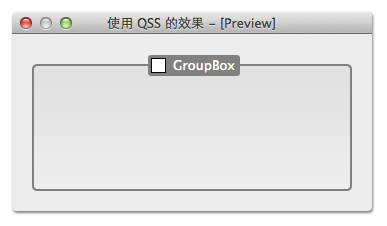
QGroupBox
QGroupBox 的 subcontrol 有 ::title 和 ::indicator。
- title 相对于 QGroupBox
- indicator 的 subcontrol-origin 和 subcontrol-position 自定义无效

下面 QSS 的效果如图:
      1


      2


      3


      4


      5


      6


      7


      8


      9


      10


      11


      12


      13


      14


      15


      16


      17


      18


      19


      20


      21


      22


      23


      24


      25


      26


      27


      28


      29
|
QGroupBox {
background-color:
qlineargradient(x1: 0, y1: 0, x2: 0, y2: 1,
stop: 0 #E0E0E0, stop: 1 #EEEEEE);
border:
2px solid gray;
border-radius:
5px;
margin-top:
10px;
}
QGroupBox
::title {
subcontrol-origin: margin;
subcontrol-position: top center;
padding:
2px
3px;
color: white;
margin-top:
2px;
background-color: gray;
border-radius:
3px;
spacing:
5px;
}
QGroupBox
::indicator {
width:
13px;
height:
13px;
border:
1px solid black;
background: white;
}
QGroupBox
::indicator
:checked {
background: yellow;
}
|
QTableView
QTableView 相关的 subcontrol 有 QTableView 的 ::item,QHeaderView 的 ::section 和 左上角的 QTableCornerButton 的 ::section。
QTableView 的 QSS 对于 QTableWidget 也是生效的。

下面 QSS 的效果如图:

      1


      2


      3


      4


      5


      6


      7


      8


      9


      10


      11


      12


      13


      14


      15


      16


      17


      18


      19


      20


      21


      22


      23


      24


      25


      26


      27


      28


      29


      30
|
QTableView,
QHeaderView,
QTableView
::item {
background: white;
}
QTableView
::item
:alternate {
background:
rgb(209, 231, 254);
}
QTableView
::item
:selected {
color: black;
background:
qlineargradient(
x1: 0, y1: 0, x2: 0, y2: 1,
stop: 0 #FAFBFE,
stop: 1 #DCDEF1);
}
QHeaderView
::section
:horizontal,
QTableCornerButton
::section {
background-color:
qlineargradient(spread:reflect,
x1:0, y1:0, x2:0, y2:1,
stop:0 rgba(255, 255, 255, 255),
stop:
1
rgba(164, 164, 164, 255));
border:
1px solid
rgb(153, 153, 153);
border-width:
0
1px
1px
0;
}
QHeaderView
::section
:vertical {
background:
#DDD;
border:
1px solid
rgb(153, 153, 153);
border-width:
0
1px
1px
0;
}
|
注意: QTableView::item 设置 padding, margin 没有的效果。
QTreeView
QTreeView 相关的 subcontrol 有 QHeaderView::section(和上面 QTableView 的 header view 的 QSS 一样,其实就是一个东西),QTreeView::item 和 QTreeView::branch。
QTreeView 的 QSS 对于 QTreeWidget 也是生效的。

QTreeView 的 subcontrol 并不多,但是 branch 有很多种不同的状态,关键就是理解这些状态,不同状态时使用不同的背景,下面 QSS 的效果如图:

      1


      2


      3


      4


      5


      6


      7


      8


      9


      10


      11


      12


      13


      14


      15


      16


      17


      18


      19


      20


      21


      22


      23


      24


      25


      26


      27


      28


      29


      30


      31


      32


      33


      34


      35


      36


      37


      38


      39


      40


      41


      42


      43


      44


      45


      46


      47


      48


      49


      50


      51


      52
|
QHeaderView
::section
:horizontal {
background-color:
qlineargradient(spread:reflect,
x1:0, y1:0, x2:0, y2:1,
stop:0 rgba(255, 255, 255, 255),
stop:
1
rgba(164, 164, 164, 255));
border:
1px solid
rgb(153, 153, 153);
border-width:
0
1px
1px
0;
}
QTreeView
::item {
border-bottom:
1px solid lightgray;
selection-color: black;
}
QTreeView
::item
:selected {
background:
qlineargradient(
x1: 0, y1: 0, x2: 0, y2: 1,
stop: 0 #FAFBFE,
stop: 1 #DCDEF1);
}
QTreeView
::branch {
background: yellow;
}
QTreeView
::branch
:has-siblings:!
adjoins-item {
background: cyan;
}
QTreeView
::branch
:has-siblings
:adjoins-item {
background: red;
}
QTreeView
::branch:!
has-children:!
has-siblings
:adjoins-item {
background: blue;
}
QTreeView
::branch
:closed
:has-children
:has-siblings {
background: black;
}
QTreeView
::branch
:has-children:!
has-siblings
:closed {
background: gray;
}
QTreeView
::branch
:open
:has-children
:has-siblings {
background: magenta;
}
QTreeView
::branch
:open
:has-children:!
has-siblings {
background: green;
}
|
哦,哦,哦……,这一堆 QSS 是不是很熟悉,好像在哪里看到过?那就对了,说明你看书不少,吼吼,就是来源于 Qt 的帮助文档。上面的 QSS 是不实用的,直接这么用到项目里,肯定被咔嚓,但是把各种状态的 branch 标记为不同的颜色,这样在做设计的时候就能很容易的分辨出各种 branch,然后根据需求设计出不同的图片放到对应的 branch。其实 Qt 的帮助文档里对 QTreeView 的 QSS 已经有一个很完善的例子,在 QtCreator 的帮助里搜索 style sheets examples,定位到 Customizing QTreeView 就可以看到这个例子了,开发的时候,照葫芦画瓢的做就可以了:

QTabWidget 相关的 subcontrol 有:
- QTabWidget::pane
- QTabWidget::tab-bar
- QTabBar::tab
- QTabBar::close-button
- QTabBar::tear
- QTabBar::scroller
- QTabBar QToolButton::left-arrow
- QTabBar QToolButton::right-arrow

不幸的是,在我看来,QTabWidget 还有一些 bug,例如:
- QTabBar::close-button 只能定位在 tab 的左边或者右边,不能调整和文本之间的间隔
- Tab 互相遮盖的情况下,如我们的例子的样式,拖动 tab 时某些 tab 会被截断
- QTabBar::scroller 的定位也是个问题,不能自由定位到需要的位置
- QTabBar 和 QTabWidget 不一样宽

上图是 SublimeText 的截图,很多应用中的 tab widget 也差不多是上面这个样,至少这几个 bug 决定了 QTabWidget 使用 QSS 我还做不到这么好,其实用性大受限制,所以就不对 QTabWidget 做太多介绍,只给出一个小例子,展示一下简单的定制 QTabWidget,满足一般的需求,复杂的需要我们自己实现一个 tab widget。
下面 QSS 的效果如图:

      1


      2


      3


      4


      5


      6


      7


      8


      9


      10


      11


      12


      13


      14


      15


      16


      17


      18


      19


      20


      21


      22


      23


      24


      25


      26


      27


      28


      29


      30


      31
|
QTabWidget
::pane {
border:
2px solid
rgb(69, 69, 69);
margin-top: -
2px;
}
QTabWidget
::tab-bar {
left:
5px;
}
QTabBar
::tab {
color: gray;
min-width:
40px;
height:
28px;
border-width:
0
18px
0
18px;
border-image:
url(:/img/tab-inactive.png)
0
18
0
18 stretch stretch;
}
QTabBar
::tab
:selected {
color:
#DDD;
height:
28px;
border-width:
0
18px
0
18px;
border-image:
url(:/img/tab-active.png)
0
18
0
18 stretch stretch;
}
QTabBar
::tab:!
first {
margin-left: -
20px;
}
QTabBar
::tab
:hover {
color:
#DDD;
}
|
| tab-active.png | tab-inactive.png |
|---|
 |  |
QScrollBar 相关的 subcontrol 挺多的,仔细观察的话,有点像 QSpinBox 和 QSlider 的合体:
- ::sub-line, ::add-line
- ::sub-page, ::add-page
- ::up-arrow, ::down-arrow
- ::left-arrow, ::right-arrow

很多时候并不是每一个 subcontrol 都需要处理的,例如下面的 QSS 中,arrow 没有处理,直接绘制在 ::sub-line 和 ::add-line 的背景里,也没有处理 ::sub-page 和 ::add-page,效果如图:

      1


      2


      3


      4


      5


      6


      7


      8


      9


      10


      11


      12


      13


      14


      15


      16


      17


      18


      19


      20


      21


      22


      23


      24


      25


      26


      27


      28


      29


      30


      31


      32


      33


      34


      35


      36


      37


      38


      39


      40


      41


      42


      43


      44


      45


      46


      47


      48


      49


      50


      51


      52


      53


      54


      55


      56


      57


      58


      59


      60


      61
|
      QScrollBar

      :horizontal {


      height:

      16px;


      border-width:

      0px

      10px

      0px

      10px;


      border-image:

      url(:/img/horizontal-track.png)

      0

      10

      0

      10 repeat stretch;


      margin-left:

      6px;


      margin-right:

      16px;


      padding-right:

      4px;


      }


      QScrollBar

      ::handle

      :horizontal {


      min-width:

      40px;


      border-width:

      0

      17px

      0

      17px;


      border-image:

      url(:/img/horizontal-handle.png)

      0

      17

      0

      17 repeat repeat;


      }


      QScrollBar

      ::sub-line

      :horizontal {


      width:

      20px;


      height:

      17px;


      subcontrol-position: left;


      subcontrol-origin: margin;


      background-image:

      url(:/img/horizontal-sub-line.png)


      }


      QScrollBar

      ::add-line

      :horizontal {


      width:

      20px;


      height:

      17px;


      subcontrol-position: right;


      subcontrol-origin: border;


      background-image:

      url(:/img/horizontal-add-line.png)


      }


      QScrollBar

      :vertical {


      width:

      16px;


      border-width:

      10px

      0px

      10px

      0px;


      border-image:

      url(:/img/vertical-track.png)

      10

      0

      10

      0 repeat repeat;


      margin-top:

      6px;


      margin-bottom:

      16px;


      padding-bottom:

      6px;


      }


      QScrollBar

      ::handle

      :vertical {


      min-height:

      40px;


      border-width:

      17px

      0px

      17px

      0px;


      border-image:

      url(:/img/vertical-handle.png)

      17

      0

      17

      0 repeat repeat;


      }


      QScrollBar

      ::sub-line

      :vertical {


      width:

      17px;


      height:

      22px;


      subcontrol-position: top left;


      subcontrol-origin: margin;


      background-image:

      url(:/img/vertical-sub-line.png)


      }


      QScrollBar

      ::add-line

      :vertical {


      width:

      17px;


      height:

      22px;


      subcontrol-position: bottom;


      subcontrol-origin: border;


      background-image:

      url(:/img/vertical-add-line.png)


      }
|
QTableView 的 QSS 这里没有给出,请参考上面 QTableView 的 subcontrol 的内容。
QScrollBar 使用的背景图:


有 subcontrol 的常用 widget 基本上介绍完了,相关的 QSS 还有更多的细节都可以在 Qt 的帮助文档里找到,请搜索 style sheet 阅读更多的文档。
----------------------------------------------------------------------------------------------------------------------
转自:https://qtdebug.com/qtbook-qss-subcontrol/


 扫一扫
扫一扫
 9万+
9万+

 被折叠的 条评论
为什么被折叠?
被折叠的 条评论
为什么被折叠?
 到【灌水乐园】发言


