


举个例子
<!DOCTYPE html>
<html lang="en">
  <head>
    <meta charset="UTF-8" />
    <meta http-equiv="X-UA-Compatible" content="IE=edge" />
    <meta name="viewport" content="width=device-width, initial-scale=1.0" />
    <title>Document</title>

    <style>
        .ballDiv {
            position: relative;
            height: 300px;
            width: 500px;

        }
      .ball {
        width: 100px;
        height: 100px;
        background: #f40;
        border-radius: 50%;
        margin: 30px;
      }
      .ball1 {
        animation: move1 1s alternate infinite ease-in-out;
      }
      .ball2 {
        position: absolute;
        left: 0px;
        animation: move2 1s alternate infinite ease-in-out;
      }

      @keyframes move1 {
        to {
          transform: translate(100px);
        }
      }

      @keyframes move2 {
        to {
          left: 100px;
        }
      }
    </style>
  </head>
  <body>
    <button id="btn">死循环</button>
    <div class="ballDiv">
        <div class="ball ball1"></div>
        <div class="ball ball2"></div>
    </div>

    <script>
      function delay(duration) {
        var start = Date.now();

        while (Date.now() - start < duration) {}
      }

      btn.onclick = function () {
        delay(5000);
      };
    </script>
  </body>
</html>
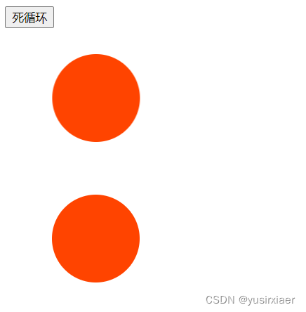
ball1的动画使用transform左移100px, ball2的动画使用left左移100px。动画效果相同。
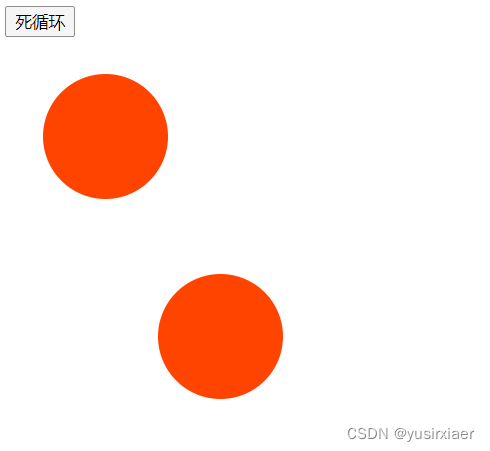
当点按钮触发等待5秒时,渲染主线程是一直等待5s结束,再重排重绘。而ball1的transform不受影响,因为根本原因是transform在合成线程中最后一步draw,不在渲染主线程中执行!
CSS3新添加的Transform不会引起文档的重新布局。简而言之就是浏览器的主线程会计算样式布局等,然后交给GPU去渲染;
而修改dom的几何信息例如height,动画中的left移动等,动画中每一帧都对布局有影响从而浏览器会重新计算生成布局树再分层,生成绘制指令再分块,再光栅化,然后交给GPU重新渲染。但是Transform则不会影响,浏览器只需要一次生成这个元素的位图,并在动画开始的时候将它提交给GPU去处理 。之后,浏览器不需要再做任何布局、 绘制以及提交位图的操作。自然提升了速度~


 828
828


 被折叠的 条评论
为什么被折叠?
被折叠的 条评论
为什么被折叠?
 到【灌水乐园】发言


