


普通写法
html:
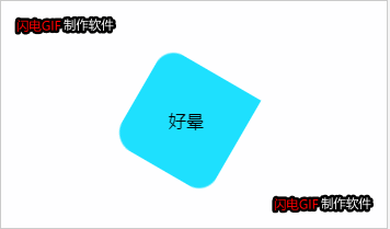
<div class="mcircle">好晕</div>
css:
<style>
.mcircle {
width: 100px;
height: 100px;
background: rgb(30, 225, 255);
border-radius: 0px 18px 20px 18px;
transform: rotate(-135deg);
text-align: center;
line-height: 100px;
margin: 100px auto;
}
</style>
文字保持水平显示
解决方案:文字放一个容器里面,这个额容器反转父容器指定的角度
html:
<div class="mcircle"><div style="transform: rotate(135deg)">好晕</div></div>

css不变
动画进阶
解决方案:子元素动画逆向执行动画
html:
 <div class="mcircle">
        <div>好晕</div>
    </div>

css:
.mcircle {
            width: 100px;
            height: 100px;
            background: rgb(30, 225, 255);
            border-radius: 0px 18px 20px 18px;
            text-align: center;
            line-height: 100px;
            margin: 100px auto;
            animation: rotate 3s linear infinite;
        }

        .mcircle div {
            animation: rotate 3s linear infinite;
            animation-direction: reverse;
        }

        @keyframes rotate {
            0% {
                transform: rotateZ(0);
            }

            100% {
                transform: rotateZ(360deg);
            }
        }


 2510
2510


 被折叠的 条评论
为什么被折叠?
被折叠的 条评论
为什么被折叠?
 到【灌水乐园】发言


