


如何出现滚动条?
万变不离其宗:文档内容超过其高度就会有滚动条。
1.设固定高度+overflow:auto就会出现滚动条,此举措表示适配的时候会让自己崩溃。
2.设置top+bottom即可让它高度自动适应(此刻不设置div高度,文档内容自填充),当然此刻要注意好定位,定位不好,真的也会崩溃。
例子1:无固定高度的
<style type="text/css">
			html,body{
				margin:0;
				padding:0;
				height:100%;
			}
			.wrapper{
				height:100%;
				position: relative;
			}
			header{
				width:100%;
				height:100px;
				background: blue;
				color:#fff;
				position: absolute;
				top:0;
				left:0;
			}
			footer{
				width:100%;
				height:100px;
				background: blue;
				color:#fff;
				position: absolute;
				bottom:0;
				left:0;
			}
			.content{
				width:100%;
				position: absolute;
				top:100px;
				bottom: 100px;
				background: burlywood;
			}
			.section1{
				height: 100px;
				background: red;
			}
			.section2{
				height:30px;
				background: green;
			}
			.section3{
				width:100%;
				position: absolute;
				top:130px;
				bottom: 0;
				overflow: auto;
			}
		</style>
	</head>
	<body>
		<div class="wrapper">
			<header>header</header>
			<section class="content">
				<section class="section1">
					广告
				</section>
				<section class="section2">title</section>
				<section class="section3">
					<p>内容</p>
					<p>内容</p>
					<p>内容</p>
					<p>内容</p>
					<p>内容</p>
					<p>内容</p>
					<p>内容</p>
					<p>内容</p>
					<p>内容</p>
					<p>内容</p>
					<p>内容</p>
					<p>内容</p>
					<p>内容</p>
					<p>内容</p>
					<p>内容</p>
					<p>内容</p>
					<p>内容</p>
					<p>内容</p>
					<p>内容</p>
					<p>内容</p>
					<p>内容</p>
					<p>内容</p>
					<p>内容</p>
					<p>内容</p>
					<p>内容</p>
					<p>内容</p>
					<p>内容</p>
					<p>内容</p>
					<p>内容</p>
					<p>内容</p>
				</section>
			</section>
			<footer>footer</footer>
		</div>
	</body>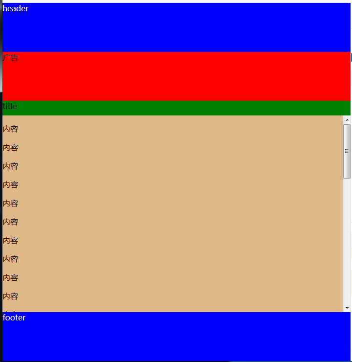


 扫一扫
扫一扫
 866
866

 被折叠的 条评论
为什么被折叠?
被折叠的 条评论
为什么被折叠?
 到【灌水乐园】发言


