| 属性名 | 类型 | 默认值 | 说明 |
|---|
| hover-class | String | none | 指定按下去的样式类。当 hover-class="none" 时,没有点击态效果 |
| hover-stop-propagation | Boolean | false | 指定是否阻止本节点的祖先节点出现点击态 |
| hover-start-time | Number | 50 | 按住后多久出现点击态,单位毫秒 |
| hover-stay-time | Number | 400 | 手指松开后点击态保留时间,单位毫秒 |
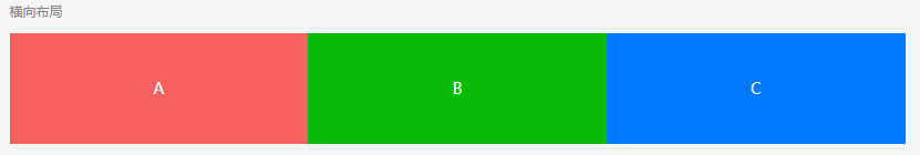
<view class="uni-flex uni-row">
	<view class="flex-item">A</view>
	<view class="flex-item">B</view>
	<view class="flex-item">C</view>
</view>


.flex-item {width: 33.3%;}

<view class="uni-flex uni-column">
	<view class="flex-item-V">A</view>
	<view class="flex-item-V">B</view>
	<view class="flex-item-V">C</view>
</view>

.flex-item-V {width: 100%;}
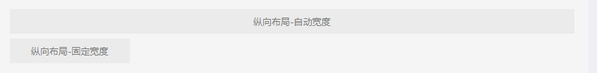
<view>纵向布局-自动宽度</view>

<view  style="width: 300rpx;">纵向布局-固定宽度</view>

<view class="uni-flex uni-row">
	<view class="text">横向布局-自动宽度</view>
	<view class="text">横向布局-自动宽度</view>
</view>
<view class="uni-flex uni-row" style="justify-content: center;">
	<view class="text">横向布局-居中</view>
	<view class="text">横向布局-居中</view>
</view>
<view class="uni-flex uni-row" style="justify-content: flex-end;">
	<view class="text">横向布局-居右</view>
	<view class="text">横向布局-居右</view>
</view>
<view class="uni-flex uni-row">
	<view class="text" style="flex: 1;">横向布局-平均分布</view>
	<view class="text" style="flex: 1;">横向布局-平均分布</view>
</view>
<view class="uni-flex uni-row" style="justify-content: space-between;">
	<view class="text">横向布局-两端对齐</view>
	<view class="text">横向布局-两端对齐</view>
</view>

-webkit-justify-content: center;
justify-content: center;

居中:center
居右:flex-end
平均分布:flex:1
两端对齐:space-between

<view class="uni-flex uni-row">
	<view class="text" style="width: 200rpx;">固定宽度</view>
	<view class="text" style="flex: 1;">自动占满余量</view>
</view>
<view class="uni-flex uni-row">
	<view class="text" style="width: 200rpx;">固定宽度</view>
	<view class="text" style="flex: 1;">自动占满</view>
	<view class="text" style="width: 200rpx;">固定宽度</view>
</view>

<view class="uni-flex uni-row" style="flex-wrap: wrap;">
	<view class="text" style="width: 280rpx;">一行显示不全,wrap折行</view>
	<view class="text" style="width: 280rpx;">一行显示不全,wrap折行</view>
	<view class="text" style="width: 280rpx;">一行显示不全,wrap折行</view>
</view>

<view class="uni-flex uni-row">
	<view class="text uni-flex" style="flex: 1;height: 200rpx;justify-content: center;align-items: flex-start;">
		<text>垂直居顶</text>
	</view>
	<view class="text uni-flex" style="flex: 1;height: 200rpx;justify-content: center;align-items: center;">
		<text>垂直居中</text>
	</view>
	<view class="text uni-flex" style="flex: 1;height: 200rpx;justify-content: center;align-items: flex-end;">
		<text>垂直居底</text>
	</view>
</view>

-webkit-align-items:flex-start;
align-items: flex-start;

垂直居顶:flex-start
垂直居中:center
垂直居底:flex-end
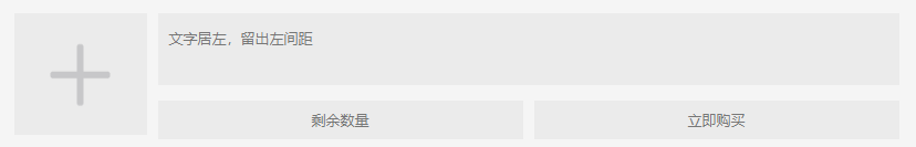
<view class="uni-flex uni-row">
	<view class="text uni-flex" style="width: 200rpx;height: 220rpx;justify-content: center;align-items: center;">
		<image src="../../../static/plus.png" style="width: 150rpx;height: 150rpx;"></image>
	</view>
	<view class="uni-flex uni-column" style="flex: 1;justify-content: space-between;">
		<view class="text" style="height: 120rpx;text-align: left;padding-left: 20rpx;padding-top: 10rpx;">
			文字居左,留出左间距
		</view>
		<view class="uni-flex uni-row">
			<view class="text" style="flex: 1;">剩余数量</view>
			<view class="text" style="flex: 1;">立即购买</view>
		</view>
	</view>
</view>

整总体横向布局,左边固定200rpx,右边自动占满。
右总体垂直布局
右下横向布局,左右自动占满


 4444
4444


 被折叠的 条评论
为什么被折叠?
被折叠的 条评论
为什么被折叠?
 到【灌水乐园】发言


