


动画概念了解
流畅、有意义的动画对于APP户体验来说是非常重要的,用RN开发实现动画有三种方法:
- requestAnimationFrame:称为帧动画,原理是通过同步浏览器的刷新频率不断重新渲染界面实现动画效果,现在网页H5动画基本都由这种实现。帧动画最初是Flash用于实现网页动画和游戏,即AS3编程。由于H5实现对动画更优的支持及Adobe对Flash的停止维护,这种编程现在基本已经被取代。另外,由于性能消耗较大,故一般不会用于APP的动画实现。
- LayoutAnimation:称为布局动画,这种方法使用起来非常便捷,它会在如透明度渐变、缩放这类变化时触发动画效果,动画会在下一次渲染或布局周期运行。布局动画还有个优点就是无需使用动画化组件,如Animated.View。
- Animated:用于实现精细动画效果。需要配合动画化组件使用,目前官方提供的动画化组件有4种:Animated.Image,Animated.ScrollView,Animated.Text 和 Animated.View。它们非常强大,基本可以满足大部分动画需求,在实际应用场景中,可以应用于透明度渐变、位移、缩放、颜色的变化等。
解决虚拟机上运行动画卡顿的问题
在进入主题前,我们先解决一下虚拟机运行动画有卡顿感的问题。为了让虚拟机可以流畅运行动画,建议使用64位镜像文件和电脑的显卡来渲染动画。
以Android开发为例:打开Android Studio的SDK配置项,勾选64位的虚拟机镜像并下载(可根据自己需求下载相应的API镜像):

创建虚拟机时选择该镜像,同时配置渲染方式为Hardware - GLES 2.0


通过这种方式创建出来虚拟机运行动画时将不会有卡顿感。如果还有卡顿感可以降低API的版本。
若使用的是较高版本的API,在debug的时有可能会报出了如下错误:
java.net.UnknownServiceException: CLEARTEXT communication ** not permitted by network security polic...这是因为Google为保证用户数据和设备的安全,针对下一代 Android 系统(Android P) 的应用程序,将要求默认使用加密连接,这意味着 Android P 将禁止 App 使用所有未加密的连接,因此运行 Android P 系统的安卓设备无论是接收或者发送流量,未来都不能明码传输,需要使用下一代(Transport Layer Security)传输层安全协议,而 Android Nougat 和 Oreo 则不受影响。有以下三种解决方案:
1. APP改用https请求。
2. targetSdkVersion 降到27以下。
3. 在 res 下新增一个 xml 目录,然后创建一个名为:network_security_config.xml 文件(名字自定) ,内容如下,大概意思就是允许开启http请求。
<?xml version="1.0" encoding="utf-8"?>
<network-security-config>
    <base-config cleartextTrafficPermitted="true" />
</network-security-config>
然后在APP的AndroidManifest.xml文件下的application标签增加以下属性
<application
...
 android:networkSecurityConfig="@xml/network_security_config"
...
/>
requestAnimationFrame帧动画
这种方法主要是通过循环执行requestAnimationFrame函数并在函数内实现随着帧频变化刷新样式,由于性能消耗会非常巨大,故不建议使用requestAnimationFrame来实现APP的动画效果。帧动画实现的核心代码如下:
// 循环执行requestAnimationFrame
requestAnimationFrame(()=>{
    width++; // 每次循环宽度+1
    // setNativeProps 是指仅重新渲染样式变化的子组件,并不像setState那样把全部组件都重新渲染。
    this.view.current.setNativeProps({
        style: {
            width
        }
    });
});

// 渲染
render(){
    return(
        <View ref={(view) => { this.view = view; }} />
    );
}
LayoutAnimation 布局动画
布局动画是指在组件布局发生变化时触发的动画。目前官方API仅支持透明度渐变、缩放两种动画。
在Android上使用 LayoutAnimation 布局动画,需要在UIManager中启用,加上这段代码即可:
constructor(props){
    super(props);
    // 当为Android系统时,启用UIManager,否则布局动画将无效
    if (Platform.OS == 'android') {
        UIManager.setLayoutAnimationEnabledExperimental && UIManager.setLayoutAnimationEnabledExperimental(true);
    }
}
LayoutAnimation属性:
| 属性 | 描述 |
|---|---|
| Types | 为枚举格式,表示展现的动画方式。 1. spring:类似于弹簧动画效果 2. linear:线性动画效果 3. easeInEaseOut:缓出缓入动画效果 |
| Properties | 为枚举格式,表示哪些样式的变化使用动画过渡 目前仅支持两种 1. opacity:透明度变化时使用该属性 2. scaleXY:缩放,容器宽高的变化时使用该属性 |
| Presets | 包括了系统默认的三种动画实现配置{spring:{...}, linear:{...},easeInEaseOut:{...}},若需其它额外动画效果,可通过LayoutAnimation.configureNext方法自定义。 |
LayoutAnimation方法:
| 方法 | 描述 |
|---|---|
| spring() | 使用默认的动画配置(即LayoutAnimation.Presets.spring对象) 实现弹性动画效果。 |
| linear() | 使用默认的动画配置(即LayoutAnimation.Presets.linear对象) 实现线性动画效果。 |
| easeInEaseOut() | 使用默认的动画配置(即LayoutAnimation.Presets.easeInEaseOut对象) 实现缓出缓入动画效果 |
| configureNext(config,onAnimationDidEnd,onError) | 自定义动画配置。参数为: 1. config 自定义的动画配置对象 3. onError 动画运行错误时触发的函数,仅IOS支持 |
根据LayoutAnimation提供的方法,可以知道实现布局动画的方式有两种:
- 默认布局动画
- 自定义布局动画
1、默认布局动画:
这种方式实现起来足够简单,只需要在生命周期函数UNSAFE_componentWillUpdate中触发动画函数即可,如:
UNSAFE_componentWillUpdate () {
LayoutAnimation.spring(); // 布局发生变化时触发弹簧动画效果
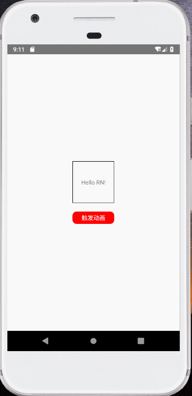
}贴上完整代码:
import React, { Component } from 'react';
import { View, Text, TouchableOpacity, StyleSheet, LayoutAnimation,Platform, UIManager  } from 'react-native';

class LayoutAnimationComp extends Component {

    constructor(props){
        super(props);
        this.state = {
            width: 100,
            height: 100
        };
        if (Platform.OS == 'android') {
            UIManager.setLayoutAnimationEnabledExperimental && UIManager.setLayoutAnimationEnabledExperimental(true);
        }
    }

    UNSAFE_componentWillUpdate () {
        LayoutAnimation.spring();
    }

    _onPress = () => {
        this.setState({width: this.state.width + 50, height: this.state.height + 50});
    }

    render(){
        return(
            <View style={styles.container}>
                <View style={[styles.viewStyle, {width: this.state.width, height: this.state.height}]}>
                    <Text>Hello RN!</Text>
                </View>

                <TouchableOpacity style={styles.btnContainerStyle} onPress={this._onPress}>
                    <Text style={{color:'#FFFFFF'}}>触发动画</Text>
                </TouchableOpacity>
            </View>
        );
    }
}

const styles = StyleSheet.create({
    container: {
        flex: 1,
        justifyContent: 'center',
        alignItems: 'center'
    },
    viewStyle: {
        justifyContent: 'center',
        alignItems: 'center',
        borderWidth: 1
    },
    btnContainerStyle: {
        width: 100,
        height: 30,
        marginTop: 20,
        borderRadius: 10,
        justifyContent: 'center',
        alignItems: 'center',
        backgroundColor:'red'
    }
});

export default LayoutAnimationComp;
效果:

2、自定义布局动画
自定义配置函数configureNext(config,onAnimationDidEnd,onError)的参数格式:
LayoutAnimation.configureNext({
    duration: 1000, // 动画持续时间默认值
    // 组件创建时的动画
    // create: {},
    // 组件更新时的动画
    update: {
        duration: 3000, // 动画持续时间,没有设置时使用配置的默认值(即1000毫秒)
        delay: 0, // 动画延时执行时间
        type: LayoutAnimation.Types.spring, // 动画类型: spring弹性|linear线性|easeInEaseOut缓出缓入|easeIn缓入|easeOut缓出
        springDamping: 0.4, // 弹跳动画阻尼系数,配合动画类型为spring使用,其他类型不需要
        property: LayoutAnimation.Properties.scaleXY, // 动画特性: opacity透明度|scaleXY缩放
    },
    // 组件删除时的动画
    // delete:{}
    },()=>{
        console.log('onAnimationDidEnd'); // 当动画结束的时候被调用。只在iOS设备上支持。
    },()=>{
        console.log('onError'); // 当动画产生错误的时候被调用。只在iOS设备上支持。
});
布局动画可以在组件创建、更新和销毁时都可以自定义动画效果,贴上完整代码:
import React, { Component } from 'react';
import { View, Text, TouchableOpacity, StyleSheet, LayoutAnimation,Platform, UIManager } from 'react-native';
class LayoutAnimationComp extends Component {
constructor(props){
super(props);
this.state = {
width: 100,
height: 100
};
if (Platform.OS == 'android') {
UIManager.setLayoutAnimationEnabledExperimental && UIManager.setLayoutAnimationEnabledExperimental(true);
}
}
UNSAFE_componentWillUpdate () {
LayoutAnimation.configureNext({
duration: 1000, // 动画持续时间默认值
update: {
duration: 3000, // 动画持续时间,没有设置时使用配置的默认值(即1000毫秒)
delay: 0, // 动画延时执行时间
type: LayoutAnimation.Types.spring, // 动画类型: spring弹性|linear线性|easeInEaseOut缓出缓入|easeIn缓入|easeOut缓出
springDamping: 0.4, // 弹跳动画阻尼系数,配合动画类型为spring使用
property: LayoutAnimation.Properties.scaleXY, // 动画特性: opacity透明度|scaleXY缩放
},
},()=>{
console.log('onAnimationDidEnd'); // 当动画结束的时候被调用。只在iOS设备上支持。
},()=>{
console.log('onError'); // 当动画产生错误的时候被调用。只在iOS设备上支持。
});
}
_onPress = () => {
this.setState({width: this.state.width + 50, height: this.state.height + 50});
}
render(){
return(
<View style={styles.container}>
<View style={[styles.viewStyle, {width: this.state.width, height: this.state.height}]}>
<Text>Hello RN!</Text>
</View>
<TouchableOpacity style={styles.btnContainerStyle} onPress={this._onPress}>
<Text style={{color:'#FFFFFF'}}>触发动画</Text>
</TouchableOpacity>
</View>
);
}
}
const styles = StyleSheet.create({
container: {
flex: 1,
justifyContent: 'center',
alignItems: 'center'
},
viewStyle: {
justifyContent: 'center',
alignItems: 'center',
borderWidth: 1
},
btnContainerStyle: {
width: 100,
height: 30,
marginTop: 20,
borderRadius: 10,
justifyContent: 'center',
alignItems: 'center',
backgroundColor:'red'
}
});
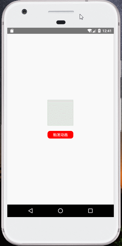
export default LayoutAnimationComp;效果:
Animated
Animated是一个性能极高的动画库。Animated封装了四个可以动画化的组件:Animated.Image,Animated.ScrollView,Animated.Text 和 Animated.View,这表示使用Animated实现动画时由这些组件来完成动画渲染。
Animated实现动画有三个步骤,以透明度渐变为例:
- 定义一个动画变量。在组件中定义一个状态值this.state.fadeInOpacity,把它与动画变量绑定。
- 渲染一个动画化组件。如Animated.View,把第一步定义的this.state.fadeInOpacity作为该组件透明度opacity样式的赋值
- 触发一个动画函数。如线性效果触发 Animated.timing(.....).start(),this.state.fadeInOpacity会根据动画函数实现变化,从而实现透明度渐变的动画效果。
1、定义动画变量
创建方法有两种:
- 纯数值类型变量:new Animated.Value(num),通常与插值函数interpolate配合使用,用于透明度、缩放、位移等动画效果。
- 坐标类型变量:new Animated.ValueXY({x:numX, y:numY}); 仅用于位移动画。
this.state = {
    fadeInOpacity: new Animated.Value(0),
    translateXYValue: new Animated.ValueXY({x:0, y:0})
};
那么创建动画变量有什么用?
通过动画变量的变化驱动组件样式的变化,从而实现动画效果。以透明度渐变由隐藏到显示为例,要实现透明度渐变就需要把组件样式中的opacity值由0~1,那么我们可以创建一个变量值初始值为0的动画变量:new Animated.Value(0),通过触发Animated动画函数(篇章后面会介绍),使初始值0变为1并赋值到组件样式中,这样就能实现最终的动画效果。
插值函数interpolate
可以把它当成是实现值映射的功能。如从透明度输入值0~1映射成坐标系的输出值0~100,当透明度在渐变的时候,同时实现组件发生100像素的位移。我们看一段代码:
this.state = {
    fadeInOpacity: new Animated.Value(0)
};

componentDidMount(){
    Animated.timing(
        this.state.fadeInOpacity, // 动画中的变量值
        {
            toValue: 1, // 动画中的变量值最终数值设定
            easing: Easing.linear, // 动画类型
            duration: 1000, // 让动画持续一段时间
        }
    ).start();
}

render(){
    return(
        <Animated.View
            style={
                [styles.viewStyle,
                    {
                        opacity: this.state.fadeInOpacity,
                        transform: [
                            {translateX: this.state.fadeInOpacity.interpolate({
                                inputRange: [0, 1],
                                outputRange: [0, 300],
                            })}
                        ]
                    }
                ]
            }
        >
        </Animated.View>
    );
}
最终的动画效果是组件透明度由0变为1,同时在x轴上位移300屏幕像素。
2、渲染一个动画化组件
目前支持Animated动画库的动画化组件只有4个:Animated.Image,Animated.ScrollView,Animated.Text 和 Animated.View。
组件的样式格式写法一般是这样子的:
<Animated.View
    style={
        [styles.viewStyle,
            {
                opacity: this.state.fadeInOpacity
                ...
            }
        ]
    }
>
</Animated.View>
styles.viewStyle表示组件的基础样式,对象{ opacity: this.state.fadeInOpacity }表示动画变化时的样式改变。
3、触发动画函数
动画函数主要用于驱动动画变量从初始值到最终值之间按照一定的规律发生变化,如线性、弹性或衰变变化。把配置好的动画函数用.start来启动动画和.stop来停止动画。另外,.start将会接收一个动画执行完成后触发的回调函数,该函数可用于实现循环动画效果,如在动画结束后重现在启动一次动画。
线性动画:
Animated.timing(
    this.state.xxx, // 动画变量变化前的值
    {
      toValue: 1, // 动画变量变化后的值
      easing: Easing.linear, // 动画缓动类型,可以了解Easing库
      duration: 1000, // 让动画持续一段时间
      delay: 1000 // 让动画延时开始
    }
).start();
弹性动画:
Animated.spring(
    this.state.xxx, // 动画变量变化前的最终值
    {
        toValue: 0, // 动画变量变化后的最终值
        velocity: 0, // 初始速度,默认0
        // 下面两组配置只能用一种,出来的效果是一样的,只是写法不同
        // tension: 7, // 张力系数,默认7
        // friction: 40, // 摩擦系数,默认40
        // 或
        bounciness: 8,      //反弹系数,默认8
        speed: 12,           //速度,默认12
    }
).start();
衰变动画:
Animated.decay(
    this.state.xxx,
    {
        velocity: 0.1, // 起始速度,必填参数。
        deceleration: 0.997 // 速度衰减比例,默认为0.997。
}).start();根据这三个步骤,就可以实现动画。如透明度渐变动画实例:
import React, { Component } from 'react';
import { View, Text, Animated, StyleSheet, Easing, TouchableOpacity } from 'react-native';
class AnimatedComp extends Component {
state = {
fadeInOpacity: new Animated.Value(0.1),
};
_onPress = () => {
Animated.timing(
this.state.fadeInOpacity,
{
toValue: 1,
easing: Easing.linear,
duration: 3000
}
).start();
}
render(){
return(
<View style={styles.container}>
<Animated.View
style={
[styles.viewStyle,
{
opacity: this.state.fadeInOpacity,
}
]
}
>
</Animated.View>
<TouchableOpacity style={styles.btnContainerStyle} onPress={this._onPress}>
<Text style={{color:'#FFFFFF'}}>触发动画</Text>
</TouchableOpacity>
</View>
);
}
}
const styles = StyleSheet.create({
container: {
flex: 1,
justifyContent: 'center',
alignItems: 'center'
},
viewStyle: {
width: 100,
height: 100,
justifyContent: 'center',
alignItems: 'center',
borderWidth: 1,
backgroundColor: 'green'
},
btnContainerStyle: {
width: 100,
height: 30,
marginTop: 20,
borderRadius: 10,
justifyContent: 'center',
alignItems: 'center',
backgroundColor:'red'
}
});
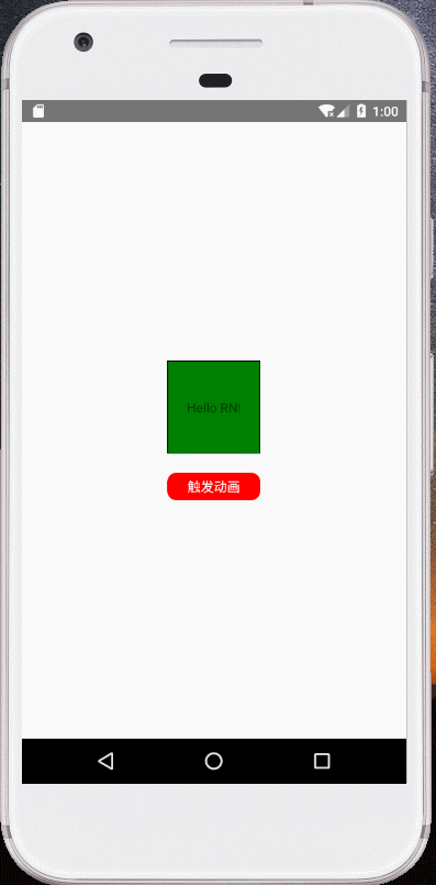
export default AnimatedComp;效果:
位移动画实例:
import React, { Component } from 'react';
import { View, Text, Animated, StyleSheet, Easing, TouchableOpacity } from 'react-native';
class AnimatedComp extends Component {
state = {
translateXYValue: new Animated.ValueXY({x:0, y:0})
};
_onPress = () => {
Animated.timing(
this.state.translateXYValue,
{
toValue: ({x:100, y:0}),
easing: Easing.linear,
duration: 1000
}
).start();
}
render(){
return(
<View style={styles.container}>
<Animated.View
style={
[styles.viewStyle,
{
transform: [
{translateX: this.state.translateXYValue.x}, // x轴移动
{translateY: this.state.translateXYValue.y}, // y轴移动
]
}
]
}
>
</Animated.View>
<TouchableOpacity style={styles.btnContainerStyle} onPress={this._onPress}>
<Text style={{color:'#FFFFFF'}}>触发动画</Text>
</TouchableOpacity>
</View>
);
}
}
const styles = StyleSheet.create({
container: {
flex: 1,
justifyContent: 'center',
alignItems: 'center'
},
viewStyle: {
width: 100,
height: 100,
justifyContent: 'center',
alignItems: 'center',
borderWidth: 1,
backgroundColor: 'green'
},
btnContainerStyle: {
width: 100,
height: 30,
marginTop: 20,
borderRadius: 10,
justifyContent: 'center',
alignItems: 'center',
backgroundColor:'red'
}
});
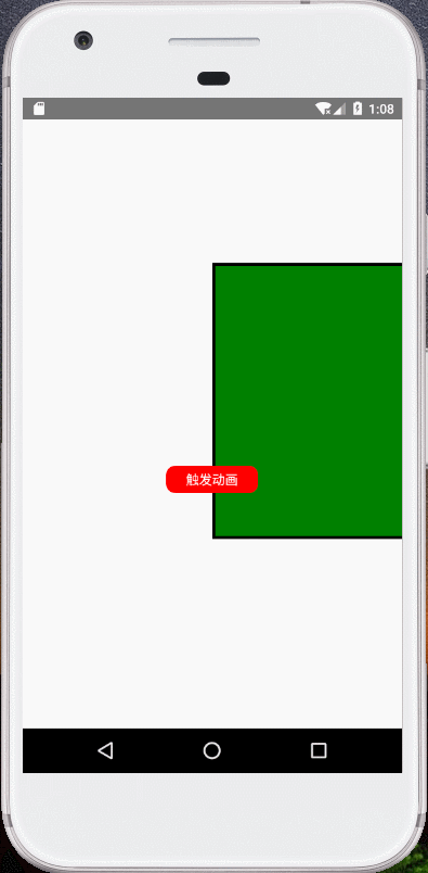
export default AnimatedComp;效果等同于通过interpolate映射的方式实现位移(与上例仅写法不同)
import React, { Component } from 'react';
import { View, Text, Animated, StyleSheet, Easing, TouchableOpacity } from 'react-native';

class AnimatedComp extends Component {


    state = {
        translateValue: new Animated.Value(1)
    }

    _onPress = () => {
        Animated.timing(
            this.state.translateValue,
            {
              toValue: 0,
              easing: Easing.linear,
              duration: 1000
            }
          ).start();
    }

    render(){
        return(
            <View style={styles.container}>
                <Animated.View
                    style={
                        [styles.viewStyle,
                            {
                                transform: [
                                    {
                                        translateX: this.state.translateValue.interpolate({
                                            inputRange: [0, 1],
                                            outputRange: [100, 0]
                                        })
                                    }
                                ]
                            }
                        ]
                    }
                >
                </Animated.View>

                <TouchableOpacity style={styles.btnContainerStyle} onPress={this._onPress}>
                    <Text style={{color:'#FFFFFF'}}>触发动画</Text>
                </TouchableOpacity>
            </View>
        );
    }
}

const styles = StyleSheet.create({
    container: {
        flex: 1,
        justifyContent: 'center',
        alignItems: 'center'
    },
    viewStyle: {
        width: 100,
        height: 100,
        justifyContent: 'center',
        alignItems: 'center',
        borderWidth: 1,
        backgroundColor: 'green'
    },
    btnContainerStyle: {
        width: 100,
        height: 30,
        marginTop: 20,
        borderRadius: 10,
        justifyContent: 'center',
        alignItems: 'center',
        backgroundColor:'red'
    }
});

export default AnimatedComp;
效果:

衰变动画实例:
import React, { Component } from 'react';
import { View, Text, Animated, StyleSheet, TouchableOpacity } from 'react-native';

class AnimatedComp extends Component {

    state = {
        bounceValue : new Animated.Value(1)
    };

    componentDidMount(){
        // 监听bounceValue衰变过程
        this.state.bounceValue.addListener((state) => {
            console.log('bounceValue=>' + state.value);
        });
        this.state.bounceValue.stopAnimation((state) => {
            console.log('bounceValue=>' + state.value);
        });
    }

    _onPress = () => {
        Animated.decay(
            this.state.bounceValue, {
                velocity: 0.02, // 起始速度,必填参数。
                deceleration: 0.997 // 速度衰减比例,默认为0.997。
        }).start();
    }

    render(){
        return(
            <View style={styles.container}>
                <Animated.View
                    style={
                        [styles.viewStyle,
                            {
                                transform: [{scale: this.state.bounceValue}]
                            }
                        ]
                    }
                >
                    <Text>Hello RN!</Text>
                </Animated.View>

                <TouchableOpacity style={styles.btnContainerStyle} onPress={this._onPress}>
                    <Text style={{color:'#FFFFFF'}}>触发动画</Text>
                </TouchableOpacity>
            </View>
        );
    }
}

const styles = StyleSheet.create({
    container: {
        flex: 1,
        justifyContent: 'center',
        alignItems: 'center'
    },
    viewStyle: {
        width: 100,
        height: 100,
        justifyContent: 'center',
        alignItems: 'center',
        borderWidth: 1,
        backgroundColor: 'green'
    },
    btnContainerStyle: {
        width: 100,
        height: 30,
        marginTop: 20,
        borderRadius: 10,
        justifyContent: 'center',
        alignItems: 'center',
        backgroundColor:'red'
    }
});

export default AnimatedComp;
效果:
通过interpolate映射同步改变多个样式:
import React, { Component } from 'react';
import { View, Text, Animated, StyleSheet, TouchableOpacity } from 'react-native';

class AnimatedComp extends Component {

    state = {
        translateValue: new Animated.Value(1)
    };

    _onPress = () => {
        Animated.spring(
            this.state.translateValue,
            {
                toValue: 0,
                velocity: 0,
                bounciness: 10,
                speed: 12
            }
        ).start();
    }

    render(){
        return(
            <View style={styles.container}>
                <Animated.View
                    style={
                        [styles.viewStyle,
                            {
                                transform: [
                                    {scale: this.state.translateValue.interpolate({
                                        inputRange: [0, 1],
                                        outputRange: [1, 3],
                                    })},
                                    {translateX: this.state.translateValue.interpolate({
                                        inputRange: [0, 1],
                                        outputRange: [0, 50],
                                    })},
                                    {rotate: this.state.translateValue.interpolate({
                                        inputRange: [0, 1],
                                        outputRange: [
                                            '0deg', '720deg'
                                        ],
                                    })},
                                ]
                            }
                        ]
                    }
                >
                </Animated.View>

                <TouchableOpacity style={styles.btnContainerStyle} onPress={this._onPress}>
                    <Text style={{color:'#FFFFFF'}}>触发动画</Text>
                </TouchableOpacity>
            </View>
        );
    }
}

const styles = StyleSheet.create({
    container: {
        flex: 1,
        justifyContent: 'center',
        alignItems: 'center'
    },
    viewStyle: {
        width: 100,
        height: 100,
        justifyContent: 'center',
        alignItems: 'center',
        borderWidth: 1,
        backgroundColor: 'green'
    },
    btnContainerStyle: {
        width: 100,
        height: 30,
        marginTop: 20,
        borderRadius: 10,
        justifyContent: 'center',
        alignItems: 'center',
        backgroundColor:'red'
    }
});

export default AnimatedComp;
效果:
多个动画执行顺序
多个动画间有三种顺序方式:
- Animated.sequence(Animates<Array>),表示按顺序运行动画
- 并发:Animated.parallel(Animates<Array>),表示并发运行动画
- Animated.stagger(delayTime<Number>, Animates<Array>),表示在上一个动画开始隔delayTime毫秒后执行下一个动画
顺序运行动画实例:
import React, { Component } from 'react';
import { View, Text, Animated, StyleSheet, Easing, TouchableOpacity } from 'react-native';

class AnimatedComp extends Component {

    state = {
        fadeInOpacity: new Animated.Value(0.1),
        translateValue: new Animated.Value(1)
    };

    _onPress = () => {
        Animated.sequence([
            // Animated.delay(1000), // 延时1秒后开始第一个动画
            Animated.timing(
                this.state.fadeInOpacity,
                {
                  toValue: 1,
                  easing: Easing.linear,
                  duration: 2000
                }
            ),
            Animated.timing(
                this.state.translateValue,
                {
                    toValue: 0,
                    easing: Easing.linear,
                    duration: 2000,
                }
            )
        ]).start();
    }

    render(){
        return(
            <View style={styles.container}>
                <Animated.View
                    style={
                        [styles.viewStyle,
                            {
                                opacity: this.state.fadeInOpacity,
                                transform: [
                                    {
                                        translateX: this.state.translateValue.interpolate({
                                            inputRange: [0, 1],
                                            outputRange: [100, 0]
                                        })
                                    }
                                ]
                            }
                        ]
                    }
                >
                </Animated.View>

                <TouchableOpacity style={styles.btnContainerStyle} onPress={this._onPress}>
                    <Text style={{color:'#FFFFFF'}}>触发动画</Text>
                </TouchableOpacity>
            </View>
        );
    }
}

const styles = StyleSheet.create({
    container: {
        flex: 1,
        justifyContent: 'center',
        alignItems: 'center'
    },
    viewStyle: {
        width: 100,
        height: 100,
        justifyContent: 'center',
        alignItems: 'center',
        borderWidth: 1,
        backgroundColor: 'green'
    },
    btnContainerStyle: {
        width: 100,
        height: 30,
        marginTop: 20,
        borderRadius: 10,
        justifyContent: 'center',
        alignItems: 'center',
        backgroundColor:'red'
    }
});

export default AnimatedComp;
效果:

滚动动画
滚动动画是指随着ScrollView组件滚动实现页面内的样式变化。贴上代码:
import React from 'react';
import { View, Animated, StyleSheet, ScrollView, Image } from 'react-native';
let deviceHeight = require('Dimensions').get('window').height;
let deviceWidth = require('Dimensions').get('window').width;
class ScrollAnimatedComp extends React.Component {
state = {
xOffset: new Animated.Value(0),
xyOffset: new Animated.ValueXY({x:0,y:0})
};
componentDidMount(){
// new Animated.ValueXY() 类型监听
this.state.xyOffset.addListener((value) => {
console.log('xyOffset=>x:' + value.x + ' y:' + value.y);
});
this.state.xyOffset.stopAnimation((value) => {
console.log('xyOffset=>x:' + value.x + ' y:' + value.y);
});
// new Animated.Value() 类型值监听
this.state.xOffset.addListener((state) => {
console.log('xOffset=>' + state.value);
});
this.state.xOffset.stopAnimation((state) => {
console.log('xOffset=>' + state.value);
});
}
// ****Animated.event是实现手势控制动画的关键,允许手势或其它事件直接绑定到动态值上。这里的Aniamted.event的输入是一个数组,用来做数据绑定 。
render(){
return(
<View style={styles.container}>
<ScrollView
pagingEnabled={true}
horizontal={true}
showsHorizontalScrollIndicator={false}
style={{width:deviceWidth,height:deviceHeight}}
scrollEventThrottle={100}
onScroll={Animated.event(
[{nativeEvent: {contentOffset: {x: this.state.xOffset}}}] // 把contentOffset.x绑定给this.state.xOffset
)}
>
<Animated.Image
source={require('../../../assets/images/watch.jpg')}
style={{
height:deviceHeight,
width:deviceWidth,
opacity: this.state.xOffset.interpolate({ //映射到0.0,1.0之间
inputRange: [0, deviceWidth],
outputRange: [1.0, 0.0]
})
}}
resizeMode='cover'
/>
<Image source={require('../../../assets/images/watch.jpg')} style={{height:deviceHeight, width:deviceWidth}} resizeMode='cover' />
</ScrollView>
</View>
);
}
}
const styles = StyleSheet.create({
container: {
marginTop:25,
flex: 1
},
});
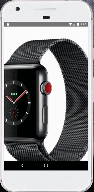
export default ScrollAnimatedComp;效果:
至此,RN动画篇将全部完毕,欢迎交流。


 4799
4799


 被折叠的 条评论
为什么被折叠?
被折叠的 条评论
为什么被折叠?
 到【灌水乐园】发言


