


教程链接
https://github.com/datawhalechina/fantastic-matplotlib
https://gitee.com/zhang35/fantastic-matplotlib/blob/main/第三回:布局格式定方圆.ipynb
作业
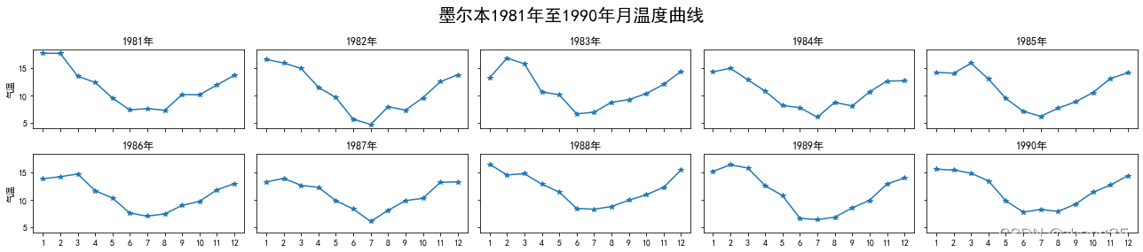
1. 墨尔本1981年至1990年的每月温度情况
ex1 = pd.read_csv('data/layout_ex1.csv')
ex1.head()

	Time	Temperature
0	1981-01	17.712903
1	1981-02	17.678571
2	1981-03	13.500000
3	1981-04	12.356667
4	1981-05	9.490323
- 请利用数据,画出如下的图:
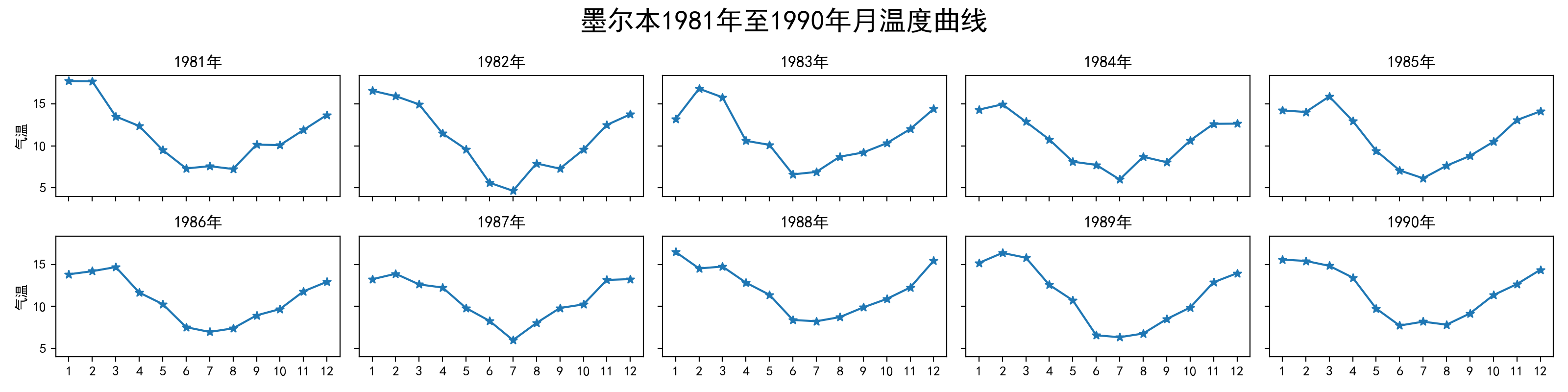
fig, axes = plt.subplots(2, 5, figsize=(18, 4), sharex=True, sharey=True)
year = 1981
fig.suptitle('墨尔本1981年至1990年月温度曲线', size=20)
for i in range(2):
    axes[i, 0].set_ylabel("气温")
    for j in range(5):
        ax = axes[i, j]
        ax.set_title("%d年" % year)
        year += 1
        data_start = (i * 5 + j) * 12
        ax.plot(range(1, 13), ex1.iloc[data_start : data_start + 12]['Temperature'], marker='*')
        ax.set_xticks(range(1, 13))
fig.tight_layout()
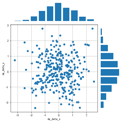
2. 画出数据的散点图和边际分布
- 用
np.random.randn(2, 150)生成一组二维数据,使用两种非均匀子图的分割方法,做出该数据对应的散点图和边际分布图
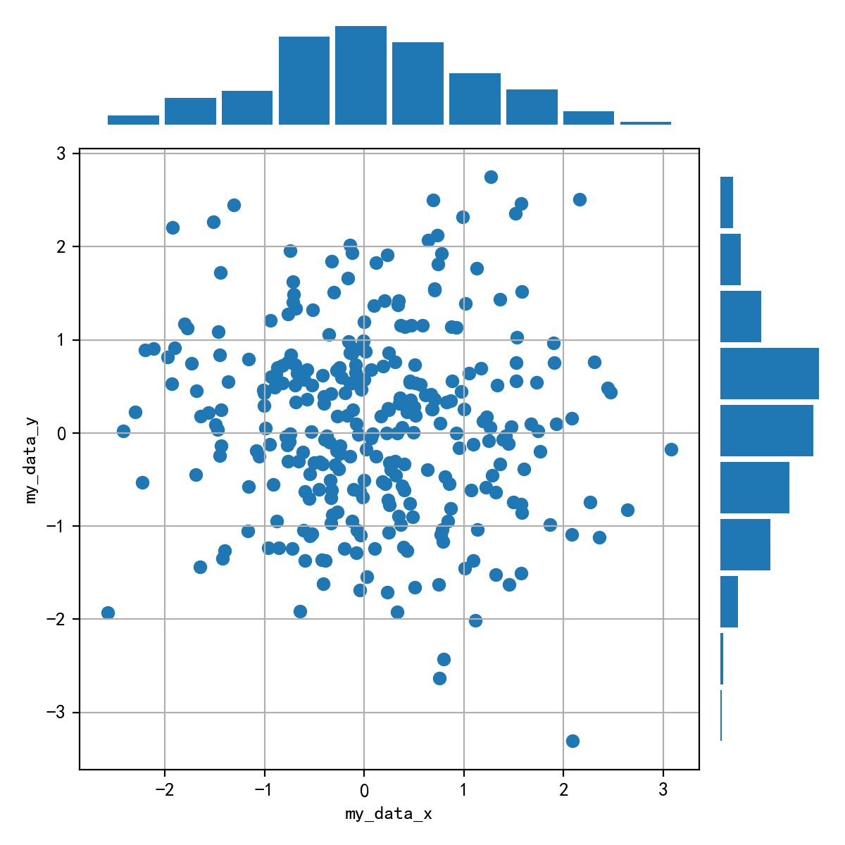
data = np.random.randn(2, 150)
fig = plt.figure(figsize=(6, 6))
spec = fig.add_gridspec(nrows=5, ncols=5, width_ratios=[1]*5, height_ratios=[1] * 5)

ax = fig.add_subplot(spec[1:5, :4])
ax.grid()
ax.set_xlabel('my_data_x')
ax.set_ylabel('my_data_y')
ax.scatter(data[0], data[1])

ax2 = fig.add_subplot(spec[:1, :4])
# ax2.get_xaxis().set_visible(False)
# ax2.get_yaxis().set_visible(False)
ax2.axis('off')
# bins = np.arange(-2.8, 3.7, 0.5)
# ax.hist(data[0], bins, alpha=0.5, rwidth=0.8)
ax2.hist(data[0], rwidth=0.8) # hist默认的bin=10

ax3 = fig.add_subplot(spec[1:5, 4:])
ax3.axis('off')
ax3.hist(data[1], rwidth=0.8, orientation='horizontal')

fig.tight_layout()
plt.show()


 被折叠的 条评论
为什么被折叠?
被折叠的 条评论
为什么被折叠?
 到【灌水乐园】发言


