


CSS3 包含多个新的文本特性。下面就来简单的介绍一下。
1、text-shadow:向文本添加阴影。
所有主流浏览器都支持 text-shadow 属性。Internet Explorer 9 以及更早版本的浏览器不支持 text-shadow 属性。
语法:text-shadow: h-shadow v-shadow blur color。
h-shadow:必需。水平阴影的位置。允许负值。
v-shadow:必需。垂直阴影的位置。允许负值。
blur:可选。模糊的距离。
color:可选。阴影的颜色。参阅 CSS 颜色值。
h1{
text-shadow: 5px 5px 5px #f3e;
}
效果图如下:

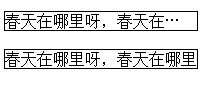
2、text-overflow:规定当文本溢出包含元素时发生的事情。
语法:text-overflow: clip|ellipsis|string。
clip:修剪文本。
ellipsis:显示省略符号来代表被修剪的文本。
string:使用给定的字符串来代表被修剪的文本。
div.test{
white-space:nowrap;
width:12em;
overflow:hidden;
border:1px solid #000000;
}
<div class="test" style="text-overflow:ellipsis;">春天在哪里呀,春天在哪里?春天在那小朋友的眼睛里。</div><br/>
<div class="test" style="text-overflow:clip;">春天在哪里呀,春天在哪里?春天在那小朋友的眼睛里。</div>
效果如下:
3、hanging-punctuation:规定标点字符是否位于线框之外。
目前主流浏览器都不支持 hanging-punctuation 属性。
语法:hanging-punctuation: none|first|last|allow-end|force-end;
4、punctuation-trim:规定是否对标点字符进行修剪。
目前主流浏览器都不支持 punctuation-trim 属性。
语法:punctuation-trim: none|start|end|allow-end|adjacent;
5、text-align-last:设置如何对齐最后一行或紧挨着强制换行符之前的行。
6、text-emphasis:向元素的文本应用重点标记以及重点标记的前景色。
目前主流浏览器都不支持 text-emphasis 属性。
语法:text-emphasis: text-emphasis-style text-emphasis-color;
7、text-justify:规定当 text-align 设置为 “justify” 时所使用的对齐方法。
只有 Internet Explorer 支持 text-justify 属性。
语法:text-justify: auto|inter-word|inter-ideograph|inter-cluster|distribute|kashida|trim。
div{
text-align:justify;
text-justify:inter-word;
}
8、text-outline:规定文本的轮廓。
所有主流浏览器都不支持 text-outline 属性。
语法:text-outline: thickness blur color。
thickness :必需。轮廓的粗细。
blur :可选。轮廓的模糊半径。
color:必需。轮廓的颜色。参阅 CSS 颜色值。
p.test{
text-outline: 2px 2px #ff0000;
}
9、text-wrap:规定文本的换行规则。
目前主流浏览器都不支持 text-wrap 属性。
语法:text-wrap: normal|none|unrestricted|suppress。
normal:只在允许的换行点进行换行。
none:不换行。元素无法容纳的文本会溢出。
unrestricted:在任意两个字符间换行。
suppress:压缩元素中的换行。浏览器只在行中没有其他有效换行点时进行换行。
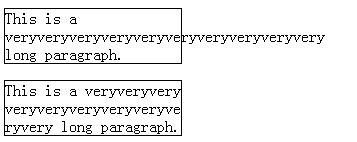
10、word-break:规定非中日韩文本的换行规则。
所有主流浏览器都支持 word-break 属性。
在恰当的断字点进行换行。
语法为word-break: normal|break-all|keep-all。
normal:使用浏览器默认的换行规则。
break-all:允许在单词内换行。
keep-all:只能在半角空格或连字符处换行。
p.test1{
width:11em;
border:1px solid #000000;
word-break:hyphenate;
}
p.test2{
width:11em;
border:1px solid #000000;
word-break:break-all;
}
效果如下:
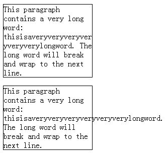
11、word-wrap:允许对长的不可分割的单词进行分割并换行到下一行。
所有主流浏览器都支持 word-wrap 属性。
语法:word-wrap: normal|break-word。
normal:只在允许的断字点换行(浏览器保持默认处理)。
break-word:在长单词或 URL 地址内部进行换行。
p.test{
width:11em;
border:1px solid #000000;
word-wrap:break-word;
}
p.test2{
width:11em;
border:1px solid #000000;
}
<p class="test">This paragraph contains a very long word: thisisaveryveryveryveryveryverylongword. The long word will break and wrap to the next line.</p>
<p class="test2">This paragraph contains a very long word: thisisaveryveryveryveryveryverylongword. The long word will break and wrap to the next line.</p>
效果如下:


 2127
2127


 被折叠的 条评论
为什么被折叠?
被折叠的 条评论
为什么被折叠?
 到【灌水乐园】发言


