


ProgressBar简介
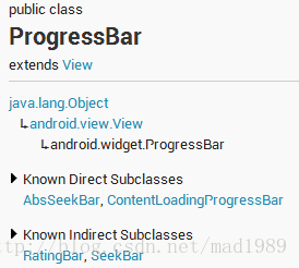
继承于View类,直接子类有AbsSeekBar和ContentLoadingProgressBar,其中AbsSeekBar的子类有SeekBar和RatingBar,可见这二者也是基于ProgressBar实现的。
1、ProgressBar有两个进度,一个是android:progress,另一个是android:secondaryProgress。后者主要是为缓存需要所涉及的,比如在看网络视频时候都会有一个缓存的进度条以及还要一个播放的进度,在这里缓存的进度就可以是android:secondaryProgress,而播放进度就是android:progress,有了secondProgress,可以很方便定制ProgressBar。
2、ProgressBar分为确定的和不确定的,确定的是我们能明确看到进度,相反不确定的就是不清楚、不确定一个操作需要多长时间来完成,这个时候就需要用的不确定的ProgressBar了。属性android:indeterminate如果设置为true的话,那么ProgressBar就可能是圆形的滚动条或者水平的滚动条(由样式决定),但是我们一般时候,是直接使用Style类型来区分圆形还是水平ProgressBar的。
3、ProgressBar的样式设定其实有两种方式,在API文档中说明的方式如下:
- Widget.ProgressBar.Horizontal
- Widget.ProgressBar.Small
- Widget.ProgressBar.Large
- Widget.ProgressBar.Inverse
- Widget.ProgressBar.Small.Inverse
- Widget.ProgressBar.Large.Inverse
- style="?android:attr/progressBarStyle"
- style="?android:attr/progressBarStyleHorizontal"
- style="?android:attr/progressBarStyleInverse"
- style="?android:attr/progressBarStyleLarge"
- style="?android:attr/progressBarStyleLargeInverse"
- style="?android:attr/progressBarStyleSmall"
- style="?android:attr/progressBarStyleSmallInverse"
- style="?android:attr/progressBarStyleSmallTitle"
- <ProgressBar
- android:id="@+id/progressBar1"
- style="?android:attr/progressBarStyleHorizontal"
- style="@android:style/Widget.ProgressBar.Horizontal"(等同于@android:attr)
- android:layout_width="match_parent"
- android:layout_height="wrap_content" />
水平ProgressBar系统样式
我们去看一下style="?android:attr/progressBarStyleHorizontal"的源码,如下:
- <pre name="code" class="java"> <style name="Widget.ProgressBar.Horizontal">
- <item name="android:indeterminateOnly">false</item>
- <item name="android:progressDrawable">@android:drawable/progress_horizontal</item>
- <item name="android:indeterminateDrawable">@android:drawable/progress_indeterminate_horizontal</item>
- <item name="android:minHeight">20dip</item>
- <item name="android:maxHeight">20dip</item>
- <item name="android:mirrorForRtl">true</item>
- </style>
- <?xml version="1.0" encoding="utf-8"?>
- <!-- Copyright (C) 2008 The Android Open Source Project
- Licensed under the Apache License, Version 2.0 (the "License");
- you may not use this file except in compliance with the License.
- You may obtain a copy of the License at
- http://www.apache.org/licenses/LICENSE-2.0
- Unless required by applicable law or agreed to in writing, software
- distributed under the License is distributed on an "AS IS" BASIS,
- WITHOUT WARRANTIES OR CONDITIONS OF ANY KIND, either express or implied.
- See the License for the specific language governing permissions and
- limitations under the License.
- -->
- <layer-list xmlns:android="http://schemas.android.com/apk/res/android">
- <item android:id="@android:id/background">
- <shape>
- <corners android:radius="5dip" />
- <gradient
- android:startColor="#ff9d9e9d"
- android:centerColor="#ff5a5d5a"
- android:centerY="0.75"
- android:endColor="#ff747674"
- android:angle="270"
- />
- </shape>
- </item>
- <item android:id="@android:id/secondaryProgress">
- <clip>
- <shape>
- <corners android:radius="5dip" />
- <gradient
- android:startColor="#80ffd300"
- android:centerColor="#80ffb600"
- android:centerY="0.75"
- android:endColor="#a0ffcb00"
- android:angle="270"
- />
- </shape>
- </clip>
- </item>
- <item android:id="@android:id/progress">
- <clip>
- <shape>
- <corners android:radius="5dip" />
- <gradient
- android:startColor="#ffffd300"
- android:centerColor="#ffffb600"
- android:centerY="0.75"
- android:endColor="#ffffcb00"
- android:angle="270"
- />
- </shape>
- </clip>
- </item>
- </layer-list>
这里面有3个item,分别为:background、secondProgress、progress,看名字就能知道其大概作用,我们比较关心的应该是后两个,其实把这个文件copy一份到自己的项目下,就可以随心所欲的修改shape属性:圆角、渐变等等。
自定义水平ProgressBar
第一步,在drawable文件夹下新建一个progressbar_horizontal_1.xml:
- <?xml version="1.0" encoding="utf-8"?>
- <layer-list xmlns:android="http://schemas.android.com/apk/res/android" >
- <!-- background -->
- <item
- android:id="@android:id/background"
- android:drawable="@drawable/progress_patch_green">
- </item>
- <!-- progress -->
- <item android:id="@android:id/progress">
- <clip>
- <nine-patch android:src="@drawable/progress_patch_galy" />
- </clip>
- </item>
- <!-- second progress -->
- <item android:id="@android:id/secondaryProgress">
- <clip>
- <nine-patch android:src="@drawable/progresspatch_blue" />
- </clip>
- </item>
- </layer-list>
上图中的progress和secondprogress中src的资源便是我自定义的,注意这三个之间的叠放顺序,background是最底层,中间的是progress最上层是second。
第二步,标准一点,在style中新建我们自定义的style:mProgress_horizontal:
- <style name="mProgress_horizontal">
- <item name="android:indeterminateOnly">false</item>
- <item name="android:progressDrawable">@drawable/progressbar_horizontal_1</item><!-- progress_horizontal -->
- <item name="android:indeterminateDrawable">@android:drawable/progress_indeterminate_horizontal</item>
- <item name="android:minHeight">20dip</item>
- <item name="android:maxHeight">20dip</item>
- </style>
上图中prpgressDrawable资源便是指向了我们自定义的progressbar_horizontal_1,大功告成。
第三步,组件引用:
- <ProgressBar
- android:id="@+id/progressBar1"
- android:layout_width="match_parent"
- android:layout_height="wrap_content"
- android:background="@drawable/progress_backround"
- android:padding="5dp"
- android:progress="50"
- style="@style/mProgress_horizontal"
- android:secondaryProgress="20"
- android:visibility="visible" />
【附】
在这里我们也可以省略第二步创建style,直接在组件中android:progressDrawable引用自己的progressbar_horizontal_1,如下:
- <ProgressBar
- android:id="@+id/progressBar1"
- android:indeterminate="false"
- android:indeterminateOnly="false"
- android:layout_width="match_parent"
- android:layout_height="wrap_content"
- android:background="@drawable/progress_backround"
- android:padding="5dp"
- android:progress="50"
- android:maxHeight="20dp"
- android:minHeight="20dp"
- android:progressDrawable="@drawable/progressbar_horizontal_1"
- android:secondaryProgress="20"
- />
第四步,效果图:

圆形ProgressBar系统样式
- <ProgressBar
- android:id="@+id/progressBar2"
- style="@android:attr/progressBarStyleLarge"
- android:layout_gravity="center_vertical"
- android:layout_width="match_parent"
- android:layout_height="wrap_content" />
我们以progressBarStyleLarge为例进行探索,找到这个布局文件,源码如下:
- <style name="Widget.ProgressBar.Large">
- <item name="android:indeterminateDrawable">@android:drawable/progress_large_white</item>
- <item name="android:minWidth">76dip</item>
- <item name="android:maxWidth">76dip</item>
- <item name="android:minHeight">76dip</item>
- <item name="android:maxHeight">76dip</item>
- </style>
同样一眼看出 indeterminateDrawable 便是主角了,继续看一下progress_large_white源码,如下:
- <rotate xmlns:android="http://schemas.android.com/apk/res/android"
- android:drawable="@drawable/spinner_white_76"
- android:pivotX="50%"
- android:pivotY="50%"
- android:fromDegrees="0"
- android:toDegrees="360" />
看到这里就透彻了,就是在这里spinner_white_76进行不停的旋转的,我们copy一下这个文件,就可以直接自定义了。
自定义圆形ProgressBar
第一步,在drawable文件夹下新建:progressbar_circle_1.xml,如下:
- <?xml version="1.0" encoding="utf-8"?>
- <rotate xmlns:android="http://schemas.android.com/apk/res/android"
- android:drawable="@drawable/loading" //自定义的菊花图片
- android:fromDegrees="0"
- android:pivotX="50%"
- android:pivotY="50%"
- android:toDegrees="360" >
- </rotate>
第二步,在Style中定义mProgress_circle,如下:
- <style name="mProgress_circle">
- <item name="android:indeterminateDrawable">@drawable/progressbar_circle_1</item>
- <item name="android:minWidth">25dp</item>
- <item name="android:minHeight">25dp</item>
- <item name="android:maxWidth">60dp</item>
- <item name="android:maxHeight">60dp</item>
- </style>
支持大小自己随意定,别失真就好
第三步,组件中引用,如下:
- <ProgressBar
- android:id="@+id/progressBar2"
- style="@style/mProgress_circle"
- android:layout_gravity="center_vertical"
- android:layout_width="match_parent"
- android:indeterminateDuration="1200"
- android:layout_height="wrap_content" />
【附】
上面是通过一张图片填充 android:indeterminateDrawable ,我们也可以定义一个 动画 或者自定义 颜色(shape) 来实现,跟图片的用法一样:
定义动画 progress_circle_loading,xml:
- <?xml version="1.0" encoding="UTF-8"?>
- <animation-list android:oneshot="false"
- xmlns:android="http://schemas.android.com/apk/res/android">
- <item android:duration="100" android:drawable="@drawable/loading_1" />
- <item android:duration="100" android:drawable="@drawable/loading_2" />
- <item android:duration="100" android:drawable="@drawable/loading_3" />
- <item android:duration="100" android:drawable="@drawable/loading_4" />
- <item android:duration="100" android:drawable="@drawable/loading_5" />
- <item android:duration="100" android:drawable="@drawable/loading_6" />
- </animation-list>
style的indeterminateDrawable引入:
- <pre name="code" class="java"><item name="android:indeterminateDrawable">@drawable/progress_circle_loading</item>
定义shape颜色 progress_circle_shape.xml
- <?xml version="1.0" encoding="utf-8"?>
- <rotate xmlns:android="http://schemas.android.com/apk/res/android"
- android:fromDegrees="0"
- android:pivotX="50%"
- android:pivotY="50%"
- android:toDegrees="360" >
- <shape
- android:innerRadiusRatio="3"
- android:shape="ring"
- android:thicknessRatio="8"
- android:useLevel="false" >
- <gradient
- android:centerColor="#FFFFFF"
- android:centerY="0.50"
- android:endColor="#1E90FF"
- android:startColor="#000000"
- android:type="sweep"
- android:useLevel="false" />
- </shape>
- </rotate>
style的indeterminateDrawable引入:
- <item name="android:indeterminateDrawable">@drawable/progress_circle_shape</item>
效果图如下:

SeekBar的原理是一样的,不信你看下图,我就是用的seekbar
最后来张全家福:

<shape>和<selector>在Android UI设计中经常用到。比如我们要自定义一个圆角Button,点击Button有些效果的变化,就要用到<shape>和<selector>。
可以这样说,<shape>和<selector>在美化控件中的作用是至关重要。
在看这篇文章之前,可以看下这个小例子:镂空按钮的实现
1.Shape
简介
作用:XML中定义的几何形状
位置:res/drawable/文件的名称.xml
使用的方法:
Java代码中:R.drawable.文件的名称
XML中:Android:background="@drawable/文件的名称"
属性:
<shape> Android:shape=["rectangle" | "oval" | "line" | "ring"]
其中rectagle矩形,oval椭圆,line水平直线,ring环形
<shape>中子节点的常用属性:
<gradient> 渐变
Android:startColor
起始颜色
Android:endColor
结束颜色
Android:angle
渐变角度,0从左到右,90表示从下到上,数值为45的整数倍,默认为0;
Android:type
渐变的样式 liner线性渐变 radial环形渐变 sweep
<solid > 填充
Android:color
填充的颜色
<stroke >描边
Android:width
描边的宽度
Android:color
描边的颜色
Android:dashWidth
表示'-'横线的宽度
Android:dashGap
表示'-'横线之间的距离
<corners >圆角
Android:radius
圆角的半径 值越大角越圆
Android:topRightRadius
右上圆角半径
Android:bottomLeftRadius
右下圆角角半径
Android:topLeftRadius
左上圆角半径
Android:bottomRightRadius
左下圆角半径
<padding >填充
android:bottom="1.0dip"
底部填充
android:left="1.0dip"
左边填充
android:right="1.0dip"
右边填充
android:top="0.0dip"
上面填充
2.Selector
简介
根据不同的选定状态来定义不同的现实效果
分为四大属性:
android:state_selected 是选中
android:state_focused 是获得焦点
android:state_pressed 是点击
android:state_enabled 是设置是否响应事件,指所有事件
另:
android:state_window_focused 默认时的背景图片
引用位置:res/drawable/文件的名称.xml
使用的方法:
Java代码中:R.drawable.文件的名称
XML中:Android:background="@drawable/文件的名称"
- <?xml version="1.0" encoding="utf-8" ?>
- <selector xmlns:Android="http://schemas.android.com/apk/res/android">
- <!-- 默认时的背景图片-->
- <item Android:drawable="@drawable/pic1" />
- <!-- 没有焦点时的背景图片 -->
- <item
- Android:state_window_focused="false"
- android:drawable="@drawable/pic_blue"
- />
- <!-- 非触摸模式下获得焦点并单击时的背景图片 -->
- <item
- Android:state_focused="true"
- android:state_pressed="true"
- android:drawable= "@drawable/pic_red"
- />
- <!-- 触摸模式下单击时的背景图片-->
- <item
- Android:state_focused="false"
- Android:state_pressed="true"
- Android:drawable="@drawable/pic_pink"
- />
- <!--选中时的图片背景-->
- <item
- Android:state_selected="true"
- android:drawable="@drawable/pic_orange"
- />
- <!--获得焦点时的图片背景-->
- <item
- Android:state_focused="true"
- Android:drawable="@drawable/pic_green"
- />
- </selector>
3.layer-list
简介:
将多个图片或上面两种效果按照顺序层叠起来
例子:
- <?xml version="1.0" encoding="utf-8"?>
- <layer-list xmlns:android="http://schemas.android.com/apk/res/android">
- <item>
- <bitmap android:src="@drawable/android_red"
- android:gravity="center" />
- </item>
- <item android:top="10dp" android:left="10dp">
- <bitmap android:src="@drawable/android_green"
- android:gravity="center" />
- </item>
- <item android:top="20dp" android:left="20dp">
- <bitmap android:src="@drawable/android_blue"
- android:gravity="center" />
- </item>
- </layer-list>
- <ImageView
- android:layout_height="wrap_content"
- android:layout_width="wrap_content"
- android:src="@drawable/layers" />

4.最后
以上三个标签可以揉合到一块儿来使用,所要实现的效果就是上面三种标签的说明,比如下面这个例子:
- <selector xmlns:android="http://schemas.android.com/apk/res/android">
- <item android:state_pressed="true">
- <layer-list>
- <item android:bottom="8.0dip">
- <shape>
- <solid android:color="#ffaaaaaa" />
- </shape>
- </item>
- <item>
- <shape>
- <corners android:bottomLeftRadius="4.0dip" android:bottomRightRadius="4.0dip" android:topLeftRadius="1.0dip" android:topRightRadius="1.0dip" />
- <solid android:color="#ffaaaaaa" />
- <padding android:bottom="1.0dip" android:left="1.0dip" android:right="1.0dip" android:top="0.0dip" />
- </shape>
- </item>
- <item>
- <shape>
- <corners android:bottomLeftRadius="3.0dip" android:bottomRightRadius="3.0dip" android:topLeftRadius="1.0dip" android:topRightRadius="1.0dip" />
- <solid android:color="@color/setting_item_bgcolor_press" />
- </shape>
- </item>
- </layer-list>
- </item>
- <item>
- <layer-list>
- <item android:bottom="8.0dip">
- <shape>
- <solid android:color="#ffaaaaaa" />
- </shape>
- </item>
- <item>
- <shape>
- <corners android:bottomLeftRadius="4.0dip" android:bottomRightRadius="4.0dip" android:topLeftRadius="1.0dip" android:topRightRadius="1.0dip" />
- <solid android:color="#ffaaaaaa" />
- <padding android:bottom="1.0dip" android:left="1.0dip" android:right="1.0dip" android:top="0.0dip" />
- </shape>
- </item>
- <item>
- <shape>
- <corners android:bottomLeftRadius="3.0dip" android:bottomRightRadius="3.0dip" android:topLeftRadius="1.0dip" android:topRightRadius="1.0dip" />
- <solid android:color="@color/setting_item_bgcolor" />
- </shape>
- </item>
- </layer-list>
- </item>
- </selector>


 扫一扫
扫一扫
 686
686

 被折叠的 条评论
为什么被折叠?
被折叠的 条评论
为什么被折叠?
 到【灌水乐园】发言


