


R语言做招聘漏斗图
参考https://plotly.com/r/funnel-charts/ 介绍招聘漏斗作图
使用plotly包
#基础漏斗图
library(plotly)
fig <- plot_ly()
fig <- fig %>%
add_trace(
type = "funnel", #选择漏斗图
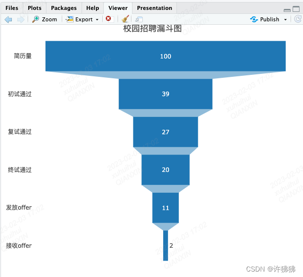
y = c("简历量", "初试通过", "复试通过", "终试通过", "发放offer", "接收offer"),
x = c(100, 39, 27, 20, 11, 2))
fig <- fig %>%
layout(title = "校园招聘漏斗图",
yaxis = list(categoryarray = c("简历量", "初试通过", "复试通过", "终试通过", "发放offer", "接收offer")))
fig
#带通过率漏斗图(显示各环节相对于第一个环节的通过率)
fig <- plot_ly()
fig <- fig %>%
  add_trace(
  type = "funnel",  #选择漏斗图
  y = c("简历量", "初试通过", "复试通过", "终试通过", &#
最低0.47元/天 解锁文章


 被折叠的 条评论
为什么被折叠?
被折叠的 条评论
为什么被折叠?
 到【灌水乐园】发言


