


当开发者掌握了状态管理的基本概念后,往往想开发一款自己的应用。然而,如果在应用开发初期未能精心规划项目结构,随着项目的不断扩展和复杂化,状态变量的增多将导致组件间关系变得错综复杂。此时,开发任何新功能都可能引起连锁反应,维护成本也会增加。为此,本文旨在介绍MVVM模式以及ArkUI的UI开发模式与MVVM的关系,指引开发者如何去设计自己的项目结构,从而在产品迭代和升级时,能更容易的去开发和维护。
本文档涵盖了大多数状态管理V1装饰器,所以在阅读本文档前,建议开发者对状态管理V1有一定的了解。
MVVM模式介绍
概念
在应用开发中,UI的更新需要随着数据状态的变化进行实时同步,而这种同步往往决定了应用程序的性能和用户体验。为了解决数据与UI同步的复杂性,ArkUI采用了 Model-View-ViewModel(MVVM)架构模式。MVVM 将应用分为Model、View和ViewModel三个核心部分,实现数据、视图与逻辑的分离。通过这种模式,UI可以随着状态的变化自动更新,无需手动处理,从而更加高效地管理数据和视图的绑定与更新。
- Model:负责存储和管理应用的数据以及业务逻辑,不直接与用户界面交互。通常从后端接口获取数据,是应用程序的数据基础,确保数据的一致性和完整性。
- View:负责用户界面展示数据并与用户交互,不包含任何业务逻辑。它通过绑定ViewModel层提供的数据来动态更新UI。
- ViewModel:负责管理UI状态和交互逻辑。作为连接Model和View的桥梁,通常一个View对应一个ViewModel,ViewModel监控Model数据的变化,通知View更新UI,同时处理用户交互事件并转换为数据操作。
ArkUI的UI开发模式就属于MVVM模式,通过对MVVM概念的基本介绍,开发者大致能猜到状态管理能在MVVM中起什么样的作用,状态管理旨在数据驱动更新,让开发者只用关注页面设计,而不去关注整个UI的刷新逻辑,数据的维护也无需开发者进行感知,由状态变量自动更新完成,而这就是属于ViewModel层所需要支持的内容,因此开发者使用MVVM模式开发自己的应用是最省心省力的。
ArkUI开发模式图
ArkUI的UI开发开发模式即是MVVM模式,而状态变量在MVVM模式中扮演着ViewModel的角色,向上刷新UI,向下更新数据,整体框架如下图:
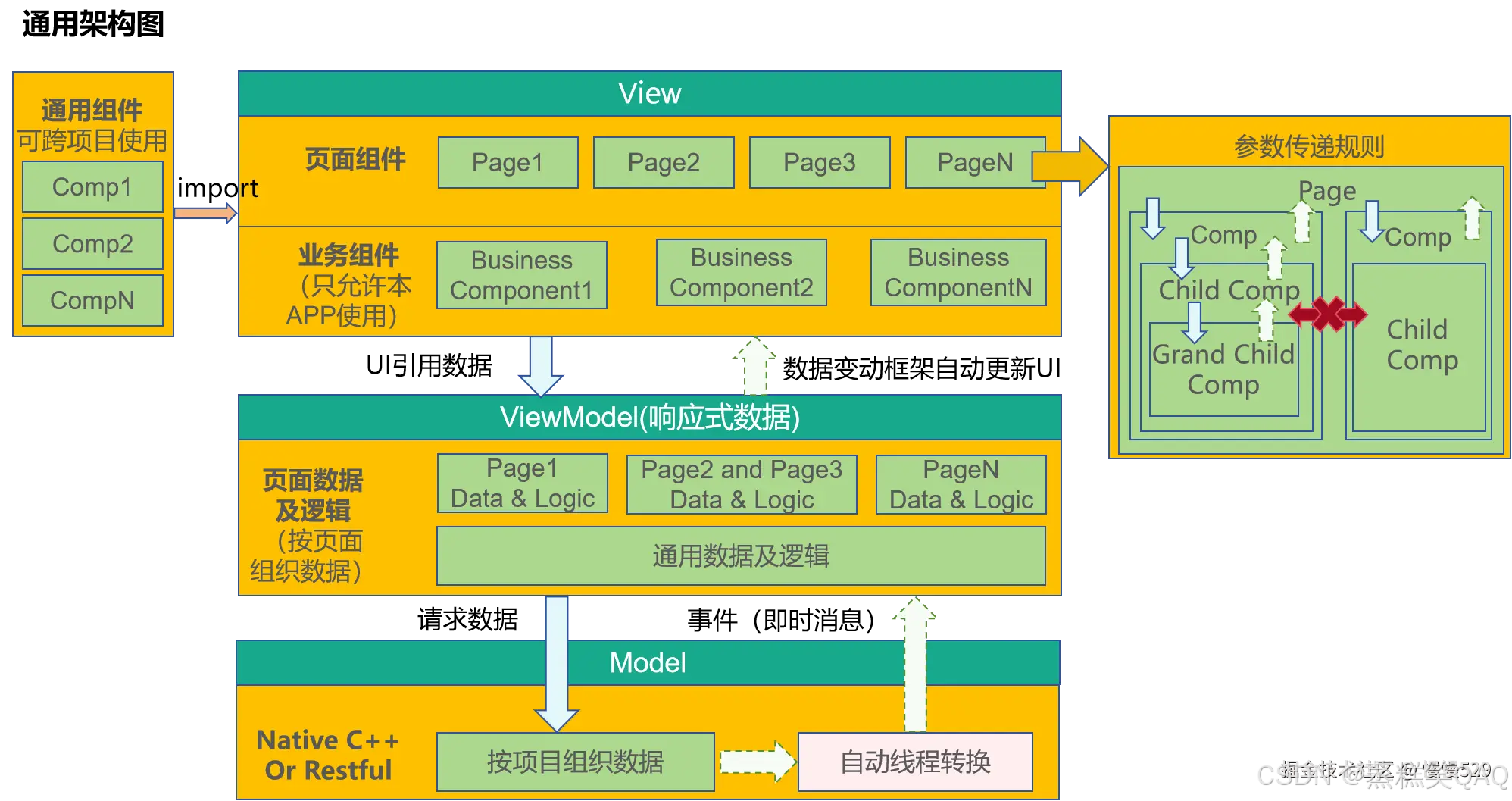
分层说明
View层
- 页面组件:所有应用基本都是按照页面进行分类的,比如登录页,列表页,编辑页,帮助页,版权页等。每个页对应需要的数据可能是完全不一样的,也可能多个页面需要的数据是同一套。
- 业务组件:本身具备本APP部分业务能力的功能组件,典型的就是这个业务组件可能关联了本项目的ViewModel中的数据,不可以被共享给其他项目使用。
- 通用组件:像系统组件一样,这类组件不会关联本APP中ViewModel的数据,这些组件可实现跨越多个项目进行共享,来完成比较通用的功能。
ViewModel层
- 页面数据:按照页面组织的数据,当用户浏览页面时,某些页面可能不会被显示出来,因此,这个页面数据最好设计成懒加载(按需加载)的模式。
ViewModel层数据和Model层数据的区别:
Model层数据是按照整个工程,项目来组织数据,是一套完成本APP的业务数据。
ViewModel层数据,是提供某个页面上使用的数据,它可能是整个APP的业务数据的一部分。另外ViewModel层还可以附加对应Page的辅助页面显示数据,这部分数据可能与本APP的业务完全无关,仅仅是为页面展示提供便利的辅助数据。
Model层
Model层是应用的原始数据提供者。
架构核心原则
不可跨层访问
- View层不可以直接调用Model层的数据,只能通过ViewModel提供的方法进行调用。
- Model层数据,不可以直接操作UI,Model层只能通知ViewModel层数据有更新,由ViewModel层更新对应的数据。
下层不可访问上层数据
下层的数据通过通知模式更新上层数据。在业务逻辑中,下层不可直接写代码去获取上层数据。如ViewModel层的逻辑处理,不能去依赖View层界面上的某个值。
非父子组件间不可直接访问
这是针对View层设计的核心原则,一个组件应该具备这样的逻辑:
- 禁止直接访问父组件(必须使用事件或是订阅能力)。
- 禁止直接访问兄弟组件能力。这是因为组件应该仅能访问自己看的见的子节点(通过传参)和父节点(通过事件或通知),以此完成组件之间的解耦。
对于一个组件,这样设计的原因是:
- 组件自己使用了哪些子组件是明确的,因此可以访问。
- 组件被放置于哪个父节点下是未知的,因此组件想访问父节点,就只能通过通知或者事件能力完成。
- 组件不可能知道自己的兄弟节点是谁,因此组件不可以操纵兄弟节点。
备忘录开发实战
本节通过备忘录应用的开发,让开发者了解如何通过ArkUI框架设计自己的应用,本节未设计代码架构直接进行功能开发,即根据需求做即时开发,不考虑后续维护,同时向开发者介绍功能开发所需的装饰器。
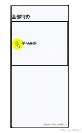
@State状态变量
- @State装饰器作为最常用的装饰器,用来定义状态变量,一般作为父组件的数据源,当开发者点击时,通过触发状态变量的更新从而刷新UI,去掉@State则不再支持刷新UI。
@Entry
@Component
struct Index {
  @State isFinished: boolean = false;

  build() {
    Column() {
      Row() {
        Text('全部待办')
          .fontSize(30)
          .fontWeight(FontWeight.Bold)
      }
      .width('100%')
      .margin({top: 10, bottom: 10})

      // 待办事项
      Row({space: 15}) {
        if (this.isFinished) {
          // 此处'app.media.finished'仅作示例,请开发者自行替换,否则imageSource创建失败会导致后续无法正常执行。
          Image($r('app.media.finished'))
            .width(28)
            .height(28)
        }
        else {
          // 此处'app.media.unfinished'仅作示例,请开发者自行替换,否则imageSource创建失败会导致后续无法正常执行。
          Image($r('app.media.unfinished'))
            .width(28)
            .height(28)
        }
        Text('学习高数')
          .fontSize(24)
          .fontWeight(450)
          .decoration({type: this.isFinished ? TextDecorationType.LineThrough : TextDecorationType.None})
      }
      .height('40%')
      .width('100%')
      .border({width: 5})
      .padding({left: 15})
      .onClick(() => {
        this.isFinished = !this.isFinished;
      })
    }
    .height('100%')
    .width('100%')
    .margin({top: 5, bottom: 5})
    .backgroundColor('#90f1f3f5')
  }
}
效果图:
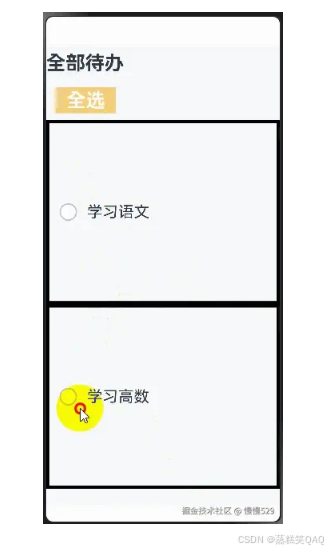
@Prop、@Link的作用
上述示例中,所有的代码都写在了@Entry组件中,随着需要渲染的组件越来越多,@Entry组件必然需要进行拆分,为此拆分出的子组件就需要使用@Prop和@Link装饰器:
- @Prop是父子间单向传递,子组件会深拷贝父组件数据,可从父组件更新,也可自己更新数据,但不会同步父组件数据。
- @Link是父子间双向传递,父组件改变,会通知所有的@Link,同时@Link的更新也会通知父组件对应变量进行刷新。
@Component
struct TodoComponent {
  build() {
    Row() {
      Text('全部待办')
        .fontSize(30)
        .fontWeight(FontWeight.Bold)
    }
    .width('100%')
    .margin({top: 10, bottom: 10})
  }
}

@Component
struct AllChooseComponent {
  @Link isFinished: boolean;

  build() {
    Row() {
      Button('全选', {type: ButtonType.Normal})
        .onClick(() => {
          this.isFinished = !this.isFinished;
        })
        .fontSize(30)
        .fontWeight(FontWeight.Bold)
        .backgroundColor('#f7f6cc74')
    }
    .padding({left: 15})
    .width('100%')
    .margin({top: 10, bottom: 10})
  }
}

@Component
struct ThingsComponent1 {
  @Prop isFinished: boolean;

  build() {
    // 待办事项1
    Row({space: 15}) {
      if (this.isFinished) {
        // 此处'app.media.finished'仅作示例,请开发者自行替换,否则imageSource创建失败会导致后续无法正常执行。
        Image($r('app.media.finished'))
          .width(28)
          .height(28)
      }
      else {
        // 此处'app.media.unfinished'仅作示例,请开发者自行替换,否则imageSource创建失败会导致后续无法正常执行。
        Image($r('app.media.unfinished'))
          .width(28)
          .height(28)
      }
      Text('学习语文')
        .fontSize(24)
        .fontWeight(450)
        .decoration({type: this.isFinished ? TextDecorationType.LineThrough : TextDecorationType.None})
    }
    .height('40%')
    .width('100%')
    .border({width: 5})
    .padding({left: 15})
    .onClick(() => {
      this.isFinished = !this.isFinished;
    })
  }
}

@Component
struct ThingsComponent2 {
  @Prop isFinished: boolean;

  build() {
    // 待办事项1
    Row({space: 15}) {
      if (this.isFinished) {
        // 此处'app.media.finished'仅作示例,请开发者自行替换,否则imageSource创建失败会导致后续无法正常执行。
        Image($r('app.media.finished'))
          .width(28)
          .height(28)
      }
      else {
        // 此处'app.media.unfinished'仅作示例,请开发者自行替换,否则imageSource创建失败会导致后续无法正常执行。
        Image($r('app.media.unfinished'))
          .width(28)
          .height(28)
      }
      Text('学习高数')
        .fontSize(24)
        .fontWeight(450)
        .decoration({type: this.isFinished ? TextDecorationType.LineThrough : TextDecorationType.None})
    }
    .height('40%')
    .width('100%')
    .border({width: 5})
    .padding({left: 15})
    .onClick(() => {
      this.isFinished = !this.isFinished;
    })
  }
}

@Entry
@Component
struct Index {
  @State isFinished: boolean = false;

  build() {
    Column() {
      // 全部待办
      TodoComponent()

      // 全选
      AllChooseComponent({isFinished: this.isFinished})

      // 待办事项1
      ThingsComponent1({isFinished: this.isFinished})

      // 待办事项2
      ThingsComponent2({isFinished: this.isFinished})
    }
    .height('100%')
    .width('100%')
    .margin({top: 5, bottom: 5})
    .backgroundColor('#90f1f3f5')
  }
}
效果图如下:
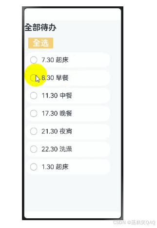
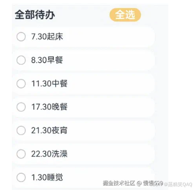
循环渲染组件
- 上个示例虽然拆分出了子组件,但是发现组件1和组件2的代码十分类似,当渲染的组件除了数据外其他设置都相同时,此时就需要使用到ForEach循环渲染。
- ForEach使用之后,冗余代码变得更少,并且代码结构更加清晰。
@Component
struct TodoComponent {
  build() {
    Row() {
      Text('全部待办')
        .fontSize(30)
        .fontWeight(FontWeight.Bold)
    }
    .width('100%')
    .margin({top: 10, bottom: 10})
  }
}

@Component
struct AllChooseComponent {
  @Link isFinished: boolean;

  build() {
    Row() {
      Button('全选', {type: ButtonType.Normal})
        .onClick(() => {
          this.isFinished = !this.isFinished;
        })
        .fontSize(30)
        .fontWeight(FontWeight.Bold)
        .backgroundColor('#f7f6cc74')
    }
    .padding({left: 15})
    .width('100%')
    .margin({top: 10, bottom: 10})
  }
}

@Component
struct ThingsComponent {
  @Prop isFinished: boolean;
  @Prop things: string;
  build() {
    // 待办事项1
    Row({space: 15}) {
      if (this.isFinished) {
        // 此处'app.media.finished'仅作示例,请开发者自行替换,否则imageSource创建失败会导致后续无法正常执行。
        Image($r('app.media.finished'))
          .width(28)
          .height(28)
      }
      else {
        // 此处'app.media.unfinished'仅作示例,请开发者自行替换,否则imageSource创建失败会导致后续无法正常执行。
        Image($r('app.media.unfinished'))
          .width(28)
          .height(28)
      }
      Text(`${this.things}`)
        .fontSize(24)
        .fontWeight(450)
        .decoration({type: this.isFinished ? TextDecorationType.LineThrough : TextDecorationType.None})
    }
    .height('8%')
    .width('90%')
    .padding({left: 15})
    .opacity(this.isFinished ? 0.3: 1)
    .border({width:1})
    .borderColor(Color.White)
    .borderRadius(25)
    .backgroundColor(Color.White)
    .onClick(() => {
      this.isFinished = !this.isFinished;
    })
  }
}

@Entry
@Component
struct Index {
  @State isFinished: boolean = false;
  @State planList: string[] = [
    '7.30 起床',
    '8.30 早餐',
    '11.30 中餐',
    '17.30 晚餐',
    '21.30 夜宵',
    '22.30 洗澡',
    '1.30 起床'
  ];

  build() {
    Column() {
      // 全部待办
      TodoComponent()

      // 全选
      AllChooseComponent({isFinished: this.isFinished})

      List() {
        ForEach(this.planList, (item: string) => {
          // 待办事项1
          ThingsComponent({isFinished: this.isFinished, things: item})
            .margin(5)
        })
      }

    }
    .height('100%')
    .width('100%')
    .margin({top: 5, bottom: 5})
    .backgroundColor('#90f1f3f5')
  }
}
效果图如下:
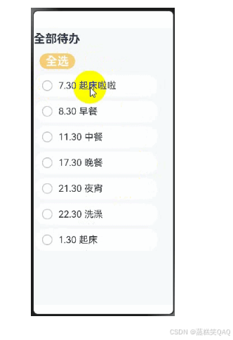
@Builder方法
- Builder方法用于组件内定义方法,可以使得相同代码可以在组件内进行复用。
- 本示例不仅使用了@Builder方法进行去重,同时对数据进行了移出,可以看到此时代码更加清晰易读,相对于最开始的代码,@Entry组件基本只用于处理页面构建逻辑,而不处理大量与页面设计无关的内容。
@Observed
class TodoListData {
  planList: string[] = [
    '7.30 起床',
    '8.30 早餐',
    '11.30 中餐',
    '17.30 晚餐',
    '21.30 夜宵',
    '22.30 洗澡',
    '1.30 起床'
  ];
}

@Component
struct TodoComponent {
  build() {
    Row() {
      Text('全部待办')
        .fontSize(30)
        .fontWeight(FontWeight.Bold)
    }
    .width('100%')
    .margin({top: 10, bottom: 10})
  }
}

@Component
struct AllChooseComponent {
  @Link isFinished: boolean;

  build() {
    Row() {
      Button('全选', {type: ButtonType.Capsule})
        .onClick(() => {
          this.isFinished = !this.isFinished;
        })
        .fontSize(30)
        .fontWeight(FontWeight.Bold)
        .backgroundColor('#f7f6cc74')
    }
    .padding({left: 15})
    .width('100%')
    .margin({top: 10, bottom: 10})
  }
}

@Component
struct ThingsComponent {
  @Prop isFinished: boolean;
  @Prop things: string;

  @Builder displayIcon(icon: Resource) {
    Image(icon)
      .width(28)
      .height(28)
      .onClick(() => {
        this.isFinished = !this.isFinished;
      })
  }

  build() {
    // 待办事项1
    Row({space: 15}) {
      if (this.isFinished) {
        // 此处'app.media.finished'仅作示例,请开发者自行替换,否则imageSource创建失败会导致后续无法正常执行。
        this.displayIcon($r('app.media.finished'));
      }
      else {
        // 此处'app.media.unfinished'仅作示例,请开发者自行替换,否则imageSource创建失败会导致后续无法正常执行。
        this.displayIcon($r('app.media.unfinished'));
      }
      Text(`${this.things}`)
        .fontSize(24)
        .fontWeight(450)
        .decoration({type: this.isFinished ? TextDecorationType.LineThrough : TextDecorationType.None})
        .onClick(() => {
          this.things += '啦';
        })
    }
    .height('8%')
    .width('90%')
    .padding({left: 15})
    .opacity(this.isFinished ? 0.3: 1)
    .border({width:1})
    .borderColor(Color.White)
    .borderRadius(25)
    .backgroundColor(Color.White)
  }
}

@Entry
@Component
struct Index {
  @State isFinished: boolean = false;
  @State data: TodoListData = new TodoListData();

  build() {
    Column() {
      // 全部待办
      TodoComponent()

      // 全选
      AllChooseComponent({isFinished: this.isFinished})

      List() {
        ForEach(this.data.planList, (item: string) => {
          // 待办事项1
          ThingsComponent({isFinished: this.isFinished, things: item})
            .margin(5)
        })
      }

    }
    .height('100%')
    .width('100%')
    .margin({top: 5, bottom: 5})
    .backgroundColor('#90f1f3f5')
  }
}
效果图如下:
总结
- 通过对代码结构的一步步优化,可以看到@Enrty组件作为页面的入口,其build函数应该只需要考虑将需要的组件进行组合,类似于搭积木,将需要的组件搭起来。被page调用的子组件则类似积木,等着被需要的page进行调用。状态变量类似于粘合剂,当触发UI刷新事件时,状态变量能自动完成对应绑定的组件的刷新,从而实现page的按需刷新。
- 虽然现有的架构并未使用到MVVM的设计理念,但是MVVM的核心理念已经呼之欲出,这也是为什么说ArkUI的UI开发天生属于MVVM模式,page和组件就是View层,page负责搭积木,组件就是积木被page组织;组件需要刷新,通过状态变量驱动组件刷新从而更新page;ViewModel的数据需要有来源,这就是Model层来源。
- 示例中的代码功能还是比较简单的,但是已经感觉到功能越来越多的情况下,主page的代码越来越多,当备忘录需要添加的功能越来越多时,其他的page也需要使用到主page的组件时,应该如何去组织项目结构呢,MVVM模式是组织的首选。
通过MVVM开发备忘录实战
上一章节中,展示了非MVVM模式如何组织代码,能感觉到随着主page的代码越来越庞大,应该采取合理的方式进行分层,使得项目结构清晰,组件之间不去互相引用,导致后期维护时牵一发而动全身,加大后期功能更新的困难,为此本章通过对MVVM的核心文件组织模式介绍入手,向开发者展示如何使用MVVM来组织上一章节的代码。
MVVM文件结构说明
-
src
-
ets
-
pages ------ 存放页面组件
-
views ------ 存放业务组件
-
shares ------ 存放通用组件
-
service ------ 数据服务
- app.ts ------ 服务入口
- LoginViewModel ----- 登录页ViewModel
- xxxModel ------ 其他页ViewModel
-
-
分层设计技巧
Model层
- model层存放本应用核心数据结构,这层本身和UI开发关系不大,让用户按照自己的业务逻辑进行封装。
ViewModel层
注意:
ViewModel层不只是存放数据,他同时需要提供数据的服务及处理,因此很多框架会以“service”来进行表达此层。
-
ViewModel层是为视图服务的数据层。它的设计一般来说,有两个特点:
1、按照页面组织数据。
2、每个页面数据进行懒加载。
View层
View层根据需要来组织,但View层需要区分一下三种组件:
- 页面组件:提供整体页面布局,实现多页面之间的跳转,前后台事件处理等页面内容。
- 业务组件:被页面引用,构建出页面。
- 共享组件:与项目无关的多项目共享组件。
共享组件和业务组件的区别:
业务组件包含了ViewModel层数据,没有ViewModel,这个组件不能运行。
共享组件:不包含ViewModel层的数据,需要的数据从外部传入。共享组件包含一个自定义组件,只要外部参数(无业务参数)满足,就可以工作。
代码示例
现在按照MVVM模式组织结构,重构如下:
-
src
-
ets
-
Model
- ThingsModel
- TodoListModel
-
pages
- Index
-
View
- AllChooseComponent
- ThingsComponent
- TodoComponent
- TodoListComponent
-
ViewModel
- ThingsViewModel
- TodoListViewModel
-
-
resources
-
rawfile
- defaultTasks.json
-
-
文件代码如下:
- Index.ets
import { common } from '@kit.AbilityKit';
// import ViewModel
import TodoListViewModel from '../ViewModel/TodoListViewModel';

// import View
import { TodoComponent } from '../View/TodoComponent';
import { AllChooseComponent } from '../View/AllChooseComponent';
import { TodoListComponent } from '../View/TodoListComponent';

@Entry
@Component
struct TodoList {
  @State thingsTodo: TodoListViewModel = new TodoListViewModel();
  private context = getContext(this) as common.UIAbilityContext;

  async aboutToAppear() {
    await this.thingsTodo.loadTasks(this.context);
  }

  build() {
    Column() {
      Row({ space: 40 }) {
        // 全部待办
        TodoComponent()
        //全选
        AllChooseComponent({ thingsViewModel: this.thingsTodo })
      }

      Column() {
        TodoListComponent({ thingsViewModelArray: this.thingsTodo.things })
      }
    }
    .height('100%')
    .width('100%')
    .margin({ top: 5, bottom: 5 })
    .backgroundColor('#90f1f3f5')
  }
}
- ThingsModel.ets
export default class ThingsModel {
  thingsName: string = 'Todo';
  isFinish: boolean = false;
}
- TodoListModel.ets
import { common } from '@kit.AbilityKit';
import util from '@ohos.util';
import ThingsModel from './ThingsModel';

export default class TodoListModel {
  things: Array<ThingsModel> = [];

  constructor(things: Array<ThingsModel>) {
    this.things = things;
  }

  async loadTasks(context: common.UIAbilityContext) {
    let getJson = await context.resourceManager.getRawFileContent('defaultTasks.json');
    let textDecoderOptions: util.TextDecoderOptions = { ignoreBOM: true };
    let textDecoder = util.TextDecoder.create('utf-8', textDecoderOptions);
    let result = textDecoder.decodeToString(getJson, { stream: false });
    this.things = JSON.parse(result);
  }
}
- AllChooseComponent.ets
import TodoListViewModel from "../ViewModel/TodoListViewModel";

@Component
export struct AllChooseComponent {
  @State titleName: string = '全选';
  @Link thingsViewModel: TodoListViewModel;

  build() {
    Row() {
      Button(`${this.titleName}`, { type: ButtonType.Capsule })
        .onClick(() => {
          this.thingsViewModel.chooseAll();
          this.titleName = this.thingsViewModel.isChoosen ? '全选' : '取消全选';
        })
        .fontSize(30)
        .fontWeight(FontWeight.Bold)
        .backgroundColor('#f7f6cc74')
    }
    .padding({ left: this.thingsViewModel.isChoosen ? 15 : 0 })
    .width('100%')
    .margin({ top: 10, bottom: 10 })
  }
}
- ThingsComponent.ets
import ThingsViewModel from "../ViewModel/ThingsViewModel";

@Component
export struct ThingsComponent {
  @Prop things: ThingsViewModel;

  @Builder
  displayIcon(icon: Resource) {
    Image(icon)
      .width(28)
      .height(28)
      .onClick(() => {
        this.things.updateIsFinish();
      })
  }

  build() {
    // 待办事项
    Row({ space: 15 }) {
      if(this.things.isFinish) {
        // 此处'app.media.finished'仅作示例,请开发者自行替换,否则imageSource创建失败会导致后续无法正常执行。
        this.displayIcon($r('app.media.finished'));
      } else {
        // 此处'app.media.unfinished'仅作示例,请开发者自行替换,否则imageSource创建失败会导致后续无法正常执行。
        this.displayIcon($r('app.media.unfinished'));
      }

      Text(`${this.things.thingsName}`)
        .fontSize(24)
        .fontWeight(450)
        .decoration({ type: this.things.isFinish ? TextDecorationType.LineThrough: TextDecorationType.None })
        .onClick(() => {
          this.things.addSuffixes();
        })
    }
    .height('8%')
    .width('90%')
    .padding({ left: 15 })
    .opacity(this.things.isFinish ? 0.3 : 1)
    .border({ width: 1 })
    .borderColor(Color.White)
    .borderRadius(25)
    .backgroundColor(Color.White)
  }
}
- TodoComponent.ets
import ThingsViewModel from "../ViewModel/ThingsViewModel";
import { ThingsViewModelArray } from "../ViewModel/TodoListViewModel"
import { ThingsComponent } from "./ThingsComponent";

@Component
export struct TodoListComponent {
  @ObjectLink thingsViewModelArray: ThingsViewModelArray;

  build() {
    Column() {
      List() {
        ForEach(this.thingsViewModelArray, (item: ThingsViewModel) => {
          // 待办事项
          ListItem() {
            ThingsComponent({ things: item })
              .margin(5)
          }
        }, (item: ThingsViewModel) => {
          return item.thingsName;
        })
      }
    }
  }
}
- TodoListComponent.ets
@Component
export struct TodoComponent {
  build() {
    Row() {
      Text('全部待办')
        .fontSize(30)
        .fontWeight(FontWeight.Bold)
    }
    .padding({ left: 15 })
    .width('50%')
    .margin({ top: 10, bottom: 10 })
  }
}
- ThingsViewModel.ets
import ThingsModel from "../Model/ThingsModel";

@Observed
export default class ThingsViewModel {
  @Track thingsName: string = 'Todo';
  @Track isFinish: boolean = false;

  updateTask(things: ThingsModel) {
    this.thingsName = things.thingsName;
    this.isFinish = things.isFinish;
  }

  updateIsFinish(): void {
    this.isFinish = !this.isFinish;
  }

  addSuffixes(): void {
    this.thingsName += '啦';
  }
}
- TodoListViewModel.ets
import ThingsViewModel from "./ThingsViewModel";
import { common } from "@kit.AbilityKit";
import TodoListModel from "../Model/TodoListModel";

@Observed
export class ThingsViewModelArray extends Array<ThingsViewModel> {
}

@Observed
export default class TodoListViewModel {
  @Track isChoosen: boolean = true;
  @Track things: ThingsViewModelArray = new ThingsViewModelArray();

  async loadTasks(context: common.UIAbilityContext) {
    let todoList = new TodoListModel([]);
    await todoList.loadTasks(context);
    for(let things of todoList.things) {
      let thingsViewModel = new ThingsViewModel();
      thingsViewModel.updateTask(things);
      this.things.push(thingsViewModel);
    }
  }

  chooseAll(): void {
    for(let things of this.things) {
      things.isFinish = this.isChoosen;
    }
    this.isChoosen = !this.isChoosen;
  }
}
- defaultTasks.json
[
  {"thingsName": "7.30起床", "isFinish": false},
  {"thingsName": "8.30早餐", "isFinish": false},
  {"thingsName": "11.30中餐", "isFinish": false},
  {"thingsName": "17.30晚餐", "isFinish": false},
  {"thingsName": "21.30夜宵", "isFinish": false},
  {"thingsName": "22.30洗澡", "isFinish": false},
  {"thingsName": "1.30睡觉", "isFinish": false}
]
经过MVVM模式拆分后的代码,项目结构更加清晰,各模块的职责更加明确。如果有新的页面需要使用事件组件,比如TodoListComponent组件,只需导入该组件即可。
效果图如下:


 扫一扫
扫一扫


 被折叠的 条评论
为什么被折叠?
被折叠的 条评论
为什么被折叠?
 到【灌水乐园】发言


