


Radio是单选框组件,通常用于提供相应的用户交互选择项,同一组的Radio中只有一个可以被选中。
创建单选框
Radio通过调用[RadioOptions]来创建,以RadioOptions中的value和group为例:
Radio(options: {value: string, group: string})
其中,value是单选框的名称,group是单选框的所属群组名称。checked属性可以设置单选框的状态,状态分别为false和true,设置为true时表示单选框被选中。
Radio支持设置选中状态和非选中状态的样式。
Radio({ value: 'Radio1', group: 'radioGroup' })
  .checked(false)
Radio({ value: 'Radio2', group: 'radioGroup' })
  .checked(true)

添加事件
除支持[通用事件]外,Radio还用于选中后触发某些操作,可以绑定onChange事件来响应选中操作后的自定义行为。
  Radio({ value: 'Radio1', group: 'radioGroup' })
    .onChange((isChecked: boolean) => {
      if(isChecked) {
        //需要执行的操作
      }
    })
  Radio({ value: 'Radio2', group: 'radioGroup' })
    .onChange((isChecked: boolean) => {
      if(isChecked) {
        //需要执行的操作
      }
    })
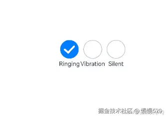
场景示例
通过点击Radio切换声音模式。
// xxx.ets
import { promptAction } from '@kit.ArkUI';

@Entry
@Component
struct RadioExample {
  @State Rst: promptAction.ShowToastOptions = { 'message': 'Ringing mode.' };
  @State Vst: promptAction.ShowToastOptions = { 'message': 'Vibration mode.' };
  @State Sst: promptAction.ShowToastOptions = { 'message': 'Silent mode.' };

  build() {
    Row() {
      Column() {
        Radio({ value: 'Radio1', group: 'radioGroup' }).checked(true)
          .height(50)
          .width(50)
          .onChange((isChecked: boolean) => {
            if (isChecked) {
              // 切换为响铃模式
              this.getUIContext().getPromptAction().showToast(this.Rst);
            }
          })
        Text('Ringing')
      }

      Column() {
        Radio({ value: 'Radio2', group: 'radioGroup' })
          .height(50)
          .width(50)
          .onChange((isChecked: boolean) => {
            if (isChecked) {
              // 切换为振动模式
              this.getUIContext().getPromptAction().showToast(this.Vst);
            }
          })
        Text('Vibration')
      }

      Column() {
        Radio({ value: 'Radio3', group: 'radioGroup' })
          .height(50)
          .width(50)
          .onChange((isChecked: boolean) => {
            if (isChecked) {
              // 切换为静音模式
              this.getUIContext().getPromptAction().showToast(this.Sst);
            }
          })
        Text('Silent')
      }
    }.height('100%').width('100%').justifyContent(FlexAlign.Center)
  }
}


 扫一扫
扫一扫


 被折叠的 条评论
为什么被折叠?
被折叠的 条评论
为什么被折叠?
 到【灌水乐园】发言


