


安卓笔记
- 智能手机应用类型
- 按钮
- 菜单
- 文本框
- 拨打电话
- 显示弹窗
- 界面布局
- ConstraintLayout动画
- 界面的动态替换
- 使用ViewStub动态实例化控件
- CountDown倒计时
- 按钮动画
- 设置按钮集合
- XXOO游戏
- 新建另一个页面
- Activity状态与生命周期
- 创建新的Activity
- 新建一个对象
- 多个Activity
- Intent
- 安卓权限问题
- Fragment
- Jetpack
- Android Material Design
- RecyclerView
- 声明
智能手机应用类型
- Mobile Web
本质上是一个传统的Web应用 - Native App
使用Kotlin/Swift开发
使用系统原生的编程语言实现,调用手机硬件和操作系统的所有功能,开发量较大 - Hybrid App
本质上是一个内嵌了WebView的NativeApp
使用JavaScript编写
id 'kotlin-android-extensions'
按钮
val Year = findViewById<TextView>(R.id.editText)
val textView2 = findViewById<TextView>(R.id.textView2)
val btnClick = findViewById<Button>(R.id.button)
//响应按钮
btnClick.setOnClickListener {
	val NowYear = Calendar.getInstance()[Calendar.YEAR]//日期
	val InYear = Year.text.toString().toInt()
	textView2.text = "您的年龄是:" + (NowYear - InYear)
}
btnChangeMyText.setOnClickListener {
	counter++//事件响应函数中的第一个参数,引用按钮对象自己
	(it as Button).text = "我被扁了${counter}次! :-("
}
btnLongClick.setOnLongClickListener {
	Toast.makeText(this, "长按了按钮", Toast.LENGTH_SHORT).show()
     true//返回true表示应用程序己经处理了长按事件
}
//设定复选框的状态
myCheckBox.isChecked = false
//响应复选框状态的改变
myCheckBox.setOnCheckedChangeListener { buttonView, isChecked ->
//buttonView引用当前的复选框对象
//isChecked表示当前是选中还是取消
	val info = if (isChecked) "勾选" else "取消勾选"
	buttonView.text = "您${info}了复选框"
}
//针对单选钮的编程,需要基于它的容器RadioGroup
rgGender.setOnCheckedChangeListener { group, checkedId ->
//checkedId表示当前选中的单选钮Id
	tvRadioButton.text = when (checkedId) {
	R.id.rdoFemale -> "美女"
	R.id.rdoMale -> "帅哥"
	else -> "傻瓜"
	}
}
var isFlower = false
btnChangeImage.setOnClickListener {
	if (isFlower) {
		image.setImageResource(R.drawable.forest)
	} else {
	image.setImageResource(R.drawable.flower)
	}
	isFlower = !isFlower
}
//使用ImageAsset
image.setImageResource(R.mipmap.ic_launcher)
rGroup.setOnCheckedChangeListener { group, checkedId ->
	when (checkedId) {
		R.id.center -> image.setScaleType(ImageView.ScaleType.FIT_CENTER)
         R.id.fitend -> image.setScaleType(ImageView.ScaleType.FIT_END)
         R.id.fitstart -> image.setScaleType(ImageView.ScaleType.FIT_START)
     }
}//when就是switch
菜单
右上角小菜单
File name: mymenu
Recource type: Menu
Directory name: menu
ShowAsAction:ifRoom有空间则显示,always始终显示,withText同时显示文本
override fun onCreateOptionsMenu(menu: Menu?): Boolean {
	super.onCreateOptionsMenu(menu)
	//设置在任何情况下均显示图标
    setIconEnable(menu!!,true);
    //加载菜单资源
    menuInflater.inflate(R.menu.mymenu,menu)
    return true
}
//Hack手段,使用反射打开“显示菜单项图标”功能
private fun setIconEnable(menu: Menu, enable: Boolean) {
    try {
        val clazz =
            Class.forName("androidx.appcompat.view.menu.MenuBuilder")
        val m: Method = clazz.getDeclaredMethod(
            "setOptionalIconsVisible",
             Boolean::class.javaPrimitiveType
        )
        m.isAccessible = true
        //下面传入参数
        m.invoke(menu, enable)
    } catch (e: Exception) {
        e.printStackTrace()
    }
}
//相应菜单点击事件
override fun onOptionsItemSelected(item: MenuItem): Boolean {
    super.onOptionsItemSelected(item)
    when(item.itemId){
        R.id.mnuAbout->tvInfo.text="About"
        R.id.mnuEdit->tvInfo.text="Edit"
        R.id.mnuExit->finish()
        R.id.mnuNew->tvInfo.text="New"
        R.id.mnuOpen->tvInfo.text="Open"
        R.id.mnuSave->tvInfo.text="Save"
    }
    return true
}
    override fun onCreateOptionsMenu(menu: Menu): Boolean {
        super.onCreateOptionsMenu(menu)
        menuInflater.inflate(R.menu.menu, menu)
        return true
    }

    override fun onOptionsItemSelected(item: MenuItem): Boolean {
        if (item.itemId == R.id.about_item) {
            showInfo()
        }
        return true
    }

    private fun showInfo() {
        val dialogTitle = "关于"
        val dialogMessage = "倒计时计数器 ver 1.0 \n\n开发:金旭亮"
        val builder = AlertDialog.Builder(this)
        builder.setTitle(dialogTitle)
        builder.setMessage(dialogMessage)
        builder.create().show()
    }
上下文菜单
File name:mycontext_menu
Directory name: menu
Recource type: Menu
registerForContextMenu(tvInfo)// 给控件注册上下文菜单

override fun onCreateContextMenu(
    menu: ContextMenu?,
    v: View?,
    menuInfo: ContextMenu.ContextMenuInfo?
) {
    super.onCreateContextMenu(menu, v, menuInfo)
    menuInflater.inflate(R.menu.mycontext_menu,menu)
}

override fun onContextItemSelected(item: MenuItem): Boolean {
   val info= when(item.itemId){
       R.id.main_ctxmenu_deleteCommunicator->
           "选中了:main_ctxmenu_deleteCommunicator"
       R.id.main_ctxmenu_editCommunicator->
           "选中了:main_ctxmenu_editCommunicator"
       else -> "选中了:main_ctxmenu_sendMessage"
    }
    tvInfo.text=info
    return true
}
文本框
EditText
intputType属性:用于限制用户只能输⼊数字等特定的字符
text属性:用于取出用户输⼊的字符串
maxLength属性:用于设置用户能输⼊的最⼤字符数
edtPhone.addTextChangedListener(object : TextWatcher {
    override fun afterTextChanged(s: Editable?) {
    }

    override fun beforeTextChanged(s: CharSequence?, start: Int,
                                   count: Int, after: Int) {
    }

    override fun onTextChanged(s: CharSequence?, start: Int,
                                       before: Int, count: Int) {
        val strLength = s.toString()?.length
        if (strLength == 11) {
            tvInfo.text = "您输入的手机号码是:${s}"
        } else {
            tvInfo.text = "还剩余${11 - strLength}个数字"
        }
   }
})

btnCall.setOnClickListener {
    callPhone(edtPhone.text.toString())
}
拨打电话
在AndroidManifest.xml中声明权限:
<uses-permission android:name="android.permission.CALL_PHONE"/>
显示弹窗
消息弹框
Toast.makeText(this, "长按了按钮", Toast.LENGTH_SHORT).show()
界面弹框
    private fun showInfo() {
        val dialogTitle = "关于"
        val dialogMessage = "倒计时计数器 ver 1.0 \n\n开发:金旭亮"
        val builder = AlertDialog.Builder(this)
        builder.setTitle(dialogTitle)
        builder.setMessage(dialogMessage)
        builder.create().show()
    }
界面布局
Margin:元素之间的间距
Padding:元素内部具体内容与元素外边界之间的区域
固定值:100sp
warp_content:数值依控件所显示的内容而定
match_parent:与其父空间的数值相匹配(一致)
fill_parent:
dp:
160dpi屏幕上 1dp1像素
480dpi屏幕上 1dp3像素
使用ConstraintLayout
在build.gradle 中添加以下依赖:
implementation 'androidx.constraintlayout:constraintlayout:1.1.3 '
显示过长的文本
将有可能超出屏幕的布局放到scrollView控件中,即可自动给其添加滚动查看功能。
实现水平居中
使用LinearLayout
⼦控件宽度设置为match_parent,然后让其内容居中,以TextView为例,这是通过设置它的textAligment(⽂本对齐⽅式)实现center
⼦控件宽⾼度均设置为wrap_content,可以使用layout_gravity让其“显示位置居中center_horizontal
实现水平和垂直居中
使用LinearLayout
让⼦控件的宽度⾼度占满⽗控件,然后设置gravity和textAlignment让其“内容居中”,center
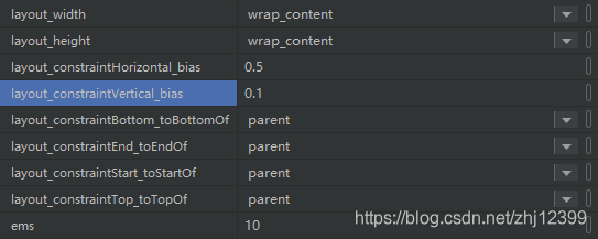
使用ConstrainLayout
android:layout_width="wrap_content"
android:layout_height="wrap_content"
app:layout_constraintBottom_toBottomOf="parent"
app:layout_constraintEnd_toEndOf="parent"
app:layout_constraintStart_toStartOf="parent"
app:layout_constraintTop_toBottomOf="parent"
app:layout_constraintVertical_bias="0.5"
模块集中方法
实现北南中布局
使用LinearLayout
顶部和底部都有控件,中部依据屏幕⼤小自动切换。
中间可用RecyclerView作为示例控件,设置layout_weight实现自动铺满可用空间。
layout_height = “0dp”
layout_weight = “1”
控件隐藏与显示
android:visibility=“gone”:不显示此按件,它不参与布局
android:visibility=“invisible”:不显示此按件,但它参与布局,在界面上会留有位置
android:visibility=“visible”:此控件正常显示
ConstraintLayout动画
    //定义两个约束集,分别对应两个动画状态(即关键帧)
    val constraintSet = ConstraintSet()
    val constraintSet2 = ConstraintSet()
    //定义动画对象
    val transition = ChangeBounds()
    //这个标记用于在两个动画状态之间反复切换
    var flag = true

    override fun onCreate(savedInstanceState: Bundle?) {
        super.onCreate(savedInstanceState)
        setContentView(R.layout.activity_main)

        //分别装载两个布局文件的约束集
        constraintSet.load(this, R.layout.activity_main)
        constraintSet2.load(this, R.layout.activity_main2)
        //设定动画属性
        transition.interpolator = AnticipateOvershootInterpolator(1.0f)
        transition.duration = 1000
        //点击Activity时,启动动画
        rootContainer.setOnClickListener {
            animateToKeyframe()
        }
    }


    fun animateToKeyframe() {
        //开始动画
        TransitionManager.beginDelayedTransition(rootContainer, transition)
        if (flag) {
            constraintSet2.applyTo(rootContainer)
        } else {
            constraintSet.applyTo(rootContainer)
        }
        flag = !flag
    }
界面的动态替换
在Activity中需要时随时调用setContentView(R.layout.布局⽂件ID);即可,动态切换的布局可共享Activity中的成员变量。
使用代码创建控件实例,然后调用ViewGroup的addView⽅法加⼊到控件树中
(1)直接用new关键字实例化
(2)使用LayoutInflator基于XML布局进⾏实例化
在不需要时,可以随时调用ViewGroup.removeView()⽅法从控件树中移除特定的控件。
	    var counter = 0
        btnAdd.setOnClickListener {
            counter++
            //从XML布局文件中加载并实例化一个TextView控件对象
            val textView = layoutInflater.inflate(R.layout.my_textview, null) as TextView
            //设置TextView控件显示的文本
            textView.text = "新控件${counter}"
            //给其挂接事件响应
            textView.setOnClickListener {
                Toast.makeText(this, "${(it as TextView).text}", Toast.LENGTH_SHORT)
                    .show()
            }
            //追加到控件容器中
            viewContainer.addView(textView)
        }

        btnRemoveAllView.setOnClickListener {
            viewContainer.removeAllViews()
        }
<TextView
    xmlns:android="http://schemas.android.com/apk/res/android"
    android:layout_width="match_parent"
    android:layout_height="wrap_content"
    android:layout_margin="4dp"
    android:text="新控件"
    android:textAlignment="center"
    android:textColor="#ff0000"
    android:textSize="20sp">
</TextView>
使用ViewStub动态实例化控件
示例每次运⾏时,都随机地确定到底使用哪个布局。
可以为ViewStub指定⼀个布局,在inflate布局的时候,只有ViewStub会被初始化。然后当viewstub被设置为可见的时候,或者调用了inflate⽅法的时候, ViewStub所指向的布局就会被inflate和实例化,然后ViewStub的布局属性都会传给所指向的布局,这样就可以使用ViewStub来⽅便在运⾏时有选择的显示某⼀个布局。
 fun randomChangeView() {
    val ranValue = Random().nextInt(100)
    if (ranValue > 49) {
        viewstub_textview.inflate()
        val textView = findViewById<TextView>(R.id.viewstub_demo_textview)
        textView.text = "viewstub是一个轻量级的 view," +
                "可以为viewstub指定一个布局," +
                "在inflate布局的时候,只有viewstub会被初始化."
    } else {
        viewstub_iamgeview.inflate()
        val imageView = findViewById<ImageView>(R.id.viewstub_demo_imageview)
        imageView.setImageResource(R.drawable.test)
    }
}
//activity_main.xml中
<LinearLayout
    xmlns:android="http://schemas.android.com/apk/res/android"
    android:orientation="vertical"
    android:layout_width="match_parent"
    android:layout_height="match_parent"
    android:gravity="center_horizontal">
    <ViewStub
        android:id="@+id/viewstub_textview"
        android:layout_width="wrap_content"
        android:layout_height="wrap_content"
        android:layout_marginLeft="5dp"
        android:layout_marginRight="5dp"
        android:layout_marginTop="10dp"
        android:layout="@layout/viewstub_textview_layout"/>
    <ViewStub
        android:id="@+id/viewstub_iamgeview"
        android:layout_width="wrap_content"
        android:layout_height="wrap_content"
        android:layout_marginLeft="5dp"
        android:layout_marginRight="5dp"
        android:layout="@layout/viewstub_imageview_layout"/>
</LinearLayout>
//viewstub_imageview_layout.xml中
<LinearLayout
  xmlns:android="http://schemas.android.com/apk/res/android"
  android:orientation="vertical"
  android:layout_width="wrap_content"
  android:layout_height="wrap_content">
    <ImageView
        android:id="@+id/viewstub_demo_imageview"
        android:layout_width="wrap_content"
        android:layout_height="wrap_content"/>
</LinearLayout>
//viewstub_textview_layout.xml中
<LinearLayout
  xmlns:android="http://schemas.android.com/apk/res/android"
  android:orientation="vertical"
  android:layout_width="wrap_content"
  android:layout_height="wrap_content">
    <TextView
        android:id="@+id/viewstub_demo_textview"
        android:layout_width="match_parent"
        android:layout_height="wrap_content"
        android:background="#aa664411"
        android:textSize="16sp"/>
</LinearLayout>
CountDown倒计时
//CountDownTimer是一个抽象基类
private lateinit var countDownTimer: CountDownTimer
private var timeLeft = 60
private var isStart = false

private fun startCountDown() {
        timeLeft = 30
        isStart = true
        countDownTimer = object : CountDownTimer(30000, 1000) {
            override fun onFinish() {
                Toast.makeText(this@MainActivity, "时间到!", Toast.LENGTH_LONG).show()
                btnCountDown.isEnabled = true、、//倒计时结束后才能开始点击
            }

            override fun onTick(millisUntilFinished: Long) {
                timeLeft = millisUntilFinished.toInt() / 1000
                tvInfo.text = "${timeLeft}"
            }
        }
        countDownTimer.start()
    }

    private fun cancelCountDown() {
        if (!isStart)
            return
        countDownTimer.cancel()
        btnCountDown.isEnabled = true//点击完取消后就可以点击开始了

    }
按钮动画
btnCountDown.setOnClickListener {
    //装载动画
    val bounceAnimation = AnimationUtils.loadAnimation(
        this,
        R.anim.bounce
    )
    it.startAnimation(bounceAnimation)
}
<?xml version="1.0" encoding="utf-8"?>
<set xmlns:android="http://schemas.android.com/apk/res/android"
    android:fillAfter="true"
    android:interpolator="@android:anim/bounce_interpolator"
    >
    <scale
        android:duration="2000"
        android:fromXScale="2.0"
        android:fromYScale="2.0"
        android:pivotX="50%"
        android:pivotY="50%"
        android:toXScale="1.0"
        android:toYScale="1.0" />
</set>
设置按钮集合
为每一个按钮都设置上onclick为btnClick这样在按下九宫格的时候就都会有反应
fun btnClick(view: View) {
    val btnSelected = view as Button
    var cellId = 0
    when (btnSelected.id) {
        R.id.btn1 -> cellId = 1
        R.id.btn2 -> cellId = 2
        R.id.btn3 -> cellId = 3
        R.id.btn4 -> cellId = 4
        R.id.btn5 -> cellId = 5
        R.id.btn6 -> cellId = 6
        R.id.btn7 -> cellId = 7
        R.id.btn8 -> cellId = 8
        R.id.btn9 -> cellId = 9
    }
    playGame(cellId, btnSelected)
}
XXOO游戏
package com.example.tictactoy

import android.graphics.Color
import androidx.appcompat.app.AppCompatActivity
import android.os.Bundle
import android.view.View
import android.widget.Button
import android.widget.Toast
import kotlinx.android.synthetic.main.activity_main.*
import java.util.*
import kotlin.collections.ArrayList


class MainActivity : AppCompatActivity() {

    override fun onCreate(savedInstanceState: Bundle?) {
        super.onCreate(savedInstanceState)
        setContentView(R.layout.activity_main)
    }

    fun btnClick(view: View) {
        val btnSelected = view as Button
        var cellId = 0
        when (btnSelected.id) {
            R.id.btn1 -> cellId = 1
            R.id.btn2 -> cellId = 2
            R.id.btn3 -> cellId = 3
            R.id.btn4 -> cellId = 4
            R.id.btn5 -> cellId = 5
            R.id.btn6 -> cellId = 6
            R.id.btn7 -> cellId = 7
            R.id.btn8 -> cellId = 8
            R.id.btn9 -> cellId = 9
        }
        playGame(cellId,btnSelected)
    }

    var player1=ArrayList<Int>()
    var player2=ArrayList<Int>()
    var activePlayer=1

    fun playGame(cellId:Int,btnSelected:Button){
        if(activePlayer==1){
            btnSelected.text="X"
            btnSelected.setBackgroundColor(Color.GREEN)
            player1.add(cellId)
            activePlayer=2
            autoPaly()
        }else{
            btnSelected.text="O"
            btnSelected.setBackgroundColor(Color.YELLOW)
            player2.add(cellId)
            activePlayer=1
        }
        btnSelected.isEnabled=false
        checkWinner()
    }

    fun checkWinner(){
        var winner=-1

        //第一行
        if(player1.contains(1) && player1.contains(2) && player1.contains(3)){
            winner=1
        }

        if(player2.contains(1) && player2.contains(2) && player2.contains(3)){
            winner=2
        }

        //第二行
        if(player1.contains(4) && player1.contains(5) && player1.contains(6)){
            winner=1
        }

        if(player2.contains(4) && player2.contains(5) && player2.contains(6)){
            winner=2
        }

        //第三行
        if(player1.contains(7) && player1.contains(8) && player1.contains(9)){
            winner=1
        }

        if(player2.contains(7) && player2.contains(8) && player2.contains(9)){
            winner=2
        }

        //------------------
        //第一列
        if(player1.contains(1) && player1.contains(4) && player1.contains(7)){
            winner=1
        }

        if(player2.contains(1) && player2.contains(4) && player2.contains(7)){
            winner=2
        }

        //第二列
        if(player1.contains(2) && player1.contains(5) && player1.contains(8)){
            winner=1
        }

        if(player2.contains(2) && player2.contains(5) && player2.contains(8)){
            winner=2
        }

        //第三列
        if(player1.contains(3) && player1.contains(6) && player1.contains(9)){
            winner=1
        }

        if(player2.contains(3) && player2.contains(6) && player2.contains(9)){
            winner=2
        }
        //-----------------------------
        //TODO:添加对于对角线的检查
        //-------------------
        if(winner!= -1){
            Toast.makeText(this,"Player${winner} win",Toast.LENGTH_SHORT).show()
        }
    }

    fun autoPaly(){
        val emptyCells=ArrayList<Int>()
        for(cellId in 1..9){
            if(!(player1.contains(cellId) || player2.contains(cellId))){
                emptyCells.add(cellId)
            }
        }
        val ranIndex= Random().nextInt(emptyCells.size)
        val cellId=emptyCells[ranIndex]

        var btnSelected:Button?
        when(cellId){
            1->btnSelected=btn1
            2->btnSelected=btn2
            3->btnSelected=btn3
            4->btnSelected=btn4
            5->btnSelected=btn5
            6->btnSelected=btn6
            7->btnSelected=btn7
            8->btnSelected=btn8
            else->btnSelected=btn9
        }
        playGame(cellId,btnSelected)
    }
}
<?xml version="1.0" encoding="utf-8"?>
<TableLayout xmlns:android="http://schemas.android.com/apk/res/android"
    xmlns:app="http://schemas.android.com/apk/res-auto"
    xmlns:tools="http://schemas.android.com/tools"
    android:layout_width="match_parent"
    android:layout_height="match_parent"
    android:gravity="center"
    tools:context=".MainActivity">

    <TableRow
        android:gravity="center"
        android:layout_width="match_parent"
        android:layout_height="match_parent" >

        <Button
            android:onClick="btnClick"
            android:id="@+id/btn1"
            android:layout_width="40pt"
            android:layout_height="40pt" />

        <Button
            android:onClick="btnClick"
            android:id="@+id/btn2"
            android:layout_width="40pt"
            android:layout_height="40pt" />

        <Button
            android:onClick="btnClick"
            android:id="@+id/btn3"
            android:layout_width="40pt"
            android:layout_height="40pt" />
    </TableRow>

    <TableRow
        android:gravity="center"
        android:layout_width="match_parent"
        android:layout_height="match_parent" >

        <Button
            android:onClick="btnClick"
            android:id="@+id/btn4"
            android:layout_width="40pt"
            android:layout_height="40pt" />

        <Button
            android:onClick="btnClick"
            android:id="@+id/btn5"
            android:layout_width="40pt"
            android:layout_height="40pt" />

        <Button
            android:onClick="btnClick"
            android:id="@+id/btn6"
            android:layout_width="40pt"
            android:layout_height="40pt" />
    </TableRow>

    <TableRow
        android:gravity="center"
        android:layout_width="match_parent"
        android:layout_height="match_parent" >

        <Button
            android:onClick="btnClick"
            android:id="@+id/btn7"
            android:layout_width="40pt"
            android:layout_height="40pt" />

        <Button
            android:onClick="btnClick"
            android:id="@+id/btn8"
            android:layout_width="40pt"
            android:layout_height="40pt" />

        <Button
            android:onClick="btnClick"
            android:id="@+id/btn9"
            android:layout_width="40pt"
            android:layout_height="40pt" />
    </TableRow>
</TableLayout>
新建另一个页面
setContentView(R.layout.activity_other)
Activity状态与生命周期
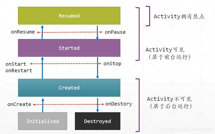
概念
五个状态:Initialized Created Started Resumed Destroyed
生命周期:
- onCreate 初始化Activity内部字段,设定Activity布局
- onRestart Activity进入已启动状态,对用户可见
- onResume Activity已经准备好,可以相应用户输入
- onPause Activity失去焦点并进入“已暂停状态”
- onStop Activity不可见,再次释放用不着的资源
- onDestrory Activity将被操作系统销毁,在此释放所有资源

在切换横屏竖屏时候
之所以用户旋转屏幕时状态会丢失,是因为Android把原先的Activity销毁了
这样做可以使界面布局改变时保存所需要的值
    override fun onCreate(savedInstanceState: Bundle?) {
        super.onCreate(savedInstanceState)
        setContentView(R.layout.activity_main)

        btnClickMe.setOnClickListener {
            counter++
            tvCount.text = "计数值:${counter}"
        }
        //恢复实例数据
        if (savedInstanceState != null) {
            counter = savedInstanceState.getInt("counter")
            tvCount.text = "计数值:${counter}"
        }
    }

    var counter = 0
    override fun onSaveInstanceState(outState: Bundle) {
        //保存实例数据
        outState.putInt("counter", counter)
        Log.d("MainActivity", "计数值己保存:$counter")
        Toast.makeText(this, "保存", Toast.LENGTH_SHORT).show()
        super.onSaveInstanceState(outState)
    }
定义静态变量
companion object {
    var globalCount: Int = 0
}
禁止横竖屏旋转
# 增添上
<activity android:name=".MainActivity" android:screenOrientation="portrait">
创建新的Activity
需要创建一个布局文件,再创建一个 Activity类,并且在 Activity 的 onCreate 方法中将布局文件与 Activity 关联起来。之后,需要在App 的清单文件中注册这个 Activity 。现在,就可以使用Intent 启动一个 Activity 了。
class SecondActivity : AppCompatActivity() {
    override fun onCreate(savedInstanceState: Bundle?) {
        super.onCreate(savedInstanceState)
        setContentView(R.layout.activity_second)//关联上视图文件
    }
}
<activity android:name=".SecondActivity"></activity>
<activity android:name=".SecondActivity"/>
btnStartSecondActivity.setOnClickListener {
//启动第二个Activity
    val intent = Intent(this, SecondActivity::class.java)
    startActivity(intent)
}
多入口的安卓程序
Android App是“多入口点”的,同一应用中的每个 Activity 都可能被单独启用,为此, Android 要求所有 Activity 都需要在清单文件中注册。用户点击App 图标启动时显示的第一个 Activity 称为“启动 Activity”它必须定义有以下 <intent-filter>,如果有多个 Activity 都有这个<intent-filter>,则第一个 Activity 被当成是启动 Activity 。
<intent-filter>
    <action android:name="android.intent.action.MAIN" />
    <category android:name="android.intent.category.LAUNCHER" />
</intent-filter>
新建一个对象
@Parcelize
class User(var name:String, var age:Int):Parcelable
多个Activity
在Bundle中存储信息
//定义信息项的标识值,定义在全局
val NAME_KEY = "name"
val AGE_KET = "age"
val OBJECT_KEY = "user_obj"

//存入离散的信息,定义在activity
fun putMessagesToBundle(bundle: Bundle) {
    bundle.putString(NAME_KEY, "张三")
    bundle.putInt(AGE_KET, 23)
}
//保存对象
fun putObjectToBundle(bundle: Bundle) {
    val user = User("李四", 45)
    bundle.putParcelable(OBJECT_KEY, user)
}
向另一个Activity传送数据
Activity之间的数据传送由 Intent 对象负责,它提供了 putXXX 系列方法(也可使用 Bundle 对象)实现信息的传送
btnMainToOther.setOnClickListener {//定义在onCreate
    val intent = Intent(this, SendToActivity::class.java)
    //打包要传给SendToActivity的信息
    val bundle = Bundle()
    //存入信息
    putMessagesToBundle(bundle)
    putObjectToBundle(bundle)
    //将打包好的信息交给Intent对象
    intent.putExtras(bundle)
    //启动并显示SendToActivity
    startActivity(intent)
}
新Activity接受外界传入的数据
//在Activity中,可以直接从它的intent属性中提取出外部传入的数据,定义在oncreate
val name = intent.getStringExtra(NAME_KEY)
val age = intent.getIntExtra(AGE_KET, 0)
val user=intent.getParcelableExtra<User>(OBJECT_KEY)
tvInfo.text = "姓名:$name, 年龄:$age\n" +
              "User(${user.name},${user.age})"
启动另一个Activity并返回结果
btnOtherToMain.setOnClickListener {
    //启动另一个Acitivity,准备接收从它那里传回的信息
    val intent = Intent(this, ReceiveFromActivity::class.java)
    //启动时,传入一个请求码,用于标识本次请求
    startActivityForResult(intent, REQUEST_CODE)
}
使用startActivityForResult方法,将信息及一个标识(称为“请求码”)发给另一个Activity,另一个Activity收到消息之后,给一个“回执”(称为“结果码”),再发回给发送者,发送者就可以依据结果码知道对方是否己经接收到了信息。
//请求码,可以随意指定
val REQUEST_CODE = 100
收到的信息,在onActivityResult 方法中提取并进行后继处理
//当收到数据时,此方法被回调
override fun onActivityResult(requestCode: Int, resultCode: Int, data: Intent?) {
    //如果结果码不是RESTULT_OK,说明对方没有完成相应的工作
    if (resultCode != Activity.RESULT_OK)
        return;
    //依据请求码,对各个请求进行处理
    when (requestCode) {
    //取出对方发回的数据,显示在界面上
        REQUEST_CODE -> tvInfo.text = data?.getStringExtra(MESSAGE_KEY) ?: "无"
    }
}
btnReturnToMain.setOnClickListener {
    val data = Intent()
    //将要传回的信息放入Intent中
    data.putExtra(MESSAGE_KEY, edtUserInput.text.toString())
    //设置结果码
    setResult(Activity.RESULT_OK, data)
    //销毁自己,重新显示MainActivity
    finish()
}
多Activity 编程阶段小结
- 如果想在 Activity 中得到新打开 Activity 关闭后返回的数据,你需要使用系统提供的
startActivityForResult 方法打开新的 Activity 。 - 新的 Activity 关闭后会向前面的 Activity 传回数据,为了得到传回的数据,必须在前
面的 Activity 中重写 onActivityResult 方法 - 使用 startActivityForResult 方法打开的新 Activity ,在关闭前需要调用 setResult 方法设置返回值,这样调用者才能接收到消息。
- 为了区分开可能的多个请求, Android 使用了请求码与响应码,请仔细分析本小节
示例源码了解详情。
Back stack与Activity启动模式
用户使用App 的过程可以看成是多个 Activity 顺序显示的过程,用户可以随时使用“ Back ”键回退回前一个 Activity 。但这里有一个问题,那就是 Android 有可能会 kill 掉不在前台的 Activity ,所以 Android 引入了一个 Task 的机制解决这个问题。 Activity 可以被 Kill但它的相关信息仍然放在 Task 中,依据这些信息Android 就可以重新创建并显示“前一个” Activity 。Task是一个堆栈,堆栈中放的是用户访问过的Activity 历史记录信息。
Activity的“进栈”与“出栈”
- 主Activity 是第一个进栈的,它每创建并显示一个 Activity ,这个 Activity 就被加入到 Task 中(即压入Task堆栈)
- 用户点击Back 键(或者通过点击按钮等方式) 关闭当前 Activity则此 Activity 就从 Task 中移除(即从 Task 栈中移除)
- 位于Task 栈顶的 Activity 称为“ 前台Activity ”,用户可以看到它,并且能与它交互。
- 其余的 Activity 称为“ 后台 Activity用户看不到它,只有它上面的Activity 被移除之后,它成为栈顶,才能被用户看到。
前台与后台Task
Android操作系统允许用户打开多个 App ,每个打开的 App 都对应着一个 Task 。当前正在与用户交互的App 所对应着的 Task ,称为“前台 Task ”,其他的App 对应的 Task ,称为“后台 Task ”。
设定Activity 启动模式的两种方式
使用清单文件,此种方法最为常见
在启动Activity 时通过Intent 设定,少用
<activity android:name = ".MainActivity"
android:launchMode = "standard"/>
- standard :这是默认模式,每次激活 Activity 时都会创建 Activity 实例,并放入Back Stack 中。
- singleTop :如果在栈顶已有一个实例,则重用此实例,并调用此实例的onNewIntent 方法。否则,创建新的实例并放入栈顶。(即使栈中已经存在该 Activity 的实例,只要不在栈顶,都会创建实例。
- singleTask :这种模式的Activity 在一个Task 中只能有一个实例存在。当需要启动一个SingleTask 模式的 Activity 时,如果所有前台后台 Task 中都没有它的实例,系统就会创建它并将它压入当前Task 的堆栈中。如果另外的Task 中 已存在该 Activity 的实例,则系统会通过调用这一 Activity 的 onNewIntent() 方法将intent 转送给它, 而不是创建新实例。
- singleInstance模式 :在一个新栈中创建实例,并让多个应用共享该实例。一旦该模式的 Activity 的实例已经存在,任何应用在激活该 Activity 时,都会重用该栈中的实例(并会自动调用其 onNewIntent 方法 。其效果相当于多个应用共享同一个应用。
Standard相当于是新建了一个Activity页面,每次创建都相当于创建了一个新的页面
SingleTop,如果此时已经打开了这个SingleTop,再次自我调用打开,则不会重新创建Activity而只是载入数据调用onNewIntent。如果此时没有打开,则会新建一个这个SingleTop。
SingleTask,如果此时已经打开了这个SingleTop,再次自我调用打开,则不会重新创建Activity而只是载入数据调用onNewIntent。如果此时没有打开,但是之前创建过了,则会调用起之前创建好的并只是载入数据调用onNewIntent。如果此时没有打开,且之前没有创建过,则才会新建。
Intent
Android应用可以使用多个不同来源的可重用组件以聚合的⽅式构建(比如在你的应用中直接集成Android系统提供的拍照程序完成照像功能)。为了让这些组件能相互沟通和协作,Android引⼊了“Intent”这⼀特殊的组件当作“信使”,完成组件间相互通信的⼯作。
Intent的组成:
代表⼀个将被执⾏的操作,可包容六类信息:
- Component name:指定Intent所针对的目标组件名称
- Action:期望Android操作系统执行的任务或采取的行动,这是一个关键的属性。
代表动作。当发送Intent的组件为其指明了⼀个Action之后,操作系统会选择⼀个执⾏组件,会依据这个Action的指示,接受相关的输⼊,执⾏对应的操作,⽣成所期望的输出。 - Data:以URL的形式指明与此Action相关联的数据
执⾏组件执⾏特定的任务往往需要相关的数据,这些数据可以保存于Data属性中,通常使用URI来表示。
intent.setAction(Intent.ACTION_CALL)
intent.setData(Uri.parse("tel:12121"))
startActivity(intent)
- Category:执行动作的所属类别
表示本Intent所属的“种类”,比如android.intent.category.LAUNCHER用于指定App初始启动的Activity是哪个:
<activity android:name=".UseIntentActivity" android:label="@string/app_name">
	<intent-filter>
		<action android:name="android.intent.action.MAIN" />
		<category android:name="android.intent.category.LAUNCHER" />
	</intent-filter>
</activity>
指明希望启动的目标组件信息。可以通过Intent.setComponent⽅法利用类名进⾏设置,也可以通过Intent.setClass⽅法利用Class对象进⾏设置:
val intent = Intent(this,OtherActivity::class.java)
CATEGORY_APP_MUSIC
CATEGORY_APP_GALLERY
CATEGORY_APP_MAPS
CATEGORY_APP_CALCULATOR
CATEGORY_APP_EMAIL
CATEGORY_APP_CALENDAR
- Extras:用来传送参数。是一个Bundle类对象,由一组可序列化的key/value对组成,其实就是我们前面用过的用于保存信息的Bundle对象
- Flags:可用来指明Activity的启动模式,用于指定目标组件的启动模式。比如,当
Intent.FLAG_ACTIVITY_NEW_TASK指定Activity应该启动⼀个新的任务(task)
Type:表示Action要处理的数据的类型,通常为MIME类型。可以使用Intent.setType()⽅法设置。
Type与Data通常互斥,设置⼀个会导致另⼀个清空,如果需要同时设置,可以使setDataAndType()⽅法,例如,以下Intent通知操作系统,App期望能查看SD卡中的⼀张图片:
val intent = Intent(Intent.ACTION_VIEW)
Intent.setDataAndType("file:///sdcard/image1.jpg","image/jpg");
Intent Filter
Intent Filter是android.content.IntentFilter类的实例。
通常在AndroidManifest.xml⽂件中使用<intent-filter>设定。每个Activity都可以指定⼀个或多个Intent Filter,以便告诉系统该Activity 可以响应什么类型的Intent。
<activity android:name=".SendSMSActivity" ……>
	<intent-filter>
		<action android:name="android.intent.action.MAIN" />
		<category android:name="android.intent.category.LAUNCHER" />
	</intent-filter>
</activity>
Intent Filter描述了⼀个组件愿意并且能够接收什么样的Intent 对象。
当Android接收到某应用发来的⼀个Intent对象时,它会从此Intent对象中提取信息,接着,提取所有“⼰注册”的应用的Intent Filter信息,在这些Intent Filter中进⾏匹配,从⽽确定到底应该启动哪个组件处理此Intent。
当有多个组件匹配此Intent对象时,Android会显示⼀个列表供用户选择。比如如果用户⼿机中安装了多个视频播放应用,则用户在⽂件管理器中点击⼀个视频,就能看到可以播放它的应用列表,从中选⼀个即可。
Intent Filter中的Action主要用于向Android系统表明本组件能“做哪些事”或“响应哪种类型的消息”。这样⼀来,在特定的场景之下,Android就知道应该“通知”哪些Intent。
val intent = Intent()
intent.setAction("cn.edu.bit.cs.powersms")
//所有的Action列表中包含了"cn.edu.bit.cs.powersms"的Activity都将会匹配成功。
……
startActivity(intent)
两种类型的Intent
显式(Explicit)Intent:直接启动特定的Activtity,只需要两个参数:context和要启动的Activity的类型,通常用于在同⼀个App内切换显示Activity
隐式(Explicit)Intent:告诉Android“你想⼲什么”,由Android帮助你筛选启动特定的Activtity,⾄少需要两个参数:⼀个是Action,另⼀个是Data URI,还可以附加有其他的参数(比如Category,Extra等)
对于显式Intent,直接调用之
对于隐式Intent,Android采用了复杂的匹配流程,⼤致分为三个步骤:1. 匹配Action 2. 匹配Data和Type 3. 匹配Category,如果有多个组件匹配,则显示列表让用户选择
安卓权限问题
<application
</application>
<uses-permission android:name="android.permission.CALL_PHONE" />
btnCall.setOnClickListener {
    callPhone("10000")
}
fun callPhone(telephoneNumber: String) {
    val intent = Intent(Intent.ACTION_CALL)
    val data = Uri.parse("tel:$telephoneNumber")
    intent.setData(data)
    //检查打电话权限是否己经被授予
    if (ActivityCompat.checkSelfPermission(
            this,
            Manifest.permission.CALL_PHONE
        ) != PackageManager.PERMISSION_GRANTED
    ) {
        //没有被授予,则申请打电话的权限
        ActivityCompat.requestPermissions(
            this, arrayOf(Manifest.permission.CALL_PHONE),
            CALL_PHONE_REQUEST_CODE
        )
        return
    }
    //己被授予,则可以直接拨打电话
    startActivity(intent)
}
//依据用户权限许可结果回调此方法
override fun onRequestPermissionsResult(
        requestCode: Int,
        permissions: Array<out String>,
        grantResults: IntArray
    ) {
        when (requestCode) {
            CALL_PHONE_REQUEST_CODE -> {
                if (grantResults[0] == PackageManager.PERMISSION_GRANTED)
                //用户授予了打电话的权限
                    callPhone("10010")
                else {
                    Toast.makeText(
                        this, "用户拒绝了App申请拨打电话的权限",
                        Toast.LENGTH_LONG
                    ).show()
                }
            }
        }
    }
使用EassyPermissions库简化权限申请
- 在模块的build.gradle中,添加以下项目依赖:
implementation 'pub.devrel:easypermissions:3.0.0'
- 在App的清单⽂件中,声明要使用的权限:
<!--使用摄像头-->
<uses-permission android:name="android.permission.CAMERA" />
<!--获取位置信息-->
<uses-permission android:name="android.permission.ACCESS_FINE_LOCATION" />
- 定义请求码:
const val CAMERA_REQUEST_CODE = 1
- 用户权限授予结果的“转发”操作
override fun onRequestPermissionsResult(
    requestCode: Int,
    permissions: Array<out String>,
    grantResults: IntArray
) {
    //将权限授予结果转发给EasyPermissions库处理
    EasyPermissions.onRequestPermissionsResult(
        requestCode,
        permissions, grantResults, this
    )
}
- 集成了“权限申请”的功能代码
btnTestPermission.setOnClickListener {
    useCamera()
}
useCamera()⽅法不仅完成了“照相”的功能,还集成了“权限申请及授予”的功能。
//依据用户权限许可结果回调此方法
@AfterPermissionGranted(CAMERA_REQUEST_CODE)
private fun useCamera() {
    //需要申请的权限
    val perms = arrayOf<String>(
        Manifest.permission.CAMERA,
        Manifest.permission.ACCESS_FINE_LOCATION
    )
    if (EasyPermissions.hasPermissions(this, *perms)) {
        // 如果用户(过去)己经授予了权限
        Toast.makeText(
            this, "可以打开摄像头了",
            Toast.LENGTH_LONG
        ).show()
    } else {
        // 如果当前App没有需要的权限,请求它
        EasyPermissions.requestPermissions(
            this, "此App要求获取操纵摄像头的权限",
            CAMERA_REQUEST_CODE, *perms
        )
    }
}
- 如果希望进一步地控制权限授予流程
override fun onPermissionsDenied(requestCode: Int, perms: MutableList<String>) {
    //如果用户拒绝授与权限,并且选中了“NEVER ASK AGAIN.(不再问我)”选项
    // 而这个权限又很重要,则以下代码会打开手机的App设置页面,要求用户打开相应权限
    if (EasyPermissions.somePermissionPermanentlyDenied(this, perms)) {
        AppSettingsDialog.Builder(this).build().show()
    }
}
- 处理用户操作结果
override fun onActivityResult(requestCode: Int, resultCode: Int, data: Intent?) {
    super.onActivityResult(requestCode, resultCode, data)
    //处理用户手工打开权限的结果
    if (requestCode == AppSettingsDialog.DEFAULT_SETTINGS_REQ_CODE) {
        if (EasyPermissions.hasPermissions(
                this,
                Manifest.permission.CAMERA,
                Manifest.permission.ACCESS_FINE_LOCATION
            )
        )
            Toast.makeText(this, "用户手工许可了权限", Toast.LENGTH_SHORT)
                .show();
        else {
            Toast.makeText(this, "权限申请失败!", Toast.LENGTH_SHORT)
                .show();
        }
    }
}
对于需要更多控制的权限授予场景,可以选择让Activity实现PermissionCallbacks接⼝。
如果希望在用户拒绝权限前“说服”他同意,可以选择让Activity实现RationaleCallbacks接⼝,相关内容看Github上的项目⽂档。Github地址
Fragment
创建Fragment
1.先创建一个布局文件,fragmen_first.xml
2.再创建一个Fragment类
class FirstFragment:Fragment() {
    override fun onCreateView(
        inflater: LayoutInflater,
        container: ViewGroup?,
        savedInstanceState: Bundle?
    ): View? {
        //装载布局文件
        val root=inflater.inflate(R.layout.fragment_first,container,false)
        return root
    }
}
在MainActivity中使用经典的<fragment>装载Fragment
super.onCreate(savedInstanceState)
//activity_main使用经典的<fragment>装载Fragment
setContentView(R.layout.activity_main)
3.在MainActivity布局文件中插入Fragment
<fragment
    android:layout_width="wrap_content"
    android:layout_height="wrap_content"

    android:id="@+id/container"
    class="com.jinxuliang.hellofragment.FirstFragment"
    tools:layout="@layout/fragment_first"

    app:layout_constraintBottom_toBottomOf="parent"
    app:layout_constraintEnd_toEndOf="parent"
    app:layout_constraintHorizontal_bias="0.5"
    app:layout_constraintStart_toStartOf="parent"
    app:layout_constraintTop_toTopOf="parent">
</fragment>
AndroidX的新方法
Androidx引入了一个新的 FragmentContainerView ,它派生自 FrameLayout可以作为 Fragment 的容器,指定它的 name 属性,可以装入 Fragment。
首先添加依赖:
implementation "androidx.fragment:fragment ktx:1.2.3"
更改activity_main
<androidx.constraintlayout.widget.ConstraintLayout
    xmlns:android="http://schemas.android.com/apk/res/android"
    xmlns:app="http://schemas.android.com/apk/res-auto"
    xmlns:tools="http://schemas.android.com/tools"
    android:layout_width="match_parent"
    android:layout_height="match_parent"
    tools:context=".MainActivity">

    <androidx.fragment.app.FragmentContainerView
        android:id="@+id/container"
        android:name="com.jinxuliang.hellofragment.FirstFragment"
        android:tag="first_fragment"
        android:layout_width="0dp"
        android:layout_height="0dp"
        app:layout_constraintBottom_toBottomOf="parent"
        app:layout_constraintEnd_toEndOf="parent"
        app:layout_constraintHorizontal_bias="0.5"
        app:layout_constraintStart_toStartOf="parent"
        app:layout_constraintTop_toTopOf="parent">
    </androidx.fragment.app.FragmentContainerView>

</androidx.constraintlayout.widget.ConstraintLayout>
在MainActivity中
super.onCreate(savedInstanceState)
//使用FragmentContainerView静态装载Fragment
setContentView(R.layout.activity_main2)
使用代码设计Fragment界面
<?xml version="1.0" encoding="utf-8"?>
<FrameLayout xmlns:android="http://schemas.android.com/apk/res/android"
    xmlns:tools="http://schemas.android.com/tools"
    android:layout_width="match_parent"
    android:layout_height="match_parent"
    tools:context=".BlankFragment">

    <!-- TODO: Update blank fragment layout -->
    <TextView
        android:layout_width="wrap_content"
        android:layout_height="wrap_content"
        android:layout_gravity="center_horizontal|center_vertical"
        android:background="#FFEB3B"
        android:padding="10dp"
        android:text="Hello, blank fragment"
        android:textAppearance="@style/TextAppearance.AppCompat.Display1" />
</FrameLayout>
在MainActivity中
不管是添加还是移除,都需要通过FragmentManager启动一个事务
Fragment可以附加一个Tag,通过这个Tag可以获取此Fragment的引用
class MainActivity : AppCompatActivity() {
    override fun onCreate(savedInstanceState: Bundle?) {
        super.onCreate(savedInstanceState)
        setContentView(R.layout.activity_main)

        btnAdd.setOnClickListener {
            //实例化一个Fragment对象
            val fragment = BlankFragment()
            //添加到Activity中
            supportFragmentManager.beginTransaction()
                .addToBackStack(null)  //支持Back回退
                .add(R.id.fragment_container, fragment, "blank")
                .commit()
        }

        btnRemove.setOnClickListener {
            val fragment = supportFragmentManager.findFragmentByTag("blank")
            if (fragment != null) {
                supportFragmentManager.beginTransaction()
                    .remove(fragment)
                    .commit()
            }
        }
    }
}
Fragment的生命周期
Fragment托管于Activity,他的生命周期与Activity交织在一起,你中有我,我中有你


如果是旋转屏幕的话,由于Activity被销毁,导致Fragment也被销毁,除了不用onCreate其他都要重新进行
Fragment的状态保存
class MyFragment : Fragment() {
    var count = 0

    var infoTextView: TextView? = null
    var clickMeButton: Button? = null
    var saveStateBox: CheckBox? = null

    override fun onCreateView(
        inflater: LayoutInflater, container: ViewGroup?,
        savedInstanceState: Bundle?
    ): View? {
        val root = inflater.inflate(R.layout.fragment_my, container, false)
        infoTextView = root.findViewById(R.id.fragment_txtInfo)
        clickMeButton = root.findViewById(R.id.btnClickMe)
        clickMeButton?.setOnClickListener {
            count++
            infoTextView?.text = "Click counter: $count"
        }
        saveStateBox = root.findViewById(R.id.chkSaveState)
        return root
    }

    override fun onActivityCreated(savedInstanceState: Bundle?) {
        super.onActivityCreated(savedInstanceState)
        if (savedInstanceState != null &&
            savedInstanceState.containsKey("count")
        ) {//提取先前保存的状态
            count = savedInstanceState.getInt("count")
            infoTextView!!.text = "Click count:$count"
        }
    }

    override fun onSaveInstanceState(outState: Bundle) {
        super.onSaveInstanceState(outState)
        if (saveStateBox!!.isChecked) {//将需要保存的放到Bundle中
            outState.putInt("count", count)
        }
    }
}
使用在平板上
布局文件名(File name)也为activity_main,资源文件名(Directory name)为layout-w820dp,指明应用于大于820dp的Android设备

显示屏幕当前分辨率
class ScreenUtility {
    var dpWidth: Float
    var dpHeight: Float

    constructor(activity: Activity) {
        val display = activity.windowManager.defaultDisplay
        val metrics = DisplayMetrics()
        display.getMetrics(metrics)

        val density = activity.resources.displayMetrics.density
        dpHeight = metrics.heightPixels / density
        dpWidth = metrics.widthPixels / density
    }
}
平板布局和手机布局分开
class MainActivity : AppCompatActivity() {
    override fun onCreate(savedInstanceState: Bundle?) {
        super.onCreate(savedInstanceState)
        setContentView(R.layout.activity_main)

        btnShowDetail.setOnClickListener {
            if (isTablet()) {//显示平板界面
                val fragment = DetailFragment()
                //如果是平板界面的话,右边会有那个Fragment的空间,则填充上Fragment即可
                supportFragmentManager.beginTransaction()
                    .replace(R.id.fragment_detail_container, fragment).commit()
            } else {//显示手机app界面
                val intent = Intent(this, DetailActivity::class.java)//将显示DetailActivity
                startActivity(intent)//如果是手机的话,只能先启动承载Fragment的Activity在新建出Fragment
            }
        }
    }

    //判断是否是平板电脑
    fun isTablet(): Boolean {
        //如果界面上存在有id=fragment_detail_container的容器,则一定是平板电脑
        return fragment_detail_container != null
    }
}

给项目添加一个新的布局文件,指定一个特殊的文件夹名(如左图所示),其文件名与主 Activity 的原有布局文件同名。


黄色的这部分将用于显示DetailFragment,注意其id值,App 运行时它将被用于动态装入Fragment 。
注意:按钮id值要与手机 App主界面上按钮的id值一致。
信息传递
Activity向Fragment传送信息
- 直接访问法
Activity可以通过FragmentManager的findFragmentByTag等⽅法获取特定Fragment的引用,然后直接调用Fragment类的公有属性或⽅法,即可向它传送特定的信息。
btnSpecialFragment.setOnClickListener {
    //加载并显示特定的Fragment
    val specialFragment = SpecialFragment();
    supportFragmentManager.beginTransaction()
        .replace(R.id.fragment_container, specialFragment).commit()
    //向Fragment传送信息
    specialFragment.receiveMessage("当前时间:${Date()}")
}
能从外界直接接收信息的Fragment
class SpecialFragment : Fragment() {
    //引用显示信息的UI控件
    private var tvInfo: TextView? = null
    //保存外部传入的信息
    private var message: String? = null

    override fun onCreateView(
        inflater: LayoutInflater, container: ViewGroup?,
        savedInstanceState: Bundle?
    ): View? {
        val root = inflater.inflate(R.layout.fragment_special,
            container, false)
        tvInfo = root.findViewById(R.id.tvInfo)
        return root
    }

    override fun onResume() {
        super.onResume()
        //显示外部传入的信息
        tvInfo?.text = message
    }

    //从外界接收信息
    fun receiveMessage(message: String) {
        this.message = message;
        //注意:在此方法中不要直接访问UI控件,
        //因为外界调用此方法时,
        //此Fragment可能还没有加载到Activity中
    }
}
使用这种⽅式接收信息后,在使用UI控件显示信息时,要特别注意⽣命周期的问题,要选对合适的⽣命周期⽅法,选错的话程序会崩溃。由于这种编程⽅式“非常脆弱”,所以不推荐使用。
- 使用Arguments实现(可靠)
为了解决Activity向Fragment传送信息的问题,Android为Fragment提供了⼀个名为arguments的Bundle对象,可用于传送信息。
btnUseArguments.setOnClickListener {
    //将要发送的信息打包
    val arguments = Bundle()
    arguments.putString(MESSAGE_KEY, "Activity传给Fragment的信息")
    val fragment = SimpleFragment()
    //携带上信息
    fragment.arguments = arguments
    supportFragmentManager.beginTransaction()
        .replace(R.id.fragment_container, fragment).commit()
}
//为特定的信息给定一个消息标识
const val MESSAGE_KEY = "message_key"

class SimpleFragment : Fragment() {

    override fun onCreateView(
        inflater: LayoutInflater, container: ViewGroup?,
        savedInstanceState: Bundle?
    ): View? {
        val root = inflater.inflate(R.layout.fragment_simple,
            container, false)
        //取出消息
        val message = arguments?.getString(MESSAGE_KEY) ?: "没有消息"
        //显示消息
        val tvMessage = root.findViewById<TextView>(R.id.tvMessage)
        if (tvMessage != null) {
            tvMessage.text = message
        }
        return root
    }
}
- 通过工厂方法
其实工厂方法也是基于上一种封装⽽来的

private const val ARG_PARAM1 = "param1"
private const val ARG_PARAM2 = "param2"

class FactoryMethodFragment : Fragment() {
    // 定义两个用于保存接收到信息的私有属性
    private var param1: String? = null
    private var param2: String? = null

    override fun onCreate(savedInstanceState: Bundle?) {
        super.onCreate(savedInstanceState)
        //在创建Fragment时,检查外界有无传入信息,有则显示之
        arguments?.let {
            param1 = it.getString(ARG_PARAM1)
            param2 = it.getString(ARG_PARAM2)
        }
    }

    override fun onCreateView(
        inflater: LayoutInflater,
        container: ViewGroup?,
        savedInstanceState: Bundle?
    ): View? {
        val root= inflater.inflate(
            R.layout.fragment_factory_method,
            container, false)
        //如果外界传入了信息
        if(param1!=null && param2!=null){
            //使用TextView显示信息
            root.findViewById<TextView>(R.id.tvParams)?.text=
                "param1=${param1}\nparam2=${param2}"
        }
        return root
    }

    companion object {
        //此函数供外界调用,外部传入的信息即为此函数的实参
        //函数返回一个本Fragment的实例供外界使用
        @JvmStatic
        fun newInstance(param1: String, param2: String) =
            FactoryMethodFragment().apply {
                arguments = Bundle().apply {
                    putString(ARG_PARAM1, param1)
                    putString(ARG_PARAM2, param2)
                }
            }
    }
}
btnUseFactoryMethod.setOnClickListener {
    //实例化Fragment并向其传入信息
    val fragment = FactoryMethodFragment.newInstance(
        "Hello", "Fragment"
    )
    //显示Fragment
    supportFragmentManager.beginTransaction()
        .replace(R.id.fragment_container, fragment).commit()
}
Fragment向Activity传送信息
(1)在Fragment中定义⼀个接⼝,此接⼝中所定义⽅法的参数代表需要传给Activity的信息
(2)Activity实现这个接⼝,并在App运⾏时,将自身引用传给Fragment
(3)Fragmenet在适合的时机,回调Activity实现的接口⽅法。
这种利用接⼝将两个对象之间“解耦”的⽅法,非常重要与常见。
//Activity必须实现Fragment所定义的接口
class MainActivity : AppCompatActivity(),
    ResponseToFragmentButtonClick {

    override fun onCreate(savedInstanceState: Bundle?) {
        super.onCreate(savedInstanceState)
        setContentView(R.layout.activity_main)
        //显示Fragment
        val fragment = ButtonFragment()
        supportFragmentManager.beginTransaction()
            .add(R.id.fragment_container, fragment).commit()
    }

    //供Fragment回调的方法
    override fun responseToClick(clickCount: Int) {
        tvInfo.text = clickCount.toString()
    }
}
class ButtonFragment : Fragment() {
    var btnClickMe:Button?=null
    var counter:Int=0

    override fun onCreateView(
        inflater: LayoutInflater, container: ViewGroup?,
        savedInstanceState: Bundle?
    ): View? {
        val root= inflater.inflate(R.layout.fragment_button, container, false)
        btnClickMe=root.findViewById(R.id.btnClickMe)
        //当点触按钮时,回调外部Activity的方法
        btnClickMe?.setOnClickListener {
            counter++
            //如果有外部监听者,则回调之
            listener?.responseToClick(counter)
        }
        return root
    }

    override fun onAttach(context: Context) {
        super.onAttach(context)
        //将外部Activity设置为监听者
        if (context is ResponseToFragmentButtonClick) {
            listener = context
        } else {
            throw RuntimeException("${context} 必须实现 ResponseToFragmentButtonClick接口")
        }

    }

    //定义回调接口
    interface ResponseToFragmentButtonClick{
        fun responseToClick(clickCount:Int)
    }
    //用于引用外部监听者对象
    private var listener:ResponseToFragmentButtonClick?=null
}
Fragment To Fragment
两个Fragment之间的不要有直接的关联。实现Fragment之间的信息传送,最简单的⽅式就是通过Activity中转。
val INPUT_FRAGMENT="InputFragment"
val SHOW_FRAGMENT="ShowFragment"
val MESSAGE_KEY="message"

class MainActivity : AppCompatActivity() {
    override fun onCreate(savedInstanceState: Bundle?) {
        super.onCreate(savedInstanceState)
        setContentView(R.layout.activity_main)
        //显示输入信息的Fragment
        switchFragment(INPUT_FRAGMENT,null)

    }

    fun switchFragment(tag: String, messages: Bundle?) {
        //按照tag查找Fragment
        var fragment = supportFragmentManager.findFragmentByTag(tag)
        //如果Fragment还未创建,则实例化它
        if (fragment == null) {
            fragment = when (tag) {
                INPUT_FRAGMENT -> InputFragment()
                else -> ShowFragment()
            }
        }
        //如果有需要传送的信息,把它放到Fragment的arguments属性中
        messages?.apply {
            fragment.arguments = messages
        }
        //显示Fragment
        supportFragmentManager.beginTransaction()
            .replace(R.id.fragmentContainer, fragment, tag).commit()
    }
}
MainActivity中的这个方法,是实现Fragment之间信息交换的关键。
class InputFragment : Fragment() {
    lateinit var edtUserInput: EditText
    lateinit var btnSend: Button

    override fun onCreateView(
        inflater: LayoutInflater, container: ViewGroup?,
        savedInstanceState: Bundle?
    ): View? {

        val root = inflater.inflate(R.layout.fragment_input,
            container, false)
        edtUserInput = root.findViewById(R.id.edtUserInput)
        btnSend = root.findViewById(R.id.btnSend)
        btnSend.setOnClickListener {
            //从文本框中取出用户输入的信息
            val messages = Bundle()
            messages.putString(MESSAGE_KEY, edtUserInput.text.toString())
            //通过Activity定义的公有方法进行"中转"
            (activity as MainActivity)?.switchFragment(SHOW_FRAGMENT, messages)
        }
        return root
    }
}
class ShowFragment : Fragment() {
    lateinit var tvInfo: TextView

    override fun onCreateView(
        inflater: LayoutInflater, container: ViewGroup?,
        savedInstanceState: Bundle?
    ): View? {
        val root = inflater.inflate(R.layout.fragment_show,
            container, false)
        tvInfo = root.findViewById(R.id.tvInfo)
        //有信息?显示它!
        tvInfo.text = arguments?.getString(MESSAGE_KEY)
        return root
    }
}
Jetpack
Jetpack构成
四大组件:基础组件,架构组件,行为组件,界面组件(Layout)

在模块的build.gradle中添加相应的组件依赖,比如Lifecycle的项目依赖:
dependencies {
    def lifecycle_version = "2.2.0"
    // Lifecycles only (without ViewModel or LiveData)
    implementation "androidx.lifecycle:lifecycle-runtime-ktx:$lifecycle_version"
}
生命周期感知(Lifecycles)组件
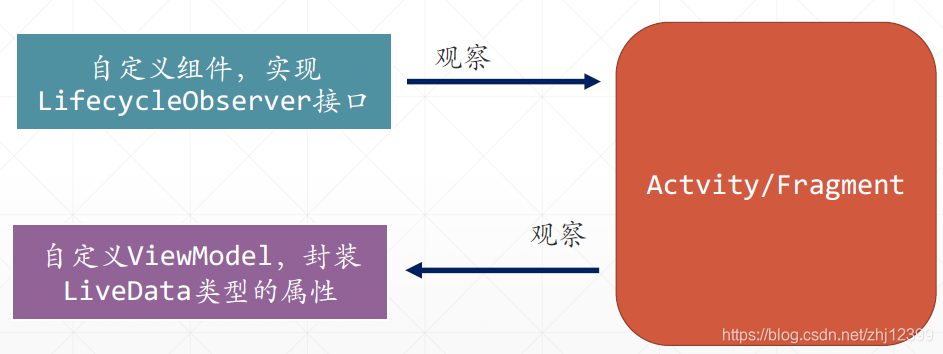
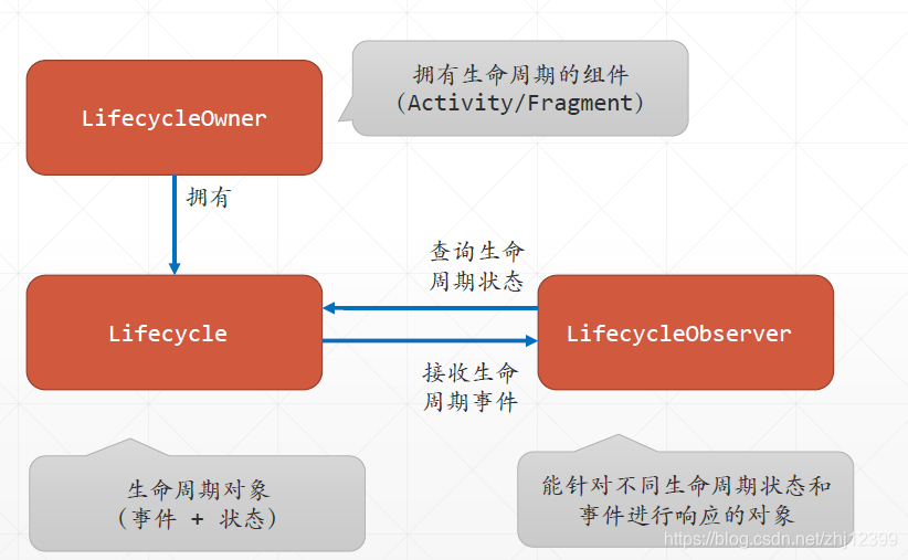
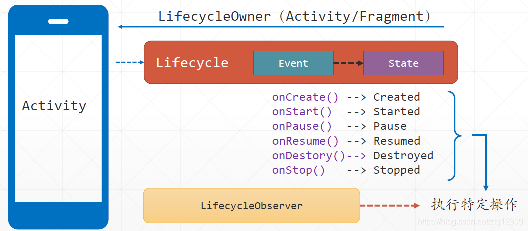
⽣命周期感知组件,它能“观察”拥有⽣命周期的组件(比如Activity和Fragment)当前所处的⽣命周期,并作出相应的响应,本质上是“Observer设计模式”的⼀个应用实例。
包容三个核⼼类型:Lifecycle,LifecycleOwner和LifecycleObserver,Android SDK中的Activity和Fragment就是⼀个LifecycleOwner。在实际开发中,通常将自⼰的组件设计为“LifecycleObserver”。
- ViewModel
提供UI界面需要显示的数据,封装UI交互逻辑,并且可以独立于UI组件(Activity/Fragment)的⽣命周期,当Activity/Fragment销毁时,其中的数据仍然能够保存。在开发中,通常在Activity/Fragment中使用ViewModelProvider创建ViewModel实例。
- Live Data
LiveData通常与ViewModel配合,ViewModel封装LiveData类型的属性,Activity/Fragment“观察”这些属性,当这些属性发⽣改变时,自动刷新显示。
- 生命周期感知组件和LiveData类型的数据
- 数据绑定库(Data Binding Library)
在布局⽂件中以声明的⽅式,直接让UI控件的特定属性从数据源(单个对象或对象集合)中提取值,或者直接更新数据源。
通过编写数据绑定表达式,支持单向和双向绑定。
数据源如果使用ViewModel(可以封装LiveData型的数据),能够实现数据源与UI的自动同步。
导航(Navigation)组件
提供有⼀个可视化的导航设计器,通过绘制出导航路线图,实现基于Fragment的导航及信息传送。

每条导航线对应⼀个“xxxToyyyAction”对象,代表⼀个导航操作,可以给其添加“Argument(即携带的数据)”
只需要绘制出导航图,调用NavController的navigate()⽅法,就能从⼀个Fragment导航到沿着导航线导航到特定的Fragment。
Work Manager
改进过的用于创建需要长时间(或定时)运⾏的后台任务,考虑了多种运⾏场景下的各种影响因素。
可以与多种现有异步和并⾏计算技术相结合,比如线程、RxJava,Coroutine等。
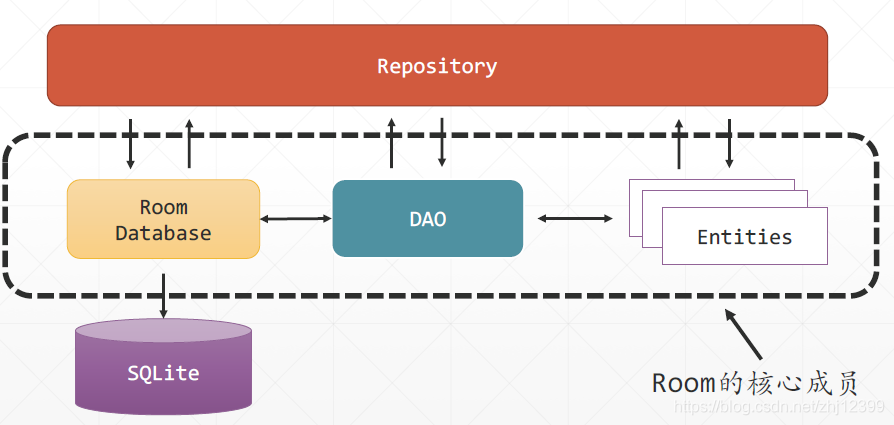
Room
⼀个底层使用SQLite数据库的ORM框架。
分页库(Paging Library)
对于较⼤的数据集,此组件用于⽅便地实现分批异步提取数据。
核⼼组件PageList,它可以从互联⽹、数据库中加载数据,然后使用PageListAdapter将数据显示在RecyclerView中。
它与其它数据存取技术(比如Retrofit和Room等),其他的异步编程技术(比如RxJava和Coroutine等),都可以很好地相互配合,实现异步非阻塞式的数据提取。
Jetpack推荐App应用MVVM设计模式
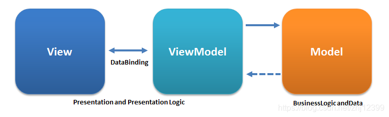
由于Android Jetpack提供了现成的ViewModel、DataBinding等组件,所以,MVVM就成为了推荐的Android App UI层设计模式。
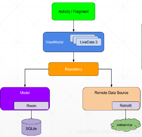
基于Jetpack的Android App架构示例
基于Jetpack的现有组件,再组合外部的第三⽅组件(比如Retrofit),可以很⽅便地开发出⾼度模块化的,易扩展的Android应用。
生命周期感知组件Lifecycles
由于不堪重负的Activity会导致出现一系列的问题
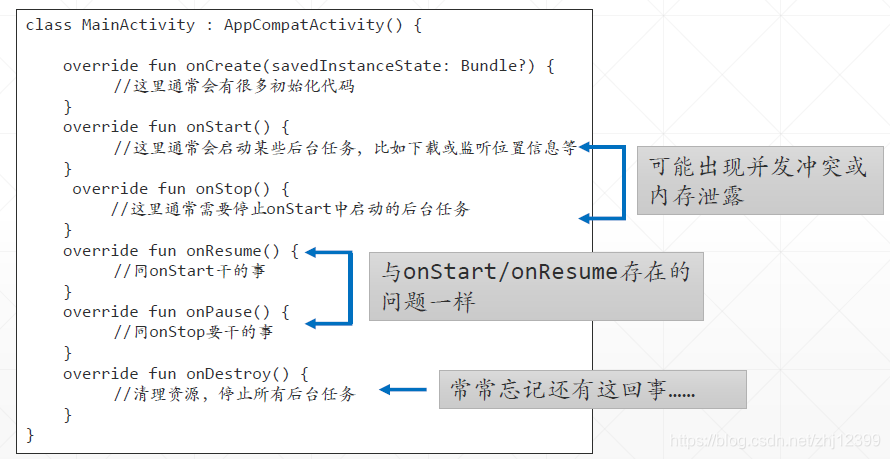
现在,不要让Activity 或 Fragment 负责回调特定的生命周期方法并在这些方法中调用特定组件的特定方法(干某事),而是让这个组件去“观察” Activity 或 Fragment 的状态,依据自己的职责,自行做出响应。
这样一来,Activity 就只管进行自己正常的生命周期状态转换,而不用理会特定组件对特定的生命周期阶段干什么事情,从而“减负”“增效”。
能够“观察”Activity/Fragment 状态变换并随之进行响应的组件,称为“生命周期感知”组件,是一个“ LifecycleObserver 。
关联Activity与LifecycleObserver
Activity 使用lifecycle.addObserver()到生命感知组件
配置Lifecycle组件:
启用Kotlin插件:
apply plugin :'kotlin-kapt'
定义项目组件依赖:
def lifecycle_version = "2.2.0"
// Lifecycles only (without ViewModel or LiveData)
implementation "androidx.lifecycle:lifecycle-runtime-ktx:$lifecycle_version"
// Annotation processor
kapt "androidx.lifecycle:lifecycle-compiler:$lifecycle_version"
定义“观察者”
class MyLifecycleObserver():LifecycleObserver {

    @OnLifecycleEvent(Lifecycle.Event.ON_CREATE)
    fun onCreate(){
        log("MyLifecycleObserver:onCreate")
    }

    @OnLifecycleEvent(Lifecycle.Event.ON_START)
    fun onStart(){
        log("MyLifecycleObserver:onStart")
    }
    @OnLifecycleEvent(Lifecycle.Event.ON_RESUME)
    fun onResume(){
        log("MyLifecycleObserver:OnResume")
    }
    @OnLifecycleEvent(Lifecycle.Event.ON_PAUSE)
    fun onPause(){
        log("MyLifecycleObserver:OnPause")
    }
    @OnLifecycleEvent(Lifecycle.Event.ON_STOP)
    fun onStop(){
        log("MyLifecycleObserver:onStop")
    }
    @OnLifecycleEvent(Lifecycle.Event.ON_DESTROY)
    fun onDestory(){
        log("MyLifecycleObserver:onDestory")
    }
    @OnLifecycleEvent(Lifecycle.Event.ON_ANY)
    fun onAny(){
        log("MyLifecycleObserver:onAny")
    }
}
LifecycleObserver是一个空接口,没有定义任何的成员,其主要目的就是标识一个类是“生命周期观察员(感知者)”。
使用注解定义针对特定生命周期事件的响应方法
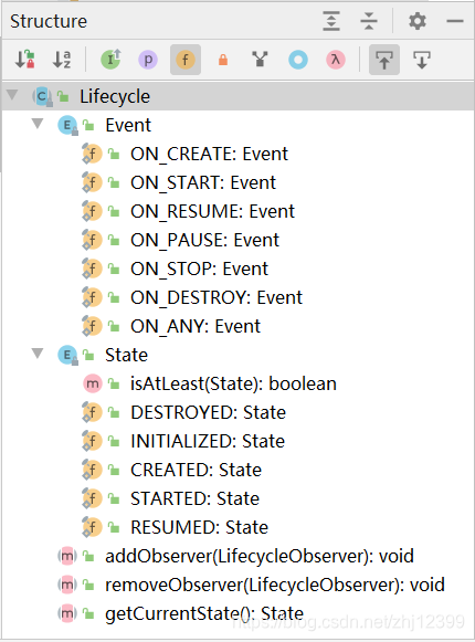
Lifecycle类的成员
右图展示了Lifecycle 类的成员,可以看到主要就是定义了两个内部枚举类型 Event 和 State ,同时还定义了添加和移除观察者对象的方法。
再MainActivity中注册观察者
override fun onCreate(savedInstanceState: Bundle?) {
    super.onCreate(savedInstanceState)
    setContentView(R.layout.activity_main)
    //添加观察者
    lifecycle.addObserver(MyLifecycleObserver())
    log("MainActivity:onCreate")
}
查询当前状态
观察者如果需要确定Activity 是否处于特定的状态,可以将actvity 的 L ifecycle 对象“注入”到观察者中( Activity 只需要在 addObserver 时传入 this 即可):
//从外部(比如 Activity )注入特定的 L ifecycle 对象
class MyLifecycleObjserver(lifecycle: Lifecycle ) : LifecycleObserver {
    fun doSometing(){//查询是否处于特定的状态
        if (lifecycle. isAtLeast (Lifecycle.State.STARTED)){
            //...
        }
    }
}
例子:使用JDK 中的 Timer 组件,编写一个计数器,在 Activity 的onCreate() 方法启动计数,在onDestory() 方法中停止计数。
class MainActivity : AppCompatActivity() {
    override fun onCreate(savedInstanceState: Bundle?) {
        super.onCreate(savedInstanceState)
        setContentView(R.layout.activity_main)
        MyTimer(this)
    }

    override fun onDestroy() {
        super.onDestroy()
        Log.i("MyTimer", "MainActivity: onDestory")
    }

    //在UI线程中更新文本框控件
    fun showTimerInfo(message: String) {
        runOnUiThread {
            tvInfo.text = message
        }
    }
}
class MyTimer(val activity: MainActivity) : LifecycleObserver {

    var secondsCount = 0
    private var timer = Timer()

    val task: TimerTask = object : TimerTask() {
        override fun run() {
            secondsCount++
            Log.i("MyTimer", "Timer is at : $secondsCount")
            activity.showTimerInfo(secondsCount.toString())//更新显示内容
        }
    }

    init {
        activity.lifecycle.addObserver(this)
    }

    @OnLifecycleEvent(Lifecycle.Event.ON_START)
    fun startTimer() {
        timer.schedule(task,0,1000)
    }

    @OnLifecycleEvent(Lifecycle.Event.ON_STOP)
    fun stopTimer() {
        timer.cancel()
        Log.i("MyTimer", "Timer is stopped!")
    }
}
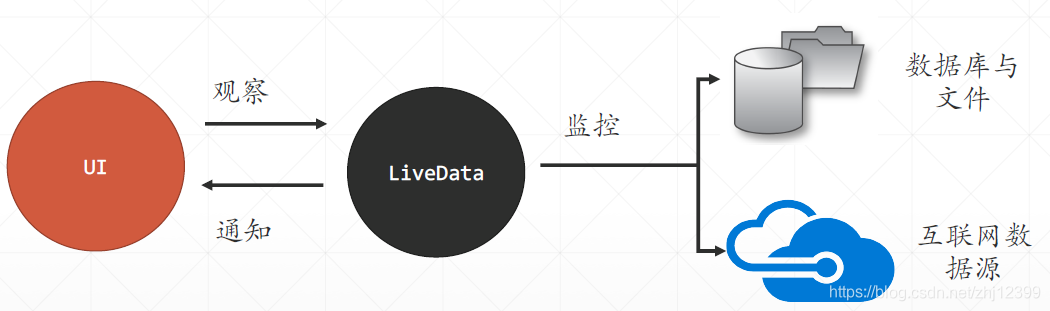
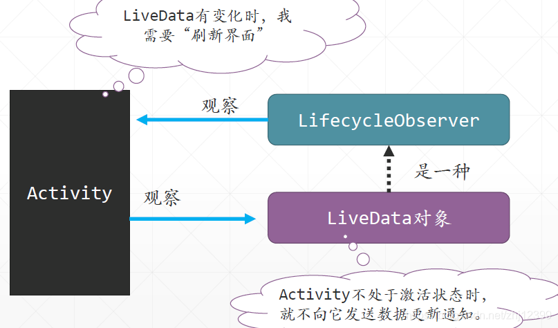
LiveData
LiveData是一种可观察的 数据容器, Activity 可以“观察”它,当LiveData 中的数据有变化时, Activity 会得到通知。
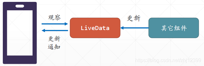
LiveData本身也是一种生命周期感知组件(其实就是一个LifecycleObserver),当它“感知”到 Activity 被清除时,就不会向Activity 发送数据“更新通知”。
LiveData能够感知“观察者”所处的生命周期
当观察者处于“非激活状态”(比如在后台运行或己被销毁)时,LiveData 不会向它再发送 “数据己更新”通知。
配置组件:
添加依赖:
def lifecycle_version = "2.2.0"
// LiveData
implementation "androidx.lifecycle:lifecycle-livedata-ktx:$lifecycle_version"
定义LiveData数据类
class MyDataClass() {
    //此属性可以有多个外部“观察者”,当属性值改变时,这些观察者都会收到通知
    val info: MutableLiveData<String> = MutableLiveData()
}
MainActivity中
class MainActivity : AppCompatActivity() {
    override fun onCreate(savedInstanceState: Bundle?) {
        super.onCreate(savedInstanceState)
        setContentView(R.layout.activity_main)

        //实例化数据对象
        val dataClass = MyDataClass()
        //封装UI更新代码
        val infoObserver = Observer<String> {
            tvInfo.text = it
        }
        //观察数据对象的info属性
        dataClass.info.observe(this, infoObserver)
        btnChangeInfo.setOnClickListener {
            //修改数据对象的info属性,“间接”引发UI界面的更新
            dataClass.info.value = "当前时间:${Date().toString()}"
        }
    }
}
设置LiveData 观察的代码应该放在 onCreate() 而不是onResume() 中,因为onResume() 方法往往会被调用很多次。
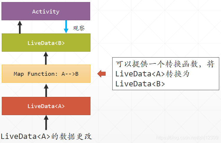
LiveData中的数据转换
class MyTimer {
    //内部LiveData,不允许外界直接访问
    private val currentTime = MutableLiveData<Long>()

    //转换函数,将MutableLiveData<Long>()转换为LiveData<String>
    val currentTimeStrings: LiveData<String> = Transformations.map(currentTime) {
        //将long类型的数值转换为时间格式——H:MM:SS
        DateUtils.formatElapsedTime(it)
    }

    init {
        val timer = Timer()  //使用JDK中的Timer组件实现定时调用
        val startTime = System.currentTimeMillis()
        var elapsedTime: Long = 0  //保存己消逝的时间
        //定时任务
        val task: TimerTask = object : TimerTask() {
            override fun run() {
                elapsedTime = (System.currentTimeMillis() - startTime) / 1000
                //对LiveData值的修改必须在UI线程中执行
                currentTime.postValue(elapsedTime)
                //这里不能直接设置currentTime 的 value 属性,因为 Android 约定不能跨线程更新 UI 组件,而 JDK 中的 Timer 是在工作线程中执行TimerTask 的。
                //直接使用以下这句,会导致App闪退
                //currentTime.value = elapsedTime
            }
        }
        //每隔一秒,更新一次显示
        timer.schedule(task, 1000, 1000)
    }
}
示例中定义了一 MyTimer 类,里面定义了两个属性,但只有 currentTimeStrings 是可以被被外界所“观察”的 。 MyTimer 中有代码定时更改 currentTime 属性的值。
class MainActivity : AppCompatActivity() {
    override fun onCreate(savedInstanceState: Bundle?) {
        super.onCreate(savedInstanceState)
        setContentView(R.layout.activity_main)

        //封装UI更新代码
        val infoObserver = Observer<String> {
            tvInfo.text = it
        }
        val myTimer = MyTimer()
        //观察MyTimer的currentTimeStrings属性
        myTimer.currentTimeStrings.observe(this, infoObserver)
    }
}
转换函数switchMap
fun <X,Y> map (source: LiveData<X>, func: (x)->Y ): LiveData<Y>
数据源是一个X类型的 LiveData ,转换函数将这个数据源中的X类型的数据转换为 Y 类型的数据,返回LiveData<Y>
fun <X,Y> switchMap (source: LiveData<X>, switchMapFunc:(x)->LiveData<Y>): LiveData<Y>
数据源是一个X 类型的LiveData,转换函数将这个数据源中的 X类型的数据转换为 LiveData<Y>类型的数据,返回LiveData<Y>
实例:
data class User(
    var id: Int,
    var name: String
)
class UserRepository {
    //用于保存多个用户对象
    private val users = mutableListOf<User>()
    init {
        fillUsers() //填充示例用户对象
    }
    //向用户集合中添加100个用户对象
    private fun fillUsers() {
        for (i in 1..100) {
            users.add(User(i, "User $i"))
        }
    }
    //按照Id值查找对象
    fun getUserById(id: Int): User? = users.find {
        it.id == id
    }
}
//向Activity提供数据的数据源对象
class MyDataSource() {
    private val repo = UserRepository()

    //userId是一个LiveData,它主要用于触发数据库查询任务
    private val userId: MutableLiveData<Int> = MutableLiveData()

    //供外界调用,以发出“更换用户”的请求
    fun changeUser(userId: Int) {
        //修改userId,将导致currentUser属性值的变化
        this.userId.value = userId
    }

    //供Activity绑定,changeUser()函数修改userId,触发此转换函数的运行
    val currentUser = Transformations.switchMap(userId) {
        val result = MutableLiveData<User>()
        //访问数据库,结果由MutableLiveData所承载
        result.value = repo.getUserById(it)
        //return一个MutableLiveData对象给外界
        result
    }
}
class MainActivity : AppCompatActivity() {
    override fun onCreate(savedInstanceState: Bundle?) {
        super.onCreate(savedInstanceState)
        setContentView(R.layout.activity_main)

        val dataSource = MyDataSource()

        btnChangeUser.setOnClickListener {
            //发出更换用户的请求
            dataSource.changeUser(Random().nextInt(100))
        }
        //观察数据源的LiveData属性——currentUser
        dataSource.currentUser.observe(this, Observer {
            tvInfo.text = it?.name?:"没有找到用户"
        })
    }
}
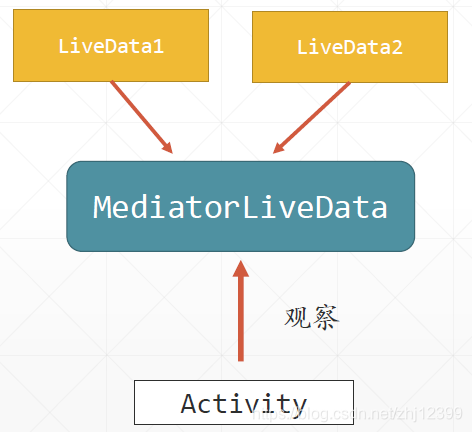
可以使用MediatorLiveData 汇总多个LiveData 的改变,也就是说,只要任一个LiveData 有变化, MediatorLiveData 就会向所有观察者发送数据更新通知。
class MainActivity : AppCompatActivity() {
    //两个LiveData,与两个文本框相关联
    private val string1 = MutableLiveData<String>()
    private val string2 = MutableLiveData<String>()

    override fun onCreate(savedInstanceState: Bundle?) {
        super.onCreate(savedInstanceState)
        setContentView(R.layout.activity_main)

        initEditText()
        initMediatorLiveData()
    }

    //给两个文本添加监听器
    private fun initEditText() {
        edtString1.addTextChangedListener {
            string1.value = it.toString()
        }
        edtString2.addTextChangedListener {
            string2.value = it.toString()
        }
    }

    //建立好TextView与MediatorLiveData间的关联
    private fun initMediatorLiveData() {
        val result = MediatorLiveData<Int>()
        val doSum = Observer<String> {
            //取出两个LiveData中的数据,计算其包容的字符串总长度
            val strLength1 = string1.value?.length ?: 0
            val strLength2 = string2.value?.length ?: 0
            //更新MediatorLiveData,触发UI更新过程
            result.value = strLength1 + strLength2
        }
        //汇集两个LiveData的改变,任何一个有变化,都会调用DoSum
        result.addSource(string1, doSum)
        result.addSource(string2, doSum)
        //观察MediatorLiveData,使用文本框显示其值
        result.observe(this, Observer {
            tvInfo.text = result.value?.toString() ?: "0"
        })
    }
}
可以将LiveData 与 DataBinding Library 和 ViewModel 相配合,直接在布局文件中设置 UI 控件从 ViewModel 对象的 LiveData 属性中“抽取值”并实现“自动更新”,无需让 Activity 手动写代码“观察”它。
可以将LiveData 与 ROOM 框架相配合,在后台加载数据库中的数据,然后使用 RecyclerView 等 UI 控件在数据装载完毕之后自动刷新显示。
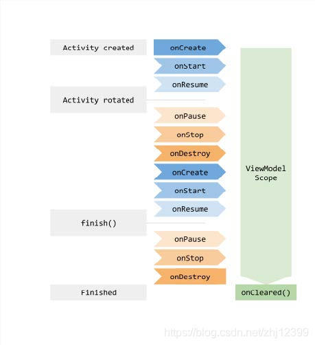
ViewModel基础
Jetpack中的 ViewModel 组件为解决与 Activity/Fragment 生命周期相关的数据问题,提供了一个解决方案。
ViewModel是一个类,它包容那些 Activity/Fragment 需要显示的数据。
ViewModel对象是“独立”于Activity/Fragment 的生命周期的,只有当 App 退出时,它才会被销毁,因此,它是"Singleton"的。
Activity中使用ViewModel
使用方法:
1.添加依赖
implementation 'androidx.lifecycle:lifecycle-extensions:2.2.0'
// ViewModel
implementation "androidx.lifecycle:lifecycle-viewmodel-ktx:2.2.0"
// Saved state module for ViewModel
2.定义ViewModel类
注意:自定义ViewModel 类必须从ViewModel类中派生。
且:ViewModel 中不能有Activity/Fragment 的引用,这容易引发内存资源泄漏问题。
package com.jinxuliang.viewmodeldemo

import androidx.lifecycle.MutableLiveData
import androidx.lifecycle.ViewModel

class MyViewModel : ViewModel() {

    init {
        log("MyViewVmodel创建")
    }

    override fun onCleared() {
        super.onCleared()
        log("MyViewModel己被销毁")
    }

    val score = MutableLiveData<Int>(0)
}
3.使用ViewModel
val TAG = "ViewModelDemo"

//一个用于输出Log的简易方法
fun log(message: String) {
    Log.d(TAG, message)
}

class MainActivity : AppCompatActivity() {
    //引用本Actvity关联的ViewModel对象
    lateinit var viewModel: MyViewModel

    override fun onCreate(savedInstanceState: Bundle?) {

        super.onCreate(savedInstanceState)
        setContentView(R.layout.activity_main)

        //创建ViewModel实例,不要直接new,而要使用ViewModelProvider 来实例化ViewModel对象Activity
        viewModel = ViewModelProvider(this)
            .get(MyViewModel::class.java)

        //观察ViewModel中封装的LiveData数据
        //Activity通常会“观察”ViewModel 对象中的 LiveData不过, 如果使用数据绑定库,则这些与“观察”相关的语句都可以删除。
        viewModel.score.observe(this, Observer { newScore ->
            tvInfo.text = newScore.toString()
        })
        btnChangeScore.setOnClickListener {
            val initValue = viewModel.score.value!!.toInt()
            //修改ViewModel中的数据
            viewModel.score.value = initValue + 1
        }
    }
}
关键点:
ViewModel需要对 Activity 或 Fragment “一无所知”,它不引用Activity 或 Fragment 本身,不调用 Activity 或 Fragment 中的任何函数,也不会访问 Activity 或 Fragment 中 的任何控件!
ViewModel的职责是将数据从 Activity 或 Fragment 中“剥离”出来,从而实现 Activity 或 Fragment “瘦身”的目的。
Activity或 Fragment 通过主动“观察” ViewModel 实现界面的更新。
在Fragment中使用ViewModel
下面将使用Fragment配合ViewModel,下部是一个放置了一个TextView的Fragment,点击Activity中的按钮,Fragment中的TextView显示点击个数
在Fragment中使用ViewModel:在Android studio中提供了现成的模板用于向项目中添加使用ViewModel的Fragment。
1.定义ViewModel
package com.jinxuliang.fragmentwithviewmodel

import androidx.lifecycle.LiveData
import androidx.lifecycle.MutableLiveData
import androidx.lifecycle.ViewModel

class ExampleViewModel : ViewModel() {
    //计数器
    var counter:MutableLiveData<Int> = MutableLiveData()
}
这个ViewModel 是给 Fragment 用的,里面就定义了一个“可观察”的 count 属性。
2.定义ExampleFragment
package com.jinxuliang.fragmentwithviewmodel

import androidx.lifecycle.ViewModelProviders
import android.os.Bundle
import android.util.Log
import androidx.fragment.app.Fragment
import android.view.LayoutInflater
import android.view.View
import android.view.ViewGroup
import androidx.lifecycle.Observer
import androidx.lifecycle.ViewModelProvider
import kotlinx.android.synthetic.main.example_fragment.*


class ExampleFragment : Fragment() {

    companion object {
        fun newInstance() = ExampleFragment()
    }

    override fun onCreateView(
        inflater: LayoutInflater, container: ViewGroup?,
        savedInstanceState: Bundle?
    ): View? {
        return inflater.inflate(R.layout.example_fragment, container, false)
    }

    //引用ViewModel对象
    lateinit var viewModel: ExampleViewModel

    override fun onActivityCreated(savedInstanceState: Bundle?) {
        super.onActivityCreated(savedInstanceState)
        //实例化ViewModel
        viewModel = ViewModelProvider(this)
            .get(ExampleViewModel::class.java)

        val updateCounter = Observer<Int> {
            //使用文本控件显示计数器的当前值
            tvInfo?.text = it.toString()
        }
        //监控计数器值的变化
        viewModel.counter.observe(viewLifecycleOwner, updateCounter)
    }
}
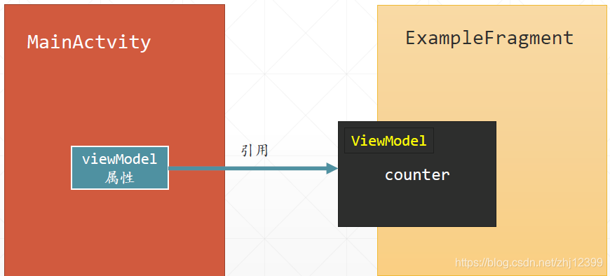
在ExampleFragment 中实例化ViewModel 对象,并且观察它的counter 属性,当其有变化时,使用文本控件显示其值。
注意外界可以通过ExampleFragment 中的 viewModel属性引用到它所包容的 ViewModel对象。
3.定义MainActivity
package com.jinxuliang.fragmentwithviewmodel

import androidx.appcompat.app.AppCompatActivity
import android.os.Bundle
import androidx.lifecycle.ViewModelProvider
import kotlinx.android.synthetic.main.activity_main.*

class MainActivity : AppCompatActivity() {

    lateinit var viewModel: ExampleViewModel

    override fun onCreate(savedInstanceState: Bundle?) {
        super.onCreate(savedInstanceState)
        setContentView(R.layout.activity_main)

        btnClickMe.setOnClickListener {
            //累加计数器值并更新Fragment显示
            val currentCount = viewModel?.counter.value ?: 0
            viewModel?.counter.value = currentCount + 1
//注意一下计数器值是从ExampleFragment的ViewModel中取出的
        }
    }

    override fun onStart() {
        super.onStart()
        //获取ExampleFragment对象的引用
        val fragment = supportFragmentManager.findFragmentByTag(
            "example_fragment"
        )
        //引用ExampleFragment对象所关联的ViewModel对象
        viewModel = (fragment as ExampleFragment).viewModel
    }
}
基于ViewModel实现控件同步
由于ViewModel 是独立于 Activity/Fragment 的存在,这就让它成为一种很好的 App “信息公共存储区域“,如果在ViewModel 中使用 LiveData 封装数据,那么Activity/Fragment 通过“观察” LiveData ,就能轻松地实现多个控件之间状态的同步。
下面的示例中定义了一个Fragment,里面包容了一个SeekBar和一个TextView
在Activity 上放置了同一个 Fragment的两个实例,这两个实例共用同一个ViewModel ,从而实现四个控件的同步响应。
package com.jinxuliang.sharevmbetweenfragments

import androidx.lifecycle.MutableLiveData
import androidx.lifecycle.ViewModel

class SeekBarViewModel:ViewModel() {
    val seekBarValue:MutableLiveData<Int> = MutableLiveData()
}
package com.jinxuliang.sharevmbetweenfragments

import android.os.Bundle
import android.util.Log
import android.view.LayoutInflater
import android.view.View
import android.view.ViewGroup
import android.widget.SeekBar
import android.widget.SeekBar.OnSeekBarChangeListener
import androidx.fragment.app.Fragment
import androidx.lifecycle.Observer
import androidx.lifecycle.ViewModelProvider
import kotlinx.android.synthetic.main.fragment_seek_bar.*


class SeekBarFragment : Fragment() {

    override fun onCreate(savedInstanceState: Bundle?) {
        super.onCreate(savedInstanceState)
    }

    private lateinit var mSeekBar: SeekBar
    lateinit var mSeekBarViewModel: SeekBarViewModel

    override fun onCreateView(
        inflater: LayoutInflater, container: ViewGroup?,
        savedInstanceState: Bundle?
    ): View? {
        val root = inflater.inflate(
            R.layout.fragment_seek_bar,
            container, false
        )
        mSeekBar = root.findViewById(R.id.seekBar)
        //实例化ViewModle对象,注意不能传入this作为参数
        //因为在同一个Actvity中可以出现多个Fragment,
        //如果每个Fragment都有一个ViewModel,彼此独立,
        //那就无法实现多个Fragment间的同步。
        mSeekBarViewModel = ViewModelProvider(requireActivity())
            .get(SeekBarViewModel::class.java)
        subscribeSeekBar()
        return root
    }

    //设定TextView和SeekBar之间的同步关系
    private fun subscribeSeekBar() {
        //监听SeekBar的值改变事件
        mSeekBar.setOnSeekBarChangeListener(
            object : OnSeekBarChangeListener {
                override fun onProgressChanged(
                    seekBar: SeekBar,
                    progress: Int,
                    fromUser: Boolean
                ) {
                    if (fromUser) {
                        //值的改变是由于用户拖动的
                        mSeekBarViewModel.seekBarValue.value = progress
                    }
                }
                override fun onStartTrackingTouch(seekBar: SeekBar) {}
                override fun onStopTrackingTouch(seekBar: SeekBar) {}
            })

        // 当ViewModel改变时,更新SeekBar和TextView
        mSeekBarViewModel.seekBarValue.observe(
            requireActivity(), Observer<Int?> { value ->
                if (value != null) {
                    mSeekBar.progress = value
                    tvInfo.text = value.toString()
                }
            })
    }

    companion object {
        @JvmStatic
        fun newInstance() = SeekBarFragment()
    }
}
package com.jinxuliang.sharevmbetweenfragments

import androidx.appcompat.app.AppCompatActivity
import android.os.Bundle

class MainActivity : AppCompatActivity() {

    override fun onCreate(savedInstanceState: Bundle?) {
        super.onCreate(savedInstanceState)
        setContentView(R.layout.activity_main)
    }
}
在实际开发中使用ViewModel ,关键在于需要区别开哪些数据和代码应该移到 ViewModel 中,这是一个分析与决策的过程。
ViewModel中的代码,主要是实现数据处理的,但这些处理,必须与 UI 相剖离 ,因此,不能有变量或属性引用 Activity/Fragment或 Activity/Fragment 上的任何一个 UI 控件,不能有代码调用Activity/Fragment 上的函数,而应该反过来,让Activity/Fragment 去“观察” ViewModel 中的 LiveData 属性。
ViewModel主要用于提取和存储数据,不应该包容过多的处理逻辑,业务相关的数据处理代码,应该放在专门的组件中,实现业务逻辑,不是 ViewModel的职责。
外界可以访问的数据,应该尽量设置为immutable(不可改)的。
private val innerData = MutableLiveData<String>()
val outerData:LiveData<String>
get()=innerData
每个ViewModel 中的 LiveData 属性应该是独立的,不同的 ViewModel实例之间,不要共享对象。
ViewModel可以启动异步操作,访问数据库,或者从网上下载数据这些异步操作返回的结果,通常会被封装为 LiveData 。
注意:
LiveData 有可能丢失数据。比如,当用户旋转手机导致Activity 被销毁再重建,在这个过程中,由于 Activity 本身处于非激活状态,但 ViewModel 仍然存活,因此,此时 LiveData 的修改不会触发更新通知,只有等到 Activity 重新激活并重新连接到 LiveData才能收到后继的数据更新通知,“中间”收到的将会“丢失”。
不要滥用LiveData LiveData 用于动态更新 UI 组件,里面的关键是Activity 或 Fragment 是有生命周期的,如果不涉及生命周期问题,直接实现简单的 Observer 设计模式是推荐的。
ViewModel与经典MVVM设计模式
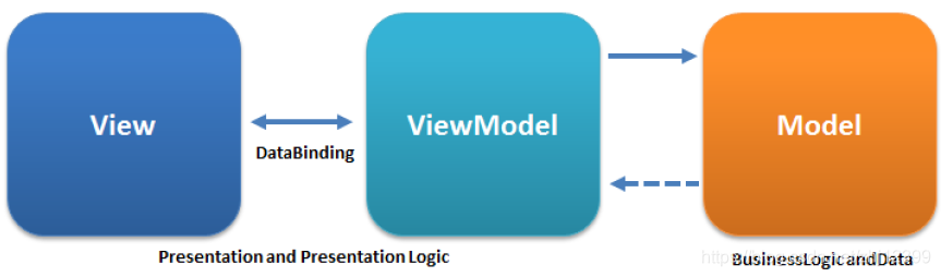
ViewModel的功能,与 MVVM 设计模式关系紧密,在 Jetpack 中,ViewModel 通常包容使用 LiveData 承载的数据,并且与 Jetpack 中的数据绑定库结合 起来,以构建响应式( Reactive )的 App 。
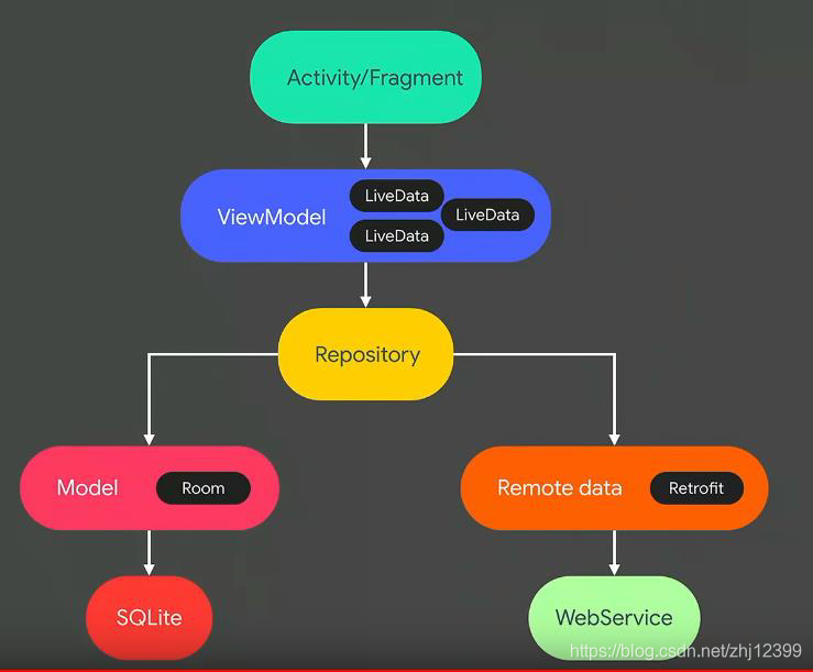
上图所示为典型的使用Jetpack组件构建的 App 架构,可以看到,ViewModel 在其中起到了一个“承上启下”,沟通 UI 组件与底层数据之间关联的作用。
上图中用一访问数据库的Room 组件,用于访问互联网服务的Retrofit
Navigation
当一个App中包容有多个Activity或 Fragment 时,App切换显示这些Activity或Fragment的过程称为“导航”。
“导航”可以看成是App 的旅游路线,用户“顺着”这条路线浏览你的App 。
早期的App,“导航”功能是由程序员手工完成的,比如使用startActivity() 启动一个新的Activity 。
Jetpack现在提供了一整套的导航组件(包括相应的库、插件和工具),能帮助我们非常方便地实现导航。
Jetpack中的导航组件,采用“单 Activity + 多 Fragment ”的 App 组织方式。Activity是App的入口和容器,Fragment则构成了 App 的具体界面。导航体现为从一个Fragment 转移到另一个Fragment。
使用方法
添加依赖
def nav_version = "2.2.1"
// Kotlin
implementation "androidx.navigation:navigation-fragment-ktx:$nav_version"
implementation "androidx.navigation:navigation-ui-ktx:$nav_version"
New 一个Resource File文件
File name例如:nav_graph.xml
Resource type:Navigation
导航图
向这个导航资源文件中添加 Fragment ,并建立 Fragment之间的导航关系。
向MainActivity布局中添加NavHostFragment
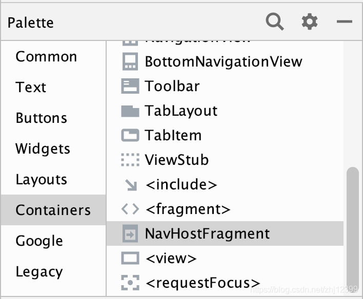
<?xml version="1.0" encoding="utf-8"?>
<androidx.constraintlayout.widget.ConstraintLayout
    xmlns:android="http://schemas.android.com/apk/res/android"
    xmlns:app="http://schemas.android.com/apk/res-auto"
    xmlns:tools="http://schemas.android.com/tools"
    android:layout_width="match_parent"
    android:layout_height="match_parent"
    tools:context=".MainActivity">

    <fragment
        android:id="@+id/navHost"
        android:name="androidx.navigation.fragment.NavHostFragment"
		//NavHostFragment是Fragment导航容器,各个 Fragment 就显示在它所占的屏幕区域内

        android:layout_width="match_parent"
        android:layout_height="match_parent"
        android:layout_marginStart="8dp"
        android:layout_marginTop="8dp"
        android:layout_marginEnd="8dp"
        android:layout_marginBottom="8dp"
        app:defaultNavHost="true"
        //设定这是默认的NavHost,它将捕获手机的Back键

        app:layout_constraintBottom_toBottomOf="parent"
        app:layout_constraintEnd_toEndOf="parent"
        app:layout_constraintStart_toStartOf="parent"
        app:layout_constraintTop_toTopOf="parent"
        app:navGraph="@navigation/nav_graph" />
        //设定NavHostFragment 关联的导航图

</androidx.constraintlayout.widget.ConstraintLayout>
实现导航组件的核心类型
NavHostFragment:一个特殊的Fragment ,它是其他Fragment 的容器。通常在主Activity 中放置它。
NavController:与NavHostFragment相关联,它有一个navigate() 方法,用于切换显示特定的Fragment,findNavController().navigate(要跳转的目的地)
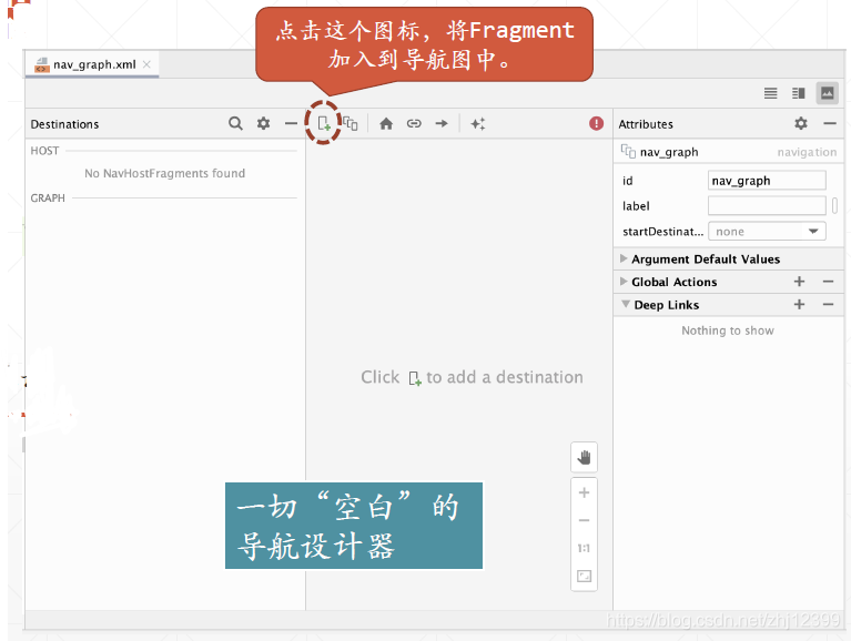
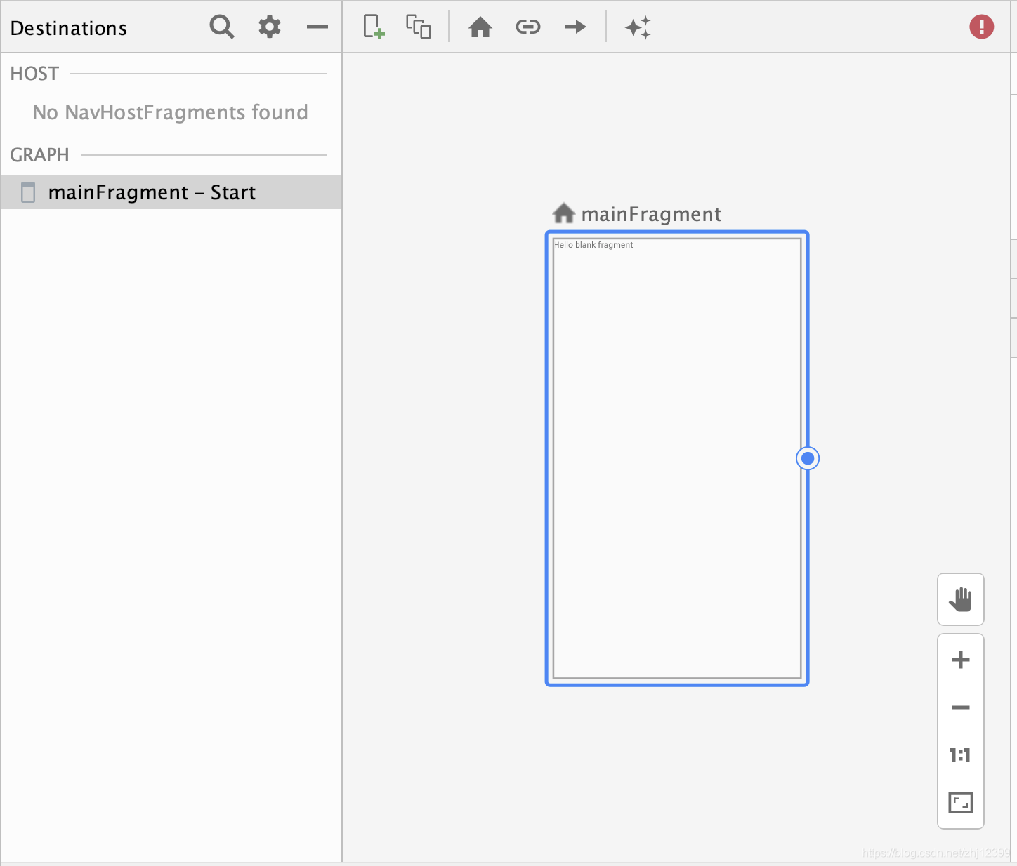
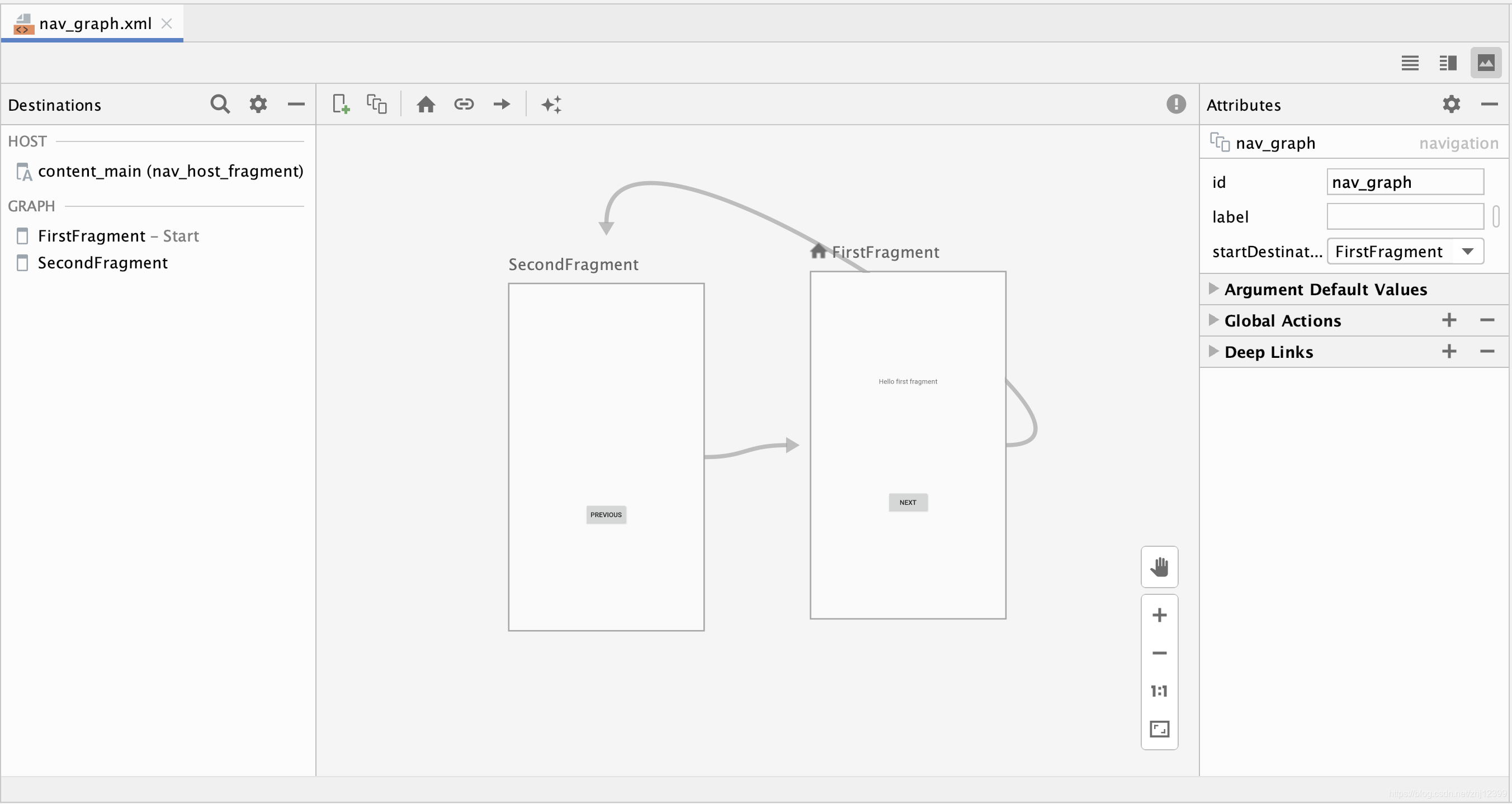
添加第一个Fragment,作为 Home
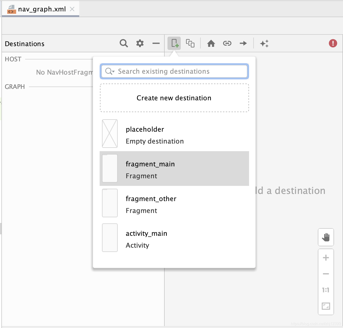
HomeFragment有一个小房子图标进行标识
点击拖动这个小圆点,可创建导航关系
默认情况下,第一个加入的Fragment 成为导航的起点,称为”Home”。
添加第2个 Fragment ,并建立导航关系
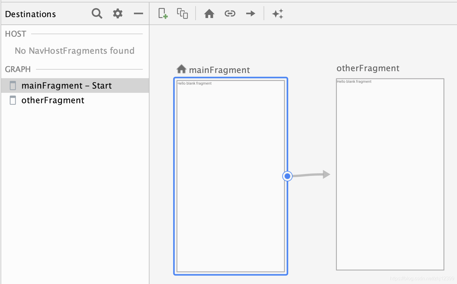
导航图其实是一个XML文件,主要由fragment和action所组成。
注意fragment和action的id ,它们都可以用于导航。
<?xml version="1.0" encoding="utf-8"?>
<navigation xmlns:android="http://schemas.android.com/apk/res/android"
    xmlns:app="http://schemas.android.com/apk/res-auto"
    xmlns:tools="http://schemas.android.com/tools"
    android:id="@+id/nav_graph"
    app:startDestination="@id/mainFragment">

    <fragment
        android:id="@+id/mainFragment"
        android:name="com.jinxuliang.hellonavigation.MainFragment"
        android:label="fragment_main"
        tools:layout="@layout/fragment_main" >
        <action
            android:id="@+id/action_mainFragment_to_otherFragment"
            app:destination="@id/otherFragment" />
    </fragment>
    <fragment
        android:id="@+id/otherFragment"
        android:name="com.jinxuliang.hellonavigation.OtherFragment"
        android:label="fragment_other"
        tools:layout="@layout/fragment_other" />
</navigation>
导航文件的嵌套结构及相关术语
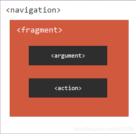
destination(目的地 ):即Fragment ,它是跳转的目标。
action(行为):从一个Fragment转到另一个 Fragment 的路线,体现在导航图中各个 Fragment 之间的连线,每个action都有一个唯一的Id进行标识。
argument(参数 ):代表导航发生时从一个Fragment向另一个Fragment传送的数据。
class MainFragment : Fragment() {
    override fun onCreateView(
        inflater: LayoutInflater, container: ViewGroup?,
        savedInstanceState: Bundle?
    ): View? {
        // Inflate the layout for this fragment
        val root = inflater.inflate(R.layout.fragment_main,
            container,
            false)

        //获取NavController的引用
        //Fragment显示在 NavHostFragment 中
        //使用此方法可以获取 NavHostFragment 关联的 NavController
        val navController = findNavController()

        val btnShowNext = root.findViewById<Button>(R.id.btnShowNext)

        btnShowNext.setOnClickListener {
            //通过导航图中目的地的id进行导航
            navController.navigate(R.id.otherFragment)
            //实现导航的关键是调用NavController的navigate()方法。
        }

        val btnShowNextUseAction = root.findViewById<Button>(R.id.btnShowNextUseAction)
        btnShowNextUseAction.setOnClickListener {
            //通过导航图中定义的Action进行导航
            navController.navigate(R.id.action_mainFragment_to_otherFragment)
        }
        return root
    }
}
class MainActivity : AppCompatActivity() {
    override fun onCreate(savedInstanceState: Bundle?) {
        super.onCreate(savedInstanceState)
        setContentView(R.layout.activity_main)
    }
}
class OtherFragment : Fragment() {
    override fun onCreateView(
        inflater: LayoutInflater, container: ViewGroup?,
        savedInstanceState: Bundle?
    ): View? {
        // Inflate the layout for this fragment
        return inflater.inflate(R.layout.fragment_other, container, false)
    }
}
在导航中传送数据
1.最简单的方法:
使用Bundle和Fragment.arguments
首先创建两个Fragment,之后用导航链接好
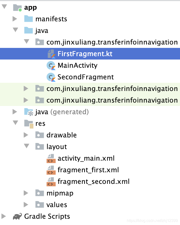
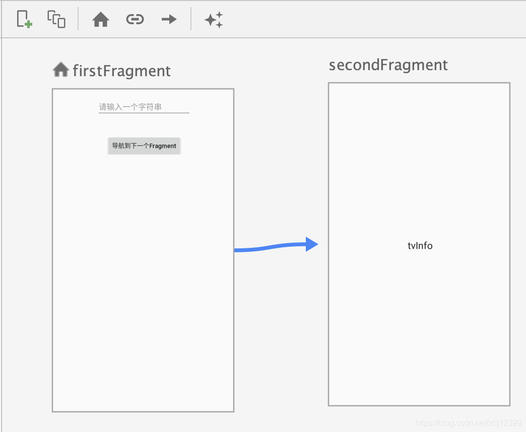
class FirstFragment : Fragment() {
    override fun onCreate(savedInstanceState: Bundle?) {
        super.onCreate(savedInstanceState)
    }

    override fun onCreateView(
        inflater: LayoutInflater, container: ViewGroup?,
        savedInstanceState: Bundle?
    ): View? {
        val root = inflater.inflate(R.layout.fragment_first, container, false)
        //获取相关控件的引用
        val btnNavigateToNext = root.findViewById<Button>(R.id.btnNavigateToNext)
        val edtUserInput = root.findViewById<TextView>(R.id.edtUserInput)
        //获取导航控制器的引用
        val navController = findNavController()
        btnNavigateToNext.setOnClickListener {
            //从文本框中取出用户输入的文本,放到Bundle中
            val bundle = bundleOf("user_input" to edtUserInput.text.toString())
            //将Bundle传给下一个导航目的地
            navController.navigate(R.id.secondFragment, bundle)
        }
        return root
    }
}
class SecondFragment : Fragment() {
    override fun onCreateView(
        inflater: LayoutInflater, container: ViewGroup?,
        savedInstanceState: Bundle?
    ): View? {

        val root = inflater.inflate(
            R.layout.fragment_second,
            container, false
        )

        val tvInfo = root.findViewById<TextView>(R.id.tvInfo)
        //取出收到的信息并显示
        tvInfo.text = arguments?.getString("user_input") ?: "无"
        return root
    }
}
这种信息传送方式极为简单原始,但当要传送的信息比较多时,容易出错。
2.启用SafeArgs插件
一种“类型安全”的导航信息传送方式。
两个Fragment 可以相互切换。
在项目的build.gradle中:
buildscript {
    ext.kotlin_version = '1.3.71'
    repositories {
        google()
        jcenter()
    }
    dependencies {
        classpath 'com.android.tools.build:gradle:3.6.2'
        classpath "org.jetbrains.kotlin:kotlin-gradle-plugin:$kotlin_version"
        //启用SafeArg插件
        def nav_version = "2.2.1"
        classpath "androidx.navigation:navigation-safe-args-gradle-plugin:$nav_version"
    }
}
在模块的build.gradle中:
apply plugin: 'com.android.application'
apply plugin: 'kotlin-android'
apply plugin: 'kotlin-android-extensions'
//启用SafeArgs的Kotlin插件
apply plugin: "androidx.navigation.safeargs.kotlin"
SafeArgs插件功能
动态生成相应的代码,以面向对象的方式封装Action和相关联数据,为导航目的地生成以下两个类型:
XXXDirections:代表跳转到特定Fragment的action
XXXArgs:代表跳转过程中相关联的数据,底层是使用 Fragment的Arguments 存储的。
class FirstFragment : Fragment() {
    override fun onCreateView(
        inflater: LayoutInflater, container: ViewGroup?,
        savedInstanceState: Bundle?
    ): View? {
        return inflater.inflate(R.layout.fragment_first, container, false)
    }

    override fun onViewCreated(view: View, savedInstanceState: Bundle?) {
        super.onViewCreated(view, savedInstanceState)
        button_first.setOnClickListener {
            //使用有参数的导航
            val navCtrl = findNavController()
            //生成一个随机数作为要传送数据的示例
            val ranNumber = Random().nextInt(100)
            //让action携带上数据
            val action = FirstFragmentDirections
                .actionFirstFragmentToSecondFragment(ranNumber)
            //导航到下一个目的地
            navCtrl.navigate(action)
        }
    }
}
class SecondFragment : Fragment() {
    //提取出相应的参数
    private val myArgs by navArgs<SecondFragmentArgs>()

    override fun onCreateView(
        inflater: LayoutInflater, container: ViewGroup?,
        savedInstanceState: Bundle?
    ): View? {
        // Inflate the layout for this fragment
        return inflater.inflate(R.layout.fragment_second, container, false)
    }

    override fun onViewCreated(view: View, savedInstanceState: Bundle?) {
        super.onViewCreated(view, savedInstanceState)

        //取出FirstFragment传入的参数,刷新显示
        val tvInfo = view.findViewById<TextView>(R.id.textview_second)
        tvInfo.text = myArgs.number.toString()

        //回到FirstFragment
        view.findViewById<Button>(R.id.button_second).setOnClickListener {
            findNavController().navigate(R.id.action_SecondFragment_to_FirstFragment)
        }
    }
}
在导航时可以传入不止一个参数,只需要你连续为SecondFragment 定义多个 Argument 就好了。
导航中的回退管理
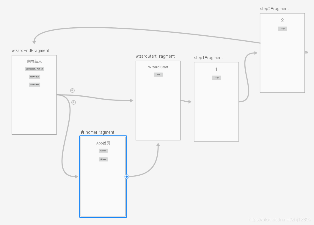
同一个Fragment,可以有多个目的地,体现为它的<fragment>中包容有多个<action>元素
两种跳转操作:NavController.navigate(目的地):将目的地压入堆栈,在此之前,可能有从栈中弹出部分 Fragment 的过程,参看后面的介绍。
NavController.popBackStack(目的地, true/false):第二个参数为
false 时,表示将堆栈中目的地之上的所有 Fragment 全部弹出去(不包括目的地 Fragment ),如果第二个参数为 true ,则连目的地自己也一并弹出。
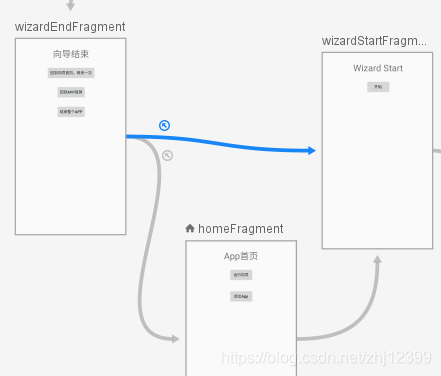
Pop Behavior的属性值
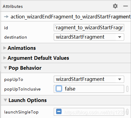
btnNextWizard.setOnClickListener {
    //popBackStack只执行出栈操作,将第二个参数改为true和false进行一下测试
    //navCtl.popBackStack(R.id.wizardStartFragment,true)
    //navigate肯定执行一个入栈操作,出栈操作如何执行,看action的popUpInclusive设置
    navCtl.navigate(R.id.action_wizardEndFragment_to_wizardStartFragment)
}
两种方式的对比:
Navigate:
如果在导航图中设置了导航关联线,那么在使用navigate(actionId) 方式导航时, popUpToInclusive值会导致出栈操作的结果不一样。
如果是通过目的地 id (不是通过 actionId )导航(这意味着不理会栈的 popUp 设置),则只会将目的地 Fragment入栈,没有出栈操作(即原有栈的内容仍然保存)。
popBackStack:
通过 popBackStack() 方法实现导航,则要求目的地 Id 必须在栈中己经存在,如果不存在,导航不起作用。
在目的地 id 在栈中存在的前提下,方法的第 2 个参数决定目的地 Fragment 是否应该也出栈。
popBackStack() 方法不理会导航关联线是否存在,也绝不会出现入栈操作。
看另外一个导航:
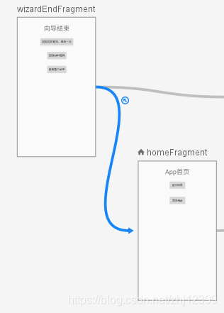
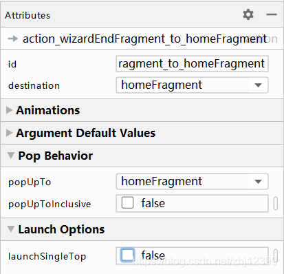
两个值都是false ,则栈中将出现两个HomeFragment 实例,因此,你需要两次Back ,才能退出程序。
btnGoHome.setOnClickListener {
    //通过action回到App首页
    navCtl.navigate(R.id.action_wizardEndFragment_to_homeFragment)
}
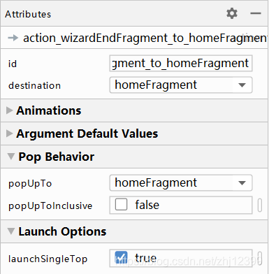
设置popUpToInclusive
这里写自定义目录标题
- 智能手机应用类型
- 按钮
- 菜单
- 文本框
- 拨打电话
- 显示弹窗
- 界面布局
- ConstraintLayout动画
- 界面的动态替换
- 使用ViewStub动态实例化控件
- CountDown倒计时
- 按钮动画
- 设置按钮集合
- XXOO游戏
- 新建另一个页面
- Activity状态与生命周期
- 创建新的Activity
- 新建一个对象
- 多个Activity
- Intent
- 安卓权限问题
- Fragment
- Jetpack
- Android Material Design
- RecyclerView
- 声明
Android Material Design
Material Design Components(MDC)
基础使用
添加依赖:
implementation 'com.google.android.material:material:1.1.0
参看官网
在manifest中
<?xml version="1.0" encoding="utf-8"?>
<manifest xmlns:android="http://schemas.android.com/apk/res/android"
    package="com.jinxuliang.hellomaterialdesign">

    <application
        android:allowBackup="true"
        android:icon="@mipmap/ic_launcher"
        android:label="@string/app_name"
        android:roundIcon="@mipmap/ic_launcher_round"
        android:supportsRtl="true"
        android:theme="@style/AppTheme">
        //主题类型

        <activity android:name=".MainActivity">
            <intent-filter>
                <action android:name="android.intent.action.MAIN" />
                <category android:name="android.intent.category.LAUNCHER" />
            </intent-filter>
        </activity>
    </application>
</manifest>
AppTheme主题定义在res/values/styles.xml文件中,其父主题是"Theme.AppCompat…"
<resources>
    <!-- 设定选用Material主题 -->
    <style name="AppTheme" parent="Theme.AppCompat.Light.DarkActionBar">
        <!-- Customize your theme here. -->
        <item name="colorPrimary">@color/colorPrimary</item>
        <item name="colorPrimaryDark">@color/colorPrimaryDark</item>
        <item name="colorAccent">@color/colorAccent</item>
    </style>
</resources>
AppCompat主题具有最好 的 兼容性,其中也可以使用一些 Material 控件,左图所示为默认的App 显示风格,可以人工指定或添加主题样式属性的方式,在 App 中使用 Material 控件。
如果将父主题更换为Material Design主题,整个应用界面风格都会改变,这个正是“主题”的作用。
<resources>
    <!-- 设定选用Material主题 -->
    <style name="AppTheme" parent="Theme.MaterialComponents">
        <!-- Customize your theme here. -->
        <item name="colorPrimary">@color/colorPrimary</item>
        <item name="colorPrimaryDark">@color/colorPrimaryDark</item>
        <item name="colorAccent">@color/colorAccent</item>
    </style>
</resources>
官方提供的 Material Design 主题
Theme.MaterialComponents
Theme.MaterialComponents.NoActionBar
Theme.MaterialComponents.Light
Theme.MaterialComponents.Light.NoActionBar
Theme.MaterialComponents.Light.DarkActionBar
Theme.MaterialComponents.DayNight
Theme.MaterialComponents.DayNight.NoActionBar
Theme.MaterialComponents.DayNight.DarkActionBar
如果之前使用的是AppCompat主题设计的,将其更改为Material主题,可能会导致“界面大变”。如果出现这种情况,可以选择使用桥接主题( Bridge Theme)
<style name="Theme.MyApp" parent="Theme.MaterialComponents.Light.Bridge">
	<!-- ... -->
</style>
“桥接主题”都继承自相应的AppCompat 主题,为它们扩充了Material 主题才有的新特性,这样一来,就可以在不改变原有界面的前提下,使用 Material 主题了。
使用Material日期组件
//显示Material日期选择控件
private fun showDatePicker() {
    val builder = MaterialDatePicker.Builder.datePicker()
    builder.setTitleText("请选择一个日期")
    //默认选中当前日期
    builder.setSelection(Date().time)
    val picker = builder.build()
    //设定“Ok”按钮点击响应
    picker.addOnPositiveButtonClickListener {
         tvInfo.text = formatDate(it)
    }
    //显示
    picker.show(supportFragmentManager, null)
}
//格式化日期
fun formatDate(dateNum: Long): String {
    val format = "yyyy-MM-dd"
    return SimpleDateFormat(format, Locale.CHINA).format(Date(dateNum))
}
定制主题颜色
优先级(由低到高):主题(Theme)< 样式(Style)< 属性(Attribute)
颜色在colors.xml中定义
<?xml version="1.0" encoding="utf-8"?>
<resources>
    <color name="colorPrimary">#6200EE</color>
    <color name="colorPrimaryDark">#3700B3</color>
    <color name="colorAccent">#03DAC5</color>
</resources>
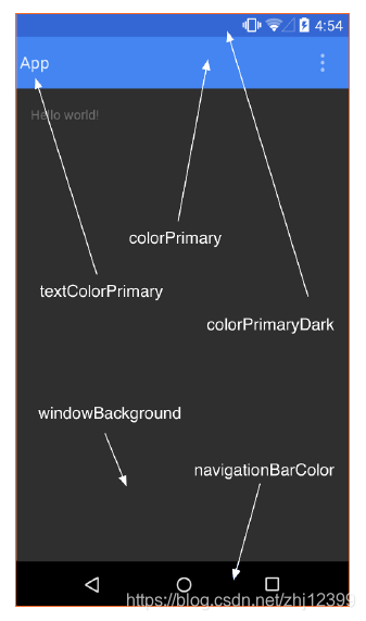
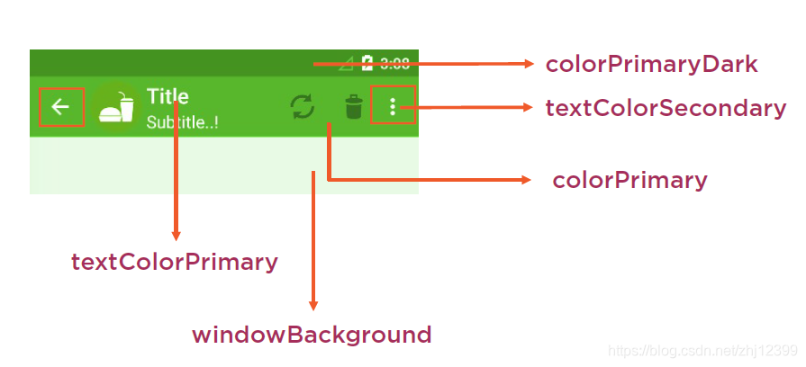
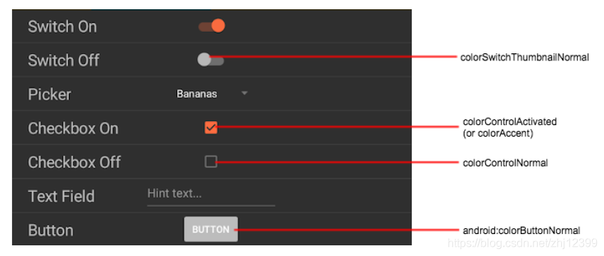
访问Material.io官网可以看到各种推荐颜色及其对应的数值,将其复制到colors.xml中,即可在App中使用。
参看官网
主颜色与次颜色
主颜色(Primary Color)是你的App中使用最多的颜色,比如背景。
次颜色(Secondary Color)多指那些前景色,比如文本。
参看官网
先点击右下角的Primary面板,然后在上面的颜色面板中挑一个主颜色
再点击右下角的Secondary面板,然后在上面的颜色面板中挑一个次颜色
最后点击右上角的export导出针对于Android的设计结果,下载后得到一个colors.xml文件。
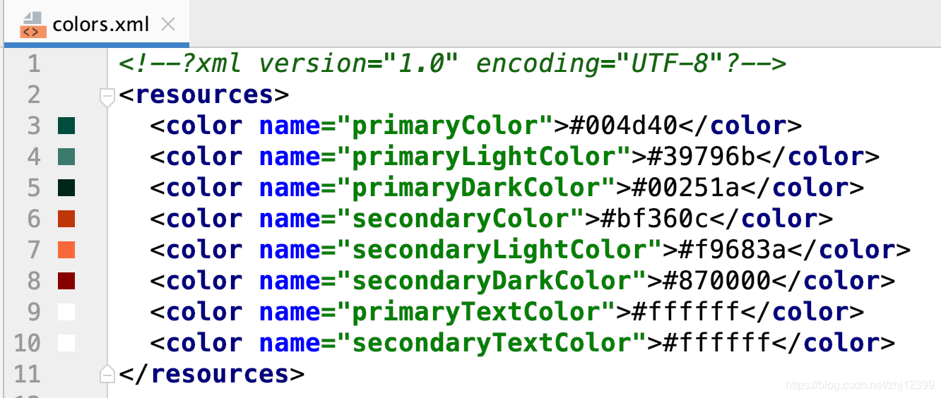
你选择不同的主次颜色,会生成不同的colors.xml,另外,App所使用的是AppCompat还是Material主题,颜色常量名会有所差异,需要查询官方文档确认这些名字。
然后修改styles.xml,以便匹配clolors.xml中定义的颜色常量名:
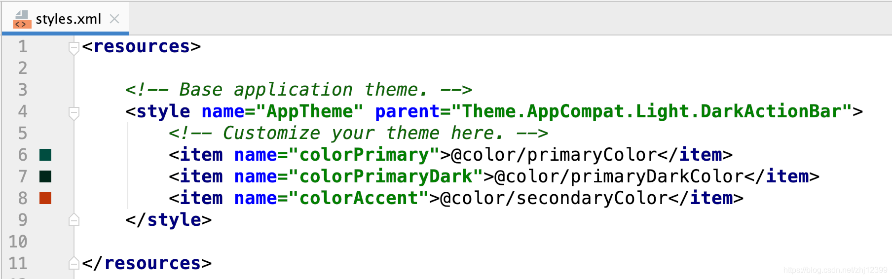
针对不同版本的手机,定制不同的主题
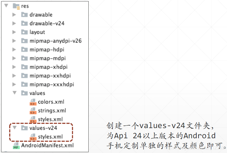
values/styles.xml,适用于所有版本的Android
<resources>
    <!-- Base application theme. -->
    <style name="AppTheme" parent="Theme.AppCompat.Light.DarkActionBar">
        <!-- Customize your theme here. -->
        <item name="colorPrimary">@color/colorPrimary</item>
        <item name="colorPrimaryDark">@color/colorPrimaryDark</item>
        <item name="colorAccent">@color/colorAccent</item>
    </style>
</resources>
values-v24/styles.xml,适用于API 24以上版本的Android
<?xml version="1.0" encoding="utf-8"?>
<resources>
    <!-- Base application theme. -->
    <style name="AppTheme" parent="Theme.MaterialComponents.DayNight.DarkActionBar">
        <!-- Customize your theme here. -->
        <item name="colorPrimary">@android:color/holo_blue_light</item>
        <item name="colorPrimaryDark">@android:color/holo_blue_dark</item>
        <item name="colorAccent">@android:color/holo_orange_light</item>
        <item name="colorControlActivated">@android:color/holo_red_light</item>
        <item name="colorButtonNormal">#3423ff</item>
        <item name="colorControlHighlight">#33691E</item>
    </style>
</resources>
按钮
按钮一共有四种风格:
纯⽂字按钮
线框(outline)按钮
充填(filled)按钮
开关(toggle)按钮
如果App使用的是Material主题,那么,布局⽂件中的<Button>,会被实例化为MaterialButton对象。
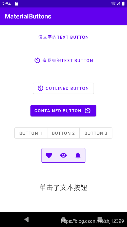
<com.google.android.material.button.MaterialButtonToggleGroup
    android:id="@+id/toggleButtonGroup"
    android:layout_width="wrap_content"
    android:layout_height="wrap_content"
    android:layout_marginTop="24dp"
    app:layout_constraintEnd_toEndOf="parent"
    app:layout_constraintHorizontal_bias="0.5"
    app:layout_constraintStart_toStartOf="parent"
    app:layout_constraintTop_toBottomOf="@+id/btnFilled">
    <Button
        android:id="@+id/toggleButton1"
        style="?attr/materialButtonOutlinedStyle"
        android:layout_width="wrap_content"
        android:layout_height="wrap_content"
        android:text="Button 1" />
    <Button
        android:id="@+id/toggleButton2"
        style="?attr/materialButtonOutlinedStyle"
        android:layout_width="wrap_content"
        android:layout_height="wrap_content"
        android:text="Button 2" />
    <Button
        android:id="@+id/toggleButton3"
        style="?attr/materialButtonOutlinedStyle"
        android:layout_width="wrap_content"
        android:layout_height="wrap_content"
        android:text="Button 3" />
</com.google.android.material.button.MaterialButtonToggleGroup>
<com.google.android.material.button.MaterialButtonToggleGroup
    android:id="@+id/toggleIconButtonGroup"
    android:layout_width="wrap_content"
    android:layout_height="wrap_content"
    android:layout_marginTop="24dp"
    app:layout_constraintEnd_toEndOf="parent"
    app:layout_constraintHorizontal_bias="0.5"
    app:layout_constraintStart_toStartOf="parent"
    app:layout_constraintTop_toBottomOf="@+id/toggleButtonGroup">
    <Button
        android:id="@+id/toggleIconButton1"
        style="@style/Widget.App.Button.OutlinedButton.IconOnly"
        android:layout_width="wrap_content"
        android:layout_height="wrap_content"
        app:icon="@drawable/ic_favorite_black_24dp" />
    <Button
        android:id="@+id/toggleIconButton2"
        style="@style/Widget.App.Button.OutlinedButton.IconOnly"
        android:layout_width="wrap_content"
        android:layout_height="wrap_content"
        app:icon="@drawable/ic_remove_red_eye_black_24dp" />
    <Button
        android:id="@+id/toggleIconButton3"
        style="@style/Widget.App.Button.OutlinedButton.IconOnly"
        android:layout_width="wrap_content"
        android:layout_height="wrap_content"
        app:icon="@drawable/ic_notifications_black_24dp" />
</com.google.android.material.button.MaterialButtonToggleGroup>
toggleButtonGroup.addOnButtonCheckedListener { toggleButtongroup, checkedId, isChecked ->
    val msg = when (checkedId) {
        R.id.toggleButton1 -> "Button1 : $isChecked"
        R.id.toggleButton2 -> "Button2 : $isChecked"
        R.id.toggleButton3 -> "Button3 : $isChecked"
        else -> "unknown checkedId"
    }
    tvInfo.text = msg
}
toggleIconButtonGroup.addOnButtonCheckedListener { group, checkedId, isChecked ->
    val msg = when (checkedId) {
        R.id.toggleIconButton1 -> "Toggle Button1 : $isChecked"
        R.id.toggleIconButton2 -> "Toggle Button2 : $isChecked"
        R.id.toggleIconButton3 -> "Toggle Button3 : $isChecked"
        else -> "unknown checkedId"
    }
    tvInfo.text = msg
}
文本编辑框
两种样式
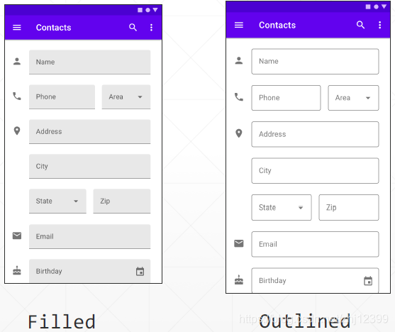
六种状态样式
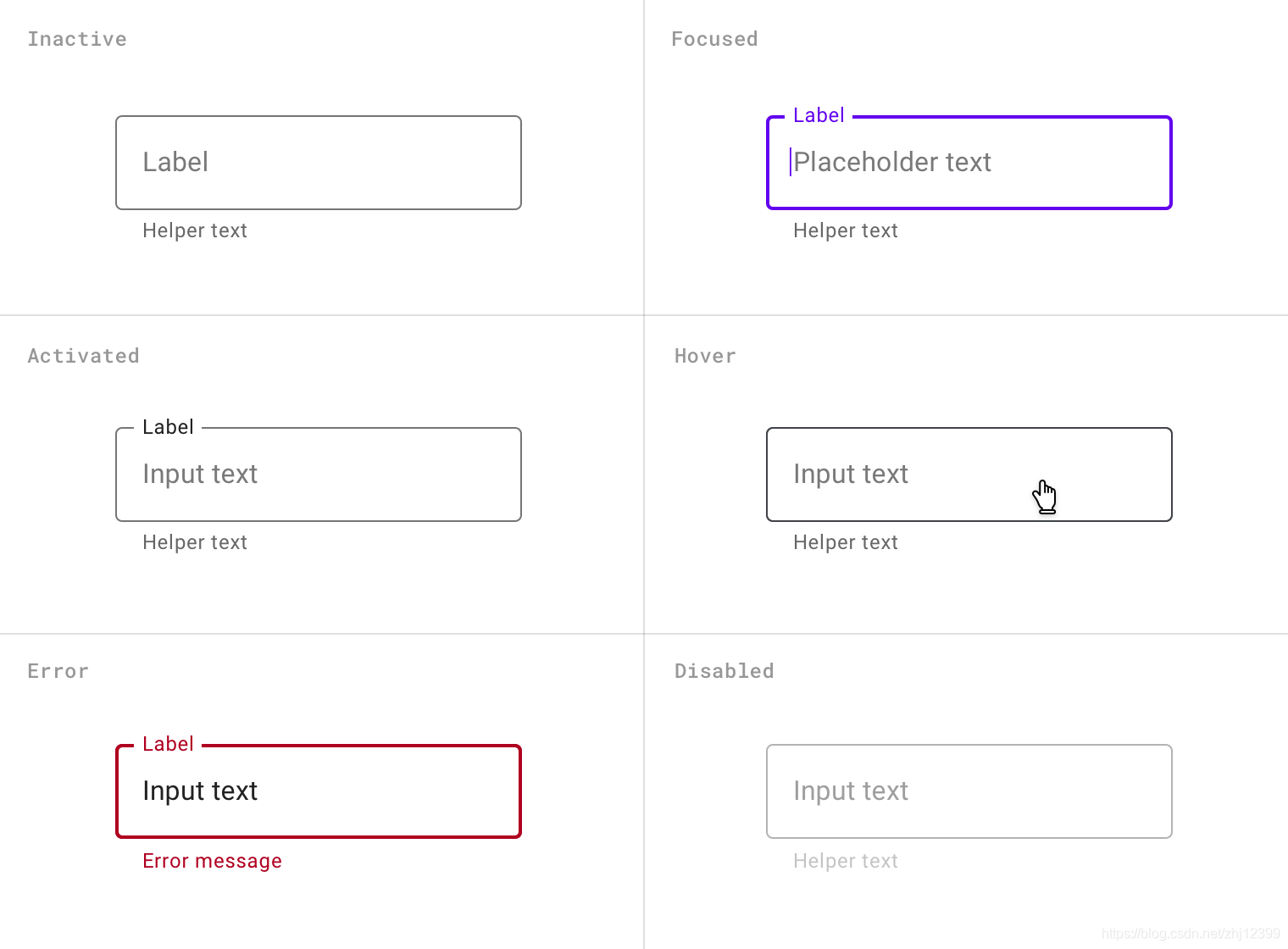
使用Material文本控件需要使用TextInputLayout来包容TextInputEditText
应用示例:用户注册
class MainActivity : AppCompatActivity() {

    override fun onCreate(savedInstanceState: Bundle?) {
        super.onCreate(savedInstanceState)
        setContentView(R.layout.activity_main)

        val items = listOf("Kotlin", "Python", "C#", "C++")
        val adapter = ArrayAdapter(this, R.layout.list_item, items)
        (programInputLayout.editText as? AutoCompleteTextView)?.setAdapter(adapter)

        edtPwd2.addTextChangedListener {
            val pwd = edtPwd1.text.toString()
            val pwd2 = it.toString()
            if (pwd != pwd2) {
                pwdInputLayout2.error = "两次密码不一致"
            } else {
                pwdInputLayout2.error = null
            }
        }
    }
}
<com.google.android.material.textfield.TextInputLayout
    android:id="@+id/nameInputLayout"
    style="@style/Widget.MaterialComponents.TextInputLayout.OutlinedBox"
    android:layout_width="match_parent"
    android:layout_height="wrap_content"
    android:layout_marginStart="16dp"
    android:layout_marginEnd="16dp"
    android:hint="用户名"
    app:boxBackgroundMode="outline"
    app:counterEnabled="true"
    app:counterMaxLength="20"
    app:helperText="请输入你的用户名"
    app:layout_constraintBottom_toTopOf="@+id/pwdInputLayout"
    app:layout_constraintEnd_toEndOf="parent"
    app:layout_constraintStart_toStartOf="parent"
    app:layout_constraintTop_toTopOf="parent"
    app:layout_constraintVertical_chainStyle="packed">
    <com.google.android.material.textfield.TextInputEditText
        android:layout_width="match_parent"
        android:layout_height="wrap_content" />
</com.google.android.material.textfield.TextInputLayout>
<com.google.android.material.textfield.TextInputLayout
    android:id="@+id/pwdInputLayout"
    style="@style/Widget.MaterialComponents.TextInputLayout.OutlinedBox"
    android:layout_width="0dp"
    android:layout_height="wrap_content"
    android:layout_marginStart="16dp"
    android:layout_marginEnd="16dp"
    android:hint="密码"
    app:boxBackgroundMode="outline"
    app:counterEnabled="true"
    app:counterMaxLength="6"
    app:endIconMode="password_toggle"
    app:helperText="请输入你的密码"
    app:layout_constraintBottom_toTopOf="@+id/pwdInputLayout2"
    app:layout_constraintEnd_toEndOf="parent"
    app:layout_constraintStart_toStartOf="parent"
    app:layout_constraintTop_toBottomOf="@+id/nameInputLayout">
    <com.google.android.material.textfield.TextInputEditText
        android:id="@+id/edtPwd1"
        android:layout_width="match_parent"
        android:layout_height="wrap_content" />
</com.google.android.material.textfield.TextInputLayout>
<com.google.android.material.textfield.TextInputLayout
    android:id="@+id/pwdInputLayout2"
    style="@style/Widget.MaterialComponents.TextInputLayout.OutlinedBox"
    android:layout_width="0dp"
    android:layout_height="wrap_content"
    android:layout_marginStart="16dp"
    android:layout_marginEnd="16dp"
    android:hint="密码"
    app:boxBackgroundMode="outline"
    app:counterEnabled="true"
    app:counterMaxLength="6"
    app:endIconMode="password_toggle"
    app:errorEnabled="true"
    app:helperText="再输入一次你的密码"
    app:layout_constraintBottom_toTopOf="@+id/programInputLayout"
    app:layout_constraintEnd_toEndOf="parent"
    app:layout_constraintStart_toStartOf="parent"
    app:layout_constraintTop_toBottomOf="@+id/pwdInputLayout">
    <com.google.android.material.textfield.TextInputEditText
        android:id="@+id/edtPwd2"
        android:layout_width="match_parent"
        android:layout_height="wrap_content" />
</com.google.android.material.textfield.TextInputLayout>
<com.google.android.material.textfield.TextInputLayout
    android:id="@+id/programInputLayout"
    style="@style/Widget.MaterialComponents.TextInputLayout.OutlinedBox.ExposedDropdownMenu"
    android:layout_width="0dp"
    android:layout_height="wrap_content"
    android:layout_marginStart="16dp"
    android:layout_marginEnd="16dp"
    app:helperText="请选择你擅长的一种编程语言"
    app:layout_constraintBottom_toTopOf="@+id/btnOk"
    app:layout_constraintEnd_toEndOf="parent"
    app:layout_constraintStart_toStartOf="parent"
    app:layout_constraintTop_toBottomOf="@+id/pwdInputLayout2">
    <AutoCompleteTextView
        android:layout_width="match_parent"
        android:layout_height="wrap_content"
        android:inputType="none" />
</com.google.android.material.textfield.TextInputLayout>
list_item.xml
<?xml version="1.0" encoding="utf-8"?>
<TextView
    xmlns:android="http://schemas.android.com/apk/res/android"
    android:layout_width="match_parent"
    android:layout_height="wrap_content"
    android:padding="16dp"
    android:ellipsize="end"
    android:maxLines="1"
    android:textAppearance="?attr/textAppearanceSubtitle1" />
使用Outline样式
启用最⼤字数限制
实时的数据校验功能
支持从列表中选择
CardView
⼀个圆角矩形,里面显示⽂本图片等内容,类似于现实⽣活中的便签。可看成是⼀个简化版
的FrameLayout,只不过它有着圆角的边界和阴影效果罢了。
使用添加依赖:
implementation 'com.google.android.material:material:1.1.0'
在这里放置卡片内容
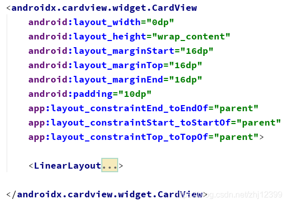
cardCornerRadius:定义圆角半径
cardBackgroundColor:定义卡片的背景⾊
在实际开发中可以使用两种“CardView”,⼀种是androidx提供的,另⼀种是Material组件库中所提供的,后者功能更强⼤些:
(1) androidx.cardview.widget.CardView
(2) com.google.android.material.card.MaterialCardView
<?xml version="1.0" encoding="utf-8"?>
<androidx.constraintlayout.widget.ConstraintLayout xmlns:android="http://schemas.android.com/apk/res/android"
    xmlns:app="http://schemas.android.com/apk/res-auto"
    xmlns:tools="http://schemas.android.com/tools"
    android:layout_width="match_parent"
    android:layout_height="match_parent"
    tools:context=".MainActivity">

    <androidx.cardview.widget.CardView
        android:layout_width="0dp"
        android:layout_height="wrap_content"
        android:layout_marginStart="16dp"
        android:layout_marginTop="16dp"
        android:layout_marginEnd="16dp"
        android:padding="10dp"
        app:layout_constraintEnd_toEndOf="parent"
        app:layout_constraintStart_toStartOf="parent"
        app:layout_constraintTop_toTopOf="parent">
        <LinearLayout
            android:layout_width="match_parent"
            android:layout_height="match_parent"
            android:layout_margin="2dp"
            android:orientation="vertical">
            <TextView
                android:id="@+id/title"
                android:layout_width="match_parent"
                android:layout_height="wrap_content"
                android:layout_margin="4dp"
                android:gravity="center_horizontal"
                android:text="card title"
                android:textSize="15sp" />

            <TextView
                android:id="@+id/conent"
                android:layout_width="match_parent"
                android:layout_height="60dp"
                android:gravity="center_horizontal|center_vertical"
                android:text="Card Content comes here..."
                android:textColor="#ff00aa"
                android:textSize="20sp" />
        </LinearLayout>
    </androidx.cardview.widget.CardView>
</androidx.constraintlayout.widget.ConstraintLayout>
MaterialCardView直接支持“选中”和“取消选中”两种状态,支持点击,长按等事件响应,还支持拖动。更多参看官网
class MainActivity : AppCompatActivity() {
    override fun onCreate(savedInstanceState: Bundle?) {
        super.onCreate(savedInstanceState)
        setContentView(R.layout.activity_main)

        card.setOnClickListener {
            card.isChecked = !card.isChecked
        }
        card.setOnCheckedChangeListener { card, isChecked ->
            tvInfo.text="选中? $isChecked"
        }
    }
}
<?xml version="1.0" encoding="utf-8"?>
<androidx.constraintlayout.widget.ConstraintLayout xmlns:android="http://schemas.android.com/apk/res/android"
    xmlns:app="http://schemas.android.com/apk/res-auto"
    xmlns:tools="http://schemas.android.com/tools"
    android:layout_width="match_parent"
    android:layout_height="match_parent"
    tools:context=".MainActivity">
    <TextView
        android:id="@+id/tvInfo"
        android:layout_width="wrap_content"
        android:layout_height="wrap_content"
        android:layout_marginTop="60dp"
        android:textAppearance="@style/TextAppearance.AppCompat.Display1"
        app:layout_constraintEnd_toEndOf="parent"
        app:layout_constraintStart_toStartOf="parent"
        app:layout_constraintTop_toBottomOf="@+id/card"
        tools:text="tvInfo" />
    <com.google.android.material.card.MaterialCardView
        android:id="@+id/card"
        android:layout_width="match_parent"
        android:layout_height="wrap_content"
        android:layout_margin="8dp"
        android:clickable="true"
        android:focusable="true"
        android:checkable="true"
        app:layout_constraintEnd_toEndOf="parent"
        app:layout_constraintHorizontal_bias="0.5"
        app:layout_constraintStart_toStartOf="parent"
        app:layout_constraintTop_toTopOf="parent">
        <LinearLayout
            android:layout_width="match_parent"
            android:layout_height="wrap_content"
            android:orientation="vertical">
            <!-- Media -->
            <ImageView
                android:layout_width="match_parent"
                android:layout_height="194dp"
                android:contentDescription="湖边的小树"
                android:scaleType="centerCrop"
                app:srcCompat="@drawable/lake" />
            <LinearLayout
                android:layout_width="match_parent"
                android:layout_height="wrap_content"
                android:orientation="vertical"
                android:padding="16dp">
                <!-- Title, secondary and supporting text -->
                <TextView
                    android:layout_width="wrap_content"
                    android:layout_height="wrap_content"
                    android:text="title"
                    android:textAppearance="?attr/textAppearanceHeadline6" />
                <TextView
                    android:layout_width="wrap_content"
                    android:layout_height="wrap_content"
                    android:layout_marginTop="8dp"
                    android:text="secondary_text"
                    android:textAppearance="?attr/textAppearanceBody2"
                    android:textColor="?android:attr/textColorSecondary" />
                <TextView
                    android:layout_width="wrap_content"
                    android:layout_height="wrap_content"
                    android:layout_marginTop="16dp"
                    android:text="supporting_text"
                    android:textAppearance="?attr/textAppearanceBody2"
                    android:textColor="?android:attr/textColorSecondary" />
            </LinearLayout>
            <!-- Buttons -->
            <LinearLayout
                android:layout_width="wrap_content"
                android:layout_height="wrap_content"
                android:layout_margin="8dp"
                android:orientation="horizontal">
                <com.google.android.material.button.MaterialButton
                    style="?attr/borderlessButtonStyle"
                    android:layout_width="wrap_content"
                    android:layout_height="wrap_content"
                    android:layout_marginEnd="8dp"
                    android:text="action_1" />
                <com.google.android.material.button.MaterialButton
                    style="?attr/borderlessButtonStyle"
                    android:layout_width="wrap_content"
                    android:layout_height="wrap_content"
                    android:text="action_2" />
            </LinearLayout>
        </LinearLayout>
    </com.google.android.material.card.MaterialCardView>
</androidx.constraintlayout.widget.ConstraintLayout>
Snackbar·短期消息
Snack Bar可以看成是⼀种显示短期消息的⽅式,类似于Toast,只不过它是显示在屏幕下⽅,可以用⼿指向右拖动以消除之,并且还可以拥有按钮,响应⼿指点触。
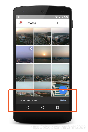
还是需要添加依赖:
implementation 'com.google.android.material:material:1.1.0'
btnSimple.setOnClickListener {
    //第一个参数必须是一个派生自View的控件,这里选择按钮本身
    Snackbar.make(btnSimple, "显示一条消息", Snackbar.LENGTH_LONG).show()
}
btnClickable.setOnClickListener {
    Snackbar.make(btnClickable, "显示一条可以点击的消息", Snackbar.LENGTH_LONG)
        .setAction("点击我!") { tvInfo.text = "Snackbar上的按钮被点击!" }.show()
}
Floation Action Button·小圆点
本质上就是⼀个圆型按钮,不同之处在于它能“浮”在其它的控件之上。始终居于右下角,并且具备动态调整位置的功能。
“Floating Action Button”的另⼀特性是它能以特定的控件为“锚点”进⾏定位。如果与⼀个特殊的布局控件Coordinator Layout相关联,能够参与多个Material组件之间的相互协同。
有⼤和小两种尺⼨通过fabSize属性指定。
Material组件库中还提供了⼀种“扩展的”Floating Action Button,其类名为ExtendedFloatingActionButton,其形状为⼀个长的圆角矩型。
<?xml version="1.0" encoding="utf-8"?>
<androidx.coordinatorlayout.widget.CoordinatorLayout xmlns:android="http://schemas.android.com/apk/res/android"
    xmlns:app="http://schemas.android.com/apk/res-auto"
    xmlns:tools="http://schemas.android.com/tools"
    android:id="@+id/coordinatorLayout"
    android:layout_width="match_parent"
    android:layout_height="match_parent"
    tools:context=".MainActivity" >
    <com.google.android.material.floatingactionbutton.FloatingActionButton
        android:id="@+id/fab"
        android:layout_width="wrap_content"
        android:layout_height="wrap_content"
        android:clickable="true"
        android:layout_gravity="bottom|right"
        android:layout_margin="16dp"
        app:srcCompat="@android:drawable/btn_star" />
    <TextView
        android:id="@+id/tvInfo"
        android:layout_width="wrap_content"
        android:layout_height="wrap_content"
        android:layout_gravity="center"
        android:text="Snackbar与Floating Action Button\n的配合关系"
        android:textAppearance="@style/TextAppearance.AppCompat.Large"
        tools:text="tvInfo" />
</androidx.coordinatorlayout.widget.CoordinatorLayout>
通常情况下,会把Floating Action Button放到CoordinatorLayout中,以实
现和其它Material控件的连动。
fab.setOnClickListener {
    val snackbar = Snackbar.make(fab, "这是一条消息", Snackbar.LENGTH_LONG)
    snackbar.setAction("Click Me") {
        tvInfo.text = "Snackbar上的按钮被点击"
    }
    snackbar.setTextColor(Color.YELLOW)
    snackbar.setBackgroundTint(Color.BLUE)
    snackbar.setActionTextColor(Color.WHITE)
    snackbar.show()
}
Floating Aciton Button,它总位于Snack Bar上⽅,不会被“挡住"
Material控件必须放到专门的布局控件中要想实现FloatingActionBar自动避让
“Snackbar”,它必须被包容到CoordinatorLayout这⼀布局控件中,这⼀布局控件是Google Material控件组中的顶层布局控件。
想让各种Google Material控件拥有预期的特性,通常都必须将它们放到CoordinatorLayout这⼀控件中。
Coordinator Layout可以看成是⼀个功能增强的Frame Layout它主要用于承载支持Material Design特性的相应控件,能够协调它所包容的⼦控件之间的协作关系,在很多采用了Material组件的App中,都可以看到它身影。
使用Android Studio创建项目时,如果选中这个模板,里面就直接放置了⼀个Floating Button和⼀个Snack Bar,同时集成了Fragment的导航功能。
Toolbar
不管使不使用Material主题,App中都可以使用Toolbar。
首先添加依赖:
implementation 'com.google.android.material:material:1.1.0'
接下来隐藏系统的ActionBar,将App主题的Parent设置为“NoActionBar”,AppCompat和MaterialComponents都有这个主题。styles.xml
<resources>
    <!-- Base application theme. -->
    <style name="AppTheme" parent="Theme.MaterialComponents.Light.NoActionBar">
        <!-- Customize your theme here. -->
        <item name="colorPrimary">@color/colorPrimary</item>
        <item name="colorPrimaryDark">@color/colorPrimaryDark</item>
        <item name="colorAccent">@color/colorAccent</item>
    </style>
</resources>
给Activity布局添加Toolbar,在控件面板中可以找到Toolbar,将它拖到布局⽂件中,通常会让其定位于屏幕顶部(事实上是可以随意定位的),其背影⾊由colorPrimary值决定。
默认样式是actionBarTheme
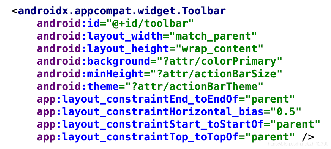
⽗主题:Theme.MaterialComponents.Light.NoActionBar
Toolbar主题:?attr/actionBarTheme
使用代码让Toolbar取代ActionBar
class MainActivity : AppCompatActivity() {
    override fun onCreate(savedInstanceState: Bundle?) {
        super.onCreate(savedInstanceState)
        setContentView(R.layout.activity_main)
        //使用代码设定标题
        toolbar.title = "Toolbar使用示例"
        toolbar.subtitle = "子标题"
        //设置ToolBar具有传统ActionBar的功能
        setSupportActionBar(toolbar)
        //显示"返回"图标
        supportActionBar?.setDisplayHomeAsUpEnabled(true)

        //底部Toolbar
        //使用代码直接给工具栏挂接菜单
        toolbar2.inflateMenu(R.menu.menu_main)
        toolbar2.setOnMenuItemClickListener {
            tvInfo.text = getMenuItemClickText(it)
            true
        }
    }

    override fun onCreateOptionsMenu(menu: Menu?): Boolean {
        menuInflater.inflate(R.menu.menu_main, menu)
        return true
    }

    override fun onOptionsItemSelected(item: MenuItem): Boolean {
        //在MainActivity中点击"Up"图标,则退出App
        if (item.itemId == android.R.id.home) {
            finish()
        }
        //显示用户选中的菜单项
        tvInfo.text = getMenuItemClickText(item)
        return true
    }

    private fun getMenuItemClickText(item: MenuItem): String {
        return when (item.itemId) {
            R.id.discard -> "Delete"
            R.id.search -> "Search"
            R.id.edit -> "Edit"
            R.id.settings -> "Settings"
            R.id.Exit -> "Exit"
            else -> "unknown id"
        }
    }
}
修改ToolBar的主题,指定使用深⾊的ActionBar,可以看到⽂字使用了较浅的对比⾊,协调多了。除了修改主题,你也可以使用布局属性或代码直接修改Toolbar的背景⾊和⽂字前景⾊,就是费多点劲罢了
<?xml version="1.0" encoding="utf-8"?>
<androidx.constraintlayout.widget.ConstraintLayout xmlns:android="http://schemas.android.com/apk/res/android"
    xmlns:app="http://schemas.android.com/apk/res-auto"
    xmlns:tools="http://schemas.android.com/tools"
    android:layout_width="match_parent"
    android:layout_height="match_parent"
    tools:context=".MainActivity">

    <androidx.appcompat.widget.Toolbar
        android:id="@+id/toolbar"
        android:layout_width="match_parent"
        android:layout_height="wrap_content"
        android:background="?attr/colorPrimary"
        android:minHeight="?attr/actionBarSize"

        android:theme="@style/ThemeOverlay.AppCompat.Dark.ActionBar"

        app:popupTheme="@style/ThemeOverlay.AppCompat.Light"
        app:layout_constraintEnd_toEndOf="parent"
        app:layout_constraintHorizontal_bias="0.5"
        app:layout_constraintStart_toStartOf="parent"
        app:layout_constraintTop_toTopOf="parent" />

    <TextView
        android:id="@+id/tvInfo"
        android:layout_width="wrap_content"
        android:layout_height="wrap_content"
        android:text="Hello World!"
        android:textAppearance="@style/TextAppearance.AppCompat.Large"
        app:layout_constraintBottom_toBottomOf="parent"
        app:layout_constraintLeft_toLeftOf="parent"
        app:layout_constraintRight_toRightOf="parent"
        app:layout_constraintTop_toTopOf="parent" />

    <androidx.appcompat.widget.Toolbar
        android:id="@+id/toolbar2"
        android:layout_width="match_parent"
        android:layout_height="wrap_content"
        android:background="?attr/colorPrimary"
        android:minHeight="?attr/actionBarSize"
        android:theme="@style/ThemeOverlay.AppCompat.Dark.ActionBar"
        app:popupTheme="@style/ThemeOverlay.AppCompat.Light"
        app:layout_constraintBottom_toBottomOf="parent"
        app:layout_constraintEnd_toEndOf="parent"
        app:layout_constraintStart_toStartOf="parent">
        <Button
            android:id="@+id/button"
            android:layout_width="wrap_content"
            android:layout_height="wrap_content"
            android:text="Button" />
        <Switch
            android:id="@+id/switch1"
            android:layout_width="wrap_content"
            android:layout_height="wrap_content"
            android:text="Switch" />
    </androidx.appcompat.widget.Toolbar>
</androidx.constraintlayout.widget.ConstraintLayout><?xml version="1.0" encoding="utf-8"?>
<androidx.constraintlayout.widget.ConstraintLayout xmlns:android="http://schemas.android.com/apk/res/android"
    xmlns:app="http://schemas.android.com/apk/res-auto"
    xmlns:tools="http://schemas.android.com/tools"
    android:layout_width="match_parent"
    android:layout_height="match_parent"
    tools:context=".MainActivity">

    <androidx.appcompat.widget.Toolbar
        android:id="@+id/toolbar"
        android:layout_width="match_parent"
        android:layout_height="wrap_content"
        android:background="?attr/colorPrimary"
        android:minHeight="?attr/actionBarSize"

        android:theme="@style/ThemeOverlay.AppCompat.Dark.ActionBar"

        app:popupTheme="@style/ThemeOverlay.AppCompat.Light"
        app:layout_constraintEnd_toEndOf="parent"
        app:layout_constraintHorizontal_bias="0.5"
        app:layout_constraintStart_toStartOf="parent"
        app:layout_constraintTop_toTopOf="parent" />

    <TextView
        android:id="@+id/tvInfo"
        android:layout_width="wrap_content"
        android:layout_height="wrap_content"
        android:text="Hello World!"
        android:textAppearance="@style/TextAppearance.AppCompat.Large"
        app:layout_constraintBottom_toBottomOf="parent"
        app:layout_constraintLeft_toLeftOf="parent"
        app:layout_constraintRight_toRightOf="parent"
        app:layout_constraintTop_toTopOf="parent" />

    <androidx.appcompat.widget.Toolbar
        android:id="@+id/toolbar2"
        android:layout_width="match_parent"
        android:layout_height="wrap_content"
        android:background="?attr/colorPrimary"
        android:minHeight="?attr/actionBarSize"
        android:theme="@style/ThemeOverlay.AppCompat.Dark.ActionBar"
        app:popupTheme="@style/ThemeOverlay.AppCompat.Light"
        app:layout_constraintBottom_toBottomOf="parent"
        app:layout_constraintEnd_toEndOf="parent"
        app:layout_constraintStart_toStartOf="parent">
        <Button
            android:id="@+id/button"
            android:layout_width="wrap_content"
            android:layout_height="wrap_content"
            android:text="Button" />
        <Switch
            android:id="@+id/switch1"
            android:layout_width="wrap_content"
            android:layout_height="wrap_content"
            android:text="Switch" />
    </androidx.appcompat.widget.Toolbar>
</androidx.constraintlayout.widget.ConstraintLayout>
添加选项菜单
添加一个菜单资源文件和相应的图标资源
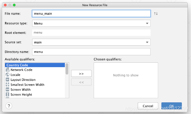
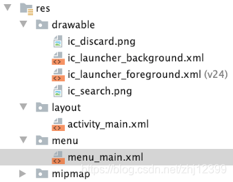
<?xml version="1.0" encoding="utf-8"?>
<menu
    xmlns:android="http://schemas.android.com/apk/res/android"
    xmlns:app="http://schemas.android.com/apk/res-auto">
   <item
        android:id="@+id/discard"
        android:icon="@drawable/ic_discard"
        android:orderInCategory="100"
        android:title="@string/delete"
        app:showAsAction="ifRoom"/>
    <item
        android:id="@+id/search"
        android:icon="@drawable/ic_search"
        android:orderInCategory="100"
        android:title="@string/search"
        app:showAsAction="ifRoom"/>
    <item
        android:id="@+id/settings"
        android:orderInCategory="100"
        android:title="@string/settings"
        app:showAsAction="never"/>
    <item
        android:id="@+id/edit"
        android:orderInCategory="100"
        android:title="@string/edit"
        app:showAsAction="never"/>
    <item
        android:id="@+id/Exit"
        android:orderInCategory="100"
        android:title="@string/exit"
        app:showAsAction="never"/>
</menu>
弹出菜单选中浅⾊系(浅底深字),popupTheme专门用于⼲这事。
Toolbar其实是⼀个容器,里头也能放东西,并且在⼀个界面中,可以不⽌有⼀个Toolbar。
Toolbar还可以和其它的Material布局控件相互配合,实现更为复杂的交互效果。
底部Toolbar里放了⼀个Button和⼀个Switch控件,同时给它挂接了⼀个菜单,是使用代码实现的。
Material对话框
对话框在弹出时,通常不会自动消失,需要等待用户进⾏明确的指示,因此,只有App需要关键的信息或用户明确的指示才能继续的场景下,弹出对话框。
四种常见的对话框
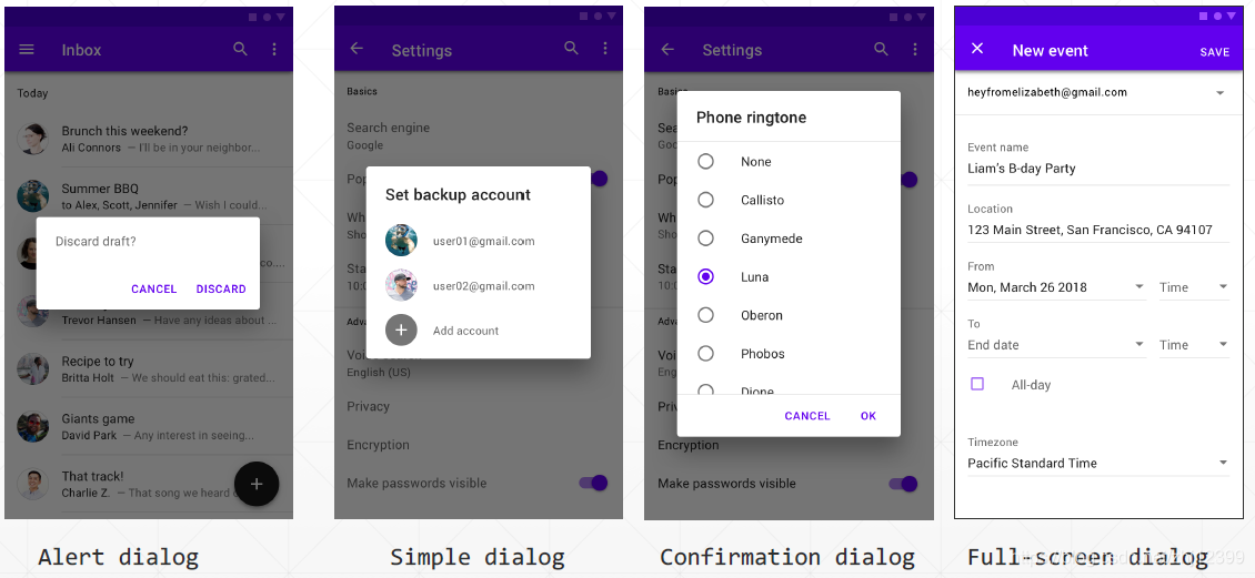
最简单的对话框
使用AlertDialog可以创建右侧所示的对话框,多用于“提醒”操作。
对话框框可以包容最多三个按钮,分为“肯定(Positive)”、“否定(Negative)”和“中立(Neutral)”三个类别,用户点击任何⼀个,对话框关闭。
AlertDialog提供了相应的⽅法为三个按钮添加监听器以响应用户对这三个按钮的点击操作。
//显示Alert对话框
private fun showAlertDialog() {
    //注意:如果不使用Material组件库中的对话框
    //则构造器应该为:AlertDialog.Builder
    MaterialAlertDialogBuilder(this)
        .setTitle("询问操作")
        .setMessage("请问您打算真的删除这条记录吗?")
        .setNeutralButton("取消") { dialog, which ->
            tvInfo.text = "选择了:取消"
            //which=DialogInterface.BUTTON_NEUTRAL
        }
        .setNegativeButton("否") { dialog, which ->
            tvInfo.text = "选择了:否"
            //which=DialogInterface.BUTTON_NEGATIVE
        }
        .setPositiveButton("是") { dialog, which ->
            tvInfo.text = "选择了:是"
            //which=DialogInterface.BUTTON_POSITIVE
        }
        .show()
}
显示列表对话框
第⼆种常用的对话框是列表对话框,用户从列表中选择⼀项,点击之后对话框关闭。
列表由⼀个字符串数组保存,调用对话框构造器对象的setItems⽅法将此数组传给对话框对象,同时可以指定⼀个“列表项选中”事件的监听⽅法。
//显示一个简单的列表供用户选择
private fun showListDialog() {
    val items = arrayOf("第一选项", "第二选项", "第三选项")
    MaterialAlertDialogBuilder(this)
        .setTitle("列表对话框")
        .setItems(items) { dialog, which ->
            tvInfo.text = "选中了第“$which”个选项"
        }
        .show()
}
单选项列表对话框
选项通常用字符串数组保存,调用setSingleChoiceItems⽅法将此数组与对话框关联。
//显示单选项列表框
private fun showSingleSelctionDialog() {
    val singleItems = arrayOf("第一单选项", "第二单选项", "第三单选项")
    val checkedItem = 1  //默认选中第2项
    var selectedIndex = -1  //用于保存用户最终的选择
    MaterialAlertDialogBuilder(this)
        .setTitle("单选项列表对话框")
        .setNeutralButton("取消") { dialog, which ->
            tvInfo.text = "你取消了操作"
        }
        .setPositiveButton("确定") { dialog, which ->
            tvInfo.text = "你选择了“${singleItems[selectedIndex]}”"
        }
        .setSingleChoiceItems(singleItems, checkedItem) { dialog, which ->
            selectedIndex = which
            Log.d("MainActivity", "选择:$which")
        }
        .show()
}
如果要支持多选,只需要调用setMultiChoiceItems⽅法即可。
DialogFragment
但前面有“致命弱点”,仅使用AlertDialog,那么,当它显示时,如果用户旋转⼿机,将会导致它消失。如果想解决这个问题,可以使用DialogFragment,编写⼀个类,派⽣自这个类即可。
class AlertDialogFragment : DialogFragment() {
	//自定义的对话框,派⽣自DialogFragment,为其提供⼀个⼯厂⽅法,并将参数值保存到Fragment的arguments中。
    companion object {
        fun newInstance(title: String, message: String): AlertDialogFragment {
            val fragment = AlertDialogFragment()
            //将外部传入的信息保存到arguments中以便在重建时恢复状态
            fragment.arguments = bundleOf("title" to title, "message" to message)
            return fragment
        }
    }

	//为了让对话框能够回调外部提供的⽅法,可以在对话框内部定义事件回调接⼝,以便让外部(其实就是Activity)实现它。
    //实现外部回调的接口,其成员可以依据实际情况进行定制
    interface OkClickListener {
        fun onClickOkButton(message: String)
    }

    //引用外部事件监听对象
    var listener: OkClickListener? = null

    //当此Fragment附加到Activity时,此方法被调用
    override fun onAttach(context: Context) {
        super.onAttach(context)
        //context其实就是实现了OkClickListener接口的Activity对象
        listener = context as OkClickListener
    }

    //此方法必须向外界返回一个Dialog对象
    //真正的对话框,其实就是在这个⽅法中创建的,注意⼀下它需要检查是否有上次保存的状态。
    override fun onCreateDialog(savedInstanceState: Bundle?): Dialog {
        var title = ""
        var message = ""
        //提取上次保存的状态
        if (arguments != null) {
            title = arguments!!.getString("title", "默认标题")
            message = arguments!!.getString("message", "默认内容")
        }
        //创建AlertDialog对象并返回给外界
        val dialog = AlertDialog.Builder(activity)
            .setTitle(title)
            .setMessage(message)
            .create()
        //可以设置多个按钮,这里只设定了一个
        dialog.setButton(AlertDialog.BUTTON_POSITIVE, "Ok") { _, _ ->
            listener?.onClickOkButton("对话框己关闭")
            dialog.dismiss()
        }
        return dialog
    }
}
在MainActivity中调用DialogFragment的MainActivity
class MainActivity : AppCompatActivity(),
    AlertDialogFragment.OkClickListener {
	//,如果Activity想响应对话框按钮的点击事件,则它必须实现相应的事件接⼝
    override fun onCreate(savedInstanceState: Bundle?) {
        super.onCreate(savedInstanceState)
        setContentView(R.layout.activity_main)

        btnShowAlertDialogFragment.setOnClickListener{
            showAlertDialogFragment()
        }
    }

    var title: String = "我的对话框"
    var message: String = "使用DialogFragment创建的对话框"

    //显示派生自DialogFragment的对话框
    private fun showAlertDialogFragment() {
        //显示派生自DialogFragment的对话框
        val dialogFragment = AlertDialogFragment.newInstance(title, message)
        //强制用户必须点击按钮才能关闭
        dialogFragment.isCancelable = false
        //显示对话框
        dialogFragment.show(supportFragmentManager, null)
    }

    //供对话框回调的方法
    //调用DialogFragment的Acitivity,需要实现Fragment所定义的所有接⼝⽅法,以实现回调
    override fun onClickOkButton(message: String) {
        tvInfo.text = message
    }
}
由于DialogFragment的功劳,现在对话框显示之后,不管用户怎么旋转⼿机,对话框也不会消失了。
自定义对话框
基于DialogFragment实现对话框,除了前面介绍的能支持状态保存,另⼀⼤好处就是允许你不受任何限制地定义自⼰的对话框界面,因为它本身就是⼀个Fragment。
class CustomDialogFragment : DialogFragment() {

    //对于有自定义界面的对话框,需要重写onCreateView方法
    //对于使用AlertDialog内置界面的对话框,需要重写onCreateDialog方法
    override fun onCreateView(
        inflater: LayoutInflater,
        container: ViewGroup?,
        savedInstanceState: Bundle?
    ): View? {
        //装载布局文件
        val rootView = inflater.inflate(R.layout.my_dialog_view, container, false)
        //初始化图片标题
        val tvTitle = rootView.findViewById<TextView>(R.id.tvTitle)
        tvTitle.text = arguments?.getString("title") ?: "无"
        val btnOk = rootView.findViewById<Button>(R.id.btnOk)
        btnOk.setOnClickListener {
            dismiss() //关闭对话框
        }
        return rootView
    }

    companion object {
        //使用工厂方法创建的对话框实例
        fun create(title: String): CustomDialogFragment {
            val bundle = bundleOf("title" to title)
            val dialog = CustomDialogFragment()
            dialog.arguments = bundle
            return dialog
        }
    }
}
<?xml version="1.0" encoding="utf-8"?>
<androidx.constraintlayout.widget.ConstraintLayout
    xmlns:android="http://schemas.android.com/apk/res/android"
    xmlns:app="http://schemas.android.com/apk/res-auto"
    xmlns:tools="http://schemas.android.com/tools"
    android:layout_width="match_parent"
    android:layout_height="match_parent">
    <ImageView
        android:id="@+id/imageView"
        android:layout_width="362dp"
        android:layout_height="242dp"
        android:layout_marginStart="8dp"
        android:layout_marginTop="16dp"
        android:layout_marginEnd="8dp"
        android:scaleType="center"
        app:layout_constraintEnd_toEndOf="parent"
        app:layout_constraintStart_toStartOf="parent"
        app:layout_constraintTop_toTopOf="parent"
        app:srcCompat="@drawable/snowmountain" />
    <Button
        android:id="@+id/btnOk"
        android:layout_width="wrap_content"
        android:layout_height="wrap_content"
        android:layout_marginTop="24dp"
        android:layout_marginEnd="24dp"
        android:text="Ok"
        app:layout_constraintEnd_toEndOf="parent"
        app:layout_constraintTop_toBottomOf="@+id/imageView" />
    <TextView
        android:id="@+id/tvTitle"
        android:layout_width="wrap_content"
        android:layout_height="wrap_content"
        android:layout_marginStart="24dp"
        android:layout_marginTop="24dp"
        app:layout_constraintStart_toStartOf="@+id/imageView"
        app:layout_constraintTop_toTopOf="@+id/imageView"
        tools:text="tvTitle" />
</androidx.constraintlayout.widget.ConstraintLayout>
装载了自定义布局的对话框,同样支持⼿机旋转后自动重建的功能
底部导航
BottomNavigationView可用于实现经典的“底部卡片式”App界面,AndroidStudio直接内置了这⼀组件。
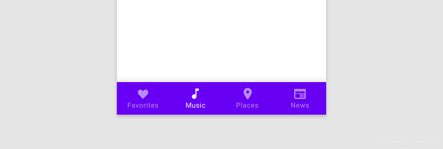
主界面其实是由Fragment实现,当用户点击底部导航按钮时,App切换显示不同的Fragment。
底部导航栏,其实是由Menu组件构成的。
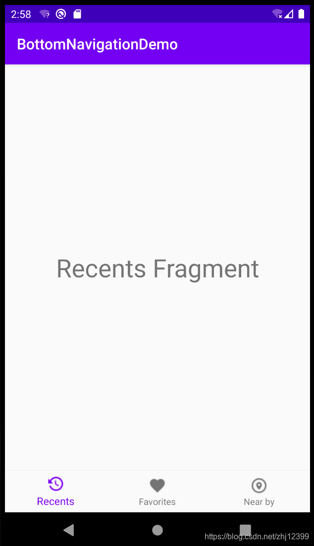
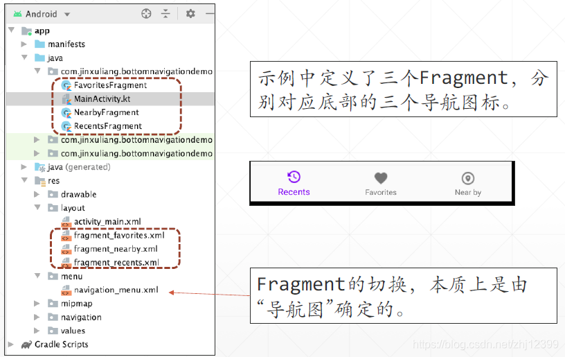
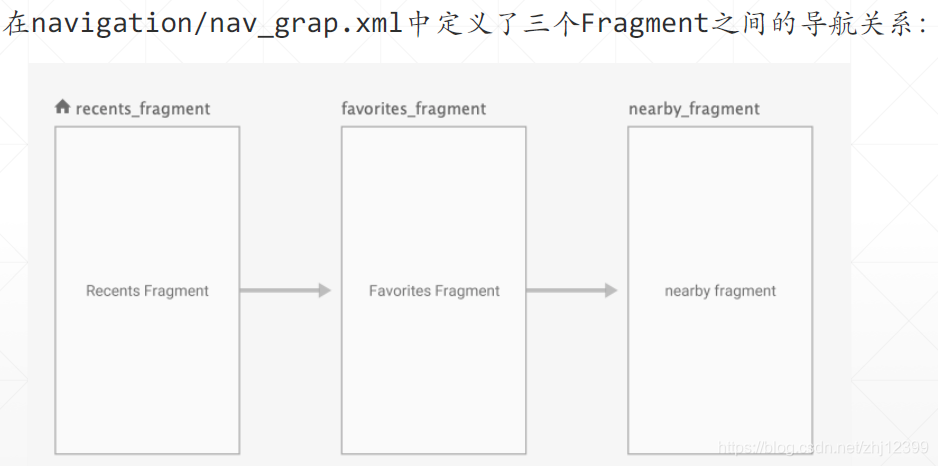
使用Menu定义底层导航栏
<?xml version="1.0" encoding="utf-8"?>
<menu xmlns:android="http://schemas.android.com/apk/res/android">
    <item
        android:id="@+id/nearby_fragment"
        android:title="@string/near_by"
        android:icon="@drawable/nearby"
        android:orderInCategory="3"/>
    <item
        android:id="@+id/favorites_fragment"
        android:title="@string/favorites"
        android:icon="@drawable/fav"
        android:orderInCategory="2"/>
    <item
        android:id="@+id/recents_fragment"
        android:title="@string/recents"
        android:icon="@drawable/recents"
        android:orderInCategory="1"/>
</menu>
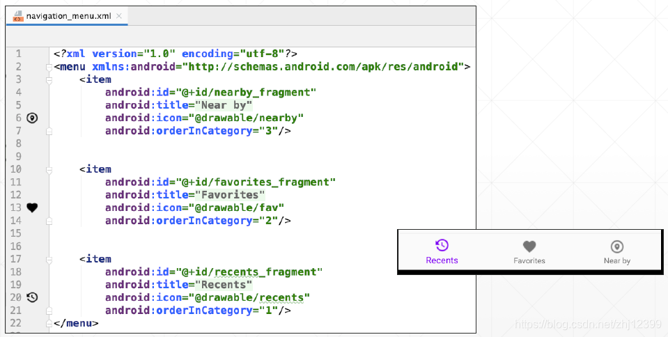
修改MainActivity布局
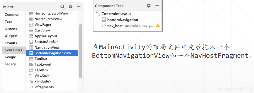
让BottomNavigationView引用menu组件
让NavHostFragment引用nav_grap组件
<?xml version="1.0" encoding="utf-8"?>
<androidx.constraintlayout.widget.ConstraintLayout xmlns:android="http://schemas.android.com/apk/res/android"
    xmlns:app="http://schemas.android.com/apk/res-auto"
    xmlns:tools="http://schemas.android.com/tools"
    android:layout_width="match_parent"
    android:layout_height="match_parent"
    tools:context=".MainActivity">

    <com.google.android.material.bottomnavigation.BottomNavigationView
        android:id="@+id/bottomNavigation"
        android:layout_width="match_parent"
        android:layout_height="wrap_content"
        android:background="?android:attr/windowBackground"
        app:layout_constraintBottom_toBottomOf="parent"
        app:layout_constraintEnd_toEndOf="parent"
        app:layout_constraintStart_toStartOf="parent"
        app:menu="@menu/navigation_menu" />

    <fragment
        android:id="@+id/nav_host"
        android:name="androidx.navigation.fragment.NavHostFragment"
        android:layout_width="0dp"
        android:layout_height="0dp"
        android:layout_marginStart="8dp"
        android:layout_marginTop="8dp"
        android:layout_marginEnd="8dp"
        android:layout_marginBottom="8dp"
        app:defaultNavHost="true"
        app:layout_constraintBottom_toTopOf="@+id/bottomNavigation"
        app:layout_constraintEnd_toEndOf="parent"
        app:layout_constraintStart_toStartOf="parent"
        app:layout_constraintTop_toTopOf="parent"
        app:navGraph="@navigation/nav_grap" />
</androidx.constraintlayout.widget.ConstraintLayout>
关联NavController与BottonNavigationView
class MainActivity : AppCompatActivity() {
    override fun onCreate(savedInstanceState: Bundle?) {
        super.onCreate(savedInstanceState)
        setContentView(R.layout.activity_main)
        //关联NavController与BottonNavigationView
        val navController = findNavController(R.id.nav_host)
        bottomNavigation.setupWithNavController(navController)
    }
}
导航功能运转成功的关键,在于menu中菜单项的id值,要与导航图中导航目的地的id值⼀致
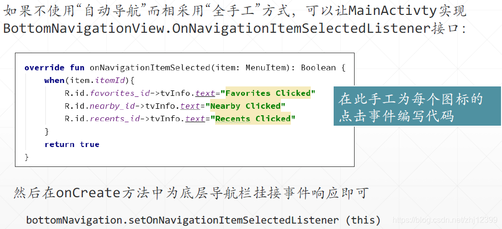
ViewPape2
ViewPage主要用于实现界面的切换,最常见的例⼦就是许多App针对初次使用本App的用户所提供的“教程”,分为若⼲页,每页介绍⼀个本App的功能或亮点,引导用户学会使用自⼰的
App。它使用新的Adapter基类。
使用的适配器:
1.如果要切换的界面是使用Fragment实现的,则你需要从FragmentStateAdapter类中派⽣出自⼰的⼦类,比较简单。
2.如果要切换的界面是直接使用普通的布局⽂件定义的,则你需要从RecyclerView.Adapter类中派⽣出自⼰的⼦类,这里面你需要使用ViewHolder设计模式,实现起来较第⼀种⽅式要复杂⼀点。
基于Fragment
先添加模块依赖:
implementation "androidx.viewpager2:viewpager2:1.0.0"
给示例项目添加⼀个Fragment,示例将创建多个它的实例,模拟在真实App中需要切换显示的多个页面。
//此Fragment从外部接收一个整数值
class MyPageFragment(val num: Int) : Fragment() {
    override fun onCreateView(
        inflater: LayoutInflater, container: ViewGroup?,
        savedInstanceState: Bundle?
    ): View? {
        Log.d("ViewPager2", "MyFragment实例化:num=$num")
        val root = inflater.inflate(
            R.layout.fragment_my_page,
            container, false
        )
        //使用TextView显示num属性的值,以区分开特定的Fragment实例
        val tvInfo = root.findViewById<TextView>(R.id.tvInfo)
        tvInfo.text = num.toString()
        return root
    }

    override fun onDestroy() {
        super.onDestroy()
        Log.d("ViewPager2", "MyFragment被销毁:num=$num")
    }
}
<?xml version="1.0" encoding="utf-8"?>
<FrameLayout xmlns:android="http://schemas.android.com/apk/res/android"
    xmlns:tools="http://schemas.android.com/tools"
    android:layout_width="match_parent"
    android:layout_height="match_parent"
    tools:context=".MyPageFragment">
    <TextView
        android:id="@+id/tvInfo"
        android:layout_width="wrap_content"
        android:layout_height="wrap_content"
        android:layout_gravity="center"
        android:textAppearance="@style/TextAppearance.AppCompat.Display1"
        android:textColor="#D32F2F"
        tools:text="tvInfo" />
</FrameLayout>
创建Adapter
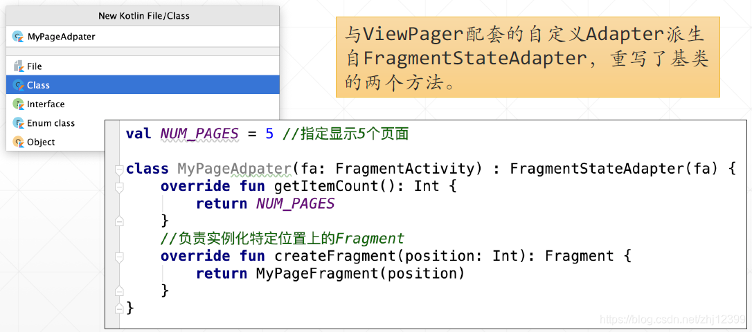
val NUM_PAGES = 5 //指定显示5个页面

class MyPageAdpater(fa: FragmentActivity) : FragmentStateAdapter(fa) {
    override fun getItemCount(): Int {
        return NUM_PAGES
    }
    //负责实例化特定位置上的Fragment
    override fun createFragment(position: Int): Fragment {
        return MyPageFragment(position)
    }
}
在MainActivity布局中加入ViewPager2模块
<?xml version="1.0" encoding="utf-8"?>
<LinearLayout xmlns:android="http://schemas.android.com/apk/res/android"
    xmlns:app="http://schemas.android.com/apk/res-auto"
    xmlns:tools="http://schemas.android.com/tools"
    android:layout_width="match_parent"
    android:layout_height="match_parent"
    tools:context=".MainActivity">
    <androidx.viewpager2.widget.ViewPager2
        android:id="@+id/pager"
        android:layout_width="match_parent"
        android:layout_height="match_parent">
    </androidx.viewpager2.widget.ViewPager2>
</LinearLayout>
最后在MainActivity中加入一行代码即可
class MainActivity : AppCompatActivity() {
    override fun onCreate(savedInstanceState: Bundle?) {
        super.onCreate(savedInstanceState)
        setContentView(R.layout.activity_main)
        //实例化适配器对象并将其传给ViewPager2组件
        pager.adapter = MyPageAdpater(this)
    }
}
Fragmentd的生命周期:
来回滑动显示不同的Fragment,可以看到,内存中始终只有3个Fragment实例存活!
不使用Fragment
编写一个数据类,封装数据
//数据类,封装图片的资源Id与图片标题
data class ImageItem(
    val title: String,
    val imageId: Int
)
创建ViewHolder对象
//view引用放在布局文件(本例中为image_container.xml)中的根控件对象
class ImageViewHolder(view: View) : RecyclerView.ViewHolder(view) {
    private val tvTitle = view.findViewById<TextView>(R.id.tvTitle)
    private val imageView = view.findViewById<ImageView>(R.id.imageView)
    //使用特定的UI控件显示ImageItem的内容
    fun bind(item: ImageItem) {
        tvTitle.text = item.title
        imageView.setImageResource(item.imageId)
    }
}
ViewHolder是⼀种设计模式,在Android的ListView/RecyclerView控件开发中普遍应用,其功能主要是缓存UI控件的引用,避免频繁调用findViewById()带来的性能损失。在介绍RecyclerView那部分时会对其再进⾏展开介绍。
接下来创建Adapter:
//ViewPager2直接重用了RecyclerView的Adapter类
//将要显示的图片在外部准备好,然后注入进来
class ImageViewPagerAdapter(private val images:List<ImageItem>)
    : RecyclerView.Adapter<ImageViewHolder>(){
    //在此方法中实例化ViewHolder对象,运行时只会创建有限次
    override fun onCreateViewHolder(parent: ViewGroup, viewType: Int)
            : ImageViewHolder {
        //加载布局文件
        val root= LayoutInflater.from(parent.context).inflate(
            R.layout.image_container,
            parent,
            false)
        //实例化ViewHolder对象
        return ImageViewHolder(root)
    }

    override fun getItemCount(): Int {
        return images.size  //有几张图片?
    }

    override fun onBindViewHolder(holder: ImageViewHolder, position: Int) {
        //特定位置应该显示哪张图片?使用对应的ViewHolder对象所缓存的相应控件引用显示它
        holder.bind(images[position])
    }
}
在MainActivity中
class MainActivity : AppCompatActivity() {
    override fun onCreate(savedInstanceState: Bundle?) {
        super.onCreate(savedInstanceState)
        setContentView(R.layout.activity_main)
        //关联ViewPager2组件与Adapter
        pager.adapter = ImageViewPagerAdapter(createImageList())
    }

    //构建图片列表
    private fun createImageList(): List<ImageItem> {
        return listOf(
            ImageItem("Image1", R.drawable.image1),
            ImageItem("Image2", R.drawable.image2),
            ImageItem("Image3", R.drawable.image3),
            ImageItem("Image4", R.drawable.image4),
            ImageItem("Image5", R.drawable.image5),
            ImageItem("Image6", R.drawable.image6)
        )
    }
}
卡片式布局
Android提供了 TableLayout 和 TabItem 两个控件用于实现“卡片”,如果要实现滑动切换,则需要与 ViewPage 相互配合才能实现。
定制“卡片”
先添加依赖
implementation 'com.google.android.material:material:1.1.0'
在styles.xml中更改模式parent=“Theme.MaterialComponents.Light.NoActionBar”
<resources>
    <!-- Base application theme. -->
    <style name="AppTheme" parent="Theme.MaterialComponents.Light.DarkActionBar">
        <!-- Customize your theme here. -->
        <item name="colorPrimary">@color/colorPrimary</item>
        <item name="colorPrimaryDark">@color/colorPrimaryDark</item>
        <item name="colorAccent">@color/colorAccent</item>
    </style>
</resources>
设计MainActivity布局页面
添加图标资源:
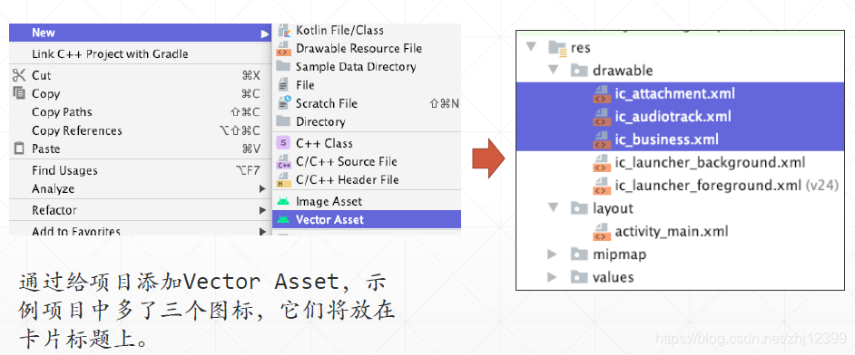
让卡片显示图标:
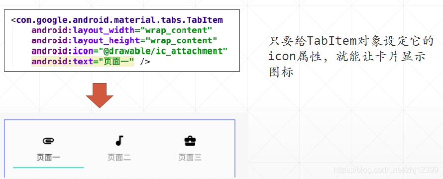
<?xml version="1.0" encoding="utf-8"?>
<LinearLayout xmlns:android="http://schemas.android.com/apk/res/android"
    xmlns:app="http://schemas.android.com/apk/res-auto"
    xmlns:tools="http://schemas.android.com/tools"
    android:layout_width="match_parent"
    android:layout_height="match_parent"
    android:orientation="vertical"
    tools:context=".MainActivity">
    <com.google.android.material.tabs.TabLayout
        android:id="@+id/tabLayout"
        android:layout_width="match_parent"
        android:layout_height="wrap_content"
        android:layout_margin="16dp">
        <com.google.android.material.tabs.TabItem
            android:layout_width="wrap_content"
            android:layout_height="wrap_content"
            android:icon="@drawable/ic_attachment"
            android:text="页面一" />
        <com.google.android.material.tabs.TabItem
            android:layout_width="wrap_content"
            android:layout_height="wrap_content"
            android:icon="@drawable/ic_audiotrack"
            android:text="页面二" />
        <com.google.android.material.tabs.TabItem
            android:layout_width="wrap_content"
            android:layout_height="wrap_content"
            android:icon="@drawable/ic_business"
            android:text="页面三" />
    </com.google.android.material.tabs.TabLayout>
</LinearLayout>
图标上可以添加小数字:
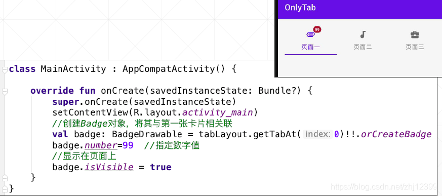
class MainActivity : AppCompatActivity() {
    override fun onCreate(savedInstanceState: Bundle?) {
        super.onCreate(savedInstanceState)
        setContentView(R.layout.activity_main)
        //创建Badge对象,将其与第一张卡片相关联
        val badge: BadgeDrawable = tabLayout.getTabAt(0)!!.orCreateBadge
        badge.number=99  //指定数字值
        //显示在页面上
        badge.isVisible = true
    }
}
实现滑动切换过程
TabLayout配合TabItem控件可以很方便地实现卡片,它本身也有属性支持滑动切换激活的卡片,但它不包容要在手机屏幕上显示的页面(页面包容具体显示给用户看的内容),你必须手写代码检测当前激活的选项卡是哪张,然后装载相应的布局文件(或 Fragment )。
我们期望达到的交互效果是用户可以在页面主体区直接用手指滑动切换不同的卡片,这正是在前面课程中介绍过的 ViewPage 组件的功能,因此,如果把 ViewPage 与 Tablayout/TabItem 控件组合起来,就能达到那种期望的效果。
先添加依赖:
implementation 'com.google.android.material:material:1.1.0'
implementation "androidx.viewpager2:viewpager2:1.0.0"
简单的文本Tabs
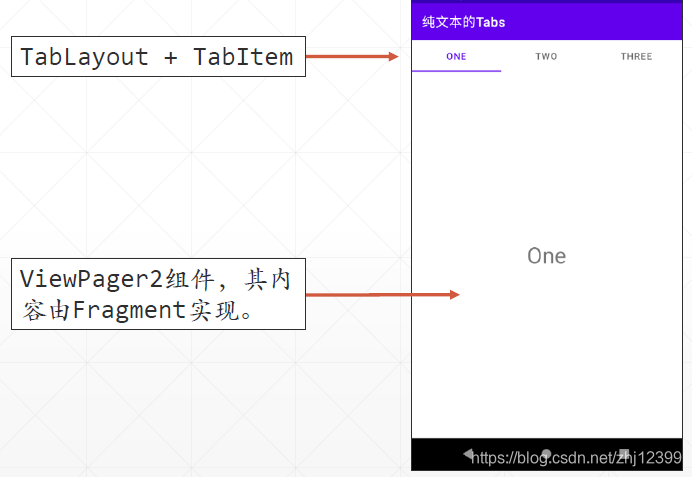
class TextTabsActivity : AppCompatActivity() {
    //计划显示三页卡片
    val fragmentList = mutableListOf<Fragment>(
        FragmentOne(), FragmentTwo(), FragmentThree())
    val titleList = mutableListOf<String>("One", "Two", "Three")

    override fun onCreate(savedInstanceState: Bundle?) {
        super.onCreate(savedInstanceState)
        setContentView(R.layout.activity_text_tabs)

        toolbar.title = "纯文本的Tabs"
        setSupportActionBar(toolbar)

        val adapter=TextTabsAdapter(this,fragmentList,titleList)
        viewPager.adapter=adapter
        //关联TabLayout与ViewPager2,并设定卡片页标题
        TabLayoutMediator(tabs,viewPager){
            tab,position->
                tab.text=adapter.getPageTitle(position)
        }.attach()
    }
}
class TextTabsAdapter(
    fa: FragmentActivity,
    val fragmentList: List<Fragment>, //要显示的Fragment集合
    val titleList: List<String>  //每个Fragment对应的Tab页标题
) : FragmentStateAdapter(fa) {
    //依据当前位置取出要显示的Fragment
    override fun createFragment(position: Int): Fragment {
       return fragmentList[position]
    }
    //获取要显示的选项卡
    override fun getItemCount(): Int {
        return fragmentList.size
    }
    //提取页面标题
    fun getPageTitle(position: Int): CharSequence? {
        return titleList[position]
    }
}
<?xml version="1.0" encoding="utf-8"?>
<androidx.constraintlayout.widget.ConstraintLayout xmlns:android="http://schemas.android.com/apk/res/android"
    xmlns:app="http://schemas.android.com/apk/res-auto"
    xmlns:tools="http://schemas.android.com/tools"
    android:layout_width="match_parent"
    android:layout_height="match_parent"
    tools:context=".activitys.TextTabsActivity">
    <androidx.appcompat.widget.Toolbar
        android:id="@+id/toolbar"
        android:layout_width="match_parent"
        android:layout_height="wrap_content"
        android:background="?attr/colorPrimary"
        android:minHeight="?attr/actionBarSize"
        android:theme="@style/ThemeOverlay.AppCompat.Dark.ActionBar"
        app:layout_constraintEnd_toEndOf="parent"
        app:layout_constraintStart_toStartOf="parent"
        app:layout_constraintTop_toTopOf="parent" />
    <com.google.android.material.tabs.TabLayout
        android:id="@+id/tabs"
        android:layout_width="match_parent"
        android:layout_height="wrap_content"
        app:tabMode="fixed"
        app:tabGravity="fill"
        app:layout_constraintEnd_toEndOf="parent"
        app:layout_constraintStart_toStartOf="parent"
        app:layout_constraintTop_toBottomOf="@id/toolbar">
    </com.google.android.material.tabs.TabLayout>
    <androidx.viewpager2.widget.ViewPager2
        android:id="@+id/viewPager"
        android:layout_width="match_parent"
        android:layout_height="0dp"
        app:layout_constraintBottom_toBottomOf="parent"
        app:layout_constraintEnd_toEndOf="parent"
        app:layout_constraintStart_toStartOf="parent"
        app:layout_constraintTop_toBottomOf="@id/tabs" />
</androidx.constraintlayout.widget.ConstraintLayout>
带图标的Tabs
class IconTabsActivity : AppCompatActivity() {
    val fragmentList = mutableListOf<Fragment>(
        FragmentOne(), FragmentTwo(), FragmentThree(),
        FragmentFour(), FragmentFive(), FragmentSix()
    )
    override fun onCreate(savedInstanceState: Bundle?) {
        super.onCreate(savedInstanceState)
        setContentView(R.layout.activity_icon_tabs)

        toolbar.title = "带图标的Tabs"
        setSupportActionBar(toolbar)

        val adapter = IconTabsAdapter(this, fragmentList)
        viewPager.adapter = adapter
        //关联TabLayout与ViewPager2
        TabLayoutMediator(tabs, viewPager) { tab, i ->
        }.attach()

        setTabItemIcon()
    }
    //为每个选项卡设置图标
    private fun setTabItemIcon() {
        tabs.getTabAt(0)?.setIcon(R.drawable.ic_1)
        tabs.getTabAt(1)?.setIcon(R.drawable.ic_2)
        tabs.getTabAt(2)?.setIcon(R.drawable.ic_3)
        tabs.getTabAt(3)?.setIcon(R.drawable.ic_4)
        tabs.getTabAt(4)?.setIcon(R.drawable.ic_5)
        tabs.getTabAt(5)?.setIcon(R.drawable.ic_6)
    }
}
class IconTabsAdapter(
    fa: FragmentActivity,
    val fragmentList: List<Fragment>
) : FragmentStateAdapter(fa) {
    override fun createFragment(position: Int): Fragment {
       return fragmentList[position]
    }
    override fun getItemCount(): Int {
        return fragmentList.size
    }
}
<?xml version="1.0" encoding="utf-8"?>
<androidx.constraintlayout.widget.ConstraintLayout xmlns:android="http://schemas.android.com/apk/res/android"
    xmlns:app="http://schemas.android.com/apk/res-auto"
    xmlns:tools="http://schemas.android.com/tools"
    android:layout_width="match_parent"
    android:layout_height="match_parent"
    tools:context=".activitys.IconTabsActivity">
    <androidx.appcompat.widget.Toolbar
        android:id="@+id/toolbar"
        android:layout_width="match_parent"
        android:layout_height="wrap_content"
        android:background="?attr/colorPrimary"
        android:minHeight="?attr/actionBarSize"
        android:theme="@style/ThemeOverlay.AppCompat.Dark.ActionBar"
        app:layout_constraintEnd_toEndOf="parent"
        app:layout_constraintStart_toStartOf="parent"
        app:layout_constraintTop_toTopOf="parent" />
    <com.google.android.material.tabs.TabLayout
        android:id="@+id/tabs"
        android:layout_width="match_parent"
        android:layout_height="wrap_content"
        app:tabMode="fixed"
        app:tabGravity="center"
        app:layout_constraintEnd_toEndOf="parent"
        app:layout_constraintStart_toStartOf="parent"
        app:layout_constraintTop_toBottomOf="@id/toolbar">
    </com.google.android.material.tabs.TabLayout>
    <androidx.viewpager2.widget.ViewPager2
        android:id="@+id/viewPager"
        android:layout_width="match_parent"
        android:layout_height="0dp"
        app:layout_constraintBottom_toBottomOf="parent"
        app:layout_constraintEnd_toEndOf="parent"
        app:layout_constraintStart_toStartOf="parent"
        app:layout_constraintTop_toBottomOf="@id/tabs" />
</androidx.constraintlayout.widget.ConstraintLayout>
让卡片标题可滚动
app:tabMode="scrollable
仅设置这一项即可
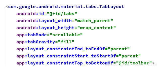
class ScrollTabsActivity : AppCompatActivity() {
    val fragmentList = mutableListOf<Fragment>(
        FragmentOne(), FragmentTwo(), FragmentThree(),
        FragmentFour(), FragmentFive(), FragmentSix()
    )
    val titleList = mutableListOf<String>("卡片一", "卡片二", "卡片三", "卡片四", "卡片五", "卡片六")
    override fun onCreate(savedInstanceState: Bundle?) {
        super.onCreate(savedInstanceState)
        setContentView(R.layout.activity_scroll_tabs)

        toolbar.title = "可滚动的Tabs"
        setSupportActionBar(toolbar)

        val adapter = ScrollTabsAdapter(this, fragmentList, titleList)
        viewPager.adapter = adapter
        TabLayoutMediator(tabs, viewPager) { tab, position ->
            tab.text=adapter.getPageTitle(position)
            tab.setIcon(adapter.getPageIcon(position))
        }.attach()
    }
}
class ScrollTabsAdapter(
    val fa: FragmentActivity, val fragmentList: List<Fragment>,
    val titleList: List<String>
) : FragmentStateAdapter(fa) {
    override fun createFragment(position: Int): Fragment {
        return fragmentList[position]
    }

    override fun getItemCount(): Int {
        return fragmentList.size
    }

    fun getPageTitle(position: Int): CharSequence? {
        return titleList[position]
    }

    fun getPageIcon(position: Int):Int{
       return when(position){
            0->R.drawable.ic_1
            1->R.drawable.ic_2
            2->R.drawable.ic_3
            3->R.drawable.ic_4
            4->R.drawable.ic_5
            5->R.drawable.ic_6
            else->-1
        }
    }
}
<?xml version="1.0" encoding="utf-8"?>
<androidx.constraintlayout.widget.ConstraintLayout xmlns:android="http://schemas.android.com/apk/res/android"
    xmlns:app="http://schemas.android.com/apk/res-auto"
    xmlns:tools="http://schemas.android.com/tools"
    android:layout_width="match_parent"
    android:layout_height="match_parent"
    tools:context=".activitys.ScrollTabsActivity">
    <androidx.appcompat.widget.Toolbar
        android:id="@+id/toolbar"
        android:layout_width="match_parent"
        android:layout_height="wrap_content"
        android:background="?attr/colorPrimary"
        android:minHeight="?attr/actionBarSize"
        android:theme="@style/ThemeOverlay.AppCompat.Dark.ActionBar"
        app:layout_constraintEnd_toEndOf="parent"
        app:layout_constraintStart_toStartOf="parent"
        app:layout_constraintTop_toTopOf="parent" />
    <com.google.android.material.tabs.TabLayout
        android:id="@+id/tabs"
        android:layout_width="match_parent"
        android:layout_height="wrap_content"
        app:tabMode="scrollable"
        app:tabGravity="fill"
        app:layout_constraintEnd_toEndOf="parent"
        app:layout_constraintStart_toStartOf="parent"
        app:layout_constraintTop_toBottomOf="@id/toolbar">
    </com.google.android.material.tabs.TabLayout>
    <androidx.viewpager2.widget.ViewPager2
        android:id="@+id/viewPager"
        android:layout_width="match_parent"
        android:layout_height="0dp"
        app:layout_constraintBottom_toBottomOf="parent"
        app:layout_constraintEnd_toEndOf="parent"
        app:layout_constraintStart_toStartOf="parent"
        app:layout_constraintTop_toBottomOf="@id/tabs" />
</androidx.constraintlayout.widget.ConstraintLayout>
自定义卡片标题
只需在一个独立的布局文件中定义好用到的控件,然后对每个TabItem对象设置它的 customView属性即可,自定义的卡片标题布局可放到Adapter中加载:
class CustomViewTabsActivity : AppCompatActivity() {
    private val fragmentList = listOf(FragmentOne(), FragmentTwo(), FragmentThree())
    private val titleList = listOf("Title 1", "Title 2", "Title 3")
    private val subTitleList = listOf("tab 1", "tab 2", "tab 3")
    override fun onCreate(savedInstanceState: Bundle?) {
        super.onCreate(savedInstanceState)
        setContentView(R.layout.activity_custom_view_tabs)
        toolbar.title = "自定义View的Tabs"
        setSupportActionBar(toolbar)

        val adapter = CustomTabsAdapter(this, fragmentList, titleList, subTitleList)
        viewPager.adapter = adapter

        TabLayoutMediator(tabs, viewPager) { tab, position ->
            //设定TabItem使用自定义布局
            tab.customView = adapter.getCustomViewForTab(position)
        }.attach()
    }
}
class CustomTabsAdapter(
    val fa: FragmentActivity,
    val fragmentList: List<Fragment>,
    val titleList: List<String>,
    val subTitleList:List<String>
) : FragmentStateAdapter(fa) {

    override fun createFragment(position: Int): Fragment {
        return fragmentList[position]
    }

    override fun getItemCount(): Int {
        return fragmentList.size
    }
    //获取每张卡片对应的布局对象
    fun getCustomViewForTab(position: Int): View {
        //实例化布局文件
        val root = fa.layoutInflater.inflate(R.layout.tab_item_header, null)
        //设定控件的值
        val tvTitle = root.findViewById<TextView>(R.id.tvTitle)
        tvTitle.text = titleList[position]  //主标题
        val tvSubtitle = root.findViewById<TextView>(R.id.tvsubtitle)
        tvSubtitle.text = subTitleList[position] //次标题
        return root  //将己经填充好内容的控件树传给外界
    }
}
<?xml version="1.0" encoding="utf-8"?>
<androidx.constraintlayout.widget.ConstraintLayout xmlns:android="http://schemas.android.com/apk/res/android"
    xmlns:app="http://schemas.android.com/apk/res-auto"
    xmlns:tools="http://schemas.android.com/tools"
    android:layout_width="match_parent"
    android:layout_height="match_parent"
    tools:context=".activitys.CustomViewTabsActivity">
    <androidx.appcompat.widget.Toolbar
        android:id="@+id/toolbar"
        android:layout_width="match_parent"
        android:layout_height="wrap_content"
        android:background="?attr/colorPrimary"
        android:minHeight="?attr/actionBarSize"
        android:theme="@style/ThemeOverlay.AppCompat.Dark.ActionBar"
        app:layout_constraintEnd_toEndOf="parent"
        app:layout_constraintStart_toStartOf="parent"
        app:layout_constraintTop_toTopOf="parent" />
    <com.google.android.material.tabs.TabLayout
        android:id="@+id/tabs"
        android:layout_width="match_parent"
        android:layout_height="wrap_content"
        app:tabMode="fixed"
        app:tabGravity="fill"
        app:layout_constraintEnd_toEndOf="parent"
        app:layout_constraintStart_toStartOf="parent"
        app:layout_constraintTop_toBottomOf="@id/toolbar">
    </com.google.android.material.tabs.TabLayout>
    <androidx.viewpager2.widget.ViewPager2
        android:id="@+id/viewPager"
        android:layout_width="match_parent"
        android:layout_height="0dp"
        app:layout_constraintBottom_toBottomOf="parent"
        app:layout_constraintEnd_toEndOf="parent"
        app:layout_constraintStart_toStartOf="parent"
        app:layout_constraintTop_toBottomOf="@id/tabs" />
</androidx.constraintlayout.widget.ConstraintLayout>
RecyclerView
运⾏时才知道要有多少⼦控件参与布局
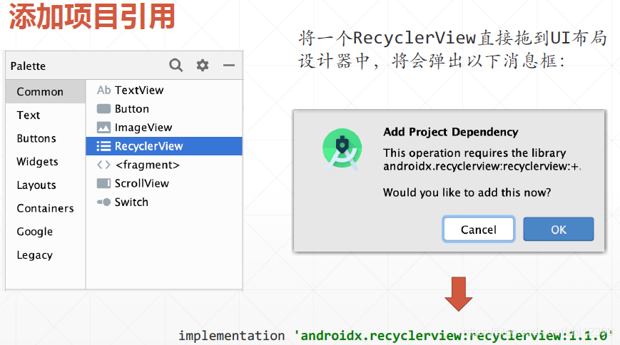
implementation 'androidx.recyclerview:recyclerview:1.1.0'
编写数据类封装要显示的数据信息:
data class MyData (val value:Int,val info:String)
在MainActivity中编写函数创建数据对象集合:
在Activity的onCreate()⽅法,“串”起⼀切,其中关键是三个对象:
1.RecyclerView本身
2.LayoutManager:决定布局模式(⽹格还是列表)
3.Adapter:负责提供数据
class MainActivity : AppCompatActivity() {
    override fun onCreate(savedInstanceState: Bundle?) {
        super.onCreate(savedInstanceState)
        setContentView(R.layout.activity_main)
        //设置布局管理器
        myDataRecyclerView.layoutManager = LinearLayoutManager(this)
        //创建Adapter对象,并将数据集合传给它
        val adapter = MyDataAdapter(createData())
        //关联RecyclerView与Adapter
        myDataRecyclerView.adapter = adapter

    }
    //创建数据集合
    private fun createData(): List<MyData> {
        val data = mutableListOf<MyData>()
        val ran = Random()
        for (i in 1..20) {
            val ranValue = ran.nextInt(
                100
            )
            data.add(MyData(ranValue, "info${ranValue}"))
        }
        return data
    }
}
使用一个布局文件设定每行的内容
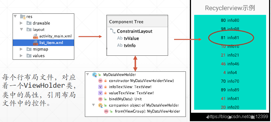
引⼊ViewHolder类的主要原因,在于需要通过重用UI控件,避免不必要的findViewById()调用,从⽽在需要显示⼤量数据(比如上千⾏)时提升App性能和保证滚动的流畅性。
RecyclerView并不直接地操作数据集合,它将这个⼯作委托给了⼀个Adapter类。Adapter类负责从数据集合中查询数据,实例化ViewHolder对象并通过设置其属性值实现数据的显示。
//包容要显示的数据集合,并且实现数据的提取与显示工作
class MyDataAdapter(private val data: List<MyData>) :
    RecyclerView.Adapter<MyDataViewHolder>() {

    //调用工厂方法实例化ViewHolder对象
    override fun onCreateViewHolder(parent: ViewGroup, viewType: Int)
            : MyDataViewHolder {
        return MyDataViewHolder.from(parent)
    }
    //获取要显示的数据集行数
    override fun getItemCount(): Int {
        return data.size
    }
    //从数据集合中提取指定位置的数据对象,传给ViewHolder对象显示
    override fun onBindViewHolder(
        holder: MyDataViewHolder,
        position: Int
    ) {
        val item = data[position]
        holder.bind(item)
    }
}

//私有构造方法,不允许外界直接实例化
class MyDataViewHolder private constructor(itemView: View) : RecyclerView.ViewHolder(itemView) {
    //使用私有属性引用行布局文件中定义的控件,以便能使用它们显示数据对象的内容
//    private val infoTextView = itemView.findViewById<TextView>(R.id.tvInfo)
//    private val valueTextView = itemView.findViewById<TextView>(R.id.tvValue)

    //使用Kotlin,可以省去findViewById的调用,直接通过Id访问到UI控件
    private val infoTextView = itemView.tvInfo
    private val valueTextView = itemView.tvValue

    //依据传入的数据对象,更新对应控件的值
    fun bind(item: MyData) {
        infoTextView.text = item.info
        valueTextView.text = item.value.toString()
        //针对不同类型的数据,调整文本框的文字颜色
        if (item.value < 60) {
            valueTextView.setTextColor(Color.RED)
        } else {
            valueTextView.setTextColor(Color.BLACK)
        }
    }

    companion object {
        //使用工厂方法实例化ViewHolder对象
        fun from(parent: ViewGroup): MyDataViewHolder {
            //加载布局文件并实例化
            val layoutInflater = LayoutInflater.from(parent.context)
            val root = layoutInflater.inflate(
                R.layout.list_item,
                parent, false
            )
            return MyDataViewHolder(root)
        }
    }
}
界面定制·布局切换
实现线性布局、网格布局和瀑布流布局
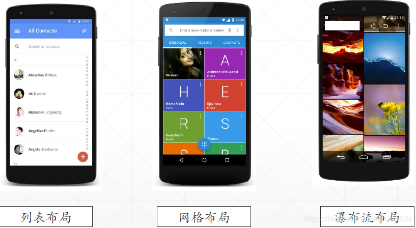
RecyclerView的布局,是由布局管理器决定的,目前主要包括以下三种布局管理器:
• LinearLayoutManager:线性布局管理器
• GridLayoutManager:表格布局管理器
• StaggeredGridLayoutManager:瀑布流布局管理器
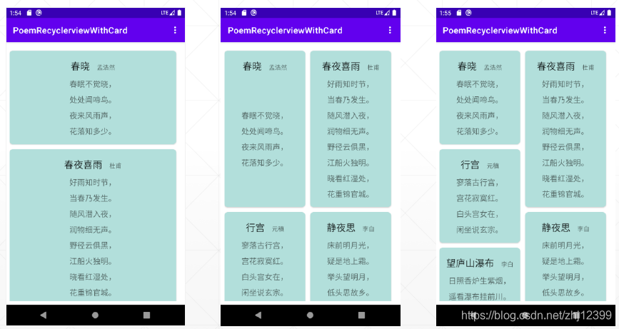
以下示例中多首古诗放到⼀个List中,然后使用RecyclerView显示这些诗,使用选项菜单在运⾏过程中动态切换其布局。
//封装一首诗相关的数据
data class Poem(val title:String,  //标题
                val author :String, //作者
                val contents:List<String> //诗的内容
)
class PoemLibrary {
    companion object {
        //人工创建一个List,往里面加了若干首诗,作为供RecyclerView显示的数据源
        fun getPoemList(): List<Poem> {
            val poems = mutableListOf<Poem>()
            poems.add(
                Poem("春晓", "孟浩然",
                    listOf("春眠不觉晓,", "处处闻啼鸟。", "夜来风雨声,", "花落知多少。")
                )
            )
            poems.add(
                Poem("春夜喜雨", "杜甫",
                    listOf("好雨知时节,", "当春乃发生。", "随风潜入夜,", "润物细无声。",
                        "野径云俱黑,","江船火独明。","晓看红湿处,","花重锦官城。")
                )
            )
            poems.add(
                Poem("行宫", "元稹",
                    listOf("寥落古行宫,", "宫花寂寞红。", "白头宫女在,", "闲坐说玄宗。")
                )
            )
            poems.add(
                Poem("静夜思", "李白",
                    listOf("床前明月光,", "疑是地上霜。", "举头望明月,", "低头思故乡。")
                )
            )
            poems.add(
                Poem("望庐山瀑布", "李白",
                    listOf("日照香炉生紫烟,", "遥看瀑布挂前川。", "飞流直下三千尺,", "疑是银河落九天。")
                )
            )
            return poems
        }
    }
}
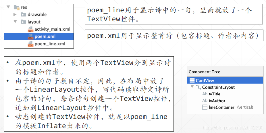
poem_line.xml:
<?xml version="1.0" encoding="utf-8"?>
<TextView
    xmlns:android="http://schemas.android.com/apk/res/android"
    xmlns:tools="http://schemas.android.com/tools"
    android:id="@+id/tvLine"
    android:layout_width="match_parent"
    android:layout_height="wrap_content"
    android:layout_margin="4dp"
    android:padding="2dp"
    android:textAlignment="center"
    android:textAppearance="@style/TextAppearance.AppCompat.Medium"
    tools:text="poem_line">
</TextView>
poem.xml:
<?xml version="1.0" encoding="utf-8"?>
<androidx.cardview.widget.CardView xmlns:android="http://schemas.android.com/apk/res/android"
    xmlns:app="http://schemas.android.com/apk/res-auto"
    xmlns:tools="http://schemas.android.com/tools"
    android:layout_width="match_parent"
    android:layout_height="wrap_content"
    app:cardBackgroundColor="#B2DFDB"
    app:cardCornerRadius="8dp"
    app:contentPadding="4dp">
    <androidx.constraintlayout.widget.ConstraintLayout
        android:layout_width="match_parent"
        android:layout_height="match_parent">
        <TextView
            android:id="@+id/tvTitle"
            android:layout_width="wrap_content"
            android:layout_height="wrap_content"
            android:layout_marginTop="16dp"
            android:textAppearance="@style/TextAppearance.AppCompat.Large"
            app:layout_constraintEnd_toStartOf="@+id/tvAuthor"
            app:layout_constraintHorizontal_bias="0.5"
            app:layout_constraintHorizontal_chainStyle="packed"
            app:layout_constraintStart_toStartOf="parent"
            app:layout_constraintTop_toTopOf="parent"
            tools:text="tvTitle" />
        <TextView
            android:id="@+id/tvAuthor"
            android:layout_width="wrap_content"
            android:layout_height="wrap_content"
            android:layout_marginStart="16dp"
            android:textAppearance="@style/TextAppearance.AppCompat.Small"
            app:layout_constraintBaseline_toBaselineOf="@+id/tvTitle"
            app:layout_constraintEnd_toEndOf="parent"
            app:layout_constraintHorizontal_bias="0.5"
            app:layout_constraintStart_toEndOf="@+id/tvTitle"
            tools:text="tvAuthor" />
        <LinearLayout
            android:id="@+id/lineContainer"
            android:layout_width="0dp"
            android:layout_height="wrap_content"
            android:layout_marginStart="8dp"
            android:layout_marginTop="8dp"
            android:layout_marginEnd="8dp"
            android:layout_marginBottom="8dp"
            android:orientation="vertical"
            app:layout_constraintBottom_toBottomOf="parent"
            app:layout_constraintEnd_toEndOf="parent"
            app:layout_constraintStart_toStartOf="parent"
            app:layout_constraintTop_toBottomOf="@+id/tvTitle"></LinearLayout>
    </androidx.constraintlayout.widget.ConstraintLayout>
</androidx.cardview.widget.CardView>
activity_main:
<?xml version="1.0" encoding="utf-8"?>
<androidx.constraintlayout.widget.ConstraintLayout xmlns:android="http://schemas.android.com/apk/res/android"
    xmlns:app="http://schemas.android.com/apk/res-auto"
    xmlns:tools="http://schemas.android.com/tools"
    android:layout_width="match_parent"
    android:layout_height="match_parent"
    tools:context=".MainActivity">
    <androidx.recyclerview.widget.RecyclerView
        android:id="@+id/recyclerView"
        android:layout_width="0dp"
        android:layout_height="0dp"
        android:layout_marginStart="8dp"
        android:layout_marginTop="8dp"
        android:layout_marginEnd="8dp"
        android:layout_marginBottom="8dp"
        app:layout_constraintBottom_toBottomOf="parent"
        app:layout_constraintEnd_toEndOf="parent"
        app:layout_constraintHorizontal_bias="0.5"
        app:layout_constraintStart_toStartOf="parent"
        app:layout_constraintTop_toTopOf="parent" />
</androidx.constraintlayout.widget.ConstraintLayout>
ViewHolder:
在ViewHolder对象的bind⽅法中,依据poem对象属性值,实例化并填充相应的控件。
class PoemViewHolder(private val root: View)
    : RecyclerView.ViewHolder(root) {
    private val tvTitle = root.tvTitle  //标题
    private val tvAuthor = root.tvAuthor    //作者

    //引用LinearLayout容器控件
    private val lineContainer = root.lineContainer

    //绑定显示一首诗
    fun bind(poem: Poem) {
        tvTitle.text = poem.title
        tvAuthor.text = poem.author
        //引用LayoutInflater,准备从布局文件中实例化控件
        val inflater = LayoutInflater.from(root.context)
        //读取诗中的每句,创建一个TextView控件,然后追加到LinearLayout中
        poem.contents.forEach {
            val textView = inflater.inflate(
                R.layout.poem_line,
                root as ViewGroup, false
            )
            (textView as TextView).text = it
            lineContainer.addView(textView)
        }
    }
}
Adapter:
//从外部注入诗歌的集合
class PoemAdapater(val poems: List<Poem>)
    : RecyclerView.Adapter<PoemViewHolder>() {
    //实例化ViewHolder对象
    override fun onCreateViewHolder(parent: ViewGroup, viewType: Int)
            : PoemViewHolder {
        val root = LayoutInflater.from(parent.context)
            .inflate(R.layout.poem, parent, false)
        return PoemViewHolder(root)
    }
    //确定显示行数
    override fun getItemCount(): Int {
        return poems.size
    }
    //显示一首诗的内容
    override fun onBindViewHolder(
        holder: PoemViewHolder,
        position: Int
    ) {
        holder.bind(poems[position])
    }
}
动态切换RecyclerView布局管理器
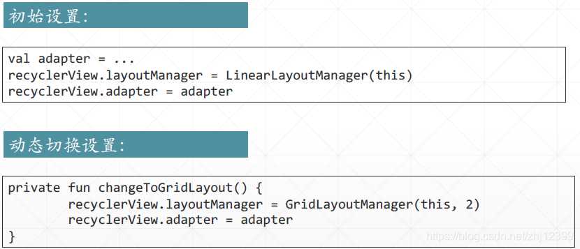
MainActivity
class MainActivity : AppCompatActivity() {
    var adapter: PoemAdapater? = null
    override fun onCreate(savedInstanceState: Bundle?) {
        super.onCreate(savedInstanceState)
        setContentView(R.layout.activity_main)

        val topSpacingDecorator = SpacingItemDecoration(30)
        recyclerView.addItemDecoration(topSpacingDecorator)
        adapter = PoemAdapater(PoemLibrary.getPoemList())
        recyclerView.layoutManager = LinearLayoutManager(this)

        recyclerView.adapter = adapter
    }
    override fun onCreateOptionsMenu(menu: Menu?): Boolean {
        super.onCreateOptionsMenu(menu)
        menuInflater.inflate(R.menu.layout_manager, menu)
        return true
    }
    override fun onOptionsItemSelected(item: MenuItem): Boolean {
        super.onOptionsItemSelected(item)
        when (item.itemId) {
            R.id.mnuGridLayout -> changeToGridLayout()
            R.id.mnuLinearLayout -> ChangeToLinearLayout()
            R.id.mnuStaggeredLayout -> changeToStaggeredlayout()
        }
        return true
    }
    private fun changeToStaggeredlayout() {
        recyclerView.layoutManager = StaggeredGridLayoutManager(2, OrientationHelper.VERTICAL)
        recyclerView.adapter = adapter
    }
    private fun ChangeToLinearLayout() {
        recyclerView.layoutManager = LinearLayoutManager(this)
        recyclerView.adapter = adapter

    }
    private fun changeToGridLayout() {
        recyclerView.layoutManager = GridLayoutManager(this, 2)
        recyclerView.adapter = adapter
    }
}
class SpacingItemDecoration(private val padding: Int): RecyclerView.ItemDecoration() {
    override fun getItemOffsets(outRect: Rect, view: View, parent: RecyclerView, state: RecyclerView.State) {
        super.getItemOffsets(outRect, view, parent, state)
        outRect.top = padding
        outRect.right=padding
    }
}
多种类型的视图模板
RecyclerView中可以显示不止一种类型的视图模板
可以同时选择显示图片或者文本类型的数据,⽂本类型的数据,使用TextView显示;图片类型的数据,使用ImageView显示。
数据封装:
由于有两种类型(⽂本和图片)的数据,⽽我们又不想将它们放在两个集合中(那样管理起来麻烦),所以,可以应用面向对象的多态特性,将它们塞到同⼀集合中,为此,设计⼀个接⼝,让⽂本数据类和图片数据类都实现这⼀接⼝。
MyData.kt
//用于标识数据
interface IMyData
//文本类型数据
data class TextData(val content: String) : IMyData
//图片类型数据
data class ImageData(val imgResId: Int) : IMyData
class DataSource {
    companion object {
        //创建示例数据源,供RecyclerView绑定
        fun getDataList(context: Context): List<IMyData> {
            val dataList = mutableListOf<IMyData>()
            for (i in 1..10) {
                //文本类型的数据
                dataList.add(TextData("图片$i"))
                //通过名字获取图片资源Id
                val imageId = context.resources.getIdentifier(
                    "img$i",
                    "drawable", context.packageName
                )
                dataList.add(ImageData(imageId))
            }
            return dataList
        }
    }
}
定义两个行视图模板:
image_item.xml
设置scaleType属性值为centerCrop以对图片进行剪裁,实现大小一致
<?xml version="1.0" encoding="utf-8"?>
<androidx.constraintlayout.widget.ConstraintLayout xmlns:android="http://schemas.android.com/apk/res/android"
    xmlns:app="http://schemas.android.com/apk/res-auto"
    android:layout_width="match_parent"
    android:layout_height="match_parent">
    <ImageView
        android:id="@+id/imageView"
        android:layout_width="0dp"
        android:layout_height="0dp"
        android:layout_marginStart="8dp"
        android:layout_marginTop="8dp"
        android:layout_marginEnd="8dp"
        android:layout_marginBottom="8dp"
        android:scaleType="centerCrop"
        app:layout_constraintBottom_toBottomOf="parent"
        app:layout_constraintEnd_toEndOf="parent"
        app:layout_constraintHorizontal_bias="0.5"
        app:layout_constraintStart_toStartOf="parent"
        app:layout_constraintTop_toTopOf="parent"
        app:srcCompat="@drawable/img1" />
</androidx.constraintlayout.widget.ConstraintLayout>
text_item.xml
<?xml version="1.0" encoding="utf-8"?>
<TextView xmlns:android="http://schemas.android.com/apk/res/android"
    android:id="@+id/tvContent"
    android:layout_width="match_parent"
    android:layout_height="wrap_content"
    android:layout_margin="4dp"
    android:padding="4dp"
    android:text="tvContent"
    android:textAlignment="center"
    android:textAppearance="@style/TextAppearance.AppCompat.Large"
    android:textColor="#303F9F">
</TextView>
于是两种数据类型对应着两个ViewHolder
//定义视图类型常量
const val UNKNOWN_VIEW_TYPE = -1  //未知类型
const val TEXT_VIEW_TYPE = 1    //文本类型
const val IMAGE_VIEW_TYPE = 2   //图片类型

//文本类型数据对应的ViewHolder
class TextViewHolder(private val root: View)
    : RecyclerView.ViewHolder(root) {
    private val tvContent: TextView = root as TextView
    fun bind(data: IMyData) {

        if (data is TextData) {
            tvContent.text = data.content
        } else {
            tvContent.text = data.toString()
        }
    }
}

//图片类型数据对应的ViewHolder
class ImageViewHolder(private val root: View)
    : RecyclerView.ViewHolder(root) {
    private val imageView = root.imageView
    fun bind(data: IMyData) {
        if (data is ImageData) {
            imageView.setImageResource(data.imgResId)
        } else {
            imageView.setImageResource(
                R.drawable.ic_launcher_foreground
            )
        }
    }
}
在Adapter中就是:
对于包容多种视图类型的RecyclerView,其中最重要的就是你需要重写其getItemViewType()⽅法:
//将数据集合注入到Adapter中
class MyDataAdapter(private val dataList: List<IMyData>) :
    RecyclerView.Adapter<RecyclerView.ViewHolder>() {

    //查询当前要显示的数据对象的类型
    override fun getItemViewType(position: Int): Int {
        val item = dataList[position]
        if (item is TextData) {
            return TEXT_VIEW_TYPE
        }
        if (item is ImageData) {
            return IMAGE_VIEW_TYPE
        }
        return UNKNOWN_VIEW_TYPE
    }//这个⽅法的返回值,将成为onCreateViewHolder()⽅法的第⼆个参数……

    //此方法的第二个参数,来自getItemViewType()的返回值
    override fun onCreateViewHolder(parent: ViewGroup, viewType: Int)
            : RecyclerView.ViewHolder {
        val inflater = LayoutInflater.from(parent.context)
        //实例化两个ViewHolder对象
        val textVH = TextViewHolder(inflater.inflate(R.layout.text_item,
            parent, false))
        val imageVH = ImageViewHolder(inflater.inflate(R.layout.image_item,
            parent, false))
        //根据实际情况选一个返回给外界
        val vh = when (viewType) {
            IMAGE_VIEW_TYPE -> imageVH
            TEXT_VIEW_TYPE -> textVH
            else -> textVH
        }
        return vh
    }

    override fun getItemCount(): Int {
        return dataList.size
    }

    override fun onBindViewHolder(holder: RecyclerView.ViewHolder, position: Int) {
        val item = dataList[position]
        if (holder is TextViewHolder) {
            holder.bind(item)
        }
        if (holder is ImageViewHolder) {
            holder.bind(item)
        }
    }
}
数据集的变更通知
如果要实现数据的增删:
RecyclerView.Adapter<>类中提供了notifyXXX()系列方法,可以通知RecyclerView:“数据集合中数据项(的个数)有变更,你需要刷新显示”。
RecyclerView.Adapter中的数据更新方法:
1.数据集合中的数据项个数有增减:
notifyDataSetChanged():强制更新整个数据集,“一切从头开始”
2.数据项本身有改变
更新单个数据项:
notifyItemChanged()
notifyItemInserted()
notifyItemRemoved()
更新多个数据项:
notifyItemRangeChanged()
notifyItemRangeInserted()
notifyItemRangeRemoved()
示例分析:
定义数据类型:
MyDataItem.kt
class MyDataItem(var imageResId:Int,    //图片资源Id
                 var title:String,      //行标题
                 var subTitle:String,   //从标题
                 var isSelected:Boolean //是否被选中
)
class MyDataSource{
    companion object{
        fun createDataList():MutableList<MyDataItem>{
            return mutableListOf(
                MyDataItem(R.drawable.ic_1,"Image 0","${R.drawable.ic_1}",false),
                MyDataItem(R.drawable.ic_2,"Image 1","${R.drawable.ic_2}",false),
                MyDataItem(R.drawable.ic_3,"Image 2","${R.drawable.ic_3}",false),
                MyDataItem(R.drawable.ic_4,"Image 3","${R.drawable.ic_4}",false),
                MyDataItem(R.drawable.ic_5,"Image 4","${R.drawable.ic_5}",false)
            )
        }
    }
}
行布局list_item.xml
<?xml version="1.0" encoding="utf-8"?>
<androidx.constraintlayout.widget.ConstraintLayout xmlns:android="http://schemas.android.com/apk/res/android"
    xmlns:app="http://schemas.android.com/apk/res-auto"
    xmlns:tools="http://schemas.android.com/tools"
    android:layout_width="match_parent"
    android:layout_height="wrap_content">
    <ImageView
        android:id="@+id/imgIcon"
        android:layout_width="64dp"
        android:layout_height="64dp"
        android:layout_marginStart="24dp"
        android:layout_marginTop="16dp"
        android:layout_marginBottom="16dp"
        app:layout_constraintBottom_toBottomOf="parent"
        app:layout_constraintStart_toStartOf="parent"
        app:layout_constraintTop_toTopOf="parent"
        app:srcCompat="@drawable/ic_1" />
    <TextView
        android:id="@+id/tvTitle"
        android:layout_width="0dp"
        android:layout_height="wrap_content"
        android:layout_marginStart="16dp"
        android:layout_marginTop="16dp"
        android:layout_marginEnd="24dp"
        android:textAppearance="@style/TextAppearance.AppCompat.Large"
        app:layout_constraintEnd_toEndOf="parent"
        app:layout_constraintStart_toEndOf="@+id/imgIcon"
        app:layout_constraintTop_toTopOf="parent"
        tools:text="tvTitle" />
    <TextView
        android:id="@+id/tvSubtitle"
        android:layout_width="0dp"
        android:layout_height="wrap_content"
        android:layout_marginStart="16dp"
        android:layout_marginTop="10dp"
        android:layout_marginEnd="24dp"
        android:textAppearance="@style/TextAppearance.AppCompat.Small"
        app:layout_constraintBottom_toBottomOf="@+id/imgIcon"
        app:layout_constraintEnd_toEndOf="parent"
        app:layout_constraintStart_toEndOf="@+id/imgIcon"
        app:layout_constraintTop_toBottomOf="@+id/tvTitle"
        tools:text="tvSubtitle" />
</androidx.constraintlayout.widget.ConstraintLayout>
在ViewHolder中
class MyViewHolder(itemView: View) : RecyclerView.ViewHolder(itemView) {
    private val imgIcon: ImageView = itemView.imgIcon
    private val tvTitle: TextView = itemView.tvTitle
    private val tvSubtitle: TextView = itemView.tvSubtitle
    fun bind(dataItem: MyDataItem) {
        imgIcon.setImageResource(dataItem.imageResId)
        tvTitle.text = dataItem.title
        tvSubtitle.text = dataItem.subTitle
        //切换选中状态(通过背景色进行区分
        if(dataItem.isSelected){
            itemView.setBackgroundColor(Color.YELLOW)
        }
        else{
            itemView.setBackgroundColor(Color.TRANSPARENT)
        }
    }
}
Adapter中:
class MyDataAdapter(
    private val itemList: List<MyDataItem>,  //显示的数据集合
    private val listener: MyClickListener?   //外部数据监听器
) : RecyclerView.Adapter<MyViewHolder>() {
    //当前选中的行索引
    var selectedIndex = -1
    //外部事件响应监听器接口
    interface MyClickListener {
        fun onClickItem(position: Int)
    }
    override fun onCreateViewHolder(parent: ViewGroup, viewType: Int)
            : MyViewHolder {
        val root = LayoutInflater.from(parent.context)
            .inflate(R.layout.list_item, parent, false)
        val holder = MyViewHolder(root)
        root.setOnClickListener {
            listener?.onClickItem(holder.adapterPosition)
            setSelected(holder.adapterPosition)
        }
        return holder
    }
    override fun getItemCount(): Int {
        return itemList.size
    }
    override fun onBindViewHolder(holder: MyViewHolder, position: Int) {
        holder.bind(itemList[position])
    }
    //供外界调用的“选中行”方法
    fun setSelected(position: Int) {
           if (position != selectedIndex && selectedIndex != -1) {
            itemList[selectedIndex].isSelected = false
            notifyItemChanged(selectedIndex)
        }
        itemList[position].isSelected = true
        notifyItemChanged(position)
        selectedIndex = position
    }
}
在MainActivity中:
特别注意MyClickListener接口在MyDataAdapter中定义,MainActivity实现了这个接口。选中行背景颜色的切换,由MyDataAdapter负责,Activity不需要考虑
class MainActivity : AppCompatActivity(), MyClickListener {
val dataList = MyDataSource.createDataList()
var adapter: MyDataAdapter? = null
var currentIndex: Int = -1
override fun onCreate(savedInstanceState: Bundle?) {
super.onCreate(savedInstanceState)
setContentView(R.layout.activity_main)
adapter = MyDataAdapter(dataList, this)
var imageCount = dataList.size
myRecyclerview.layoutManager = LinearLayoutManager(this)
myRecyclerview.adapter = adapter
//新增数据
btnAdd.setOnClickListener {
val newItem = MyDataItem(
R.drawable.ic_add,
"Image $imageCount",
"这是新加的行",
false)
dataList.add(newItem)
//通知RecyclerView,刷新显示
adapter?.notifyItemInserted(imageCount)
//滚动到尾部
myRecyclerview.scrollToPosition(dataList.size - 1)
tvInfo.text = "在末尾添加一行:Image $imageCount"
imageCount++
}
//删除数据
btnRemove.setOnClickListener {
if (currentIndex == -1) {
Toast.makeText(this, "没有选中要删除的行",
Toast.LENGTH_SHORT).show()
return@setOnClickListener
}
dataList.removeAt(currentIndex)
//通知RecyclerView有数据被删除,需要刷新显示
adapter?.notifyItemRemoved(currentIndex)
tvInfo.text = "第 ${currentIndex + 1} 行被删除"
currentIndex = -1 //当前行被删除,就没有被选中的行了
}
//修改数据
btnModify.setOnClickListener {
if (currentIndex == -1) {
Toast.makeText(this, "没有选中要修改的行",
Toast.LENGTH_SHORT).show()
return@setOnClickListener
}
val item = dataList[currentIndex]
item.subTitle = "修改于 ${Date()}"
item.imageResId = R.drawable.ic_edit
item.title = "数据己修改"
//通知RecyclerView有数据被修改,需要刷新显示
adapter?.notifyItemChanged(currentIndex)
tvInfo.text="第 ${currentIndex + 1} 行的数据己修改"
}
}
override fun onClickItem(position: Int) {
tvInfo.text = "点击了第 ${position+1} 行"
currentIndex = position
}
}
事件响应与DiffUtil
当RecyclerView需要显示的数据量很大(比如有成百上千条),并且这些数据又经常变化(最典型的例子就是像微博)时,我们可以使用DiffUtil来提升RecyclerView的性能。
下面展示一个实例:
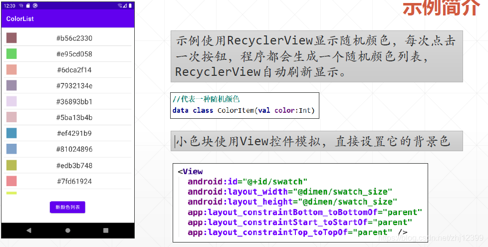
//代表一种随机颜色
data class ColorItem(val color:Int)
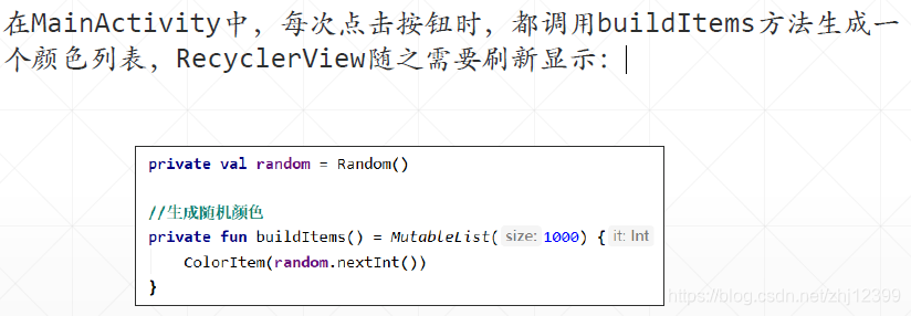
下面定义ViewHolder:
//参数row引用row.xml中的顶层控件
class ColorViewHolder(private val row: View)
: RecyclerView.ViewHolder(row) {
private val swatch: View = row.swatch
private val label: TextView = row.label
fun bindTo(item: ColorItem) {
//标签显示颜色值
label.text = label.context.getString(R.string.label_template, item.color)
//给View设置背景色
swatch.setBackgroundColor(item.color)
}
}
<?xml version="1.0" encoding="utf-8"?>
<androidx.constraintlayout.widget.ConstraintLayout
xmlns:android="http://schemas.android.com/apk/res/android"
xmlns:app="http://schemas.android.com/apk/res-auto"
android:layout_width="match_parent"
android:layout_height="wrap_content"
android:background="?android:attr/selectableItemBackground"
android:clickable="true"
android:focusable="true"
android:padding="@dimen/content_padding">
<View
android:id="@+id/swatch"
android:layout_width="@dimen/swatch_size"
android:layout_height="@dimen/swatch_size"
app:layout_constraintBottom_toBottomOf="parent"
app:layout_constraintStart_toStartOf="parent"
app:layout_constraintTop_toTopOf="parent" />
<TextView
android:id="@+id/label"
android:layout_width="wrap_content"
android:layout_height="wrap_content"
android:layout_marginStart="@dimen/label_start_margin"
android:textAppearance="?android:attr/textAppearanceLarge"
app:layout_constraintBottom_toBottomOf="parent"
app:layout_constraintEnd_toEndOf="parent"
app:layout_constraintStart_toEndOf="@id/swatch"
app:layout_constraintTop_toTopOf="parent" />
</androidx.constraintlayout.widget.ConstraintLayout>
DiffUtil这是一种用于确定数据项是否有变更,以便最小化UI更新操作的方法。
使用DiffUtil定义RecyclerView适配器的好处:
• 仅仅只会重绘有变动的数据项
• 默认支持动画效果
• 让RecyclerView在显示大量数据时更为顺畅
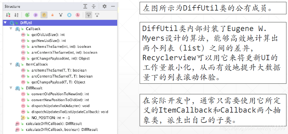
定义数据差异规则:
//用于定义比对两个列表差异的规则
class ColorListDiffCallback(
private val oldList:List<ColorItem>, //原有的老列表
private val newList:List<ColorItem> //要显示的新列表
)
: DiffUtil.Callback() {
//确定指定位置新旧列表所对应的数据对象是否是同一个
override fun areItemsTheSame(oldItemPosition: Int,
newItemPosition: Int): Boolean {
return oldList[oldItemPosition].color == newList[newItemPosition].color
}
override fun getOldListSize(): Int {
return oldList.size
}
override fun getNewListSize(): Int {
return newList.size
}
//当定位置新旧列表所对应的数据对象是同一个时,
//它们的内容(即各属性值)一样吗?
override fun areContentsTheSame(oldItemPosition: Int,
newItemPosition: Int): Boolean {
return areItemsTheSame(oldItemPosition,newItemPosition)
}
}
定义支持DiffUtil的Adapter
//使用ListAdapter作为基类,这个基类的构造方法要求注入一个
//DiffUtil.ItemCallback对象,这里直接使用了本地定义的单例对象
class ColorAdapter2(private val inflater: LayoutInflater) :
ListAdapter<Int, ColorViewHolder>(ColorDiffer) {
//支持DiffUtil的Adapter,其基类需要设置为ListAdapter。
override fun onCreateViewHolder(
parent: ViewGroup,
viewType: Int
): ColorViewHolder {
//实例化ViewHolder对象
return ColorViewHolder(
inflater.inflate(R.layout.row, parent, false)
)
}
override fun onBindViewHolder(holder: ColorViewHolder, position: Int) {
holder.bindTo(getItem(position))
}
//单例对象,用于比较列表中两个数据项的“异同”
private object ColorDiffer:DiffUtil.ItemCallback<Int>(){...}
}
数据适配器:
class ColorAdapter(private val colorList: MutableList<ColorItem>) :
RecyclerView.Adapter<ColorViewHolder>() {
override fun onCreateViewHolder(
parent: ViewGroup,
viewType: Int
): ColorViewHolder {
//实例化ViewHolder对象
val root = LayoutInflater.from(parent.context).inflate(R.layout.row, parent, false)
return ColorViewHolder(root)
}
override fun onBindViewHolder(holder: ColorViewHolder, position: Int) {
holder.bindTo(colorList[position])
}
override fun getItemCount(): Int {
return colorList.size
}
//将一个新列表从外界传入
fun submitList(newColorList: List<ColorItem>) {
//计算新旧列表间的“差异”
val diffListCallback = ColorListDiffCallback(colorList, newColorList)
val diffResult = DiffUtil.calculateDiff(diffListCallback)
//由于diffResult己经保存了新旧列表的差异信息
//所以可以放心地更改老列表为新列表了
colorList.clear()
colorList.addAll(newColorList)
//通知RecyclerView依据前面得到的新旧列表差异信息,刷新显示
diffResult.dispatchUpdatesTo(this)
}
}
从外部看,应用了DiffUtil的Adapter使用起来没什么不一样:
class MainActivity : AppCompatActivity() {
var colorAdapter: ColorAdapter? = null
//colorAdapter与colorAdapter2功能是一样的,只是基类不一样
var colorAdapter2: ColorAdapter2? = null
override fun onCreate(savedInstanceState: Bundle?) {
super.onCreate(savedInstanceState)
setContentView(R.layout.activity_main)
colorAdapter = ColorAdapter(buildItems())
colorAdapter2 = ColorAdapter2(layoutInflater, ColorItemDifferCallback())
recyclerView.apply {
layoutManager = LinearLayoutManager(this@MainActivity)
//添加行分隔线
addItemDecoration(
DividerItemDecoration(
this@MainActivity,
DividerItemDecoration.VERTICAL
)
)
// adapter = colorAdapter
adapter = colorAdapter2
colorAdapter2?.submitList(buildItems())
}
btnNewColorList.setOnClickListener {
//colorAdapter?.submitList(buildItems())
colorAdapter2?.submitList(buildItems())
}
}
private val random = Random()
//生成随机颜色
private fun buildItems() = MutableList(1000) {
ColorItem(random.nextInt())
}
}
<?xml version="1.0" encoding="utf-8"?>
<androidx.constraintlayout.widget.ConstraintLayout xmlns:android="http://schemas.android.com/apk/res/android"
xmlns:app="http://schemas.android.com/apk/res-auto"
xmlns:tools="http://schemas.android.com/tools"
android:layout_width="match_parent"
android:layout_height="match_parent"
android:padding="@dimen/content_padding"
tools:context=".MainActivity">
<androidx.recyclerview.widget.RecyclerView
android:id="@+id/recyclerView"
android:layout_width="0dp"
android:layout_height="0dp"
android:layout_marginBottom="16dp"
app:layout_constraintBottom_toTopOf="@+id/btnNewColorList"
app:layout_constraintEnd_toEndOf="parent"
app:layout_constraintStart_toStartOf="parent"
app:layout_constraintTop_toTopOf="parent" />
<Button
android:id="@+id/btnNewColorList"
android:layout_width="wrap_content"
android:layout_height="wrap_content"
android:layout_marginBottom="16dp"
android:text="新颜色列表"
app:layout_constraintBottom_toBottomOf="parent"
app:layout_constraintEnd_toEndOf="parent"
app:layout_constraintHorizontal_bias="0.5"
app:layout_constraintStart_toStartOf="parent" />
</androidx.constraintlayout.widget.ConstraintLayout>
另一种实现方法:
自定义一个类,派生自ItemCallback<T>这个类:
//用于比较列表中两个数据项的"异同"
class ColorItemDifferCallback : DiffUtil.ItemCallback<ColorItem>(){
//两数据项是否是同一个?
override fun areItemsTheSame(oldColor: ColorItem, newColor: ColorItem): Boolean {
return oldColor.color == newColor.color
}
//两数据项的"内容"是否相同?相同的,意味着视图就不需要更新
override fun areContentsTheSame(oldColor: ColorItem, newColor: ColorItem): Boolean {
return areItemsTheSame(oldColor, newColor)
}
}
ListAdapter是Android提供的,可以简化开发。
ColorAdapter2的用法与前面的ColorAdpter完全一样。
//使用ListAdapter作为基类,这个基类的构造方法要求注入一个
//DiffUtil.ItemCallback对象
class ColorAdapter2(private val inflater: LayoutInflater,
coloritemDifferCallbackObject: ColorItemDifferCallback) :
ListAdapter<ColorItem, ColorViewHolder>(coloritemDifferCallbackObject) {
override fun onCreateViewHolder(
parent: ViewGroup,
viewType: Int
): ColorViewHolder {
//实例化ViewHolder对象
return ColorViewHolder(
inflater.inflate(R.layout.row, parent, false)
)
}
override fun onBindViewHolder(holder: ColorViewHolder, position: Int) {
holder.bindTo(getItem(position))
}
}
视图绑定
由于有KTX的加持,默认情况下,Activity和Fragment中的有id的控件,在Activity和Fragment内部均可以直接通过id进⾏访问,但这是有局限的,在Activity和Fragment之外,这个法⼦就不顶用了。
可以打开⼀个称为“视图绑定(View Binding)”的特性,为指定模块所有的XML布局⽂件⽣成⼀个Binding类,实例化之后,就能直接通过属性名直接访问到里面的控件,从⽽彻底地“告别”findViewById()⽅法。
要在某个模块中启用视图绑定,请将viewBinding 元素添加到其对应的build.gradle ⽂件中,打开这⼀功能特性:
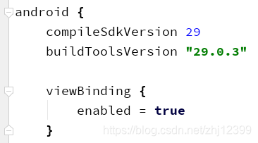
将XML ⽂件的名称转换为驼峰式⼤小写,并在末尾添加“Binding”⼀词,比如actvity_main.xml,对应的数据绑定类名为:ActivityMainBinding,布局⽂件中声明的所有有Id值的控件,在这⼀数据绑定类中都有同名属性(其实是Java中的公有字段)可用。没有设置Id的控件,在绑定类中就⽆法直接访问到了。
每个绑定类还包含⼀个root属性,引用相应布局⽂件的根控件。
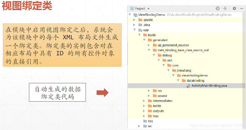

在Activity中的初始化:
启用了视图绑定特性之后,Activity中的初始化代码需要略作修改,如下图所示,关键就是实例化视图绑定对象的实例,并且将其根控件引用传给Activity。
有了binding对象,就能通过它的字段直接引用到相应的控件对象,比如binding.root,在本例中引用的是ConstraintLayout控件。
class MainActivity : AppCompatActivity() {
private val imageInfo = arrayOf(
Pair("flower.jpg", R.drawable.flower),
Pair("mushroom.jpg", R.drawable.mushroom),
Pair("lotus.jpg",R.drawable.lotus)
)
private var imageIndex = 0
private lateinit var binding: ActivityMainBinding
override fun onCreate(savedInstanceState: Bundle?) {
super.onCreate(savedInstanceState)
binding = ActivityMainBinding.inflate(layoutInflater)
setContentView(binding.root)
changeImage()
btnChangeImage.setOnClickListener {
changeImage()
}
}
private fun changeImage() {
tvInfo.text = imageInfo[imageIndex % imageInfo.size].first
imageView.setImageResource(imageInfo[imageIndex % imageInfo.size].second)
imageIndex++
}
}
Google为Android平台还提供了另⼀项“数据绑定库(DataBindingLibrary)”技术,这⼀技术比“视图绑定(View Binding)”功能要强⼤,但受限也较多两者之间的区别主要在于:
1.数据绑定库仅处理使用<layout> 代码创建的数据绑定布局。
2.使用数据绑定库可以在布局⽂件中插⼊“数据绑定表达式”,通过与Jetpack中的ViewModel和LiveData相互配合,能轻松地实现MVVM设计模式。
数据绑定
在build.gradle中启用数据绑定特性:
android {
compileSdkVersion 30
buildToolsVersion '30.0.3'
dataBinding {
enabled = true
}
...
}
创建数据:
//一个简单的数据类
data class MyName(
var name: String = "",
var nickname: String = ""
)
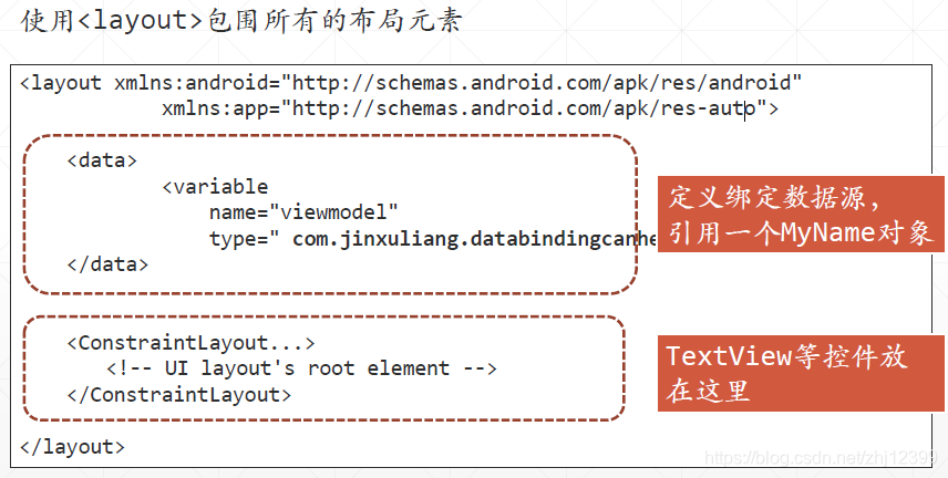
<?xml version="1.0" encoding="utf-8"?>
<layout xmlns:android="http://schemas.android.com/apk/res/android"
xmlns:app="http://schemas.android.com/apk/res-auto"
xmlns:tools="http://schemas.android.com/tools">
<data>
<variable
name="myName"
type="com.jinxuliang.databindingcanhelp.MyName" />
</data>
<androidx.constraintlayout.widget.ConstraintLayout
android:layout_width="match_parent"
android:layout_height="match_parent"
tools:context=".MainActivity">
<TextView
android:id="@+id/tvNickName"
android:layout_width="wrap_content"
android:layout_height="wrap_content"
android:layout_marginTop="32dp"
android:text="@={myName.nickname}"
android:textAppearance="@style/TextAppearance.AppCompat.Large"
app:layout_constraintEnd_toEndOf="parent"
app:layout_constraintStart_toStartOf="parent"
app:layout_constraintTop_toTopOf="parent"
tools:text="tvNickName" />
<TextView
android:id="@+id/tvName"
android:layout_width="wrap_content"
android:layout_height="wrap_content"
android:layout_marginTop="16dp"
android:text="@={myName.name}"
android:textAppearance="@style/TextAppearance.AppCompat.Display3"
android:textColor="#303F9F"
app:layout_constraintEnd_toEndOf="parent"
app:layout_constraintHorizontal_bias="0.5"
app:layout_constraintStart_toStartOf="parent"
app:layout_constraintTop_toBottomOf="@+id/tvNickName"
tools:text="tvName" />
</androidx.constraintlayout.widget.ConstraintLayout>
</layout>
于是在MainActivity中不再需要findById ,不再需要显式地调用setText 之类方法,所有数据显示参数均在布局文件中进行设定。
class MainActivity : AppCompatActivity() {
override fun onCreate(savedInstanceState: Bundle?) {
super.onCreate(savedInstanceState)
setContentView(R.layout.activity_main)
//获取数据绑定对象的引用
val binding: ActivityMainBinding = DataBindingUtil.setContentView(
this,
R.layout.activity_main
)
//设定绑定数据源
binding.myName = MyName("宋江", "及时雨")
}
}
数据绑定在提供数据的源对象和目标对象之间建立一种关联,目标对象可以显示和修改源对象的数据,两者自动维持同步。
在Android 开发中,数据绑定库是一种支持库,借助该库,开发者可以使用声明性格式(而非程序化地)将布局中的界面组件绑定到应用中的数据源。
数据绑定的使用步骤:
布局文件使用<layout>包裹之后,在Activity中定义以下属性:
private lateinit var binding: ActivityMainBinding
在onCreate() 方法中使用以下代码指定 Activity 与布局文件的关联:
binding = DataBindingUtil.setContentView(this, R.layout.activity_main)
现在,就可以通过binding对象的属性访问到各个控件了:
binding.tvInfo.text = " "
binding.btnTest.setOnClickListener{...}
数据绑定表达式
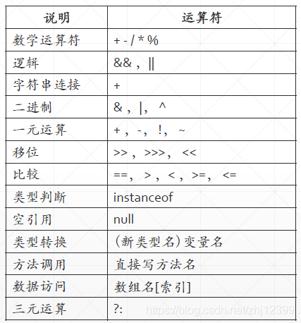
定义一些数据:
MyDataItem.kt
class MyDataItem (
val isMale:Boolean,
val showIcon:Boolean,
val map:Map<String,String>,
val cupSize:Int
)
string.xml
<resources>
<string name="app_name">DataBindingExpression</string>
<string name="gender">性别: %s</string>
<string-array name="sizes">
<item>中杯</item>
<item>大杯</item>
<item>特大杯</item>
</string-array>
</resources>
Activity.xml
导入了Android SDK 中的 View 类型,以便在数据绑定表达式中使用 View 类型的成员。
<?xml version="1.0" encoding="utf-8"?>
<layout
xmlns:android="http://schemas.android.com/apk/res/android"
xmlns:app="http://schemas.android.com/apk/res-auto"
xmlns:tools="http://schemas.android.com/tools">
<data>
<!--导入View类型,从而在数据绑定表达式中可以直接使用View -->
<import type="android.view.View"/>
<variable
name="dataObj"
type="com.jinxuliang.databindingexpression.MyDataItem" />
</data>
<LinearLayout
android:id="@+id/activity_binding_expr"
android:layout_width="match_parent"
android:layout_height="match_parent"
android:gravity="center_horizontal"
android:orientation="vertical"
android:paddingLeft="16dp"
android:paddingTop="16dp"
android:paddingRight="16dp"
android:paddingBottom="16dp">
<!-- 布尔值-->
<!-- 可以通过表达式切换图片显示与否-->
<ImageView
android:layout_width="96dp"
android:layout_height="96dp"
android:src="@drawable/ic_wallpaper"
android:visibility="@{dataObj.showIcon ? View.VISIBLE : View.INVISIBLE}" />
<!-- 访问数组 -->
<!-- 访问strings.xml 中定义的数组-->
<TextView
android:layout_width="match_parent"
android:layout_height="wrap_content"
android:padding="4dp"
android:text="@{@stringArray/sizes[dataObj.cupSize]}"
android:textAlignment="center"
android:textAppearance="@style/TextAppearance.AppCompat.Large"
tools:text="cupSize" />
<!-- 访问Map中的成员 -->
<TextView
android:layout_width="match_parent"
android:layout_height="wrap_content"
android:padding="4dp"
android:text="@{dataObj.map[`key`]}"
android:textAlignment="center"
android:textAppearance="@style/TextAppearance.AppCompat.Large"
tools:text="mapValue" />
<!-- 处理字符串参数 -->
<TextView
android:layout_width="match_parent"
android:layout_height="wrap_content"
android:padding="4dp"
android:text="@{dataObj.isMale ? @string/gender(`男`) : @string/gender(`女`)}"
android:textAlignment="center"
android:textAppearance="@style/TextAppearance.AppCompat.Large"
tools:text="@string/gender" />
</LinearLayout>
</layout>
实现MVVM设计模式
数据绑定库最有用的一个场景,并不在于它可以消除findViewById,而在于它能与Jetpack中的VieModel、LiveData相互配合,实现MVVM这种设计模式。
应用了MVVM设计模式的App中,Activity或Fragment需要显示的数据,放到ViewModel中。ViewModel中包容LiveData类型的属性。
Activity或Fragment的布局文件中为ViewModel定义变量,然后使用这个变量定义数据绑定表达式,设置特定UI控件的特定属性值。
这样一来,只要一更改ViewModel中LiveData属性值,UI就自动刷新而无需手工干涉。
设计ViewModel:
class CounterViewModel : ViewModel() {
var counter: MutableLiveData<Int> = MutableLiveData()
//递增计数器的值
fun increaseCounter() {
val currentValue = counter.value ?: 0
counter.value = currentValue + 1
}
}
添加一个Fragment,并设计布局文件:
注意如何由整数转换为字符串
注意如何绑定事件响应代码
<?xml version="1.0" encoding="utf-8"?>
<layout xmlns:android="http://schemas.android.com/apk/res/android"
xmlns:app="http://schemas.android.com/apk/res-auto"
xmlns:tools="http://schemas.android.com/tools">
<data>
<variable
name="counterVM"
type="com.jinxuliang.fragmentdatabinding.CounterViewModel" />
</data>
<androidx.constraintlayout.widget.ConstraintLayout
android:id="@+id/tvInfo"
android:layout_width="match_parent"
android:layout_height="match_parent">
<Button
android:id="@+id/btnClickMe"
android:layout_width="wrap_content"
android:layout_height="wrap_content"
android:layout_marginTop="32dp"
android:text="Click Me !"
android:onClick="@{()->counterVM.increaseCounter()}"
android:textAllCaps="false"
app:layout_constraintEnd_toEndOf="parent"
app:layout_constraintHorizontal_bias="0.5"
app:layout_constraintStart_toStartOf="parent"
app:layout_constraintTop_toTopOf="parent" />
<TextView
android:id="@+id/textView"
android:layout_width="wrap_content"
android:layout_height="wrap_content"
android:text="@{String.valueOf(counterVM.counter)}"
android:textAppearance="@style/TextAppearance.AppCompat.Display4"
app:layout_constraintBottom_toBottomOf="parent"
app:layout_constraintEnd_toEndOf="parent"
app:layout_constraintStart_toStartOf="parent"
app:layout_constraintTop_toBottomOf="@+id/btnClickMe" />
</androidx.constraintlayout.widget.ConstraintLayout>
</layout>
初始化Fragment
class CounterFragment : Fragment() {
companion object {
fun newInstance() = CounterFragment()
}
private lateinit var viewModel: CounterViewModel
private lateinit var binding: CounterFragmentBinding
override fun onCreateView(
inflater: LayoutInflater, container: ViewGroup?,
savedInstanceState: Bundle?
): View? {
//实例化数据绑定对象
binding = DataBindingUtil.inflate<CounterFragmentBinding>(
inflater,
R.layout.counter_fragment, container, false
)
//设定其生命周期感知对象引用
binding.lifecycleOwner = this
return binding.root
}
override fun onActivityCreated(savedInstanceState: Bundle?) {
super.onActivityCreated(savedInstanceState)
//实例化ViewModel对象
viewModel = ViewModelProvider(this)
.get(CounterViewModel::class.java)
//关联数据绑定对象与ViewModel对象
binding.counterVM = viewModel
}
}
这样的话,点击按钮,ViewModel中的counter属性值更改,又通过数据绑定机制自动刷新UI界面,同时屏幕旋转时计数值仍然能保存,完美!
声明
文章中所有截图,图片,代码等均来自于北京理工大学金旭亮老师,本人仅作笔记用途。
如需使用本文中任何资料请与教师联系。


 扫一扫
扫一扫


 408
408

 被折叠的 条评论
为什么被折叠?
被折叠的 条评论
为什么被折叠?
 到【灌水乐园】发言


