


一、定义解释
1、属性
box-shadow是css3的一个新属性
2、参数
box-shadow的四个参数
(1)h-shadow:必需、水平阴影的位置、允许负值
(2)v-shadow:必需、垂直阴影的位置、允许负值
(3)blur:可选、模糊距离【既然是距离肯定就不会是负值,下面的也是一个道理】
(4)color:可选、阴影的颜色
3、方向问题
h-shadow:正值,显示在左侧
负值,显示在右侧
0,显示原文字底部
v-shadow:正值,显示的在下侧
负值,显示的在上侧
0,显示在原文字底部
即:X轴正直向右,Y轴正直向下,0值在文字底部
二、实例说明
1、影子效果
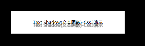

<div class="divTwo">
  <span>Text Shadow(文本阴影)-Css3演示</span>
</div>
.divTwo{
   width: 400px;
   height: 80px;
   background-color: white;
   margin-left: 50px;
   display: flex;
   align-items: center;
   justify-content: center;
 }
 .divTwo span{
   text-shadow:0px 10px 2px #333333; // 图一样式
   text-shadow:-10px -10px 1px #E8503F; // 图二样式
 }
2、发光效果
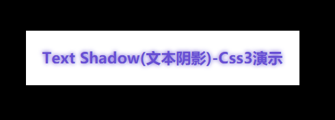
<div class="divTwo">
  <span>Text Shadow(文本阴影)-Css3演示</span>
</div>
.divTwo{
   width: 400px;
   height: 80px;
   background-color: white;
   margin-left: 50px;
   display: flex;
   align-items: center;
   justify-content: center;
 }
 .divTwo span{
   text-shadow:0px 0px 6px rgb(103, 78, 212);
   font-size: 22px;
   font-weight: bold;
   color: rgb(103, 78, 212);
 }
3、多色阴影效果
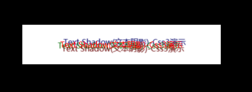
<div class="divTwo">
<span>Text Shadow(文本阴影)-Css3演示</span>
</div>
.divTwo{
width: 400px;
height: 80px;
background-color: white;
margin-left: 50px;
display: flex;
align-items: center;
justify-content: center;
}
.divTwo span{
text-shadow: 0.2em 0.5em 0.1em #600,-0.3em 0.1em 0.1em #060,0.4em -0.3em 0.1em #006;
color:red;
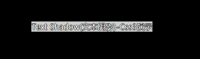
}4、火焰效果
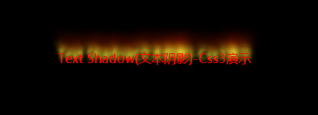
<div class="divTwo">
   <span>Text Shadow(文本阴影)-Css3演示</span>
 </div>
.divTwo{
  width: 400px;
  height: 80px;
  background-color: black;
  margin-left: 50px;
  display: flex;
  align-items: center;
  justify-content: center;
}
.divTwo span{
  text-shadow: 0 -5px 4px #FF3,2px -10px 6px #fd3,-2px -15px 9px #f80,2px -25px 15px #f20;
  color:red;
  font-size: 18px;
}
5、立体凸起效果
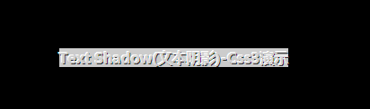
<div class="divTwo">
  <span>Text Shadow(文本阴影)-Css3演示</span>
</div>
.divTwo{
   width: 400px;
   height: 80px;
   background-color: black;
   margin-left: 50px;
   display: flex;
   align-items: center;
   justify-content: center;
}
.divTwo span{
   text-shadow: -1px -1px white,1px 1px #333;
   color:#D1D1D1;
   font-weight: bold;
   background: #CCC;
}
6、描边效果
 <div class="divTwo">
   <span>Text Shadow(文本阴影)-Css3演示</span>
 </div>
.divTwo{
   width: 400px;
   height: 80px;
   background-color: black;
   margin-left: 50px;
   display: flex;
   align-items: center;
   justify-content: center;
 }
 .divTwo span{
   text-shadow: -1px 0 black,0 1px black,1px 0 black,0 -1px black;
   color:#ffffff;
   background: #CCC;
 }
借鉴地址
https://www.html.cn/tool/css3Preview/Box-Shadow.html
佚名:https://www.jb51.net/css/488398.html
w3school:https://www.w3school.com.cn/cssref/pr_text-shadow.asp


 2210
2210


 被折叠的 条评论
为什么被折叠?
被折叠的 条评论
为什么被折叠?
 到【灌水乐园】发言


