


一、前言:当代码遇见浪漫
最近沉迷于前端特效开发,突发奇想 —— 能不能用代码为喜欢的人打造一个充满回忆的互动网页?于是有了这个以 “lover” 为关键词的专属空间。它不仅是技术练习,更是用数字语言书写的 “情书”,融合了爱心动画、粒子特效、倒计时互动和回忆相册等元素。接下来,我将拆解这个网页的实现逻辑与浪漫细节,带你感受代码背后的心意。
样式展示;
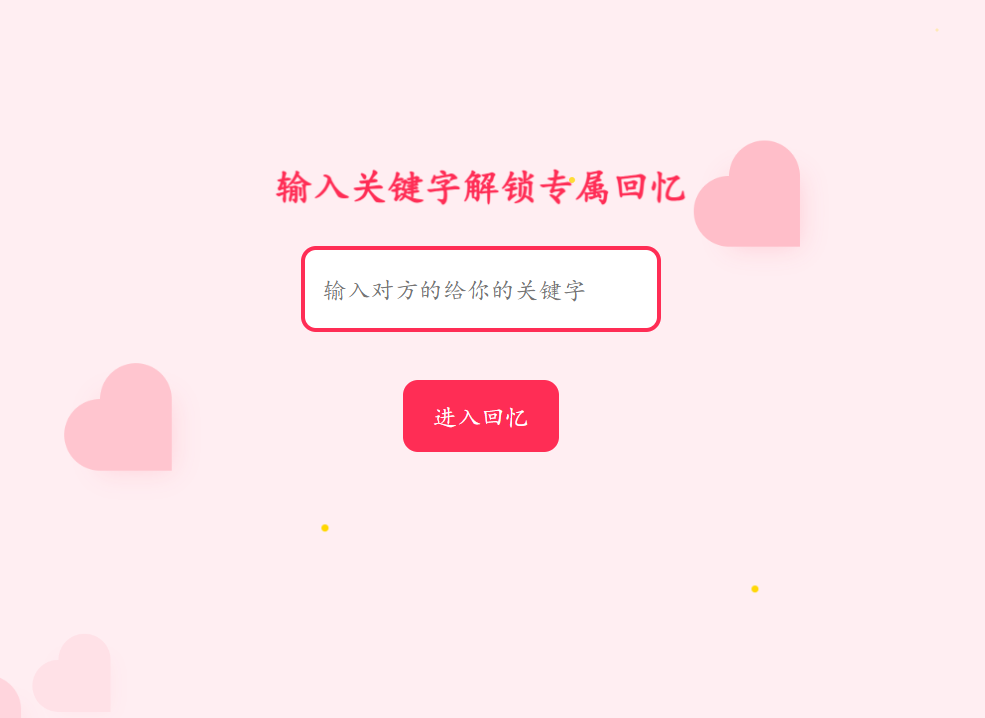
点击尝试 你和TA的专属回忆 关键字 : 关键字
刚进入网站
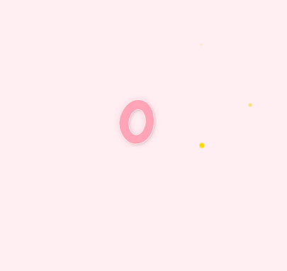
输入关键字后倒计时 5秒 (保证图片可以正常加载)
二、核心特效解析:让网页 “动” 起来
1. 跳动的爱心海洋:CSS3 动画的浪漫魔法
网页加载时,15 颗粉色爱心会随机分布在页面各处,伴随弹性缩放和位移动画,模拟 “心跳” 效果。核心代码通过 CSS 变量动态控制每个爱心的位置、延迟和持续时间:
.heart {
  --x: calc(Math.random() * 100vw); /* 随机X坐标 */
  --y: calc(Math.random() * 100vh); /* 随机Y坐标 */
  --delay: calc(Math.random() * 2s); /* 随机延迟 */
  --dur: calc(3s + Math.random() * 2s); /* 随机动画时长 */
  animation: heartPop var(--dur) ease-in-out infinite var(--delay);
}
动画关键帧(@keyframes heartPop)模拟了爱心从 “弹出→上升→消散” 的过程,配合box-shadow实现光影立体感,让每个爱心都像真实跳动的心脏。
2. 粒子与气泡:营造梦幻氛围
- 粒子尾迹:引入
particles.js库生成动态粒子,虽然代码中设置number.value: 0隐藏默认粒子,但可通过修改参数快速实现鼠标交互粒子效果。 - 漂浮的泡泡:15 个半透明泡泡从随机位置升起,通过 CSS 变量控制水平偏移和起始点:
css
.bubble {
  --x: calc(Math.random() * 100vw); /* 随机水平位置 */
  --y: calc(Math.random() * 100vh); /* 随机垂直起始点 */
  animation: bubbleFloat 8s linear infinite var(--delay);
}
动画通过transform模拟上升轨迹,opacity控制淡入淡出,营造轻盈感。
3. 倒计时与图片预加载:仪式感拉满
输入关键词 “ ” 后,触发 5 秒倒计时。每个数字伴随粒子散射动画(@keyframes showDigit),数字消失时粒子向四周飞散,增强视觉冲击。同时,后台预加载所有图片和 GIF,避免内容延迟:
function startCountdownAndPreload() {
  const allUrls = [...imageUrls, ...gifUrls];
  allUrls.forEach(url => new Image().src = url); // 预加载资源
  // 倒计时逻辑...
}
三、互动逻辑:从关键词到回忆相册
1. 关键词验证:专属入口
点击 “进入回忆” 按钮时,系统验证输入内容是否为 “杨若兮”。若错误,弹出提示;若正确,隐藏输入界面,启动倒计时:
document.getElementById('submit-btn').onclick = () => {
  const keyword = document.getElementById('keyword-input').value.trim();
  if (keyword !== '杨若兮') {
    alert('关键词不正确,再试一次哦~');
    return;
  }
  // 显示倒计时并预加载资源
};
2. 逐元素动画:回忆的渐进式展开
主内容区的文字和图片带有.animated-element类,通过 JavaScript 控制每个元素延迟显示,形成 “逐行揭开回忆” 的仪式感:
function showMainContent() {
  const elements = document.querySelectorAll('.animated-element');
  elements.forEach((el, index) => {
    setTimeout(() => el.classList.add('show'), index * 2000); // 每2秒显示一个元素
  });
}
淡入动画(opacity: 0 → 1)和向上位移(transform: translateY(20px) → 0)让内容呈现更具层次感。
四、细节优化:适配与美学平衡
1. 移动端适配:弹性布局与尺寸缩放
通过媒体查询(@media (max-width: 768px))调整元素尺寸和动画参数,例如将爱心大小从 40px 缩至 25px,倒计时容器宽度从 150px 缩至 100px,确保手机端视觉流畅。
2. 字体与配色:传递情感基调
- 字体:标题使用手写风格的
Pacifico字体,倒计时数字采用圆润的Chewy字体,增强亲切感。 - 配色:主色调为 #FF3B58(玫瑰红)和 #FFEEF2(淡粉背景),搭配 #FFD700(金色星星),营造甜蜜、梦幻氛围。
五、扩展思考:技术与情感的更多可能
这个网页只是前端创意的起点,未来可尝试:
- 动态数据加载:通过 API 读取云端相册,实现内容动态更新。
- 重力感应特效:利用手机陀螺仪实现元素随设备倾斜移动。
- 声音互动:添加点击音效或语音留言功能,丰富感官体验。
六、结语:代码亦是情书
有人用文字写诗,有人用画笔抒情,而程序员可以用代码构建专属空间。每个动画的 timing-function、每个元素的层级关系、每次点击的交互逻辑,都是藏在 0 和 1 中的心意。希望这个充满 “杨若兮” 回忆的网页,能让你感受到:技术不止于逻辑,更能承载浪漫与温度。
七.注意
通过下面这个面板就可以找到自己图片链接啦 如 http://你的公网ip/style/imags/文件名+后缀>
test.jpg (1080×1080) http://162.14.118.189/style/imags/test.jpg如这个链接 还可以音乐哦
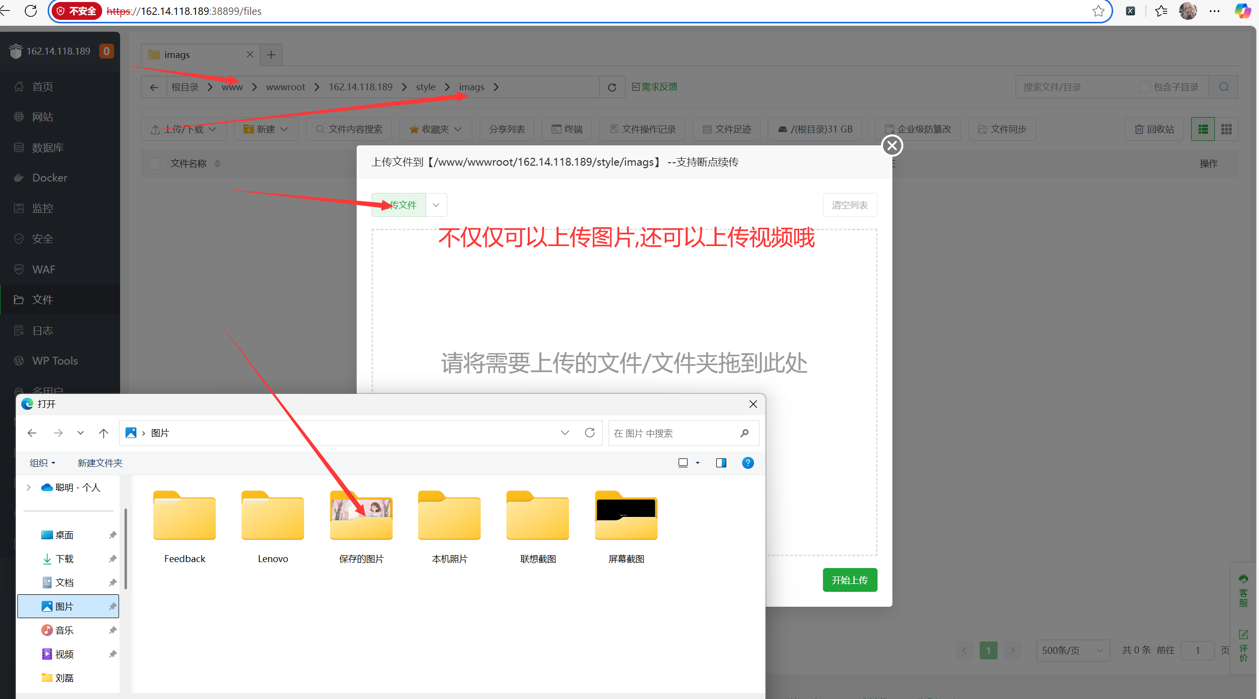
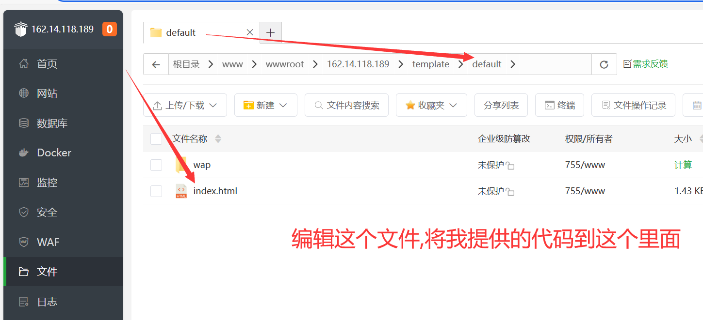
注意注意 若想手机端也可以看见 就要编辑 wap 里面的 index文件哦
你和TA的专属回忆 http://162.14.118.189/ 就可以通过ip地址直接访问到啦
八.代码展示
注意注意 里面有 需要更改的地方就是你和他的图片 以及对他的话
位置在 1.
<!-- 这里可以继续添加很多很多,关于你和他的图片
格式
<p class="cute-text animated-element content-item">更改地址1,输入你想说的话</p>
<img src="图片地址,可以观看关于我的网站 里面有教程<http://你的ip/style/imags/文件名+后缀>" class="animated-element content-item" />
-->
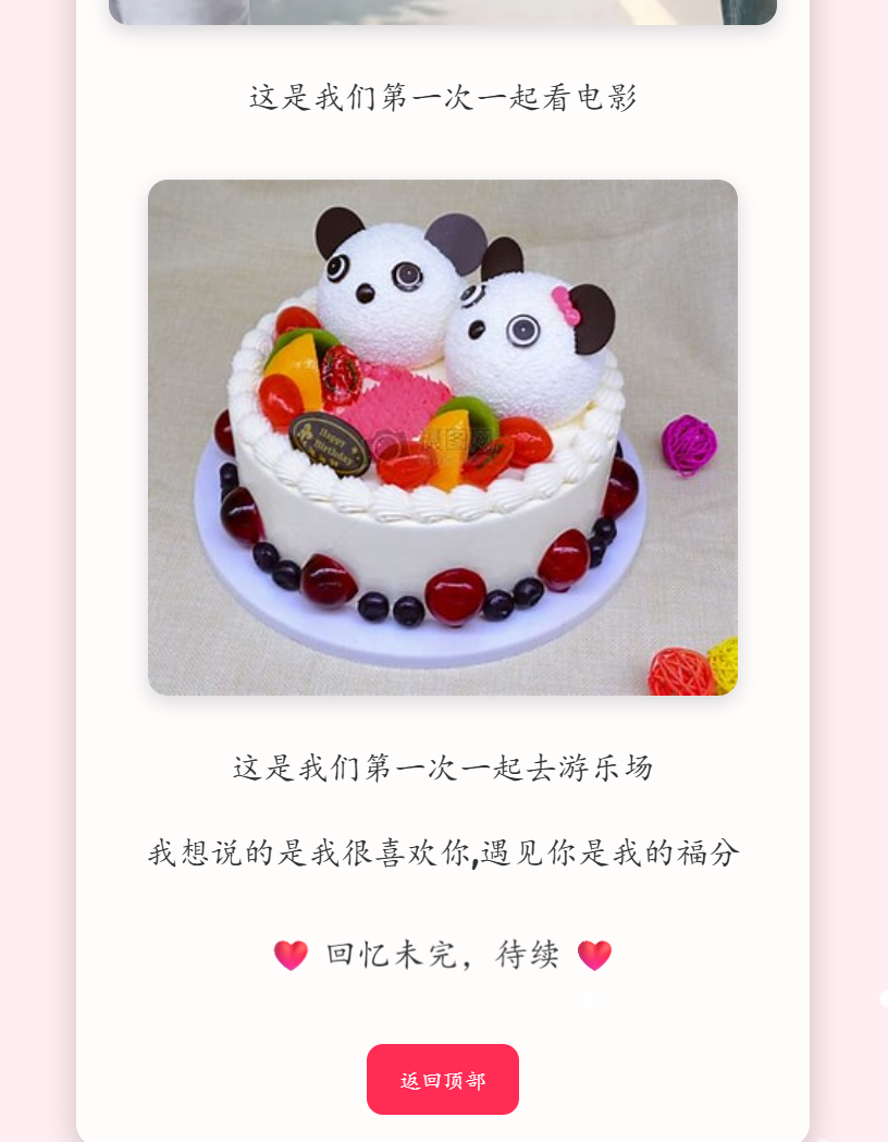
<p class="cute-text animated-element content-item">还记得我们第一次相遇吗?</p>
<img src="https://tse4-mm.cn.bing.net/th/id/OIP-C.13UIVQB0vPUB1uHriVlirwHaE8?w=244&h=180&c=7&r=0&o=7&cb=iwp2&dpr=1.5&pid=1.7&rm=3" class="animated-element content-item" />
<p class="cute-text animated-element content-item">夕阳西下与你一起等待夜幕降临</p>
<img src="https://tse4-mm.cn.bing.net/th/id/OIP-C.Jp6-VNAIoN7cqfMxmpTZGQHaE8?w=273&h=182&c=7&r=0&o=7&cb=iwp2&dpr=1.5&pid=1.7&rm=3"class="animated-element content-item" />
<p class="cute-text animated-element content-item">这是我们第一次牵手</p>
<img src="http://122.51.31.96/dsbyrx/img/wuyudewo.png"class="animated-element content-item" />
<p class="cute-text animated-element content-item">这是我们第一次一起去游乐场</p>
<p class="cute-text animated-element content-item">我想说的是我很喜欢你,遇见你是我的福分</p>
<!-- 在这里继续添加你的图片链接 下面也有一个需要添加 -->
// 图片预加载列表 第二个位置
const imageUrls = [
"https://tse4-mm.cn.bing.net/th/id/OIP-C.13UIVQB0vPUB1uHriVlirwHaE8?w=244&h=180&c=7&r=0&o=7&cb=iwp2&dpr=1.5&pid=1.7&rm=3",
"<http://你的ip/style/imags/文件名+后缀>"
// 更多图片链接... 上面如果添加图片后这里也需要
];<!DOCTYPE html>
<html lang="zh-CN">
<head>
<meta charset="UTF-8">
<meta name="viewport" content="width=device-width, initial-scale=1.0, maximum-scale=1.0, user-scalable=no">
<title>你和TA的专属回忆</title>
<!-- 字体 & 库 -->
<link href="https://fonts.googleapis.com/css2?family=Pacifico&display=swap" rel="stylesheet">
<link href="https://fonts.googleapis.com/css2?family=Chewy&display=swap" rel="stylesheet">
<script src="https://cdn.jsdelivr.net/npm/particles.js@2.0.0/particles.min.js"></script>
<style>
html,
body {
margin: 0;
padding: 0;
width: 100%;
height: 100%;
overflow: auto;
background: #ffeef2;
font-family: 'Pacifico', cursive;
position: relative;
scroll-behavior: smooth;
}
/* 输入模块容器,确保垂直排列且居中 */
.input-wrapper {
display: flex;
flex-direction: column;
align-items: center; /* 子元素水平居中 */
text-align: center;
}
/* 输入框与按钮间距(可调整) */
#keyword-input {
margin-bottom: 20px; /* 增加底部间距 */
}
/* 手机端适配(可选) */
@media (max-width: 768px) {
#submit-btn {
margin-top: 12px; /* 确保移动端间距一致 */
}
}
/* 垂直心形样式(优化视觉) */
.heart {
position: absolute;
width: 40px;
height: 40px;
background-color: #ff3b58;
transform: translate3d(var(--x), var(--y), 0) scale(0);
transform-origin: center;
animation: heartPop var(--dur) ease-in-out infinite var(--delay);
box-shadow: 0 0 15px rgba(255, 59, 88, 0.7);
transition: transform 0.3s ease;
z-index: 1;
}
.heart:hover {
transform: translate3d(var(--x), var(--y), 0) scale(1.8) !important;
filter: brightness(1.2);
cursor: pointer;
}
.heart::before,
.heart::after {
content: "";
position: absolute;
width: 40px;
height: 40px;
border-radius: 50%;
background-color: #ff3b58;
}
.heart::before {
left: -20px;
}
.heart::after {
top: -20px;
}
@keyframes heartPop {
0% {
transform: translate3d(var(--x), var(--y), 0) scale(0);
opacity: 0;
}
15% {
transform: translate3d(var(--x), var(--y), 0) scale(1.5);
opacity: 1;
}
50% {
transform: translate3d(var(--x), calc(var(--y) - 15px), 0) scale(1);
}
75% {
transform: translate3d(var(--x), calc(var(--y) - 45px), 0) scale(1.2);
}
100% {
transform: translate3d(var(--x), calc(var(--y) - 90px), 0) scale(0);
opacity: 0;
}
}
/* 粒子尾迹 */
#particles-js {
position: fixed;
top: 0;
left: 0;
width: 100%;
height: 100%;
pointer-events: none;
z-index: 0;
}
/* 输入 & 倒计时 */
.center {
display: flex;
align-items: center;
justify-content: center;
position: relative;
z-index: 1;
}
#input-screen,
#countdown-screen {
width: 100%;
height: 100%;
flex-direction: column;
}
input,
button {
font-family: 'Pacifico', cursive;
}
#keyword-input {
padding: 12px;
font-size: clamp(14px, 4vw, 16px);
border: 3px solid #ff2d55;
border-radius: 10px;
width: 80%;
max-width: 300px;
transition: all 0.3s ease;
}
#keyword-input:focus {
outline: none;
box-shadow: 0 0 15px rgba(255, 45, 85, 0.5);
transform: scale(1.03);
}
#submit-btn {
margin-top: 12px;
padding: 10px 20px;
background: #ff2d55;
color: #fff;
border: none;
border-radius: 10px;
font-size: clamp(14px, 4vw, 16px);
cursor: pointer;
transition: all 0.3s ease;
position: relative;
overflow: hidden;
}
#submit-btn:hover {
background: #ff6b81;
transform: translateY(-3px);
box-shadow: 0 6px 15px rgba(255, 45, 85, 0.4);
}
#submit-btn:active {
transform: translateY(1px);
box-shadow: 0 2px 8px rgba(255, 45, 85, 0.4);
}
#submit-btn::after {
content: '';
position: absolute;
top: 50%;
left: 50%;
width: 5px;
height: 5px;
background: rgba(255, 255, 255, 0.5);
opacity: 0;
border-radius: 100%;
transform: scale(1, 1) translate(-50%);
transform-origin: 50% 50%;
}
@keyframes ripple {
0% {
transform: scale(0, 0);
opacity: 0.5;
}
100% {
transform: scale(20, 20);
opacity: 0;
}
}
#submit-btn:focus::after {
animation: ripple 1s ease-out;
}
#countdown {
font-size: clamp(60px, 20vw, 100px);
color: #ff2d55;
animation: fade 1s ease-in-out infinite;
font-family: 'Chewy', cursive;
}
@keyframes fade {
0%,
100% {
opacity: 0;
}
50% {
opacity: 1;
}
}
/* 倒计时容器 */
#countdown-container {
position: relative;
width: 150px;
height: 150px;
}
.digit {
position: absolute;
top: 50%;
left: 50%;
transform: translate(-50%, -50%) scale(0);
font-size: clamp(60px, 20vw, 100px);
color: #ff2d55;
opacity: 0;
animation: showDigit 1s ease-out forwards;
font-family: 'Chewy', cursive;
text-shadow: 2px 2px 4px rgba(0, 0, 0, 0.3), 0 0 10px #ff99aa;
-webkit-text-stroke: 1px white;
}
.particle {
position: absolute;
width: 4px;
height: 4px;
background: #ff6b81;
border-radius: 50%;
opacity: 0;
animation: scatter 0.6s ease-out forwards, gather 0.6s ease-in 0.8s forwards;
}
@keyframes showDigit {
0% {
transform: translate(-50%, -50%) scale(0);
opacity: 0;
}
30% {
transform: translate(-50%, -50%) scale(1.5);
opacity: 1;
}
60% {
transform: translate(-50%, -50%) scale(1);
opacity: 1;
}
100% {
opacity: 0;
}
}
@keyframes scatter {
to {
opacity: 1;
transform: var(--tx) var(--ty) translate(-50%, -50%);
}
}
@keyframes gather {
to {
opacity: 0;
transform: translate(-50%, -50%) scale(0.5);
}
}
/* 主内容 */
#main-screen {
display: none;
flex-direction: column;
text-align: center;
padding: 20px;
overflow-y: auto;
position: relative;
z-index: 1;
}
.message {
background: rgba(255, 255, 255, 0.8);
padding: 20px;
margin: 15px auto;
max-width: 90%;
border-radius: 15px;
box-shadow: 0 6px 20px rgba(0, 0, 0, 0.2);
transform-origin: center;
transition: all 0.3s ease;
opacity: 0;
transform: translateY(20px);
}
.message.show {
opacity: 1;
transform: translateY(0);
}
.cute-text {
font-size: clamp(16px, 5vw, 20px);
color: #333;
line-height: 1.6;
}
.message img,
.message video {
max-width: 100%;
border-radius: 12px;
margin-top: 15px;
transition: all 0.3s ease;
transform-origin: center;
box-shadow: 0 4px 12px rgba(0, 0, 0, 0.15);
}
.message img:hover,
.message video:hover {
transform: scale(1.02);
box-shadow: 0 8px 20px rgba(0, 0, 0, 0.2);
}
.heartbeat {
animation: heartbeat 1.5s ease-in-out infinite;
}
@keyframes heartbeat {
0%,
100% {
transform: scale(1);
}
50% {
transform: scale(1.05);
}
}
.halo::before {
content: '';
position: absolute;
top: -25%;
left: -25%;
right: -25%;
bottom: -25%;
background: radial-gradient(circle, rgba(255, 255, 255, 0.8) 0%, transparent 70%);
filter: blur(30px);
z-index: -1;
}
/* 新增星星特效 */
.star {
position: absolute;
width: 4px;
height: 4px;
background-color: #ffd700;
border-radius: 50%;
animation: starTwinkle 3s ease-in-out infinite;
}
@keyframes starTwinkle {
0%,
100% {
opacity: 0.2;
transform: scale(0.5);
}
50% {
opacity: 1;
transform: scale(1.2);
}
}
/* 新增泡泡特效 */
.bubble {
position: absolute;
width: 10px;
height: 10px;
border-radius: 50%;
background: rgba(255, 255, 255, 0.8);
box-shadow: inset 0 0 5px rgba(255, 255, 255, 0.5);
animation: bubbleFloat 8s linear infinite;
}
@keyframes bubbleFloat {
0% {
transform: translate(var(--x), var(--y)) scale(0.5);
opacity: 0;
}
10% {
opacity: 1;
}
90% {
opacity: 1;
}
100% {
transform: translate(var(--x), calc(var(--y) - 250px)) scale(1.2);
opacity: 0;
}
}
/* 新增彩带特效 */
.ribbon {
position: absolute;
width: 5px;
height: 50px;
background: linear-gradient(to bottom, #ff6b81, #ffd700);
animation: ribbonFall 6s linear infinite;
}
@keyframes ribbonFall {
0% {
transform: translate(var(--x), -50px) rotate(var(--rotate)deg);
opacity: 0;
}
10% {
opacity: 1;
}
90% {
opacity: 1;
}
100% {
transform: translate(var(--x), calc(var(--y) + window.innerHeight)) rotate(var(--rotate)deg);
opacity: 0;
}
}
/* 图片淡入动画 */
@keyframes fadeIn {
from {
opacity: 0;
}
to {
opacity: 1;
}
}
/* 音乐播放器样式 */
.music-player {
position: fixed;
bottom: 20px;
right: 20px;
z-index: 2;
transition: all 0.3s ease;
}
.music-player:hover {
transform: scale(1.05);
}
/* 加载指示器 */
.loader {
border: 3px solid rgba(255, 255, 255, 0.3);
border-radius: 50%;
border-top: 3px solid #ff2d55;
width: 24px;
height: 24px;
animation: spin 1s linear infinite;
margin: 10px auto;
display: none;
}
@keyframes spin {
0% { transform: rotate(0deg); }
100% { transform: rotate(360deg); }
}
/* 手机端适配 */
@media (max-width: 768px) {
.heart {
width: 25px;
height: 25px;
}
.heart::before,
.heart::after {
width: 25px;
height: 25px;
}
.heart::before {
left: -12.5px;
}
.heart::after {
top: -12.5px;
}
@keyframes heartPop {
50% {
transform: translate3d(var(--x), calc(var(--y) - 10px), 0) scale(1);
}
75% {
transform: translate3d(var(--x), calc(var(--y) - 30px), 0) scale(1.2);
}
100% {
transform: translate3d(var(--x), calc(var(--y) - 60px), 0) scale(0);
opacity: 0;
}
}
#keyword-input {
padding: 8px 16px;
}
#submit-btn {
padding: 8px 16px;
font-size: 14px;
}
#countdown-container {
width: 100px;
height: 100px;
}
.digit {
font-size: 60px;
}
.particle {
width: 3px;
height: 3px;
}
.message {
padding: 15px;
}
.cute-text {
font-size: 16px;
}
.music-player {
bottom: 10px;
right: 10px;
}
}
/* 新增逐元素动画样式 */
.animated-element {
opacity: 0;
transform: translateY(20px);
transition: opacity 0.5s ease-out, transform 0.5s ease-out;
}
.animated-element.show {
opacity: 1;
transform: translateY(0);
}
</style>
</head>
<body>
<!-- 平面爱心 -->
<script>
for (let i = 0; i < 15; i++) {
const h = document.createElement('div');
h.className = 'heart';
const x = Math.random() * window.innerWidth;
const y = Math.random() * window.innerHeight;
h.style.setProperty('--x', x + 'px');
h.style.setProperty('--y', y + 'px');
h.style.setProperty('--delay', Math.random() * 2 + 's');
h.style.setProperty('--dur', 3 + Math.random() * 2 + 's');
document.body.appendChild(h);
}
</script>
<!-- 粒子尾迹 -->
<div id="particles-js"></div>
<!-- 输入 -->
<div id="input-screen" class="center">
<div class="input-wrapper"> <!-- 新增包裹容器 -->
<h2 class="heartbeat" style="color: #ff2d55; margin-bottom: 20px;">输入关键字解锁专属回忆</h2>
<input id="keyword-input" type="text" placeholder="输入对方的给你的关键字" />
<button id="submit-btn">进入回忆</button>
<div class="loader" id="loader"></div>
</div>
</div>
<!-- 倒计时 -->
<div id="countdown-screen" class="center">
<div id="countdown-container"></div>
</div>
<!-- 主内容 -->
<div id="main-screen" class="center">
<div class="message">
<!-- 这里可以继续添加很多很多,关于你和他的图片 上一个代码块写了模版 -->
<!-- 在这里继续添加你的图片链接 下面也有一个需要添加 -->
<div class="animated-element content-item" style="margin-top: 30px;">
<p class="cute-text heartbeat">❤️ 回忆未完,待续 ❤️</p>
<button id="back-to-top" style="padding: 10px 20px; margin-top: 20px; background: #ff2d55; color: white; border: none; border-radius: 10px; cursor: pointer; transition: all 0.3s ease;">
返回顶部
</button>
</div>
</div>
</div>
<!-- 新增星星特效 -->
<script>
const existingElements = [];
function isOverlapping(x, y, width, height) {
const newRect = { left: x, top: y, right: x + width, bottom: y + height };
for (const rect of existingElements) {
if (
newRect.left < rect.right &&
newRect.right > rect.left &&
newRect.top < rect.bottom &&
newRect.bottom > rect.top
) {
return true;
}
}
return false;
}
for (let i = 0; i < 25; i++) {
const star = document.createElement('div');
star.className = 'star';
let x, y;
do {
x = Math.random() * window.innerWidth;
y = Math.random() * window.innerHeight;
} while (isOverlapping(x, y, 4, 4));
star.style.left = x + 'px';
star.style.top = y + 'px';
star.style.animationDelay = Math.random() * 3 + 's';
document.body.appendChild(star);
existingElements.push({ left: x, top: y, right: x + 4, bottom: y + 4 });
}
</script>
<!-- 新增泡泡特效 -->
<script>
for (let i = 0; i < 15; i++) {
const bubble = document.createElement('div');
bubble.className = 'bubble';
let x, y;
do {
x = Math.random() * window.innerWidth;
y = Math.random() * window.innerHeight;
} while (isOverlapping(x, y, 10, 10));
bubble.style.setProperty('--x', x + 'px');
bubble.style.setProperty('--y', y + 'px');
bubble.style.animationDelay = Math.random() * 5 + 's';
document.body.appendChild(bubble);
existingElements.push({ left: x, top: y, right: x + 10, bottom: y + 10 });
}
</script>
<!-- 新增彩带特效 -->
<script>
for (let i = 0; i < 10; i++) {
const ribbon = document.createElement('div');
ribbon.className = 'ribbon';
let x;
do {
x = Math.random() * window.innerWidth;
} while (isOverlapping(x, -50, 5, 50));
const rotate = Math.random() * 360;
ribbon.style.setProperty('--x', x + 'px');
ribbon.style.setProperty('--rotate', rotate + 'deg');
ribbon.style.animationDelay = Math.random() * 4 + 's';
document.body.appendChild(ribbon);
existingElements.push({ left: x, top: -50, right: x + 5, bottom: 0 });
}
</script>
<!-- 音乐播放器 -->
<div class="music-player">
<!-- 这里输入你的音乐地址 -->
<audio id="music" src="https://122.51.31.96/dsbyrx/misc/xintiao.ogg" preload="auto" muted autoplay controls></audio>
</div>
<script>
// 获取音频元素
const audio = document.getElementById('music');
// 尝试播放音频
const tryPlay = async () => {
try {
await audio.play();
audio.muted = false;
document.removeEventListener('click', tryPlay);
document.removeEventListener('touchstart', tryPlay);
} catch (error) {
console.error('播放音频时出错:', error);
}
};
// 监听用户交互事件
document.addEventListener('click', tryPlay);
document.addEventListener('touchstart', tryPlay);
// 监听 canplaythrough 事件
audio.addEventListener('canplaythrough', () => {
tryPlay();
});
// 提交按钮逻辑
document.getElementById('submit-btn').onclick = () => {
const keywordInput = document.getElementById('keyword-input');
const keyword = keywordInput.value.trim();
if (keyword === '') {
keywordInput.classList.add('shake');
setTimeout(() => keywordInput.classList.remove('shake'), 500);
return;
}
if (keyword !== '关键字') { // 替换为实际的关键词
alert('关键词不正确,再试一次哦~');
keywordInput.value = '';
return;
}
// 显示加载指示器
document.getElementById('loader').style.display = 'block';
document.getElementById('submit-btn').disabled = true;
// 模拟加载延迟
setTimeout(() => {
document.getElementById('input-screen').style.display = 'none';
document.getElementById('loader').style.display = 'none';
startCountdownAndPreload();
}, 1000);
};
// 倒计时和预加载函数
function startCountdownAndPreload() {
const container = document.getElementById('countdown-container');
document.getElementById('countdown-screen').style.display = 'flex';
let c = 5;
// 图片预加载列表
const imageUrls = [
"https://tse4-mm.cn.bing.net/th/id/OIP-C.13UIVQB0vPUB1uHriVlirwHaE8?w=244&h=180&c=7&r=0&o=7&cb=iwp2&dpr=1.5&pid=1.7&rm=3",
"<http://你的ip/style/imags/文件名+后缀>"
// 更多图片链接... 上面如果添加图片后这里也需要
];
const preloadImages = (urls) => {
return Promise.all(urls.map(url => {
return new Promise((resolve) => {
const img = new Image();
img.onload = resolve;
img.onerror = resolve;
img.src = url;
});
}));
};
const next = () => {
if (c < 0) {
document.getElementById('countdown-screen').style.display = 'none';
preloadImages(imageUrls).then(() => {
// 立即显示主内容
showMainContent();
});
return;
}
container.innerHTML = '';
const d = document.createElement('div');
d.className = 'digit';
d.textContent = c;
container.appendChild(d);
for (let i = 0; i < 10; i++) {
const p = document.createElement('div');
p.className = 'particle';
const angle = Math.random() * 2 * Math.PI;
const dist = 50 + Math.random() * 25;
p.style.setProperty('--tx', `translateX(${Math.cos(angle) * dist}px)`);
p.style.setProperty('--ty', `translateY(${Math.sin(angle) * dist}px)`);
p.style.animationDelay = 0.2 + i * 0.02 + 's';
container.appendChild(p);
}
c--;
setTimeout(next, 1200);
};
next();
}
// 显示主内容(关键修改)
function showMainContent() {
const mainScreen = document.getElementById('main-screen');
mainScreen.style.display = 'flex';
// 立即显示主内容容器
const mainMessage = mainScreen.querySelector('.message');
mainMessage.classList.add('show');
// 获取所有内容项(文字和图片)
const contentItems = document.querySelectorAll('.content-item');
// 逐个显示内容项,每个间隔1.5秒
contentItems.forEach((item, index) => {
setTimeout(() => {
item.classList.add('show');
}, index * 2000); // 每个元素间隔1.5秒显示
});
}
// 添加返回顶部按钮事件
document.getElementById('back-to-top').addEventListener('click', () => {
window.scrollTo({
top: 0,
behavior: 'smooth'
});
});
// 添加抖动动画
const style = document.createElement('style');
style.textContent = `
@keyframes shake {
0%, 100% { transform: translateX(0); }
10%, 30%, 50%, 70%, 90% { transform: translateX(-5px); }
20%, 40%, 60%, 80% { transform: translateX(5px); }
}
.shake {
animation: shake 0.5s ease-in-out;
}
`;
document.head.appendChild(style);
</script>
</body>
</html>


 扫一扫
扫一扫


 被折叠的 条评论
为什么被折叠?
被折叠的 条评论
为什么被折叠?
 到【灌水乐园】发言


