


目录
一.小程序开发基础
-
注册微信小程序账号
-
完善小程序账号信息
-
项目成员和体验成员
-
小程序开发者ID
一个完整的开发者ID由小程序ID和小程序密钥组成
-
微信开发者工具
稳定版 预发布版 开发版
必须联网使用
-
创建小程序
1.了解文件和目录结构介绍
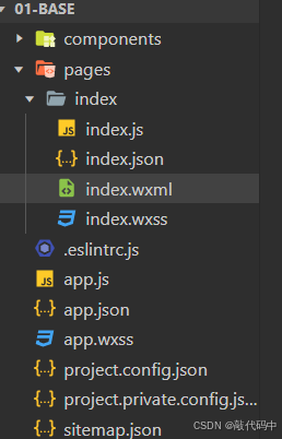
每个页面通常由四个文件组成,每个文件只对当前界面有效:
-
.js:页面逻辑
-
.wxml:页面结构
-
.wxss:页面样式
-
.json: 小页面配置
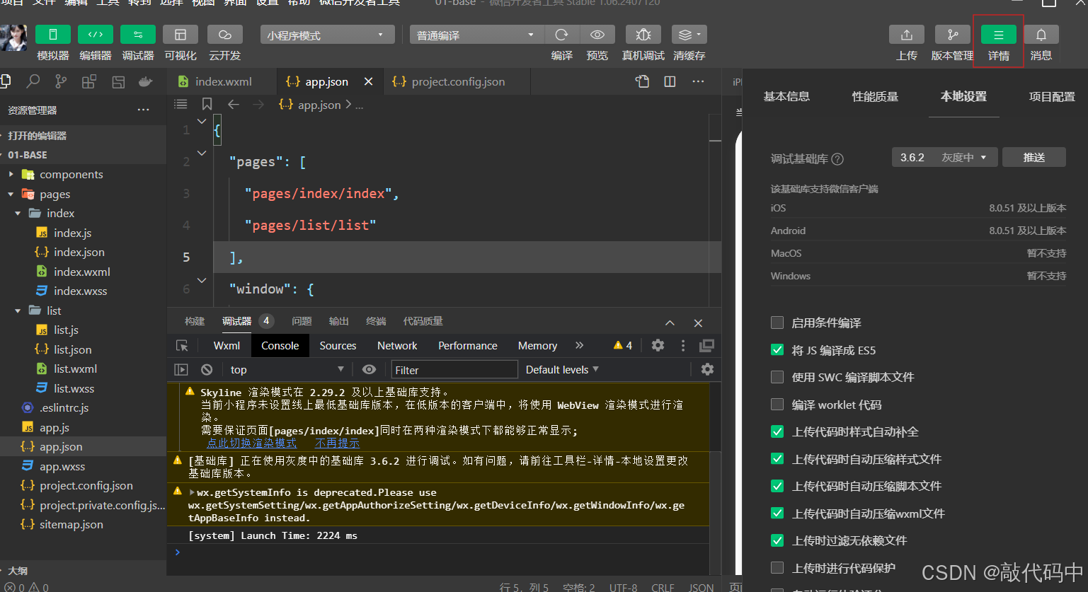
2.新建页面及调试基础库
有多种方法可以新建页面:
-
在pages文件夹中新建文件夹
-
在app.json文件“pages”中新建
调试基础库:
3.调试小程序代码
二.配置文件
1.配置文件介绍
小程序中常见的配置文件有以下几种:
-
app.json:小程序全局配置文件,用于配置小程序的一些全局属性和页面路由。 -
界面
.json:小程序页面配置文件,也称局部配置文件,用于配置当前页面的窗口样式,页面标题等。 -
project.config.json:小程序项目的配置文件,用于保存项目的一些配置信息和开发者的个人设置。 -
sitemap.json:配置小程序及其页面是否允许被微信索引,提高小程序在搜索引擎搜索到的概率。
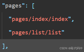
2.全局配置文件—pages配置
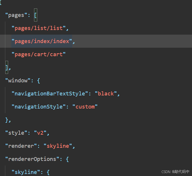
 "pages": [
     "pages/index/index",
     "pages/cate/cate",
     "pages/cart/cart",
     "pages/profile/profile",
     "pages/list/list"
],pages字段:用于指定小程序由那些页面组成,用于让小程序知道由那些页面组成以及页面定义在哪个目录,每一项对应一个页面的路径信息。
若没entryPagePath属性图片中小程序的首页为list页面(pages字段下第一项即为首页)
2.全局配置—window配置
window字段:用于设置小程序的状态栏,导航条,标题,窗口背景色。
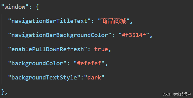
"window": {
     "navigationBarTitleText": "商品商城",
     "navigationBarBackgroundColor": "#f3514f",
     "enablePullDownRefresh": true,
     "backgroundColor": "#efefef",
     "backgroundTextStyle":"dark"
   },
注意:
-
将"renderer": "skyline"删除才能显示样式
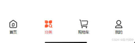
3.全局配置—tabbar配置
tabBar字段:定义小程序顶部,底部tab栏,用以实现页面之间的快速切换。
可以通过tabBar配置项指定tab栏的表现,以及tab切换时显示的对应页面。
 "tabBar": {
     "selectedColor": "#f3514f",
     "color": "#000000",
     "backgroundColor": "#ffffff",
     "borderStyle":"white",
     "position": "bottom",
     "list": [
       {
         "text": "首页",
         "pagePath": "pages/index/index",
         "iconPath": "/assets/tabbar/index.png",
         "selectedIconPath": "/assets/tabbar/index-active.png"
       },
       {
         "text": "分类",
         "pagePath": "pages/cate/cate",
         "iconPath": "/assets/tabbar/cate.png",
         "selectedIconPath": "/assets/tabbar/cate-active.png"
       },
       {
         "text": "购物车",
         "pagePath": "pages/cart/cart",
         "iconPath": "/assets/tabbar/cart.png",
         "selectedIconPath": "/assets/tabbar/cart-active.png"
       },
       {
         "text": "我的",
         "pagePath": "pages/profile/profile",
         "iconPath": "/assets/tabbar/my.png",
         "selectedIconPath": "/assets/tabbar/my-active.png"
       }
     ]
   },
borderStyle:底部tab栏横杠是否展示
color:点击之前字体(text)颜色
selectedColor:点击之后字体颜色
backgroundColor :tab栏颜色
position:tab栏位置
pagePath:点击之后跳转到
iconPath:点击之前图片
selectedIconPath:点击之后图片
注意:
tab按数组的顺序排序,list配置最少2个,最多5个tab。
4.页面配置
页面配置也称局部配置
局部配置会覆盖全局配置
navigationBarTitleText:页面名称
navigationBarBackgroundColor:导航条颜色
5.项目配置文件和配置Sass
project.config.json:项目配置文件,常用来进行配置公共的配置。
project.private.config.json:项目私有的配置,常用来配置个人的配置。
第一步:在project.config.json文件中找到setting属性加上useCompilerPlugins属性
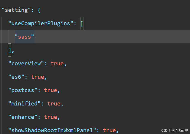
 "useCompilerPlugins": [
       "sass"
     ],
第二步:将原本的index.wxss文件名改为index.scss
注意:
-
project.private.config.json写到.gitignore避免版本管理的冲突。 -
与最终编译结果有关的设置必须设置到
project.config.json。
6.sitemap.json文件
sitemap.json文件:配置小程序以及其页面是否允许被微信索引,提高小程序在微信内部被用户搜索到的概率。
微信现已开放小程序内搜索,开发者可通过sitemap.json配置来设置小程序页面是否允许被微信索引。当开发者允许微信索引时,微信会通过爬虫的形式,为小程序的页面内容建立索引。当用户的搜索词条触发改索引时,小程序页面将可能展示在搜索结果中。
在app.json中
"sitemapLocation": "sitemap.json",
sitemapLocation属性:用于指定sitemap.json文件所在位置
sitemap.json文件默认(允许被微信索引):
 "rules": [{
     "action": "allow",
     "page": "*"
     }]
若有页面不允许被微信索引(只有index不允许被索引):
 "rules": [{
     "action": "disallow",
     "page": "pages/index/index"
     }]
若有页面不允许被微信索引(只有index允许被索引):
 "rules": [{
     "action": "allow",
     "page": "pages/index/index"
     }]
注意:
-
在开发过程中
sitemap.json文件一般是不需要改动的。 -
没有
sitemap.json则默认所有页面都能被索引。 -
{“action”:”allow”,”page”:”*”}是优先级最低的默认规则,未显示指明”disallow“的默认都被索引。
三.样式和组件
在开发web网站的时候:页面的结构由html进行编写,列如:经常会使用到div,p,span,img,a等标签,页面的样式由css进行编写,列如:经常会使用.class,#id,element等选择器。
但在小程序中不能使用HTML标签,也就没有DOM和BOM,CSS也仅仅支持部分选择器,
小程序提供了WXML进行页面结构编写,同时提供了WXSS进行页面的样式编写
WXLL提供了view,text,image,navigator等标签来构建页面结构,只不过在小程序中将标签称为组件
WXSS对CSS扩充和修改,新增了尺寸单位rpx,提供了全局的样式和局部样式,另外需要注意的是WXSS仅支持部分CSS选择器
1.样式
(1)尺寸单位rpx
不同型号设计宽度不同:单位px适用于不同型号展示页面效果不同
rpx:是小程序新增的自适应单位,它可以根据不同设备的屏幕宽度进行自适应缩放。
小程序规定如何型号手机:屏幕宽度为750px
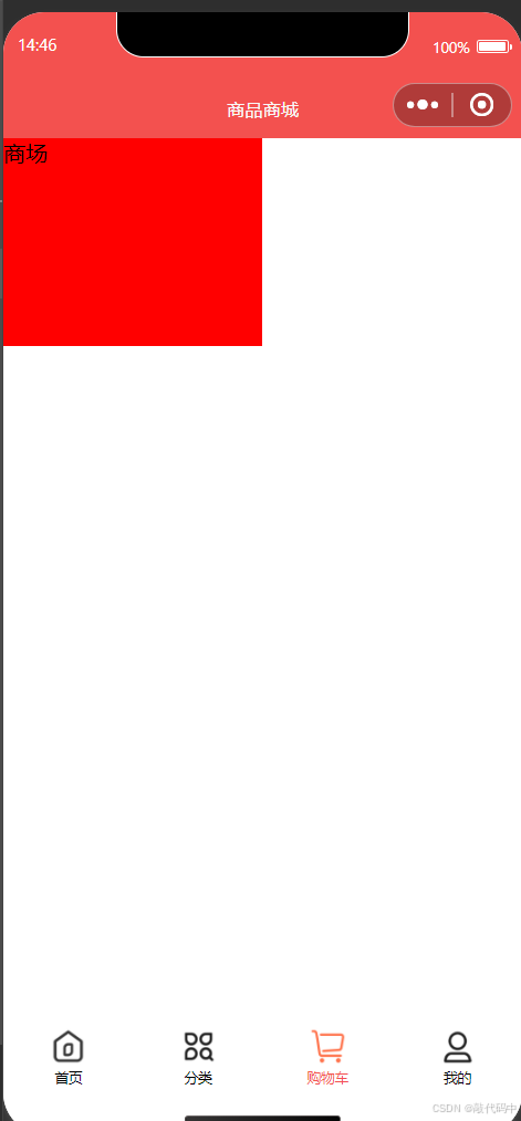
<!-- 需求:绘制一个盒子,让盒子的宽度占据屏幕的一半 -->
<!-- view 是小程序提供的组件,是容器组件,类似于div,也是一个块级元素 ,占据一行-->
<!-- 如果想实现需求,不能使用px,px是固定单位,不呢个实现自适应,需要使用小程序提供的rpx单位 -->
<!-- 微信小程序规定不管是什么型号的手机,宽度为750rpx -->
<!-- rpx单位能够实现自适应的 -->
<view class="box">商场</view>
.box{
width: 375rpx;
height: 300rpx;
background-color: red;
}
开发建议:
-
开发微信小程序时设计师可以用iPhone6作为视觉标准,IPhone6设计稿一般为750px
-
如果IPhone6作为视觉稿的标准量取多少px,直接写多少rpx即可,开发起来更方便,也能适配屏幕的宽度
(2)全局样式和局部样式
在进行网页开发时,我们常用创建gobal.css,base.css,或者reset.css作为全局样式文件进行重置颜色或者样式统一,然后每一个页面或者组件中写当前页面或组件的局部样式,小程序中也存在全局样式和局部样式。
2.组件
小程序常用的组件:
-
view组件 -
swiper和swiper-item组件 -
image组件 -
text组件 -
navigator组件 -
scroll-view组件 -
字体图标
(1)划分页面结构
将页面划分为4个区域:
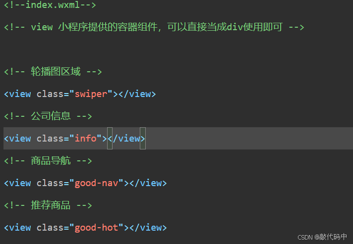
配置首页背景色:
<!--index.wxml-->
<!-- view 小程序提供的容器组件,可以直接当成div使用即可 -->
<!-- 轮播图区域 -->
<view class="swiper"></view>
<!-- 公司信息 -->
<view class="info"></view>
<!-- 商品导航 -->
<view class="good-nav"></view>
<!-- 推荐商品 -->
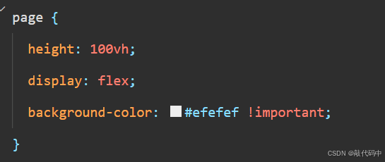
<view class="good-hot"></view> page {
height: 100vh;
display: flex;
background-color: #efefef !important;
}(2)轮播图区域绘制
在进行网页开发时,实现轮播图的时候,我们通常先使用HTML,CSS实现轮播图的结构样式,然后使用JS控制轮播图的效果,或者直接使用插件实现轮播图的功能,而在小程序中实现小程序功能则相对简单很多。
在小程序中,提供了swiper和swiper-intem组件实现轮播图:
swiper:滑块视图容器,其中只能放置swiper-item组件。
swiper-item:只可放置在swiper组件中,宽高自动设置为100%,代表swiper中的一项。
<!-- 轮播图区域 -->
 <view class="swiper">
 <!-- autoplay 自动轮播
  interval 自定义轮播间隔时间
  indicator-dots 显示面板指示点
  indicator-color指示点颜色
  indicator-active-color选中指示点颜色
  circular衔接滑动-->
   <swiper
     autoplay
     circular
     indicator-dots
     interval="2000"
     indicator-color="#fff"
     indicator-active-color="#f3514f">
         <swiper-item>
             1
         </swiper-item>
         <swiper-item>
             2
         </swiper-item>
         <swiper-item>
             3
         </swiper-item>
     </swiper>
 </view>
// 轮播图区域样式
.swiper{
swiper{
height: 360rpx;
background-color: skyblue;
swiper-item{
// &在scss中代表的是父选择器,引用的意思
// swiper-item:first-child
&:first-child{
background-color:cyan ;
}
&:last-child{
background-color: lightgreen;
}
}
}
}(3)轮播图图片添加
在小程序当中,如果需要渲染图片,需要使用image组件,常用的属性有4个:
-
src属性:图片资源地址。 -
mode:图片剪裁,缩放的模式。 -
show-menu-longpress:长按图片显示菜单。 -
lazy-load:图片懒添加。
注意事项:
-
image默认具有宽度和高度,宽是320px高度是240px。 -
image组件不给src属性设置图片地址,也占据宽和高。
swiper-item{
             image{
                 height: 100%;
                 width: 100%;
             };
<swiper-item>
<image src="/assets/banner/banner-1.jpg" mode=""/>
</swiper-item>
<swiper-item>
<image src="/assets/banner/banner-2.jpg" mode=""/>
</swiper-item>
<swiper-item>
<image src="/assets/banner/banner-3.jpg" mode=""/>
</swiper-item>
<!-- src:图片的资源地址 -->
<!-- mode:图片的剪裁和缩放模式 -->
<!-- show-menu-by-longpress:长按显示菜单,菜单中有转发给朋友,收藏,保存等功能 -->
<!-- lazy-load:懒加载,在滑动到一定距离(上下三屏)以后展示图片 -->(4)绘制公司信息区域
在小程序中,如果需要渲染文本,需要使用text组件,常用的属性有2个:
-
user-select:文本是否可选,用于长按选择文本。
-
space:显示连续空格。
注意事项:
-
除了文本节点以外的其他节点都无法长按选中。
-
text组件内只支持text嵌套。
-
演示:
 <!-- user-select:长按后选择文本 -->
 <!-- space:显示连续空格 -->
 <text user-select space="nbsp">商    品商场</text>
page {
display: block;
flex-direction: column;
height: 100vh;
background-color: #efefef !important;
box-sizing: border-box;
padding: 16rpx;
view{
// 为page第二个以及后面的view添加上边框
&:nth-child(n+2){
margin-top: 16rpx;
}
}
}
.info{
display: flex;
justify-content: space-between;
background-color: #ee7d6e;
padding: 16rpx;
border-radius: 10rpx;
// border-radius你设置元素的外边框圆角
font-size: 24rpx;
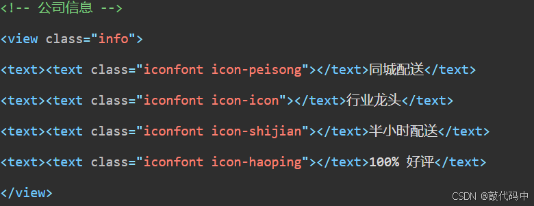
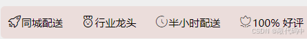
}<!-- 公司信息 -->
<view class="info">
<text>同城配送</text>
<text>行业龙头</text>
<text>半小时配送</text>
<text>100% 好评</text>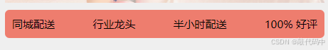

(5)商品导航区域
商品导航区域由5个商品导航组成
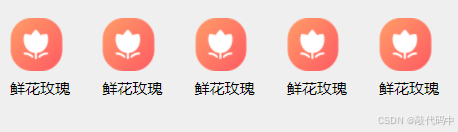
用view,image,text组件实现
 .good-nav{
     display: flex;
     justify-content: space-between;
     background-color: #efefef;
     padding: 5rpx 16rpx;
     // padding一次性设置元素所有四条边的内边距区域
     border-radius: 10rpx;
     view{
         display: flex;
         flex-direction: column;
         image{
             width: 85rpx;
             height: 85rpx;
         }
         text{
             font-size: 24rpx;
             margin-top: 12rpx;
         }
     }
 }
<!-- 商品导航 -->
<view class="good-nav">
<view>
<image src="/assets/images/cate-1.png" mode=""/>
<text>鲜花玫瑰</text>
</view>
<view>
<image src="/assets/images/cate-1.png" mode=""/>
<text>鲜花玫瑰</text>
</view>
<view>
<image src="/assets/images/cate-1.png" mode=""/>
<text>鲜花玫瑰</text>
</view>
<view>
<image src="/assets/images/cate-1.png" mode=""/>
<text>鲜花玫瑰</text>
</view>
<view>
<image src="/assets/images/cate-1.png" mode=""/>
<text>鲜花玫瑰</text>
</view>
</view>(6)跳转到商品列表
在小程序中,如果需要进行跳转,需要使用navigation组件,常用属性有2个:
-
url:当前小程序内的跳转链接。 -
open-type:跳转方式-
navigate:保留当前页面,跳转到应用内的那个页面,但是不能跳到tabbar页面。 -
redirect:关闭当前页面,跳转到应用内的那个页面,但是不能跳到tabbar页面。 -
switchTab:跳转到tabBar页面,并关闭其他所有非tabBar页面。 -
raLaunch:关闭所有页面,打开到应用内的那个页面。 -
navigateBack:关闭当前页面,放回上一页面或多级页面。
-
注意事项:
-
路径后可以带参数。参数与路径之间使用?分隔,参数键与参数值用=相连,不同参数用&分隔
列如:/list?id=10&name=hua,在
onLoad(options)生命周期函数中获取传递的数据 -
open-type=“switchTab”时不支持传参。
常见跳转方式:
<!-- 在进行页面跳转时 需要在路径前加/斜线-->
<navigator url="/pages/list/list">到商品列表页面</navigator>
<!-- navigator:只能跳转到非TabBar页面,不能跳转到TabBar页面,保留上一级页面 -->
<navigator url="/pages/list/list" open-type="navigate">到商品列表页面</navigator>
<navigator url="/pages/cate/cate">到商品分类页面</navigator>
<!-- redirect:只能跳转到非TabBar页面,不能跳转到TabBar页面,关闭上一级页面 -->
<navigator url="/pages/list/list" open-type="redirect">到商品列表页面</navigator>
<!-- switchTab:只能跳转到TabBar页面,不能跳转到非TabBar页面,关闭所有页面 -->
<navigator url="/pages/list/list" open-type="switchTab">到商品列表页面</navigator>
<navigator url="/pages/cate/cate" open-type="switchTab">到商品分类页面</navigator>
<!-- relauch:关闭所有页面,然后打开小程序中某一个页面 -->
<navigator url="/pages/list/list" open-type="reLaunch">到商品列表页面</navigator>
<navigator url="/pages/cate/cate" open-type="reLaunch">到商品分类页面</navigator>在list.wxml文件中:
<!-- navigateBack:返回上一页或者前几页,默认只能返回上一页 -->
<!-- delta:返回的层级,默认为1,如果想返回几级,就写几 -->
<navigator open-type="navigateBack">返回上一页(1)</navigator>
<navigator open-type="navigateBack" delta="1">返回上一页(1)</navigator>传参事列:
 <navigator url="/pages/list/list?id=10&num=hua">到商品列表页面</navigator>
 <navigator url="/pages/cate/cate?id=10&num=hua" open-type="switchTab">到商品分类页面</navigator>
功能实现:
<view>
     <navigator url="/pages/list/list">
       <image src="/assets/images/cate-1.png" mode=""/>
         <text>鲜花玫瑰</text>
     </navigator>
     </view>
     <view>
         <navigator url="/pages/list/list">
       <image src="/assets/images/cate-1.png" mode=""/>
         <text>鲜花玫瑰</text>
     </navigator>
     </view>
     <view>
         <navigator url="/pages/list/list">
       <image src="/assets/images/cate-1.png" mode=""/>
         <text>鲜花玫瑰</text>
     </navigator>
     </view>
     <view>
         <navigator url="/pages/list/list">
       <image src="/assets/images/cate-1.png" mode=""/>
         <text>鲜花玫瑰</text>
     </navigator>
     </view>
     <view>
         <navigator url="/pages/list/list">
       <image src="/assets/images/cate-1.png" mode=""/>
         <text>鲜花玫瑰</text>
     </navigator>
     </view>
</view>写完跳转功能后页面会出现格式不齐,在修改一下index.scss弹性布局。将原来的布局套上navigator。
 navigator{
             display: flex;
         flex-direction: column;
         }
(7)推荐商品区域
在小程序中想实现内容滚动,需要使用scroll-view组件
scroll-view:可滚动视图区域,适用于需要滚动展示内容的场景,用于在小程序中实现类似于网页中的滚动条效果,用户可以通过手指滑动或者点击滚动条来滚动内容。
-
scroll-x:允许横向滚动
-
scroll-y:允许纵向滚动
基础:
 <scroll-view class="scroll-x" scroll-x>
     <view>1</view>
     <view>2</view>
     <view>3</view>
 </scroll-view>
 <scroll-view class="scroll-y" scroll-y>
     <view>1</view>
     <view>2</view>
     <view>3</view>
 </scroll-view>
.scroll-x{
width: 100%;
// nowrap阻止源码中的文本换行
white-space: nowrap;
background-color: skyblue;
view{
display: inline-block;
width: 300rpx;
height: 80rpx;
&:last-child{
background-color: lightgreen;
}
&:first-child{
background-color: lightpink;
}
}
}
.scroll-y{
height: 400rpx;
background-color: lightseagreen;
margin-top: 10rpx;
view{
height: 400rpx;
&:last-child{
background-color: rgb(45, 98, 167);
}
&:first-child{
background-color: lightpink;
}
}
}
功能实现:
<view class="good-nav">
<view>
<navigator url="/pages/list/list">
<image src="/assets/images/cate-1.png" mode=""/>
<text>鲜花玫瑰</text>
</navigator>
</view>
<view>
<navigator url="/pages/list/list">
<image src="/assets/images/cate-1.png" mode=""/>
<text>鲜花玫瑰</text>
</navigator>
</view>
<view>
<navigator url="/pages/list/list">
<image src="/assets/images/cate-1.png" mode=""/>
<text>鲜花玫瑰</text>
</navigator>
</view>
<view>
<navigator url="/pages/list/list">
<image src="/assets/images/cate-1.png" mode=""/>
<text>鲜花玫瑰</text>
</navigator>
</view>
<view>
<navigator url="/pages/list/list">
<image src="/assets/images/cate-1.png" mode=""/>
<text>鲜花玫瑰</text>
</navigator>
</view>
</view>
<!-- 推荐商品 -->
<view class="good-hot">
<scroll-view class="scroll-x" scroll-x>
<view>
<view class="good-item">
<image src="/assets/floor/1.jpg" mode=""/>
<text>粉玫瑰</text>
<text>99</text>
</view>
</view>
<view>
<view class="good-item">
<image src="/assets/floor/3.jpg" mode=""/>
<text>粉玫瑰</text>
<text>99</text>
</view>
</view>
<view>
<view class="good-item">
<image src="/assets/floor/4.jpg" mode=""/>
<text>粉玫瑰</text>
<text>99</text>
</view>
</view>
<view>
<view class="good-item">
<image src="/assets/floor/5.jpg" mode=""/>
<text>粉玫瑰</text>
<text>99</text>
</view>
</view>
<view>
<view class="good-item">
<image src="/assets/floor/2.jpg" mode=""/>
<text>粉玫瑰</text>
<text>99</text>
</view>
</view>
</scroll-view>
</view>
// 推荐商品区域
 .good-hot{
     background-color: #efefef;
     border-radius: 10rpx;
     font-size: 24rpx;
     margin-top: 26rpx;
  .scroll-x{  width: 100%;
      white-space: nowrap;
      view{
          display: inline-block;
          width: 320rpx;
          height: 420rpx;
          margin-right: 16rpx;
          .good-item{
              display: flex;
              flex-direction: column;
              justify-content:space-between;
              text{
                 //  第一个text加粗
                  &:nth-of-type(1){
                      font-weight: bold;
                  }
                 }
             }
          image{
              width: 100%;
              height: 320rpx;
          }
          &:last-child{
             margin-right: auto;
         }
      }
  }
}
(8)字体图标的使用
小程序中的字体图标使用方式与web相似
iconfont平台
1.在平台上获取代码
在搜索框搜索需要的图标
选中图标点击添加入库
点击后右上角购出现物车图标上提示点开
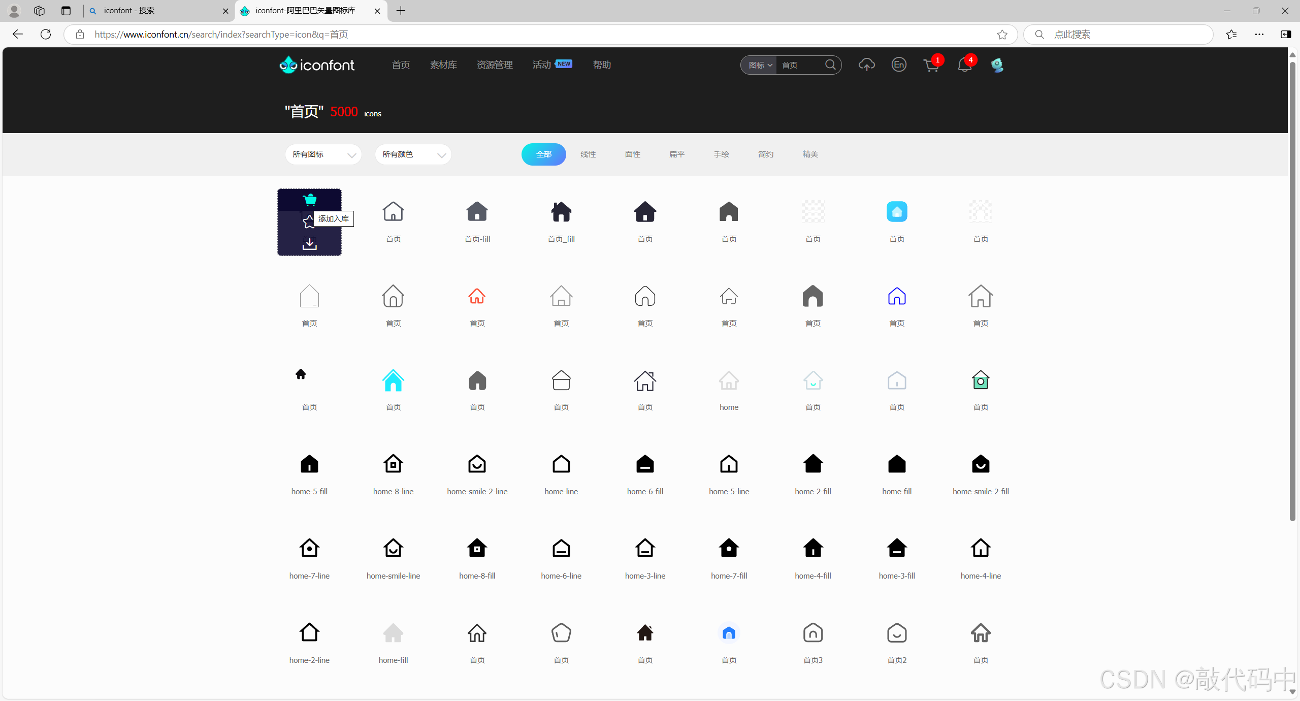
点击添加到项目(没有项目新建一个即可)
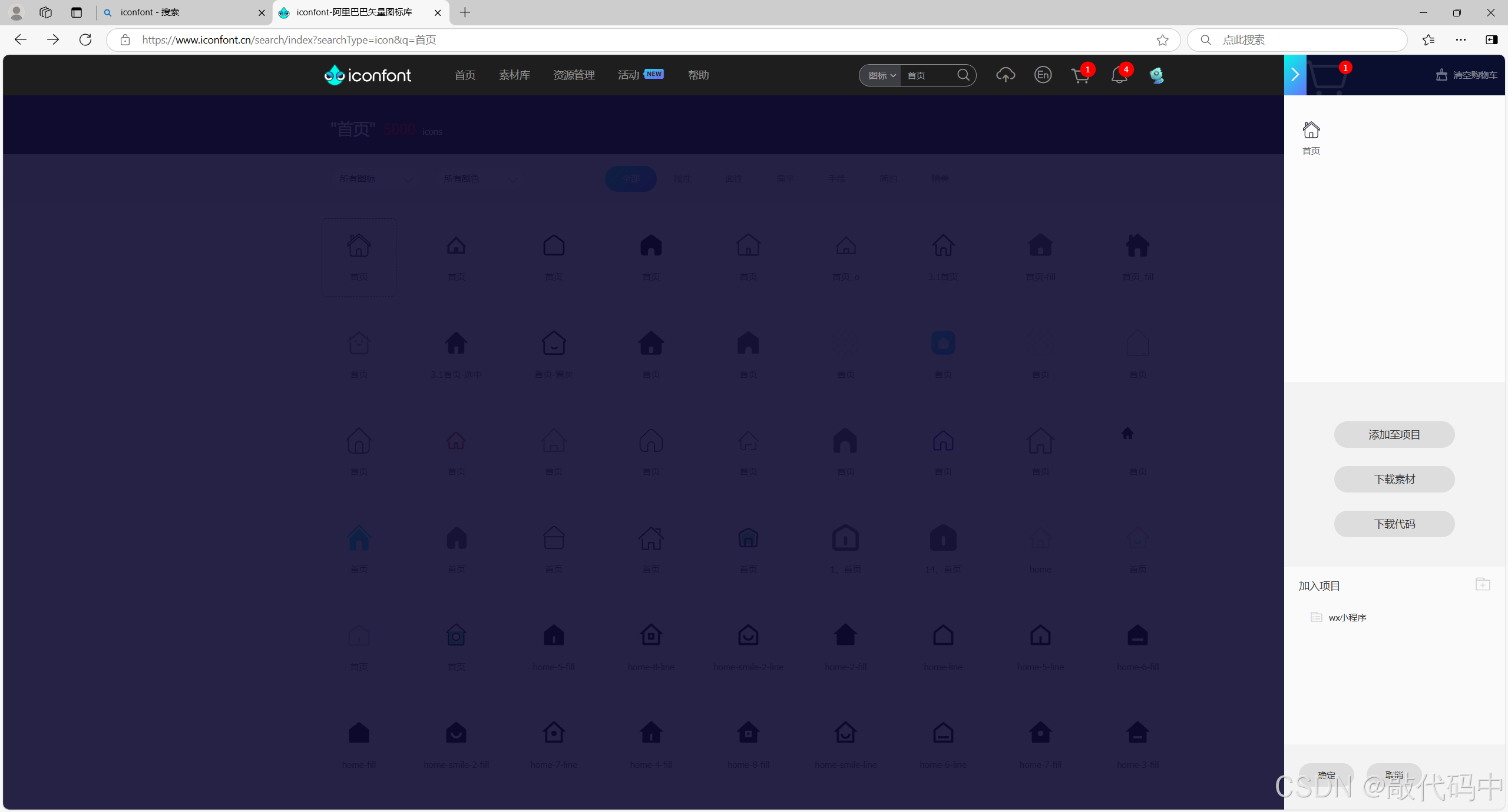
这里是点击了wx小程序项目
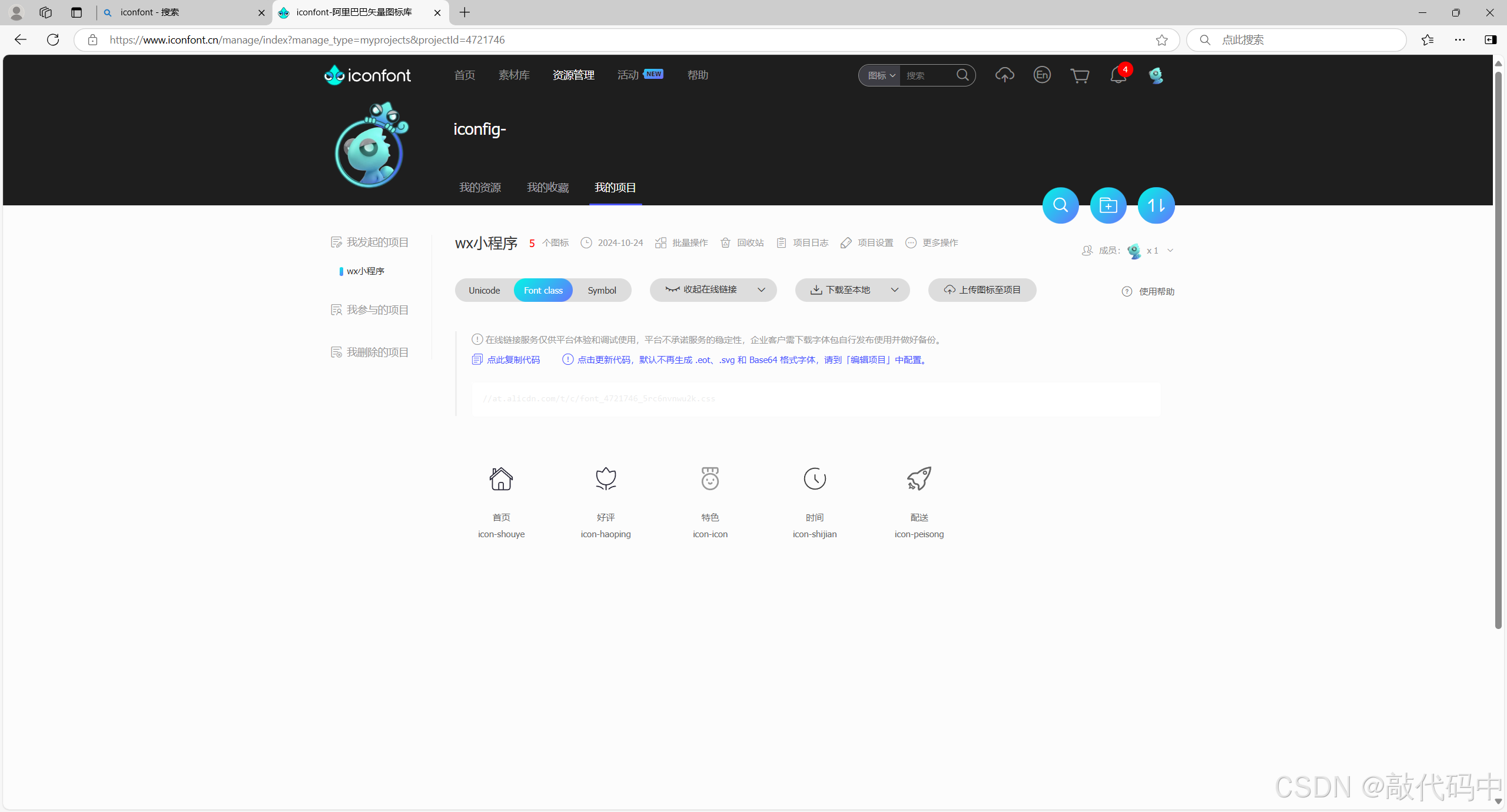
点击更新代码
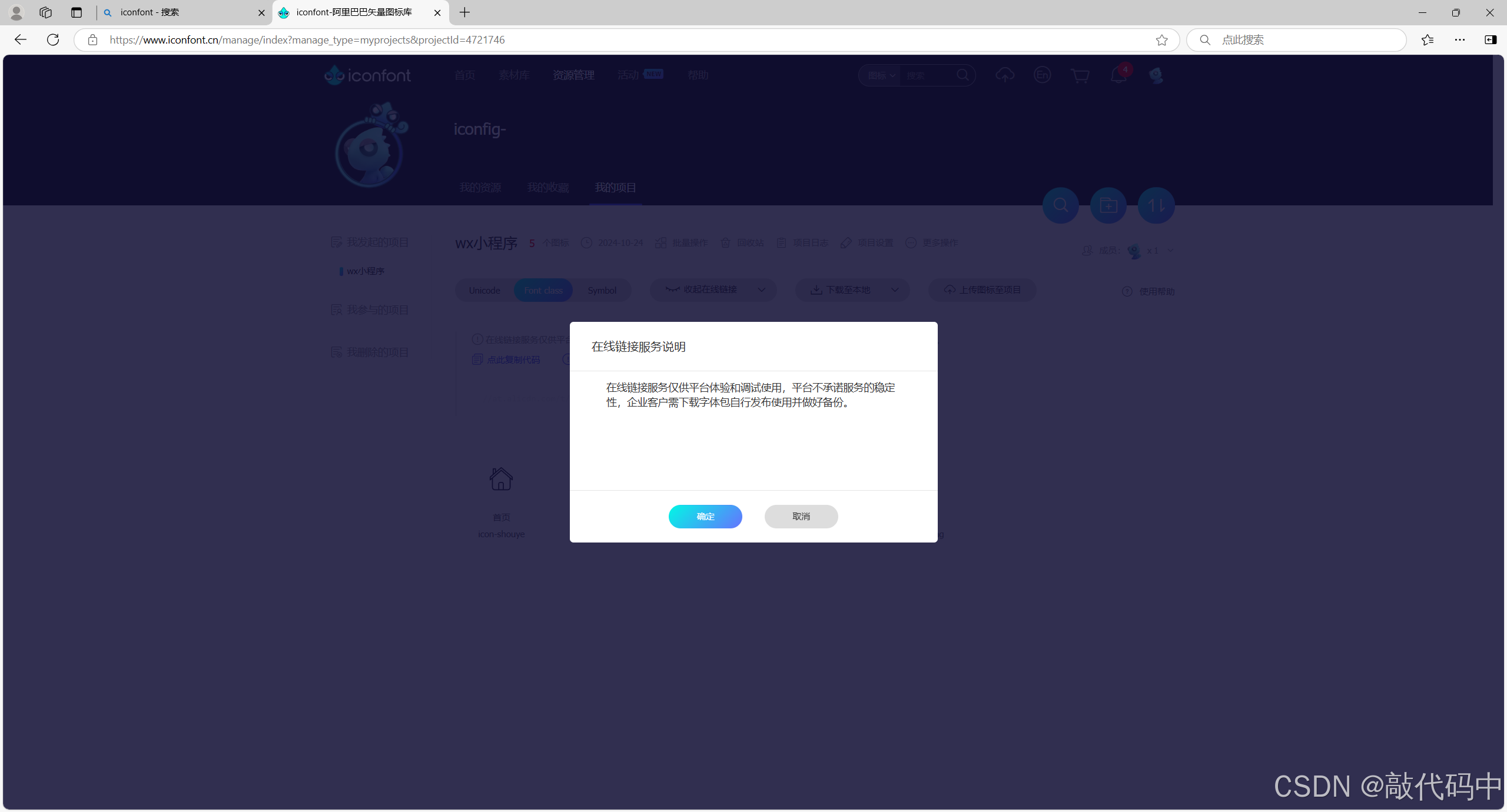
点击确认
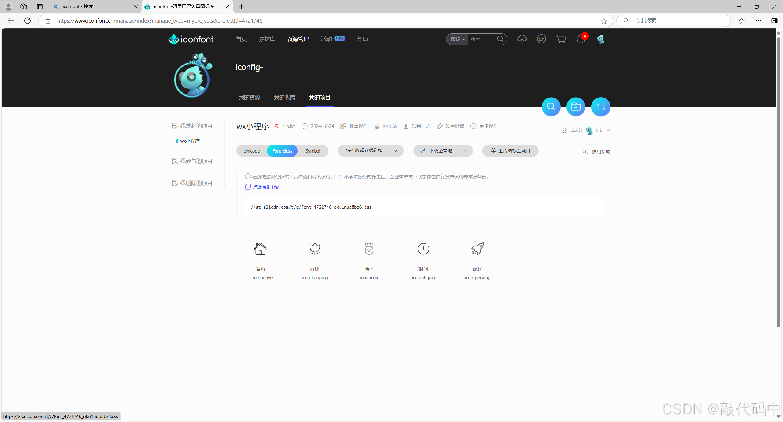
点击生成的//….css,得到代码
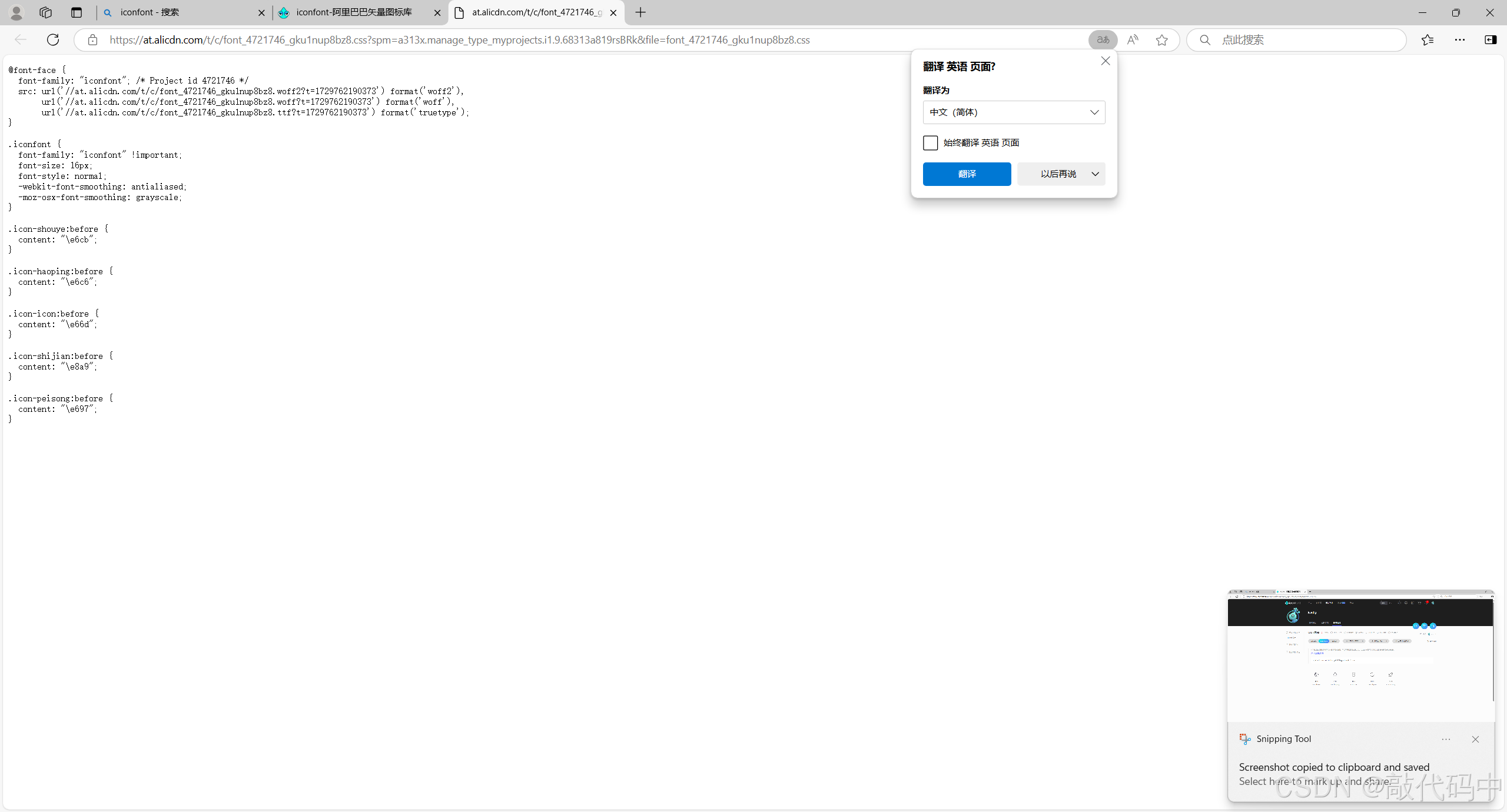
2.将代码放入项目中
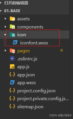
新建文件夹和文件:在案例中放入了icon/iconfont.wxss文件中
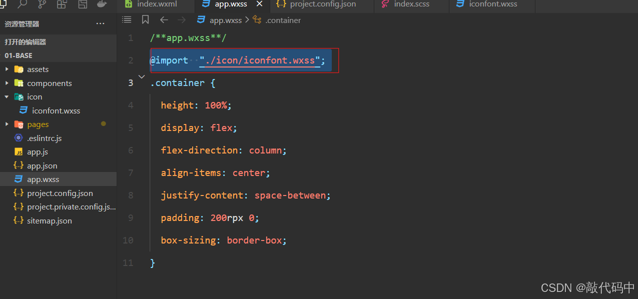
在app.wxss中添加@import 用于图标使用
3.使用图标
class=“inconfont icon-haoping”中icon-haoping 为图标的名称 在保存下来的代码中(iconfont.wxss)可以找到每个图标对应的名称
效果展示:
(9)背景图片的使用
在微信小程序中,我们可以使用background-image属性来设置元素的背景图片。
注意事项:
小程序的background-image不支持本地路径!需要使用网络图片,或者base64,或者使用<image/>组件。
.bg-image{
	height: 400rpx;
	// 小程序背景图的地址不能写本地路径,不能实现
	// background-image: url(../../assets/banner/banner-1.jpg);

	// 可以使用网络途径替换本地途径,可以实现
	// background-image: url(http://8.131.91.46:6677/bgimage.png);

	// 也可以将图片转换成base64的格式,然后使用(不建议)
	background-image: url();
}
<view class="bg-image"></view>四.事件系统
1.事件绑定和事件对象
小程序中绑定方式与网页开发中绑定方式几乎是一致的,只不过在小程序中不能通过on的方式绑定事件,也没有click等事件,小程序中绑定事件使用bind方法,click事件也需要使用tap事件来进行代替,绑定事件的方法有两种:
-
bind事件名,bind后面需要跟上冒号,冒号后跟上事件名,例如
:<view bind:tab='fnName'></view> -
bind事件名,bind后面直接跟上事件名,例如:
<view bindtap='fnName'></view>
事件处理函数需要写到.js文件中,在.js文件中需要条用小程序提供的Page方法来注册小程序的页面,我们可以直接在Page方法中创建事件处理函数。
实例:
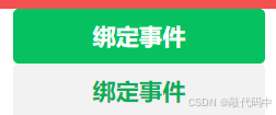
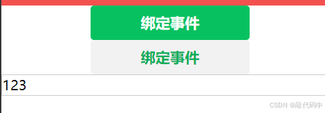
<!-- 第一种绑定事件方式:bind:事件名 -->
<!-- <button type="primary" size="mini" bind:tap="handler">绑定事件</button> -->
<button type="primary" bind:tap="handler">绑定事件</button>
<!-- 第一种绑定事件方式:bind:事件名 -->
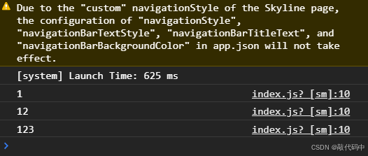
<button type="default" bindtap="handler">绑定事件</button> handler(event){
// console.log('事件触发了...')
console.log(event)
},
点击按钮,可在调试器上看见事件已被触发(打印)
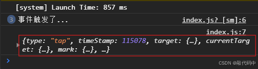
console.log(event)获取一个对象:记录了事件触发时的相关信息
获取用户在输入框输入的值:
<!-- 在小程序中input默认没有边框,需要自己设置边框 添加样式-->
<input type="text" bindinput="getInputVal"/>
getInputVal(event){
console.log(event)
}input{
border: 1px solid #ccc;
}
点击调试器上打印的最后一个对象:
detail中的value属性显示了用户的输入值
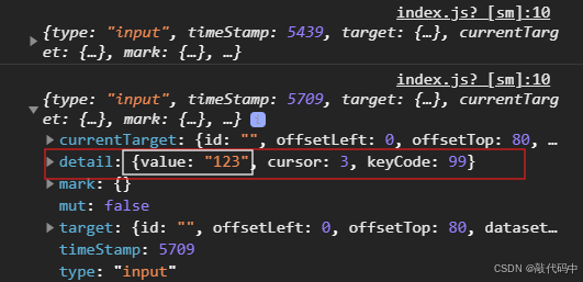
若想直接获取用户输入值可:
getInputVal(event){
		console.log(event.detail.value)
	}
2.事件分类和阻止事件冒泡
事件分为冒泡事件,非冒泡事件。
冒泡事件:当一个组件的事件被触发后,改事件会向父节点传递
非冒泡事件:当一个组件的事件被触发后,改事件不会向父节点传递
使用bind绑定的事件,会触发事件冒泡,如果想阻止事件冒泡,可以使用catch来绑定事件
(1)了解事件冒泡
<view class="catch" bind:tap="pareHandler">
  <button bind:tap="btnHandler">按钮</button>
</view>
button嵌套在view中:
pareHandler为父组件,btnHandler为子组件
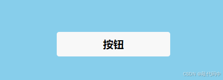

因为btnHandler在pareHandler里面,所以点击btnHandler时,也同时点击了pareHandler,这就是事件冒泡
(2)阻止事件冒泡
将bind修改成catch:
 <view class="catch" bind:tap="pareHandler">
   <button catch:tap="btnHandler">按钮</button>
 </view>
更新中。。。


 扫一扫
扫一扫


 3614
3614

 被折叠的 条评论
为什么被折叠?
被折叠的 条评论
为什么被折叠?
 到【灌水乐园】发言


