


The world has been severely affected by Cov-2019 in the whole year 2020. Many companies and organizations are struggling with a difficult environment. Many long-established companies and organizations are at risk of bankruptcy and dissolution. For example, Burger King’s subsidiary in New Zealand has filed for bankruptcy protection. In such a business winter, the size of a company or organization is closely related to its viability. Therefore, we want to choose a visualization that studies the size distribution of world companies and organizations, and then research and improve this visualization. The visualization we select should not be a perfect one, we want to understand the visualization better by improving it. if the selected picture has no pitfalls, it would be difficult for us to conduct active and exploratory research and study on this visualization. Meanwhile, the visualization should not contain some specific effects like article light shadow. These visualizations are often created not only with Matplotlib but also modified with other software like Photoshop and AE. It could cause too much trouble when we making the replication.
We finally find the visualization in “WTF-Visualizations”: https://luiscruz.github.io/course_infovis/wtf-viz/media/tumblr_oe9sycgsub1sgh0voo1_1280.png 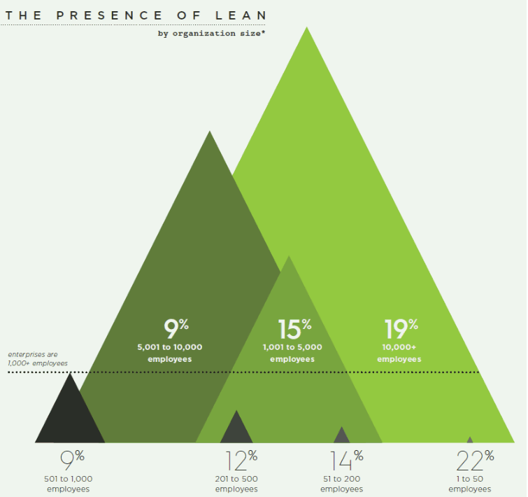
picture1: The original visualization.
As you can see, we chose a deformed bar chart as our original visualization. Don’t read the next paragraph and try to read and understand it in 20 seconds. It is hard, right? We have to admit that even this original visualization is beautiful, but it is not friendly for readers who want to get information easily from it. We will talk about the pitfalls of the original visualization and how can we improve it in the next few paragraphs. Now let us tell you about how did we analysis this visualization on a more specific level.
The picture reflects the proportion of companies and organizations of different range of sizes. In spite of the visualization conflicts with many information visualization principles, from the vision of aesthetics point of view, this visualization is great right? The combination of shapes, positions, and their occlusion relationships make the visualization looks balance and in accord. If you have been exposed to Chinese landscape paintings, you will find that this visualization is built with the inspiration of landscape paintings. The author uses a light green as the background color, while using a more saturated green as the main color. The background color and the color of triangles are located in a similar position on the color circle(near green), making the color of the entire image harmonious. When the reader takes a look at the picture for the first time, the most attractive part in the picture is three huge green triangles and texts on them. So the reader may start to read texts. A percentage plus a range of employee numbers is likely to make the reader confused. The reader may want to know what these numbers mean. Now the reader may be trapped in the “Cognitive tunnelling”. “Cognitive tunnelling” can be briefly described as when looking at a visual element in the graph, the user will lose relevant information as long as they are close. So it would be better for the reader to extract attention from the triangles and try to find more explanatory features. The reader is likely to see the dotted line in the lower middle and try to understand its meaning, but this is also very difficult because the reader doesn’t know what the position and texts of the dotted line represent. So the reader may turn to the text in the upper left corner, which is located in the most remote position. After reading the text in the upper left corner, In this section, the reader begins to understand that this graph shows the distribution of company and organization sizes. Then if the reader re-examines the triangle and the text on it, he or she will find that the larger the percentage displayed on the triangle, the larger the size of the triangle, and the numbers of employees on the triangles is the range of the employee numbers represented by this triangle (obviously the interval is not equal long). After reading the basic elements of the graph, if the reader has had contact with statistics or data visualization before, he or she may realize that this visualization is actually a reformed bar chart. In fact, this visualization replaces bars in the bar chart with triangles. Then generate the current visualization by adjusting the position and color of the triangles and allowing them to overlap with each other. In order to control the aspect ratio of the picture within a reasonable range, the author reuses the x-axis by overlapping triangles and dividing the triangle into two parts by the dotted line. However, after this adjustment, the order between the large and small triangles becomes less intuitive. This increases the difficulty of reading and may cause working memory overload. What is working memory overload? Simply put, in a short period of time, the new information that the brain can store is limited, and this limited capacity can be understood as working memory. This capacity is about 5 - 9 basic elements for ordinary people. So if reading a visualization requires you to remember more than 9 words of elements at the same time while you are reading them, it is a bad visualization.
Now we must introduce a concept of information visualization: “Visual Variables”. They are elements you can see and gain information from. As you can see, there are three main visual variables in the visualization: the size of triangles, the percentage on triangles and employee number ranges on the triangles. The size of triangles and employee number on it represents the size of organizations. The percentage on the triangle shows the organization percentage in that interval. Clarifying the visual variables contained in a visualization can help us deconstruct and analyze the visualization better and make our research more professional to the domain audience.
Now we have deconstructed the elements in the visualization, and we have some assumptions about the reader’s reaction when seeing this visualization from the reader’s perspective. Now we can summarize the pitfalls contained in this visualization through the above analysis.
There are seven main pitfalls in the visualization:
-
As the comments in the source website “The try-to-find-an-angle chart”. The angle is the intersection of the lines, so it is easy for angles to draw people’s attention. However, there are too many angles in the picture. According to the cognitive theory, it could cause “cognitive tunnelling”. The audience may get confused by it.
-
Three triangles are green, the green color is unfriendly to color-blind people because most color blind people are Red-green blind, which means they can not see red and green color. Red-green blindness is a large number of readers, according to the survey, they account for about 8% of the population. So we should avoid using red and green color in visualization.
-
Some texts are located at the bottom of the visualization, but triangles are overlapping with each other at the bottom which may be hard for the user to identify which triangle they are describing.
-
Triangles are overlapping with each other, and their colors are similar to each other, So if the user checks the visualization on a low-quality screen, It could be difficult for the user to identify a triangle from others.
-
The Lie factor of the visualization is significant. What is lie factor? Lie factor is used to describe the relation between the size of the effect shown in the graph and the size of the effect shown in the data, which can ensure the integrity of a graph. If the value of lie factor of a graph is between 0.95 and 1.05, it means that this graph is integrated. The formulaic definition is Lie factor = size of the effect shown in the graph / size of the effect shown in the data. The size difference of triangles is tiny compared with the employee number difference. (the employee number difference is too huge, so it is unavoidable)
-
The resolution of the visualization is too low, which makes some small-sized characters blurred and hard to read.
-
Large and small triangles are not in order. It slow down the reading speed and may cause working memory overload(the reader has to remember more information at the same time).
After analysis of the visualization itself, Our other major focus is to study what the data behind the visualization represents and their connection with human society. What kind of data or trend does the image reflect? And what is our guess, assumption, or guess about it? If you extract data from the visualization, you will find that the large and small triangles show a larger percentage while the middle size triangles show a smaller percentage. Obviously, a company will not be very large when it is first established. A company like Microsoft also started from a garage studio. This explains why companies with fewer than 50 employees accounted for the largest percentage, which seems normal. However, the proportion of large companies is higher than that of medium-sized companies, which seems counter-intuitive. We can come up with a theory: a medium-sized organization is not a stable form of the existence of a company. When a company reaches a medium-sized scale, it can either successfully expand into a large company or decline into a small company(or just broken up). If there are more data, such as the relationship between the company’s survival time and company size, we can conduct more analysis to verify this hypothesis. This reminds me of a Chinese proverb: One hundred steps is half 90. Many great careers fail in the middle of the process, just as climbing is the most tired and uncomfortable in the middle of the process.
Now it is time for us to make the replication of the selected visualization. We will explain our method step by step. The programming tool we use is mainly python and its image library Matplotlib. If you are familiar with python or matplotlib or have used it before, you can follow our steps And get another visual replication of your own.
-
If we want to replicate the visualization, we must know the specific positional data of triangles. Fortunately, the triangle is the simplest geometric figure. We only need its three vertices to determine its position, so we printed this visualization on paper and added a y-axis, taking the x-axis and y-axis as the benchmark to constructed a Cartesian coordinate system. We use it to measure and quantitatively record the positions of each vertex and text.
-
We set the size of the canvas in matplotlib through plt.figure(size = ()). Then measure the size of the original visualization on the printing paper, so that the ratio of the coordinates in the Cartesian coordinate system and the coordinates in the code on the printing paper is obtained. Then we convert all recorded coordinates into coordinates on the canvas in matplotlib according to this ratio. Now we have successfully got the coordinates of all key vertices and text on the matplotlib canvas.
-
Now we only need the color configuration of the triangles. We obtained the colors on the visualization in RGB format through an online picture color analysis website. Then convert them to the decimal form required by matplotlib as the color configuration. This is the website we use for online color analysis: http://www.jiniannet.com/Page/allcolor
-
Now we can draw pictures. We use the matplotlib function plt.plot() to draw edges of triangles based on coordinates of vertices. Then we use the function plt.fill() to fill the triangles with their colors.
-
We copy and paste the text in the original visualization and place it in the designated position through plt.text().
-
It is time to remove extra inks. we removed the x-axis, y-axis, upper and right borders by ax=plt.gca(), ax.spines[‘ledt’].set_color(‘none’)
-
The default image resolution of matplotlib is not high enough, which makes some small-sized characters very blurred, so we set the resolution to dpi = 300 through plt.figure(dpi = 300). This makes the visualization sharper. Finally we save the visualization in the folder as “replication.jpg” with plt.savefig().
For professional readers who want to refer to our code, you are welcome to check it in the appended .ipynb file. The picture below is the replication generated by our code.

picture2: The replication visualization.
Now we already have the replication of original visualization, so how do we evaluate whether our copy is similar to the original picture? From the perspective of human vision, our replication is very similar to the original one, but human vision is not accurate enough. We need a more rigorous method to quantitatively describe the similarity of the two pictures. We pick "Mean hash algorithm" and "Difference hash algorithm" to calculate the difference of the replication picture and original visualization. These two algorithms use a hash function to traverse each pixel of a picture, compare the results of the hash function to get a sequence of 0 and 1, and measure the similarity of the two pictures by comparing the sequences of them. The result is " Mean hash algorithm difference:11, Difference hash algorithm difference:12" Considering that we use the 8x8 dot matrix, it means that these values are between 0 and 64. 0 means two images are totally the same and 64 means totally different, we can say that the replication we made is close to the original visualization. For professional readers who want to refer to our code, you are welcome to check it in the appended .ipynb file.

picture3: The pie chart.
Now we have finished the replication part and we are going to improve the original visualization in the next few paragraphs. When we are trying to improve the visualization, the key step is choosing the right type of visualization. Because the sum of the percentages of the source data is 100%, we thought of using a pie chart. When we finished the drawing, we asked the public for opinions, and the outside opinions pointed out a big flaw in the pie chart. Please check the above picture3. When a pie chart is created, it should follow this rule: each slice of the pie should be arranged in order from largest to smallest or from smallest to largest. But the pie chart created according to this principle is anti-intuitive. Because this disrupts the order of the employee number intervals. For example, it jumps from the minimum interval 1-50 to the maximum interval 10000+ and then jump to 1001-5000. So we turned to another type of visualization: Bar Chart.

picture4: The bar chart.
We created the bar chart following some principles put forward by Edward Tufte. The first principle we are following is “Remove non-data ink”. Please look at the above picture4, We tried our best to remove inks that can not convey information. The y-axis, upper and right bound was removed. We labeled all percentages directly above bars to obey the principle “The representation of numbers, as physically measured on the surface of the graph itself, should be directly proportional to the numerical quantities represented”. If we use labels or values on y axis instead, the reader has to move their eye from the bar to the edge of the picture many times, which is troublesome. Consider the relationship with original visualization, we copy and paste the title from it. We also used the background color of the original visualization: ”honeydew“. And we did want to use color to convey some information. Therefore, we use a gradient color to fill bars. The darker the bar color, the larger the company sizes corresponding to this bar. Considering the possibility of color blindness among readers, we chose purple as our fill color.
We showed two improved images to Yixuan-Wang and Yutian-Liu in Group 1, and the feedback we got was that the bar chart is better both in aesthetics and practicality vision, so we chose the bar chart as our improved visualization.
Now we are telling the division of labor when we doing the project. Yuxuan-Can and Qiyuan-Zhang discussed principles in selecting the visualization and made the selection. Qiyuan-Zhang made the first version of replication and Yuxuan-Can updated it to the final version, Yucheng-Li programmed the first and second version of improved visualization. The report is written by Yuxuan-Cao and improved by Qiyuan-Zhang and Yucheng-Li. We also took some comments on how to improve the visualization better from Yixuan-Wang, Yutian-Liu in group 01, and professor Luís Cruz.
Generally speaking, our research and exploration work can be divided into the following parts:
-
Select a visualization that satisfies our need, which is a reformed bar chart.
-
Make an analysis of the selected visualization, interpret and deconstruct the picture itself.
-
Research and exploration of the information behind the pictures and the relationship between these
information and human society -
Make a replication of the visualization and evaluate the similarity.
-
Improve the visualization and make it easier to read.
-
Put our work in the blog website CSDN.com


 3782
3782


 被折叠的 条评论
为什么被折叠?
被折叠的 条评论
为什么被折叠?
 到【灌水乐园】发言


