vue echart实现横向柱状图颜色渐变、标签右对齐

本文描述了如何使用ECharts库创建一个带有颜色渐变、指定特定柱状图颜色和标签右对齐的横向柱状图,以及如何设置双Y轴。作者提供了详细的代码示例以帮助读者实现这些功能。

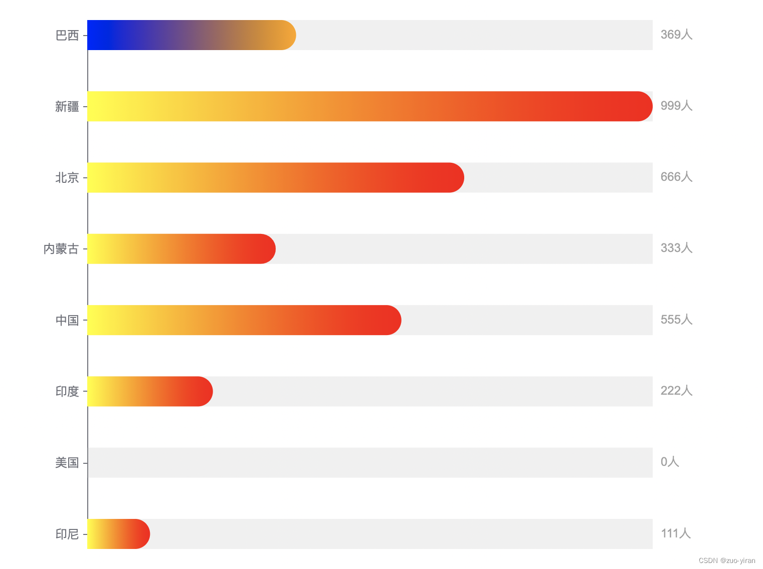
需求:用echart实现柱状图的横向展示,对指定数据的柱状图进行颜色区分,且对应标签值展示在柱状图右侧,实现文字的右对齐。
主要问题点:
1、柱状图的颜色渐变
通过colorStops设置color渐变的起止颜色,

colorStops: [
  {
    offset: 0.01, // 颜色的开始位置
    color: 'blue' // 0% 处的颜色
  },
  {
    offset: 0.99, // 颜色的结束位置
    color: 'orange' // 100% 处的颜色
  }
]

2、指定某一个柱状图颜色
给data中的指定颜色值进行特殊设置:

data: [111,0,222,555,333,666,999,
  {
    value: 369,
    label:'巴西',
    itemStyle: {
      color: 'red'
    }
  }
]

3、使用双Y轴实现标签右对齐
设置两个Y轴,一个为原本的名字,另一个为具体对应的数值。
效果如下图所示:
在这里插入图片描述
完整代码如下:

import * as echarts from 'echarts';

var chartDom = document.getElementById('main');
var myChart = echarts.init(chartDom);
var option;

option = {
  title: {
    text: '',
    subtext: ''
  },
  tooltip: {
    trigger: 'item' //悬浮提示框不显示
  },
  grid: {
    //绘图区调整
    x: 150, //左留白
    y: 30, //上留白
    x2: 100, //右留白
    y2: 30 //下留白
  },
  xAxis: [
    {
      show: false,
      type: 'value',
      boundaryGap: [0, 0],
      position: 'top',
      max: 'dataMax' // 保证百分比和柱状图宽度对应得上
    }
  ],
  yAxis: [
    {
      type: 'category',
      data: ['印尼', '美国', '印度', '中国', '内蒙古', '北京', '新疆', '巴西'],
      // axisTick: { // 刻度
      //   show: false // 不显示刻度线
      // },
      axisTick: {
        show: true,//隐藏刻度线
        alignWithLabel: true,//设置刻度线与标签对齐
        length: 4
      },
      axisLine: {
        show: true // 设置轴线
      },
      boundaryGap: false,// 坐标轴是否留白
    },
    {
      type: 'category',
      data: [[111], [0], [222], [555], [333], [666], [999], [369]],
      // 刻度
      axisTick: {
        show: false // 不显示刻度线
      },
      axisLine: {
        show: false // 设置轴线
      },
      axisLabel: {
        textStyle: {
          fontSize: '12',
          color: '#a1a1a1' // 坐标值的具体的颜色
        },
        formatter: function (value) {
          return value + '人';
        }
      },
      boundaryGap: false
    }
  ],
  series: [
    {
      name: '',
      type: 'bar',
      tooltip: { show: false },
      barMinHeight: 0, //最小柱高
      barWidth: 30, //柱宽度
      barMaxWidth: 100, //最大柱宽度
      barGap: '-100%', // 两条柱条重叠
      showBackground: true,
      data: [
        111,0,222,555,333,666,999,
        {
          value: 369,
          // label:'巴西',
          itemStyle: {
            color: {
              colorStops: [
                {
                  offset: 0.01, // 颜色的开始位置
                  color: 'blue' // 0% 处的颜色
                },
                {
                  offset: 0.99, // 颜色的结束位置
                  color: 'orange' // 100% 处的颜色
                }
              ]
            }
          }
        }
      ],
      itemStyle: {
        normal: {
          //柱状图颜色
          // color:'red',
          // 每个柱子的颜色即为colorList数组里的每一项,如果柱子数目多于colorList的长度,则柱子颜色循环使用该数组
          color: function (params) {
            // var index = params.dataIndex
            var colorList = [
              // 渐变颜色的色值和透明度
              // 透明度从0
              'yellow', // 到透明度1 ,如果需要不同的颜色直接修改不同颜色即可
              'red'
            ];
            return {
              colorStops: [
                {
                  offset: 0.01, // 颜色的开始位置
                  color: colorList[0] // 0% 处的颜色
                },
                {
                  offset: 0.99, // 颜色的结束位置
                  color: colorList[1] // 100% 处的颜色
                }
              ]
            };
          },
          label: {
            show: false, //显示文本
            position: ['100%', '0%'] //数据值位置
            // textStyle:{  // 单独设置标签样式
            //     color:'#000',
            //     fontSize:'30'
            // }
          },
          // 柱形图圆角,初始化效果
          barBorderRadius: [0, 15, 15, 0]
        }
      }
    }
  ]
};
myChart.setOption(option);
解释一下列语句的语法,纯文本输出.<!-- sy1\src\views\statistics\components\top10.vue --> <template> <div class="container top10"> <h2 class="homeTitle"> 销量排名TOP10 </h2> <div class="charBox"> <div id="top" style="width: 100%; height: 380px" /> </div> </div> </template> <script lang="ts"> import { Component, Vue, Prop, Watch } from 'vue-property-decorator' import * as echarts from 'echarts' @Component({ name: 'Top', }) export default class extends Vue { @Prop() private top10data!: any @Watch('top10data') getData() { this.$nextTick(() => { this.initChart() }) } initChart() { type EChartsOption = echarts.EChartsOption const chartDom = document.getElementById('top') as any const myChart = echarts.init(chartDom) var option: any option = { tooltip: { trigger: 'axis', backgroundColor: '#fff', //背景颜色(此时为默认色) borderRadius: 2, //边框圆角 textStyle: { color: '#333', //字体颜色 fontSize: 12, //字体大小 fontWeight: 300, }, }, grid: { top: '-10px', left: '0', right: '0', bottom: '0', containLabel: true, }, xAxis: { show: false, }, yAxis: { // 隐藏y轴坐标轴 axisLine: { show: false, }, // 隐藏y轴刻度线 axisTick: { show: false, alignWithLabel: true, }, type: 'category', // interval: 100, axisLabel: { textStyle: { color: '#666', fontSize: '12px', }, // formatter: "{value} ml",//单位 }, data: this.top10data.nameList, }, series: [ { data: this.top10data.numberList, type: 'bar', showBackground: true, backgroundStyle: { color: '#F3F4F7', }, barWidth: 20, barGap: '80%' /*多个并排柱子设置柱子之间的间距*/, barCategoryGap: '80%' /*多个并排柱子设置柱子之间的间距*/, itemStyle: { emphasis: { barBorderRadius: 30, }, normal: { barBorderRadius: [0, 10, 10, 0], // 圆角 color: new echarts.graphic.LinearGradient( // 渐变色 1, 0, 0, 0, // 渐变色的起止位置, 右/下/左/上 [ // offset 位置 { offset: 0, color: '#FFBD00' }, { offset: 1, color: '#FFD000' }, ] ), label: { //内容样式 show: true, formatter: '{@score}', color: '#333', // position: "insideLeft", //内部左对齐 position: ['8', '5'], //自定义位置第一个参数为x轴方向,第二个参数为y轴方向,左上角为起点,向右向下为正数,向上向左为负数 }, }, }, // label: { // show: true, // position: "left", // valueAnimation: true, // }, }, ], } option && myChart.setOption(option) } } </script>
最新发布
10-28
评论 2
添加红包

请填写红包祝福语或标题

红包个数最小为10个

红包金额最低5元

当前余额3.43前往充值 >
需支付:10.00
成就一亿技术人!
领取后你会自动成为博主和红包主的粉丝 规则
hope_wisdom
发出的红包
实付
使用余额支付
点击重新获取
扫码支付
钱包余额 0

抵扣说明:

1.余额是钱包充值的虚拟货币,按照1:1的比例进行支付金额的抵扣。
2.余额无法直接购买下载,可以购买VIP、付费专栏及课程。

余额充值