


一、准备所有资源
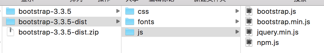
1、首先需要下载Bootstrap
2、下载jquery
- Bootstrap下载地址:http://v3.bootcss.com/getting-started/#download
- jquery下载地址:http://jquery.com/download/
二、代码部分:
1、根据设备显示页面的比例
<!--加了这句话就会实现响应式布局-->
    <meta name="viewport" content="width=device-width,initial-scale= 1" >
initial-scale为缩放比例
2、引入文件
//引入样式
<link href="bootstrap/css/bootstrap.min.css" rel="stylesheet" type="text/css">
//引入jquery
<script src="bootstrap/js/jquery.min.js"></script>
//js
<script src="bootstrap/js/bootstrap.min.js"></script>
3、布局样式
<!--布局样式
container 固定宽度并且具有响应式
container-fluid自由宽高(100%)
-->
<div class="container">
    <h1>Downloading jQuery</h1>
   <p> Compressed and uncompressed copies of jQuery files are available. The uncompressed file is best used during development or debugging; the compressed file saves bandwidth and improves performance in production. You can also download a sourcemap file for use when debugging with a compressed file. The map file is not required for users to run jQuery, it just improves the developer's debugger experience. As of jQuery 1.11.0/2.1.0 the //# sourceMappingURL comment is not included in the compressed file.

    To locally download these files, right-click the link and select "Save as..." from the menu.
   </p>
</div>

<div class="container-fluid">
    <h1>Downloading jQuery</h1>
     <font class="h1">行内块样式</font>
    <p> Compressed and uncompressed copies of jQuery files are available. The uncompressed file is best used during development or debugging; the compressed file saves bandwidth and improves performance in production. You can also download a sourcemap file for use when debugging with a compressed file. The map file is not required for users to run jQuery, it just improves the developer's debugger experience. As of jQuery 1.11.0/2.1.0 the //# sourceMappingURL comment is not included in the compressed file.

        To locally download these files, right-click the link and select "Save as..." from the menu.
    </p>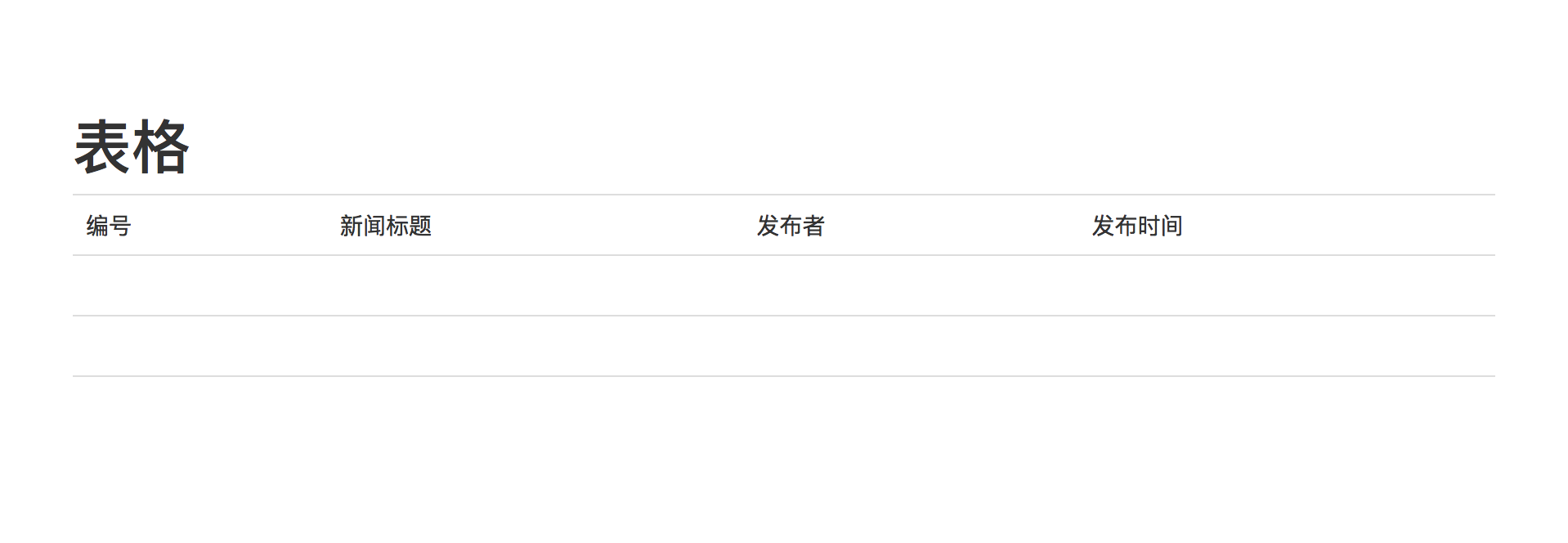
</div>- 表格样式
<body style="padding: 50px;background-color: #ccc">
<div class="container" style="background-color: #fff;padding: 50px;">
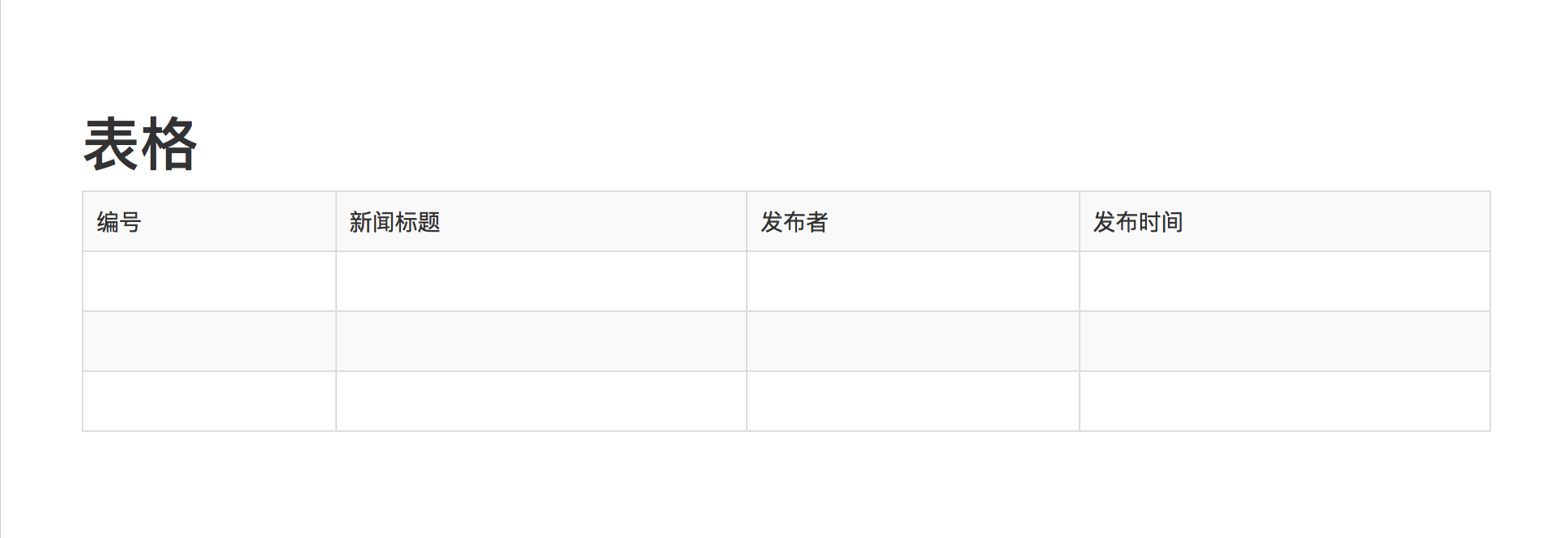
<h1> 表格 </h1>
<table class="table">
<tr>
<td>编号</td>
<td>新闻标题</td>
<td>发布者</td>
<td>发布时间</td>
</tr>
<tr>
<td> </td>
<td> </td>
<td> </td>
<td> </td>
</tr>
<tr>
<td> </td>
<td> </td>
<td> </td>
<td> </td>
</tr>
<tr>
<td> </td>
<td> </td>
<td> </td>
<td> </td>
</tr>
</table>
</div>
</body>效果图:
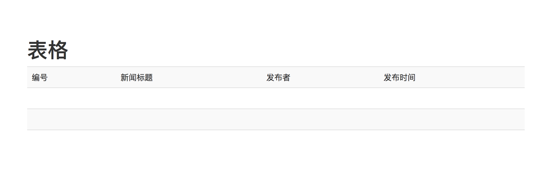
表格的其他样式
- 表格隔行变色
//表格隔行变色
<table class="table table-striped">
效果图:
- 表格边框
//表格边框
<table class="table table-striped table-bordered">
效果图:
- 表格鼠标放上或离开效果
<table class="table table-hover table-condensed">- 表格的自动滚动条
<!--当屏幕大小小于768时出现滚动条-->
<div class="table-responsive">
<table class="table table-hover table-condensed">
<tr class="active">
<td>编号</td>
<td>新闻标题</td>
<td>发布者</td>
<td>发布时间</td>
</tr>
<tr>
<td> </td>
<td> </td>
<td> </td>
<td> </td>
</tr>
<tr>
<td> </td>
<td> </td>
<td> </td>
<td> </td>
</tr>
<tr>
<td> </td>
<td> </td>
<td> </td>
<td> </td>
</tr>
</table>
</div>- 表格的样式
<!--form-inline 是表格横向排列-->
    <form class="form-inline">
        <div class="form-group">
            <!--sr-only 设置隐藏-->
            <label for="username" class="sr-only">用户名:</label>
            <input type="text" class="form-control" id="username" placeholder="请输入您用户名">
        </div>
        <div class="form-group">
            <label for="password">密码:</label>
            <input type="text" class="form-control" id="password" placeholder="请输入您的密码">
        </div>
    </form>
Bootstrap 的基本的 HTML 模板:
<!DOCTYPE html>
<html>
   <head>
      <title>Bootstrap 模板</title>
      <meta name="viewport" content="width=device-width, initial-scale=1.0">
      <!-- 引入 Bootstrap -->
      <link href="http://apps.bdimg.com/libs/bootstrap/3.3.0/css/bootstrap.min.css" rel="stylesheet">

         <script src="https://oss.maxcdn.com/libs/html5shiv/3.7.0/html5shiv.js"></script>
         <script src="https://oss.maxcdn.com/libs/respond.js/1.3.0/respond.min.js"></script>
      <![endif]-->
   </head>
   <body>
      <h1>Hello, world!</h1>

      <!-- jQuery (Bootstrap 的 JavaScript 插件需要引入 jQuery) -->
      <script src="https://code.jquery.com/jquery.js"></script>
      <!-- 包括所有已编译的插件 -->
      <script src="js/bootstrap.min.js"></script>
   </body>
</html>


 509
509


 被折叠的 条评论
为什么被折叠?
被折叠的 条评论
为什么被折叠?
 到【灌水乐园】发言


