


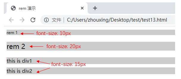
1. rem是什么?
- rem,CSS3新增的一个相对单位(root em,根em),相对于根元素,常用于响应式布局
- em,相对长度单位,相对于父元素,不常用
- px,像素(Pixel)绝对长度单位
<style>
    html{
        font-size: 100px;
    }
    div{
        background-color: #ccc;
        margin-top: 10px;
        font-size: 0.15rem;
    }
    p{background-color: #ccc;}
</style>

<body>
    <p style="font-size: 0.1rem">rem 1</p>
    <p style="font-size: 0.2rem">rem 2</p>

    <div>
        this is div1
    </div>
    <div>
        this is div2
    </div>
</body>
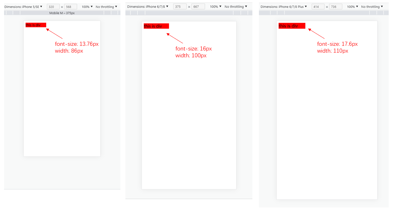
2. 响应式布局的常见方案
首先,进行media-query,根据不同的屏幕宽度设置根元素font-size。然后,通过rem,基于根元素的相对单位。
<!DOCTYPE html>
<html lang="en">
<head>
    <meta charset="UTF-8">
    <meta http-equiv="X-UA-Compatible" content="IE=edge">
    <meta name="viewport" content="width=device-width, initial-scale=1.0">
    <title>Document</title>
    <style>
        /* iphone5 或者更小的尺寸 */
        @media only screen and (max-width: 374px){
            html{
                font-size: 86px;
            }
        }
        /* iphone6/7/8 和 iphone x */
        @media only screen and (min-width: 375px) and (max-width: 413px){
            html{
                font-size: 100px;
            }
        }
        /* iphone6p 或者更大 */
        @media only screen and (min-width: 375px){
            html{
                font-size: 110px;
            }
        }

        body{
            font-size: 0.16rem;
        }
        #div1{
            width: 1rem;
            background-color: red;
        }
    </style>
</head>
<body>
    <div id = "div1">
        this is div
    </div>
</body>
</html>
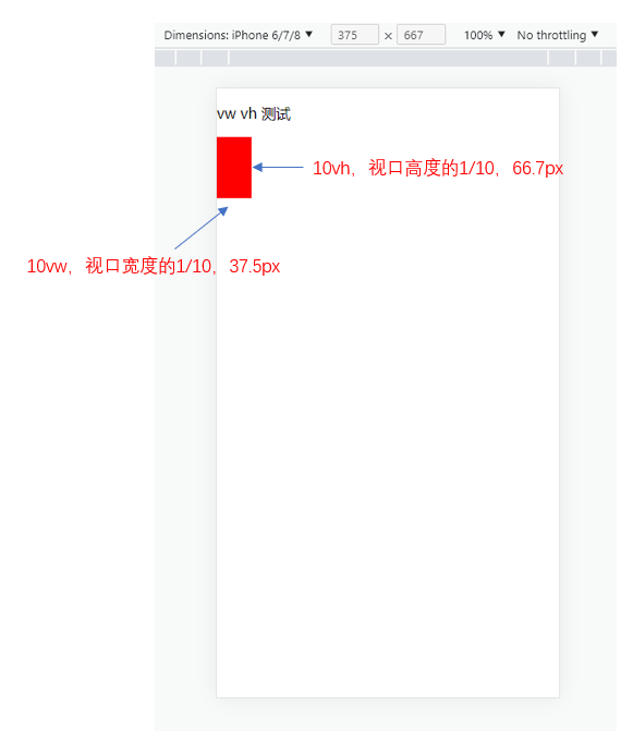
3. vm/vh
网页视口尺寸:
| 属性 | 解释 |
|---|---|
window.screen.height | 屏幕高度 |
window.innerHeight | 网页视口高度 |
document.body.clientHeight | body高度 |
- vh:网页视口高度的1/100
- vw:网页视口宽度的1/100
- vmax取两者最大值,vmin取两者最小值
<style>
    body{
        margin: 0;
        padding: 0;
    }

    #container{
        background-color: red;
        width: 10vw;
        height: 10vh;
    }
</style>

<body>
    <p>vw vh 测试</p>
    <div id = "container"></div>
</body>


 380
380


 被折叠的 条评论
为什么被折叠?
被折叠的 条评论
为什么被折叠?
 到【灌水乐园】发言


