


<!DOCTYPE html>
<html lang="zh-CN">
<head>
<meta charset="UTF-8">
<meta http-equiv="X-UA-Compatible" content="IE=edge">
<meta name="viewport" content="width=device-width, initial-scale=1.0">
<title>loading倒影效果</title>
</head>
<body>
<div class="container">
<span>Loading...</span>
<div class="circle">
<div class="ring"></div>
</div>
</div>
</body>
</html>
<style>
* {
margin: 0;
padding: 0;
box-sizing: border-box;
}
body {
height: 100vh;
display: flex;
justify-content: center;
align-items: center;
background-color: rgb(7, 15, 26);
}
.container {
position: relative;
height: 150px;
width: 250px;
-webkit-box-reflect: below 1px linear-gradient(transparent, rgb(7, 15, 26));
}
.container>span {
position: absolute;
left: 50%;
top: 50%;
transform: translate(-50%, -50%);
color: rgb(20, 129, 202);
text-shadow: 0 0 10px rgb(20, 129, 202),
0 0 30px rgb(20, 129, 202),
0 0 60px rgb(20, 129, 202),
0 0 100px rgb(20, 129, 202);
font-size: 18px;
z-index: 1;
}
.circle {
position: relative;
margin: 0 auto;
height: 150px;
width: 150px;
background-color: rgb(13, 10, 37);
border-radius: 50%;
animation: zhuan 2s linear infinite;
}
@keyframes zhuan {
0% {
transform: rotate(0deg);
}
100% {
transform: rotate(360deg);
}
}
.circle::after {
content: '';
position: absolute;
top: 10px;
left: 10px;
right: 10px;
bottom: 10px;
background-color: rgb(7, 15, 26);
border-radius: 50%;
}
.ring {
position: absolute;
top: 0;
left: 0;
width: 75px;
height: 150px;
background-image: linear-gradient(180deg, rgb(22, 121, 252), transparent 80%);
border-radius: 75px 0 0 75px;
}
.ring::after {
content: '';
position: absolute;
right: -5px;
top: -2.5px;
width: 15px;
height: 15px;
background-color: rgb(40, 124, 202);
box-shadow: 0 0 5px rgb(40, 151, 202),
0 0 10px rgb(40, 124, 202),
0 0 20px rgb(40, 124, 202),
0 0 30px rgb(40, 124, 202),
0 0 40px rgb(40, 124, 202),
0 0 50px rgb(40, 124, 202),
0 0 60px rgb(40, 124, 202),
0 0 60px rgb(40, 124, 202);
border-radius: 50%;
z-index: 1;
}
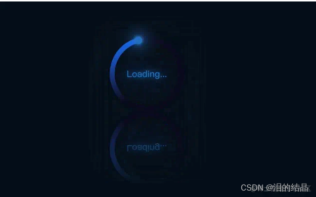
</style>最终效果:
https://p3-juejin.byteimg.com/tos-cn-i-k3u1fbpfcp/d2fa6e0939d6419ab1a8e0b59b6bf8de~tplv-k3u1fbpfcp-zoom-in-crop-mark:3024:0:0:0.awebp


 1554
1554


 被折叠的 条评论
为什么被折叠?
被折叠的 条评论
为什么被折叠?
 到【灌水乐园】发言


