


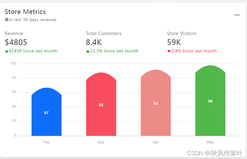
<div id="chart4"></div>e = {
series: [{
name: 'Yearly Profit',
data: [{
x: 'OEE',
y: 67,
fillColor: '#0D6EFD',
strokeColor: '#0D6EFD'
},
{
x: '时间开动率',
y: 88,
fillColor: '#F74D5D',
strokeColor: '#F74D5D'
},
{
x: '性能开动率',
y: 92,
fillColor: '#EB8C87',
strokeColor: '#C23829'
},
{
x: '良品率',
y: 98,
fillColor: '#51B84A',
strokeColor: '#51B84A'
}]
}],
chart: {
foreColor: "#9ba7b2",
type: "bar",
height: 300,
toolbar: {
show: !1
}
},
plotOptions: {
bar: {
horizontal: !1,
columnWidth: "55%",
endingShape: "rounded"
}
},
colors: ["#0dcaf0", "#0d6efd", "#e5e7e8", "#cc08FF"],
xaxis: {
categories: ["Feb", "Mar", "Apr", "May"]
},
fill: {
opacity: 1
},
tooltip: {
y: {
formatter: function(e) {
return "$ " + e + " thousands"
}
}
}
};
new ApexCharts(document.querySelector("#chart4"), e).render();效果图


 1366
1366


 被折叠的 条评论
为什么被折叠?
被折叠的 条评论
为什么被折叠?
 到【灌水乐园】发言


