


需要实现这样一个功能
默认高度下文本超出隐藏,点击展开可查看所有内容,点击收起可折叠
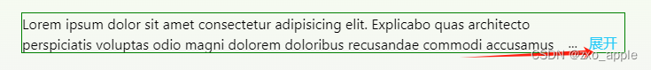
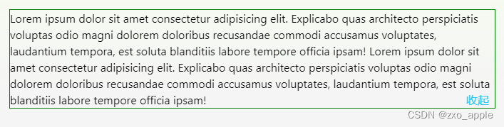
方法一:通过html和css实现
代码部分
html:
 <div className="expand-fold">
        <input id="check-box" type="checkbox" />
        <div className="content">
          {/* htmlFor和input的id一致 */}
          <label className="label" htmlFor="check-box"></label>
          <span>
            Lorem ipsum dolor sit amet consectetur adipisicing elit. Explicabo
            quas architecto perspiciatis voluptas odio magni dolorem doloribus
            recusandae commodi accusamus voluptates, laudantium tempora, est
            soluta blanditiis labore tempore officia ipsam! Lorem ipsum dolor
            sit amet consectetur adipisicing elit. Explicabo quas architecto
            perspiciatis voluptas odio magni dolorem doloribus recusandae
            commodi accusamus voluptates, laudantium tempora, est soluta
            blanditiis labore tempore officia ipsam!
          </span>
        </div>
      </div>

css:
  .expand-fold {
      display: flex;

      #check-box { // 将勾选框隐藏
        display: none;
      }
      #check-box:checked + .content { // 选中勾选框(点击展开)时修改最大高度,合理即可
        max-height: 800px;
      }
      #check-box:checked + .content .label { // 展开时,隐藏省略号,文字改为收起
        &::before {
          // 隐藏省略号
          content: '';
        }
        &::after {
          content: '收起';
        }
      }

      .content {
        font-size: 16px;
        flex: 1;
        max-height: 46px;
        line-height: 23px;
        overflow: hidden;
        &::before { // 将展开/收起文字对齐最右边
          content: '';
          float: right;
          height: calc(100% - 23px);
        }
      }
      .label { // 展开收起文字部分
        position: relative;
        float: right;
        clear: both;
        font-size: 16px;
        padding: 0 8px;
        color: #26caf8;
        border-radius: 4px;
        cursor: pointer;
        &::before { // 默认展开时添加省略号
          content: '...';
          position: absolute;
          left: -5px;
          color: #333;
          transform: translateX(-100%);
        }
        &::after {
          content: '展开';
        }
      }
    }
方法二:通过AntDesign + react实现组件封装
AntDesign默认只有展开功能,没有收起功能,以下是基于Typography组件实现展开收起
组件UI部分
import { Typography } from 'antd';
import React, { useState } from 'react';
import style from './index.less';

const { Paragraph } = Typography;

export type ExpandTextType = {
  rows?: number;
  symbol?: React.ReactNode;
  foldSlot?: React.ReactNode;
  children?: React.ReactNode;
};

const defaultSymbol = () => (
  <span className="ant-typography">
    展开 <i className="iconfont icon-jiantou-shaixuanzhankai"></i>
  </span>
);

const Example: React.FC<ExpandTextType> = (props) => {
  const { rows = 2, symbol = defaultSymbol(), foldSlot } = props;
  const [ellipsis, setEllipsis] = useState(false);
  const [counter, setCounter] = useState(0);
  const onFold = () => {
    setEllipsis(!ellipsis);
    setCounter(counter + 1);
  };
  const onExpand = () => {
    setEllipsis(!ellipsis);
    setCounter(counter + 0);
  };

// 自定义收起文案
  const renderFold = () => {
    return (
      <a className="ant-typography-fold" onClick={onFold}>
        {foldSlot ? (
          foldSlot
        ) : (
          <span>
            收起
            <i className="iconfont icon-jiantou-shaixuanzhankai icon-fold"></i>
          </span>
        )}
      </a>
    );
  };
  return (
    <div className={style['container']}>
      <Paragraph
        key={counter}
        ellipsis={{
          rows,
          expandable: true,
          symbol,
          onExpand,
        }}
      >
        {props?.children}
        {ellipsis && renderFold()}
      </Paragraph>
    </div>
  );
};

export default Example;
组件css
.container {
  :global {
    .ant-typography {
      margin-bottom: 0;
    }

    .ant-typography-expand,
    .ant-typography-fold {
      color: #089cdb;
      font-size: 13px;
      cursor: pointer;
      height: 17px;
      line-height: 17px;
      margin-left: 4px;

      .iconfont.icon-jiantou-shaixuanzhankai {
        display: inline-block;
        font-size: 10px;
        transform: rotate(90deg);
      }

      .iconfont.icon-jiantou-shaixuanzhankai.icon-fold {
        transform: rotate(-90deg);
        margin-left: 4px;
      }
    }
  }
}
页面使用组件
import ExpandText from '@/components/ExpandText';
import style from './index.less';

export type ExampleType = unknown;
const Example: React.FC<ExampleType> = () => {
  return (
    <div className={style.container}>
          <ExpandText>这里放入要展示的文案内容啊...</ExpandText>
    </div>
  );
};

export default Example;
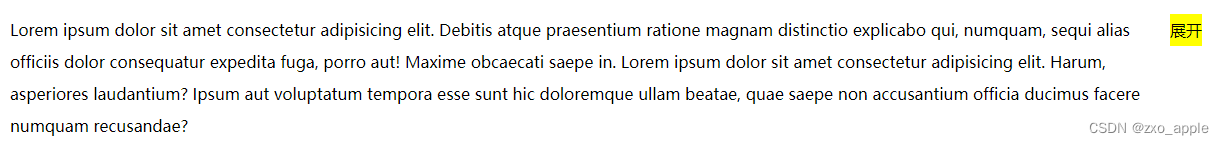
方法三:默认显示一行,超过一行显示展开按钮

import React, { useState, useRef, useEffect } from 'react';
import styles from './index.less';

export default function index() {
  const contentRef = useRef<any>(null);
  const [showCollapse, setShowCollapse] = useState(false); // 是否显示展开按钮
  const [open, setOpen] = useState(false); // 是否展开

  function handleResize() {
    const contentEl = document.querySelector('.panel-content') as HTMLElement;
    contentRef.current = contentEl;
    // 判断内容高度scrollHeight 是否超过指定高度clientHeight
    if (
      contentEl?.scrollHeight > contentEl?.clientHeight ||
      contentEl?.scrollHeight > 32
    ) {
      setShowCollapse(true);
    } else {
      setShowCollapse(false);
    }
  }

  useEffect(() => {
    handleResize();
    // 监听窗口变化 动态判断是否超过指定高度
    window.addEventListener('resize', handleResize);
    return () => window.removeEventListener('resize', handleResize);
  }, []);

  useEffect(() => {
    if (contentRef.current) {
      if (open) {
        // 展开最大高度 根据自己内容定
        contentRef.current.style.maxHeight = '1000px';
      } else {
        // 默认收起高度
        contentRef.current.style.maxHeight = '32px';
      }
    }
  }, [open]);

  // 超出指定高度 显示展开按钮
  return (
    <div className={styles.container}>
      <div className="panel-content">
        Lorem ipsum dolor sit amet consectetur adipisicing elit. Debitis atque
        praesentium ratione magnam distinctio explicabo qui, numquam, sequi
        alias officiis dolor consequatur expedita fuga, porro aut! Maxime
        obcaecati saepe in. Lorem ipsum dolor sit amet consectetur adipisicing
        elit. Harum, asperiores laudantium? Ipsum aut voluptatum tempora esse
        sunt hic doloremque ullam beatae, quae saepe non accusantium officia
        ducimus facere numquam recusandae?
      </div>

      {/* 超出高度才显示展开按钮 */}
      {showCollapse && (
        <div className="expand" onClick={() => setOpen(!open)}>
          展开
        </div>
      )}
    </div>
  );
}
.container {
  display: flex;
  align-items: start;
  :global {
    .panel-content {
      line-height: 32px;
      flex: 1;
      overflow: hidden;
      transition: all 0.2s linear;
    }
    .expand {
      background-color: yellow;
      width: 32px;
      height: 32px;
      line-height: 32px;
    }
  }
}


 511
511


 被折叠的 条评论
为什么被折叠?
被折叠的 条评论
为什么被折叠?
 到【灌水乐园】发言


