


一、前言
又看到了一个有意思的hover效果,毕竟当一段效果可以通过CSS实现的时候,绝不使用Javascript来实现,复刻后记录一下,一来是方便自己学习,另一来是方便以后在需要使用到的时候能快速找到并使用上~
耐心看完,你也许有所收获~
二、实现效果
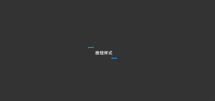
大致效果如下,问:如果UI设计师把这个效果给到你,你会怎么实现?文章结尾有代码,想要的自取,如果想要看demo的可以看这个地址:gitee项目demo地址
三、CSS要点
这个效果其实一点也不复杂,甚至可以说是简单,核心的要点就是对svg标签的利用(MDN关于SVG属性的说明);
看效果就明白了,核心一共分为两部分
- stroke属性,这个样式主要用来实现描边线的效果;
- transition属性,这个主要用来实现动画的效果;
就这两,没了,如果不太明白的话那么就简单说下:
stroke属性相关
stroke 属性定义了给定图形元素的外轮廓的颜色。它的默认值是 none(MDN关于stroke的说明)。在我们这个demo里,一共用到了这几个
/* 定义描边线的宽度,demo默认的宽度是:6px */
stroke-width: 6px;
fill: transparent;

/* 定义描边线的颜色,demo默认的颜色值是:#009ffd */
stroke: #009ffd;

/*
 * 定义描边线的缺口样式,demo中缺口也就是断线样式是靠这个属性实现的,
 * 如果要改断线样式,就是改这个
 */
stroke-dasharray: 20 180;

/* 相对起始点的偏移量,在这个demo中,这个属性可以帮助我们更好的去实现动画 */
stroke-dashoffset: -220;transition属性相关
动画属性,在CSS动画中它和animation经常出现,不同的是,transition经常用于一次性动画,animation则经常用于持续性动画(transition属性MDN解释)
transition是一个集合属性,和background类似,在demo中是这么写的
transition: 1s all ease;分别代表:
transition: 动画持续时间 动画作用于该DOM的所有属性 执行动画的函数曲线(ease代表的是匀速)等同于
// demo中的集合
transition: 1s all ease;

// 拆开后等同于下面三个
transition-duration: 1s;
transition-property: all;
transition-timing-function: ease;
四、完整实现代码
<!DOCTYPE html>
<html lang="cn">
  <head>
    <meta charset="UTF-8" />
    <meta name="viewport" content="width=device-width, initial-scale=1.0" />
    <title>Document</title>
    <style>
      body,
      html {
        position: relative;

        width: 100%;
        height: 100%;
        margin: 0;
        padding: 0;

        overflow: hidden;
      }
      .main-container {
        position: relative;

        width: 100%;
        height: 100%;
        display: flex;
        align-items: center;
        justify-content: center;

        background-color: #333333;
      }

      /* 按钮样式 */
      .btn-style {
        position: relative;

        width: 150px;
        height: 40px;
      }
      .btn-style #shape{
        stroke-width: 6px;
        fill: transparent;
        stroke: #009ffd;
        stroke-dasharray: 20 180;
        stroke-dashoffset: -220;
        transition: 1s all ease;
      }
      .btn-style:hover #shape {
        stroke-dasharray: 150 0;
        stroke-width: 4px;
        stroke-dashoffset: 150;
        stroke: #06d6a0;
      }
      .btn-text{
        cursor: pointer;
        position: absolute;
        top: 0;

        width: 100%;
        height: 100%;
        display: flex;
        align-items: center;
        justify-content: center;

        color: #ffffff;
        font-size: 14px;
        letter-spacing: 1px;
      }
    </style>
  </head>
  <body>
    <div class="main-container">
      <div class="btn-style">
        <svg height="40" width="150">
          <rect id="shape" height="40" width="150" />
        </svg>
        <div class="btn-text">按钮样式</div>
      </div>
    </div>
  </body>
</html>


 扫一扫
扫一扫


 被折叠的 条评论
为什么被折叠?
被折叠的 条评论
为什么被折叠?
 到【灌水乐园】发言


