<!DOCTYPE html>
<html lang="en">
<head>
<meta charset="UTF-8">
<meta name="viewport" content="width=device-width, initial-scale=1.0">
<title>Document</title>
<style>
* {
margin: 0;
padding: 0;
list-style: none;
}
body {
background-color: #eee;
font-size: 22px;
}
h3 {
margin: 10px;
font-weight: normal;
}
section {
width: 1000px;
margin: 0 auto;
}
ul {
background-color: #fff;
border: 1px solid #ccc;
height: 400px;
}
ul li {
width: 200px;
height: 200px;
background-color: pink;
margin: 10px;
}
section:nth-child(1) ul {
display: flex;
/* 侧轴 相当于 垂直方向 */
/* 侧轴对齐方式:从侧轴的开始方向对齐,默认从上到下,
第一排放不下就往下排,还有默认不会在一行放不下的时候自动往下排,
需要配合 flex-wrap: wrap; 才会自动换行
*/
align-items: flex-start;
}
section:nth-child(2) ul {
display: flex;
/* 侧轴对齐方式:从底部开始 */
align-items: flex-end;
}
section:nth-child(3) ul {
display: flex;
/* 侧轴对齐方式:居中 */
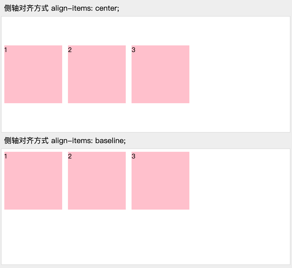
align-items: center;
}
section:nth-child(4) ul {
display: flex;
/* 侧轴对齐方式:基线对齐方式 */
align-items: baseline;
}
section:nth-child(5) ul {
display: flex;
/* 侧轴对齐方式:拉伸 */
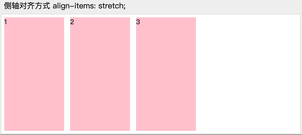
align-items: stretch;
}
section:nth-child(5) ul li {
/* 在拉伸模式下,得去除固定高度 */
height: auto;
}
</style>
</head>
<body>
<section>
<h3>侧轴对齐方式 align-items: flex-start;</h3>
<ul>
<li>1</li>
<li>2</li>
<li>3</li>
</ul>
</section>
<section>
<h3>侧轴对齐方式 align-items: flex-end;</h3>
<ul>
<li>1</li>
<li>2</li>
<li>3</li>
</ul>
</section>
<section>
<h3>侧轴对齐方式 align-items: center;</h3>
<ul>
<li>1</li>
<li>2</li>
<li>3</li>
</ul>
</section>
<section>
<h3>侧轴对齐方式 align-items: baseline;</h3>
<ul>
<li>1</li>
<li>2</li>
<li>3</li>
</ul>
</section>
<section>
<h3>侧轴对齐方式 align-items: stretch;</h3>
<ul>
<li>1</li>
<li>2</li>
<li>3</li>
</ul>
</section>
</body>
</html>


 336
336


 被折叠的 条评论
为什么被折叠?
被折叠的 条评论
为什么被折叠?
 到【灌水乐园】发言


